Combining border-image and box-shadow
CSS3 Backgrounds and Borders extends CSS 2.1 to provide borders consisting of images, boxes with multiple backgrounds, boxes with rounded corners and boxes with shadows. The interaction of border images and box-shadow is underspecified. This document proposes a way to combine border-image and box-shadow in a way that is clearly specified and gives an expected result.
@@ show a couple of examples of box-shadow with and without blur, on corner and on side. @@
A border image is constructed by specifying a source image and describing how it is sliced, stretched and replicated to form the resulting border image.


A source image with transparent portions, on white and grey backgrounds
Using this image with some CSS as below, gives the following result
border-width: 30px;
border-image: url("transborder.png") 30 30 30 30 round stretch;
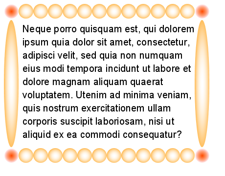
An image border constructed from the source image above.
Because the interaction between border-image and box-shadow is underspecified in the CSS3 Backgrounds and Borders draft, opinions vary on what to do if they are both applied to the same element.
4.1 Disallow the combination
Once suggestion is that border-image causes box-shadow to have no effect. While simple to specify, this is not very satisfactory. Content authors are likely to be surprised that they are barred from using a drop shadow if they use border images.
4.2 Opaque box
Some implementors construct the border image area, compisite the border image onto the background, and then treat the result as an opaque rectangle with the box-shadow applied to that. While better than making border-image and box-shadow mutually exclusive, the rendered result is probably not what the designer was aiming for.
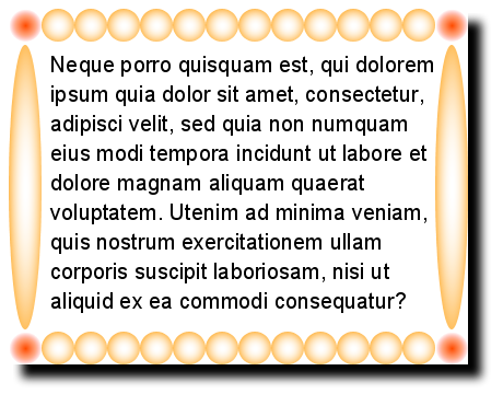
A drop shadow applied to the composited border image, as an opaque rectangle, looks wrong
A likely result of the above approaches is that web designers will make their own drop shadows as part of the image border. However, this can be tricky to arrange when the source image is sliced up, stretched and replicated, as seen below.
4.3 Use the alpha channel
The original source image, specified by border-image-source, may have an alpha channel (transparency). However, applying a drop shadow to the source image before slicing and tiling gives unexpected results: the required alignment of the drop shadows overlaps that of the portions of the original source image.
The resulting border image can also be considered to have an alpha channel. Applying a drop shadow to the entire border image also does not give the correct result, in comparison to the same box-shadow applied to a normal CSS border.
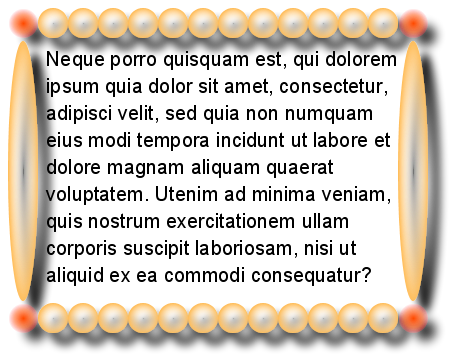
A drop shadow applied to the entire border image looks wrong
Separately applying a drop shadow to the relevant parts of the border image area similarly has issues with overlapping. However, identifying the relevant parts of the border image area and applying a single drop shadow to those parts, as a group, gives a result that is in accordance with how the same drop shadow would apply to an opaque box, and is more intuitively what would be expected.
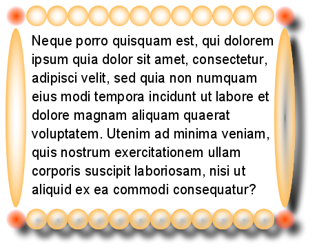
A drop shadow applied to the group of bottom-right, top-right, bottom-left, bottom and left parts.
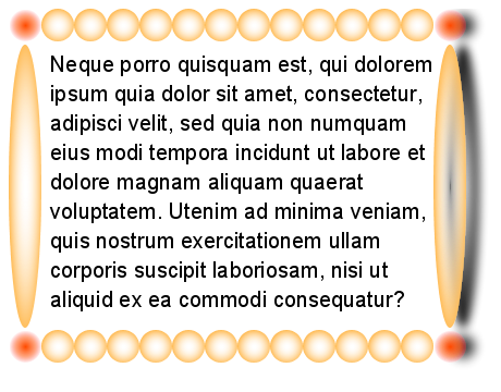
A drop shadow applied to the group of top-right, right, and bottom parts.
Firstly, consistently use the phrase "source image" for the image pointed to by the style sheet, and "border-image" for the resulting image border, laid out in the image border area.
Authors can specify a border image to be used in place of the border styles. In this case, the border's design is taken from the sides and corners of a source image specified with ‘border-image-source’, whose pieces may be sliced, scaled and stretched in various ways to fit the border image area.
The four ‘border-image-slice’ values represent inward offsets from the top, right, bottom, and left edges of the source image (respectively), dividing it into nine regions: four corners, four edges and a middle. The middle image part is discarded (treated as fully transparent) unless the ‘fill’ keyword is present.
Name the parts of the border image area (either as below in text, or with a diagram):
The border image is drawn inside an area called the border image area. This is a nine-part area whose boundaries by default correspond to the border box. The parts are termed the top-left part, top part, top-right part, left part, centre part, right part, bottom-left part, botto part, bottom-right part.
Clarify that the border image has an alpha channel, if the source image had one (currently mentioned in passing in an example).
The images are then tiled within their respective areas. All images are drawn at the same stacking level as normal borders: immediately in front of the background layers. If the source image had an alpha channel, the border image will also have one.
Add a new section after 5.5 The ‘border-image’ shorthand. Introduce the concept of a "key part" and "affected parts" of the border image.
5.6 Applying box-shadow to a border image
The key part of the border image is determined by the values of the horizontal and vertical offsets of the box-shadow property, and also whether 'inset' was specified.
@@ I think this would be better done with a table for each combination of horizontal offset (negative, zero, positive) and vertical offset (negative, zero, positive). Then say that when 'inset' is specified, the key part is the opposite one. Or, have two tables for the two cases.
The affected parts of the border image are the key part, and adjoining parts up to and including the next two corner parts. For example, if the affected part was the right part, the affected parts would be the top-right, right, and bottom-right parts (one edge and two corners). If the affected part was the bottom-right part, the affected parts would be the bottom-right, top-right, bottom-left, bottom and left parts (three corners and two sides).
Describe how to form the alpha channel that is used for the drop shadow.
The box-shadow is rendered as if a copy of the alpha channel of the border image was made, and the alpha channel of all non-affected parts was set to zero (fully transparent).
That algorithm was used to construct the two sample images above showing drop shadows on a corner and on an edge.
Chris Lilley chris@w3.org