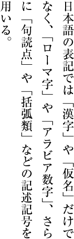
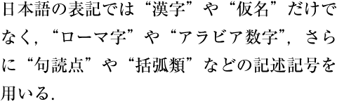
書記システムは,言語,文字と並び,文化を構成する重要な要素である.それぞれの文化集団には独自の言語,文字,書記システムがある.個々の書記システムをサイバースペースに移転することは,文化的資産の継承という意味で,情報通信技術にとって非常に重要な責務といえよう.
Writing systems are main part of cultures, together with languages and scripts. Each cultural community has its own language, script and writing system. In that sense, the transfer of each writing system into cyber space is a task with very important responsibility for information and communication technology.
この責務を実現するための基礎的な作業として,このドキュメントでは,日本語という書記システムにおける組版上の問題点をまとめた.具体的な解決策を提示することではなく要望事項の説明をすることにした.それは,実装レベルの問題を考える前提条件をまず明確にすることが重要であると考えたからある.
As one of the basic work items of this task, this document describes issues of text composition in the Japanese writing system. The goal of this task is not to propose solutions itself but describe important issues as the basic information for actual implementations.
このドキュメントの作成は,W3C Japanese Layout Task Forceが行った.このタスクフォースは,次のようなメンバーで構成され,ユーザーコミュニティーからの要望と専門家による解決策を調和させるために様々な議論を行ってきた.
This document was created by the W3C Japanese Layout Task Force. This Task Force is organized with the following members, and has discussed a lot of issues to harmonize the requirements from user communities and solutions from technological experts.
-
日本語組版の専門家(“JIS X 4051:日本語文書の組版方法”のエディターたち)
Experts of Japanese text composition (The editors of "JIS X 4051:Formatting rules for Japanese documents")
-
日本における国際化,標準化活動の専門家(マイクロソフト,アンテナハウス,ジャストシステムの社員)
Experts of internationalization and standardization in Japan (from Microsoft, Antenna House, Justsystems)
また,このタスクフォースは,バイリンガルによるものとしても,画期的なものといえよう.ディスカッションは,日本語の組版を問題とすることから,主として日本語で行った.しかし,議事録とメーリングリストは英語のものを用意した.W3CのXSL,CSS,SVG,国際化コアなどのワーキンググループメンバーとの英語及び日本語によるフェイス・ツウ・フェイスの会議を開催した.
This task force is also an outstanding effort as a bilingual methodology. Discussion is mainly conducted in Japanese, because of the Japanese composition issues, but, minutes and mailing list are written in English. As a process of the development, the task force held already two face-to-face meetings with the participating Working Groups.
ドキュメントも日本語で準備し,これを英訳し,2つのドキュメントを公開することにした.用語についても,特殊な用語は極力避けるように努めた.英語の用語との対応についても,用語の定義内容を検討し,概念に対応できない部分を持つ場合は,日本語の用語はローマ字で表現し,今後の課題として残した.さらに,日本語組版を見慣れていない読者のために,要望事項の説明をわかりやすい英語と図表で行うように努力した.
This document itself was also developed bilingually, and is published bilingually. As for technical terms, we carefully avoided to use jargon. Even if there are some English words corresponding to the Japanese words, we carefully studied the differences of the actual accurate meaning, and if there are some differences between corresponding concepts, we decided to provide the Japanese jargon in ROMAJI (Latin transliteration) for future discussion. Moreover, we prepared as many figures as possible with clear and understandable English for non Japanese readers.
日本語組版は,欧文組版と異なる事項がある.主に次の点で異なる.
Japanese composition has several differences from Western composition. Major differences include:
-
In Japanese composition, not only horizontal writing mode but also vertical writing mode is used.
-
日本語組版で使用する漢字等(cl-19),平仮名(cl-15),片仮名(cl-16)の字幅は,原則として全角のモノスペースであり,これを原則としてベタ組にする.
The width of all ideographic characters(cl-19), hiraganas(cl-15), katakanas(cl-16) are mostly full-width and fixed-width, and basically these characters are composed as solid setting.
このドキュメントでは,このことを前提にして,主に日本語組版の特徴を次の方針で解説する.
Accordingly, this document mainly explains the characteristics of Japanese composition using the following policy.
-
日本語組版の表現された結果又は表現されるべき結果だけを問題とする.あくまで日本語組版として要求される事項を取り上げ,具体的にどのように処理するかは別の次元の問題と考えるからである.
It focuses on requirements to be established as Japanese visual presentation form of text composition. Technology-specific interpretations of the requirements and/or how to implement them are out of scope of this document.
-
日本語組版の日本工業規格(JIS)に“JIS X 4051(日本語文書の組版方法)”がある.これとの参照関係をできるだけ示すことを心掛けた.また,JIS X 4051に記述していない事項を除き,基本的な事項にできるだけ限定した.したがって,詳細な処理内容はJIS X 4051にゆずり,参照だけで示した箇所がある.日本語組版に本格的に対応するためにはJIS X 4051を参照する必要があるが,それ以前の基本的な理解を深めることがまずは重要と考えたからである.JIS X 4051で規定されている内容だけではなく,それ以外で重要と思われる事項については解説する.
It explicitly refers to JIS X 4051 "Formatting rules for Japanese documents" as much as possible. Also, unless an issue is not explained in JIS X 4051, this document is focused on basic issues of Japanese layout. Accordingly, some issues have only reference to the corresponding clause of JIS X 4051. To implement a high quality Japanese text layout system, the implementers have to refer to JIS X 4051, however, the description of this document is sufficient to recognize the basic characteristics of Japanese composition as basic knowledge. Also, some issues, which are not described in JIS X 4051, are described in detail.
したがって,このドキュメントとJIS X 4051との関係でいえば,JIS X 4051の要点の解説あるいは要約,補足説明,それに関わる周辺情報の追加,JIS X 4051で規定していない事項の解説ということになる.したがって,基本的な事項を理解するためであれば,このドキュメントで十分であるが,詳細な内容を知るためにはJIS X 4051を参照する必要がある.
With this policy, this document includes tutorial- or summary-like, supplemental explanation, related background, and additional description of JIS X 4051. This document covers all basic issues of Japanese text layout, but JIS X 4051 has to be referred to for advanced discussion.
-
ある組版処理がどのような局面で使用されるかをできるだけ示すように心掛けた.
It provides typical examples in actual use for key composition features for better understanding of their usage.
-
日本語組版に日常的に接していない読者のために,説明している事項の使用頻度について簡単に解説した.これは実際に調査した結果ではなく,執筆者の読書経験による判断である.これは日常的に日本語組版に接している読者にはある程度判断できることであるが,そうでない読者のために,ある程度の使用頻度情報を伝えるためである.したがって,組版処理事項の重要さをある程度判断するができるようにすることを主な目的とするので,情報の正確性を求めないでほしい.
For non Japanese readers, frequency of usage for each issue is indicated. These frequencies are not the outcome from any accurate research, but from the long experience of the authors. These frequencies are easy to imagine for ordinary Japanese text readers, however, it may be difficult to imagine without explicit information for non Japanese readers. These frequencies are only rough information to prioritize the importance of issues. An example:
例えば,“割注の使用頻度は多くないが,その該当用語が出てきた箇所に直接補足説明できることから,古典や翻訳書において人物・用語等の簡単な紹介に重要な役割を果たしている”のように説明し.これに対し,“ルビは,最近では新聞でも採用しており,多くのドキュメントで利用されている.”のように示すことにする.
"warichu (inline cutting note) is not frequently used, but is useful to simply annotate persons, things, and so on, on the appeared place, especially in classics or translations." "ruby is frequently used in modern documents including newspapers."
-
日本語組版に接していない読者を考慮し,できるだけ図解して示すようにした.また,例示も多くするように心掛けた.
Considering non Japanese readers of this document, figures are used for explanation as much as possible.
-
組版処理と読みやすい組版設計の関係は別問題である.しかし,両者は不可分の関係があり,解説でも両者を同時に説明する事項もでてくる.しかし,できるだけ両者を区別して記述することを心掛けた.具体的な方法としては,読みやすい組版設計の解説は,できるだけ注記で述べるようにした.
Text layout rules and recommendations for readable design are different topics. However, these two issues are difficult to discuss independently. In this document, these two aspects are carefully separated. The cosmetic design recommendations are mainly described as notes.
-
このドキュメントの解説では,組版処理の対象を主に書籍とする.筆者の経験がその点に最も深いこともあるが,日本語組版処理において質の面から書籍の組版が重要と考えるからである.量が多いというだけでなく,質の面から見ると,書籍組版は多くの問題点をもっている.書籍組版は,その処理内容が多様であり,これらについて最も古くから多くの人により問題点が考えられ,かつ指摘されてきた経緯がある.処理そのものについては,書籍の組版処理はむつかしく,また要求のレベルが高かったという点もある.また,書籍で考えられてきた事項の多くが,その他のドキュメントでも応用できる点が多いといえよう.
The main target of this document is common books. The authors' experiences are mainly common books, and the required quality of common books is the highest in the market. There are many kinds of books in the market, and the requirements are quite diversified. The task force has a lot of accumulated experiences in requirements and solutions to Japanese text composition. Also, the issues, which have been discussed for a long time, are applicable for other kinds of publication.
しかし,使用頻度という点でいえば,雑誌,マニュアル,Web上のドキュメント等の重要性は,書籍と変わらない.また,これらのドキュメントの組版処理では,書籍とは異なる事項も含んでいる.これらにおける問題点は,次の課題としたい.
In terms of frequency, the importance of magazine, technical manual, Web document have no difference from common books. Also there are several characteristics in these publications, which are different from common books. These issues should be treated in future documents.
このドキュメントは,次の3つの部分で構成されている.
This document consists of three parts:
-
1 日本語組版の基本
1 The basic specification of Japanese text composition
-
2 行の組版処理
2 The processing of line composition
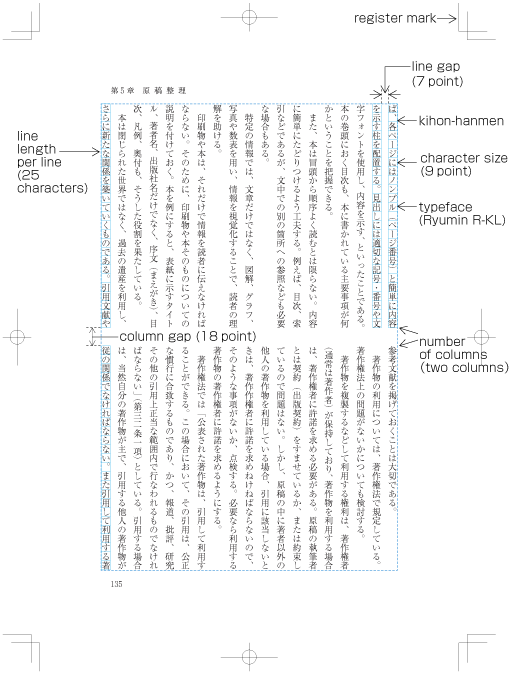
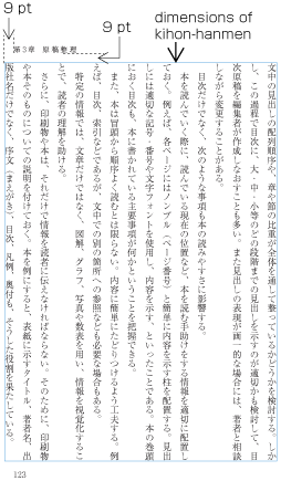
第1章では,日本語組版で使用される文字の特徴,縦組と横組の相違点,基本版面の設計方法及びその適用方法などについて解説した.
Section 2 explains the characteristics of letters and symbols, which are used in Japanese composition, their differences in vertical writingmode and horizontal writing mode, and the design and adaptation of kihon hanmen
第2章では,漢字等(cl-19),平仮名(cl-15),片仮名(cl-16),約物だけでなく文字に添えて行間に配置されるルビ処理や欧文を含む行の組版処理及び行内での文字配置方法を解説した.
Section 3 explains line composition methods for ideographic characters(cl-19), hiraganas(cl-15), katakanas(cl-16), punctuation marks, together with ruby (inter line pronunciation and annotation) and mixture of Latin letters.
第3章では,見出し,注,図版,表などの構成方法及び配置方法を解説した.
Section 4 describes the construction method and composition method of headings, note, illustrations and tables.
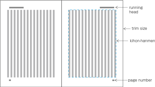
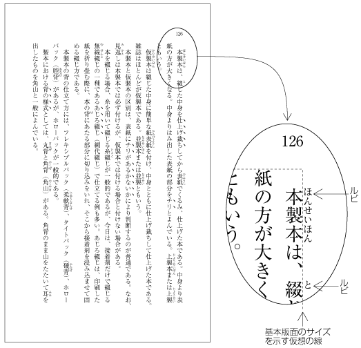
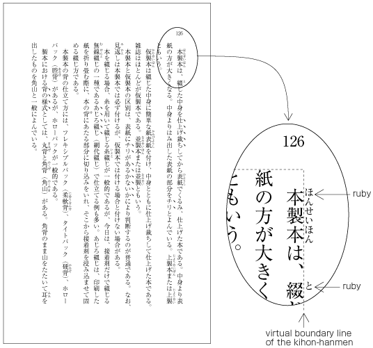
なお,日本語組版は,原則として全角のモノスペースの文字・記号を字間を空けずに(ベタ組にして)配置する.このことを前提にして本の基本となる版面(基本版面)を設計する.そのうえで実際のページでは,基本版面の設計に従い図版や文字・記号などを配置する.この基本版面の設計と,それに従いどのように図版や文字・記号などを配置するかを理解することは,日本語組版を理解する重要なポイントである.そこで,第1章では,基本版面の設計とその適用方法について,詳細に解説した.特に,“1.5 基本版面の設計要素の各ページに対する適用”では,次の3点について,基本版面で設計した事項のどこを厳守し,どのような例外がでるかについて,典型的な例を解説した.ここでの説明の目的は,日本語組版を理解してもらうためのものであり,各要素の詳細な解説は,第2章と第3章で行うので,説明が一部では重なる部分もでてくる.
In principle, characters in Japanese composition are full-width full-width, fixed-width and positioned without spaces (solid setting). This is taken as a premise for the design of kihon hanmen, the basis of book layout. Furthermore, following the design of kihon hanmen, illustrations, characters, symbols etc. are placed in an actual page. For the understanding of Japanese layout, it is an important aspect to understand the design of the kihonhanmen and how to position illustrations, characters, symbols etc. following kihon hanmen. Hence, section 2 describes the design of kihonhanmen and its application methods in detail. Especially dummy provides prototypical patterns about the following three guidelines, what is strictly recommended to be taken into account, and what exceptions are possible. The goal of this explanation is the understanding of Japanese composition. Since detailed explanations of the various elements of "kihon hanmen" are given in section 3 and 4, some explanations are being repeated.
このドキュメントで使用している用語の定義は,別ドキュメントで行った.用語の表記及び参照等は,次のように行った.
The definitions of technical terms are described in a separate document. The notation of technical terms and reference to the definitions are as follows:
後送
TBD
日本語文書の組体裁は,以下の順序で設計する。
Page format of a Japanese document shall be specified by:
-
まず、基本となる組体裁を設計する。
Firstly, preparing a template of the page format, which determines the basic appearance of pages of the document;
基本となる組体裁は,書籍では,1パターンであることが多いが,雑誌では一般に数パターンを作成する.
Generally, books use only one template of page format and magazines often use several templates.
書籍では,1パターンといっても,前述したように目次などは,基本となる組体裁を元に設計をしなおす.また,索引は,基本となる組体裁とは異なる組方になる例が多く,縦組の書籍でも,索引は横組とし,段組とする例が多い.この場合でも,基本となる組体裁で設計した版面サイズと索引の版面サイズが近似するように設計する.
As mentioned before, although in books there is one template of page format, the basic pattern is adapted for e.g. the table of contents with small modification. Furthermore, there are many examples of indices, which have a different page format than the basic page format. And, in books in vertical writing mode, often indices are in horizontal writing mode. It holds also for such cases where the goal is to make the size of the hanmen for indices close to the size of hanmen in the basic page format.
雑誌は,性格の異なる記事の集合である.そこで記事内容により,ある部分は9ポイントの3段組,ある部分は8ポイントの4段組と,記事内容により組方を変えている例が多い.
Magazines gather articles of different kinds. Often the layout will differ depending on the content of the article, like one part with 9 point character size and 3 columns, and another part with 8 point character size and 4 columns.
基本となる組体裁の主な設計要素としては,次がある(縦組の例をdummygeneratedに示す).
The following are the basic elements of Page Format. dummy illustrates an example of a page format with vertical writing mode).

-
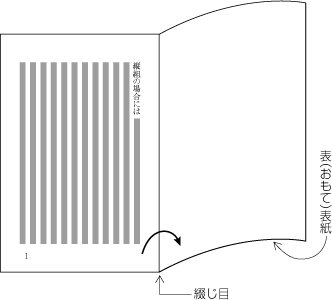
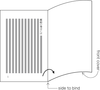
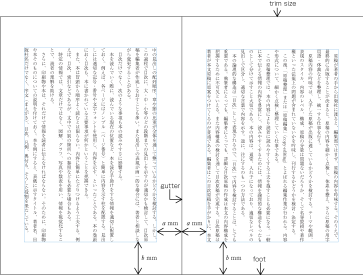
仕上りサイズと綴じる側(dummygenerated参照,日本語文書では一般に縦組では右綴じ,横組では左綴じ)
Trim size and binding side (Japanese documents with vertical writing mode mode are bound on the right-hand side, and documents with horizontal writing mode are bound on the left-hand side. See dummy. )
-
Principal Text direction (vertical writing mode or horizontal writing mode)
-
The appearance of kihon hanmen and its position relative to the trim size
-
The appearance of running heads and Page numbers and their positions relative to the trim size and kihon hanmen
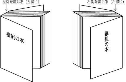
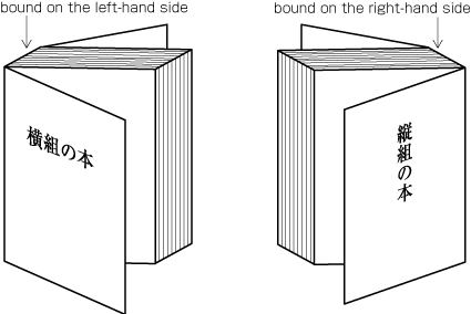 Binding-side (bound on the right-hand side and bound on the left-hand side)
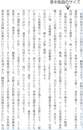
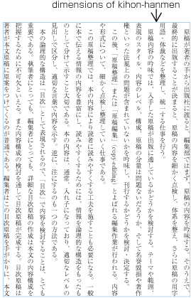
本の基本として設計される版面体裁が基本版面である.基本版面の設計要素としては,次がある(dummygenerated参照).
Kihon hanmen is the hanmen style designed as the basis of a book. The following are the basic elements of kihonhanmen (See dummy).
|
注1) (note 1) |
基本版面で設計した各要素が,実際のページでどのように適用されるかは日本語組版の特徴を理解するための重要なポイントである.そこで,その詳細は後述する. The question of how the various elements of kohonhanmen are applied to a real page is an important aspect for the understanding of the characteristics of Japanese composition. Accordingly, the details of kihonhanmen will be explained later. |
|
注2) (note 2) |
基本版面の指定等については,JIS X 4051の7.5に規定されている. The normative definition of kihonhanmen is provided in JIS X 4051, sec. 7.5. |
|
注3) (note 3) |
-
使用する文字サイズ及びフォント名
Character size and Typeface name
-
Number of columns and Column space when using multi-column format
基本となる組体裁を設計し,それを基準に文書の実際のページにおける各要素の配置設計を行う例をいくつか示しておく(なお,この点を含め,基本版面の設計要素が各ページでどのように適用されるかについては“1.5 基本版面の設計要素の各ページに対する適用”で解説する).
Below are several examples of how the basic page format is created, and how then various elements are placed on a real text page (This and other aspects of how the various elements of kihon hanmen are arranged on each page are explained in dummy.).
-
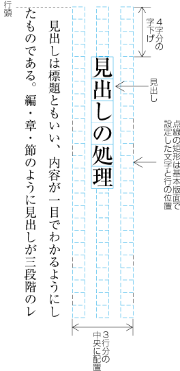
見出しの行送り方向のスペースは,基本版面で設定した行の位置を元に,それの何行分を用いるかという方法で設計する(この処理方法については,JIS X 4051の8.3.3のd)に規定されている).見出しの字詰め方向の字下げは,基本版面で設定した文字位置を基準に,その何字分を下げるかという方法で一般に設計する.dummygeneratedの例は,見出しを基本版面で設定した行の位置の3行の中央に配置し,基本版面で設定した文字サイズの4字下がった位置に配置している.
The space of headings in the block direction is specified by using the line positions provided by kihonhanmen as a basis and by deciding how many times they need to be used. (Details of this processing are defined in JIS X 4051, sec. 8.3.3. d). The line head indent of the inline direction of the heading is normally specified by using the character position designed via kihon hanmen as a basis. The line head indent is then specified with the number of character positions. In the example in dummy, the heading is placed in the middle line of three lines which are provided via kihon hanmen. It is indented 4 characters of the character size provided via kihon hanmen.
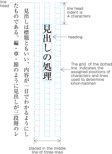 Layout example of a heading based on the line position, which is designed via kihon hanmen
注1)
(note 1)
-
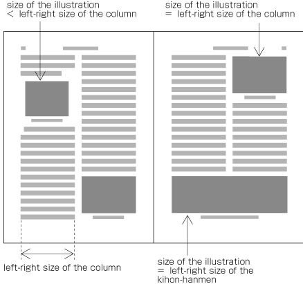
配置する図版のサイズ
Size of illustrations
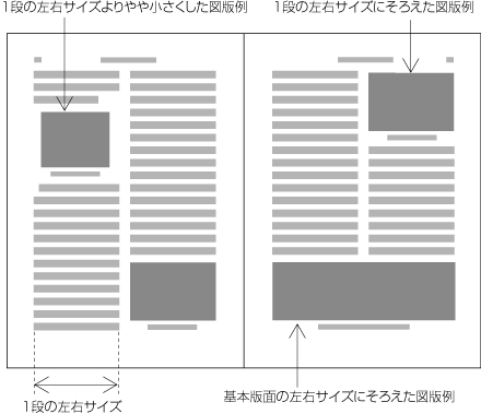
横組の2段組に図版を配置する場合,図版の左右サイズは,できるだけ基本版面で設計した1段の左右サイズ又は基本版面の左右サイズを基準に設計し,そのいずれかのサイズで配置できるときは,そのように決める(dummygenerated参照).また,位置は,多くは版面の天又は地などに揃えて配置する(dummygenerated参照).
In horizontal writing mode with two columns, if at all possible, the width of illustrations should be either the width of one column (which is provided via kihon hanmen) or the width of kihonhanmen (See dummy). The illustrations are usually set at the head or the foot of the page (See dummy).
注1)
(note 1)
-
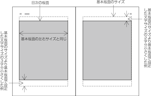
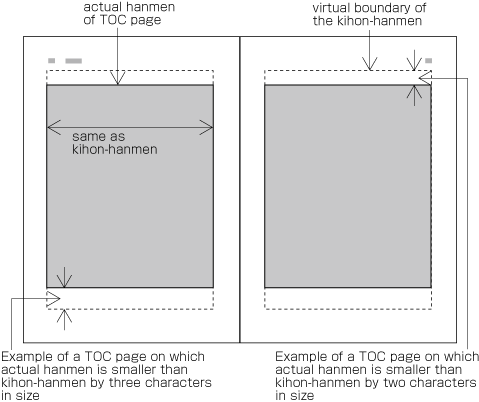
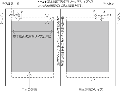
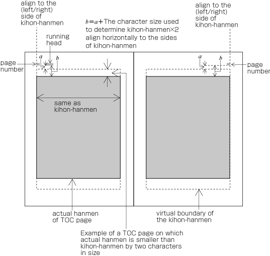
目次の版面サイズ
Hanmen size for the table of contents
書籍の目次の版面サイズは,基本版面のサイズを基準に設計する.例えば,縦組の目次では,左右の行送り方向のサイズは基本版面のサイズと同じにし,天地の字詰め方向のサイズは,やや小さくする例が多い(dummygenerated参照).
The hanmen size for the table of contents of books is based on the size of kihon hanmen. There are many examples, for the table of contents in vertical writing mode, in which the size of the left-to-right line feed is identical to the size of kihon hanmen, and the text direction size for head and foot is a little bit smaller (See dummy).
注1)
(note 1)
基本版面と異なる版面にした場合の柱及びノンブルに位置については,“1.6.2 柱及びノンブルの配置の原則”で解説する(dummygenerated参照).
There are cases when a different hanmen than kihon hanmen is used for positioning of running head and page number. This will be discussed in dummy (See dummy).
日本語組版に使用する和文文字では,主に漢字等(cl-19),平仮名(cl-15),片仮名(cl-16)を使用する(dummygenerated参照).
Japanese letters used for composing Japanese text mainly consist of ideographic characters(cl-19), hiraganas(cl-15) and katakanas(cl-16) (See Fig. 1-4).
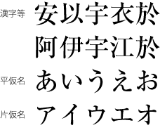 漢字・平仮名・片仮名
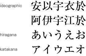 Kanji, hiragana and katakana
|
注1) (note 1) |
日本語組版には,漢字と仮名以外に,多くの約物類(dummygenerated参照)のほかに,アラビア数字,ラテン文字,ギリシャ文字などを混用する場合がある. In addition to kanji and kana, various punctuation marks (See dummy) as well as Western-Arabic numerals, Latin letters and/or Greek letters may be used in Japanese text. |
|
注2) (note 2) |
このドキュメントにでてくる文字及び文字クラスの詳細は,“2.9 文字クラスについて”,及び別ドキュメントの“用語集”で解説する.また,Appendix 〓に各文字クラスに含まれる文字・記号とUnicodeとの対応を示す. The details of characters and character classes used in this document will be explained in dummy, as well as in a separate document about the terminology of Japanese Layout. Also, the mapping from letters and symbols in each character class to Unicode code points will be shown in an appendix dummy(Editor's note: replace with the actual appendix number.) to this document. |
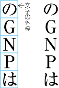
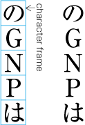
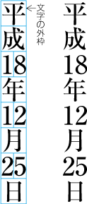
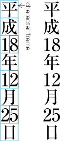
漢字等(cl-19),平仮名(cl-15),片仮名(cl-16)は,正方形の仮想ボディ(又は文字の外枠ともいう)をもっており,その仮想ボディの天地左右中央に,仮想ボディよりやや小さくした字面をもっている.文字サイズは,この仮想ボディのサイズで示す(dummygenerated参照).なお,字幅は,文字を配列する方向(字詰め方向)の仮想ボディの大きさをいい,横組では文字の幅となるが,縦組では文字の高さとなる.(dummygenerated参照)
ideographic characters(cl-19), hiraganas(cl-15) and katakanas(cl-16) , that are of the same size, have square imaginary bodies of equal dimensions (also known as the outer frame of a character). Aligned with the vertical and horizontal center of the imaginary body, there is a smaller box called the letter face, which contains the actual symbol. Character size shall be measured by the size of the imaginary body (See dummy). "Character width" is a term to describe the advance width of the imaginary body of a character in inline direction (Direction of text advance). By definition it is equal to the "width" of a character in horizontal writing mode, while it's the height of a character in vertical writing mode (See dummy).
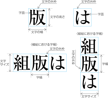 漢字と仮名のサイズの示し方
 The Size of Kanji and Hiragana, and the Imaginary Bodies
|
注1) (note 1) |
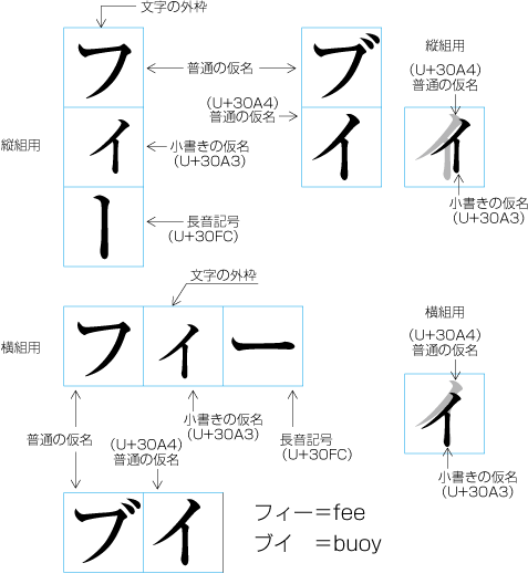
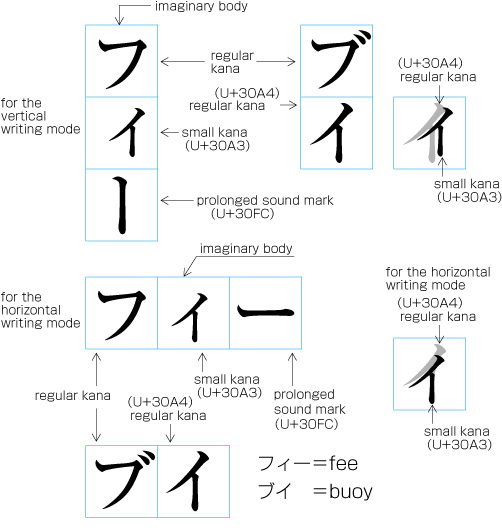
小書きの仮名(cl-11-ja)(っ,ょ,ュ,ァ,ィ,ゥなど)は,縦組では仮想ボディの天地中央で右寄り,横組では仮想ボディの左右中央で下寄りに字面を配置する(dummygenerated参照).また,約物などでは,仮想ボディの天地左右中央に配置しない例がある. The letter face of small kanas(cl-11) (っ, ょ, ュ, ァ, ィ, ゥ, etc) shall be placed at the vertical center and to the right of horizontal center of the imaginary body in vertical writing mode, and at the horizontal center and below the vertical center in horizontal writing mode. (See dummy). Also there are punctuation marks, of which letter faces are not placed at the vertical and horizontal center of the imaginary body.
|
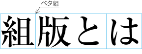
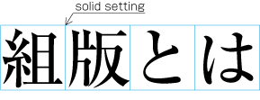
漢字等(cl-19),平仮名(cl-15),片仮名(cl-16)は,行に文字を配置していく際には,原則として,仮想ボディを密着させて配置するベタ組にする(図1-8参照).
When composing a line with ideographic characters(cl-19), hiraganas(cl-15) and katakanas(cl-16) characters, in principle no extra space between their imaginary bodes is placed. This is called solid setting (See dummy).
|
注1) (note 1) |
活字組版の時代から漢字等(cl-19),平仮名(cl-15),片仮名(cl-16)の設計は,縦組又は横組にした場合でも読みやすく,また,ベタ組とした場合に読みやすいように設計されていた.ただし,活字組版では,文字サイズ別に何段階かに分けて原図(母型の元になるもの)を作成していたが,今日では,同一の原図から単純に拡大・縮小して使用するので,大きな文字サイズにした際には,字間の調整が必要になる場合もでてきた. Since the letterpress printing era,ideographic characters(cl-19), hiraganas(cl-15) and katakanas(cl-16) letters have been designed so that they are easy to read regardless of text direction and with thesolid setting. However, unlike the letterpress pringing era, when several sizes of the Original pattern of a letter was required to create matrices, in today's digital era, because the same original pattern can be used for any size simply by enlargement or reduction,inter-letter space might be necessary to be adjusted, when composing lines with large character size. |
||||
|
注2) (note 2) |
次のようにベタ組にしない方法も,印刷物の内容によっては採用されている. Depending on the contents, there are several settings in addition to the solid setting as shown below.
|


日本語の組版における組方向は,縦組(縦書き)と横組(横書き)がある.原稿の内容に応じて,いずれかの組方向を選択する.
Japanese composition has two layout directions. One is in vertical direction (vertical writing mode) the other is horizontal direction (horizontal writing mode). Depending on the content, either of the directions may be chosen.
|
注1) (note 1) |
日本語組版に使用する漢字等(cl-19),平仮名(cl-15),片仮名(cl-16)は,原則として正方形の文字なので,活字組版の時代から,縦組・横組共用の印刷用文字の配置方向を変えるだけで,縦組と横組の組版が可能であった(dummygenerated参照).なお,横組専用の活字の設計も一部で行われた例があるが,あまり普及しなかった. Ideographic characters(cl-19), hiraganas(cl-15) and katakanas(cl-16) characters for Japanese composition have basically been designed to have the same dimensions of a square body, and the same collection of types can be used in either vertical writing mode or horizontal writing mode simply by changing the direction of text. (See dummy). There were some attempts to develop printing types designed exclusively for horizontal writing mode, but they were not widely accepted. |
|
注2) (note 2) |
|
|
注3) (note 3) |
公用文は横組が推奨され,教科書等では特別な科目を除き,多くが横組であり,また,携帯小説の読者も増えており,今後は横組が増えていくと予想される.しかし,大部数の新聞のすべては縦組であり,一般の読者を対象とする発行部数の多い雑誌もほとんど縦組である.また,書籍でも読者の多い小説などでは,ほとんどが縦組である(小説は縦組でないと読めないという読者もいる).したがって,日本語組版において,縦組が重要であるということは,当分は変わらないと予想される. For official (e.g. governmental) documentation, horizontal writing mode is recommended, educational material (with the exception of certain topics) is mostly in horizontal writing mode, and furthermore, the readers of "mobile novels" are increasing, and it is expected that in the future, horizontal writing mode will increase in this area as well. However, most of the large newspapers are written completely in vertical writing mode, and most of the large journals for ordinary readers are almost completely in vertical writing mode. In addition, novels, which are the most widely read kind of book publication, are almost completely in vertical writing mode (some readers say that they cannot read a novel if it is not in vertical writing mode.). Hence it can be expected that the importance of vertical writing mode for Japanese will not change for the time being. |
|
注4) (note 4) |
1つの印刷物の中では,縦組と横組のどちらか一方の組方向で組版するが,縦組の場合は,横組にして柱を配置するなどして,部分的に横組が混用される場合も多い(dummygenerated参照). There's usually only one direction for all text throughout a book, but there are cases where horizontal writing mode are partially adopted in vertically composed books, for e.g. running heads composed horizontally (See dummy). 例 ページ内に配置する表及びキャプション,図版のキャプション,柱,ノンブルなど. Tables, captions for illustrations, running heads, and page numbers composed horizontally in a page with a vertical writing mode. |
The following are major differences between vertical writing mode and horizontal writing mode.
-
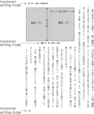
文字,行,段及びページの配置,並びに綴じの方向は,次のようになる.
Arrangement of characters, lines, columns and pages; Direction of page progression.
注1)
(note 1)
-
縦組の場合(2段組の例であるdummygenerated参照)
Vertical writing mode (See dummy for an example of vertical writing mode with two columns per page)
 縦組における文字などの配置方向
 Direction of arrangement for characters and other elements in vertical writing mode.
-
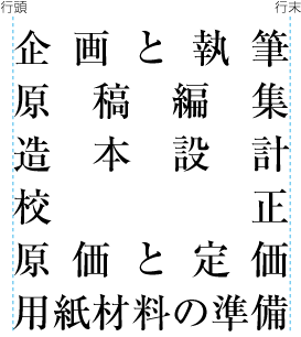
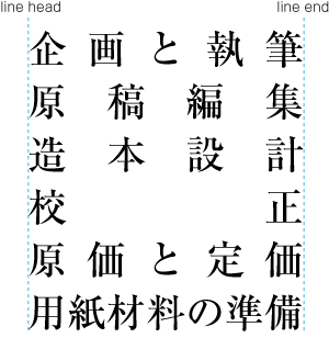
文字は上から下に,行は右から左に配置する.
Characters are arranged from top to bottom, lines are arranged from right to left.
-
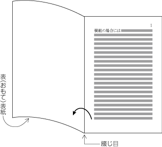
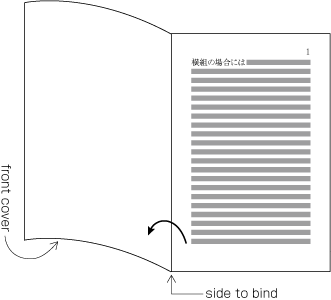
段は上から下に,ページは表面から開始,右から左に配置する(左方向から右方向に本は開いていく,dummygenerated参照).
Columns are arranged from top to bottom. A book starts with the left(recto) side and progresses from right to left (See dummy).
 縦組における本の開いていく方向
 Progression of pages for a book with vertical writing mode
-
-
横組の場合(2段組の例であるdummygenerated参照)
Horizontal composition (See dummy for an example of horizontal text layout with two-columns per page)
 横組における文字などの配置方向
 Direction of arrangement for characters and other elements in horizontal writing mode
-
文字は左から右に,行は上から下に配置する.
Characters are arranged from left to right, and lines are arranged from top to bottom.
-
段は左から右に,ページは表面から開始,左から右に配置する(右方向から左方向に本は開いていく,dummygenerated参照).
Columns are arranged from left to right. A book starts with the right(recto) side and progresses from left to right (See dummy).
 横組における本の開いていく方向
 Progression of pages for a book with horizontal writing mode
-
-
文中に挿入される英数字の向きは,次のようになる.
Orientation of alphanumeric characters in a line
-
縦組の場合は,次の3つの配置方法がある.
There are three ways to arrange alphanumerics in vertical writing mode.
-
和文文字と同じように正常な向きで,1字1字配置する.主に1文字の英数字,大文字の頭字語(dummygenerated参照)など.
Arranging one by one with the same normal orientation as that of Japanese characters. Usually applied to one letter alphanumeric or capital abbreviations (See dummy).
 縦組における英数字の配置例1
 Arrangement of alphanumerics in vertical writing mode - 1
注1)
(note 1)
和文文字と同じように正常な向きで,1字1字配置する場合に使用する英数字は,活字組版時代から固有の字幅を持つ欧文組版用の文字(プロポーショナルな文字)ではなく,全角でデザインされたモノスペースの欧字や数字を用いていた.
The alphanumeric characters used for this arrangement have different typographic features than those with propotional width used for Western text. They are of fixed-width and full-width design, which have been used since the letterpress printing era.
-
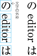
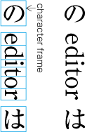
文字を時計回りに90度回転し,配置する.主に英字の単語,文など(dummygenerated参照).
Arranging characters rotated 90 degrees clockwise. Usually applied to English words or sentences (See dummy).
 縦組における英数字の配置例2
 Arrangement of alphanumerics in vertical writing mode - 2
注1)
(note 1)
dummygeneratedにおいて“editor”の仮想ボディの前後に隙間がある.この隙間は,和文と欧文を混ぜて配置する場合の必要な処理であり,詳細は後述する.
In dummy, there are spaces before and after the imaginary body for the Western word “editor”. These spaces are necessary for the Japanese and Western mixed text composition, details of which will be provided in the later section.
-
正常な向きのまま,横組にする(縦中横,dummygenerated参照).主に2桁の数字の場合などで利用されている(縦中横の処理は,JIS X 4051の4.8に規定されている).
Setting horizontally without changing orientation (tatechuyoko (horizontal-in-vertical composition), see dummy). This is usually applied to two-digit numbers (see JIS X 4051, sec. 4.8 for the definition.).
-
-
There's only one arrangement with in normal orientation in horizontal writing mode.
-
-
表,図版などを,サイズの関係から時計回り又は反時計回りに90度回転して配置する場合,次のようにする(この処理は,JIS X 4051の7.3に規定されている).
Arrangement of tables and/or illustrations rotated 90 degrees clockwise or counterclockwise for size considerations (This processing is defined in JIS X 4051, sec. 7.3.).
-
縦組の場合は,表,図版などの上側を右側にする(dummygenerated参照).
In vertical writing mode, align top of tables/illustrations to the right of page (See dummy).
-
横組の場合は,表,図版などの上側を左側にする(dummygenerated参照).
In horizontal writing mode, align top of tables/illustrations to the left of page (See dummy).
 Example arrangement of a table rotated 90 degrees counterclockwise in horizontal writing mode
注1)
(note 1)
これは,本を読んでいく流れに従うためである.
The orientation is determined not to prevent reading flow of the book.
-
-
-
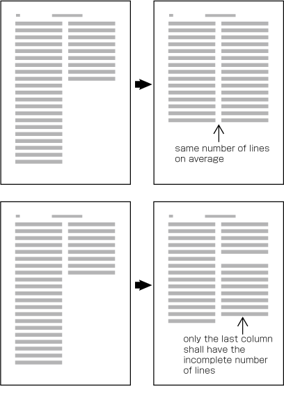
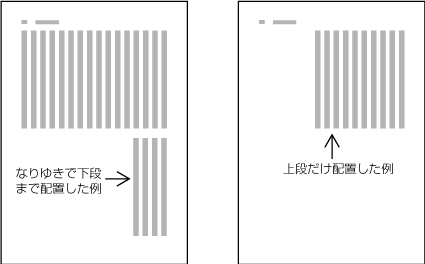
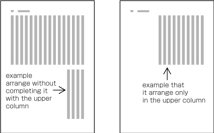
改丁・改ページなどの直前ページにおいて,段組の行がページの途中で終わる場合は,次のようにする(改丁・改ページの処理は,JIS X 4051の8.1.1に規定されている).
Arrangement of incomplete number of lines on a multi-column format page due to new recto, page break or other reasons (The processing of new recto and page break is defined in JIS X 4051, sec. 8.1.1.).
-
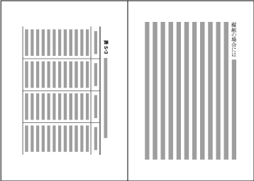
縦組の場合は,“なりゆき”とし,各段の左右行数は不揃いになる(dummygenerated参照).
In vertical writing mode, just finish the line where it ends ("nariyuki"). The number of lines in each column is not uniform. (See dummy).
-
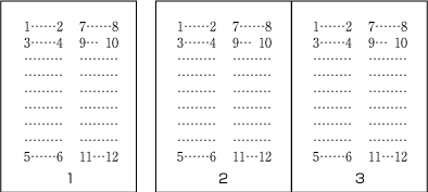
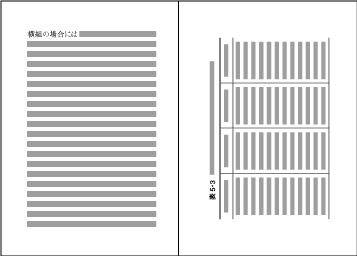
横組の場合は,各段の行数を平均にする.ただし,行数が段数で割り切れない場合,その不足する行数は,最終段の末尾を空けるようにする(dummygenerated参照).
In horizontal writing mode, re-arrange columns so that each column has the same number of lines on average. In case the number of lines is not divisible by the number of columns, add the smallest number to make it divisible and re-arrange columns using the quotient as the number of lines so that only the last column shall have the incomplete number of lines. (See dummy).
 How to process incomplete number of lines on a multi-column format page. An example in horizontal writing mode.
注1)
(note 1)
-

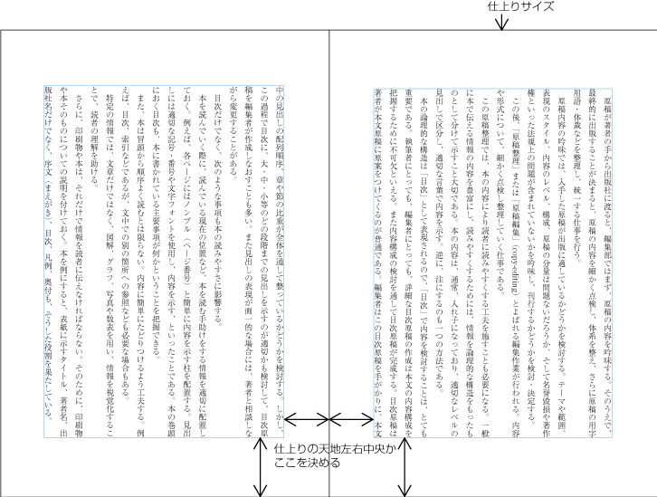
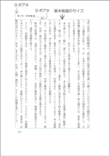
日本語組版では,正方形の仮想ボディをベタ組にすることから,まず基本版面のサイズを設計し,そのうえで,仕上りサイズに対する基本版面の位置を決めている.そこで,基本版面は,次の手順で設定する(図1-26参照).
In Japanese composition, first the size of kihon hanmen is defined, using the square imaginary body of characters in solid setting. Taken this as a base, the position of kihonhanmen with regards to the trim size is specified. Now, the following are procedures to determine kihon hanmen (See Fig. 1-26).
-
基本版面のサイズを決める.
Specifying the dimensions of kihon hanmen.
-
基本版面の配置位置の指定方法には,次がある.
Various alternative methods for specifying the position of kihon hanmen relative to the trim size are as follows.
 基本版面の設定手順の2
 Procedures to determine KIHON HANMEN Step 2
注1)
(note 1)
一般には,基本版面を仕上りサイズの天地左右中央に配置する例が多い.つまり,デフォルトは仕上りサイズの天地左右中央であり,基本版面のサイズによっては,天地中央よりやや上げる・下げる,または左右に移動させるなどの操作を行う.
In most cases kihon hanmen is set at the horizontal and vertical center of the trim size, which should be the default positioning, but depending on the dimensions of kihon hanmen there may be a case where the default needs to be changed, for example, by moving kihon hanmen up, down, to the left or to the right of the default position.
注2)
(note 2)
仕上りサイズと四方のマージンを設定することにより基本版面のサイズを決める方法は,和文の組版では,一般に行わない.この方法でしか設定できない場合は,あらかじめ基本版面のサイズと刷り位置から四方のマージンを計算し,設定することになる.
It's technically possible to determine the dimensions of kihon hanmen by specifying the trim size and margins of all sides, but this method is not common in the Japanese composition tradition. If this is the only way an implementation allows, the margins of each side need to be measured in relation to the dimensions of kihon hanmen and its position in the trim size.
基本版面は,次のような事項を考慮し設計する(この項のa項及びb項は処理内容というよりは,どのように設計するかという問題についての解説である.なお,基本版面の指定については,JIS X 4051の7.4.1に規定がある).
The following are the considerations that should be taken into account in designing kihon hanmen. (The items a) and b) of this topic are not about processing, but rather an explanation about how the design should be. The definition of kihon hanmen is given in JIS X 4051, sec. 7.4.1.)
-
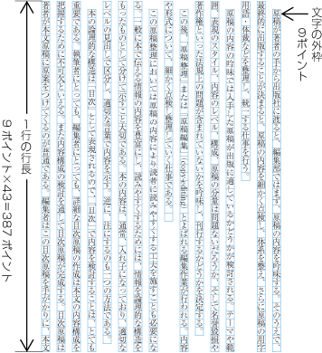
大人を読者対象とした本の場合の文字サイズは,一般に9ポイント(≒3.2mm)が多い.辞書など特別の本を除き,最低でも8ポイント(≒2.8mm)である.
Character size. Generally 9 points (≒3.2mm), 8 points (≒2.8mm) at smallest for books targeted to adults but for special purpose like dictionaries.
注1)
(note 1)
欧文の場合,10ポイント(≒3.5mm)又は12ポイント(≒4.2mm)がよく使用されている.これは和文文字と欧文文字との文字設計の違いによる.
In Western text layout, 10 points (≒3.5mm) or 12 points (≒4.2mm) are commonly used. This is mainly because of a difference of design principles between Japanese and Latin letters.
-
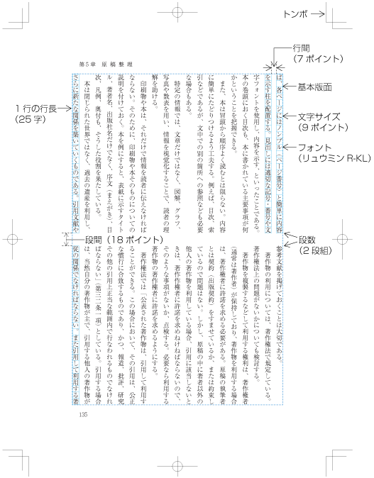
1行の行長は,文字サイズの整数倍に設定する(dummygenerated参照).
Line length should be multiples of the character size (See dummy).
注1)
(note 1)
これは,2つの理由による.この2つを満足させるために,行長は,文字サイズの整数倍に設定する必要がある.
There are basically two reasons why line length should be multiples of the character size.
-
和文の組版は,段落の最終行を除き,行長を揃えるのが原則である.なお,段落の先頭行も,原則としてインデントを行うので,その部分だけ行長は短くなる.
For Japanese composition, all line lengths except that of the last line of the paragraph should be the same in principle. Furthermore, only the first line of a paragraph is shorter, since as a matter of principle it is indented.
-
漢字等(cl-19),平仮名(cl-15),片仮名(cl-16)などの印刷用の文字は,原則として正方形である.また,各文字間をベタ組とするのが原則である.
Japanese characters like ideographic characters(cl-19), hiraganas(cl-15)and katakanas(cl-16) for printing are uniformly designed in the same square and they are set solid (no extra space between adjacent imaginary bodies) in principle.
注2)
(note 2)
1行の行長(字詰め数,1行に配置する字数)は,縦組の場合,最大で52字くらい,横組では40字くらいにする.仕上りサイズの関係で,1行の字詰め数がこれ以上になる場合は,段組にして,1行の字詰め数を少なくすることが望ましい.
The best line length (number of characters per line) is around 52 characters at max in vertical writing mode and 40 characters in horizontal writing mode. If it would go beyond the recommended length due to the trim size, consider multi-column format and make the line length shorter.
-
-
行と行の間の空き(行間)は,特別な場合を除き,一定の値を確保する.また,各行の行の位置は,できるだけ揃えるようにする.そこで,一般に基本版面の行送り方向のサイズは,行数と行間(又は行送り)で設定する.
Use the same amount of line gap across the book except special cases and each line should be aligned. With these two conditions, the size of kihon hanmen in the block direction is specified with number of lines and line-gap (or line height, line feed).
注1)
(note 1)
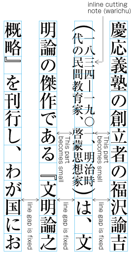
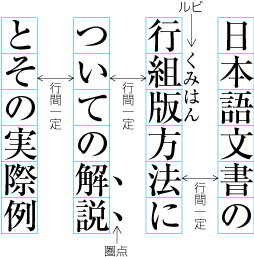
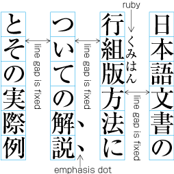
日本語組版では,行間にルビ・圏点・傍線・下線などを配置する例がある.このようなものを配置した場合でも,行間は一定にし,変更しない(dummygenerated参照).本文中に注と参照するための合印を行間に配置する方法があるが,この場合も同様に扱う.なお,ルビなどの配置法そのものについては,第2章で解説する.
In Japanese composition, there are cases that ruby, emphasis dots (kenten, bousen, under lines etc.) are inserted between lines. The line gap is not changed and kept constant for these cases as well (See dummy). It is also possible to insert references to notes between lines within the main text. This case is handled in the same manner. Further explanation about the placement of RUBY will be given in dummy.
注2)
(note 2)
割注は,基本版面で設定した行送り方向の行の幅(基本版面で設定した文字サイズ)よりはみ出して配置する.この場合でも,割注の入らない部分の行間を一定にし,割注のある箇所は狭くなるようにする(dummygenerated参照).したがって,割注が入る場合は,行間をある程度大きくしておく必要がある.この他に,縦中横,上付き・下付きの添え字などについても,行送り方向の行の幅よりはみ出して配置する場合は,同様に扱う.なお,割注などの配置法そのものについては,第2章で解説する.
warichu (inline cutting note) juts out of the line width in the block direction (the character size designed via kihon hanmen). Also for these cases, the line gap is defined for the parts without warichu, and the passages with warichu are made narrower (See dummy). Hence, for warichu, line gap is larger to some extend. The same is true for tatechuyoko or sub- and super-ornament characters. Further explanations of the placement of warichu and other items is provided in dummy.
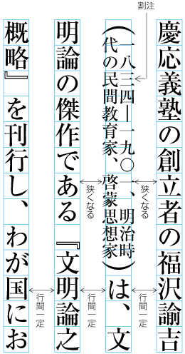 割注が入った場合の行間の処理例
 Example of inter-line processing with warichu between lines
注3)
(note 3)
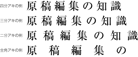
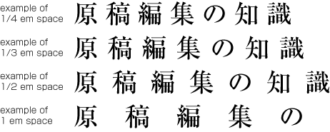
基本版面の行間は,基本版面の文字サイズの二分アキ以上で全角アキ以下の範囲とすることが多い.字詰め数が少ない場合は,二分アキでもよい.35字を超えるような字詰め数では,全角アキか,それよりやや詰めた行間にするのがよい.
It is common that line gap for kihon hanmen is set a value between 1/2 em space and full width (em) of the character size in kihon hanmen. 1/2 em space can be chosen in case the number of characters per line is small, but full width (em) or close to it should be appropriate when it is larger than 35 characters.
注4)
(note 4)
古典の注釈本などで,行間にルビやその他の要素を数多く配置する場合などを除き,行間を全角アキ以上にすることはない.全角アキ以上にしたからといって,読みやすくなるわけではない.
Unless ruby or other design elements are placed in the space between lines for books like classics with many annotations, there's no need to make line-gap larger than full width, which would not improve legibility.
注5)
(note 5)
欧文の組版の行間は,文字サイズの三分アキまたはそれ以下とする場合も多い.これと比較すると和文の組版の行間は大きくなる.これも,和文文字と欧文文字との文字設計の違いによる.
It is said that the standard line-gap in Western text layout is 1/3 em space, which is smaller than that in Japanese composition. This difference again comes from the design difference between Latin letters and Japanese letters.
それぞれのページに配置する各要素は,できるだけ基本版面で設定した版面サイズの内側になるように配置する.しかし,次のような例外がある.
If at all possible, the various elements of a page should be inside the hanmen size. This is which is determined by kihon hanmen. However, there are exceptions like the following ones.
-
版面又は段の先頭に配置する行の右側(縦組)又は上側(横組)にルビや傍線,圏点などが付く場合は,版面又は段の領域の外側に接して配置する(dummygenerated参照).ルビや下線などを左側(縦組)又は下側(横組)に付けた場合は,版面又は段の末尾に配置する行で版面又は段の領域の外側に接して配置する.次項を含め,このことは基本版面で設定した行の位置を確保するためである.本文中に注と参照するための合印を行間に配置する方法があるが,この場合も同様に扱う.
If there are ruby, emphasis marks (side line / under line, emphasis dots etc.) at the right side (for vertical writing mode) or upper side (for horizontal setting) of the hanmen or the first paragraph of a page, the added item is put outside the hanmen or the area of the paragraph (See dummy). In cases where ruby, under lines etc. are put on the left (in vertical writing mode) or bottom (horizontal writing mode), the item is in contact with the hanmen or the line at the end of the paragraph. Like for the handling of exceptions mentioned below, the purpose here is to preserve the line positions which are provided via kihon hanmen. It is also possible to insert reference marks to notes between lines within the main text. This case is handled in the same manner.
 版面の外側に配置したルビの例
 Example of ruby annotation placed outside of kihon hanmen
-
版面又は段の先頭又は末尾に配置する行に基本版面で設定した行送り方向の行の幅(基本版面で設定した文字サイズ)よりはみ出して配置する要素がある場合は,基本版面で設定した行送り方向の行の幅よりはみ出して配置する部分を,版面又は段の領域の外側にはみ出して配置する(前項とこの項の処理は,JIS X 4051の12.1.1に規定されている).例えば,縦中横の設定を行った文字列の横幅が基本版面で設定した文字サイズより大きくなる場合などである.この他に,割注,上付き・下付きの添え字なども同様な扱いとする.
When there are elements, which jut out of the line width in the block direction given by kihon hanmen (the character size specified via kihon hanmen), in the first line or the last line of page/column, the parts of the item which jut out of the line width in the block direc tion given by kihon hanmen, are put jutting out of the hanmen area or outer side of the column (The processing of this item and item a) is defined in JIS X 4051, sec. 12.1.1.). For example this is the case when the width of a sequence of characters which are set to tatechuyoko is larger than the width of characters set for kihon hanmen. In addition, warichu (inline cutting note) or sub- and superscript (ornament characters) are handled with the same manner.
-
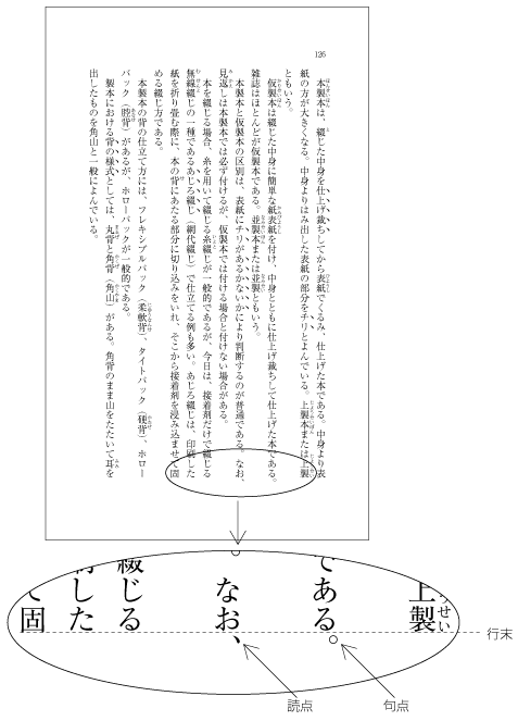
ぶら下げ組とよばれる処理をした場合は,行頭禁則の処理を必要とする句点(。)と読点(、)に限り,行末の版面又は段の領域の外側に接して配置する(dummygenerated参照).なお,ぶら下げ組についてはJIS X 4051に規定されていないが,同規格の解説8.1)c)に説明がある.
The processing of so-called line adjustment by hanging punctuation is only necessary for [。] (IDEOGRAPHIC FULL STOP) and [、] (IDEOGRAPHIC COMMA) which need line head wrap: The character is placed so that it touches the hanmen of the line end or the outside area of the column (See dummy). Hanging punctuation is not defined in JIS X 4051, but there is an explanation in sec. 8.1, c).
 ぶら下げ組により版面の外側に配置した句点と読点の例
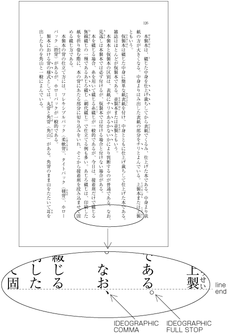 Example of IDEOGRAPHIC COMMA and IDEOGRAPHIC FULL STOP placed below the kihon hanmen
注1)
(note 1)
ぶら下げ組は,字間による行の調整処理を少なくする方法である.
Hanging punctuation is a method to reduce line adjustment, which relies on line gap.
注2)
(note 2)
ぶら下げ組を採用している書籍は多い.
There are a lot of books which apply hanging punctuation.
-
図版や表を各ページに配置する場合,一般に基本版面で設定した範囲内に配置する.しかし,配置する図版や表によっては,基本版面で設定した範囲をはみ出して配置する場合もある.
Illustrations and tables are normally placed inside the area which is defined via kihon hanmen. However, depending on the illustration or table, there are also cases in which they jut outside the area of kihon hanmen.
-
視覚的効果を出すために基本版面で設定した範囲をはみ出して配置する.特に紙面一杯に配置する“裁ち落し”とよばれる方法は,書籍では多くないが,雑誌などではよく行われている(dummygenerated参照).
To achieve a visual effect, the illustration or table juts outside of kihon hanmen. Especially the "bleeds" method of using the complete paper area is used not often in books, but used often in magazines (See dummy).
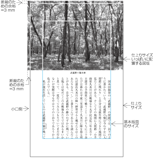 裁ち落しの例
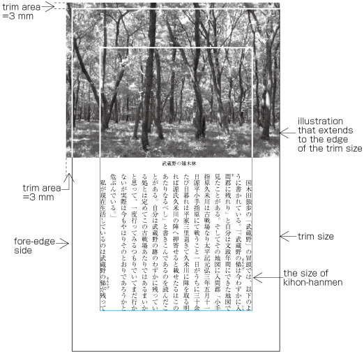 Example of bleeds
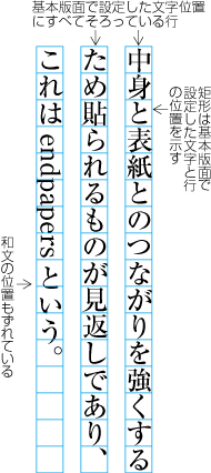
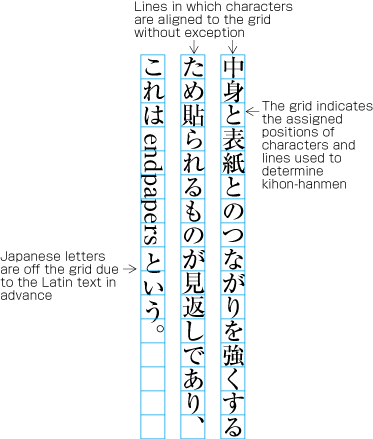
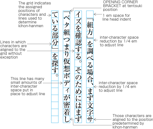
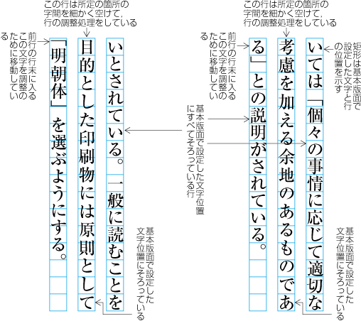
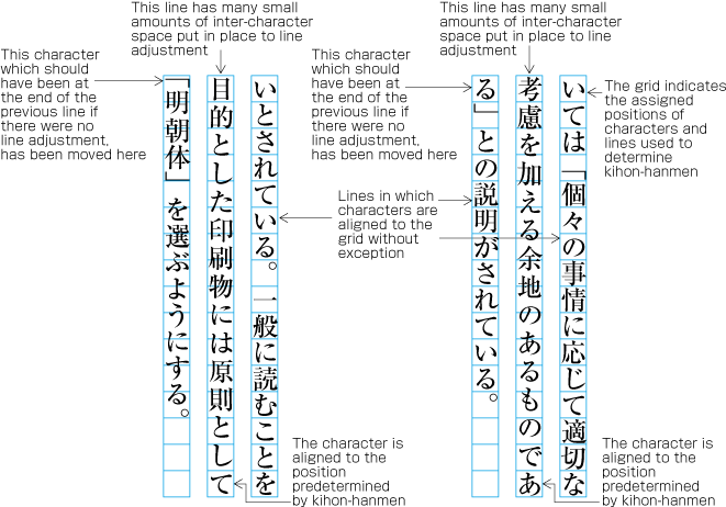
各ページにおける行の位置は,基本版面で設定した行の位置に従うのが原則である.前掲した図(dummygenerated)のようにルビや圏点が付いた場合だけでなく,例えば,次のdummygeneratedに示したように,行中の一部として基本版面で設定した文字サイズより小さな文字が入る場合でも,基本版面で設定した行の位置を基準に配置し,それに後続する行も基本版面で設定した行の位置にくるようにする.
In principle, pagewise positioning of lines relies on the line positions given via kihon hanmen. This is also true for ruby or emphasis dots as shown in dummy, and also with characters as shown in dummy. These characters within a line are smaller than the characters size provided by kihon hanmen. Nevertheless, the line positions given by kihon hanmen is followed as the basic guide line, and the subsequent lines also use these positions.
 行中に小さい文字が入った場合の行の位置
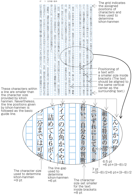 Positioning of lines with a mix of a smaller size of text
|
注1) (note 1) |
括弧書きの文字を小さくするのは,その部分は補足的な説明ということからである.ただし,その扱い方としては,次の3つの方式がある.限定した箇所のみの文字を小さくする方法が最もよく利用されている. The characters within brackets are made smaller, since the text is an additional explanation. There are the following three methods of handling such cases. The method c), making only characters in restricted places smaller, is the most commonly used one.
|
ただし,次のような例外がある.
There are the following exceptions of line position handling.
-
横組などで,図版や表の左右にテキストを配置しない方法とした場合,1ページに2つ以上の図版や表が挿入されたときは,基本版面で設定した行の位置からずれることがある(dummygenerated参照).ただし,基本版面で設定した行の位置に配置する方法もある(dummygenerated参照).前者の方法は,図版や表の前後の空きをできるだけ均一にするという考え方による(この方法を採用している書籍が多い).この処理方法については,JIS X 4051の10.3.2のd)に規定がある.
In horizontal writing mode, assuming that there is no text to the left or right of an illustration or table, it can happen that when inserting more than one illustration or table, they slip of the lines given via kihon hanmen (See dummy). But the illustration or table may also stick on the lines given via kihon hanmen (See dummy). The former method is used to achieve equal space before and after illustrations or tables, if at all possible (This method is often used in books.). This processing method is defined in JIS X 4051, sec. 10.3.2., d).
 図版等を複数配置した場合の行の配置例1
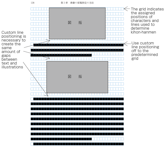 Positioning of lines with multiple illustrations - 1
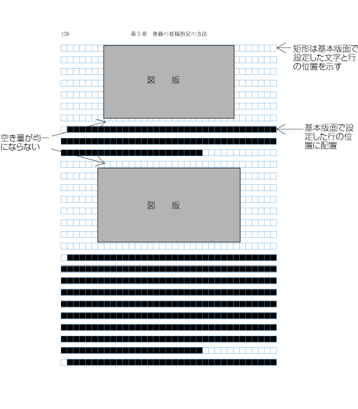 図版等を複数配置した場合の行の配置例2
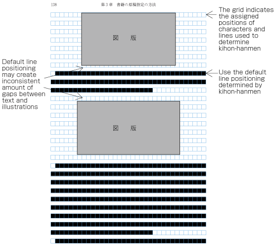 Positioning of lines with multiple illustrations - 2
-
段落間や横組でページの下端に挿入される脚注などは,基本版面で設定した文字サイズよりは小さくする.これに伴い行間も狭くするので,基本版面で設定した行の位置とは揃わない.例えば,縦組において,段落の間に入る後注の配置位置の例をdummygeneratedに示す.後注の組版処理については,JIS X 4051の9.3,脚注は9.4に規定されている.
The size of the endnotes, inserted between paragraphs or the size of the footnotes at the bottom of the page (in horizontal writing mode), are smaller than the character size given via kihon hanmen. As a result, the line distance becomes smaller, and the line positions are not identical to the lines given via kihon hanmen. As an example, dummy shows the position of an endnote between paragraphs in vertical writing mode. The processing of endnotes is defined in JIS X 4051, sec. 9.3, and the processing of footnotes in sec. 9.4.
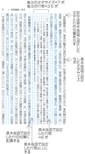 縦組の後注の配置例
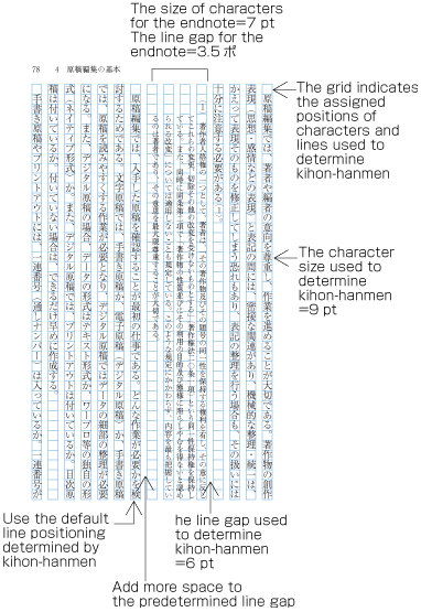 Positioning of an endnote in vertical writing mode
-
見出しは,前述したように必ずしも基本版面で設定した行の位置とは揃わないことがある.しかし,その行送り方向にしめる領域は,基本版面で設定した行を基準に設計する(dummygenerated参照).
As mentioned above, it may happen that the position of headings is not identical with the lines given via kihon hanmen. Nevertheless, the area in the block direction uses the line positions given via kihon hanmen as a basis of alignment (See dummy).
各行に配置する文字の位置は,基本版面で設定したベタ組とした文字の配置位置に従うのが原則である.しかし,前掲したいくつかの図でも基本版面で設定した文字の位置に従っていない例がある.こうした事例は多いが,以下では,典型的な例をいくつか示す(詳細は第2章で解説する).
In principle, the characters in each line follow the solid setting positions of characters, which are given via kihon hanmen. However, as already shown in some of the previous figures, there are examples in which the character positions do not follow the positions given via kihon hanmen. Such cases are rather common, and here we will show some prototypical examples (details will be given in dummy).
|
注1) (note 1) |
基本版面で設定した文字サイズのベタ組にしない箇所がある場合,行長が揃わない場合が発生する.段落の最終行を除き,行長を揃える処理が必要になる.この処理方法については,“2.8 行の調整処理”で解説する. In cases when there are places which differ from the character size of solid setting given via kihon hanmen, it may happen that line lengths are not identical; it will be necessary to align the lengths of lines, with the exception of the last line of a paragraph. This processing method is explained in dummy about line adjustment. |
-
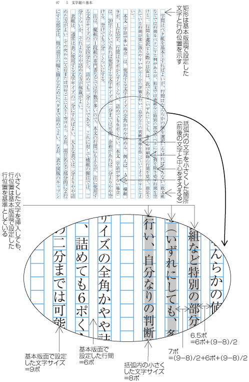
行中の一部として基本版面で設定した9ポより小さい文字が挿入されるdummygeneratedの場合である.この場合は,基本版面で設定した9ポの部分は9ポの仮想ボディに従いベタ組にするとともに,小さくした8ポの部分は,小さくした8ポの仮想ボディに従いベタ組にする.
It may happen that in a part of a line, characters, which are smaller than 9 point, are inserted. (See dummy). In this case, 9 point is the size provided via kihon hanmen. In such cases, the parts with 9 points given via kihon hanmen use solid setting with the imaginary body of 9 point. For the smaller parts with 8 point use solid setting with the imaginary body of 8 point.
-
行中にプロポーショナルの欧字を図1-20のように,文字を時計回りに90度回転して配置する場合は,プロポーショナルの欧字は,その字幅に応じて配置するので,基本版面で設定した文字位置とは揃わなくなる(dummygenerated参照).英字の後ろに連続する和文の配置位置もずれてくる.
In cases with proportional, Latin letters (See dummy) rotated 90 degrees clockwise, the proportional Latin letters shall be placed in accordance with their width. Hence, they do not fit to the character positions given via kihon hanmen (See dummy). The Japanese letters following the Latin letters consequently slip off from the default positions as well.
 行中に欧字を配置した例
 Positioning of a mix of Western and Japanese letters in a line
-
改行した行の先頭(改行行頭)や段落の2行目以下の行頭(折り返し行頭)に配置する始め括弧類(cl-01)の配置方法には,いくつかある(詳細は“2.1.5 行頭の括弧類の配置方法”で解説する).改行行頭の字下げは全角とする場合,又は折り返し行頭は行頭にアキをとらない配置法である天付きとする場合は,dummygeneratedのように2字目以下の文字は,基本版面で設定した文字位置とは揃わなくなる.しかし,行長を揃える調整処理を行っているので,行末の文字は,基本版面で設定した文字位置に揃っている.
There are several methods for positioning opening brackets(cl-01) at the head of line feed lines or lines after the first line of a paragraph (details are explained in dummy.). In cases where the indentation of line feed lines is full width, or if the tentsuki position is used for the bracket (that is, there is no space at the line head), the second character will be in a position which is not given via kihon hanmen (See dummy). However, since adaptation processing for the alignment of line lengths is applied, the characters at the end of the line are at positions which are in accordance with the positions given via kihon hanmen.
 行頭の括弧類の配置方法により文字位置がずれた例
 Example of positioning of characters off to the grid due to the opening brackets at the line head
-
dummyで解説するように句点類(cl-06),読点類(cl-07),始め括弧類(cl-01),終わり括弧類(cl-02)の字幅は,半角であるが,これらの約物が漢字等(cl-19),片仮名(cl-16),平仮名(cl-15)と連続する場合は,原則として,それぞれの約物の前及び/又は後ろに二分アキをとることで,結果として全角というサイズにする.しかし,句読点や括弧類が連続する場合は,二分アキをとらない箇所があり,このケースでは基本版面で設定した文字位置に揃わないことになる(dummygenerated参照).これは,見た目の体裁をよくするためである.
dummy explains that full stops(cl-06), commas(cl-07), opening brackets(cl-01) and closing brackets(cl-02) are half-width. If these punctuation marks and brackets are in continuation with ideographic characters(cl-19), katakanas(cl-16) or hiraganas(cl-15) characters, in principle there is a 1/2 em space before or after the punctuation mark or brackets, so that these are made in effect a full width size. However, if they are in continuation with other punctuation marks or brackets, the 1/2 em space is not used. In such cases, the character positions are different than the positions given via kihon hanmen (See dummy). The purpose is to improve the visual appearance.
 句読点や括弧類が連続する例
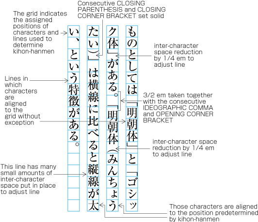 Example of lines with consecutive punctuation marks
-
dummyで解説するように終わり括弧類(cl-02),句点類(cl-06),読点類(cl-07)を行頭に配置してはならないという規則(行頭禁則という)がある.これらが行頭にくる場合は,なんらかの調整が必要になる.その調整処理のために基本版面で設定した文字位置に揃わない場合がでてくる.
dummy explains the principle that closing brackets(cl-02), full stops(cl-06) and commas(cl-07) shall not be placed at the line head (so-called line head wrap). If these characters appear at the line head, some kind of adjustment processing becomes necessary. As a result of such adjustment processing, it may happen that characters are placed at positions which are different from the positions given via kihon hanmen.
 行頭にきてはならない終わり括弧類を避ける調整をした例
 Example of line adjustment to avoid those characters which shall not start a line, such as closing brackets
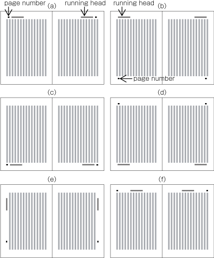
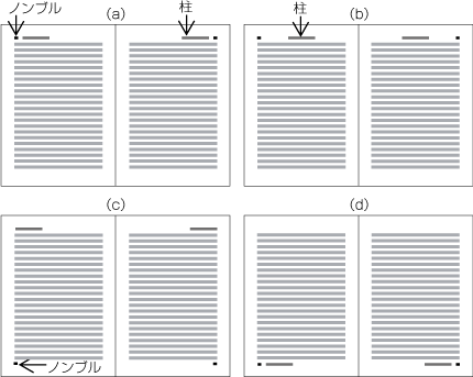
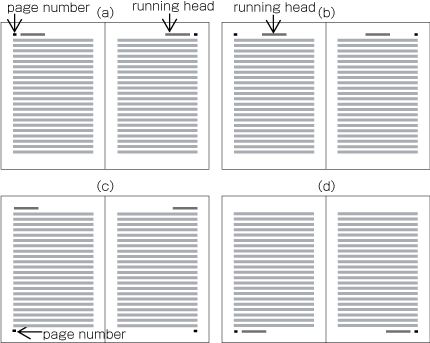
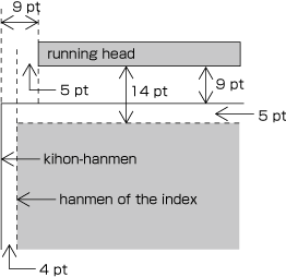
柱及びノンブルの縦組における代表的な配置位置例をdummygeneratedに示す.
Typical positioning of running head and page numbers in vertical writing mode is as shown in dummy.
 Typical positioning of running heads and page numbers in vertical writing mode
柱及びノンブルの横組における代表的な配置位置例をdummygeneratedに示す.
Typical positioning of running heads and page numbers in horizontal writing mode is as shown in dummy.
 Typical positioning of running heads and page numbers in horizontal writing mode
柱及びノンブルの位置は,仕上りサイズに対する絶対的な位置関係ではなく,基本版面との相対的な位置関係で一般に設定する(柱の配置については,JIS X 4051の7.6.4に,ノンブルの配置については,JIS X 4051の7.5.4に規定がある).
In principle, positions of running heads and page numbers should be specified with relative positions to kihon hanmen, not with the absolute coordinates in the trim size (Position of running heads are defined in JIS X 4051, sec. 7.6.4. Positions of page numbers are defined in JIS X 4051, sec. 7.5.4.).
例)天・小口寄りに縦組で柱を配置した場合の例(dummygenerated参照)
(Example) Positioning a running head above the top left corner (to head and fore-edge) of kihon hanmen in vertical writing mode (See dummy)
基本版面との上下方向の空きは9ポイント(9ポ)
9 points above kihon hanmen (vertical space)
基本版面との左右方向の空き(入りともいう)は9ポイント(9ポ)
9 points from the left edge of kihon hanmen (horizontal space)
柱及びノンブルの基本版面との位置関係では,次のような点に注意する.
The following recommendations should be taken into account in positioning running heads and page numbers with reference to kihon hanmen.
-
縦組においてノンブル及び柱を横組にして配置する場合は,基本版面との上下方向の最低の空き量は,基本版面の文字サイズの全角アキとする。横組の場合は,同じ組方向となるので,基本版面の文字サイズよりやや大きくする.
When positioning running heads and page numbers horizontally with reference to kihon hanmen in vertical writing mode, the amount of vertical space between the edge of kihon hanmen and the running head is full width of character size in kihon hanmen. If kihon hanmen is horizontally set, take more vertical space than the character size in kihon hanmen.
-
縦組及び横組において,ノンブル及び柱を横組にして配置する場合は,左ページでは,基本版面の左端の延長線にノンブル又は柱の先頭をそろえて配置するか,基本版面の左端の延長線から基本版面の文字サイズの全角アキだけ右に寄せた位置に配置する.右ページでは,基本版面の右端の延長線にノンブル又は柱の末尾をそろえて配置するか,基本版面の右端の延長線から基本版面の文字サイズの全角アキだけ左に寄せた位置にノンブル又は柱の末尾をそろえて配置する.
Regardless of direction of text in kihon hanmen, running heads and page numbers in horizontal writing mode on the left page should be aligned either at the left edge of kihon hanmen or at the full width horizontal space off to the right from the left edge. On the right page, the tail of the running heads or page numbers be aligned either at the right edge of kihon hanmen or at the full width space off to left from the right edge.
-
縦組において,ノンブル及び柱を小口側に縦組にして配置する場合(dummygeneratedの3段目左端の例参照)は,基本版面との左右方向の最低の空き量は,基本版面の行間とする.天から基本版面の文字サイズで4倍くらい下げた位置に柱を配置し,地から基本版面の文字サイズで5倍くらい上げた位置にノンブルを配置する.
When positioning running heads and page numbers vertically to the fore-edge in vertical writing mode (See the bottom left spread in dummy for example), the minimum horizontal distance from kihon hanmen should be the same as that of the line-gap of kihon hanmen. The running head should be positioned approximately four characters of kihon hanmen below off the head, and page numbers should be positioned approximately five characters of kihon hanmen above off the foot.
注1)
(note 1)
ノンブルを縦組で掲げる場合は,一般に漢数字を用い,横組で掲げる場合は,一般にアラビア数字を用いる.また,前付の部分を別ノンブルにした場合は,横組で掲げるノンブルは,一般にローマ数字の小文字を用いる.
In general, Ideographic numerals are used for vertically set page numbers, and Western-Arabic numerals for horizontal pagination. When giving different pagination on the front matter, small Roman numbers are used for the horizontal pagination.
Positioning of all running heads and page numbers in the same book should be consistent.
|
注1) (note 1) |
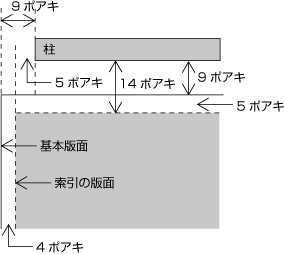
目次,索引などの文字を配置する領域が,基本版面のサイズより小さくなる場合,仕上りサイズに対する柱及びノンブルの位置は同じである.したがって,目次,索引などの文字を配置する領域が基本版面のサイズより小さくなった分だけ,目次,索引などの文字を配置する領域と柱及びノンブルとの空き量は変化する.次に示すdummygeneratedは,dummygeneratedで示した基本版面より小さくした目次の版面と柱及びノンブルの位置関係を示したものであり,dummygeneratedは,基本版面より左右方向で各4ポイント小さくしただけでなく,上下方向でも各5ポイント小さくした索引の版面と柱の位置関係を示したものである. Even on a page with text area, smaller than kihon hanmen in size such as for table of contents or Index, positioning of running head and page number shall be the same. Therefore, the positioning of running heads and page numbers with reference to those areas smaller than kihon hanmen in size, shall be changed. The following dummy demonstrates the relations of the hanmen for table of contents and running heads or page numbers. As shown in dummy, this hanmen is smaller than kihon hanmen. dummy demonstrates the relations of positions of running heads and page numbers for the hanmen of indices. These hanmens are not only 4 points smaller at the left and right, but also 5 points smaller at the top and bottom. |
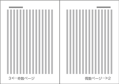
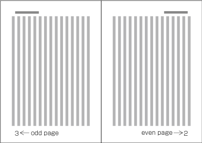
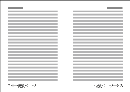
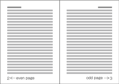
ノンブルは,紙葉の表面を“1”として開始するので,縦組の見開きにおいては,右ページは偶数ページ,左ページは奇数ページとなり(dummygenerated参照),横組の見開きにおいては,左ページは偶数ページ,右ページは奇数ページとなる(dummygenerated参照).
Because the start of page shall be on the recto side, the right-hand page of a spread in vertical writing mode is always even page and the left-hand page is always odd page (See dummy). Likewise, the left-hand page of a spread in horizontal writing mode is always even page and the right-hand page is always odd page (See dummy).
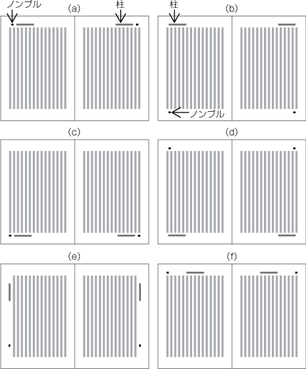
柱には,両柱方式(dummygenerated参照)と片柱方式(dummygenerated参照)とがある(柱の掲げ方についてはJIS X 4051の7.6.2に,ノンブルの掲げ方については,7.5.2に規定がある).
There are two methods to arrange running heads. One is single running head system and the other is double running head system. (Arrangement of running heads is defined in JIS X 4051, sec. 7.6.2. Page Numbers are defined in sec. 7.5.2.).
 両柱方式の例
 Double running head method
 片柱方式の例
 Single running head method
|
注1) (note 1) |
|
|
注2) (note 2) |
ノンブルも原則としてページに1つだけ配置するが,次のようなケースでは複数を配置する場合もある. In general, there will be only one page number per page. However there are some cases where multiple page numbers are printed as in the following examples:
|
-
両柱方式では,偶数ページにレベルの高い見出し又は書名を掲げ,奇数ページには,偶数ページに掲げた書名又は見出しより1ランク下の見出しを掲げる.ただし,目次など下位レベルの見出しのない部分では,偶数ページと奇数ページに同じ柱を掲げる.
In the double running head system, the primary headings or the book title are used for the running heads on the even pages, and the secondary headings on the odd pages, one level below the ones on the even pages. In case there is no secondary heading, such as the page for the table of contents, the same copy of running head is used on both even and odd page.
注1)
(note 1)
柱に何を掲げるかは,その本の内容による.読者が各ページに何が書かれているかを検索する,または現在説明されている内容を確認することが主な目的である.その点では書名を掲げるのはあまり意味があることではない.3つのランクの見出しがあった場合は,最も大きな見出しと,その次にランクする見出しを掲げるというのが,最も普通な方法であろう.
Which information should be used for the running heads would depend on the content of the book . Provided that the main purpose of running heads is to signpost readers to what is written on each page, or to the content of the current page, it does not make much sense to use the book title for the running head. The most common approach for a book with three levels of headings is to use the top level heading and the second level heading.
-
In single running head system, one of top level to third level headdings is selected and printed.
-
柱は,原則として見出しと同じ内容を掲げるが,次のような例外がある.
In principle, the contents of running heads will be the same as those of headings with the following differences;
-
論文集などでは,著者名を見出しの後ろに括弧類などで括って示す.
For certain publications like a collection of monographs, the name of authors may be added at the end of headings in Parenthesis.
-
柱は,原則として片柱方式の場合は全ての奇数ページ,両柱方式の場合は全ページに掲げるが,次のようなページでは表示しない.これは体裁の問題からである.
In principle, running heads are printed on all odd pages in single running head system, and on all even and odd pages in double running head system. However, for the sake of appearance, they may be omitted on pages like the following.
-
-
-
白ページ
Blank pages
-
-
-
-
ノンブルは,原則として全ページに掲げるが,次のようなページでは表示しない.これは体裁の問題からである.
In principle, page numbers are printed on all pages. However, for the sake of appearance, they may be omitted on pages with the following conditions.
-
-
白ページ
Blank pages
-
-
横書きにおいてノンブルを天側の余白に配置した場合で,改丁・改ページ等で見出しが始まるページ(この場合,ノンブルを地の中央に移動して表示する方法もある)
Pages in horizontal writing mode with a page number placed on the margin to the head and with a heading right after new recto or new page (In this case, there is also the method of moving the page numbers to the foot center.).
注1)
(note 1)
ページはあるが,そのページを数えない場合には,次のような例がある.
Cases in which there are pages which are not counted are for example as follows.
-
本扉を別紙とした場合
if the main title page is the enclosure;
-
巻頭に別紙で口絵を挿入した場合
if a frontispiece is inserted in the opening page of a book; or
-
-
ノンブルは,1冊の本を通して数字を連続させる方法(通しノンブルという)と,前付や後付部分を別に1から数字を開始してノンブルを付ける方法がある(別ノンブルという).また,マニュアル等では,章別に1から数字を開始する方法もある(この場合は,1から開始した数字の前に章名を示す接頭辞を付けることが多い).
There are two types of page numbers. "continuous pagination" means that page numbers are continued through one complete book. "Different pagination" means that page numbers are started from "1" separatley at the front matter and back matter. Also, for example in manuals, there is also the method of starting from page number "1" for each chapter (In these cases, it is common that before the page number, the name of the chapter is added as a prefix.).
注1)
(note 1)
前付と本文を別ノンブルとする場合は,それぞれを1から数字を開始してノンブルを付ける.この場合,前付部分は,本文と区別するためにローマ数字の小文字を使用する例が多い.
If the front matter and the main text have different page numbers, each is starting with page number "1". In this case, it is common to use Roman numerals for the front matter, in order to distinguish it from the main text.
注2)
(note 2)
縦組の書籍で横組の索引を付けた場合は,次のような方法がある.
For books in vertical writing mode with indices in horizontal writing mode, the following methods are available.
-
本の終りから開始する横組の索引に,本の流れからいえば逆方向から1から数字を開始してノンブルを付ける(逆ノンブルという).
So-called reversal pagination. The index in horizontal writing mode is starting at the end of the book, and page numbers are added starting with "1" in reverse order (reverse pagination).
-
本の終りから開始する横組の索引に,本の流れ方向に従い1から数字を開始してノンブルを付ける(索引の流れからは逆になる,通しノンブルという).
So-called continuous pagination. The index in horizontal writing mode is starting at the end of the book, and page numbers are added starting with "1" in the same order as the flow of the book. (The flow of index pages are reverse order of the page numbers)
-
逆ノンブルと通しノンブルの両方を付ける.この場合は,通しノンブルの配置位置は本文と同じにし,逆ノンブルの位置は別の箇所にし(例えば,通しノンブルが地のときは逆ノンブルは天),本文と同じアラビア数字を用いるが,その前後に括弧を付けるなどして区別を付ける方法がよく利用されている.
Usage of both reverse pagination and continuous pagination. In these cases, the page numbers of continuous pagination are in the same position as the page numbers of the main text, and page numbers in reversal pagination are in a different position (for example, if serial pagination is at the foot, reversal pagination is at the head). Often methods to distinct the different paginations are applied, like using Arabic numbers like for the main text, but adding brackets before and after.
-
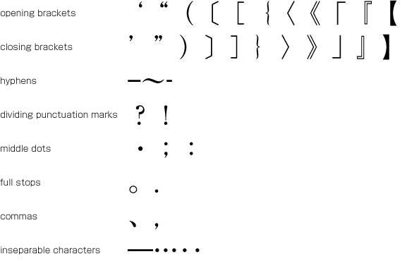
縦組と横組で異なる約物などを使用する例がある.主な例を次に示す. (なお,以下のドキュメントでは,約物を含む文字・記号について,その組み版上のふるまいで分類し,文字クラスとしてグループに分けて扱う.用語の後ろの括弧内に“(cl-01)”などと示すものは,その文字クラスの番号である.文字クラスの詳細は“2.9 文字クラスについて”で解説する.)
There are some punctuation marks that could be used uniquely in either vertical writing mode or horizontal writing mode. In this document, characters and symbols are treated as members of character classes, classified by the behavior to be composed. Each class name is followed by class id, like opening brackets(cl-01) The following are some typical examples:
-
-
縦組の句点類(cl-06)には,[。] (IDEOGRAPHIC FULL STOP)を,読点類(cl-07)には[、] (IDEOGRAPHIC COMMA)を使用する.
In vertical writing mode, [。] (IDEOGRAPHIC FULL STOP) and [、] (IDEOGRAPHIC COMMA) shall be used for 読点類(cl-07) and 句点類(cl-06).
-
横組の句点類(cl-06)と読点類(cl-07)には,次の3つの方式がある.
In horizontal writing mode, there are three conventions in choice of symbols for 読点類(cl-07) and 句点類(cl-06):
-
コンマ(,)とピリオド(.)[,] (COMMA)と[[.] (FULL STOP)を使用する(図2-1参照).
Using COMMA(,) [,] (COMMA) and FULL STOP (.) [.] (FULL STOP) (See dummy).
 コンマ[,] (COMMA)とピリオド[.] (FULL STOP)を使用した例
 Example text using [,] (COMMA) and [.] (FULL STOP)
-
コンマ[,] (COMMA)(,)と句点[。] (IDEOGRAPHIC FULL STOP)を使用する(図2-2参照).
Using [,] (COMMA) (,) and [。] (IDEOGRAPHIC FULL STOP) (See dummy).
 コンマ[,] (COMMA)と句点[。] (IDEOGRAPHIC FULL STOP)を使用した例
 Example text using COMMA and IDEOGRAPHIC FULL STOP
-
[、] (IDEOGRAPHIC COMMA)読点と句点[。] (IDEOGRAPHIC FULL STOP)を使用する(図2-3参照).
Using [、] (IDEOGRAPHIC COMMA) and [。] (IDEOGRAPHIC FULL STOP) (See dummy).
 読点[、] (IDEOGRAPHIC COMMA)と句点[。] (IDEOGRAPHIC FULL STOP)を使用した例
 Example text using [、] (IDEOGRAPHIC COMMA) and [。] (IDEOGRAPHIC FULL STOP)
注1)
(note 1)
横組の場合,欧文が混用される場合も多い.そこで,欧文の句読点であるコンマ[,] (COMMA)とピリオド[.] (FULL STOP)と揃えるとしたのが1の方式である.理工学書でよく利用されている方式である.2は,1のピリオド[.] (FULL STOP)が和文とのバランスが悪く,小さいということから句点[。] (IDEOGRAPHIC FULL STOP)に変えた方法であり,日本の公用文で採用されている方式である(かつては公用文でもコンマ[,] (COMMA)とピリオド[.] (FULL STOP)を使用したこともある).
In the horizontal writing mode, there are many cases of Japanese and Western mixed text compositions. The convention shown in (i) is a way to apply the same [,] (COMMA) and [.] (FULL STOP) to both Western and Japanese texts for consistency, which is commonly seen in books on science and technology. The convention shown in (ii) was invented because of the problem in (i) that the size of [.] (FULL STOP) appears too small for Japanese texts and using [。] (IDEOGRAPHIC FULL STOP) for period would mitigate it. This convention has been adopted to the Japanese official publications (In the past, [,] (COMMA) and [.] (FULL STOP) were adopted to some official publications.).
-
-
-
かぎ括弧[「] (LEFT CORNER BRACKET)[」] (RIGHT CORNER BRACKET)とコーテーションマーク[“] (LEFT DOUBLE QUOTATION MARK)[”] (RIGHT DOUBLE QUOTATION MARK)
[「] (LEFT CORNER BRACKET), [」] (RIGHT CORNER BRACKET), [“] (LEFT DOUBLE QUOTATION MARK) and [”] (RIGHT DOUBLE QUOTATION MARK)
-
縦組では,かぎ括弧[「] (LEFT CORNER BRACKET)[」] (RIGHT CORNER BRACKET)を用いる(図2-4参照).
In vertical writing mode, [「] (LEFT CORNER BRACKET) and [」] (RIGHT CORNER BRACKET) shall be used for quotation (See dummy).
 かぎ括弧[「] (LEFT CORNER BRACKET)[」] (RIGHT CORNER BRACKET)を使用した例
 Examples of quoted texts in [「] (LEFT CORNER BRACKET) and [」] (RIGHT CORNER BRACKET)
-
横組では,かぎ括弧[「] (LEFT CORNER BRACKET)[」] (RIGHT CORNER BRACKET)に替えてコーテーションマーク[“] (LEFT DOUBLE QUOTATION MARK)[”] (RIGHT DOUBLE QUOTATION MARK)[‘] (LEFT SINGLE QUOTATION MARK)[’] (RIGHT SINGLE QUOTATION MARK)を用いる方法がある(図2-5参照).
In horizontal writing mode, pairs of [“] (LEFT DOUBLE QUOTATION MARK) and [”] (RIGHT DOUBLE QUOTATION MARK) or pairs of [‘] (LEFT SINGLE QUOTATION MARK) and [’] (RIGHT SINGLE QUOTATION MARK) may be used in place of [「] (LEFT CORNER BRACKET) and [」] (RIGHT CORNER BRACKET).
 ダブルコーテーションマーク[“] (LEFT DOUBLE QUOTATION MARK)[”] (RIGHT DOUBLE QUOTATION MARK)を使用した例
 Examples of quoted texts in [“] (LEFT DOUBLE QUOTATION MARK) and [”] (RIGHT DOUBLE QUOTATION MARK)
注1)
(note 1)
かぎ括弧[「] (LEFT CORNER BRACKET)[」] (RIGHT CORNER BRACKET)を横組で用いると,特に終わりかぎ括弧[」] (RIGHT CORNER BRACKET)の体裁がよくないからであるが,最近は,かぎ括弧の使用が増えているようである.
This is because [「] (LEFT CORNER BRACKET) and [」] (RIGHT CORNER BRACKET), especially [」] (RIGHT CORNER BRACKET) may not look good in horizontal writing mode, but adoption of corner brackets in horizontal writing mode seems increasing.
注2)
(note 2)
ダブルコーテーションマークに似た括弧類にダブルミニュート[〟] (LOW DOUBLE PRIME QUOTATION MARK)[〝] (REVERSED DOUBLE PRIME QUOTATION MARK)がある(図2-6参照).これは,縦組専用の括弧類であり,横組では使用しない.
Though [〟] (LOW DOUBLE PRIME QUOTATION MARK) and [〝] (REVERSED DOUBLE PRIME QUOTATION MARK) are similar to double quotation marks in appearance (See dummy), they are exclusively for vertical writing mode and shall not be used in horizontal writing mode.
 ダブルミニュート[〟] (LOW DOUBLE PRIME QUOTATION MARK),[〝] (REVERSED DOUBLE PRIME QUOTATION MARK)を使用した例
 Examples of quoted texts in [〟] (LOW DOUBLE PRIME QUOTATION MARK) and [〝] (REVERSED DOUBLE PRIME QUOTATION MARK)
注3)
(note 3)
[“] (LEFT DOUBLE QUOTATION MARK)及び[”] (RIGHT DOUBLE QUOTATION MARK)は,横組専用の括弧類であり,縦組では使用しない.また,[‘] (LEFT SINGLE QUOTATION MARK)及び[’] (RIGHT SINGLE QUOTATION MARK)も横組専用の括弧類であり,縦組では使用しない.ただし,縦組において欧文用文字(cl-27)などを時計回りに90度回転させて配置する場合に使用する例がある.
[“] (LEFT DOUBLE QUOTATION MARK) and[”] (RIGHT DOUBLE QUOTATION MARK) are exclusively for horizontal writing mode and shall not be used in vertical writing mode. Also, [‘] (LEFT SINGLE QUOTATION MARK) and [’] (RIGHT SINGLE QUOTATION MARK) are exclusively for horizontal writing mode and shall not be used in vertical writing mode. However, in vertical writing mode, when Western characters(cl-27) are composed 90 degree rotated clockwise, these quotation marks are sometimes used.
-
-
ブラケット[[] (LEFT SQUARE BRACKET)[]] (RIGHT SQUARE BRACKET)とキッコウ[〔] (LEFT TORTOISE SHELL BRACKET)[〕] (RIGHT TORTOISE SHELL BRACKET)
[[] (LEFT SQUARE BRACKET), []] (RIGHT SQUARE BRACKET), [〔] (LEFT TORTOISE SHELL BRACKET) and [〕] (RIGHT TORTOISE SHELL BRACKET)
ブラケット([ ])を縦組用に変形したものがキッコウ(〔 〕)である.したがって,特別な場合を除き,横組ではブラケットを使用する.
[〔] (LEFT TORTOISE SHELL BRACKET) and [〕] (RIGHT TORTOISE SHELL BRACKET) are vertical variation of [[] (LEFT SQUARE BRACKET) and []] (RIGHT SQUARE BRACKET) in horizontal writing mode. Therefore, square brackets should be used in horizontal writing mode except for special cases.
|
注1) (note 1) |
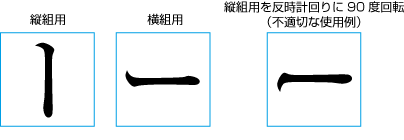
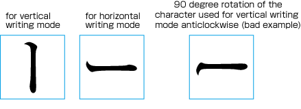
句点類(cl-06)及び読点類(cl-07)は,縦組用と横組用では,仮想ボディに対する字面の配置位置が異なる.始め括弧類(cl-01),終わり括弧類(cl-02),ハイフン類(cl-03)は,縦組用と横組用で字面の向きを変更する.その他,小書きの仮名(cl-11)は,前述したように仮想ボディに対する字面の位置が縦組用と横組用では異なる.また,[ー] (KATAKANA-HIRAGANA PROLONGED SOUND MARK)長音記号は,字形の向きを変更するだけではなく,字形そのものも変更している.横組用の長音記号は,縦組用の長音記号を単純に反時計回りに90度回転したものではない(図2-7参照). The position of the letter face of commas(cl-07) and full stops(cl-06) on the imaginary bodyis different in vertical and horizontal writing mode. The same letter face of opening brackets(cl-01), closing brackets(cl-02) and hyphens(cl-03) can be used in both vertical and horizontal writing mode by rotating clockwise 90 degrees to the inline direction. Again, the position of the letter face of small kanas(cl-11) symbols on the imaginary body is different in vertical and horizontal writing mode. In addition, as to [ー] (KATAKANA-HIRAGANA PROLONGED SOUND MARK), the difference in vertical and horizontal writing mode is not only in the orientation of the letter face to the inline direction but also the shape of the symbol. The shape of katakana-hiraganaprolongedsoundmark for horizontal writing mode is not the same as the one for vertical writing mode rotated counterclockwise 90 degrees (See dummy). |
約物などを行に配置する場合の基本的な配置は,次のようにする.
Positioning punctuation marks (commas, periods and brackets) in line is as follows.
|
注1) (note 1) |
約物を含め,その他の文字・記号を行頭及び行末に配置する方法,並びに隣接する文字の間隔の処理方法についての詳細は,“2.9 文字クラスについて”で説明する文字クラスに従い,表の形式にしてAppendix〓に示す. Characters and symbols, including punctuation marks, which are subject to the consideration of line start wrapping, line end wrapping and inter-letter space adjustment, will be described in detail in Sec. 2.9 "Character Class". Every combination of character class is provided as a complete table in Appendix tbd. |
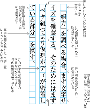
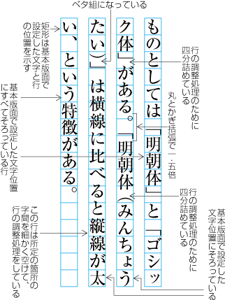
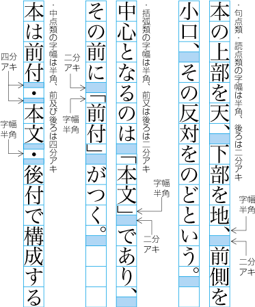
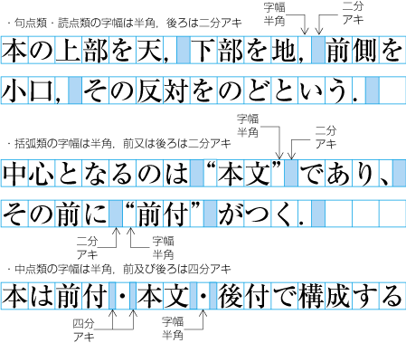
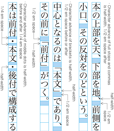
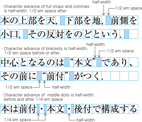
読点類(cl-07),句点類(cl-06),始め括弧類(cl-01),終わり括弧類(cl-02)及び中点類(cl-05)の字幅は,半角であるが,これらの約物が漢字等(cl-19),平仮名(cl-15)又は片仮名(cl-16)と連続する場合は,原則として,それぞれの約物の前/又は後ろ(中点類(cl-05)は,その前及び後ろ)に一定のアキをとることで,結果として全角というサイズになる(図2-8参照).漢字及び仮名の全角というサイズと揃えるとともに,これらの約物の前及び/又は後ろにアキをとることにより,文章の区切りを示すためである.この原則としたアキは,句点類の後ろは除外して行の調整処理の対象とし,結果的に0となることもある.
Character width of commas(cl-07), full stops(cl-06), opening brackets(cl-01), closing brackets(cl-02) or middle dots(cl-05) is half width(1/2 em). But when those punctuation marks are placed side by side with ideographic characters(cl-19) and/or hiraganas(cl-15), katakanas(cl-16) characters, a given amount of space will be inserted before or after the symbols in principle, which makes them as if they were full width (1 em) intrinsically (See dummy). As for middle dots(cl-05), the space will be inserted before and after the middle dot This principle makes the symbols consistent with kanji and kana characters in character width and at the same time helps making organization of text clearer with the space for punctuation. The space before / after the punctuation marks added in principle is subject to the line adjustment and may be removed eventually, except those added after periods.
-
読点類(cl-07)では,原則として後ろを二分アキにする.
After commas(cl-07), 1/2 em space is added in principle.
-
句点類(cl-06)では,後ろを二分アキにする.
Full stops(cl-06), 1/2 em space is added in principle.
-
始め括弧類(cl-01)では,前を二分アキにする.
Before opening brackets(cl-01), 1/2 em space is added in principle.
-
終わり括弧類(cl-02)では,後ろを二分アキにする.
After closing brackets(cl-02), 1/2 em space is added in principle.
-
中点類(cl-05)では,前及び後ろを四分アキにする.
Before and after middle dots(cl-05), 1/4 em space is added in principle.
 Character width of commas, periods, and the space appended before and/or after the symbols
|
注1) (note 1) |
各フォントがもっている約物がどのような字幅を持っているかは問題としない.結果として,ここで説明した配置方法になればよい.活字組版においても,二分のアキを調整するために,半角のボディ+二分のスペースという方法が一般的であった.そのために原稿に従って活字を集める作業である文選では句読点や括弧類は拾わず,ページの体裁にする植字の際に約物を拾っていた.その後,モノタイプの利用が進み,全角サイズのボディの約物も利用されるようになり,全角と半角の約物が混用されてきた. The implementation of punctuation marks in fonts can give a different character width to them, but it is expected that it's capable to follow the line composition rules explained here as the result. In letterpress printing, it was also a common practice to combine the punctuation marks with half width body and 1/2 em space in order to make it easier to remove the space later for adjustment. And because of that, the types were picked up but punctuation marks at the type-picking phase according to a manuscript and the punctuation marks were picked up only when they were necessary in composing a page. Later, with increasing adoption of Monotype machines, punctuation marks of full width body became popular and both full width and half width punctuation marks have been used in a mix since then. |
|
注2) (note 2) |
始め括弧類(cl-01),終わり括弧類(cl-02)のうち,パーレン[(] (LEFT PARENTHESIS)[)] (RIGHT PARENTHESIS)及び山括弧[〈] (LEFT ANGLE BRACKET)[〉] (LEFT ANGLE BRACKET)は,補足説明等に利用され,他の始め括弧類(cl-01),終わり括弧類(cl-02)と扱いがやや異なる.このようなことから,パーレン及び山括弧については,その前後の二分アキを確保しないで,ベタ組とする方針で処理する方法もある(図2-9参照). Among opening brackets(cl-01) and closing brackets(cl-02), [(] (LEFT PARENTHESIS); [)] (RIGHT PARENTHESIS), [〈] (LEFT ANGLE BRACKET) and [〉] (RIGHT ANGLE BRACKET) are used to indicate supplementary explanations and they are slightly different in usage from other opening brackets(cl-01) and closing brackets(cl-02). To reflect the difference, there's a convention not to append 1/2 em space before / after the parentheses and angle brackets and just set them solid (See dummy). |
 パーレン[(] (LEFT PARENTHESIS), [)] (RIGHT PARENTHESIS)と山括弧[〈] (LEFT ANGLE BRACKET), [〉] (RIGHT ANGLE BRACKET)の配置例(左がベタ組とした例)
 Positioning of [(] (LEFT PARENTHESIS), [)] (RIGHT PARENTHESIS) and [〈] (LEFT ANGLE BRACKET), [〉] (RIGHT ANGLE BRACKET) (Shown in left is an example of setting them solid.)
読点[、] (IDEOGRAPHIC COMMA)及び中点[・] (KATAKANA MIDDLE DOT)の例外的な配置方法
Exceptional Positioning of [、] (IDEOGRAPHIC COMMA)and [・] (KATAKANA MIDDLE DOT)
次のような場合は,読点[、] (IDEOGRAPHIC COMMA)の後ろ及び中点[・] (KATAKANA MIDDLE DOT)の前後のアキをとらないことを原則とする.これは体裁上からの処理である.
The space usually added after [、] (IDEOGRAPHIC COMMA) and the space before and after [・] (KATAKANA MIDDLE DOT) are in principle omitted for cosmetic reasons in the following cases.
-
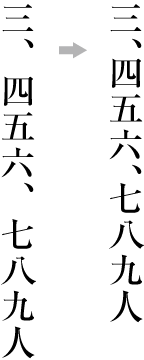
縦組において漢数字の位取りを示す読点[、] (IDEOGRAPHIC COMMA)の後ろはベタ組にする(図2-10の右側).
In vertical writing mode, ideographic digits and [、] (IDEOGRAPHIC COMMA) used as a decimal separator are set solid (as in the right line on dummy ).
 読点の例外の配置例
 An example of the exceptional positioning of the IDEOGRAPHIC COMMA
注1)
(note 1)
縦組において漢数字で概略の数を示す場合も,体裁の面から読点[、] (IDEOGRAPHIC COMMA)の後ろはベタ組にすることが望ましい(図2-10の右側).
In vertical writing mode, ideographic digits with [、] (IDEOGRAPHIC COMMA) to represent an approximate number are expected to be set solid too (as in the right line on dummy).
 漢数字で概略の数を示す読点[、] (IDEOGRAPHIC COMMA)の配置例
 An example of the positioning of [、] (IDEOGRAPHIC COMMA) with ideographic digits to represent an approximate number
-
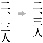
漢数字の小数点を示す中点[・] (KATAKANA MIDDLE DOT)の前後はベタ組にする(図2-11の右側).
Ideographic digits and [・] (KATAKANA MIDDLE DOT) representing a decimal point shall be set solid (as in the right line on dummy ).
 中点[・] (KATAKANA MIDDLE DOT)の例外の配置例
 An example of the exceptional positioning of [・] (KATAKANA MIDDLE DOT)
始め括弧類(cl-01)、終わり括弧類(cl-02)、読点類(cl-07)、句点類(cl-06)が連続する場合の配置方法
Positioning of Consecutive the opening brackets(cl-01), the closing brackets(cl-02), the commas(cl-07) and the full stops(cl-06)
始め括弧類(cl-01),終わり括弧類(cl-02),読点類(cl-07),句点類(cl-06),中点類(cl-05)が連続する場合は,次のようにする(図2-13参照).これは体裁上からの処理である.なお,原則として二分アキ又は四分アキとする箇所は,句点類(cl-06)の後ろの二分アキを除外して,行の調整処理の詰める場合の対象にしてよい.
In case multiple punctuation marks, such as opening brackets(cl-01), closing brackets(cl-02), commas(cl-07), full stops(cl-06) and middle dots(cl-05) come one after the other, the following space adjustments are made for cosmetic reasons (See dummy).Note also that the 1/2 em or 1/4 em spaces, appended usually before and/or after the punctuation marks but those after full stops(cl-06), can be candidates of removal for line adjustments.
-
読点類(cl-07)又は句点類(cl-06)の後ろに終わり括弧類(cl-02)が連続する場合は,読点類(cl-07)又は句点類(cl-06)と終わり括弧類の字間はベタ組とし,終わり括弧類の後ろを原則として二分アキとする(図2-13の①参照).
When closing brackets(cl-02) come immediately after commas(cl-07) or full stops(cl-06), remove the default 1/2 em space between them and in principle add 1/2 em space after the closing brackets (See dummy (1)).
-
終わり括弧類(cl-02)の後ろに読点類(cl-07)が連続する場合は,終わり括弧類と読点類の字間はベタ組とし,読点類の後ろを原則として二分アキとする.また,終わり括弧類(cl-02)の後ろに句点類(cl-06)が連続する場合は,終わり括弧類と句点類の字間はベタ組みとし,句点類の後ろを二分アキとする(図2-13の②参照).
When commas(cl-07) come immediately afterclosing brackets(cl-02), remove the default 1/2 em space between them and in principle add 1/2 em space after the commas. Wen full stops(cl-06) come immediately after closing brackets(cl-02), remove the default 1/2 em space between them and in principle add 1/2 em space after the full stops (See dummy (2)).
-
読点類(cl-07)の後ろに始め括弧類(cl-01)が連続する場合は,読点類と始め括弧類の字間は,原則として二分アキとする(図2-13の③参照).また,句点類(cl-06)の後ろに始め括弧類(cl-01)が連続する場合は,句点類と初め括弧類の字間は,二分アキとする.
When opening brackets(cl-01) come immediately after commas(cl-07), in principle, add 1/2 em space between them (See dummy (3)). When opening brackets(cl-01) come immediately afterfull stops(cl-06), add 1/2 em space between them;
-
終わり括弧類(cl-02)の後ろに始め括弧類(cl-01)が連続する場合は,終わり括弧類と始め括弧類の字間は,原則として二分アキとする(図2-13の④参照).
When opening brackets(cl-01) come immediately after closing brackets(cl-02), in principle add 1/2 em space between them (See dummy (4)).
-
始め括弧類(cl-01)の後ろに始め括弧類(cl-01)が連続する場合は,その字間はベタ組とし,前にくる始め括弧類の前を原則として二分アキとする(図2-13の⑤参照).
When opening brackets(cl-01) come immediately after other opening brackets(cl-01), set them solid and in principle add 1/2 em space before the first one (See dummy (5)).
-
終わり括弧類(cl-02)の後ろに終わり括弧類(cl-02)が連続する場合は,その字間はベタ組とし,後ろにくる終わり括弧類の後ろを原則として二分アキとする(図2-13の⑥参照).
When closing brackets(cl-02) come immediately after other closing brackets(cl-02), set them solid and in principle add 1/2 em space after the last closing brackets (See dummy (6)).
-
終わり括弧類(cl-02)の後ろに中点類(cl-05)が連続する場合は,後ろの中点類の前を原則として四分アキとする(図2-13の⑦参照).
When middle dots(cl-05) come immediately after closing brackets(cl-02), in principle add 1/4 em space before the succeeding middle dots (See dummy (7)).
-
中点類(cl-05)の後ろに始め括弧類(cl-01)が連続する場合は,前の中点類の後ろを原則として四分アキとする(図2-13の⑦参照).
When opening brackets(cl-01) come immediately after middle dots(cl-05), in principle, add 1/4 em space after the preceding middle dots (See dummy (7)).
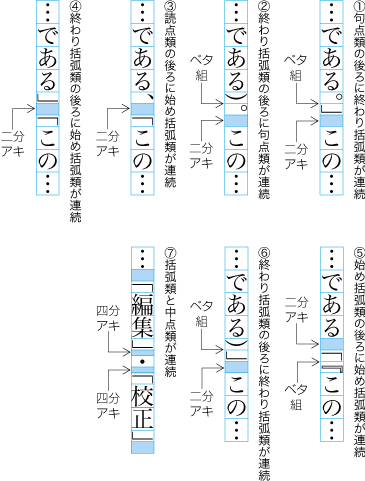 始め括弧類(cl-01),終わり括弧類(cl-02),読点類(cl-07),句点類(cl-06),中点類(cl-05)が連続する場合の配置例
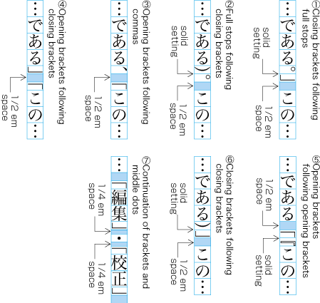 Examples of line adjustment with multiple opening brackets(cl-01), closing brackets(cl-02), commas(cl-07) , full stops(cl-06) or middle dots(cl-05)
それぞれの後ろ又は前を二分アキ,又は前後を四分アキにし,全角の幅にするとアキが目立ち,体裁がよくないからである(図2-14参照).
The line adjustment rules shown above have been established because the default 1/2 em spacing before or after the consecutive punctuation marks, or 1/4 em space before and after them, makes the line sparse and it doesn't convey a proportioned appearance (See dummy).
 始め括弧類(cl-01),終わり括弧類(cl-02),読点類(cl-07),句点類(cl-06),中点類(cl-05)が連続する場合の不適切な配置例
 Examples of bad line composition with unadjusted spaces between multiple opening brackets(cl-01), closing brackets(cl-02). commas(cl-07), full stops(cl-06) or middle dots(cl-05)
|
注1) (note 1) |
日本語組版では,全角を基本とするが,その原則通りにすると体裁がよくない場合がでてくる.このような例外的な場合は,原則である全角にするのではなく,体裁を優先し,全角としない例外処理を行う.この例外処理をどのような箇所で,どのように行うかが組版の品質にからんでくる.いかに矛盾を解決するか,という問題でもある. Japanese composition is based on the full width design of characters, but strictly following the full width based composition sometimes produces an unbalanced appearance. In such exceptional cases, the appearance as a result of the composition must be given higher priority than the full width design principle. When and how to invoke such exceptional procedures has a direct bearing on the quality of the text layout. In other words, it is a matter of how to resolve the conflicts between the principle and the products of it. |
行頭に配置する始め括弧類(cl-01)の配置方法には,図2-15のような方式がある.なお,改行の行頭(段落における第1行目の行頭)の字下げを全角とする場合である.
When starting a new line with opening brackets(cl-01), there are some patterns as shown in dummy. Note that the amount of line indent after the line feed (the first line indent of a new paragraph) is assumed to be full width across the patterns.
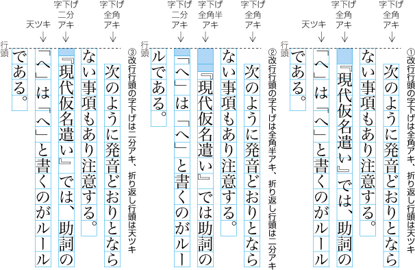 行頭に配置する始め括弧類(cl-01)の配置例
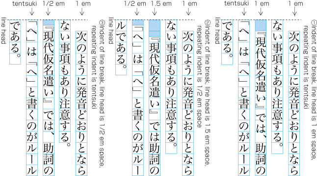 Examples of Positioning of opening brackets(cl-01) at Line Head
|
注1) (note 1) |
元々括弧類の字幅は半角であったのであるから,何もスペースを入れなければ図2-15の①の方法となる.これに対し,②の方法は,行頭の括弧類の字幅についてアキを含めて全角とする処理方法である.JIS X 4051では,①の方法を採用している(ただし,オプションで①又は③の方法も選択できる).③の方法は,小説などで会話が多い場合,改行行頭の括弧の字下げを全角又は全角半(全角の1.5倍)とすると下がりすぎになることから考えられた方法である(これが一般書にも採用されるようになっている).講談社,新潮社,文藝春秋,中央公論新社,筑摩書房など文芸関係の出版社では,③の方法が採用されている.岩波書店やその他の出版社では①の方法を採用している.以前の岩波書店の縦組では②の方法であり,この方法を採用している例はかなりあった.しかし,今日では②の方法を採用している例は少なくなった. Because the inherent character width of brackets is half width, dummy (1) can be explained as the result of applying the principle that any line should start with no space. On the other hand, the principle represented by dummy (2) is to assume opening brackets should be always accompanied by the preceding 1/2 em space as if they were full width and then apply the same principle as in dummy (1). JIS X 4051 adopts the principle shown in (1) (the patterns shown in (2) and (3) are offered as options) . The pattern shown in (3) was first invented in such books as novels which use frequent line feeds and corner brackets in dialogues, for which the first line indent with 1 em or 1.5 em would give superfluously too much space in appearance (And then this pattern was accepted and adopted by general books). Japanese major publishers which deal with literature, such as Kodansha, Shinchosha, Bungei Shunju, Chuoh Kouronsha, Chikuma shobo, adopts the pattern shown in (3). In contrast, Iwanami shoten and other publishers adopt the pattern shown in (1). Because Iwanami shoten once adopted the pattern (2) in vertical composition, there were many examples of it, but few examples of (2) can be found today. |
|
注2) (note 2) |
段落の最初の行頭の字下げは,全角とするのが原則である.ただし,次のような問題点がある. The first line indent of a new paragraph is full width in principle. However, the following exceptions can be seen.
|
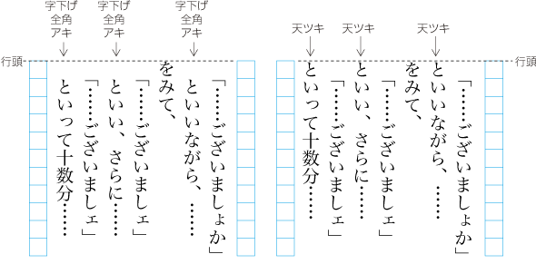
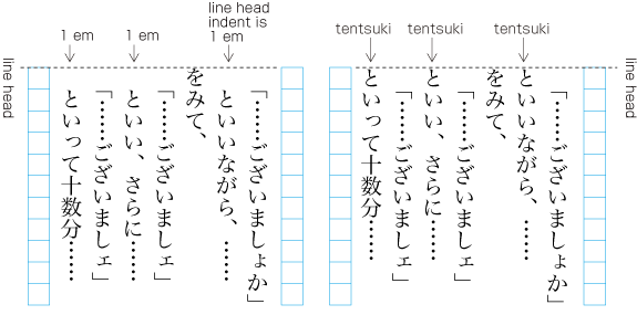
区切り約物(cl-04)とハイフン類(cl-03)の配置方法
Positioning of the dividing punctuation marks(cl-04) ([?] (QUESTION MARK) and [!] (EXCLAMATION MARK) and the hyphens(cl-03)
区切り約物(cl-04)([?] (QUESTION MARK)と[!] (EXCLAMATION MARK))の字幅は,全角とし,次のように配置する.
The dividing punctuation marks(cl-04) ([?] (QUESTION MARK) and [!] (EXCLAMATION MARK)) should be of full-width, and they are typeset as follows.
-
文末にくる区切り約物(cl-04)の前はベタ組とし,その後ろは全角アキとする(図2-17参照).ただし,区切り約物の後ろに終わり括弧類(cl-02)がくる場合は,この字間はベタ組とし,終わり括弧類の後ろを二分アキにする(図2-17参照).
Basically add no space before dividing punctuation marks(cl-04) at the end of a sentence and add 1 em space after them (See dummy). However when a closing brackets(cl-02) follows right after the dividing punctuation marks, add no space after the dividing punctuation marks either and add 1/2 em space after the closing bracket (See dummy).
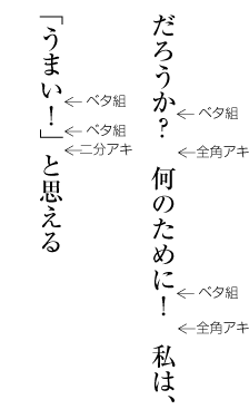 区切り約物(cl-04)の配置例(縦組の場合)
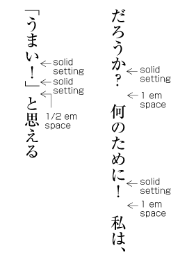 Positioning of dividing punctuation marks(cl-04) (Examples in vertical writing mode)
注1)
(note 1)
区切り約物(cl-04)の後ろの全角アキは,通常,全角の和字間隔(cl-14)を用いて空けている.
Many implementations use fulwidth ideographic space(cl-14) for 1 em space appended after dividing punctuation marks(cl-04).
注2)
(note 2)
文末に区切り約物(cl-04)が付いた場合は,句点類(cl-06)は付けない.
No full stops(cl-06) should be appended after dividing punctuation marks(cl-04) at the end of a sentence.
注3)
(note 3)
文末ではなく,文中で区切り約物(cl-04)がつく場合がある.この場合は,区切り約物の前後をベタ組にするか,その前後を四分アキにする(図2-18参照).
There're some cases where dividing punctuation marks(cl-04) are used in the middle of a sentence, not at the end. In those cases, add either no space or 1/4 em space before and after the dividing punctuation marks (See dummy).
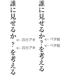 文中の区切り約物(cl-04)の配置例(縦組の場合)
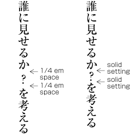 Examples of Positioning of dividing punctuation marks(cl-04) in the middle of a sentence (in vertical writing mode)
注4)
(note 4)
区切り約物(cl-04)とハイフン類(cl-03)の配置方法についての詳細は,“2.9 文字クラスについて”で説明する文字クラスに従い,表の形式にしてAppendix〓で示す.
The details of composition rule fordividing punctuation marks(cl-04) andhyphens(cl-03) are described in Appendix dummy as a complete table, following the description of character classes in dummy.
-
文末に付く区切り約物(cl-04)が行末にくる場合は,次のようにする(図2-20参照).
When dividing punctuation marks(cl-04) at the end of a sentence come to the end of a line, apply the following rules (See dummy).
 行末の区切り約物(cl-04)の配置例(縦組の場合)
 Examples of Positioning of dividing punctuation marks(cl-04) at the end of a line (in vertical writing mode)
-
行長がそこに使用されている文字サイズの13倍とする.この場合,12倍の位置にきたときは区切り約物(cl-04)の後ろを全角アキとする.
Suppose the line length is of 13 character width, and when dividing punctuation marks(cl-04) comes at 12th character position, 1 em space should be appended after it.
-
行長がそこに使用されている文字サイズの13倍とする.この場合,13倍の位置にくるときは区切り約物(cl-04)の後ろをベタ組とする.さらに,次の行頭の下がりは全角アキとしないで,天ツキとする.
Suppose the line length is of 13 character width, and when dividing punctuation marks(cl-04) comes at 13th character position, no space should be appended after it. In addition, do not carry over the 1 em space usually appended after the dividing punctuation marks to the line head of the next line, which in this case should be of no space (TENTSUKI).
-
ハイフン類(cl-03)の[‐] (HYPHEN)の字幅は四分角,[–] (EN DASH)及び[゠] (KATAKANA-HIRAGANA DOUBLE HYPHEN)の字幅は半角,[〜] (WAVE DASH)の字幅は全角とし,ハイフン類(cl-03)の前後はベタ組とする.ただし,ハイフン類(cl-03)の後ろに始め括弧類(cl-01)がくる場合は原則として二分アキ,中点類(cl-05)がくる場合は原則として四分アキとする.
Character width of the hyphens(cl-03) varies by each. [‐] (HYPHEN) should be of SIBUNKAKU (1/4 em width), [–] (EN DASH) and [゠] (KATAKANA-HIRAGANA DOUBLE HYPHEN) should be of half-width (1/2 em width), [〜] (WAVE DASH) should be of full-width. Basically there should be no space before and after hyphens(cl-03). However, 1/2 em space should be appended in principle when opening brackets(cl-01) follow right after hyphens(cl-03) and 1/4 em space when middle dots(cl-05) follow.
終わり括弧類(cl-02),ハイフン類(cl-03),区切り約物(cl-04),中点類(cl-05),句点類(cl-06),読点類(cl-07),繰り返し記号(cl-09),長音記号(cl-10),小書きの仮名(cl-11)及び割注終わり括弧類(cl-29)を行頭に配置してはならない.これは体裁がよくないからである.
In principle, any line should not begin with closing brackets(cl-02), hyphens(cl-03), dividing punctuation marks(cl-04), middle dots(cl-05), full stops(cl-06), commas(cl-07), iteration marks(cl-09), prolonged sound marks(cl-10) , small kanas(cl-11) and warichu closing brackets(cl-29), otherwise it would give the odd appearance to lines.
|
注1) (note 1) |
繰り返し記号(cl-09)の[々] (IDEOGRAPHIC ITERATION MARK),長音記号(cl-10),小書きの仮名(cl-11)を行頭禁則としない方法もあり,この方法を採用している書籍も多い.また,繰り返し記号[々] (IDEOGRAPHIC ITERATION MARK)が行頭に配置された場合,元の漢字に置き換える方法もある.たとえば,“家(行末)+々(行頭)”となった場合,“家(行末)+家(行頭)”とする方法である. Not a small number of books adopt a weaker set of rules which allows [々] (IDEOGRAPHIC ITERATION MARK) (one of iteration marks(cl-09)), prolonged sound marks(cl-10) and small kanas(cl-11) to start a line. There is another method for [々] (IDEOGRAPHIC ITERATION MARK) to replace to base kanji character when happen to set at the head of a line. For example, "家(bottom of a line) + 々(head of the next line)" will be changed to "家(bottom of a line) + 家(head of the next line)". |
|
注2) (note 2) |
[・] (KATAKANA MIDDLE DOT)を行頭に配置することを許容とする考え方もある. There's yet another weaker rule to allow [・] (KATAKANA MIDDLE DOT) to start a line. |
|
注3) (note 3) |
新聞では,区切り約物(cl-04)([?] (QUESTION MARK)と[!] (EXCLAMATION MARK))を行頭に配置することを許容している.これは1行の字詰め数が少ないことによる.字詰め数が少ないと,詰めて調整する場合も,空けて調整する場合も,少ない箇所で調整を行い,字間の調整が極端になる.これを避けるために行頭禁則の条件をゆるやかにしたものと思われる. In newspaper text layout, dividing punctuation marks(cl-04) ([?] (QUESTION MARK) and [!] (EXCLAMATION MARK)) are allowed to start a line. This is due to the fact that the line lengths are shorter in newspapers. When the line is very short, there'll be fewer opportunities for inter-character space adjustment, which makes it difficult to preserve the number of characters per line as much as possible. It is thought that this is the reason why the weaker set of line head wrapping rules has been adopted in newspaper text layout. |
|
注4) (note 4) |
始め括弧類(cl-01)及び割注始め括弧類(cl-28)を行末に配置してはならない(行末禁則).これは体裁がよくないからである.
Any line should not end with opening brackets(cl-01) and warichu opening brackets(cl-28) (line end wrapping), otherwise it would give the odd appearance to lines.
|
注1) (note 1) |
行頭禁則,行末禁則,分離(分割)禁止などの禁則を避けるために行われる処理のことを禁則処理という. The process of formatting lines to avoid non-starter characters at the line head, non-ending characters at the line end, spaces before and/or after inseparable characters, line breaking before and/or after unbreakable characters, etc., is generally called KINSOKUSYORI. |
行末に配置する終わり括弧類(cl-02),句点類(cl-06),読点類(cl-07),<a class="characterClass" href="#cl-05-ja">中点類(cl-05)</a>の配置方法
Positioning of the closing brackets(cl-02), the full stops(cl-06), the commas(cl-07) and the middle dots(cl-05) at Line End
行末に配置する終わり括弧類(cl-02),句点類(cl-06)又は読点類(cl-07)は,原則としてその後ろに二分アキを確保する(図2-21参照).また,中点[・] (KATAKANA MIDDLE DOT)も原則として,その前を四分アキ,後ろを四分アキとし,全角の扱いとする(図2-21参照).原則として二分アキ又は四分アキとする箇所は,行の調整処理の詰める場合の対象にしてよい.
For closing brackets(cl-02), full stops(cl-06) orcommas(cl-07) at the line end, in principle there is 1/2 em space after and before them (See dummy). The KATAKANA MIDDLE DOT[・] (KATAKANA MIDDLE DOT) character in principle also has 1/4 em space before and after, and is handled like a full width character (See dummy). In principle it is appropriate to apply line adjustment processing (adjustment of inter character space) to the places with the 1/2 em or 1/4 em space.
 行末に配置する終わり括弧類(cl-02),句点類(cl-06),読点類(cl-07),中点[・] (KATAKANA MIDDLE DOT)を全角扱いとする配置例
 Example of handling closing brackets(cl-02), full stops(cl-06), commas(cl-07) and [・] (KATAKANA MIDDLE DOT) at the line end like full width characters
|
注1) (note 1) |
JIS X 4051では,次のように扱っている. The following processing is defined in JIS X 4051.
|
||||||
|
注2) (note 2) |
活字組版時代は,次の考え方が主流であった(図2-22参照). In letterpress printing era, the following methods were common (See dummy).
|
||||||
|
注3) (note 3) |
DTPなどでは,行末に配置する句点類(cl-06),読点類(cl-07)及び終わり括弧類(cl-02)のすべての後ろをベタ組とする処理法も行われている(図2-23参照). In some of DTP systems etc., after full stops(cl-06), commas(cl-07) orclosing brackets(cl-02) at the line end, the line end is always solid setting (See dummy).
|
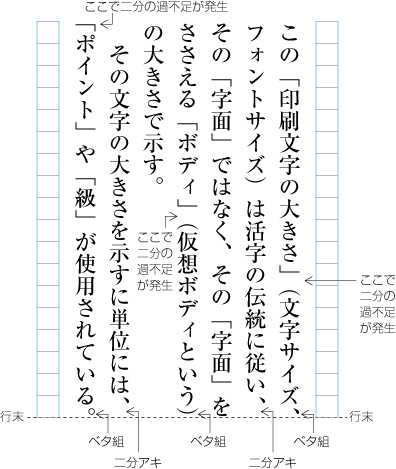
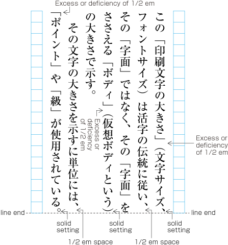
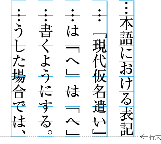
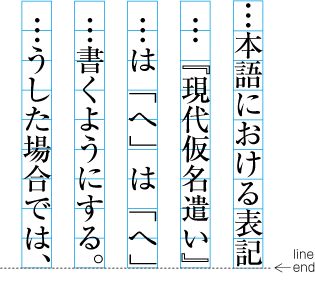
次のような文字・記号が連続する場合は,その字間で2行に分割しない(分割禁止).これは,それらの文字・記号を一体として扱いたいためである.
If the following characters and symbols appear in sequence there will be no line break inbetween them (so called BUNKATSUKINSHI). The reason is that these characters and symbols are to be handled as one unit.
|
注1) (note 1) |
行頭禁則又は行末禁則も,前の文字・記号と行頭禁則文字との字間で2行に分割しない(分割禁止),行末禁則文字と次にくる文字・記号との字間で2行に分割しない(分割禁止),と考えることができる. Both line head wrap and line end wrap mean that there will be no line break between characters or symbols. For line head wrap there is no break (BUNKATSUKINSHI) between the line head wrap character and the character or symbol before. For line end wrap, there is no break (BUNKATSUKINSHI) between the line end wrap character and the following character or symbol. |
|
注2) (note 2) |
-
連続する全角ダッシュ[—] (EM DASH)と全角ダッシュ[—] (EM DASH)との間(具体的には2倍ダッシュ,――)(図2-24参照).
Between [—] (EM DASH) in sequence (to be more specific, a double dash, see dummy).
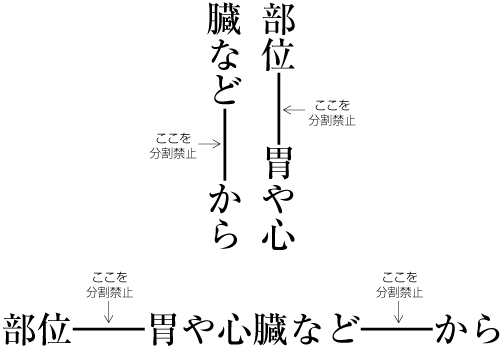 全角ダッシュ[—] (EM DASH)と全角ダッシュ[—] (EM DASH)との間は分割禁止
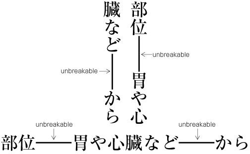 A sequence of EM DASH is unbreakable
注1)
(note 1)
全角ダッシュ[—] (EM DASH)の前後にくる他の文字との字間はベタ組にする.ただし,全角ダッシュ<span class="character">[—] (EM DASH)</span>の前後に次の文字が配置される場合は,アキを確保する.後述する<span class="character">[…] (HORIZONTAL ELLIPSIS)</span>,<span class="character">[‥] (TWO DOT LEADER)</span>,<a class="characterClass" href="#cl-12-ja">前置省略記号(cl-12)</a>,又は<a class="characterClass" href="#cl-13-ja">後置省略記号(cl-13)</a>と,その前後に位置した文字との字間も,全角ダッシュ<span class="character">[—] (EM DASH)</span>の場合と同様である.
Other characters and punctuation marks before and after[—] (EM DASH) are in solid setting. However, in following cases, some space should be set between[—] (EM DASH) and other characters. As mentioned in next note, […] (HORIZONTAL ELLIPSIS) and [‥] (TWO DOT LEADER), prefixed abbreviations(cl-12) and postfixed abbreviations(cl-13) behave similar to [—] (EM DASH).
-
全角ダッシュ[—] (EM DASH)の前に終わり括弧類(cl-02)又は読点類(cl-07)がくる場合は,それらの字間は原則として二分アキとし,句点類(cl-06)がくる場合は,その字間は二分アキとする.
In case closing brackets(cl-02) or commas(cl-07) are followed by[—] (EM DASH), 1/2 em space is inserted between them, in principle.
-
全角ダッシュ[—] (EM DASH)の後ろに始め括弧類(cl-01)がくる場合は,その字間は原則として二分アキとする.
In case [—] (EM DASH) is followed by opening brackets(cl-01), 1/2 em space is inserted between them, in principle.
-
全角ダッシュ[—] (EM DASH)の前又は後ろに中点類(cl-05)がくる場合は,その字間は原則として四分アキとする.
In case [—] (EM DASH) and middle dots(cl-05) are set side by side, 1/4 em space is inserted between them, in principle.
注2)
(note 2)
2倍ダッシュは,それを一体にして扱うということから分割禁止としていた.また,活字組版において2倍ダッシュは,2倍角のボディで作成されており,分割できないということから,その禁止の度合いが高かった.しかし,どうしても止むを得ないという場合は,全角ダッシュにして,2行に分割することも許容されていた.
A double dash is handled as one unit, hence line break is forbidden. Also, in letterpress printing, breaking of the double dash was forbidden very strongly, since the double dash was created as a double full body, so it was actually not possible to break it. Nevertheless, if it was not possible to avoid it, two EM DASH were used instead the double dash. That made it possible to have a line break between them.
-
-
連続する3点リーダ[…] (HORIZONTAL ELLIPSIS)又は2点リーダ[‥] (TWO DOT LEADER)の字間(具体的には2倍3点リーダ[……] 又は2倍2点リーダ[‥‥]).
Between […] (HORIZONTAL ELLIPSIS) or [‥] (TWO DOT LEADER) (to be more specific, double HORIZONTAL ELLIPSIS[ ……] or double TWO DOT LEADER[‥‥]).
 3点リーダ[…] (HORIZONTAL ELLIPSIS)と3点リーダ[…] (HORIZONTAL ELLIPSIS)との間は分割禁止
 Unbreakable in a sequence of […] (HORIZONTAL ELLIPSIS) or [‥] (TWO DOT LEADER)
注1)
(note 1)
活字組版において2倍3点リーダなどは,全角の3点リーダを並べていたので,その禁止の度合いは,2倍ダッシュより幾分かは低かった.
In the letterpress printing era, double HORIZONTAL ELLIPSIS etc. were created as a sequence of HORIZONTAL ELLIPSIS. Hence, compared to double dash, the line break between them was not so strongly forbidden.
-
前置省略記号(cl-12)([¥] (YEN SIGN),[$] (DOLLAR SIGN)[¢] (CENT SIGN)¢など)とその後ろにくるアラビア数字・漢数字との間(図2-26参照).それらの文字列を一体として扱いたいためである.
Between an prefixed abbreviations(cl-12) ([¥] (YEN SIGN),[$] (DOLLAR SIGN),[¢] (CENT SIGN) etc.) and the following arabic or ideographic numeral (See dummy). The reason is that such character sequences are to be handled as one unit.
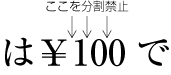 前置省略記号(cl-12)とアラビア数字の間は分割禁止
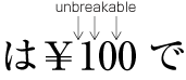 BUNKATSUKINSHI between prefixed abbreviations(cl-12) and the following Western-Arabic numeral
-
後置省略記号(cl-13)([%] (PERCENT SIGN),[‰] (PER MILLE SIGN)など)とその前にくるアラビア数字・漢数字との間(図2-27参照).それらの文字列を一体として扱いたいためである.
Between a postfixed abbreviations(cl-13) ([%] (PERCENT SIGN), [‰] (PER MILLE SIGN) etc.) and the preceding Western-Arabic numeral or ideographic numeral (See dummy). The reason is that such character sequences are to be handled as one unit.
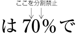 アラビア数字と後置省略記号(cl-13)の間は分割禁止
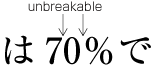 BUNKATSUKINSHI between postfixed abbreviations(cl-13) and the preceding Western-Arabic numeral
注1)
(note 1)
パーセント記号[%] (PERCENT SIGN)については,その前にくるアラビア数字・漢数字との間で分割を認める考え方もある.パーセント記号[%] (PERCENT SIGN)が記号として独立性が高いということからであろう.なお,“50パーセント”とした場合は,“0”と“パ”の間では,分割可である.
Some people think that it is appropriate to have a line break between the [%] (PERCENT SIGN) and the preceding arabic or ideographic numeral. The reason seems to be that [%] (PERCENT SIGN) has a high level of independency. Furthermore it is possible to have a line break between "0" and "パ" in cases like "50パーセント" (meaning "50 percent", where "percent" is written with KATAKANA).
-
連続するアラビア数字の字間(図2-26,図2-27,図2-28参照).アラビア数字は,位置で桁を示すことによる.
Between Western-Arabic numerals (See dummy, dummy, and dummy.). Western-Arabic numerals indicate ranks via the position of a numeral.
注1)
(note 1)
連続する漢数字の字間では分割可である(位取りを示す読点,概数を示す読点,小数点を示す中点の後ろでも分割は可である).漢数字は,“二百三十五”のように単位語を入れて表記するのが本来的な使い方であり,その位置で位を示す必要がないからである.これに対し,アラビア数字は,その数字の位置で位を示す必要があるので,原則として分割は不可である.なお,縦組でアラビア数字を正しい向きで1字1字並べた場合は,アラビア数字の漢数字的な使い方ということで,このアラビア数字の字間でも分割可である.
It is possible to have a line break between ideographic numerals. Also it is possible to have a line break after [、] (IDEOGRAPHIC COMMA) as a decimal separator or an indicator for approximate number, and [・] (KATAKANA MIDDLE DOT) as a decimal point. The reason is that the natural usage of ideographic numerals is to write them like "二百三十五", that is with inserted rank indicators (An example: "二" means "two", "百" means "hundred". "二百" means "two hundred". "三" means "three", "十" means "ten". "三十" means "thirty"."五" means "five". The complete sequence "二百三十五" means "Two hundred thirty five".). Hence, it is not necessary to express ranks via positions. In contrast, line break is forbidden for Western-Arabic numerals, since it is necessary to express the rank via the position. Furthermore, if in vertical writing mode Western-Arabic numerals are placed in appropriate direction side by side, they are used like the ideographic numerals, and it is possible to have a line break inbetween them.
注2)
(note 2)
アラビア数字の表記では,小数点に[.] (FULL STOP),位取りに[,] (COMMA)又は空白を使用する.これらも含めて分割禁止である,(図2-28参照,図2-28の“4”の前の空白は,位取りを示す空白である).
When writing Western-Arabic numerals, [.] (FULL STOP) is used as a decimal point, [,] (COMMA) or space is used as a rank indicator. Before and after these characters are inseparable (See dummy: the space before "4" expresses a rank.).
-
欧文用文字(cl-27)の単語のハイフネーション可能な箇所以外の字間及び単位記号(km, kg, mmなど)の字間(図2-28参照).
Inter-letter space among Western characters(cl-27) in a word (or, sequence of letters, which are not able to hyphenate), or unit indicators (km, kg, mm etc.) in Latin letters (See dummy).
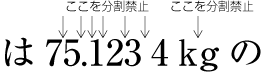 欧字の単位記号(単位記号中の文字(cl-25))の字間は分割禁止
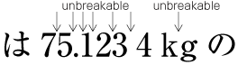 It is not able to line break between letters in unit symboles(cl-25) in Latin letters
注1)
(note 1)
欧文用文字(cl-27)の単語は,文節に従い,行末にハイフン[‐] (HYPHEN)を付けることで,分割が可能になる.
Using [‐] (HYPHEN) at the end of a line, it becomes possible to have a line break within Western characters(cl-27).
注2)
(note 2)
このドキュメントでは,プロポーショナルな欧字を用いたkm,kgなどの単位記号の文字クラスは,単位記号中の文字(cl-25)として扱う.
In this document, description of units with proportional Western characters, such as km and kg, are treated as unit symboles(cl-25).
注3)
(note 3)
図2-28の“4“と”k”の字間が四分アキとなっているのは,単位記号中の文字(cl-25)とその前に配置するアラビア数字又は量を示す欧文用文字(cl-27)との字間を四分アキとすることが慣習になっていることによる.なお,この“4”と“k”との字間で2行に分割することは可能である.その場合の四分アキは,行頭及び行末にはとらない.
In fig.2-28, there is a 1/4 em space between "4" and "k", because of the convention to insert 1/4 em between unit symboles(cl-25) and following Arabic numerals or Western characters(cl-27). It is permited to line break between "4" and "k". In this case, there are no 1/4 em space in neither the head nor bottom or lines.
-
モノルビで配置したルビ文字列の字間(図2-29参照).一体として扱うためである.なお,モノルビが付いた親文字とモノルビが付いた親文字との字間は,分割可能である.
Inter-letter space among ruby letters, composed as mono-ruby to handle mono-ruby as one object. Note that it is breakable between base characters with mono-ruby.
-
グループルビで配置した親文字列及びルビ文字列の字間(図2-29).一体として扱うためである.
Inter-letter space among ruby letters or base characters, composed as group-ruby to handle group-ruby as one object.
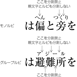 ルビ文字列の分割禁止の例
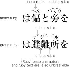 Example of unbreakable cases of ruby sequence
注1)
(note 1)
複数の親文字で構成される熟語ルビは,親文字の1字ごとに対応したルビ文字とのグループの間では,分割してよい(図2-30参照). ただし,親文字の1字ごとに対応したルビ文字(図2-30を例にすると“哺”とルビ文字の“ほ”,“乳”とルビ文字の“乳”,“類”とルビ文字の“るい”)は一体として扱い,それぞれのルビ文字列の字間及び親文字は分割してはならない.
With ruby used for compound words (jukugo-ruby), a group of ruby characters is attached to each base character. It is possible to have a line break between such groups of ruby letters and base characters (See dummy). However, each group of ruby letters and base character should not be line breaked within the group to handle them as one object.
-
親文字とその前又は後ろに付く添え字との字間.添え字が付く親文字の文字列,及び添え字の文字列の字間(図2-31参照).それらの文字列を一体として扱いたいためである.
Between sub- and superscript before or after the base character (See dummy). Inter-letter gap among base characters with ornament characters or inter-letter gap among the ornament itself. The reason is that these character sequences are to be handled as one object.
-
注と本文との対応をつけるために合印が付くことが多い.この合印の前及び合い印の文字列の字間(図2-32参照).これは体裁上の問題による.
In order to create a correspondence between notes and the related main text, often an reference marks (aijirushi) is being added. It is unbreakable before the reference mark and among letters of the reference mark itself. (See dummy). The application of unbreakable rule here is a matter of style.
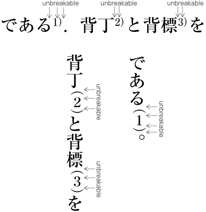 BUNKATSUKINSHI before an AIJIRUSHI (reference marks, Western-Arabic numerals or ideographic numerals)
注1)
(note 1)
このドキュメントでは,合印の文字列の文字クラスは,合印中の文字(cl-20)として扱う.
In this document, characters in reference marks are treated as characters followed by reference marks(cl-20).
注2)
(note 2)
合印の後ろには句点類(cl-06)がくる場合は多い.この場合は,合印と句点類の間でも,句点類は行頭禁止であるから分割禁止となる(図2-32参照).
Often there are full stops(cl-06) after reference marks. In these cases, it is also unbreakable between the reference marks and the full stops. The reason is that full stops shall not be set at the head of lines (See dummy).
-
割注行を囲む割注始め括弧類(cl-28)の後ろ,割注行を囲む割注終わり括弧類(cl-29)の前.
After warichu opening brackets(cl-28), which open warichu, or before warichu closing brackets(cl-29), wich close warichu.
-
同一の振り分け.同一の振り分けは,一体として扱う.
A unit of furiwake. A unit of furiwake is handled as one object.
注1)
(note 1)
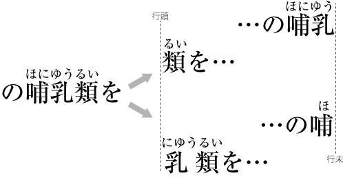
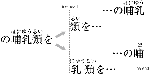
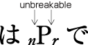
行の調整処理の際に,字間を空けて処理する場合,次の字間にはアキを入れることは避ける(分離禁止ともいう).これは,それらの文字・記号を一体として扱いたいためである.
For line adaptation processing, it is not allowed to put spaces between the following characters (This prohibition is called BUNRIKINSHI.). The reason is that these characters or symbols should appear as one unit.
|
注1) (note 1) |
行の調整処理の際に,ベタ組の字間を空けて処理できる主な箇所は,平仮名(cl-15),片仮名(cl-16),漢字等(cl-19)相互の字間ということができる.なお,空けて調整する場合は,欧文単語間の空き量なども対象になる. The main places where for line adaptation processing solid setting may be dropped are the space among hiraganas(cl-15), katakanas(cl-16), ideographic characters(cl-19). Furthermore, for example the amount of space between words in Western text is also the target of space adaptation. |
-
“2.1.10 分割禁止”で掲げた字間は,すべて行の調整処理で字間を空ける箇所としては避ける.
There must be no space between all characters described in Unbreakable Character Sequence.
注1)
(note 1)
規定された調整処理では処理できない場合に限り,欧字の単語の字間を空けることを許容する考え方もある.
Some people think that only for cases without the possibility of regular line adaptation processing, it is permissive to increase space between letters in Western words.
-
上記以外では,次も行の調整処理で字間を空ける箇所としては避ける.
In addition to the cases mentioned above, the following cases also require BUNRIKINSHI.
-
始め括弧類(cl-01)及び終わり括弧類(cl-02)の前及び後ろ.
Before or after opening brackets(cl-01) or closing brackets(cl-02).
注1)
(note 1)
始め括弧類(cl-01)の後ろ及び終わり括弧類(cl-02)の前は,分割禁止であり,かつ行の調整処理で字間を空ける処理を避ける箇所である.これに対し,始め括弧類の前及び終わり括弧類の後ろは,分割禁止ではないが,行の調整処理で字間を空ける処理を避ける箇所である.句点類(cl-06),読点類(cl-07)についても,終わり括弧類と同じように考えることができる.
After opening brackets(cl-01) or before closing brackets(cl-02) there is always BUNRIKINSHI. In contrast, before opening brackets or after closing brackets there is no BUNRIKINSHI. full stops(cl-06) and commas(cl-07) are handled the same as the closing brackets.
-
句点類(cl-06),読点類(cl-07)の前及び後ろ.
Before or after full stops(cl-06), commas(cl-07).
-
中点類(cl-05)の前及び後ろ.
Before or after middle dots(cl-05).
-
区切り約物(cl-04)の前及び後ろ.
Before or after dividing punctuation marks(cl-04).
-
ハイフン類(cl-03)の前及び後ろ.
Before or after hyphens(cl-03).
-
熟語ルビが付いた親文字列の字間
Among base characters with jukugo-ruby.
注1)
(note 1)
-
行の調整処理の処理方法については,別項で解説するが,行の調整処理が必要になる要因の1つに約物の組版処理が関係することから,ここでは行の調整処理が必要となる主な2つの例とその調整例について解説する(図2-33参照).
Methods for line adjustment processing are discussed in different sections of this document. However, since layout processing of punctuation marks is one reason for the need for line adjustment processing, here we will introduce two main examples where line adjustment processing is necessary, and shows adjustment examples (see ① at dummy).
-
日本語組版では,段落の最終行を除き,行長を揃えるのが原則である.行長は,前述したように文字サイズの整数倍に設定するので,全角文字を並べていく限りでは,行長は揃うことになる(図2-33の①参照).
The principal approach in Japanese composition is that with the exception of the last line of a paragraph, the length of all lines is aligned. As explained before, the line length is set to be n-times of the character size. Hence, as long as full width characters are used, all lines have the same length (See dummy).
-
図2-33の②では,読点[、] (IDEOGRAPHIC COMMA)とかぎ括弧[「] (LEFT CORNER BRACKET)が連続し,この2つの約物全体の字幅及び空きの合計は1.5倍となり,行長で二分の過不足が発生する.そこで,図2-33の③のようにかぎ括弧の前の二分アキ及び後ろの二分アキを四分アキに詰める処理(追込み処理という)が可能なので,ここで二分の過不足の調整を行い,行長を揃える.
In dummy at ②, there is a [、] (IDEOGRAPHIC COMMA) followed by a [「] (LEFT CORNER BRACKET), and the complete space taken by the two characters is 1.5 em. That means that in that line, 1/2 em space is missing. To achieve a uniform line lenght, in this case line adjustment processing is applied like shown at ③ in dummy: the missing 1/2 em space can be gained since it is possible to apply line adjustment by inter-character space reduction, that means to adjust 1/2 em space before and after the LEFT CORNER BRACKETto 1/4 em space.
-
図2-33の④では,15字目に始め括弧類(cl-01)がくるので,この配置を回避する調整が必要になる.その行で全角の詰める処理が可能であれば,その処理を行い,2行目の“前”の文字を1行目の15字目に配置し,問題を回避できる.しかし,この例では全角の詰める処理が不可能なので,図2-33の⑤のように始め括弧類を2行目に移動し,1行目の字間を空ける調整が可能な箇所で空ける処理(追出し処理という)を行い,1行目の行長を揃える処理を行う.
At ④ in dummy, the 15th character is opening brackets(cl-01). This makes it necessary to avoid the position at the line end. If possible, full width space reduction would be applied, and the character "前" in the second line would be moved in the first line into the 15th position. In that way, the problem could be avoided. However, in this example a full width space reduction is not possible, so line adjustment processing as shown at ⑤ in dummy is applied: The opening brackets(cl-01) is moved to the second line, and line adjustment by inter-character space expansion is applied. That means that space is inserted in the first line at places where possible.
 行の調整を行った例
 Examples of line adjustment
和欧文混植処理(縦中横処理を含む)
Japanese and Western Mixed Text Composition (including Horizontal-in-Vertical Text Composition)
和文の中にラテン文字やギリシャ文字などの欧字・欧文を混植(和欧文混植)する例は多い.次のような例がある.
There are a lot of examples of Japanese text, in which Western and/or Greek letters are mixed among Japanese letters. Examples are as follows:
-
AとBといったように欧字1字を記号として使用する.
Use one Latin letter as a symbol for something, like "A" and "B".
-
editorのように欧字の単語をそのまま使用する.
Use a Western word in Japanese context, like "editor".
-
GDPやDTPなどの組織名や事項に関する頭字語として使用する.
Use acronyms of things and organization names, like "DTP" and "GDP"
-
欧文の文献表示などで著者名や書名などを原本通り表記する.
Write Western book titles and authors in lists of referred books with original spelling.
箇条書きや見出しの頭に付く番号,さらに,単位記号・元素記号・数学記号等でも欧字は使用されており,日本語組版にとっては,和欧文混植は,ごく一般的な事例になっている.
Latin letters are also used in Itemization and headings for count up, besides symbols for unit, symbols for chemical element, mathematical symbols. As can be judged from these examples, mixture of Latin letters among Japanese letters is daily used in Japanese composition.
|
注1) note 1) |
和文中に欧文の1つ又は複数の段落をそのまま引用する例はあるが,一般の本では,そのような例は少ない.しかし,外国語の学習書では,1つ又は複数の段落を表示し,それに対する解説を和文で行うという例は多い.その他,専門書,専門雑誌などでも欧文の1つ又は複数の段落をそのまま掲げる例がある. There are some examples which include whole Western paragraphs in Japanese documents. However, there are few ordinary books, which include whole Western paragraphs in Japanese documents. There are a lot of examples of textbooks for foreign language, in which one or more Western paragraphs followed by annotations in Japanese language. Also, there are some examples in treatises and journals, which contain whole Western paragraphs. |
|
注2) note 2) |
縦組の単位記号は,例えばセンチメートル(又はセンチ)のように片仮名を用いて表す方法が一般に採用されているが,横組では,国際単位系(SI)の表記に従い,cmのような表記を採用している例が多い. In Vertical Settings, symbols for units are usually described with katakanas(cl-16) , such as センチメートル(centimeter) or センチ(abbreviation of centimeter in katakana "senchi"). In Horizontal Settings, the International System of Units(SI) is usually used, such as "cm". |
|
注3) note 3) |
和欧文混植処理については,JIS X 4051では“4.7 和欧文混植処理”に規定されている. The treatment of mixture of Japanese Characters and Western Characters are also described in JIS X 4051 4.7. |
横組では,原則としてプロポーショナルな欧字を用いる(dummygenerated参照).また,アラビア数字は,半角のアラビア数字又はプロポーショナルなアラビア数字を用いる.
In Horizontal Settings, basically proportional Western Fonts are used. (dummygenerated). As for Western-Arabic Numerals, both half width fonts and proportional fonts are used.
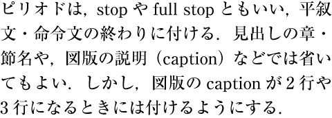 横組にプロポーショナルな欧字を用いた例
 Example of Proportional Western fonts used in Horizontal Japanese Setting
 全角のモノスペースの欧字を用いた例(横組ではこのような文字は使用しない)
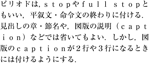 Example of Western Full Width Mono-space fonts used in Horizontal Japanese Setting. (In Horizontal Setting, Western Full Width
monospace fonts are usually not recommended.)
Example of Western Full Width Mono-space fonts used in Horizontal Japanese Setting. (In Horizontal Setting, Western Full Width
monospace fonts are usually not recommended.)
|
注1) note 1) |
dummygeneratedのように,全角のモノスペースの欧字を用いた印刷物も目にするが,体裁がよくないので,このような文字は使用しない. As shown in dummygenerated, there are some examples of Western Full Width Mono-space fonts used in Horizontal Japanese typesetting, these usage are not recommended, because of cosmetic reason. |
|
注2) note 2) |
横組の混植で使用するアラビア数字は,和文書体と調和のとれたアラビア数字を用いるが,行長の調整を考慮すると半角の字幅としたアラビア数字を用いるのが望ましい.和文書体に付属しているアラビア数字では,半角の字幅にしている例がある. Usually, in Horizontal Japanese Settings, Western-Arabic Numerals fonts, which are easy to balance and harmonize with Japanese fonts, are used. Considering line adjustment, it is recommended to use monospacehalf width Western-Arabic Numerals fonts. There are some cases of Japanese font with half width monospace Western-Arabic Numerals. |
|
注3) note 3) |
和文との混植に使用する欧字・アラビア数字の書体は,和文書体にセットされている文字(例えばdummygeneratedのようにリュウーミンR-KLのプロポーショナルな欧字・アラビア数字)を使用する方法と,欧文専用の書体を和文書体と組み合わせて使用する方法がある(例えばdummygeneratedのように和文はリュウーミンR-KL,欧字・アラビア数字はTimes New Roman). There are two choises for those glyphs of Latin letters and numerals used in Japanese and Western mixed text compositons. One way is to use those glyphs for Western characters built into the same Japanese font. The other is to combine an independent Western font for Western characters and the Japanese font for Japanese characters. (Example: dummy is composed using proportional glyphs of Latin letters and numerals included in Ryumin R-KL. dummygenerated is composed with Ryumin R-KL for Japanese characters and Times New Roman for Latin letters and numerals.)
|

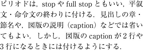
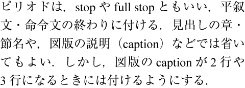

縦組では,第1章で解説したように,欧字及びアラビア数字を配置する方法としては,次の3つの方法がある.
As explained in the Chapter 1, there are three different styles to set Latin letters and Western-Arabic numerals in Vertical Settings:
-
和文文字と同じように正常な向きで,1字1字配置する(図追2-TBD参照).文中に配置する欧字又はアラビア数字が1字の場合は,この方法で配置する.この場合,欧字及びアラビア数字は,一般に全角のモノスペースの文字を用いる.
Set Latin letters and/or Western-Arabic numerals one by one in inline direction with Japanese characters (See dummy). This style is adopted typically when composing a single Latin letter or Western-Arabic numeral between the adjacent Japanese letters. Full width monospace glyphs are specified for those Latin letters and Western-Arabic numerals in this style.
 正常な向きで配置した欧字の例
 Example of Latin letters in normal orientation
-
文字を時計回りに90度回転し,配置する(dummygenerated参照).文中に配置する欧字が一般の単語又は文の場合は,この方法で配置する.この場合,横組と同様にプロポーショナルな文字(又はアラビア数字は半角の文字)を用いる.
Set Latin letters and/or Western-Arabic numerals rotated 90 degrees clockwise in Vertical Settings. (dummygenerated). This style is adopted usually when Latin letters compose a word or sentences. Proportional fonts are specified for those characters in this style as in HorizontalSettings (or half width monospace fonts for Western-Arabic numerals).
 文字を時計回りに90度回転し配置した欧字の例
 Example of Latin letters rotated 90 degrees clockwise
-
縦中横(正常な向きのまま,横組にする)にして配置する(dummygenerated参照).2桁のアラビア数字,行の幅とほぼ同じ程度かやや行の幅よりはみ出す程度の記号として用いる2文字程度の欧字の文字列では,一般に縦中横にする(後者の2文字程度の欧字の文字列は,文字を時計回りに90度回転し,配置する方法もある).この場合,プロポーショナルな文字(又はアラビア数字は半角の文字)を用いる.
Set Latin letters and/or Western-Arabic numerals in TATECHUYOKO (Horizontal-in-Vertical Settings, see dummygenerated). TATECHUYOKO layout is adopted usually when composing a two-digit number in Western-Arabic numerals, or a combination of two or three Latin letters, the length of which is equal to the default size of the line in pragraph direction or longer than that just to an acceptable extent (A combination of two or three Latin letters may be rotated 90 degrees clockwise rather than set it in TATECHUYOKO layout). Proportional glyphs (or half width monospace glyphs for Western-Arabic numerals) are used for those characters in TATECHUYOKO layout.
注1)
note 1)
頭字語(例えばGNPなど)又は頭字語類似の単語(例えばWeb)では,一般には1字1字を正常な向きで配置する(dummygenerated参照).ただし,文字を時計回りに90度回転し,配置する例もある(図追2-TBD参照).
Acronyms, such as "GNP", and abbreviations like "Web", are usually set one by one character-wise in normall orientation (See dummygenerated). However, there are some cases where acronyms and abbreviations are rotated 90 degrees clockwise (See dummygenerated).
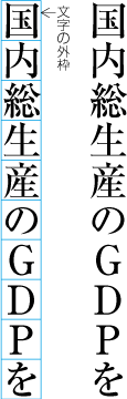 正常な向きで配置した頭字語の例
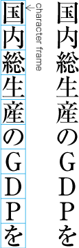 Example of acronyms set one by one in normal orientation
 文字を時計回りに90度回転し配置した頭字語の例
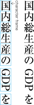 Example of acronyms rotated 90 degrees clockwise
注2)
note 2)
縦組における数字は,従来はアラビア数字を使用しないで,漢数字を使用するのが原則とされていた(縦組においては,道路番号,自動車番号など限られた場合にしかアラビア数字は使用されていなかった).しかし,新聞を始めとして縦組中でアラビア数字を使用する例が増えていることから,縦中横の利用が増大している.
The ideographic numerals were traditionally used in VerticalSettings instead of Western-Arabic numerals (The Road numbers and Car numbers were few examples of exceptions). However, the more newspapers and other publications have been adopting Western-Arabic numerals in vertical writing mode, the more the use of TATECHUYOKO layout for Western-Arabic numerals has also been increasing.
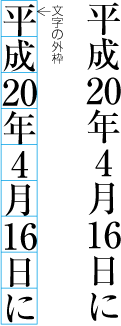
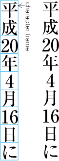
全角のモノスペースの欧字及び全角のモノスペースのアラビア数字の配置法
Setting Method for Full Width Mono-space Latin Letters and Western-Arabic Numerals
縦組で全角のモノスペースの欧字及び全角のモノスペースのアラビア数字を正常な向きで1字1字配置する場合は,一般の漢字と同様に前後に配置する平仮名(cl-15),片仮名(cl-16)又は漢字等(cl-19)との字間をベタ組にして配置する(図2-2-8参照).また,句点類(cl-06),読点類(cl-07)若しくは終わり括弧類(cl-02)の後ろ,又は始め括弧類(cl-01)の前に全角のモノスペースの欧字又は全角のモノスペースのアラビア数字がくる場合は,読点類(cl-07)若しくは終わり括弧類(cl-02)の後ろ,又は始め括弧類(cl-01)の前は,原則として二分アキとし,句点類(cl-06)の後ろは二分アキとする.句点類(cl-06),読点類(cl-07),若しくは終わり括弧類(cl-02)の前,又は始め括弧類(cl-01)の後ろに全角のモノスペースの欧字又は全角のモノスペースのアラビア数字がくる場合は,句点類(cl-06),読点類(cl-07)若しくは終わり括弧類(cl-02)の前,又は始め括弧類(cl-01)の後ろをベタ組とする.
When full-width and fixed-width Western characters or Arabic numerals are set in vertical writing mode as "quasi" Japanese character, inter-letter spaces between these characters and hiraganas(cl-15), katakanas(cl-16) or ideographic characters(cl-19) are solid setting ,similar to ordinary ideographic characters(cl-19) (Fig. 2-2-8). Also, when full-wodth and fixed-width Western characters or Arabic numerals are set after full stops(cl-06), commas(cl-07) or closing brackets(cl-02), or, before opening brackets(cl-01), insert 1/2 space after commas(cl-07) or closing brackets(cl-02), or, before opening brackets(cl-01), in principle. In addition, in these cases, insert 1/2 em after full stops(cl-06). When full-width and fixed-width Western characters or Arabic numerals are set before full stops(cl-06), commas(cl-07) or closing brackets(cl-02), or, after opening brackets(cl-01), the inter-letter space before full stops, commas or closing brackets are solid, or, after opening brackets are solid.
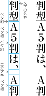 全角のモノスペースの欧字及び全角のモノスペースのアラビア数字の配置例
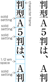 Setting example of Full Width Mono-space Latin Letters and Western-Arabic Numerals
|
注1) note 1) |
このドキュメントでは,全角のモノスペースの欧字及び全角のモノスペースのアラビア数字の文字クラスは,漢字等(cl-19)として扱う. In this document, full-width and fixed-width Western characters and Arabic numerals are treated as members of ideographic characters(cl-19) class. |
|
注2) note 2) |
全角のモノスペースの欧字及び善悪のモノスペースのアラビア数字を含む漢字等(cl-19)の配置方法についての詳細は,“2.9 文字クラスについて”で説明する文字クラスに従い,表の形式にしてAppendix 〓で示す. The details of ideographic characters(cl-19), includeing full-width and fixed-width Western characters and Arabic numerals, are described as a complete table in Appendix tbd, following dummy. |
縦中横に配置する文字列は,横方向(左から右方向)にベタ組で配置し,その文字列全体を行の中央に配置する(dummygenerated参照).なお,縦中横の前後に配置する平仮名(cl-15),片仮名(cl-16)又は漢字等(cl-19)との字間は,ベタ組にする.句点類(cl-06),読点類(cl-07)若しくは終わり括弧類(cl-02)の後ろ,又は始め括弧類の前は,原則として二分アキとし,句点類の後ろは二分アキとする.句点類,読点類若しくは終わり括弧類の前,又は始め括弧類の後ろに縦中横の文字列がくる場合は,その字間はベタ組とする.
Strings, to be set as tatechuyoko (Horizontal-in-Vertical Settings), are firstly set from left to right assolid setting, then set the whole strings align in center of the vertical line.(dummygenerated). When hiraganas(cl-15), katakanas(cl-16) orideographic characters(cl-19) are set before/after tatechuyoko, the inter-letter space is solid. When tatechuyoko is set afterfull stops(cl-06), commas(cl-07) orclosing brackets(cl-02), or, beforeopening brackets(cl-01), 1/2 em is inserted, in principle. In addition, when tatechuyoko is set afterfull stops(cl-06), 1/2 em is inserted. When tatechuyoko is set before full stops, commas or closing brackets, or, after opening brackets, the inter-letter space is solid.
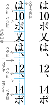 縦中横の配置例
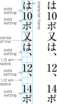 Setting example of tatechuyoko (Horizontal-in-Vertical Text Setting
|
注1) note 1) |
縦組で文字を時計回りに90度回転して配置する欧字・欧文・アラビア数字又は横組で混植する欧字・欧文・アラビア数字の配置法は,次のようにする.
Composition rules of Western characters, Western texts and Arabic numerals, set rotated 90 degrees clockwaise in vertical writing mode, and horizontal writing mode, are as follows:
-
欧文の単語の文字列は,ハイフネーション可能な箇所以外で2行に分割してはならない.
Sequence of Western characters in a Western word should not be line breaked, except hyphenation capable positions.
-
<a class="termref" href="termlist.xml#line adjustment by inter-letter space reduction">追込み処理</a>で字間を詰める場合,その処理対象として欧文間隔(cl-26)を優先的に使用し,追い出し処理で字間を空ける場合も,その処理対象として欧文間隔を優先的に使用する.
When line adjustment is done with inter-letter space reduction mode, Western word spaces(cl-26) are used with first priority. Also, when line adjustment is done with line adjustment by inter-letter space addition mode, Western word spaces are used with first priority.
-
追出し処理の際には,欧文及びアラビア数字の字間は,一般に字間を空ける調整箇所としない.
When line adjustment by inter-letter space addition mode is used, inter-letter spaces within Western words and Arabic numerals are not used to space expansion.
-
欧字・アラビア数字の前後に配置される平仮名(cl-15),片仮名(cl-16)又は漢字等(cl-19)との字間は,四分アキとする(図2-2-10参照).(この四分アキを行末の調整に使用するかどうかについては“2.8.2 詰める処理の優先順位”及び“2.8.4 空ける処理の優先順位”を参照).
Inter-letter space, between hiraganas(cl-15), katakanas(cl-16) or ideographic characters(cl-19), and, Western characters or Arabic numerals, is 1/4 em dummy. The issue, whether the 1/4 em space can be used for line end adjustment or not, is discussed in dummy and dummy.
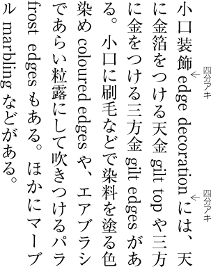 平仮名(cl-15),片仮名(cl-16)又は漢字等(cl-19)と欧字・アラビア数字の字間を四分アキとした例
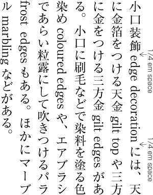 Example of 1/4 EM inter-letter space between hiraganas(cl-15), katakanas(cl-16) and ideographic characters(cl-19), and Latin Characters
|
注1) note 1) |
このドキュメントでは,プロポーショナルな欧字・アラビア数字の文字クラスは,欧文用文字(cl-27)として扱う.また,和文との混植用に設計された半角のアラビア数字がある.このアラビア数字の文字クラスは,このドキュメントでは連数字中の文字(cl-24)として扱う. In this document, proportional Western characters and Arabic numerals are treated as members of Western characters(cl-27) class. Note that half- and fixed-width Arabic numerals, designed to use in mixture with Japanese text, are treated as members of grouped numerals(cl-24). |
|
注21) note 2) |
欧字・アラビア数字との字間を四分アキにするのは,プロポーショナルな欧字・アラビア数字と和文では,文字設計の考え方に相違があり,欧字・アラビア数字と和文との字間をベタ組にすると(dummygenerated参照),字間が詰まりすぎになるからである. The reason why there need 1/4 EM inter-letter space is that the design concept of Latin fonts and Japanese fonts are different each other, so it looks too tight without the spaces.(dummygenerated)
|
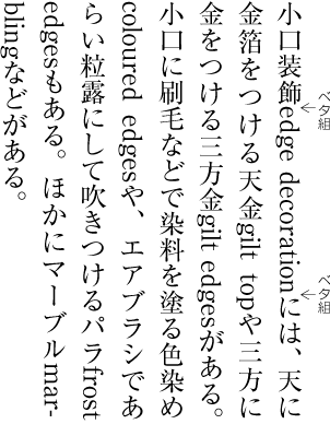
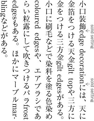
ただし,次の箇所では,四分アキとしない(dummygenerated参照).
However, in following cases, there are no 1//4 EM spaces (dummygenerated).
-
句点類(cl-06),読点類(cl-07)若しくは終わり括弧類(cl-02)の後ろ,又は始め括弧類(cl-01)の前を原則として二分アキとし,句点類(cl-06)の後ろは二分アキとする.
In the case that Latin characters and Arabic numerals are following full stops(cl-06), commas(cl-07) or closing brackets(cl-02), in principle, 1/2 em space is inserted. In the case that Latin characters and Arabic numerals are following full stops(cl-06), 1/2 em space is inserted.
-
句点類(cl-06),読点類(cl-07)若しくは終わり括弧類(cl-02)の前,又は始め括弧類(cl-01)の後ろに欧字・アラビア数字がくる場合は,その字間はベタ組とする.
In the case that Latin characters and Arabic numerals are set before full stops(cl-06), commas(cl-07) or closing brackets(cl-02), or, after opening brackets(cl-01), the inter-letter space is solid.
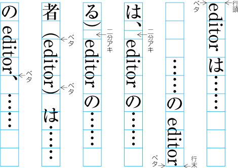
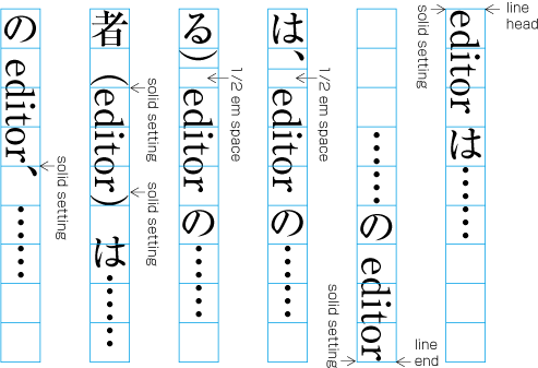
ルビとは,文字のそば(縦組では一般に右側,横組では一般に上側)に付けて文字の読み方,意味などを示す小さな文字のことである(dummygenerated参照).ルビを付ける場合,その対象となる文字のことを親文字という.ルビとしては,漢字の読みを示す仮名を付けることが多く,“振り仮名”ともよばれている.
Ruby is a small size supplementary text attached to a character or a group of characters in the main text. A run of ruby text, usually attached to the right of the characters in VerticalSettings or immediately above them in Horizontal Settings, indicates the reading or the meaning of them (See dummygenerated). Those characters in the main text, annotated by ruby, are called "base characters". KANA characters are often used for ruby to indicate readings of KANJI characters, which are also referred to as "FURIGANA".
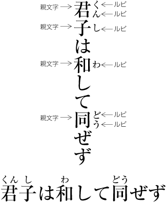
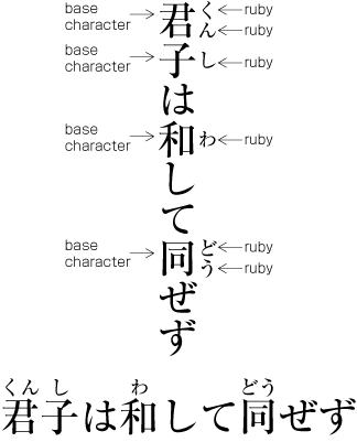
|
注1) note 1) |
ルビの使用は,漢字表記の考え方や組版におけるルビ処理方法などに影響され,変化している.特に,日本における漢字表記の基準とされてきた“当用漢字表”(1946年11月16日,内閣訓令・告示)の“使用上の注意”において,“ふりがなは,原則として使わない”とあったことから,以前はルビの使用は少なかった.しかし,“当用漢字表”を改正した“常用漢字表”(1981年10月1日,内閣訓令・告示)では,表そのものの考え方が変化した(“当用漢字表”は一般社会で使用する漢字の範囲を示したもの,“常用漢字表”は一般の社会生活において現代の国語を書き表す場合の漢字使用の目安を示したもの).例えば,“常用漢字表”の“答申前文”には,“読みにくいと思われるような場合は,必要に応じて振り仮名を用いるような配慮をするのも一つの方法であろう”とある.こうしたことから,今日ではルビの使用が増えている.従来から雑誌や書籍におけるルビ使用は,一般的なことであったが,最近では新聞でもルビを使用するようになっている. The changes of the view of KANJI usage to compose Japanese and the changes of the ruby implementation in the text layout methods have been affecting the usage of ruby itself. The use of ruby was not very popular while "TOYO KANJI HYO" (The list of KANJI characters for everyday use, issued by the Government on November 16, 1946) was put in effect because it discouraged the use of 'FURIGANA' in principle in its 'directions of use' section. "Jouyou Kanji Hyou(常用漢字表)" (The list of kanji characters in common use, issued by the Government to replace "Toyo Kanji Hyou (当用漢字表)" on October 10, 1981) has changed the scope of the list ("Toyo Kanji Hyou" defined the list of all Kanji characters that can be used for any documents, while "Jouyou Kanji Hyou" was designed to be a 'reference guide' for the use of Kanji to compose contemporary Japanese for general use in society.). For example, the preface of "Jouyou Kanji Hyou" states that one may consider the use of 'Furigana (Annotation to indicate pronouciation' when the text appears too difficult to read, which is why the use of ruby has been increasing today. The use of ruby was common in magazines and books, and even newspapers have begun to use ruby these days. |
|
注2) note 2) |
ルビの組版処理は,JIS X 4051おいては第2次規格で規定が追加され,さらに2004年の改正で,熟語に付けるルビ,肩付きルビ,親文字の両側に付けるルビ処理の規定が追加されている(“4.12 ルビ処理”). The specification of the ruby composition was first introduced at the second revision of JIS X 4051, which was further revised in 2004 to add JUKUGO-ruby, KATATSUKI-ruby and the dual ruby composition with which two distinct runs of ruby are attached to the same basic characters ("4.12 Ruby Composition"). |
ルビを付ける目的と役割から分けると,次のようなものがある.こうしたルビ付ける目的,ルビの役割の違いに応じてルビの組版処理にも複数の処理方法が必要になる(処理方法の詳細は後述).
In terms of the purpose of annotation, ruby has several functionarities as described below. Depending on the purpose and/or the function of ruby, there are different ruby composition methods (the details of the composition methods will be provided in the later sections.).
-
漢字の読み方を示す仮名(主に平仮名)のルビを付ける.これには,次の2つがある.
PURPOSE: The ruby annotation with KANA (usually HIRAGANA) characters to provide readings of KANJI characters. There are two types ruby for this purpose depending on the type of base characters:
-
1文字の親文字(漢字)の音読み又は訓読みの読み方を示す1文字の仮名又は複数の仮名のルビを付ける(dummygenerated参照). このように親文字列の1文字ごとに対応させたルビの処理方法をモノルビという.
Add one or more hiraganas(cl-15) or katakanas(cl-16) ruby characters to indicate the reading (Japanese onyomi or kunyomi) for each base ideographic characters(cl-19) character (See dummygenerated). This method, attach one or several hiraganas or katakanaz for each base kanji, is called mono-ruby.
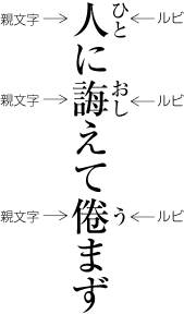 漢字1字の読みを示すルビの例
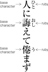 Example of Ruby Annotation for the Reading per KANJI Character
-
日本語表記では,複数の漢字で構成された熟語をよく使う.この熟語を構成する個々の漢字について,音読み又は訓読みの読み方を示す仮名のルビをつける(このようなルビの使用例は多い).このような熟語につけるルビについて,親文字とルビ文字との対応には,2つの方法がある.
In Japanese writing system, there occasionally appear compound words, constructed with a couple of kanjis. When ruby is attached for these compound words, there are two different method to attach ruby letters for base kanji characters.
-
前項と同様に,個々の漢字(親文字)の1文字ごとにそのルビを対応させる方法.つまり,モノルビとしてルビを処理する方法である(図2-3-3参照).
Atattch ruby letters for each base kanji character, similar to previous section. It is called mono-ruby (See dummy).
 熟語の読みを示すルビの例1
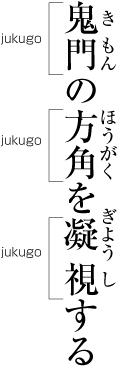 Ex-1 of Ruby in Phrase-wise Layout for Phrasal KANJIs (Editor's note: to be changed with Figure Ex-2?)
注1)
note 1)
図2-3-3において,親文字の“凝”と“視”の字間が四分アキになっている.したがって,この行が段落の途中の行であった場合は,なんらかの行の調整処理が必要になる.
In dummy, there is a 1/4 em space between base characters, "凝" and "視". So, when this line happens to appear in middle of a paragraph, there needs some line adjustment process.
-
個々の漢字の読み方を示すと同時に,熟語単位での配置も考慮して配置する方法(図2-3-4参照).この方法は熟語ルビとよばれている.熟語ルビは,熟語を構成する漢字1文字1文字の読み方を示すとともに,熟語としてのまとまりをもっているので,ルビもまとまりとして読める必要がある.熟語ルビは,熟語としてのまとまりを重視した配置方法といえる.
The method, both incidate pronounciation of each base kanji, and consider the positioning as a phrase, together dummy. This method is called jukugo-ruby. Jukugo-ruby intends to handle Kanji phrase as one object.
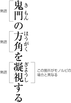 熟語に付くルビを熟語ルビで処理した例
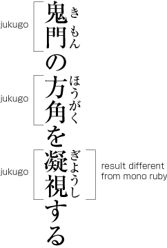 Example of ruby for phrasal Kanjis with jukugo-ruby(Figure Ex-1と入れ替わり?)
注1)
note 1)
モノルビで処理した図2-3-3と熟語ルビで処理した図2-3-4では,熟語を構成する個々の漢字に付くルビ文字が全て2字以下の場合は,その配置位置の関係は同じになる.しかし,モノルビでルビをつけた場合には,ルビ付きの親文字間を行の調整処理で時間を空ける処理の対象としている(図_2-3-3でいえば,“鬼”と“門”の字間,“方”と“角”との字間).これに対し,熟語ルビでルビを付けた場合には,ルビ付きの親文字間を行の調整処理で時間を空ける処理の対象としない,という違いがある.
There is no difference between dummy of mono-ruby and dummy of jukugo-ruby, in condition that number of ruby letters for each base kanji character are one or two. When mono-ruby method is adapted, the inter-letter space between base kanji characters can be expanded for line adjustment(In fig.2-3-3, inter-letter space between "鬼" and "門", or, "方" and "角" can be expanded). When jukugo-ruby method is adate, base kanji characters can not used for line adjustment.
注2)
note 2)
熟語に付けるルビとの対応関係の指示方法について,“凝視”を例に概念として示せば,次のようになろう.
モノルビの例:凝+(ぎよう) 視+(し)
熟語ルビの例1:「凝+(ぎよう)視+(し)」
熟語ルビの例2:(凝視)+(ぎよう/し)Following examples are the relation among ruby letters and base kanji characters.
Example of mono-ruby:凝+(ぎよう) 視+(し)
Example of jukugo-ruby(1):[凝+(ぎよう) 視+(し)]
Example of jukugo-ruby(2):(凝視)+(ぎよう/し)注3)
note 3)
熟語に付けるルビでは,書籍の場合は,熟語としてのまとまりを重視する配置方法が一般的である.ただし,コンピュータ組版の機械的な処理では,熟語としてのまとまりを重視する配置方法はむずかしく,そのような配置方法としない例も増えている.新聞などでも,熟語としてのまとまりを重視する配置方法にはしていない.なお,学習参考書などでは,個々の漢字の読み方を示すことが重要と考え,従来から個々の漢字の読み方を示すことを重視した配置方法としている.
Books commonly adopt the phrase-wise kana ruby for phrasal kanjis. However, due to technical difficulties to realize phrase-wise ruby in machine-assisted text layout, the adoption of the character-wise kana ruby is increasing. For examples, newspapers do not adopt the phrase-wise ruby, and study aid books generally adopt the character-wise ruby because it is considered more important to show the readings of each kanji character for students than the beauty of the layout.
注4)
note 4)
熟語としてのまとまりを重視する場合,複合語のときは,その複合語全体を熟語1語として考えてルビを対応させる方法と,複合語を構成する熟語単位にルビを対応させる方法がある(dummygenerated参照).氏名の場合も姓名を一体としてルビを対応させる方法と,性と名を別の単位としてルビを対応させる方法がある.いずれにするかは編集方針による.
Multiple phrasal kanjis can form one compound phrase. In this case, there are two ways to attach ruby, i.e. attaching ruby to the compound phrase as a whole, or to each phrase which forms the compound (See dummygenerated). Similarly, a Japanese personal name consists of a given name and a family name, which together form a compound of a full name, and it is an editorial decision either to attach two runs of ruby for each given name and family name or to attach the full ruby text which represents the reading of the full name to the compound.
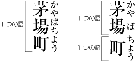 複合語に付けるルビの例
 Examples of Ruby Attachment for a Compound Phrase
注5)
note 5)
熟語は,漢字1文字ごとに音読み又は訓読みするケースが多いが,中には熟語をまとめて訓読みする場合がある(熟字訓という).この場合は,親文字である2文字又は3文字の漢字文字列にルビをまとめて付ければよいので,漢字や仮名の親文字に片仮名語をルビとして付ける場合と同じである(dummygenerated参照).
The reading of a phrasal KANJI is just a concatenation of readings of each KANJI character in most cases, but some phrases have their own native readings (known as JUKUJI readings), which cannot be derived from the readings of each character. Attaching ruby to those phrases which are usually sequences of two or three KANJI characters, is essentially the same as attaching ruby in KATAKANA to principal characters of KANJI and/or KANA (See dummygenerated).
 熟字訓のルビの例
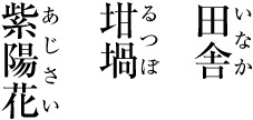 Examples of Ruby for JUKUJI readings
-
-
-
漢字又は仮名の言葉(語)に,ルビとして別な言葉を仮名で示す(読み方を示すのではなく,意味を示すルビを付けるということでもある).漢字又は仮名1字の言葉に別の言葉を対応させる場合(例えば,“市”に“バザール”というルビを付ける)は,漢字1字の読み方を示した場合(例えば,“市”に“いち”というルビを付ける)と同じように考えればよいが,2文字以上の漢字又は仮名の親文字列に仮名のルビを付ける場合は,個々の漢字とルビとの対応は問題とならず,親文字列全体に対してルビを対応させる必要がある.このケースで最も多い例は,親文字である漢字の熟語に対し,それとほぼ同じ意味の外来語である片仮名語をルビとして示す場合である(dummygenerated-2参照).翻訳が増大し,また片仮名語が増えていることから,このようなルビの使用例は多くなっている. このように2文字以上の親文字列全体にまとめて付けるルビは,group-rubyとよばれている.グループルビは,一体として扱い,2行に分割できない(熟語ルビは,親文字列の漢字の字間で2行に分割できる).
PURPOSE: The ruby annotation with KANA characters by attaching another word than the reading for a given word in KANJI and/or KANA. The purpose is to annotate the word by providing its meaning rather than its reading. In terms of the ruby layout, it is essentially the same as attaching the reading to a kanji character (e.g. attaching the reading “いち” in KANA to a KANJI character “市”), in the case of attaching ruby text to a single character in KANJI or KANA (e.g. attaching ruby text “バザール”, 'Bazaar' in KANA to a KANJI character “市” ). In case of attaching ruby text to a run of text consisting of two or more characters in KANJI and/or KANA, the ruby text needs to be positioned as if it were corresponding to the annotated text itself no matter how the ruby characters are distributed to each basic character in the annotated text. The most typical example of this case is to attach a ruby text to a phrasal KANJI to indicate its corresponding loan word in KATAKANA (See dummygenerated). The use of ruby text of this kind is on the increase in proportion to the growing need for translations and loan words. This type of ruby, namely, ruby letters are attached to two or more base characters as one object, is called group-ruby. Group-ruby and it's base characters are unbreakable, because of their behavior as one object (jukugo-ruby is line breakable between its base kanji characters).
-2 漢字の熟語に平仮名語を付けたルビの例
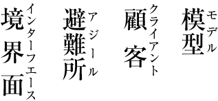 Examples of ruby for phrasal KANJIs to indicate corresponding words in HIRAGANA
注1)
note 1)
漢字1字に対し,読み方を示すルビを付ける場合と,意味を示すルビを付ける場合の組版処理がまったく同じというわけではない.後述する肩付きという方式を選んだ場合でも,意味を示すルビは中付きにするという考え方もある.
Having said that, the layout of ruby text to a single KANJI character is not entirely the same depending on the use of ruby whether it is for indicating the reading or the meaning. In fact, the KATATSUKI, one of ruby layout per character which will be described in the later section, does allow the NAKATSUKI layout for those ruby which indicate the meanings.
-
親文字である欧文の単語の読み方又は意味を示す言葉(一般に片仮名)をルビとして付ける(dummygenerated参照).逆に親文字である仮名又は漢字の言葉などに,それと同じ意味を示す欧文の単語をルビとして付ける(dummygenerated参照).この例は,aやbに比べると使用例は少ないが,学習参考書,翻訳書,旅行案内などではよく利用されている.
PURPOSE: Ruby annotation usually with katakana characters to indicate the reading or the meaning of a Western word used in base text (See dummygenerated). There are opposite cases where attaching the synonymous Western word in Latin characters as a ruby annotation to a Japanese word in kana or kanji in base text (See dummygenerated).These cases are less used than a and b, however, quite common among study guides, translated books and travel guides.
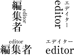

|
注1) note 1) |
親文字としての複数の欧字の文字列に仮名のルビを付ける又は複数の漢字や仮名の親文字列に欧字のルビを付ける処理は,bと同様に親文字列全体にまとめてルビを対応させるという点では同じである.しかし,親文字とルビの文字列の長さが同じでないときは,仮名又は漢字は,その字間を空けて長さのバランスをとる処理を一般に行う(dummygenerated参照).これに対し,親文字又はルビが欧文の単語の場合は,親文字とルビの文字列の長さが不ぞろいであっても,親文字列の欧字又はルビ文字列の欧字の字間は空けない,という違いがある(dummygenerated参照). There is no difference in positioning of ruby text whether attaching ruby characters in KANA to a Western word in Latin characters or attaching ruby in Latin to a Japanese word in KANJI or KANA, in that the ruby text in either case should be positioned to a run of base text to be annotated as in b). However, there is a difference in cases where the length of basetext and ruby text is different. When the length of a ruby text in KANA or KANJI is shorter than the corresponding base text, the ruby text is, in general, to be stretched by adding inter-character spaces among ruby characters so that the ruby and base text look similar in length (See dummygenerated). On the other hand, no inter-character space will be added to any ruby text in Latin characters no matter how different the ruby and base text look in length (See dummygenerated). |
ルビをどのような言葉に,どのように付けるかは各種の方法がある.
There are several methods how to attach ruby annotations to which base characters.
-
出てくる漢字の全てではなく,読み方がむずかしい一部の漢字にのみに付ける方式をパラルビという.
The 'para-ruby' is the method of attaching ruby annotations to only those base characters in KANJI which readings are difficult.
注1)
note 1)
パラルビの場合,出てくるむずかい同じ漢字の全てにルビを付ける方式と,むずかしい漢字の初出のものに限りルビを付ける方式とがある.初出も,本ごとの初出,章ごとの初出,見開きページごとの初出など,いくつかの方式がある.
The 'para-ruby' method is further divided into the method of attaching ruby annotations regardless of multiple occurrences of the same base KANJI character and the method of attaching ruby annotations to only the first instance of the same base KANJI character. Furthermore, the latter method has several variations in counting the first instance for the entire book, each chapter, or each spread, etc.
なお,熟語は,まとまりとして読むものなので,熟語にルビに付ける場合,熟語を構成する一部のむずかしい漢字にのみルビを付けるのではなく,熟語を構成する全ての漢字の読み方を示すのが望ましい(dummygenerated参照).
Note that Ruby should be attached to whole KANJI charecters in a compound phrase, because of the wholeness of compound phrese in reading. To attach Ruby to a part of KANJI characters in a compound pharse is not recommended (See dummygenerated).
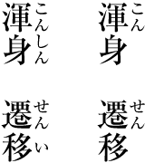 熟語に付けるルビの例(左側:望ましい例.右側:望ましくない例)
 Examples of Ruby on phrasal kanjis(Left side : recommended. Right side : not recommended.)
ルビの文字サイズは,原則として親文字の文字サイズの1/2とする(dummygenerated参照).
The size of ruby characters is in principle the half size of base characters (See dummygenerated).
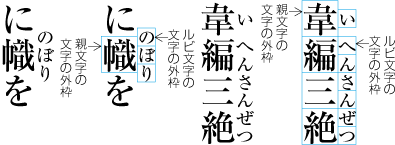
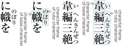
全角の字幅の漢字にルビ文字を3字付ける場合に使用している三分ルビとよばれるルビもある(使用例は少ない).縦組用の三分ルビは,ルビ文字の左右の幅は親文字の1/2とするが,ルビ文字の天地サイズを親文字の1/3とする.横組用の三分ルビは,ルビ文字の天地サイズは親文字の1/2とするが,ルビ文字の左右の幅は親文字の1/3とする(dummygenerated参照).
The 'one-third ruby' characters are rarely used to attach three ruby characters to one full-width KANJI character. The one-third ruby for vertical layout has the dimension of the half of the base character in width and the one third in height. Those for Horizontal Settings have the dimension of the half of the base characters in height and one third in width (See dummygenerated).
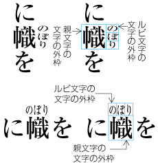 三分ルビの例
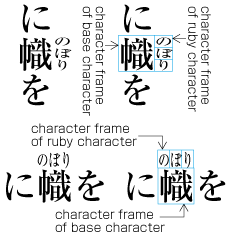 Examples of One-Third Ruby
また,12ポイント以上の大きな文字サイズの見出しなどにルビを付ける場合(用例は少ない),親文字とルビとのバランスを考慮し,ルビ文字のサイズは一般に親文字の文字サイズの1/2より小さくしている.
When ruby is attached to twelve points or larger base characters, the size of ruby letter generaly smaller than the half size of the base characters, considering the proportion of the sizes of base characters and ruby. Anyway, these cases are very rare.
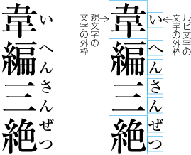
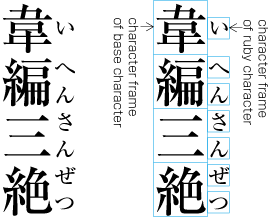 Examples of Ruby with the Size Smaller Than the Half Size of the Base Characters
|
注1) note 1) |
|
|
注2) note 2) |
親文字の文字サイズが小さい場合(例えば7ポイント未満の場合),ルビ文字はその1/2でさらに小さくなり,可読性を損なう.そこで親文字の文字サイズが小さい場合は,ルビを付けることは望ましくない.親文字の直後に括弧を付けて読み方などを示すという方法をとるとよい. When the size of base characters is very small (for e.g. smaller than seven points), the ruby, the size of which is the half size, is further small and illegible. In such cases where the size of base characters is very small, ruby is not a suitable way for annotation. In those cases, consider other annotations such as adding the reading in parenthesis immediately after the base character. |
|
注3) note 3) |
ルビの文字サイズとはやや異なる事項であるが,ルビに小書きの仮名を使用するかどうかも問題となる.ルビ文字は小さいので,活字組版では,そもそもルビ文字には小書きの仮名は準備されていなかった(使用できなかった).今日ではルビに小書きの仮名を使用する例もあるが,可読性を考慮すると,小書きの仮名のルビは,特定の読みを限定したい固有名詞などに限り使用するのが望ましい. It is slightly different from the size issue of ruby, there is a choice whether or not small KANA characters should be used in ruby annotations. Because of the size being too small, there was no choice of using small KANA in letterpress printing. Today there are cases where small KANA are used in ruby annotations, but taking legibility into consideration, it should be limited to those for accurate readings such as for proper nouns. |
縦組の場合,ルビは親文字の右側,横組の場合,ルビは親文字の上側に付けるのが原則である.
In principle, ruby is attached to the right of base characters in Vertical Settings, and to the above in Horizontal Settings.
特別な場合は,縦組でルビは親文字の左側,横組ではルビは親文字の下側に付ける例があるが,そのように付ける例は非常に少ない.
In some special cases, ruby can be seen to the left of base characters in Vertical Settings, and to the below in Horizontal Settings, both of which are very rare.
また,漢字の読みを示すルビと意味を示すルビといったように両側に付ける例(dummygenerated参照)もあるが,このように付ける例も非常に少ない.
There are cases where attaching two kinds of ruby to both sides of base characters, one for readings and the other for meanings (See dummygenerated), which are also very rare.


以下では,ルビの文字サイズを親文字の文字サイズの1/2とし,縦組では親文字の右側,横組では親文字の上側にルビを付ける場合に限定し,その配置方法を解説する.最初にモノルビ,グループルビ及び熟語ルビの親文字とルビ文字の原則的な配置方法を解説し,その後で,前後に配置する文字との関係,さらに行頭・行末における配置方法を解説する.
In the following sections, the ruby composition methods will be explained assuming the size of ruby is the half size of the base characters and they will be attached to the right in VerticalSettings and to the above in Horizontal Settings. First, the basic composition rules of mono-ruby, group-ruby and JUKUGO-ruby, then the rules of positioning of ruby with respect to those characters which come before and after the base characters, and finally the composition rules at the line start and at the line end.
モノルビの場合,モノルビのルビ文字列はベタ組とし,ルビ文字列が欧字やアラビア数字など固有の字幅を持つ文字の場合には,それぞれの文字の固有の字幅に応じて配置する.そのうえで,親文字列とルビ文字列の中央を揃えて配置することが原則である.しかし,親文字とルビの組合せに種々の例があり,様々な工夫もされているので,例をあげながら解説する.
When mono-ruby characters are Japanese, they are set solid. If mono-ruby characters have their own character widths such as Western characters or numerals, they are set according to their own widths and then the ruby text is placed so that its center matches to that of its base character. There are more variations depending on the combination of the base character and ruby text and accordingly various composition rules have been invented, which will be explained with examples.
親文字1文字に平仮名のルビ文字が2字付く場合は,親文字の長さとルビ文字の文字列の長さは揃い,dummygeneratedのようになる.
When attaching two kana ruby characters to a single base character, both lengths are the same and they are positioned as shown in dummygenerated.
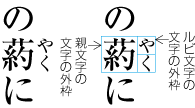 ルビ文字が2字の場合の配置例
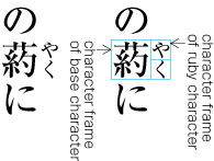 An Example of Composition with Two Ruby Characters
親文字1文字に付く平仮名のルビ文字が1字の場合は,次の2つの方法がある.
When attaching a single ruby character to a single base character, there are two ways of positioning the ruby character.
-
縦組においては親文字の天地中央とルビ文字の天地中央を揃えて配置する(dummygenerated参照).横組においては親文字の左右中央とルビ文字の左右中央を揃えて配置する(dummygenerated参照).この配置方法は,中付きとよばれている.
In vertical writing mode, attach a ruby character so that its vertical center matches to that of the base character (See dummygenerated). In horizontal writing mode, attach a ruby character so that its horizontal center matches to that of the base character (See dummygenerated). These positioning of a ruby character is called 'naka-tsuki' (center-alignment).
-
縦組においては親文字の上端とルビ文字の上端を揃えて配置する(dummygenerated参照).この配置方法は,肩付きとよばれている.なお,横組では,肩付きの配置方法にはしない.横組において親文字の左端とルビ文字の左端を揃えて配置すると,左右のバランスが壊れ,体裁がよくないからである(dummygenerated参照).
In Vertical Settings, attach a ruby character so that the top of its virtual body is aligned with the top of that of the base character (See dummygenerated). This positioning of a ruby character is called 'KATA-TSUKI' (top-alignment). For Horizontal Settings, 'KATA-TSUKI' should not be adopted. If a ruby character is attached so that the left-edge of its virtual body is aligned with the left-edge of that of the base character, it would result in the lost of center of balance, which doesn't look good (See dummygenerated).
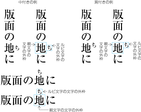 中付きと肩付きの例
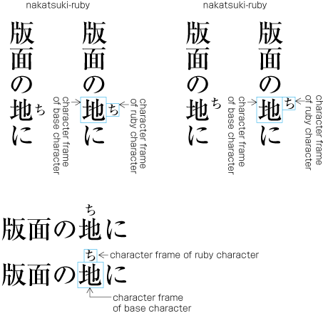 Examples of NAKA-TSUKI Alignment and KATA-TSUKI Alignment
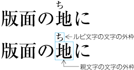 横組で肩付きとした例(このような配置法にはしない)
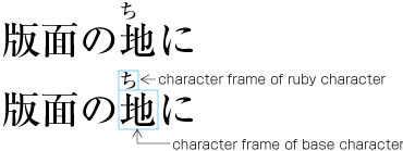 An Example of KATA-TSUKI Alignment in Horizontal Layout (this is intentional and should not be applied)
|
注1) note 1) |
活字組版においては,肩付きとする方法が一般的であったが,今日では縦組においても中付きとする方法が徐々に増えている.ただし,親文字とルビの上端を揃えた肩付きの方が慣れており,読みやすいという意見もある. Kata-tsuki alignment was commonly used in letterpress printing era, but today the adoption of naka-tsuki alignment is increasing even in vertical writing mode. However, there is still an opinion in support of kata-tsuki alignment because it is familiar and readable. |
親文字1文字に平仮名のルビ文字が3字以上付く場合は,ルビ文字列はベタ組にする.しかし,親文字列よりルビ文字列が長くなるので,その配置位置が問題となる.ルビ文字が1字の場合にどの方法を採用したかにより異なる.一般に次のようにしている.なお,親文字からルビがはみ出した場合における前後にくる文字との字間処理は後述する.
When attaching more than three hiragana ruby characters to a single base character, the ruby characters are set solid. In this case where the length of a ruby text is longer than that of its base character, positioning of the ruby text depends on which alignment has been adopted for a single ruby character. There is another issue how to maintain the spatial balance of the ruby characters hanging over those characters which are not its base characters. The adjustment of inter-character spacing for those characters which come before and after the base character will be explained in the later section.
-
縦組において,ルビ文字が1字の配置方法を中付きとした場合は,親文字の天地中央とルビ文字列全体の天地中央を揃えて配置する(dummygenerated参照).横組においては親文字の左右中央とルビ文字列全体の左右中央を揃えて配置する(図2-3-17参照).
When naka-tsuki alignment is adopted for a single ruby character, position a ruby text so that its vertical center is aligned with that of its base character in vertical wriging mode (See dummygenerated). In horizontal writing mode, position a ruby text so that its horizontal center is aligned with that of its base character (See dummy).
-
縦組においてルビ文字が1字の配置方法を肩付きとした場合は,次の2つの方法がある.
When KATA-TSUKI alignment is adopted for a single ruby character, there are two ways as follows.
-
親文字の前後に配置する文字の種類及びルビ文字の字数により親文字からのルビのはみ出しが後ろになるか,前になるか,又は両側になるかを決めるが,下側へのはみ出しを優先する.(dummygenerated参照).
Depending on the type of script of adjacent characters of the base character and the number of ruby characters, the decision is made whether the ruby hangover is allowed on the character before its base character or on the character after or on both adjacent characters. At break-even situation, the hangover is usually on the character after its base character (See dummy).
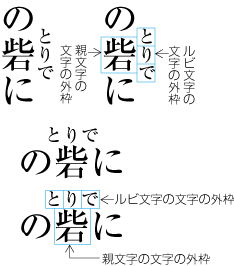
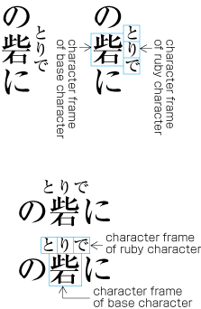
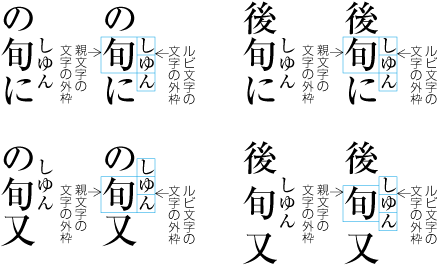
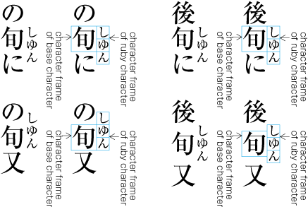 Example-2 Positioning of Ruby Text with More Than Three Characters (Vertical Settings)
|
注1) note 1) |
肩付きと中付きは,従来は親文字1字で,かつルビ文字が1字の場合のルビの配置方法についてのみ使用されていた用語である.しかし,ルビ文字が3字以上の場合についても拡大解釈して使用する例もある.このドキュメントでは,肩付き及び中付きという用語は,本来の意味に限定して使用している. The terms KATA-TSUKI and NAKA-TSUKI were originally used for the ruby alignment only when a single ruby character is attached to a single base character. However there are cases where the meaning of them is stretched so that they can be used when more than three ruby characters are involved. We use the terms KATA-TSUKI and NAKA-TSUKI with their original meaning throughout this document. |
|
注2) note 2) |
ルビ文字が3字以上付いた場合,下側へのはみ出しを優先するという方法は,親文字の字間及びその前後の字間をできるだけ空けない処理をするという考え方からのものである.活字組版で行われていた方法である. The preference for the choice of the ruby hangover on the character after its base character is due to the preference of avoiding adjustment of inter-character spacing between base characters and their adjacent characters, which was common in letterpress printing. |
親文字の文字列の長さとルビ文字の文字列の長さが同じ場合は,それぞれの文字列をベタ組にし,文字列の中心を揃えて配置する(dummygenerated参照).
In case the length (number-of-characters * advance-width-of-each-character) of a sequence of base characters and that of the ruby text are the same, each text shall be set solid and the center of both texts shall be aligned each other (See dummygenerated).
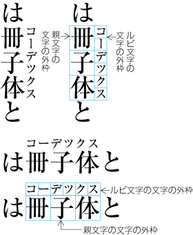
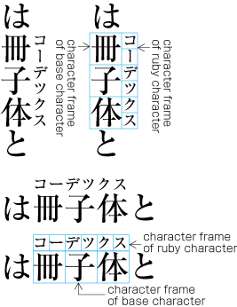 Examples of Group-Ruby which length is the same as that of the Text of Base Characters
親文字の文字列の長さよりルビ文字の文字列の長さが短い場合は,ルビ文字の文字列の字間及びその前後を適当に空け,親文字とのバランスをとる.この場合,JIS X 4051で規定しているように,ルビ文字の文字列の字間のアキの大きさ2に対して,その先頭及び末尾のアキを1の比率で空けると体裁がよい(dummygenerated参照).親文字の文字列とルビ文字の文字列の先頭及び末尾を揃え,ルビ文字の文字列の字間だけを空ける方法もある(dummygenerated参照).
In case the length of a ruby text is shorter than that of the text of its base characters, stretch the ruby text by adding a certain amount of inter-character space between each adjacent ruby characters so that both texts balance each other. To be more specific, for 2 units of inter-character space between ruby character, adding 1 unit of space before the leading character and after the trailing character will give a balanced appearance, which is the method specified in JIS X 4051 (See dummygenerated). Another way is to first align the top of both leading characters for the basetext and ruby text and the bottom of both trailing characters and then to add the same amount of inter-character space between the rest of the ruby characters (See dummygenerated).
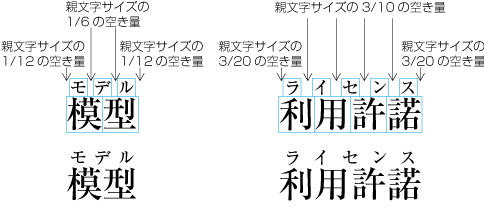
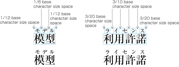 Example-1 Distribution of Group-Ruby alongside of Base Characters where the length of Ruby is shorter than that of the
Text of Base Characters
Example-1 Distribution of Group-Ruby alongside of Base Characters where the length of Ruby is shorter than that of the
Text of Base Characters
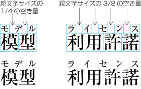
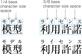 Example-2 Distribution of Group-Ruby alongside of Base Characters where the length of Ruby is shorter than that of the
Text of Base Characters
Example-2 Distribution of Group-Ruby alongside of Base Characters where the length of Ruby is shorter than that of the
Text of Base Characters
|
注1) note 1) |
活字組版では,ルビ文字の字間調整が細かくできない場合も多く,親文字とルビ文字の字数に応じて,適宜ルビ文字の文字列の先頭及び末尾を空けない方法と空ける方法を選択して行ってきた.また,ルビ文字の文字列の先頭及び末尾を空ける場合は,ルビ文字の文字列の字間のアキの大きさ2に対して,その先頭及び末尾のアキを1の比率で空けると体裁がよい,といわれていた. In letterpress printing, there were not many choices in adjustments of inter-character space between ruby characters. Therefore, depending on the number of characters in basetext and its ruby text, the choice was whether to add a certain amount of space before the leading ruby character and after the trailing character or not. In the former case it had been said that for 2 units of inter-character space between each adjacent ruby characters, adding 1 unit of the leading and trailing space would give a balanced appearance. |
|
注2) note 2) |
親文字の文字列の長さに比べ,ルビ文字の文字列の長さが極端に短い場合,JIS X 4051で規定して方法では,ルビ文字の文字列の先頭及び末尾がルビ文字の文字サイズで2倍以上空いてしまう場合がある.これは誤読の原因ともなりかねないので,ルビ文字の文字列の先頭及び末尾のアキは,ルビ文字の文字サイズの全角(又は1.5倍)までとした方がよい(dummygenerated参照). In case the length of the ruby text is far shorter than that of the base text, the method specified in JIS X 4051 could result in the twice the size of a ruby character for the leading and the trailing space, which might give a misleading appearance. Therefore, a criteria whether or not to adopt the method of JIS X 4051 is to see if the amount of the leading and the trailing space exceeds the fullwidth (or up to 3/2 of the size) of a ruby character (See dummygenerated). |

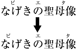
親文字の文字列の長さよりルビ文字の文字列の長さが長い場合は,親文字の文字列の字間及びその前後を適当に空け,ルビ文字とのバランスをとる.この場合,JIS X 4051で規定しているように,親文字の文字列の字間のアキの大きさ2に対して,その先頭及び末尾のアキを1の比率で空けると体裁がよい(dummygenerated参照).親文字の文字列とルビ文字の文字列の先頭及び末尾を揃え,親文字の文字列の字間だけを空ける方法もある(dummygenerated参照).
In case the length of a ruby text is longer than that of the text of its base characters, balance with the ruby text by adding a certain amount of inter-character space between each adjacent base characters. To be more specific, for 2 units of inter-character space, add 1 unit of the leading and the trailing space, as specified in JIS X 4051 (See dummygenerated). Another way is to first align the top of both the leading characters and the bottom of the trailing characters and then add a certain amount of inter-character space between each adjacent principal characters (See dummygenerated).
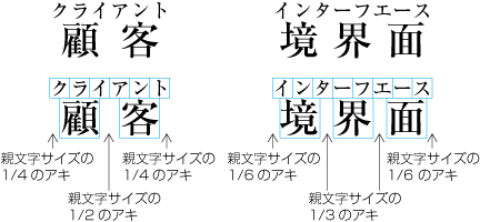
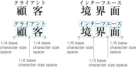 Example-1 Distribution of Group-Ruby where the length is longer than that of Base Characters
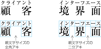
 Example-2 Distribution of Group-Ruby where the length is longer than that of Base Characters
グループルビの場合,親文字の文字列とそれに付くルビ文字の文字列は,一体として扱い,2行に分割してはならない.また,親文字の文字列とそえに付くルビ文字の文字列を合わせた親文字群は,行長の調整の際に字間を空ける処理をしてはならない.
As for groub-ruby, base characters and adjacent ruby characters shall be handled as one object, and prohibited to be line-breaked. Also, the object constructed with base characters and adjacent ruby characterss is prohibited to insert additional spaces between each characters for line adjustment.
熟語を構成するそれぞれの漢字に付くルビ文字がそれぞれ2文字以下の場合,それぞれの親文字の漢字とルビ文字を対応させ,2.3.5で述べた方法で配置する(dummygenerated参照).
If the number of ruby characters are two or less than two for each Kanji character, which participates in a Jukugo (a phrasal Kanji), for each run of ruby text for each base character, compose ruby characters as described in dummy (See dummygenerated).
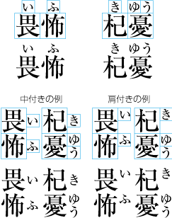 熟語ルビの配置例1
 Example-1 Distribution of JUKUGO-Ruby
熟語を構成するそれぞれの漢字の中で1字でも,それに対応するルビ文字が3字以上のものがある場合,それぞれの親文字の漢字とルビ文字を対応させることができないので,熟語全体とルビ文字の文字列を対応させて配置する.熟語全体とルビ文字の文字列を対応させる方法としては,JIS X 4051で規定しているように2.3.6項のグループルビと同様な方法で配置する方法(dummygenerated参照)と,熟語の構成,さらにその熟語の前後にくる文字の種類を考慮して配置する方法とがある(dummygenerated参照).後者の方法では,熟語を構成するそれぞれの漢字に対応するルビ文字が,熟語内の他の漢字に最大でルビ文字サイズで全角(又は1.5倍)まで掛かってよい,としている.
If there is any Kanji character in a given phrasal Kanji which needs more than three ruby characters, the Jukugo-ruby layout cannot be made because the character-wise attachment of ruby character is not feasible for all principal characters. In this case, attach the ruby text phrase-wise to the phrasal Kanji. The methods include the layout as specified in JIS X 4051 which is similar to the group-ruby method described in dummy (See dummygenerated), and the layout decided by the phonetic structure of the phrasal Kanji and the type of script of the adjacent characters (See dummygenerated). The latter method can be used unless a run of ruby text for the base character hangs over another base character more than the fullwidth (or one and a half of the fullwidth) of a ruby character in length.
 熟語ルビの配置例2
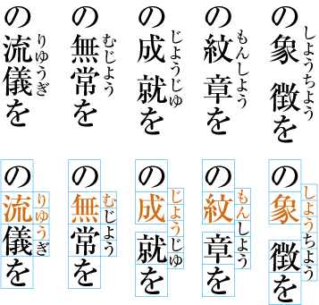 Distribution of JUKUGO-Ruby
 熟語ルビの配置例3
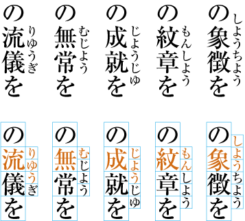 Distribution of JUKUGO-Ruby
|
注1) note 1) |
熟語ルビには,それぞれの漢字との対応でいえばルビ文字1字+ルビ文字3字又はルビ文字3字+ルビ文字1字が付くケースが多い.これをモノルビとして処理するとdummygeneratedのようになる.これはあまり体裁がよくない. There are often the cases that JUKUGO-ruby consists of one ruby character followed by three ruby characters, and vice versa, for a phrasal KANJI of two base characters. If the mono-ruby layout were chosen for these cases, it would look like as shown in dummygenerated, which wouldn't look very beautiful.
|

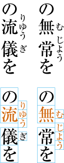
熟語ルビは,それぞれの漢字とそれに対応するルビ文字を単位として2行に分割してもよい.漢字2字の熟語を分割する場合は,それぞれがモノルビとして処理されることになる.漢字3字の熟語ルビを分割する場合は,漢字1字のモノルビと漢字2字の熟語ルビ,又は漢字2字の熟語ルビと漢字1字のモノルビとになる.それぞれの漢字とそれに対応するルビ文字との関係を維持するので,分割以前と以後とでは,漢字とルビ文字との対応が変わる場合もある(dummygenerated参照). ただし,熟語を構成する漢字に熟語ルビを付けた場合には,ルビ付きの親文字の字間は,行の調整処理で字間を空ける処理の対象としない.
A JUKUGO-ruby can be split into two lines at a boundary of each unit of ruby text attached to one KANJI character. When a phrasal KANJI consists of two characters, each unit will be processed using the mono-ruby method. When dividing a phrasal KANJI consists of three, use the mono-ruby method for the first KANJI character and use the JUKUGO-ruby method for the remaining two KANJI characters, and vice versa. In order to maintain the correspondence of each KANJI to its ruby annotation, the layout of ruby may be different after the division (See dummygenerated). Note that jukugo-ruby and its base characters as one object can not be subject of inter-letter space expansion for line adjustment.
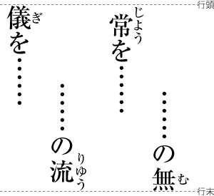
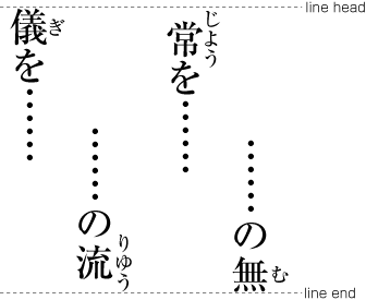
ルビ文字の文字列が親文字の文字列より短い場合は,親文字の前後に配置する他の漢字や仮名とルビの付く親文字との字間をベタ組にして配置すればよい(dummygenerated参照).
When the length of any ruby text is shorter than that of the base characters, the main text can be just set solid because there is no need for any adjustment of the inter-character spacing between base characters with ruby annotations and their adjacent characters in the main text.
 ルビ文字の文字列が親文字の文字列より短い場合は前後の文字との間はベタ組
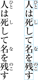 Set Solid when the length of Ruby Text is shorter than that of Base Characters
ルビ文字の文字列が親文字の文字列より長い場合は,親文字の前後に配置する他の漢字,仮名,約物などにどこまで親文字よりはみ出したルビ文字が掛かってよいかが問題となる.一般に次のように処理している(dummygenerated,dummygenerated参照).これはもっぱら誤読を避けること,及び体裁を考慮しての処理である.
When the length of a ruby text is longer than that of the base characters, how to compose the main text depends on how much the ruby text can hang over those characters of KANJI, KANA or punctuation marks, which are adjacent to the principal characters. The following are the general rules (See dummygenerated and dummygenerated). They were established especially to avoid misreading and to maintain the beauty of the layout.
-
前又は後ろにくる漢字等(cl-19)にルビ文字を掛けてはならない.
A ruby text shall not hang over the ideographic characters(cl-19) adjacent to the base characters.
-
前又は後ろにくる平仮名(cl-15),片仮名(cl-16),長音記号(cl-10)又は小書きの仮名(cl-11)に最大でルビ文字サイズの全角までルビ文字を掛けてもよい.
When the adjacent character is hiraganas(cl-15), katakanas(cl-16), prolonged sound marks(cl-10) or small kanas(cl-11), a ruby text may hang over the character up to the fullwidth size of the ruby characters.
-
前にくる終わり括弧類(cl-02),句点類(cl-06)若しくは読点類(cl-07)の後ろにある二分アキ,又は後ろにくる始め括弧類(cl-01)の前にある二分アキには,最大でルビ文字サイズで全角までルビ文字を掛けてもよい.ただし,行長の調整で二分アキが詰められている場合は,調整で詰められたアキまでとする(例えば,四分アキとなっていれば,最大でルビ文字サイズの二分までルビ文字を掛けてもよい).
The ruby letter may go over the base characters and hang over the 1/2 em spaces, which are inserted after closing brackets(cl-02), full stops(cl-06) or commas(cl-07), set befor the target ruby object, up to the amount of full-wdth size of ruby letter. Also, the ruby letter may go over the base characters and hang over the 1/2 em spaces, which are inserted before opening brackets(cl-01), set after the target ruby object, up to the amount of full -width size of ruby letter.Note that when the spaces are reduced for line adjustment, the room for ruby letter overwrap is also compressed (For example, if the space is.1/4 em in base character size, the ruby letter can overwrap by 1/2 em in ruby letter size).
-
分離禁止文字(cl-08)にも,最大でルビ文字サイズの全角までルビ文字を掛けてもよい.
When the adjacent character is one of inseparable characters(cl-08), a ruby text may hang over the character up to the fullwidth size of the ruby characters.
-
中点類(cl-05)にも最大でルビ文字サイズの全角までルビ文字を掛けてもよい.ただし,中点類の前後の四分アキが行長の調整で詰められている場合は,前にくる中点類の場合は中点類の後ろのアキ+ルビ文字サイズの二分まで,後ろにくる中点類の場合は中点類の前のアキ+ルビ文字サイズの二分まででである.
When the adjacent character is one of the middle dots(cl-05), a ruby text may hang over the middle dots, in principle, up to the fullwidth size of the ruby characters. But if there is any reduction of space before and after the middle dots as a result of the line adjustment, the amount of the extension shall be up to the amount of space after the middle dots plus 1/2 of ruby character size in case the middle dots are set befor the ruby object, or, space before the middle dots plus 1/2 of ruby character size incase the middle dots are set after the ruby object.
-
後ろにくる終わり括弧類(cl-02)には,最大でルビ文字サイズの全角までルビ文字を掛けてもよい.この場合,終わり括弧類の後ろのアキに掛けてはならない.
When the adjacent character is one of the closing brackets(cl-02), a ruby text may go over the principal characters up to the fullwidth size of the ruby characters. Note that the hang over shall not exceed beyond the closing bracket itself.
-
後ろにくる句点類(cl-06)又は読点類(cl-07)には,最大でルビ文字サイズの全角までルビ文字を掛けてもよい.この場合,句点類又は読点類の後ろのアキに掛けてはならない.
When the adjacent character is one of commas(cl-07) or full stops(cl-06), a ruby text may go over the base characters and hang over the commas or full stops up to the fullwidth size of the ruby characters. Note that the hang over shall not exceed beyond the commas or the periods itself.
-
前にくる始め括弧類(cl-01)にも,最大でルビ文字サイズの全角までルビ文字をを掛けてもよい.この場合,始め括弧類の前のアキに掛けてはならない.
Also, when the adjacent character is one of opening brackets(cl-01) before the ruby object, a ruby text may go over the base characters and hang over the opening brackets up to the full width size of the ruby characters. Note that the hang overshall not exceed beyond the opening brackets..
 ルビ文字のはみ出しがある場合の配置例1
 Example-1 Distribution of Ruby Characters hanging over the Adjacent Characters
 ルビ文字のはみ出しがある場合の配置例2
 Example-2 Distribution of Ruby Characters hanging over the Adjacent Characters
|
注1) note 1) |
前にくる始め括弧類(cl-01),特にかぎ括弧[「] LEFT CORNER BRACKET[」] RIGHT CORNER BRACKETにルビ文字を掛けることは体裁がよくないので,避けた方がよいという考え方もある.この考え方では,始め括弧類(cl-01)にルビ文字を掛けない処理とするか,又は最大でルビ文字サイズの二分までルビ文字を掛ける処理方法とする. There is a opinion that it is not good style to hang ruby characters over the opening brackets(cl-01), especially [「] LEFT CORNER BRACKET and [」] RIGHT CORNER BRACKET. When this opinion is adapted, there are two possibilities. One is not allow ruby characters hang over the opening brackets(cl-01). The other is allow ruby characters hang over hte opening brackets up to 1/2 size of ruby characters. |
|
注2) note 2) |
JIS X 4051では,片仮名は漢字と同じ文字クラスに含まれている.したがって,片仮名についてはルビ文字を掛けることは禁止されている. JIS X 4051 classifies katakana characters and kanji characters in same class. Accordingly, in JIS X 4051, it is prohibited to hang ruby characters over adjacent katakana characters. |
|
注3) note 3) |
ルビが付いた親文字群の前又は後ろの文字が,漢字等(cl-19),平仮名(cl-15),又は片仮名(cl-16)のいずれでも,最大でルビ文字サイズの 二分までルビ文字を掛けてもよい,とする処理法もある(dummygenerated参照). There is another variation that allows a ruby text to hang over any of ideographic characters(cl-19), hiraganas(cl-15) or katakanas(cl-16) characters up to the fullwidth size of the ruby characters (See dummygenerated).
|
|
注4) note 4) |
漢字等(cl-19),平仮名(cl-15)及び片仮名(cl-16)の全てにルビを掛けない,とする処理法もある(dummygenerated参照). There is a further variation that does not allow a ruby text to hang over any of ideographic characters(cl-19), hiraganas(cl-15) or katakana(cl-16) characters (See dummygenerated).
|

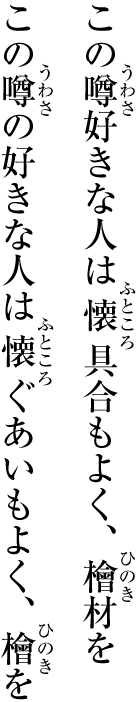

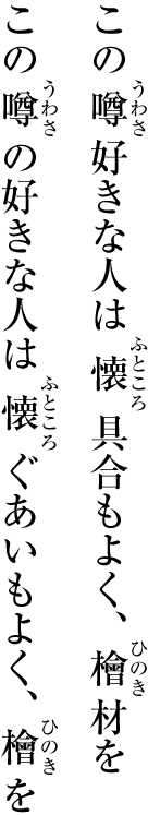
行頭又は行末にルビが付いた親文字を配置する場合,ルビ文字の文字列が親文字の文字列より短いときは,親文字の先頭又は末尾を行頭又は行末に揃えて配置すればよい.
When the line head starts with a ruby annotated text, of which ruby text length is shorter than that of the base characters, compose the text so that the first base character should be aligned with the line head. Similarly, when a ruby annotated text ends at the line end and the ruby length is shorter than that of the basic characters, compose the text so that the last basic character should be aligned with the line end.
この場合,ルビ文字の文字列が親文字の文字列より長いときは,親文字よりはみ出したルビ文字の文字列の先頭又は末尾を行頭又は行末に揃えて配置する(dummygenerated参照).また,親文字の先頭又は末尾を行頭又は行末に揃えて配置する方法もある(dummygenerated参照).
When the ruby text length is longer than that of the basic characters, compose the text so that the first ruby character which are forced out should be aligned with the line head, and vice versa (See dummygenerated). Or there is a variation to compose the text so that the first basic character should be aligned with the line head, and vice versa (See dummygenerated).
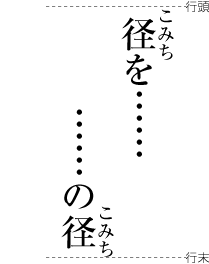
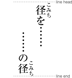
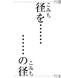
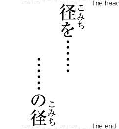
親文字の先頭又は末尾を行頭又は行末に揃えて配置する方法では,行頭又は行末では,ルビ文字が版面又は段の領域よりはみ出すことは認められていないので,親文字とルビ文字の配置方法を変更する必要がある.次のようにする.
When aligning the first base character to the line head and the last base character to the line end, a ruby text is not allowed to extend beyond the HANMEN or the area of the column. If it does, the following adjustments should be considered in positioning base characters and ruby characters.
-
モノルビの行頭 ルビ文字の文字列の先頭と親文字の文字列の先頭を揃える形に変更する(dummygenerated参照).
Mono-ruby at the line head: Make adjustments so that the top of the ruby text should be aligned with that of the base characters (See dummygenerated).
-
モノルビの行末 ルビ文字の文字列の先頭と親文字の文字列の末尾を揃える形に変更する(dummygenerated参照).
Mono-ruby at the line end: Make adjustments so that the bottom of the ruby text should be aligned with that of the last base character (See dummygenerated).
-
グループルビの行頭ルビ文字の文字列の先頭と親文字の文字列の先頭を揃え,親文字列の字間のアキと,親文字列の末尾のアキを1対1の比率に変更する(JIS X 4051で規定している方法,図2-3-36参照).
Group-ruby at the line head: Make adjustments so that the top of the ruby text should be aligned with that of the first base character, and adding the same amount of inter-letter space between the base characters and after the last base character(the method specified in JIS X 4051. See dummygenerated).
-
グループルビの行末ルビ文字の文字列の末尾と親文字の文字列の末尾を揃え,親文字列の字間のアキと,親文字列の先頭のアキとを1対1の比率に変更する(JIS X 4051で規定している方法,図2-3-36参照).
Group-ruby at the line end: Make adjustments so that the bottom of the ruby text should be aligned with that of the last base character, and adding the same amount of inter-letter space between the base characters and the space before the base characters (the method specified in JIS X 4051. See dummygenerated).
-
熟語の構成などを考慮して配置する熟語ルビが行頭にきた場合 ルビ文字列の先頭と親文字列の先頭を行頭に揃えて配置する.この場合,熟語内の他の漢字に最大でルビ文字サイズで全角(又は1.5倍)まで掛かってよい.それ以上掛かる場合は,親文字列からルビ文字列をはみ出させるか,親文字の字間を空ける.
JUKUGO-ruby at the line head: Make adjustments so that the top of the ruby text should be aligned with that of the first base character. A run of ruby characters for a base character may hang over the adjacent base characters of the same phrasal KANJI, up to the fullwidth size (or one and a half of it) of the ruby characters. If the extension should go over beyond the limit, just force the ruby text out of the base characters, or make a further adjustment by adding inter-character space between the base characters.
-
熟語の構成などを考慮して配置する熟語ルビが行末にきた場合 ルビ文字列の末尾と親文字列の末尾を行末に揃えて配置する.この場合,熟語内の他の漢字に最大でルビ文字サイズで全角(又は1.5倍)まで掛かってよい.それ以上掛かる場合は,親文字列からルビ文字列をはみ出させるか,親文字の字間を空ける.
JUKUGO-ruby at the line end: Make adjustments so that the bottom of the ruby text should be aligned with that of the last base character. A run of ruby characters for a base character may hang over the adjacent base characters of the same phrasal KANJI, up to the fullwidth size (or one and a half of it) of the ruby characters. If the extension should go over beyond the limit, just force the ruby text out of the base characters, or make a further adjustment by adding inter-character space between the base characters.
-
熟語ルビを親文字単位で2行に分割した場合 熟語ルビは,2行に分割され,行末及び行頭に分かれることがある.漢字2字の熟語の場合は,行末に漢字1字のモノルビ,次の行頭に漢字1字のモノルビという形になる.漢字3字の場合は,漢字1字のモノルビと漢字2字の熟語ルビ又は漢字2字の熟語ルビと漢字1字のモノルビとなる.漢字1字のモノルビの形になった場合は,a項又はb項で処理することになる.漢字2字以上の熟語ルビとなった場合は,e項,f項又はg項で処理することになる.
JUKUGO-ruby split into two lines: JUKUGO-ruby can be split into two lines, one at the line end and the other at the line head. In the case of a phrase with two KANJI characters, it is as the same as dealing with one KANJI character with a mono-ruby text at the line end and the other KANJI character with another mono-ruby text at the next line head. In the case of a phrase with three KANJI characters, one KANJI character with a mono-ruby text and the remaining two KANJI characters with a JUKUGO-ruby, and vice versa. The layout of one KANJI character with a mono-ruby text will be composed by the method a or be described above. The layout of two KANJI characters with a jukugo-ruby text will be composed by the method f or g above.
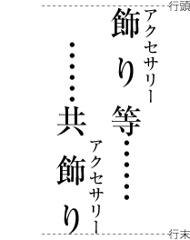
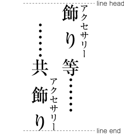
|
注1) note 1) |
熟語の構成などを考慮して配置する熟語ルビの配置方法は,熟語の構成,行頭・行中・行末かの位置,その前後に配置される文字などにより変化する.この処理方法の詳細は,複雑になるので,Appendix 〓で解説する. The composition of Jukugo-ruby changes depending with consideration of the construction of jukugo, the position in the head of the line, middle of the line or bottom of the line, and, adjacent characters before or after, The detail of this issue is too complicated to discuss here, so is discussed in Appendix. |
|
注2) note 2) |
ルビ文字が付いた親文字群については,親文字群中の文字(熟語以外のルビ付き)(cl-22)と親文字群中の文字(熟語ルビ付き)(cl-23)に分け,それと隣接する文字間の間隔についての処理方法の詳細は,“2.9 文字クラスについて”で説明する文字クラスに従い,表の形式にしてAppendix 〓で示す. The complexes of base characters with ruby characters are classified to simple-ruby character complex(cl-22) and phrasal-ruby character complex(cl-23).The handling and positioning of these complexes with adjacent characters is discussed in Appendix as a complete table, following dummy. |
圏点(傍点ともいう)は,漢字,仮名などの文字列に付け,その文字列を強調する役割を果たす.
Emphasis dots (also known as bouten or side dots) are those symbols alongside of a run of kanji or kana characters to emphasize the text.
|
注1) note 1) |
日本語組版において文中の一部の文字列を強調する方法としては,圏点を付ける方法以外に,その部分の書体を変更する(例えばゴシック体),文字の色を変更する(例えば赤色の文字にする),括弧類でくくる(例えばかぎ括弧[「] (LEFT CORNER BRACKET)[」] (RIGHT CORNER BRACKET)又は山括弧[〈] (LEFT ANGLE BRACKET)[〉] (RIGHT ANGLE BRACKET)でくくる),傍線(又は下線)を付けるなどの方法がある.どの方式にするかは編集方針による.一般に書体を変更する方法や括弧類でくくる方法がよく使用されている.圏点を付ける方法はやや少ないが,漢文等では古くからで使用されており,歴史のある伝統的な方法である. There are many ways to emphasize a run of text in the Japanese composition. Besides attaching emphasis dots, one may emphasize a certain run of text by selecting a different typeface (for e.g. Mincho face for normal text and Gothic face for emphasis), a different color (for e.g. turning to red for emphasis), by enclosing the text within brackets (for e.g. [「] (LEFT CORNER BRACKET) and [」] (RIGHT CORNER BRACKET) or [〈] (LEFT ANGLE BRACKET) and [〉] (RIGHT ANGLE BRACKET)), by drawing a line alongside of the text (or underline the text), and so on. It is an editorial decision which emphasis method to adopt. Selecting a different typeface and enclosing a text within brackets are generally used and popular emphasis methods. Attaching emphasis dots is not very common but one of long-established and traditional methods typically used in KANBUN (classic Chinese text). |
|
注2) note 2) |
慣行として,圏点は,句点類(cl-06),読点類(cl-07),始め括弧類(cl-01),終わり括弧類(cl-02)などには付けない. As a practice, emphasis dots are not used for commas(cl-07), full stops(cl-06), opening brackets(cl-01) and closing brackets(cl-02). |
圏点の組版処理は,次のようにする(dummygenerated参照).
Compositions of emphasis dots are as follows (See dummygenerated).
-
圏点の位置は,縦組では親文字の右側とし,横書きでは親文字の上側とし,親文字に接し,それぞれの中心を揃えて配置する.
Emphasis dots shall be attached to the right of the base characters in vertical writing mode, or to the above of them in horizontal writing mode. The center of emphasis dots shall be aligned with that of the base characters.
-
圏点にどのような記号を付けるかは指定によるが,一般に縦組では[﹅] (SESAME DOT),横組では[•] (BULLET)が使用されている.
There are many symbols that could be specified for use as emphasis dots.[﹅] (SESAMI DOT) in vertical writing mode and[•] (BULLET) in horizontal writing mode are those used for emphasis dots in general.
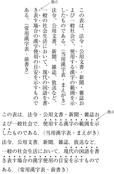 圏点の配置例
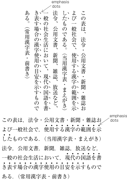 Compositions of Emphasis Dots
割注とは,行の途中に挿入する注(挿入注)の一種で,2行に割って(割り書きという)挿入することから,その名前が付けられている.割注の使用頻度は多くないが,その該当用語が出てきた箇所に直接補足説明できることから,学習参考書,旅行ガイド,事典類,解説書などで利用されており,人物・用語等の簡単な紹介に重要な役割を果たしている(dummygenerated参照).したがって,縦組での利用が多く,横組での例は非常に少ない.
Warichu (inline cutting note) is a type of inline notation, which is inserted with two lines of small characters, as the style called Warichu (divide a line into two sub lines). The frequency of inline cutting note is not so high. However, inline cutting note is very important for study guides, travel guudes, reference books, encyclopedias and manuals, because it is very effective to notify the target word where the word is happen to appear.(dummygenerated). Accordingly, inline cutting note is usually used in vertical writing mode. It is very few that inline cutting note is used in horizontal writing mode.
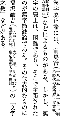 割注の例
割注の例
 Warichu (Inline cutting note
|
注1) note 1) |
割注については,JIS X 4051では“4.16 割注処理”に規定がある. JIS X 4051 specifies inline cutting note in 4.16 "Handling of inline cutting note". |
割注の文字サイズは,指定によるが,一般に6ポイント程度の文字が使用されている(dummygenerated参照).
Character size of inline cutting note depends on the basic character size. Usually around 6 point size is used.(dummygenerated).
割注そのものの行間のアキは,一般に0である.つまり,行間のアキをとらない(dummygenerated参照).
The space between adjacent inline cutting note lines is zero, namely there is no line gap between them.(dummygenerated).
割注は,dummygeneratedのように,通常,2行に割り書きし,割注全体の先頭及び末尾に,行送り方向の割注の幅と同じ文字サイズのパーレン[(] (LEFT PARENTHESIS),[)] (RIGHT PARENTHESIS)でくくる形式が多い.したがって,割注を囲む括弧類(以下,割注始め括弧類(cl-28)及び割注終わり括弧類(cl-29)とよぶ)のサイズは,割注の文字サイズの2倍にする.なお,割り注始括弧類の前,及び割注終わり括弧類の後ろの漢字等,平仮名,片仮名とのアキはベタ組とする.
As shown in dummygenerated, inline cutting note usually has two lines, and parenthesized with [(] (LEFT PARENTHESIS) and [)] (RIGHT PARENTHESIS), which are double size of inline cutting note itself. There are no space between base text and parenthesis for inline cutting note.
|
注1) note 1) |
割注を始め括弧類(cl-01),終わり括弧類(cl-02)でくくらずに,指定された一定のアキをとる方法もある. There is a style of inline cutting note, which has no opening brackets(cl-01) or closing brackets(cl-02), and has instructed spaces between base text and inline cutting note. |
|
注2) note 2) |
割注始め括弧類(cl-28)及び割注終わり括弧類(cl-29)と隣接する文字間の間隔についての処理方法の詳細は,“2.9 文字クラスについて”で説明する文字クラスに従い,表の形式にしてAppendix 〓で示す. Handling of Inter-letter space between warichu opening brackets(cl-28) or warichu closing brackets(cl-29) and adjacent characters is described in Appendix dummy as a complete table, using concept of character class described in dummy. |
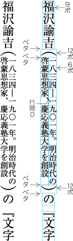 割注の指定例
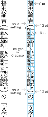 Example of instruction for Inline Cutting Note
割注の中には始め括弧類(cl-01),終わり括弧類(cl-02),句点類(cl-06),読点類(cl-07)も使用される.これらの組版処理は,本文と同じである.
Symbols, like opening brackets(cl-01), closing brackets(cl-02), commas(cl-07) and full stops(cl-06) are also used in inline cutting note text. In such cases, the handling of suchsymbols is same as basic text.
割注は,本文の1行の<a class="termref" href="termlist.xml#line feed">行送り</a>方向の幅の中心と,割注の行送り方向の幅の中心をそろえて配置する.割注の2行の行送り方向の幅は,本文の行の幅より大きくなるが,はみ出しは両方に均等に出すことになる.この場合の行間は,割注のない部分の行間を基本版面として設定した行間とし,割注の部分は狭くなる(dummygenerated参照).したがって,基本版面を設定する際に,これを考慮し,行間を広めに設計する必要がある.
The horizontal width of inline cutting note area is wider than the width of base text line. The inline cutting note area and the base text line are aligned in center line of inline direction. The line gap used to determine the kihon hanmen should not be affected by the horizontal width of the inline cutting note area. In other words, the line gap for the kihon hanmen needs to be designed wider than usual in consideration of inline cutting note.
割注の2行の行長は,できるだけ揃える.本文の1行の中に割注が全て配置できる場合は,2行に分割可能な箇所で,かつ割注全体の文字列の半分に最も近い位置で分割する(この場合の2行に分割するルール(分割可能箇所)も本文と同じである).ただし,割注の2行目の行長が1行目の行長より長くしない(dummygenerated参照).
The length of the two lines of inline cutting note should be aligned to as same as possible. If the inline cutting note can be set in one base text line, the inline cutting note text will be break into two lines, where the line can be break and nearest position from the center. Note that the rule for line break, that is to say, line breakable place, is as same as the rule for main text. The second line (left line) should not be longer than the first line (right line).(dummygenerated).
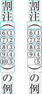 1行の中に割注が全て配置できる場合の例
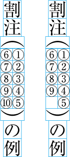 The example that the inline cutting note can be set in one base text line.
割注を本文の2行以上にわたって配置する処理
Handling of inline cutting note, when the inline cutting note is set straddled over two base text lines
割注の挿入位置や分量によっては,本文の1行の中に割注が全て配置できなく,割注を本文の2行又は3行以上にわたって配置する場合がある.この場合の文字列の配置順序及びそれぞれの割注の行長は,dummygenerated又はdummygeneratedのようにする.
inline cutting note is set straddled over two or more than three base text lines, when the inline cutting note can not be set in one base text line. In these cases, the inline cutting note text will be set as given in dummygenerated or dummygenerated.
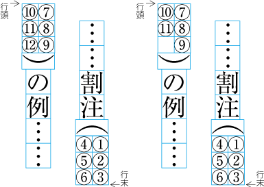 2行にわたって割注を配置する例
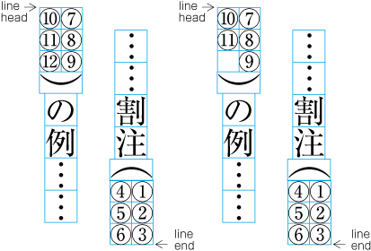 The example of inline cutting note straddled over two base text lines.
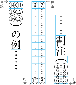 3行にわたって割注を配置する例
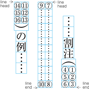 The example of inline cutting note straddled over three base text lines.
|
注1) (note 1) |
割注の利用は,そもそも人物や事項に簡単な説明を付けるもので,注記の字数がそれほど多くならない場合に利用する形式である.したがって,割注が本文の2行にわたって配置されることは,その挿入位置により頻出する.しかし,3行にわたって配置される例はほとんどない.このような注になるのであれば,別の形式の注にすることを検討する必要がある. Normally, inline cutting note is used for short notations for persons and matters. Therefore, the text size should be not so much. That is the reason why the inline cutting note is set in the base text line. Accordingly, there several times happens that inline cutting note is set straddled over two base text line. However, there scarcely happens that inline cutting note is set straddled over three or more base text lines. If the notation text size is too large, other possible notation styles should be considered to use. |
ある意味のまとまりをもった複数の文で構成されている段落(意味上の段落)を示す場合に,通常,新しい段落で改行にしている.この際,段落先頭行の字下げ(JIS X 4051では“段落字下げ”という用語を使用している)については,次のような方法がある.なお,字下げする場合は,その段落で使用している文字サイズの全角が原則である.
A paragraph, a section of a document which consists of one or more sentences to indicate a distinct idea, usually begins on a new line. For the related line head indent at the beginning of paragraphs (in JIS 4051, this is called "paragraph line head indent") the following methods are available. As for the amount of space for the indentation, in principle the full-width size of the characters in the paragraph is used.
|
注1) (note 1) |
|
|
注2) (note 2) |
段落先頭行の字下げを全角とした場合の始め括弧類(cl-01),終わり括弧類(cl-02)の組版処理については,本ドキュメントの“2.1.5 行頭の括弧類の配置方法”を参照. The layout processing of opening brackets(cl-01) and closing brackets(cl-02) in the case of full-width line head indent at the beginning of paragraphs, is described in this document, dummy. |
-
全ての段落の先頭行の字下げを行う.ほとんどの書籍・雑誌は,この方法を採用している(dummygenerated参照).
Line head indent at the beginning of paragraphs is applied for all paragraphs. Nearly all books and magazines make use of this method (See dummygenerated).
注1)
(note 1)
改行にしてかぎ括弧[「] (LEFT CORNER BRACKET),[」] (RIGHT CORNER BRACKET)で括った会話などを“といった……”などと受けて続く場合は,文節が連続していると考え,段落の先頭行の字下げは行わないで天ツキとする(dummygenerated参照).横組の別行にした数式を受けて,改行で“となるので……”などと受ける場合も,同様に段落の先頭行の字下げは行わない.ただし,小説などでは,全て段落の先頭行の字下げは行うという処理方法も行われている(dummygenerated参照).
In case of for example written conversation continued with e.g. "she said", where line break is used and parts are bound together via [「] (LEFT CORNER BRACKET) and [」] (RIGHT CORNER BRACKET), it is assumed that the phrases of "she said " and the conversation are one continuous phrase. Hence, there is no line head indent at the beginning of "she sed" phrase, after conversation part (See dummygenerated). With a (mathematical) formula in a separate line in Horizontal Settings, and a line break with an expression like "will be", there is also no line head indent at the beginning of paragraphs. However, in novels etc., there is also the approach to apply first line indent to all paragraphs (See dummygenerated).
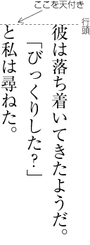 会話の直後の行の組方例1
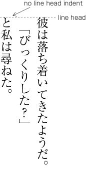 Layout example 1 of a line immediately following a written conversation
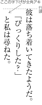 会話の直後の行の組方例2
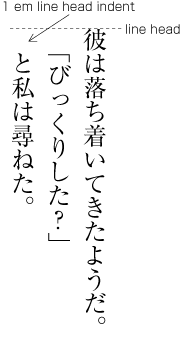 Layout example 2 of a line immediately following a written conversation
-
全ての段落の先頭行の字下げを行わないで,天ツキとする(dummygenerated参照).横組などの一部の書籍・雑誌で体裁を優先して採用している例があるが,あまり読みやすいとはいえない.
Line head indent at the beginning of paragraphs is not applied for any paragraph at all, and the tentsuki position is used (See dummygenerated). There are examples of this method used in certain books and magazines for the sake of styling, but this is rather hard to read.
-
段落の先頭行の字下げは原則として行うが,見出しの直後の段落に限り字下げを行わないで、天ツキとする(dummygenerated参照).字下げを行わない見出しと体裁を揃えるということもあり,横組の一部の書籍・雑誌でこの方法が採用されている.
In principle line head indent at the beginning of paragraphs is being applied, however not for paragraph immediately following headings, and set as "tentsuki" (See dummy). There are also cases unifying the style with headings which use tentsuki, and in some books and magazines this method is being applied for horizontal writing method..
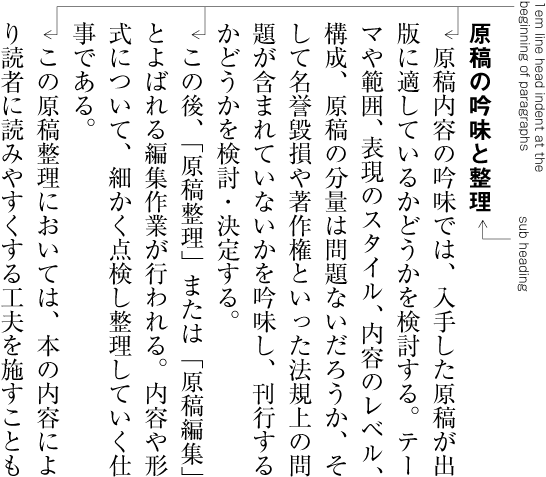
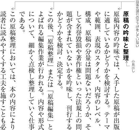
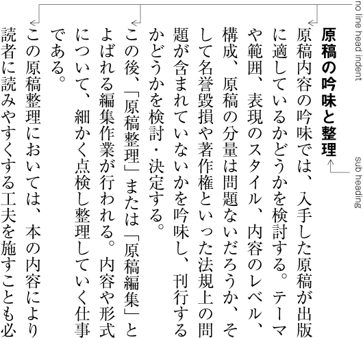
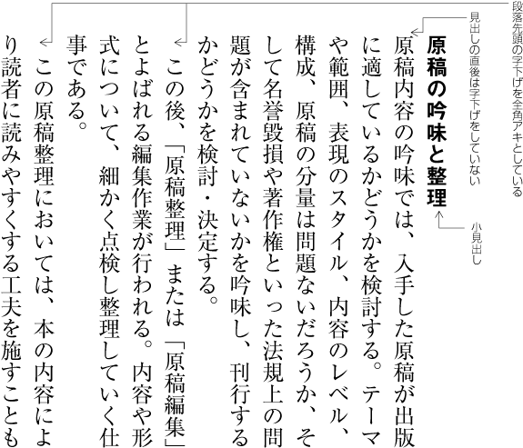
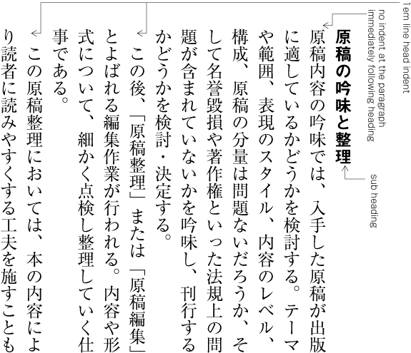
なお,箇条書きなどでは,逆に,段落の2行目以下の行頭を字下げするという方法も行われている(dummygenerated参照).“問答形式(Q&A)”などとよばれる処理方法である.番号が付く場合など,この番号が目立つという効果がある.
Furthermore, for example with itemisation, on the contrary there is also the method to indent the line following the second line of the paragraph (See dummygenerated). This is the so-called "questions and answers" form (Q&A). It has the effect that numbers (if used) stand out.
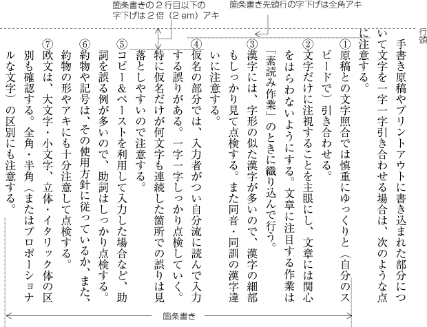 箇条書きの組方例
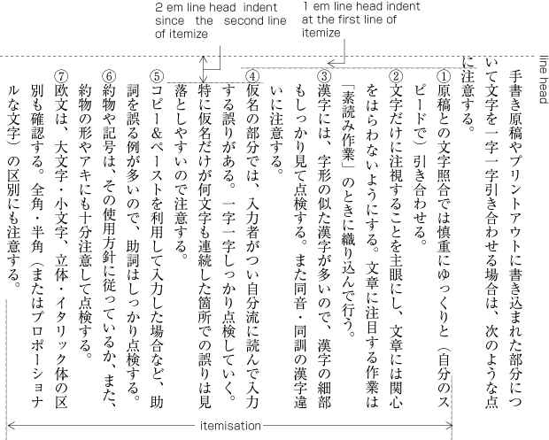 Layout example for itemisation
|
注1) (note1) |
箇条書きについては,JIS X 4051では“8.4 箇条書き処理”に規定がある. The definition of itemisation is provided in JIS X 4051, sec. 8.4 "itemisation processing". |
字下げは,版面(1段組の場合)又は段の領域(多段組の場合)の行頭側の端から指定された量だけ行頭位置を下げる処理である.逆に行末側の端から指定された量だけ行末位置を上げる処理が字上げである.
The line head indent is the indentation of the line head about a fixed amount, starting from the line head side of HANMEN (in the case of one column) or of the column area (in the case of several columns). On the contrast, the indentation of the line end position about a fixed amount, starting from the line head, is called line end indent.
字下げは,引用文を別行にして示す場合(dummygenerated参照)や,別行の見出しで行う例がある.字上げは,別行の見出しなどで行う例がある.
There are examples of line head indent for a quotation in separate lines (See dummygenerated) or for headings in separate lines. Line end indent is used for example for headings in separate lines.
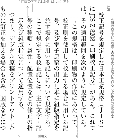 別行の引用文を字下げした例
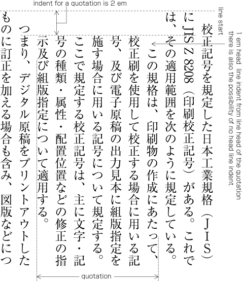 Example of line head indent for a quotation in a separate line
|
注1) (note 1) |
別行にする引用文では,本文と同じ文字サイズで字下げだけで本文との区別を表す方法と,文字サイズも本文よりは小さくする方法がある.前者の方法が多い.この場合,一般に本文の文字サイズの2倍の字下げとする例が多い.分量の多い引用文が数多く挿入される場合は,全角の字下げとして,さらに別行の引用文の前後を1行アキとする方法も行われている.文字サイズを本文よりは小さくする場合の字下げの方法は,“3.2 注の処理”参照. For quotations in different lines, there are the following methods: either the character size is the same as for the main text, and the difference to the main text is expressed only via line head indent; or the character size is made smaller than the main text. The former method is applied frequently. With this method, often the line head indent is made the double of the normal character size of the main text. If there are large quotations inserted frequently, there is also the method that full-width line head indent is used, and furthermore, before and after the quotation in a separate line, an empty line is inserted. For the method of line head indent with characters smaller than the main text, see dummy Editor's note: this section is in part 3, which will not be published.. |
|
注2) (note 2) |
そろえとは,1行の文字列の位置を指定した位置に合わせる方法のことである.次のような方法がある(dummygenerated参照).
Justification means to unify the position of a character sequence in a line to a fixed position. There are the following methods (See dummygenerated).
|
注1) (note 1) |
そろえの処理については,JIS X 4051では“4.18 そろえ等の処理”に規定されている. Justification processing is defined in JIS X 4051, sec. 4.18 "Justification Processing". |
-
中央そろえ 隣接する文字の字間は,原則としてベタ組(和欧文や始め括弧類(cl-01),終わり括弧類(cl-02)の前後など原則とするアキが必要なときは,そのアキを入れる)とするか,又は指定されたアキがある場合はそのアキにし,行頭側と行末側の空き量を均等にし,文字列の中央を,行の中央の位置に合わせて配置する.
Centering. The space between adjacent characters is in principle solid setting (if there is space necessary because of Latin script text or before or after opening brackets(cl-01) and closing brackets(cl-02), that space is inserted). If there is not solid setting but a fixed space between characters, this is used; the amount of space at the line head and line end is made equal, and the center of the character sequence is unified with the center of the line.
-
行頭そろえ 隣接する文字の字間は,原則としてベタ組(和欧文や始め括弧類(cl-01),終わり括弧類(cl-02)の前後など原則とするアキが必要なときは,そのアキを入れる)とするか,又は指定されたアキがある場合はそのアキにし,文字列の先頭を行頭の位置に合わせ,1行に満たないときは行末側を空けて配置する.
Line head justification. The space between adjacent characters is in principle solid setting (if there is space necessary because of Latin script text or before or after opening brackets(cl-01) or closing brackets(cl-02), that space is inserted). If there is not solid setting but a fixed space between characters, this is used; the start of the character sequence is unified with the line head, and if the line is not full, the line end is kept empty.
-
行末そろえ 隣接する文字の字間は,原則としてベタ組(和欧文や始め括弧類(cl-01),終わり括弧類(cl-02)の前後など原則とするアキが必要なときは,そのアキを入れる)とするか,又は指定されたアキがある場合はそのアキにし,文字列の末尾を行末の位置に合わせ,1行に満たないときは行頭側を空けて配置する.
Line end justification. The space between adjacent characters is in principle solid setting (if there is space necessary because of Latin script text or before or after opening brackets(cl-01) or closing brackets(cl-02), that space is inserted). If there is not solid setting but a fixed space between characters, this is used; the end of the character sequence is unified with the line end, and if the line is not full, the line head is kept empty.
-
均等そろえ 隣接する文字の字間は,原則としてベタ組(和欧文や始め括弧類(cl-01),終わり括弧類(cl-02)の前後など原則とするアキが必要なときは,そのアキを入れる)とし,そのうえで,行の調整を行う際に空ける調整が可能な箇所で字間を均等に空けて(又は詰める調整が可能な箇所を詰めて),文字列の先頭を行頭の位置に,文字列の末尾を行末の位置に合わせる.
Equal justification. The space between adjacent characters is in principle solid setting (if there is space necessary because of Latin script text or before or after opening brackets(cl-01) or closing brackets(cl-02), that space is inserted). In addition, using the space made available during line adjustment processing, equal character spacing is applied where possible (or character space reduction is applied where possible). The start of the character sequence is aligned to the position of the line head, and the end of the character sequence to the position of the line end.
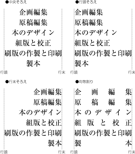 そろえの配置例
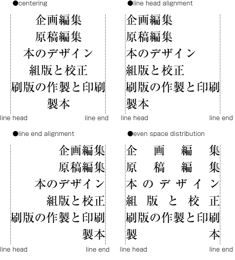 Example of Justification
|
注1) (note 1) |
そろえは,見出しや表の項目の配置方法でいくつかの方法が行われている.例えば,横組の見出しは左右のバランスを考慮し中央そろえが多いが,行頭そろえにする例もある. There are several justification methods being applied for positioning of headings or items of tables. For example for headings in HorizontalSettings often centering is used, taking the left-right balance is taken into account. However, there are also examples of line head justification. |
|
注1) (note 2) |
均等そろえは,俳句を別行にして掲げる場合によく利用されている(dummygenerated参照). Equal justification is often used for printing Haiku in separate lines (See dummygenerated).
|
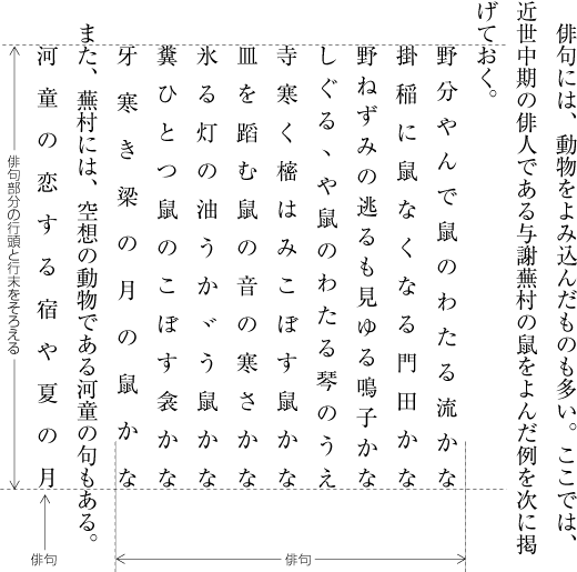

段落末尾処理とは,段落の最終行の文字数が,ある文字数未満になることを避けるための処理のことである.文字ウィドウ(character widow)処理ともいう.
The intent of widow adjustment of paragraphs is to avoid that the last line of a paragraph contains less characters than a given number. This is also called "character widow" processing.
|
注1) (note 1) |
|
|
注2) (note 2) |
日本語組版では,段落末尾処理はあまり重視されていない.しかし,段落の最終行が1字だけになる(これは許容している例が多い),もっと極端に改丁・改ページで始まる直前のページに1字だけ配置されるという場合は、避けるようにする(dummygenerated参照). Widow adjustment of paragraphs is not regarded as very important in Japanese composition. However, care is taken to avoid cases like a single character in the last line of a paragraph (often this is tolerated), or - even more extreme - that there is just one character on a page just before a page break or a new recto (See dummygenerated). |
タブ処理とは,ある特定の文字列を行中の指定された位置に合わせて配置することである.1つあるいは複数の文字列を行の特定の位置に配置する場合に利用できる.表形式のデータの配置,箇条書きなどに利用されている(dummygenerated参照).
The Tab Setting is setting a specific series of characters in a indicated align position of the line. This method is able to use to set series of characters in a indicated align position of the line. This method is useful for alignment of Table data, itemized data, etc. (See dummygenerated).
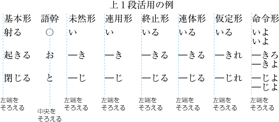 タブ処理の機能を使用して配置した例
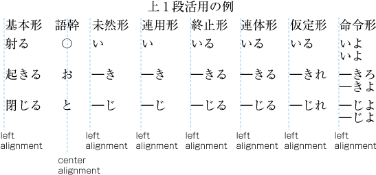 An example for the setting using Tab Setting functionality
|
注1) note 1) |
タブ処理を行うためには,タブ位置及びそのタブ種(配置位置にどのように揃えるかの形式)の指定,さらに,その指定位置に配置する文字列が必要である.そこで,タブ処理を行う文字列の前にタブ記号を挿入しておく必要がある.タブ記号の直後にある文字列がタブ処理を行う対象の文字列になる(dummygenerated参照).そして,1行中に挿入したタブ記号の数だけのタブ位置とそのタブ種を指定する.
For Tab Setting, it is necessary to identify Tab Position, Tab Type (How to align the characters in the Tab position), and the characters to be set. For this purpose, it is necessary to insert a Tab sign before the Tabbed character. A series of characters, just after the Tab sign is the target characters (See dummygenerated). If there are more than one Tab signs, it is necessary to indicate as same numbers of Tab positions and Tab Types as the numbers of Tab signs.
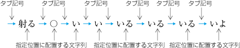 タブ記号とタブ処理の対象となる文字列
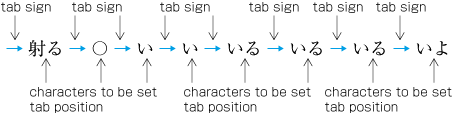 Tab Signs and the target text of Tab Setting
タブ処理で指定する配置位置にどのように揃えるかの形式(タブ種)としては,次のようなものが必要になる.
There are following types of Tab Setting to align texts with the Tab Setting.
-
左(上)そろえタブ タブ処理を行う対象の文字列の先頭をタブ位置に合わせて配置する(dummygenerated参照).左そろえタブは横組の場合のタブ種,上そろえタブは縦組の場合のタブ種である.
Top (Left) alignment Tab Setting. The start position of the text is aligned to the Tab position (See dummygenerated). Left alignment is used for Horizontal Settings and Top alignment is used for Vertical Settings.
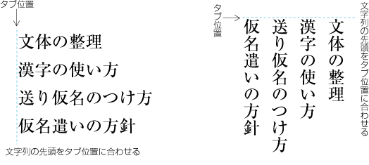 左(上)そろえタブの列
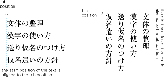 A series of Left (Top) alignment Tab Settings
-
右(下)そろえタブ タブ処理を行う対象の文字列の末尾をタブ位置に合わせて配置する(dummygenerated参照).右そろえタブは横組の場合のタブ種,下そろえタブは縦組の場合のタブ種である.
Right (Bottom) alignment Tab Setting. The bottom (right) position of the text is aligned to the Tab position (See dummygenerated). Right alignment Tab Setting is used for Horizontal Settings, and bottom alignment Tab Setting is used for Vertical Settings.
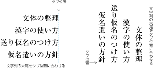 右(下)そろえタブの列
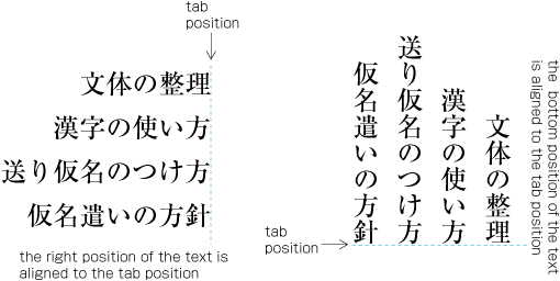 A series of right (bottom) alignment Tab Setting
-
中央そろえタブ タブ処理を行う対象の文字列の中心をタブ位置に合わせて配置する(dummygenerated参照).
Center alignment Tab Setting. The center of the text is aligned to the Tab position (See dummygenerated).
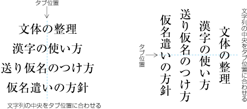 中央そろえタブの列
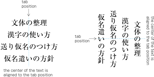 A series of Center alignment Tab Settings
-
指定文字そろえタブ タブ処理を行う対象の文字列の中にある指定された文字(例えばピリオド)の先頭をタブ位置に合わせて配置する(dummygenerated参照).
Alignment with specified character Tab Setting. The start position of specified character or sign (ex. period) in the text is aligned to the Tab position (See dummygenerated).
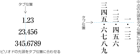 指定文字そろえタブの列
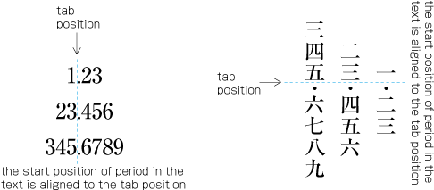 A series of the Alignment with specified character Tab Settings
行頭から,タブ記号で区切られた文字列と,タブ処理として指定された配置位置(タブ位置)を,順番に対応させて配置する.それぞれの文字列に含まれる始め括弧類(cl-01),終わり括弧類(cl-02)などの組版処理は,本文と同じである.
Set the text from the top of the line to the position before the Tab sign in the first Tab position, set the text from the first Tab sign to the next Tabsign in the second Tab position, and so on. The behavior of opening brackets(cl-01) and closing brackets(cl-02), etc. is same as the basic text.
いくつかの配置例を示す.ただし,b以降は設計段階では予想しなかった配置となる場合が多く,一般に,タブ位置の設計のやり直しが必要になる.
Following are some of the examples. The behavior of b and after are very difficult to anticipate, so it is necessary to re-design with trials and errors.
-
タブ処理の対象となる文字列が行の最初の文字列であれば,行頭に一番近いタブ位置にその文字列を合わせ,以下,順番に対応させて配置する(dummygenerated参照).
If the target string is the first series of the Line, the characters should be set in the first Tab position from the Start of the Line, and, one after another (See dummygenerated).
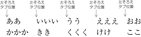 タブ処理による配置列1
 An example of Tab Setting 1
-
タブ処理の対象となる文字列が長くて,次にくるタブ位置をはみ出した場合は,その長い文字列の後ろのタブ処理の対象となる文字列は,そのはみ出した長い文字列の末尾以降にある最初のタブ位置が対応する(dummygenerated参照).
If the target string of text if too long to set before the next tab position and overflow, the next string of text is aligned to the tag position after the bottom of the preceding string (See dummygenerated).
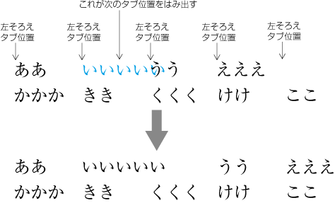 タブ処理による配置列2
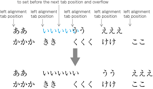 An example of Tab Setting 2
-
指定位置にタブ処理の対象となる文字列を配置した結果,前の文字列と重なってしまった場合は,直前の文字列の末尾に続けて配置する(dummygenerated参照).
If the top of the string is overwrapped with the bottom of the preceding string as the result of the Tap Setting indication, the following string is set just after the preceding string (See dummygenerated).
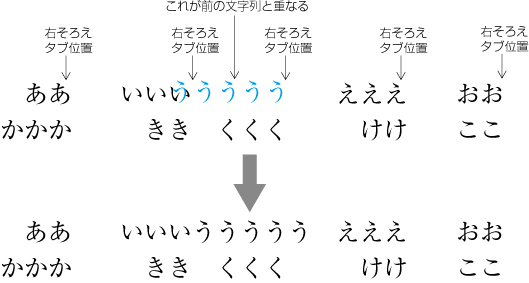 タブ処理による配置列3
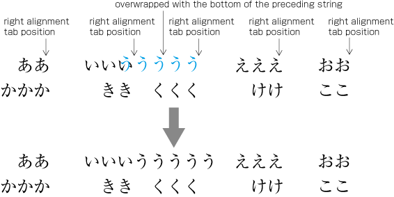 An example of Tab Setting 3
-
タブ処理の対象となる文字列に対応するタブ位置がない場合は,次行の先頭のタブ位置から順番に対応をとって配置する(dummygenerated参照).
If there is no Tab position corresponding to the target string, the string should be set from the Tab position of the next line, and so forth. (See dummygenerated).
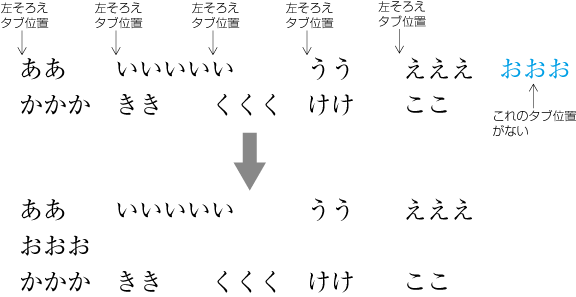 タブ処理による配置列4
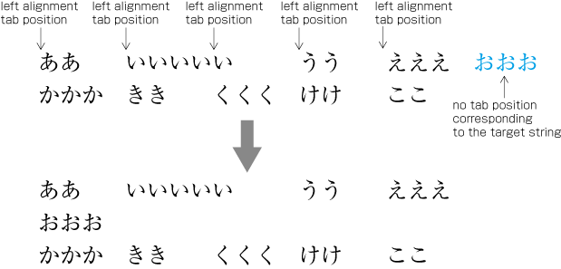 An example for Tab Setting 4
添え字とは,文字のそばにつける上付き文字又は下付き文字をいう.国際単位系(SI)の単位,数式,化学式等で使用されている.
Superscripts and Subscripts are small letters associated with a base characters used to indicate unit symboles of SI, or used for Mathematical formula and Chemical formula.
|
注1) note 1) |
上付き文字は,一般に親文字の後ろに付くが,化学式では前に付く場合がある.下付き文字は,一般に親文字の後ろに付くが,化学式では前に付く場合がある.親文字と添え字との字間はベタ組にする.
Superscripts are usually set after the base character, with some exception of chemical formula (before the base character). Subscripts are usually set after the base character, with some exception of chemical formula (before the character). Super scripts and subscripts should be set solid.
添え字が付く例をいくつか掲げる(dummygenerated参照).なお、添え字については、添え字が付く親文字を含め、このドキュメントでは親文字群中の文字(添え字付き)(cl-21)として扱う。
Examples of superscripts and subscripts(dummygenerated). In this document, superscripts and subscripts and their base characters are handled as ornamented character complex(cl-21)
 添え字の配置列
 An example of superscripts and subscripts
|
注1) note 1) |
親文字群中の文字(添え字付き)(cl-21)と隣接する文字間の間隔についての処理方法の詳細は,“2.9 文字クラスについて”で説明する文字クラスに従い,表の形式にしてAppendix 〓で示す. Inter-letter space betweenornamented character complex(cl-21) and adjacent characters is described in detail in Appendix dummy in accordance with character class concept in dummy. |
添え字の文字サイズ及び親文字に対する添え字の行送り方向の配置位置については,JIS X 4051では,“処理系定義とする”となっている.添え字の文字サイズは,親文字のサイズにもよるが,一般に親文字の60%くらいがよいであろう.
JIS X 4051 specifies the character size and the positioning of superscripts and subscripts alongside of the base character in the block direction to be implementation definable parameters. However it is recommended that the size of superscripts and subscripts are around 60% of the base character depending the size of the base character.
なお,親文字群中の文字(添え字付き)(cl-21)の文字列の字間で2行に分割してはならない.また,その文字列の字間は,行の調整処理で字間を空ける箇所にはしない.
It is prohibited to line break within ornamented character complex(cl-21). Also, it is prohibited to use the inter-letter spacen within ornamented character complex(cl-21) for line adjuctment.
|
注1) note 1) |
縦組の中に添え字が付いた文字列(親文字群中の文字(添え字付き)(cl-21))を配置する場合は,文字を時計回りに90度回転し,配置する.文字列が短い場合は縦中横にして配置してもよい. In case of vertical writing mode, characters with superscript or subscript, that is ornamented character complex(cl-21), are turned 90 degree clock wise. If the length of the sequence is short enough, the sequence can be set as tatechuyoko. |
|
注2) note 2) |
親文字の後ろに下付きと上付きとが2つ付く場合がある.この場合は,数式では親文字と下付きとをベタ組で配置し,その後ろにベタ組で上付きを配置する方法が一般的である.化学式でも同様であるが,式の意味から上付きも親文字とベタ組で配置する場合もある. When both the superscript and the subscript are following the base character, usually the subscript is set first with solid space followed by the superscript with solid space. As for chemical formula, both superscript and subscript are sometimes set vertically same position with solid space between the base character, because of the meaning of the formula. |
振分けとは,1行の途中に複数の言葉や文を配置する処理である.複数の選択肢を示す場合などに利用されている(dummygenerated参照).学習参考書,マニュアル,解説書などで使用している例がある.振分けを行う場合,複数の行を括弧類でくくることも多い.
Furiwake is a typesetting style to set multiple phrases or sentenses in halfway of a line. furiwake also used to indicate options. (dummygenerated).Study guides, manuals and reference books sometimes use furiwake. In many furiwake style, multiple lines are indicated with opening brackets(cl-01) and closing brackets(cl-02), etc.
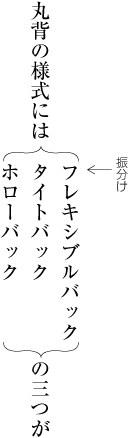 振分けの列
振分けの列
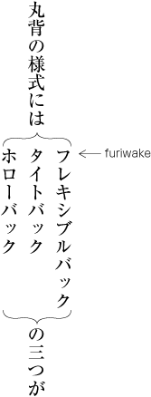 An example of FURIWAKE
振り分け処理は,一般に次のように行っている(dummygenerated参照).以下では,振分けするそれぞれの文字列を振分け行とよぶ.
Furiwake is usually done as follows:(dummygenerated). In this clause, the strings which are the target of furiwake, are called furiwake-gyou.
-
振分けに使用する文字は,その段落で使用している文字サイズとするが,やや小さい文字サイズにしたり,書体を変える場合もある.
The character size of furiwake-gyou is usually as same as the sieze of base paragraph. Sometimes, the size of uriwake-gyou is a lttle bit smaller than the size of the base paragraph. Sometimes, the font style of furiwake-gyou is changed from the style of the base paragraph.
-
同一の振分け処理の中の全ての振分け行の先頭は,揃える.
In same furiwake process, the top positions of all the furiwake^gyous are aligned.
-
振分けの行長は,同一の振分け処理の中で最も長い振分け行の行長を振分け行長とする.ただし,振分けの行長を指定し,長い同一の振分け行を折り返して複数の行にすることもある.この場合の2行目以下の行頭は指定による.同一の振分け行とする文字列中に改行の指定がある場合は,その指定箇所で振分け行を分割する.この場合の行頭は,振分け行の1行目の位置と揃える.また,同一の振分け行を複数の行に分割した場合の行間は0とする.
The line length of the furiwake block is the line length of the longest furiwake-gyou. However, it is permitted to indicate the length of furiwake block, and break the furiwake-gyous. In this style, the start positions of the breaked line should be explicitly indicated. When there are linebreak mark in the furiwake-gyou, the line is broken in the indicated places. In this style, the start position of the broken lines are aligned to the first line. The space between broken lines should be solid.
-
振分けの前後を括弧類で囲む場合,括弧類の行送り方向の幅は,振分け行の行送り方向の幅(の合計)と揃える.
When the furiwake block is enclosed by opening brackets(cl-01) and closing brackets(cl-02), etc. the width of brackets should be same as the width of FURIWAKE block.
-
同一の振分けは,一体として扱い,本文の複数の行にわたって配置してはならない.
One FURIWAKE block should be set in a base text line. One FURIWAKE block should not be extended to multiple base text lines.
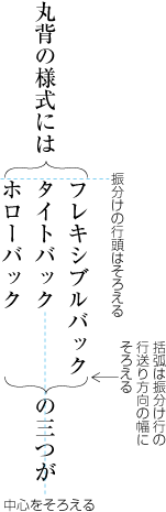 振分けの配置方法
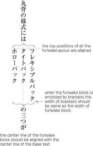 Setting method of FURIWAKE
振分けを含む段落の行間は,指定による.そこに配置される振分けの内容を考慮して指定する必要がある.
The Line-Feed space of the paragraph, which containes the FURIWAKE block, should be explicitly indicated. The space should be decided with the consideration of the content of the FURIWAKE block.
振分けは割注と異なり,一般に行送り方向のサイズが大きくなる.そこで,版面又は段の領域の外側へのはみ出しは認められていない.版面又は段の領域の範囲内に配置する.
In general, the width of FURIWAKE block is larger than the width of inline cutting note block. Accordingly, the whole FURIWAKE block should be set inside of the KIHON-HANMEN, or a column of the KIHON-HANMEN. To set FURIWAKE blocl over the border of the kihon hanmen is prohibited.
日本人名の名簿を一覧にする場合など,行中の文字列の一部について全長を指定する例がある.このような場合に,行中の指定された文字列を,字間を調整して,字詰め方向について指定された長さにする処理が字取り処理である(dummygenerated参照).人名など字数の異なる文字列を指定した一定の長さで揃えたい場合に利用できる.
In case of Japanese human name list, or similar cases, the length of some part of the base string is sometimes explicitly indicated. In these cases, the indicated letters are set with the adjustment of inter-character spacing. It is the jidori processing. (dummygenerated). JIDORI is very useful to align different letter number in same aligned length, such as human names.
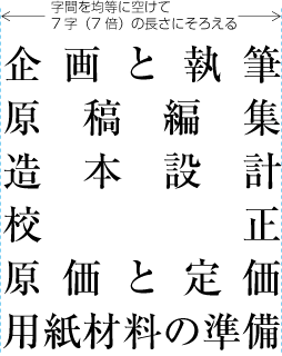 字取り処理の例1
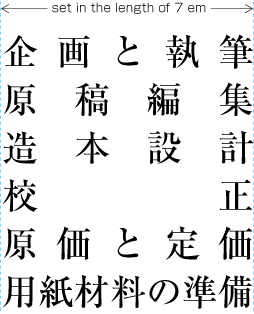 An example of JIDORI-Processing 1
横組の柱などでは,例えば,章番号などの後ろに続く文字列だけを,字取り処理する例がある.例えば,2字の文字列の字取りを柱の文字サイズの6倍とし,3字から6字の文字列の字取りを柱の文字サイズの7倍とする(dummygenerated参照).この例では,7字以上は,ベタ組とする.
Sometimes in Running Heads in Horizontal Settings, texts, except chapter and clause numbers, are processed with JIDORI-processing. For example, 2 letters are set in the length of 6 times of character size of the Running Head, 3 letters to 6 letters are set in the length of 7 times of the character size of the Running Head (dummygenerated). In this case, more than 7 letters are set in solid setting.
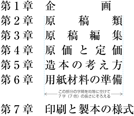 字取り処理の例2
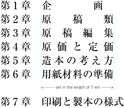 An example of JIDORI-Processing 2
字取り処理は,次のように行う.
The Process of jidori-processing should be done as follows:
-
字取りの全長の指定は,そこに使用されている文字サイズの整数倍とする.
The length of jidori-processing should be indicated with integer times of the base character size.
-
指定された文字列について,字間を均等に空け,字詰め方向の先頭から末尾までを,指定された長さにする.ただし,次のような箇所は,空ける対象としない.
The JIDORI text should be adjusted with the spacing among characters, and the length from the top of the text to the bottom of the text should be aligned in the indicated length. However, the following positions should be solid space.
-
2行に分割してはならない箇所.連数字中の文字(cl-24)の字間,欧文用文字(cl-27)の字間,2倍ダーシのダーシとダーシの間,2倍リーダのリーダとリーダの間など.これらの文字列は一体として扱いたいからである.
Positions where line breaging is prohibited; Inter-Character Spacing among Western-Arabic Numerals; Space between [—] (EM DASH) and [—] (EM DASH); Space between [‥] (TWO DOT LEADER) and [‥] (TWO DOT LEADER); Space between […] (HORIZONTAL ELLIPSIS) and […] (HORIZONTAL ELLIPSIS), and so on. These strings are expected to be treated as one block.
注1)
note 1)
グループルビが付く文字列(親文字群中の文字(熟語以外のルビ付き)(cl-22)は,組版処理上からは一体として扱うので,字取り処理では,その字間を空ける対象箇所としないということになる.しかし,体裁の上からは,親文字の字間は,字取り処理で均等に空ける対象箇所とした方がよいという考え方もある.
The set of ideographic characters(cl-19) with group-ruby is basically treated as one group, accordingly, in principal, also in jidori-processing, the inter-letter space should be solid. However, there is another method to use inter-letter space among the base characters of the group-ruby to adjust the jidori-processing.
注2)
note 2)
始め括弧類(cl-01)の前,終わり括弧類(cl-02)の後ろなど行長の調整で空ける対象箇所としない字間も問題となる.これらの箇所は,議論の分かれるところだが,字取り処理で空ける対象箇所としてよいだろう.ただし,<a class="characterClass" href="#cl-01">始め括弧類(cl-01)</a>の後ろ及び<a class="characterClass" href="#cl-02">終わり括弧類(cl-02)</a>の前は,2行に分割してはならない箇所なので,字取り処理で空ける対象箇所としない.
The handling of opening brackets(cl-01) and closing brackets(cl-02) in the jidori-processing is also very controversial. Usually, the space before opening brackets and space after closing brackets are usually solid. However, in jidoti-processing, the space before openting brackets and the space after closing brackets may be used for line adjustment. But, the space after opening brackets and the space before the closing brachets should not used for adjustment, because, these positions is prohibited to line break.
-
欧文間隔(cl-26),和字間隔(cl-14)など空白を挿入してある箇所は,その空白の前及び後ろの2箇所ではなく,空白の前(又は後ろ)だけとする.空白の前後2箇所で空けると空き過ぎになる.
Only the space befor Western word space(cl-26) and fulwidth ideographic space(cl-14) shall be used for the adjustment of jidori-processing. If bothe the spaces the befor and the after are used, the total length of the spaces are too long.
-
-
指定された文字列が1字の場合など,字間を空ける箇所がないときは,文字列の後ろを空けておく.
When there is no place to insert space for adjustment, like the text with only one letter, the space after the text should be blank.
理工学書だけでなく,一般の本でも,等号[=] (EQUALS SIGN),ほとんど等しい[≒] (APPROXIMATELY EQUAL TO OR THE IMAGE OF)や,正符号[+] (PLUS SIGN),負符号[−] (MINUS SIGN)などの数学記号が使用されている.日本語組版では,等号,ほとんど等しいなどと,正符号,負符号などでは組版処理方法が異なる.そこで,このドキュメントでは,等号の類似記号を等号類(cl-17),正符号などの類似記号を演算記号(cl-18)とに分けて,それらに限り,処理方法を解説する.
Math symbols and math operators, such as [=] (EQUALS SIGN), [≒] (APPROXIMATELY EQUAL TO OR THE IMAGE OF), [+] (PLUS SIGN) and [−] (MINUS SIGN) are commonly used not only scientific and technical documents but also usual books. In Japanese composition system, there are two different groups of math symbols, which are differently treated eatch other. So, in this document, math symbols are classified to two different classes; math symbols(cl-17) and math operators(cl-18).
|
注1) note 1) |
等号類(cl-17)及び演算記号(cl-18)にどのような記号が含まれるかは,“2.9 文字クラスについて”で解説する.また,等号類及び演算記号と隣接する文字間の間隔についての処理方法の詳細は,“2.9 文字クラスについて”で説明する文字クラスに従い,表の形式にしてAppendix 〓で示す. The members of math symbols(cl-17) and math operators(cl-18) are described in dummy. Also, the handling of inter-letter spaces between these math symbols and adjacent characters are described in Appendix dummy as a complete table, in accordance with the concept of character class, described in dummy. |
|
注2) note 2) |
理工学書などでは,水平の罫線を使用した分数(やぐら組ともよばれている),根号式,積分記号,直和記号(シグマ)なども使用される.これらの記号は,一般書ではそれほど使用されていないので,このドキュメントでは,これらの処理は範囲としない. Because the math symbols, such as [√] (SQUARE ROOT), [∫] (INTEGRAL) and [Σ] (GREEK CAPITAL LETTER SIGMA), are not frequently used in common books, the handling of these math symbols are considered to be out of scope of this document. Also, mathimatical and scientific notations like numerical formula are out of scope of this document. |
等号類(cl-17)及び演算記号(cl-18)の組版処理は,次のようにする.
Composition rules of math symbols(cl-17) and math operators(cl-18) are as follows:
《このブロックは削除する》
《このブロックは削除する》
-
等号類(cl-17)及び演算記号(cl-18)の字幅は,全角とする(図 2-7-5 参照)
The width of math symbols(cl-17) and math operators(cl-18) are full width, e.g. 1 em (See dummy).
-
別行としないで,行の途中に配置する等号類(cl-17)及び演算記号(cl-18)は,その前後に配置する連数字中の文字(cl-24),欧文用文字(cl-27),親文字群中の文字(添え字付き)(cl-21)などとの字間をベタ組とする(図 2-7-5 参照).
The inter-letter space between math symbols(cl-17) or math operators(cl-18) and before and after adjacent characters, such as grouped numerals(cl-24), Western characters(cl-27), ornamented character complex(cl-21) in one line is solid (See. dummy).
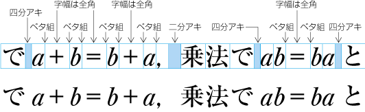 行の途中に配置する等号類および演算記号の配置例
 An example of math symbols(cl-17) and math operators(cl-18) set within ordinary line
注1)
note 1)
漢字等(cl-19),平仮名(cl-15)などの前後に等号類(cl-17)又は演算記号(cl-18)がくる場合も,その字間はベタとする.ただし,“これは-5となり”と演算記号(cl-18)が付いた連数字中の文字(cl-24)又は欧文用文字(cl-27)が付いた文字列を配置する場合は,演算記号の前は四分アキとした方がよい.
The inter-letter space between ideographic characters(cl-19) or hiraganas(cl-15), and, math symbols(cl-17) or math operators(cl-18) is solid. However, it is better to insert 1/4 em space between math operators(cl-18) and adjacent grouped numerals(cl-24) or Western characters(cl-27).
-
別行とする数式,化学式などに配置する等号類(cl-17)と連数字中の文字(cl-24),欧文用文字(cl-27),親文字群中の文字(添え字付き)(cl-21)などとの字間は,四分アキとする.別行とする数式,化学式などに配置する演算記号(cl-18)と,連数字中の文字(cl-24),欧文用文字(cl-27),親文字群中の文字(添え字付き)(cl-21)などとの字間は,ベタ組とする.
When math formula or chemical formula is set in one indipendent line, the inter-letter space between math symbols(cl-17) and adjacent grouped numerals(cl-24), Western characters(cl-27) and ornamented character complex(cl-21) shall be 1/4 em. Also, when math formula or chemical momula is set in a individual line, ther inter-letter space between math operators(cl-18) and adjacent grouped numerals(cl-24), Western characters(cl-27) or ornamented character complex(cl-21), shall be solid.
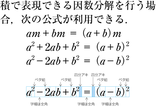 別行式に配置する等号類,演算記号の配置例
 An example of math symbols(cl-17) and math operators(cl-18) in one independent line.
注1)
note 1)
別行とする数式,化学式などは,横組では版面又は段の領域の左右中央に配置する例が多い.縦組で時計回りに90度回転させて数式,化学式などを配置する場合は,行頭から指定した字下げした位置に配置する例が多い.
In most case when math formula or chemical formula is set in one independent line, the position of the formula is the center of the line in horizontal writing mode, and with some indicated character number of intend from the head of line in vertical writing mode.
注2)
note 2)
別行とする数式などでは,連数字中の文字(cl-24),欧文用文字(cl-27)などと等号類(cl-17)の前後の字間をベタ組とする方法や二分アキとする方法もある.また,等号類(cl-17)の前後の字間を四分アキ又は二分アキとした場合は,演算記号(cl-18)と連数字中の文字(cl-24),欧文用文字(cl-27)などとの前後の字間を四分アキとする方法もある.
In the formula in one independent line, there is another method to set the inter-letter space, between grouped numerals(cl-24) or Western characters(cl-27) and math symbols(cl-17) , solid or 1/2 em. When the inter-letter space before and after the math symbols(cl-17) is set to 1/4 em or 1/2 em, there is another method to set the inter-letter space, between math operators(cl-18) and grouped numerals(cl-24) or Western characters(cl-27), 1/4 em.
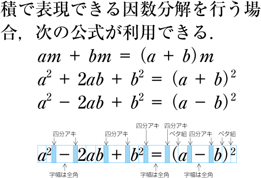 別行式に配置する等号類(cl-17),演算記号(cl-18)の配置例2
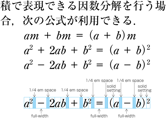 Another example to set math symbols(cl-17) and math operators(cl-18) in one independent formula line
-
等号類(cl-17)及び演算記号(cl-18)は,その前後に配置する連数字中の文字(cl-24),欧文用文字(cl-27),親文字群中の文字(添え字付き)(cl-21)などとの字間で2行に分割してよい.
It is line breakable between math symbols(cl-17) or math operators(cl-18) and adjacent grouped numerals(cl-24), Western characters(cl-27) or ornamented character complex(cl-21).
注1)
note 1)
別行式で,2行に分割する位置をある程度任意に選択できる場合は,まず<a class="characterClass" href="#cl-17-ja">等号類(cl-17)</a>の前で2行に分割するとよい.それができない場合は,<a class="characterClass" href="#cl-18-ja">演算記号(cl-18)</a>の前で2行に分割するとよい.
In independent formula line, when there are more than one line breakable place, the first priority is before the math symbols(cl-17), and the next is before the math operators(cl-18).
注2)
note 2)
数式,化学式に配置する中点<span class="character">[・] (KATKANA MIDDLE DOT)</span>,<a class="characterClass" href="#cl-01-ja">始め括弧類(cl-01)</a>及び<a class="characterClass" href="#cl-02-ja">終わり括弧類(cl-02)</a>は,<a class="characterClass" href="#cl-17-ja">等号類(cl-17)</a>又は<a class="characterClass" href="#cl-18-ja">演算記号(cl-18)</a>の前後にアキを確保する場合を除外し,中点<span class="character">[・] (KATKANA MIDDLE DOT)</span>の前後,<a class="characterClass" href="#cl-01-ja">始め括弧類(cl-01)</a>の前及び<a class="characterClass" href="#cl-02-ja">終わり括弧類(cl-02)</a>の後ろはベタ組みとする.
The inter-letter space, before and after [・] (KATKANA MIDDLE DOT), before opening brackets(cl-01) and after closing brackets(cl-02) in independent formula line, is solide, except for the case to set space between these characters and adjacent math symbols(cl-17) or math operators(cl-18).
段落内では,分割禁止されていない箇所で文字列を分割し,それぞれの行を構成していく.この際段落の最終行以外の行は,指定された行長にし,段落の最終行の末尾以外の行頭及び行末の位置を所定の位置に配置する必要がある.禁則処理その他の要因により行長に過不足がでる場合は,行の調整処理を行う.
Within a paragraph, lines are created by separating character sequences at places where line breaking is not prohibited. Except for the bottom of the last line of a paragraph, it becomes necessary to set the heads and bottoms of each line on expected aligned position. Line adjustment processing is applied for cases where some space is missing from the line length e.g. because of line wrap and other reasons.
行の調整処理が必要となる要因は様々であるが,主なものとしては次のような例がある.
There are various reasons for line adjustment processing. The most important ones will be exemplified below.
-
連数字中の文字(cl-24),欧文用文字(cl-27)など字幅が全角でない文字・記号を混用する(図2-51参照).
Mixed usage of characters and symbols (e.g. grouped numerals(cl-24), Western characters(cl-27)) where not all characters are full width (see dummy).
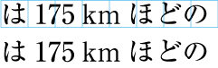 連数字中の文字(cl-24),欧文用文字(cl-27)を使用した例
 Example of grouped numerals(cl-24) and Western characters(cl-27)
-
約物が連続する.例えば,終わり括弧類(cl-02)と句点類(cl-06)が連続した場合は,終わり括弧,句点類及びアキの合計は1.5倍となる(図2-52参照).ただし,終わり括弧類,句点類,さらに始め括弧類(cl-01)が連続した場合は,これら約物の字幅とアキの合計は2倍となるので,過不足はでない(図2-52参照).
Sequences of punctuation marks. For example, a sequence of a closing brackets(cl-02) and an full stops(cl-06) takes 1.5 em space together (see dummy). However, if immediately after the full stopsan opening brackets(cl-01) is following, these punctuation marks will need 2 em space together. Hence, there is no space missing (see dummy).
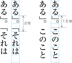 約物が連続した例
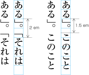 Example of sequences of punctuation marks
-
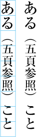 括弧内の文字サイズを1段階小さくした例
 Example of characters within brackets which are made a level smaller than the normal character size
注1)
(note 1)
-
行頭禁則,行末禁則又は分割禁止を回避する(図2-33参照).
Cases where line head wrapping, line end wrapping or inseparable should be avoided (See dummy).
行の調整処理は,規定されているアキを確保した箇所又はベタ組の字間で調整する.その方法としては,次がある.
Line adjustment processing targets places with a predefined space or solid setting. Methods for line adjustment are as follows.
-
規定されているアキを詰める処理(追込み処理).追込み処理では,読点類(cl-07)又は終わり括弧類(cl-02)の後ろの二分アキや,始め括弧類(cl-01)の前の二分アキ,欧文間隔(cl-26)などのアキを規定の範囲内で詰める処理を行う.
Line adjustment by inter-letter space reduction. This means that 1/2 em space is reduced aftercommas(cl-07) or closing brackets(cl-02), or, before opening brackets(cl-01), and Western word space(cl-26) is reduced within a defined extent.
-
字間を空ける処理(追出し処理).追出し処理では,欧文間隔(cl-26)など規定の範囲内で空けることが許されている箇所や,行の調整処理で字間を空ける処理を避けるとされていない箇所の字間について空ける処理を行う.
Lline adjustment by inter-letter space expansion. Line adjustment by inter-letter space expansion means expanding inter-letter space for line adjustment, where inter-letter space is allowed to be extended within a defined extent, such as Western word space(cl-26), or not prohibited to extend inter-letter space.
通常,詰める処理(追込み処理)を優先し,それで処理できない場合は空ける処理(追出し処理)を行う.詰める処理(追込み処理)を優先するのは,ベタ組の箇所はできるだけ空けないという考え方による.
Normally line adjustment by inter-character space reduction is preferred. Only when this is not possible space for reduction, line adjustment by inter-character space expansion is executed. The reason for the preference of line adjustment by inter-character space reduction comes from the thinking that characters in solid setting should not have more inter character space, if at all possible.
|
注1) (note 1) |
句点類(cl-06)及び読点類(cl-07)の行頭禁則を回避する方法としてぶら下げ組がある.この方法は,JIS X 4051では規定していないが,その“解説”では説明が行われている. line adjustment by hanging punctuationis a method to avoid line head wrap of full stops(cl-06) and commas(cl-07). This method is not formally defined in JIS X 4051, however, JIS X 4051 provides explanatory material about it. ぶら下げ組は,句点類(cl-06)と読点類(cl-07)に限り,版面に接して,指定の行長よりはみ出して配置する方法である(図2-54参照).ベタ組の字間を空ける調整が避けられるとして,書籍等でも採用されている.しかし,欧文組では原則としてぶら下げ組は採用されていないので,和文と欧文との混植になじまない,また,ぶら下げ組は本来,活字組版において調整の作業を軽減するために採用されていた方法である,との反対意見がある.なお,図2-54において,1行目末尾及び5行目末尾のように,行末の18字目に配置できる場合は,そのまま配置する.DTPなどでは,このような句読点を3行目のようにぶら下げにする処理を行っている例があるが,不必要な処理といえよう. Line adjustment by hanging punctuation is a method which is only applied to full stops(cl-06) and commas(cl-07). These touch the hanmen and are put on a place outside the defined line length (See dummy). This is also applied in e.g. books, in order to avoid the addition of inter character space beyond solid setting. However, line adjustment by hanging punctuation is not an appropriate method for the mixture of Japanese and Latin script text, since the latter principally does not apply line adjustment by hanging punctuation. In addition, there is an arguing against line adjustment by hanging punctuation. Originally it was a method in letterpress printing, used to make the task of line adjustment easier. Furthermore, as shown at the end of line 1 and 5 of dummy, if possible the full stops(cl-06) or commas(cl-07) are placed at the line end (the 18th position). In DTP there are examples of hanging punctuation like in line 3, but this may be regarded as unnecessary processing.
|
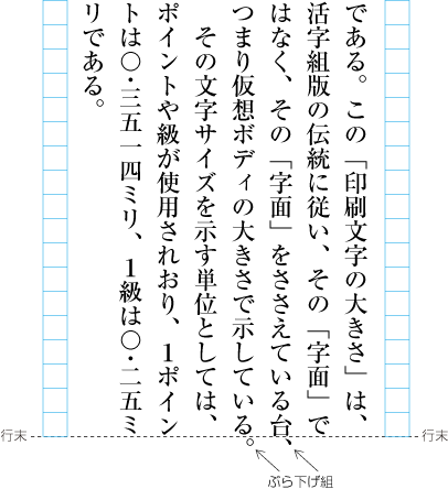
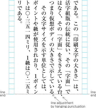
詰める処理(追込み処理)を行う場合は,通常,優先順位と詰める限界を決めて行う.JIS X 4051では,次の順序で処理するように規定している.
For line adjustment by inter-character space reduction, normally first the preferred order of reduction processing options, and the maximum amount of space reduction are decided. In JIS X 4051, the following processing order is defined.
|
注1) (note 1) |
JIS X 4051では割注の調整方法も規定しているが,ここでの解説では説明がやや複雑になるので除外した. JIS X 4051 provides also definitions for the adaptation of inline cutting note, but for the purpose of this section, these are rather complex and hence left out. |
|
注2) (note 2) |
JIS X 4051では規定していないが,図2-21のように句点類(cl-06),読点類(cl-07)又は終わり括弧類(cl-02)を行末に配置する場合は,句点類,読点類及び終わり括弧類の後ろの二分アキをベタ組にする調整を優先して行っている例がある. There are also examples for which JIS X 4051 does not provide definitions. These are cases (See Fig. 2-21) where if full stops(cl-06), commas(cl-07) or closing brackets(cl-02) are at the bottom of line, the preferred processing is to change 1/2 em space after comma, period or closing bracket to solid setting. |
-
欧文間隔(cl-26)を,最小で四分アキまで文字サイズ比で均等に詰める.
Western word space(cl-26) is reduced equally with proportional character size, up to 1/4 em space.
-
中点類(cl-05)の前後の四分アキを,最小でベタ組まで文字サイズ比で均等に詰める.
The 1/4 em space before or after middle dots(cl-05) is reduced equally with proportional character size up to solid setting.
-
始め括弧類(cl-01)の前側,並びに終わり括弧類(cl-02)及び読点類(cl-07)の後ろ側の二分アキを,最小でベタ組まで文字サイズ比で均等に詰める.
The 1/2 em space beforeopening brackets(cl-01), or, after closing brackets(cl-02) or commas(cl-07) are reduced equally with proportional character size, up to solid setting.
注1)
(note 1)
句点類(cl-06)の後ろの二分アキは,文の区切りとしての役割が大きいので,行末に配置する場合を除外して,調整には使用しない.
With the exception of the line end position, the 1/2 space after full stops(cl-06) should not adapted, since it plays an importantrole as a sentence separator.
注2)
(note 2)
読点類(cl-07)と, 始め括弧類(cl-01)・終わり括弧類(cl-02)では,その役割が異なることから,始め括弧類の前,終わり括弧類の後ろの二分アキを詰める調整を,読点類の後ろの二分アキを詰める調整より優先して処理している例もある.
commas(cl-07) fulfil different roles than opening brackets(cl-01) andclosing brackets(cl-02). Hence, there are examples where it is preferred to reduce the 1/2 em space before or after brackets, rather than to reduce the 1/2 em space after commas.
注3)
(note 3)
始め括弧類(cl-01)の前の二分アキ,終わり括弧類(cl-02)の後ろ及び読点類(cl-07)の後ろの二分アキを,ベタ組まで詰めるのは詰め過ぎであるという考えから,詰める限界を最小で四分アキまでとして処理している例もある.
The reduction of the 1/2 em space before opening brackets(cl-01) or after closing brackets(cl-02) and commas(cl-07) up to solid setting is regarded as too much reduction. Hence, there are examples where the maximum amount of space reduction is up to 1/4 em space.
-
平仮名(cl-15),片仮名(cl-16),漢字等(cl-19)などと,連数字中の文字(cl-24),欧文用文字(cl-27)又は単位記号中の文字(cl-25)との字間の四分アキを,最小で八分アキまで文字サイズ比で均等に詰める.
The 1/4 em space between Japanese text (hiraganas(cl-15), katakanas(cl-16) and ideographic characters(cl-19)) and Latin script text (grouped numerals(cl-24), Western characters(cl-27) and unit symboles(cl-25)), is reduced equally with proportional character size, up to 1/8 em space.
注1)
(note 1)
漢字等(cl-19)などと,欧文用文字(cl-27),連数字中の文字(cl-24)又は単位記号中の文字(cl-25)との四分アキは,固定したアキとして,調整には使用しない例もある.
There are also examples where the 1/4 em space between Japanese text (hiraganas(cl-15), katakanas(cl-16)andideographic characters(cl-19) ) and Latin script text (Western characters(cl-27), grouped numerals(cl-24) or unit symboles(cl-25)) is regarded as a fixed space, and space adaptation is not being applied.
注2)
(note 2)
空ける処理(追出し処理)を行う場合も詰める処理(追込み処理)と同様,優先順位と空ける限界を決めて行う.JIS X 4051では,次の順序で処理するように規定している.
Like with line adjustment by inter-character space reduction, for line adjustment by inter-character space expansion, first the order of processing and the maximum amount of space to be added are defined. In JIS X 4051, the following processing order is defined.
-
欧文間隔(cl-26)を,最大で二分アキまで文字サイズ比で均等に空ける.
Western word space(cl-26) is added equally with proportional character size up to 1/2 em space.
-
平仮名(cl-15),片仮名(cl-16),漢字等(cl-19)などと,連数字中の文字(cl-24),欧文用文字(cl-27)又は単位記号中の文字(cl-25)との字間の四分アキを,最大で二分アキまで(又は三分アキまで)文字サイズ比で均等に空ける.
The 1/4 em space between Japanese text (hiraganas(cl-15), katakanas(cl-16) and ideographic characters(cl-19)) and Latin script text (grouped numerals(cl-24), Western characters(cl-27) and unit symboles(cl-25)) is increased equally with proportional character size, up to 1/2 em space (or 1/3 em space)
注1)
(note 1)
詰める処理と同様に,漢字等(cl-19)などと,欧文用文字(cl-27),連数字中の文字(cl-24)又は単位記号中の文字(cl-25)との字間の四分アキは,固定したアキとして,空ける調整でも使用しないで処理している例がある.
Like with inter character space reduction, there are also examples there the 1/4 em space between Japanese text (hiraganas(cl-15), katakanas(cl-16) and ideographic characters(cl-19)) and Latin script text (Western characters(cl-27), grouped numerals(cl-24) and unit symboles(cl-25)) is regarded as a fixed space, and space adaptation is not being applied.
-
a, b, cで調整できない場合は,a, b, cに加え,分割禁止とされていない文字間を均等に空ける.
In addition to the adaptation in the manner of a), b) and c), in cases where such processing is not possible, space is added equally with proportional character size, with the exception of places which require BUNRIKINSHI.
注1)
(note 1)
JIS X 4051ではdの処理に加えて,欧文用文字(cl-27)の字間を含め,均等に空けるかどうかは,処理系定義とする,となっている.
JIS X 4051 provides a definition in addition to d). This says that it depends on each layout processing system whether inter-letter space should be added equally. This includes the space between Western characters(cl-27).
注2)
(note 2)
文字や記号を行に配置する場合,次のような点でその振る舞い(配置方法)が異なる.
The positioning of characters and symbols may vary depending on the following aspects.
-
行頭に配置してよいか,又は禁止するのか.配置してよい場合,どのように配置するか.
Is it allowed to place the character or symbol at the line head, or forbidden? If it is allowed, how will it be placed?
-
行末に配置してよいか,又は禁止するのか.配置してよい場合,どのように配置するか.
Is it allowed to place the character or symbol at the line end, or forbidden? If it is allowed, how will it be placed?
-
文字・記号が並んだ場合,その字間はベタ組にするか,又は一定の空きをとるのか.例えば,漢字等(cl-19)と平仮名(cl-15)が並んだ場合,その字間はベタ組であり,平仮名(cl-15)の後ろに欧文用文字(cl-27)がきた場合,その字間は四分アキとなる.
Are characters and symbols appearing in sequence in solid setting, or will there be a fixed space between them? For example, sequences of ideographic characters(cl-19) and hiraganas(cl-15) are in solid setting, and for Western characters(cl-27) following hiraganas(cl-15) there will be 1/4 em space.
-
文字が並んだ場合,その字間で2行に分割してよいか.例えば,連数字中の文字(cl-24)が並んだ場合,その字間では2行に分割してはならない.
Is it allowed to have a line break within a sequence of characters? For example, there must not be a line break in a sequence of grouped numerals(cl-24).
-
行の調整処理の際に,その並んだ文字の字間を使用してよいか.例えば,字間の空きを詰めてよいか,逆に字間を空けてよいか.なお,調整処理の優先順位と調整量の限界も問題となる.
Is it allowed to use the space between characters in a sequence during line adjustment processing? For example, is inter character space reduction or addition between the characters appearing in sequence possible? Another issue to be decided is the preference order of adjustment processing and the amount of the allowed adjustment.
組版処理を行う場合,前項で述べたような事項について,性格を同じにする文字・記号ごとにグループに分け,文字クラスとして管理する方法がある.
During layout processing, the issues mentioned in the previous section are addressed by grouping characters and symbols according to their characteristics, and handle them as character classes.
JIS X 4051でも,“6.1.1 文字クラス”に文字クラス示されている.なお,JIS X 4051では,“ここに挙げた文字以外を,それぞれの文字クラスに追加するか否かは,処理系定義とする”と備考に書かれている.
JIS X 4051 also provides similar but a little bit different character classes from this document. Furthermore JIS X 4051 states that it is implementation defined how to handle characters not explicitly mentioned, e.g. whether they should belong to either class or not.
|
注1) (note 1) |
JIS X 4051では,各文字クラスに含まれる文字・記号を特定する資料として,その付属書に各文字クラスに含まれる文字・記号とJIS X 0213との対応表が“付属書1”として掲げられている. In JIS X 4051 Annex 1, the member characters and sysbols of each character class are specified as a mapping table to JIS X 0213 character name. |
このドキュメントにおける文字クラスは,JIS X 4051における文字クラス分けを一部修正し,次のようにする.
A few character classes of this document are modified from JIS X 4051. All character classes of this document are as follows:
(1)始め括弧類(cl-01)
(1) opening brackets(cl-01)
【各文字を一覧にして示す…… 後送】
【Each member character will be provided later】
(2)終わり括弧(cl-02)
(2) closing brackets(cl-02)
【各文字を一覧にして示す…… 後送】
【Each member character will be provided later】
|
注1) (note 1) |
JIS X 4051では,読点[、] (IDEOGRAPHIC COMMA)及びコンマ[,] (COMMA)については終わり括弧類と同様な配置法となるので,文字クラスとしては終わり括弧類に含めている.しかし,このドキュメントでは,読点及びコンマは読点類(cl-07)として文字クラスを独立させ,解説する. In JIS X 4051, [、] (IDEOGRAPHIC COMMA) and [,] (COMMA) are classified as closing brackets(cl-02), because of similar positioning method. However, in this document, the handling of [、] (IDEOGRAPHIC COMMA) and [,] (COMMA) are described as an indipendent class, named commas(cl-07). |
(3)ハイフン類(cl-03)
(3) hyphens(cl-03)
【各文字を一覧にして示す…… 後送】
【Each member character will be provided later】
(4)区切り約物(cl-04)
(4) dividing punctuation marks(cl-04)
【各文字を一覧にして示す…… 後送】
【Each member character will be provided later】
(5)中点類(cl-05)
(5) middle dots(cl-05)
【各文字を一覧にして示す…… 後送】
【Each member character will be provided later】
(6)句点類(cl-06)
(6) full stops(cl-06)
【各文字を一覧にして示す…… 後送】
【Each member character will be provided later】
(7)読点類(cl-07)
(7) commas(cl-07)
【各文字を一覧にして示す…… 後送】
【Each member character will be provided later】
(8)分離禁止文字(cl-08)
(8) inseparable characters(cl-08)
【各文字を一覧にして示す…… 後送】
【Each member character will be provided later】
(9)繰り返し記号(cl-09)
(9) iteration marks(cl-09)
【各文字を一覧にして示す…… 後送】
【Each member character will be provided later】
|
注1) (note 1) |
繰り返し記号[々] (IDEOGRAPHIC ITERATION MARK)などは,JIS X 4051では,行頭禁則和字に含まれているが,このドキュメントでは,独立した文字クラスとした. In JIS X 4051, iteration marks such as [々] (IDEOGRAPHIC ITERATION MARK) are classified as "not line breakable characters before them". In this document, [々] (IDEOGRAPHIC ITERATION MARK) etc. are classified as iteration marks(cl-09). |
|
注2) (note 2) |
繰り返し記号[々] (IDEOGRAPHIC ITERATION MARK)を行頭禁則の対象としない方法がある.この場合は,漢字等(cl-19)の文字クラスとする. There is another method it is permited to line break before [々] (IDEOGRAPHIC ITERATION MARK). In this case, [々] (IDEOGRAPHIC ITERATION MARK) is regarded as a member of ideographic characters(cl-19). |
(10)長音記号(cl-10)
(10) prolonged sound marks(cl-10)
【各文字を一覧にして示す…… 後送】
【Each member character will be provided later】
|
注1) (note 1) |
長音記号[ー] (KATAKANA-HIRAGANA PROLONGED SOUND MARK)は,JIS X 405では,行頭禁則和字に含まれているが,このドキュメントでは,独立した文字クラスとした. In JIS X 405, [ー] (KATAKANA-HIRAGANA PROLONGED SOUND MARK) is a member of "Japanese characters prohibited to line break before them". In this document [ー] (KATAKANA-HIRAGANA PROLONGED SOUND MARK) is the only one member of prolonged sound marks(cl-10). |
|
注2) (note 2) |
JIS X 4051では,処理系定義として,長音記号<span class="character">[ー] (KATAKANA-HIRAGANA PROLONGED SOUND MARK)</span>を行頭禁則和字から除外することは認められている. In JIS X 4051, it is permitted to exclude [ー] (KATAKANA-HIRAGANA PROLONGED SOUND MARK) from "Japanese characters prohibited to line break before them" character class. |
|
注3) (note 3) |
長音記号[ー] (KATAKANA-HIRAGANA PROLONGED SOUND MARK)を行頭禁則の対象としない場合は,長音記号は,片仮名(cl-16)の文字クラスとする. When [ー] (KATAKANA-HIRAGANA PROLONGED SOUND MARK) is permitted to line bread before it, [ー] (KATAKANA-HIRAGANA PROLONGED SOUND MARK) is regarded as a member of katakanas(cl-16) class. |
(11)小書きの仮名(cl-11)
(11) small kanas(cl-11)
【各文字を一覧にして示す…… 後送】
【Each member character will be provided later】
|
注1) (note 1) |
小書き片仮名[ッ] (KATAKANA LETTER SMALL TU)などは,JIS X 4051では,行頭禁則和字に含まれているが,このドキュメントでは,独立した文字クラスとした.したがって,JIS X 4051でいう“行頭禁則和字”は,繰り返し記号(cl-09),長音記号(cl-10)及び小書きの仮名(cl-11-ja)の3つに分解されたことになる. In JIS X 4051, small katakana letters, such as [ッ] (KATAKANA LETTER SMALL TU), are regarded as members of "Japanese characters prohibited to line break before them" character class. In this document, small katakana letters are classified in small kanas(cl-11). Accordingly, "Japanese characters prohibited to line break before them" character class in JIS X 4051 is divided to three separate classes; iteration marks(cl-09), prolonged sound marks(cl-10) and small kanas(cl-11). |
|
注2) (note 2) |
JIS X 4051では,処理系定義として,小書きのかな(ぁぃぅァィゥなど)を行頭禁則和字から除外することは認められている. In JIS X 4051, it is permitted to exclude small kanas(ぁぃぅァィゥ etc.) from "Japanese characters prohibited to line break before them" character class as implementation definable option. |
|
注3) (note 3) |
小書きの仮名を行頭禁則の対象としない場合は,そこに含まれる小書きの平仮名は平仮名(cl-15)の文字クラス,小書きの片仮名は片仮名(cl-16)の文字クラスとする. When small kanas are permitted to line break before them, small hiraganas(ぁぃぅetc.) are regarded as members of hiraganas(cl-15) class, and small katakanas(ァィゥetc.) are regarded as members of katakanas(cl-16) class. |
(12)前置省略記号(cl-12)
(12) prefixed abbreviations(cl-12)
【各文字を一覧にして示す…… 後送】
【Each member character will be provided later】
(13)ハイフン類(cl-13)
(13) postfixed abbreviations(cl-13)
【各文字を一覧にして示す…… 後送】
【Each member character will be provided later】
(14)和字間隔(cl-14)
(14) fulwidth ideographic space(cl-14)
【各文字を一覧にして示す…… 後送】
【Each member character will be provided later】
(15)平仮名(cl-15)
(15) hiraganas(cl-15)
【各文字を一覧にして示す…… 後送】
【Each member character will be provided later】
|
注1) (note 1) |
JIS X 4051で,漢字など((1)~(12)以外の和字)と平仮名が別のクラスになっているのは,ルビの親文字からのはみ出しがあった場合,そのはみ出しを掛けてよいかどうかで差があるからである. The reason, why kanji etc.(Japanese characters except (1)~(12)) and hiragana are regarded different classes in JIS X 4051, is the difference in the case of ruby, that is the handling of jutting out of the base characters and hang over to adjacent characters. |
(16)片仮名(cl-16)
(16) katakanas(cl-16)
【各文字を一覧にして示す…… 後送】
【Each member character will be provided later】
|
注1) (note 1) |
片仮名は,JIS X 4051では,漢字などと同じ文字クラス(“(1)~(12)以外の和字”)に含まれている.しかし,このドキュメントでは,ルビのはみ出しがあった場合,平仮名と同様に掛かってよとしたことから独立した文字クラスとした. In JIS X 4051, katakana and kanji are included in the same class ("Japanese characters except for (1) to (12))". However, in this document, when ruby characters are jutting out of hte base characters and hang over to adjacent hiragana or katana, hte handling is same. Thati is the reason why in this document, katakanas(cl-16) is an indipendent character class. |
(17)等号類(cl-17)
(17) math symbols(cl-17)
【各文字を一覧にして示す…… 後送】
【Each member character will be provided later】
|
注1) (note 1) |
数式などに使う演算記号(+-÷×等)や等号類(=≠<>≦≧∞⊆⊇∪∩等)は,JIS X 4051では漢字など((1)~(12)以外の和字)も文字クラス(又は欧文用文字)に含まれている.しかし,欧字やアラビア数字と連続した場合の扱いは,漢字とは異なるので,次項の演算記号とともに新たな文字クラスを作成した. In JIS X 4051, math symbols(+-÷×etc.) and math operators(=≠<>≦≧∞⊆⊇∪∩etc.) are included in "Japanese characters excluded from (1) to (12))" class or Western character class. However, handling of math symbols and math operators adjacent to Western character or Arabic numerals is defferent from kanji. So, in this document, new math operators(cl-18) and math symbols(cl-17) classes are defined. |
(18)演算記号(cl-18)
(18) math operators(cl-18)
【各文字を一覧にして示す…… 後送】
【Each member character will be provided later】
(19)漢字等(cl-19)
(19) ideographic characters(cl-19)
【各文字を一覧にして示す…… 後送】
【Each member character will be provided later】
|
注1) (note 1) |
JIS X 4051の文字クラス名は,“(1)~(12)以外の和字”である. In JIS X 4051, corresponding character class for ideographic characters(cl-19) is "Japanese characters excluded from (1) to (12)". |
(20)合印中の文字(cl-20)
(20) characters as reference marks(cl-20)
【各文字を一覧にして示す…… 後送】
【Each member character will be provided later】
|
注1) (note 1) |
注の参照のために該当する項目の直後の行中に配置した合い印注の文字である. Characters which are inside verifiaction seal (those are characters inside a verification seal that appear in the line just after the item applicable for references of notes) |
(21)親文字群中の文字(添え字付き)(cl-21)
(21) ornamented character complex(cl-21)
【各文字を一覧にして示す…… 後送】
【Each member character will be provided later】
|
注1) (note 1) |
JIS X 4051の名称は,“添え字付き親文字群中の文字”である.親文字群とは,親文字及びそれに付随するルビ,添え字又は圏点を含めた文字群のことである. The name of this class in JIS X 4051 is "Characters included in ornamented base characters complex". The meaning of "base characters complex" is characters in a complex including ruby, ornament and emphasis dots. |
(22)親文字群中の文字(熟語以外のルビ付き)(cl-22)
(22) simple-ruby character complex(cl-22)
【各文字を一覧にして示す…… 後送】
【Each member character will be provided later】
|
注1) (note 1) |
JIS X 4051の名称は,“熟語ルビ以外のルビ付き付き親文字群中の文字”である. The name of this class in JIS X 4051 is "Characters included in base characters complex with ruby ( excluding jukugo-ruby)". |
(23)親文字群中の文字(熟語ルビ付き)(cl-23)
(23) phrasal-ruby character complex(cl-20)
【各文字を一覧にして示す…… 後送】
【Each member character will be provided later】
|
注1) (note 1) |
JIS X 4051の名称は,“熟語ルビ付き親文字群中の文字”である. The name of this class in JIS X 4051 is "Characters included in base characters complex with jukugo-ruby". |
(24)連数字中の文字(cl-24)
(24) grouped numerals(cl-24)
【各文字を一覧にして示す…… 後送】
【Each member character will be provided later】
|
注1) (note 1) |
連数字として扱われる連続した数字(アラビア数字)及び小数点のピリオド,並びに位取りのコンマ及び空白のことである. Sequences of Western-Arabic numerals which are not full width and are handled as Japanese text, the decimal point or the comma and space used as grade indicator in number. |
(25)単位記号中の文字(cl-25)
(25) unit symboles(cl-25)
【各文字を一覧にして示す…… 後送】
【Each member character will be provided later】
|
注1) (note 1) |
ここでいう単位記号は,国際単位系(SI)として使用されているラテン文字又はギリシャ文字を組み合わせて単位を示すものである. Units described here include combinations of Latin script and Greek script characters used for international units (SI). |
|
注2) (note 2) |
全角の仮想ボディにラテン文字やアラビア数字などを組み合わせた単位記号がある(全角単位字).このような単位記号は,ここでいう単位記号中の文字には含めない.なお,全角単位字は,主に縦組で使用するもので,横組で使用するのは,体裁がよくないので避けたほうがよい(図2-9-1参照). There are units created with combinations of Latin and Greek script characters with a full width imaginary body (full width units). Such units are not part of the characters for units described here. Furthermore, full width characters for units are mainly used in vertical writing mode. Their usage in horizontal writing mode is regarded as bad style and should be avoided (See dummy). |
 全角単位字(上側)と欧文用文字(下側)を用いた単位記号の例
 Example of a unit which encompasses a full width unit character (upper part) and characters for Latin script text (lower
part)
Example of a unit which encompasses a full width unit character (upper part) and characters for Latin script text (lower
part)
(26)欧文間隔(cl-26)
(26) Western word space(cl-26)
【各文字を一覧にして示す…… 後送】
【Each member character will be provided later】
(27)欧文用文字(cl-27)
(27) Western characters(cl-27)
【各文字を一覧にして示す…… 後送】
【Each member character will be provided later】
|
注1) (note 1) |
欧文用文字(cl-27)には,欧文として使用する括弧類などの欧文の約物を含む.なお,これらは和文でも欧文でも使用している種類がある.しかし,それらの字幅や字形は異なることが多い.たとえば,始め小括弧(始め丸括弧)[(] (LEFT PARENTHESIS)及び終わり小括弧(終わり丸括弧)[)] (RIGHT PARENTHESIS)は,和文用と欧文用とでは,字幅が異なるだけではなく(和文は仮想ボディの行送り方向の中央,欧文は並び線・ディセンダラインが基準),円弧の深さ(フォントにもよるが,一般に和文は円弧が深く,欧文は浅い),字形(フォントにも夜が,和文は線の太さの変化が小さく,欧文は変化が大きい)といった違いがある.これらにつき,どの部分に和文用,どの部分に欧文用を使用するかは指定による.和文注は和文用を,欧文中は欧文用を使用するのが原則であるが,判断に迷う例もある.例えば,“エディタ(editor)は……”のように和文中に英語の綴りを括弧内に示す例は多い.この始め小括弧(始め丸括弧)[(] (LEFT PARENTHESIS)及び終わり小括弧(終わり丸括弧)[)] (RIGHT PARENTHESIS)は,和文か欧文かということである.この場合の始め小括弧(始め丸括弧)[(] (LEFT PARENTHESIS)及び終わり小括弧(終わり丸括弧)[)] (RIGHT PARENTHESIS)は和文としてよいであろう. Western characters(cl-27) includes punctuation marks, such as commas, used in Western context. In these punctuation marks, several marks are use both Japanese context and Western context. However, these marks have different shapes whether in Japanese context or Western context. For example, [(] (LEFT PARENTHESIS) and [)] (RIGHT PARENTHESIS) has not only different width (Japanese:1/2 em, Western:proportional) but also different in line position (Japanese:center of imaginary body in inline direction, Western:base line and descender line dependent) and design(Japanese:slight bent, constant line thickness, Western:strong bent, dynamic line thickness). The usage of these two differently designed commas shopuld be explicitly instructed. Usually, in Japanese context, Japanese design is used, and in Western context, Western design is used. Howebver, there are some ambiguous cases, such as "エディタ(editor)は……". In this case, English spelling is indicated with parentheses, in Japanese text line. In this particular case, Japanese design is the better. |
(28)割注始め括弧類(cl-28)
(28) warichu opening brackets(cl-28)
【各文字を一覧にして示す…… 後送】
【Each member character will be provided later】
(29)割注終わり括弧類(cl-29)
(29) warichu closing brackets(cl-29)
【各文字を一覧にして示す…… 後送】
【Each member character will be provided later】
|
注1) (note 1) |
割注始め括弧類又は割注終わり括弧類は,割注を囲むために用いる括弧類及びその前後の空きのことである.一般に使用する括弧類と組版処理が異なるので,別の文字クラスにしている. Opening and closing brackets of inline cutting note encompass brackets used for surrounding inline cutting note and the space before and after. They are in a separate class since they differ from normal brackets and their processing. |
(30)縦中横中の文字(cl-30)
(30) warichu characters(cl-30)
【各文字を一覧にして示す…… 後送】
【Each member character will be provided later】
文字クラスごとに,行頭・行末に配置してよいか,禁止するか,さらに行頭・行末にきた場合の配置法や,それぞれが並んだ場合の文字間の空き量は,前に配置される文字クラスと後ろに配置される文字クラスの組合せ(2次元の表)で示すことができる.JIS X 4051では,表5に“(文字間の)空き量”として示されている.
For each character class it is possible to describe whether the characters may appear at the line head or line end or not, the positioning method for the line head or line end positions (if available), the amount of space between sequences of several characters, and the combination with character classes before or after the characters (in a 2 dimensional table). In JIS X 4051 this is shown in table 5 "Amount of space (between characters)".
|
注1) (note 1) |
2次元の表に示す場合,各文字クラスの外に,“行頭”(前に配置される文字クラスの欄)及び“行末”(後ろに配置される文字クラスの欄)の項目が必要になる.そして,行頭又は行末の配置を禁止する場合は,JIS X 4051では行頭”及び“行末”の欄に×印で示している. For the presentation as a two dimensional table, it becomes necessary for each class to have separate items about "line head" (the column about the character classes appearing before) and "line end" (the column about the character classes appearing after). If it is forbidden that the characters of the class appear at the line head or line end, JIS X 4051 uses an "X" mark in the columns for "line head" and "line end". |
また,文字クラスの文字・記号が並んだ場合,その間で2行に渡る分割が可能か,行の調整の際に字間を空けてよいかどうかも,各文字クラスの組合せ(2次元の表)で規定できる.このような事項についても,JIS X 4051では2次元の表で示している.2行に渡る分割が可能かどうかは表6,行の調整の際に字間を空けてよいかどうかは表7に示されている.
Also, it can be defined for each combination of the character classes (in a two dimensional table) whether the characters of classes appearing in sequence allow for having a break into two lines inbetween, or whether it is possible during line adjustment processing to add inter character space. In JIS X 4051 these items are also shown in a two dimensional table. Table 6 shows whether a break into two lines is possible, and table 7 shows if it is possible to add inter character space.
|
注1) (note 1) |
文字クラスの文字・記号が並んだ場合,行の調整の際にその間で詰めてよいかどうかも各文字クラスの組合せ(2次元の表)で規定できる.しかし,JIS X 4051では,そのような表は示されていない.文章で示されている. It is also possible to define for each combination of character classes whether it is possible to apply kerning during line adjustment processing for character classes appearing in sequence. However, JIS X 4051 does not provide this information as a two dimensional table, but only as a textual description. |
このドキュメントにおける,それぞれの文字クラスの文字・記号が並んだ場合の文字間の空き量の表をAppenxix 〓に掲げる.
このドキュメントにおける,それぞれの文字クラスの文字・記号が並んだ場合の文字間の空き量の表をAppenxix 〓に掲げる.
このドキュメントにおける,それぞれの文字クラスの文字・記号が並んだ場合に,その字間で2行に渡る分割が可能かどうかを示す表をAppendix 〓に掲げる.
このドキュメントにおける,それぞれの文字クラスの文字・記号が並んだ場合に,その字間で2行に渡る分割が可能かどうかを示す表をAppendix 〓に掲げる.
このドキュメントにおける,それぞれの文字クラスの文字・記号が並んだ場合に,行の調整の際に字間を空けてよいか,詰めてよいかを示す表をAppenxix 〓に掲げる.また,その際の優先順序を示す表をAppendix 〓に掲げる.
このドキュメントにおける,それぞれの文字クラスの文字・記号が並んだ場合に,行の調整の際に字間を空けてよいか,詰めてよいかを示す表をAppenxix 〓に掲げる.また,その際の優先順序を示す表をAppendix 〓に掲げる.
漢文とは,漢字だけで構成されている中国の古典文(又はそれに倣った文体の文)について,日本語の文として読むことが可能になるように,読むための様々な補助記号を付けた文である.dummygeneratedに示した例でいえば,青色で示した部分が補助記号である.
漢文とは,漢字だけで構成されている中国の古典文(又はそれに倣った文体の文)について,日本語の文として読むことが可能になるように,読むための様々な補助記号を付けた文である.dummygeneratedに示した例でいえば,青色で示した部分が補助記号である.


|
注1) 注1) |
中国の古典文(又はそれに倣った文体の文)を日本語としての語順で読むことを“訓読(くんどく)”とよんでいる. 中国の古典文(又はそれに倣った文体の文)を日本語としての語順で読むことを“訓読(くんどく)”とよんでいる. |
|
注2) 注2) |
漢文を利用する主な例としては,中国の古典文そのものの紹介又は鑑賞するためのものと,歴史書などで説明のために引用して利用するものとがある.また,高校でも必修ではないが,教育が行われている.したがって,日本語の書籍での使用例は多いとはいえないが,出版物のジャンルによっては欠かすことができない要素である. 漢文を利用する主な例としては,中国の古典文そのものの紹介又は鑑賞するためのものと,歴史書などで説明のために引用して利用するものとがある.また,高校でも必修ではないが,教育が行われている.したがって,日本語の書籍での使用例は多いとはいえないが,出版物のジャンルによっては欠かすことができない要素である. |
|
注3) 注3) |
中国の古典文(又はそれに倣った文体の文)を日本語の文として読む(訓読する)ことが可能になるように付ける補助記号を訓点(くんてん)という.訓点には,次のようなものがある(dummygenerated参照).
中国の古典文(又はそれに倣った文体の文)を日本語の文として読む(訓読する)ことが可能になるように付ける補助記号を訓点(くんてん)という.訓点には,次のようなものがある(dummygenerated参照).


-
句点,読点及び中点
句点,読点及び中点
-
始め括弧及び終わり括弧
始め括弧及び終わり括弧
-
返り点
返り点
-
レ点 “レ”
レ点 “レ”
-
一二点 “一,二,三,四,五”等
一二点 “一,二,三,四,五”等
-
上下点 “上,中”及び“下”
上下点 “上,中”及び“下”
-
甲乙点 “甲,乙,丙,丁,戊”等
甲乙点 “甲,乙,丙,丁,戊”等
-
-
送り仮名
送り仮名
-
読み仮名
読み仮名
-
たて点
たて点
|
注1) 注1) |
漢文を訓読するための方法や記号は,歴史的には様々な方法が行われてきた.これらの方法の整理統一が問題となり,文部省は調査のための委員会を組織し,検討した.その結果は,1912年に“漢文教授ニ関スル調査報告”としてまとめられている(報告は官報8630号に掲載されている).これ以降は,この報告で示されている訓読の方法で一般に行われている. 漢文を訓読するための方法や記号は,歴史的には様々な方法が行われてきた.これらの方法の整理統一が問題となり,文部省は調査のための委員会を組織し,検討した.その結果は,1912年に“漢文教授ニ関スル調査報告”としてまとめられている(報告は官報8630号に掲載されている).これ以降は,この報告で示されている訓読の方法で一般に行われている. |
|
注2) 注2) |
|
|
注3) 注3) |
どのような訓点を施すかは,読者対象によって異なる.最も省略した方法は,句読点のみを施すというものである.次に簡略化したものとしては,句読点に追加して返り点のみを施という方法がある.一般には,句読点,返り点及び送り仮名を施した例が多く,更に難しい漢字に読み仮名を付けた例もある. どのような訓点を施すかは,読者対象によって異なる.最も省略した方法は,句読点のみを施すというものである.次に簡略化したものとしては,句読点に追加して返り点のみを施という方法がある.一般には,句読点,返り点及び送り仮名を施した例が多く,更に難しい漢字に読み仮名を付けた例もある. |
返り点は,訓読する際において,日本語としての語順で,下の字から上の字に返って読む(返読する)ための順序を示すもので,次のように用いる.
返り点は,訓読する際において,日本語としての語順で,下の字から上の字に返って読む(返読する)ための順序を示すもので,次のように用いる.
-
レ点は,下の1字からすぐ上の1字に返読する場合に用いる(dummygenerated参照).
レ点は,下の1字からすぐ上の1字に返読する場合に用いる(dummygenerated参照).
 レ点の使用例(数字は読んでいく順序を示す)
 レ点の使用例(数字は読んでいく順序を示す)
-
一二点は,2字以上隔てて返読する場合に用いる(dummygenerated参照).
一二点は,2字以上隔てて返読する場合に用いる(dummygenerated参照).
 一二点の使用例(数字は読んでいく順序を示す)
 一二点の使用例(数字は読んでいく順序を示す)
-
上下点は,レ点と一二点だけでは返読を示すことができない場合に用いる(dummygenerated参照).
上下点は,レ点と一二点だけでは返読を示すことができない場合に用いる(dummygenerated参照).
 上下点の使用例(数字は読んでいく順序を示す)
 上下点の使用例(数字は読んでいく順序を示す)
-
dummygeneratedのように,漢字の字間は,原則として空けずに文字を配置する方法(以下,“漢文ベタ組”という).
dummygeneratedのように,漢字の字間は,原則として空けずに文字を配置する方法(以下,“漢文ベタ組”という).


漢文ベタ組は,引用して掲げる場合などに利用されている.漢文アキ組は,漢文(特に漢詩)を鑑賞の対象として取り上げる場合などに利用されている.
漢文ベタ組は,引用して掲げる場合などに利用されている.漢文アキ組は,漢文(特に漢詩)を鑑賞の対象として取り上げる場合などに利用されている.
|
注1) 注1) |
漢文ベタ組の句読点・括弧類の処理は,通常の日本語における処理と同様である.字幅は二分で,原則としてその前又は後ろは二分アキとする.行頭禁則,行末禁則も同様である.これらが連続する場合の処理も同様である.ただし,送り仮名の字数が多く,その漢字からはみ出した場合は,その漢字と句読点との間はベタ組のままとし,句読点の後ろを空ける(dummygenerated参照).
漢文ベタ組の句読点・括弧類の処理は,通常の日本語における処理と同様である.字幅は二分で,原則としてその前又は後ろは二分アキとする.行頭禁則,行末禁則も同様である.これらが連続する場合の処理も同様である.ただし,送り仮名の字数が多く,その漢字からはみ出した場合は,その漢字と句読点との間はベタ組のままとし,句読点の後ろを空ける(dummygenerated参照).


-
返り点の文字サイズは,そこに使用している漢字の文字サイズの1/2とする(dummygenerated参照).
返り点の文字サイズは,そこに使用している漢字の文字サイズの1/2とする(dummygenerated参照).
ただし,レ点と一二点の“一”,上下点の“上”などが同じ位置にきた場合は,二つの返り点を組み合わせて,天地・左右のサイズを漢字の文字サイズの1/2にする(dummygenerated参照).
ただし,レ点と一二点の“一”,上下点の“上”などが同じ位置にきた場合は,二つの返り点を組み合わせて,天地・左右のサイズを漢字の文字サイズの1/2にする(dummygenerated参照).
注1)
注1)
dummygeneratedのようにレ点と同じ位置にくると考えられる返り点の組合せには,“一”,“上”,“甲”及び“天”の4種類がある.しかし,レ点と“甲”及び“天”とが同じ位置にくる例は少ない.
dummygeneratedのようにレ点と同じ位置にくると考えられる返り点の組合せには,“一”,“上”,“甲”及び“天”の4種類がある.しかし,レ点と“甲”及び“天”とが同じ位置にくる例は少ない.
-
返り点は,返読を示す漢字の直後に,返り点の外枠の左端を漢字の外枠の左端に揃えて配置し,返り点と前後にくる漢字との字間はベタ組とする(dummygenerated参照).ただし,送り仮名及び/又は読み仮名文字列が漢字の上端及び/又は下端からはみ出した場合は,返り点の後ろを空ける(dummygenerated参照).
返り点は,返読を示す漢字の直後に,返り点の外枠の左端を漢字の外枠の左端に揃えて配置し,返り点と前後にくる漢字との字間はベタ組とする(dummygenerated参照).ただし,送り仮名及び/又は読み仮名文字列が漢字の上端及び/又は下端からはみ出した場合は,返り点の後ろを空ける(dummygenerated参照).
 返り点の配置位置例1
 返り点の配置位置例1
 返り点の配置位置例2
 返り点の配置位置例2
-
返り点,更に,その次に句点又は読点と続く場合は,dummygeneratedのように,漢字と返り点の両者の外枠の左端を揃えてベタ組で配置し,句点又は読点を漢文の漢字の文字サイズにして,返り点に重ねて漢字とベタ組で配置する.
返り点,更に,その次に句点又は読点と続く場合は,dummygeneratedのように,漢字と返り点の両者の外枠の左端を揃えてベタ組で配置し,句点又は読点を漢文の漢字の文字サイズにして,返り点に重ねて漢字とベタ組で配置する.
 返り点と句読点が連続する場合の配置例
 返り点と句読点が連続する場合の配置例
-
注1)
注1)
注2)
注2)
レ点(レ点及び返り点“一”とが同一位置につくものは除く)については,前の漢字ではなく,後ろに配置される漢字に付くという考え方もある.この考え方を採用し,レ点は行末に配置しないで(行末禁則),行頭に配置するという方法をとっている例もある(JIS X 4051では,この考え方による配置方法は規定していない).この方法では,送り仮名及び/又は読み仮名文字列が漢字の上端及び/又は下端からはみ出した場合は,レ点に限り,その前を空ける(dummygenerated参照).
レ点(レ点及び返り点“一”とが同一位置につくものは除く)については,前の漢字ではなく,後ろに配置される漢字に付くという考え方もある.この考え方を採用し,レ点は行末に配置しないで(行末禁則),行頭に配置するという方法をとっている例もある(JIS X 4051では,この考え方による配置方法は規定していない).この方法では,送り仮名及び/又は読み仮名文字列が漢字の上端及び/又は下端からはみ出した場合は,レ点に限り,その前を空ける(dummygenerated参照).
 レ点の前を空ける配置例
 レ点の前を空ける配置例


漢文に付く送り仮名とは,漢文を訓読する際に,漢字の読み方を示すために漢字に添える,語の末尾を示した仮名のことである(dummygenerated参照).通常,送り仮名には片仮名を用いる.
漢文に付く送り仮名とは,漢文を訓読する際に,漢字の読み方を示すために漢字に添える,語の末尾を示した仮名のことである(dummygenerated参照).通常,送り仮名には片仮名を用いる.


|
注1) 注1) |
dummygeneratedの左の例(曾テ為二レリ大梁ノ客ト一)では,“テ”の送り仮名により“曾”は“かつて”と読むことが示されており,右の例(曾ワチ是レ順ウナリ二幽独ニ一)では,“ワチ”の送り仮名により“曾”は“すなわち”と読むことが示されている. dummygeneratedの左の例(曾テ為二レリ大梁ノ客ト一)では,“テ”の送り仮名により“曾”は“かつて”と読むことが示されており,右の例(曾ワチ是レ順ウナリ二幽独ニ一)では,“ワチ”の送り仮名により“曾”は“すなわち”と読むことが示されている. |
これに対して,漢字そのものの読みを示すために漢字に付ける仮名を読み仮名といい,通常,平仮名を用いる(dummygenerated参照).
これに対して,漢字そのものの読みを示すために漢字に付ける仮名を読み仮名といい,通常,平仮名を用いる(dummygenerated参照).


-
送り仮名及び読み仮名の文字サイズは,そこに使用している漢字の文字サイズの1/2とする(dummygenerated参照).
送り仮名及び読み仮名の文字サイズは,そこに使用している漢字の文字サイズの1/2とする(dummygenerated参照).
-
送り仮名及び読み仮名は,漢字の右側に接して配置する(dummygenerated参照).ただし,再読文字(同じ漢字を2度読むもの)の2度目の読みを示す送り仮名及び読み仮名は,漢字の左側に接して配置する(dummygenerated参照).
送り仮名及び読み仮名は,漢字の右側に接して配置する(dummygenerated参照).ただし,再読文字(同じ漢字を2度読むもの)の2度目の読みを示す送り仮名及び読み仮名は,漢字の左側に接して配置する(dummygenerated参照).
 再読文字に送り仮名を配置した例
 再読文字に送り仮名を配置した例
注1)
注1)
dummygenerated(未ダレず生ヲレ知ラ)を例にすると,“未ダ”を最初に読み,返り点に従い,2度目に“未(ず)”と読む.
dummygenerated(未ダレず生ヲレ知ラ)を例にすると,“未ダ”を最初に読み,返り点に従い,2度目に“未(ず)”と読む.
-
送り仮名を付ける漢字の上端から漢字の文字サイズの1/2の位置に送り仮名文字列の先頭を揃えて配置する(dummygenerated参照).送り仮名を付ける漢字の上端から漢字の文字サイズの3/4の位置に送り仮名の先頭を揃えて配置する方法もある(dummygenerated参照).また,漢字及びそれに付く送り仮名は,2行に分割してはならない.
送り仮名を付ける漢字の上端から漢字の文字サイズの1/2の位置に送り仮名文字列の先頭を揃えて配置する(dummygenerated参照).送り仮名を付ける漢字の上端から漢字の文字サイズの3/4の位置に送り仮名の先頭を揃えて配置する方法もある(dummygenerated参照).また,漢字及びそれに付く送り仮名は,2行に分割してはならない.
 送り仮名を漢字の1/2の位置に揃えて配置した例
 送り仮名を漢字の1/2の位置に揃えて配置した例
 送り仮名を漢字の3/4の位置に揃えて配置した例
 送り仮名を漢字の3/4の位置に揃えて配置した例
-
読み仮名の配置位置は,縦組のルビの配置方法と基本的に同じである.なお,読み仮名及び送り仮名とが両方付いた場合は,読み仮名の配置方法を優先し,その読み仮名の後ろにベタ組にして送り仮名を続けて配置する(dummygenerated参照).
読み仮名の配置位置は,縦組のルビの配置方法と基本的に同じである.なお,読み仮名及び送り仮名とが両方付いた場合は,読み仮名の配置方法を優先し,その読み仮名の後ろにベタ組にして送り仮名を続けて配置する(dummygenerated参照).
 読み仮名と送り仮名が付いた例
 読み仮名と送り仮名が付いた例
-
送り仮名及び/又は読み仮名が漢字よりはみ出した場合,後ろにくる漢字には,仮名又は読み仮名はかかってはならないようにする(dummygenerated参照).ただし,漢字の上端から3/4の位置に送り仮名の先頭を揃えて配置した場合,送り仮名を最大で送り仮名の文字サイズの1/2まで後ろ漢字にかけて配置してもよいとする方法もある(dummygenerated参照).
送り仮名及び/又は読み仮名が漢字よりはみ出した場合,後ろにくる漢字には,仮名又は読み仮名はかかってはならないようにする(dummygenerated参照).ただし,漢字の上端から3/4の位置に送り仮名の先頭を揃えて配置した場合,送り仮名を最大で送り仮名の文字サイズの1/2まで後ろ漢字にかけて配置してもよいとする方法もある(dummygenerated参照).
 送り仮名の字数が多い場合の配置例1
 送り仮名の字数が多い場合の配置例1
 送り仮名の字数が多い場合の配置例2
 送り仮名の字数が多い場合の配置例2
漢文に付くたて点とは,漢文を訓読する場合,その漢字を熟語として読むことを示すために熟語の字間に挿入する符号である.連続符,音合符,訓合符,連字符,熟字符,合符ともいう(dummygenerated参照).たて点は,すべての熟語に挿入するものではなく,省略される場合も多い.
漢文に付くたて点とは,漢文を訓読する場合,その漢字を熟語として読むことを示すために熟語の字間に挿入する符号である.連続符,音合符,訓合符,連字符,熟字符,合符ともいう(dummygenerated参照).たて点は,すべての熟語に挿入するものではなく,省略される場合も多い.


たて点は,熟語の字間の天地左右中央の位置に,二分の長さの細線を配置する.たて点の前後は,原則としてベタ組とする(dummygenerated参照).
たて点は,熟語の字間の天地左右中央の位置に,二分の長さの細線を配置する.たて点の前後は,原則としてベタ組とする(dummygenerated参照).
|
注1) 注1) |
その熟語を字訓で読むのか,または字音で読むのかを示すために,たて点の位置を左右中央でなく,右端又は左端に配置する方法もある.しかし,今日では,どのような読み方にするかに関係なく,左右中央に配置する方法が一般的である. その熟語を字訓で読むのか,または字音で読むのかを示すために,たて点の位置を左右中央でなく,右端又は左端に配置する方法もある.しかし,今日では,どのような読み方にするかに関係なく,左右中央に配置する方法が一般的である. |
 たて点が付いた熟語に返り点が付く場合の配置例
 たて点が付いた熟語に返り点が付く場合の配置例
|
注1) 注1) |
|
|
注2) 注2) |
|
|
注3) 注3) |
中扉は,書籍の内容を大きく区分する場合に用いる.標題のために1ページを用い(改丁とする),裏面は白ページにする.標題のほかに,執筆者名や図版などを掲げる場合もある(dummygenerated参照).事典などでは,本文とは別の用紙を使用する例もある.
中扉は,書籍の内容を大きく区分する場合に用いる.標題のために1ページを用い(改丁とする),裏面は白ページにする.標題のほかに,執筆者名や図版などを掲げる場合もある(dummygenerated参照).事典などでは,本文とは別の用紙を使用する例もある.
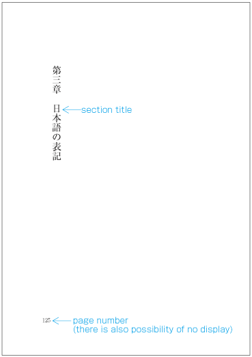
多くの本で中扉または半扉を付けている.大きく内容を区切る要素がない場合は,先頭に書名を中扉として掲げることもよく行われている.
多くの本で中扉または半扉を付けている.大きく内容を区切る要素がない場合は,先頭に書名を中扉として掲げることもよく行われている.
別行見出しは,独立した行として見出しを掲げたものである.見出しの直後に本文を続けて配置する.大見出しや中見出しは,この形式である(dummygenerated参照).
別行見出しは,独立した行として見出しを掲げたものである.見出しの直後に本文を続けて配置する.大見出しや中見出しは,この形式である(dummygenerated参照).
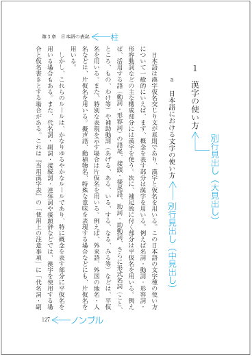
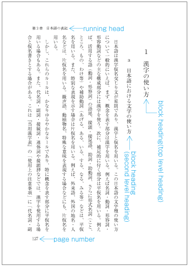
|
注1) 注1) |
|
|
注2) 注2) |
|
|
注3) 注3) |
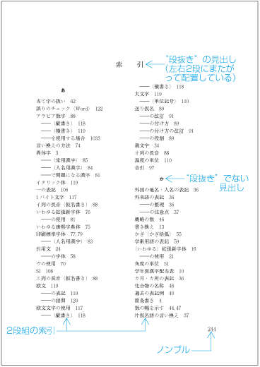
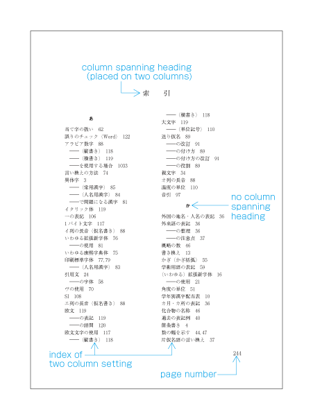
同行見出しは,見出しの次に改行を入れることなく,文章を続ける形式の見出しである(dummygenerated参照).同行見出しは,小見出しに利用されている.なお,小見出しは別行見出しとすることもある.
同行見出しは,見出しの次に改行を入れることなく,文章を続ける形式の見出しである(dummygenerated参照).同行見出しは,小見出しに利用されている.なお,小見出しは別行見出しとすることもある.
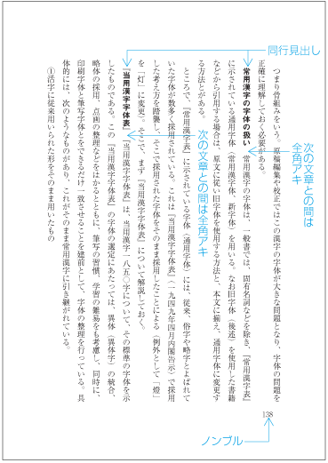
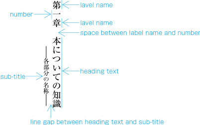
見出しは,階層構造を示しているわけであるから,それぞれのレベルに応じた表示体裁にする必要がある.見出しについては,次のような事項で見出しのレベルに応じた表示体裁にしている.
見出しは,階層構造を示しているわけであるから,それぞれのレベルに応じた表示体裁にする必要がある.見出しについては,次のような事項で見出しのレベルに応じた表示体裁にしている.
-
注1)
注1)
見出しのレベルに応じた文字サイズにする場合,例えば,大見出し,中見出し,小見出しとあったときは,小見出しは,本文の文字サイズ(例:9ポイント)より1段階大きく(例:10ポイント),中見出しは小見出しより1段階大きく(例:12ポイント),大見出しは中見出しより1段階大きくする(例:14ポイント).この例に従った文字サイズの見出し例をdummygeneratedに示す.
見出しのレベルに応じた文字サイズにする場合,例えば,大見出し,中見出し,小見出しとあったときは,小見出しは,本文の文字サイズ(例:9ポイント)より1段階大きく(例:10ポイント),中見出しは小見出しより1段階大きく(例:12ポイント),大見出しは中見出しより1段階大きくする(例:14ポイント).この例に従った文字サイズの見出し例をdummygeneratedに示す.
注2)
注2)
文字サイズに段階を付ける方法としては,JIS X 4051では,参考として次の2つの方法を紹介している.
文字サイズに段階を付ける方法としては,JIS X 4051では,参考として次の2つの方法を紹介している.
-
JIS Z 8305の表1に規定されているポイントの大きさの種類として掲げられている文字サイズのうち,左欄に掲げられている種類を基準として段階を選択する方法.[左欄に掲げられている種類は,6ポイント以上についていえば,6,7,8,9,10(以上は1ポイント差),12,14,16,18,20(以上は2ポイント差),24,28,32,36,40ポイント(以上は4ポイント差)である.]
JIS Z 8305の表1に規定されているポイントの大きさの種類として掲げられている文字サイズのうち,左欄に掲げられている種類を基準として段階を選択する方法.[左欄に掲げられている種類は,6ポイント以上についていえば,6,7,8,9,10(以上は1ポイント差),12,14,16,18,20(以上は2ポイント差),24,28,32,36,40ポイント(以上は4ポイント差)である.]
注3)
注3)
-
-
使用する書体(フォント)
使用する書体(フォント)
注1)
注1)
本文が8ポイントや9ポイントの場合,明朝体のウェイトはL(細明朝体)かそれよりやや高くしている例が多い.この場合,見出しの文字サイズを大きくしたときは,一般に本文と同じウェイトではやや弱くなるので,M(中明朝体)などに変えることも必要になる(dummygenerated参照).
本文が8ポイントや9ポイントの場合,明朝体のウェイトはL(細明朝体)かそれよりやや高くしている例が多い.この場合,見出しの文字サイズを大きくしたときは,一般に本文と同じウェイトではやや弱くなるので,M(中明朝体)などに変えることも必要になる(dummygenerated参照).
-
そろえ(字送り方向の配置位置)
そろえ(字送り方向の配置位置)
注1)
注1)
横組の大見出しや中見出しは,中央そろえにする例が比較的多い.これに対して,縦組では,行頭そろえとし,一般に字下げを行う.字下げをする場合,大きな見出しから小さな見出しを順次下げていく.下げていく量の差は,基本版面で設定した文字サイズで2字(2倍)くらいにしている.例えば,基本版面の文字サイズを9ポイントとした場合,大見出しは4字(4倍)下ガリ,中見出しは6字(6倍)下ガリ,小見出しは8字(8倍)下ガリ
横組の大見出しや中見出しは,中央そろえにする例が比較的多い.これに対して,縦組では,行頭そろえとし,一般に字下げを行う.字下げをする場合,大きな見出しから小さな見出しを順次下げていく.下げていく量の差は,基本版面で設定した文字サイズで2字(2倍)くらいにしている.例えば,基本版面の文字サイズを9ポイントとした場合,大見出しは4字(4倍)下ガリ,中見出しは6字(6倍)下ガリ,小見出しは8字(8倍)下ガリ
注2)
注2)
-
注1)
注1)
-
注1)
注1)
-
見出しのレベルの表示とは直接には関係しないが,見出しでは2字や3字といった極端に字数が少ない場合がある.そこで,見出しの字数に応じてアキ組にする例がある.dummygeneratedにいくつかの例を掲げておく.
見出しのレベルの表示とは直接には関係しないが,見出しでは2字や3字といった極端に字数が少ない場合がある.そこで,見出しの字数に応じてアキ組にする例がある.dummygeneratedにいくつかの例を掲げておく.
-
その他,罫線で飾りをつける,記号を付けるなど
その他,罫線で飾りをつける,記号を付けるなど
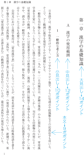
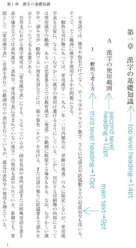
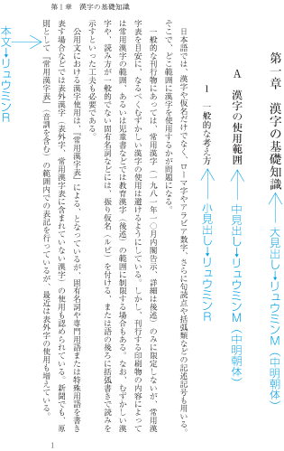
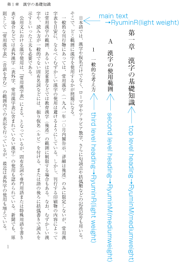
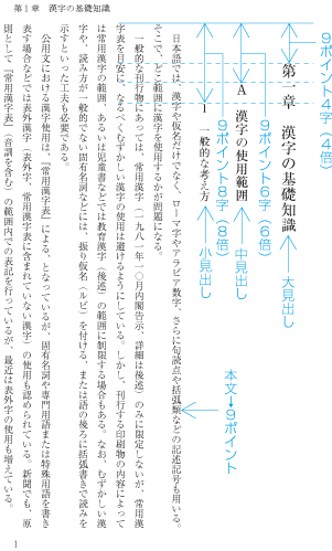
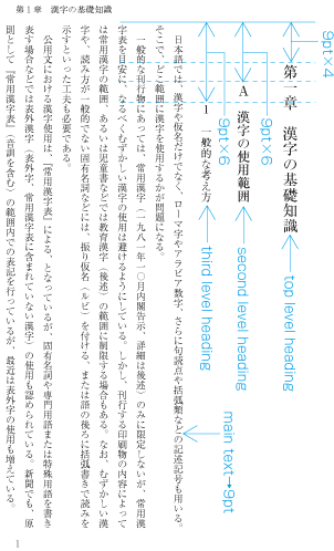
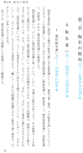
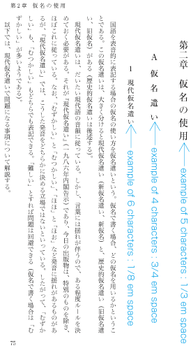
|
注1) 注1) |
-
注1)
注1)
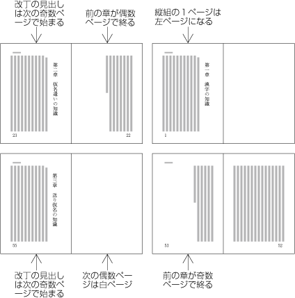
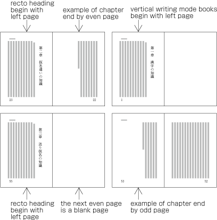
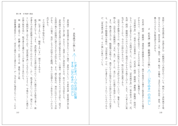
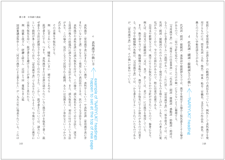
-
改段の場合,その指定直前に配置した行などの末尾の後ろは空けておけばよい.
改段の場合,その指定直前に配置した行などの末尾の後ろは空けておけばよい.
-
縦組の多段組の場合,上段から下段に行を順次配置していく(dummygenerated参照).基本版面で指定された各段に配置する行数は揃えないでよい.
縦組の多段組の場合,上段から下段に行を順次配置していく(dummygenerated参照).基本版面で指定された各段に配置する行数は揃えないでよい.
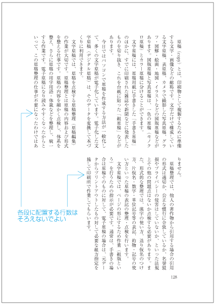
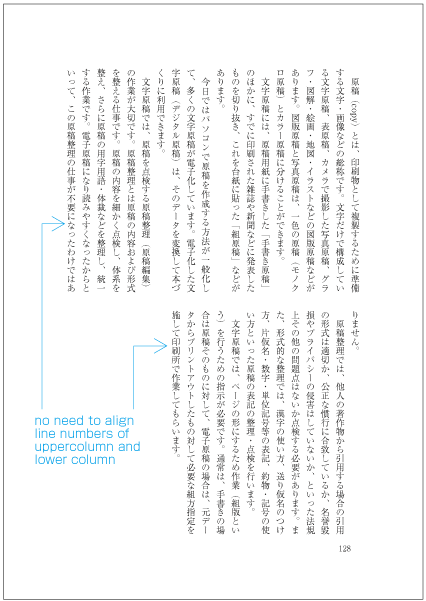
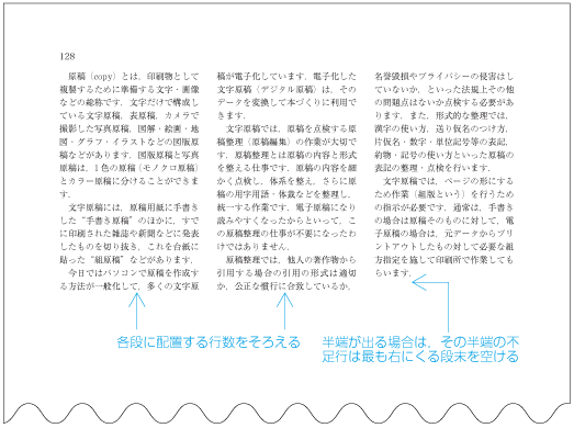
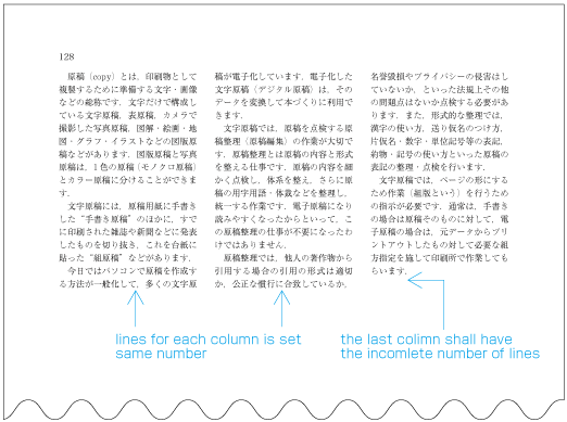
基本版面で設定した行位置を基準にして設定する方法が行取りである.別行見出しの配置を行取りの考え方で設定する方法には,次のようなものがある.
基本版面で設定した行位置を基準にして設定する方法が行取りである.別行見出しの配置を行取りの考え方で設定する方法には,次のようなものがある.
-
基本版面で設定した2行以上の複数行の領域の中央に配置する.例えば,基本版面で設定した3行の中央に配置する場合は,“3行ドリ中央”という.いくつかの配置例をdummygenerated以下に示す.なお,以下の図版において見出しのバックにある青色の矩形は,基本版面で設定した文字及び行の配置位置を示すものである.
基本版面で設定した2行以上の複数行の領域の中央に配置する.例えば,基本版面で設定した3行の中央に配置する場合は,“3行ドリ中央”という.いくつかの配置例をdummygenerated以下に示す.なお,以下の図版において見出しのバックにある青色の矩形は,基本版面で設定した文字及び行の配置位置を示すものである.
注1)
注1)
副題の文字サイズは,主見出しの文字サイズの2/3くらいがよい.一体として見えるように,主見出しとの行送り方向の空き量も狭くし,例えば,主見出しの文字サイズの1/2くらいにする.字詰め方向の位置も行頭そろえの場合は,主見出しより副題を下げ,中央そろえの場合は副題も中央そろえとする.主見出しと副題は一体として扱い,2ページ又は2段にわたって分割してはならない.
副題の文字サイズは,主見出しの文字サイズの2/3くらいがよい.一体として見えるように,主見出しとの行送り方向の空き量も狭くし,例えば,主見出しの文字サイズの1/2くらいにする.字詰め方向の位置も行頭そろえの場合は,主見出しより副題を下げ,中央そろえの場合は副題も中央そろえとする.主見出しと副題は一体として扱い,2ページ又は2段にわたって分割してはならない.
注1)
注1)
見出しを折り返す場合,折り返し箇所は,見出しの字下げの量とのバランスをとり,また,文章の内容から判断して行う.例えば,固有名詞などを途中で割らないようにする.助詞を行頭に配置することも望ましくない.その行間は,見出しが一体として見えるように狭くする.例えば.見出し文字列の文字サイズの三分アキ二分アキとする.折り返しする行頭も1行目より下げる.折り返した見出しは一体として扱い,2ページ又は2段にわたって分割してはならない.
見出しを折り返す場合,折り返し箇所は,見出しの字下げの量とのバランスをとり,また,文章の内容から判断して行う.例えば,固有名詞などを途中で割らないようにする.助詞を行頭に配置することも望ましくない.その行間は,見出しが一体として見えるように狭くする.例えば.見出し文字列の文字サイズの三分アキ二分アキとする.折り返しする行頭も1行目より下げる.折り返した見出しは一体として扱い,2ページ又は2段にわたって分割してはならない.
-
1行の見出しを基本版面で設定した行位置に配置し,その前を1行(又は複数行)空ける(複数行空ける例は少ない).この配置方法は小見出しの場合に利用されている.いくつかの配置例をdummygenerated以下に示す.
1行の見出しを基本版面で設定した行位置に配置し,その前を1行(又は複数行)空ける(複数行空ける例は少ない).この配置方法は小見出しの場合に利用されている.いくつかの配置例をdummygenerated以下に示す.
-
行取りで配置するレベルの異なった見出しが複数あった場合,見出しのレベルに応じて行取り数を変える.また,見出しは単独で掲げる場合と,レベルの異なる見出しが連続して掲げる場合がある.この場合,同一のレベルの見出しについて,単独で掲げるときの見出しの行送り方向の空き量と,連続して掲げるときの見出しの行送り方向の空き量をできるだけ揃えた方がよい.従って,同一のレベルの見出しについて,単独で掲げるときの見出しの行取りと,連続して掲げるときの見出しの行取りを変える場合がある.その例をdummygeneratedに示す.
行取りで配置するレベルの異なった見出しが複数あった場合,見出しのレベルに応じて行取り数を変える.また,見出しは単独で掲げる場合と,レベルの異なる見出しが連続して掲げる場合がある.この場合,同一のレベルの見出しについて,単独で掲げるときの見出しの行送り方向の空き量と,連続して掲げるときの見出しの行送り方向の空き量をできるだけ揃えた方がよい.従って,同一のレベルの見出しについて,単独で掲げるときの見出しの行取りと,連続して掲げるときの見出しの行取りを変える場合がある.その例をdummygeneratedに示す.
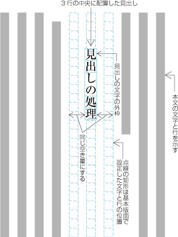
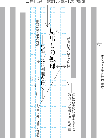
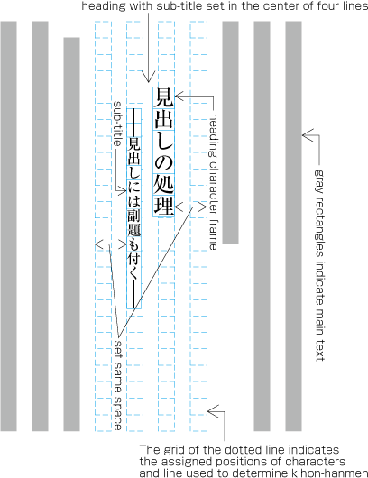
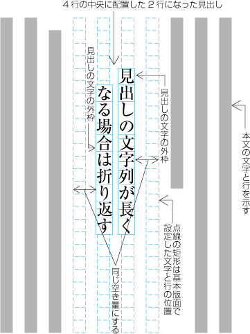
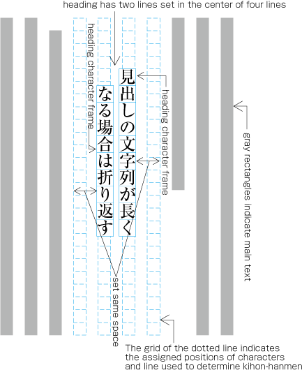
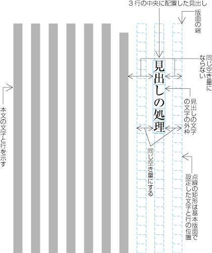
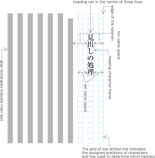
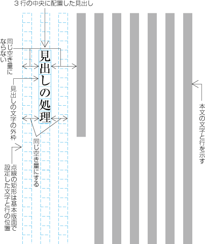
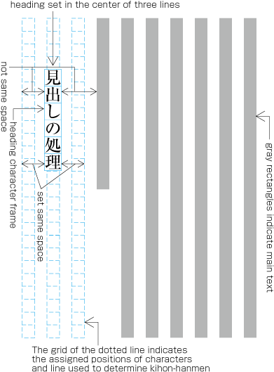
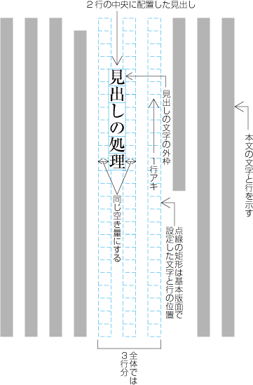
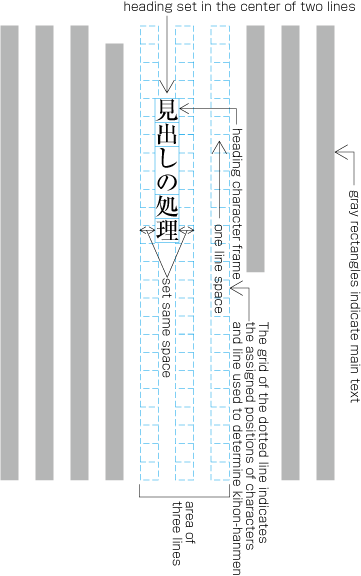
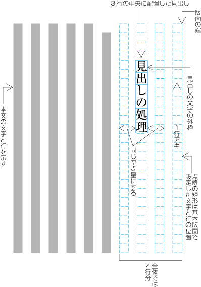
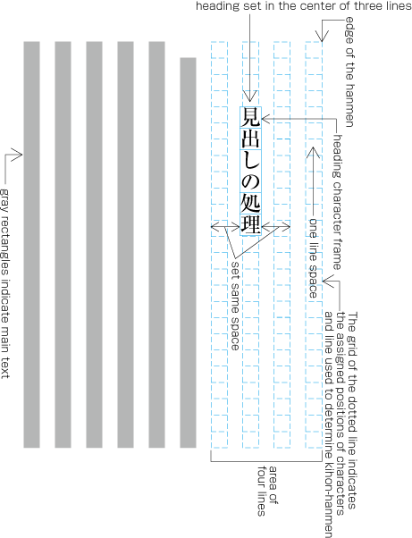
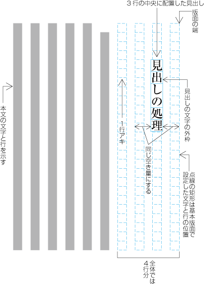
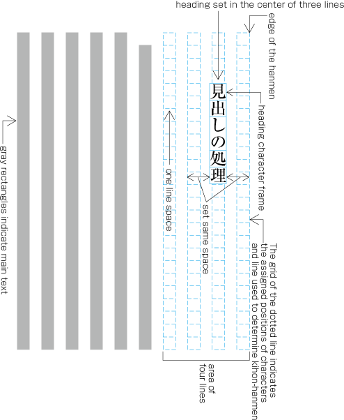
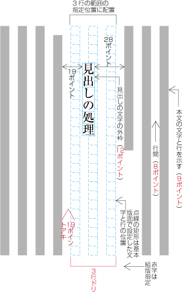
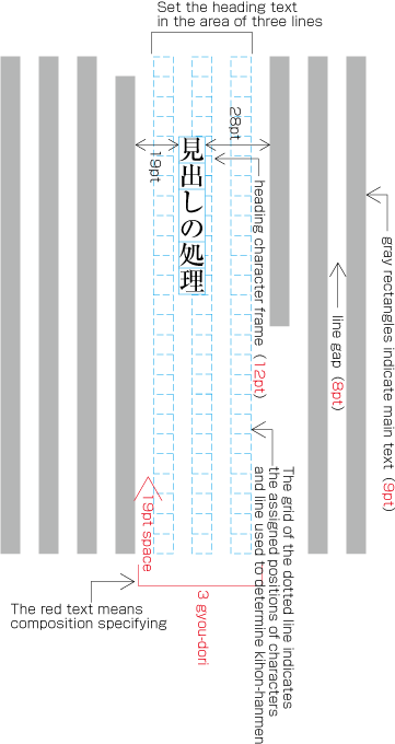
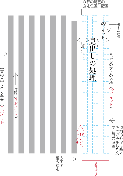
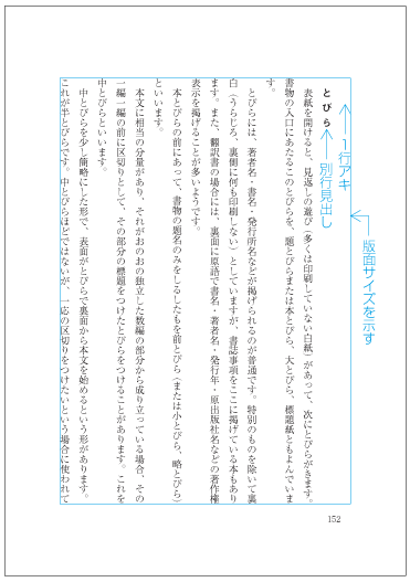
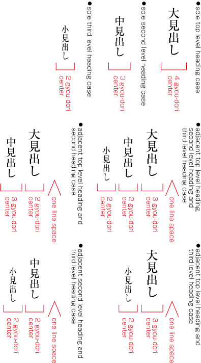
-
ページ末に指定された行数は確保できるが,見出しの後ろに本文の行が1行も配置できない場合,縦組の奇数ページ,横組の奇数ページ及び横組の偶数ページのときは,その行取りの設定がされた見出し全体を次ページの冒頭に配置する(dummygenerated参照).前のページ末は,空けたままにしておく.縦組の偶数ページの場合は,ページ末に見出しを配置する.
ページ末に指定された行数は確保できるが,見出しの後ろに本文の行が1行も配置できない場合,縦組の奇数ページ,横組の奇数ページ及び横組の偶数ページのときは,その行取りの設定がされた見出し全体を次ページの冒頭に配置する(dummygenerated参照).前のページ末は,空けたままにしておく.縦組の偶数ページの場合は,ページ末に見出しを配置する.
注1)
注1)
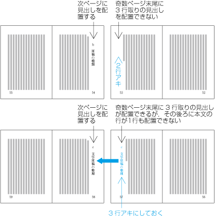
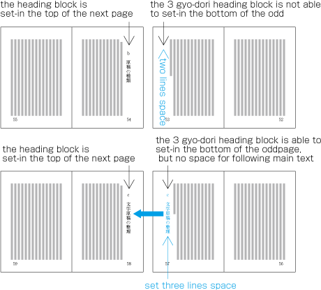
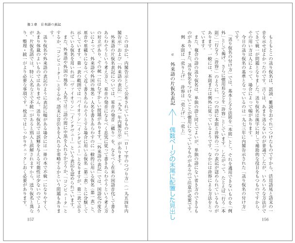
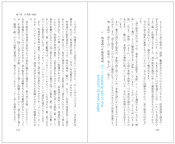
-
小見出しの前を1行アキにする方針の見出しがページ先頭にきた場合,常に1行アキにする.小見出しと1行アキはセットであり,これを一体に扱うという考え方からである.
小見出しの前を1行アキにする方針の見出しがページ先頭にきた場合,常に1行アキにする.小見出しと1行アキはセットであり,これを一体に扱うという考え方からである.
注1)
注1)
-
小見出しの前を1行アキにする方針の見出しがページ先頭にきた場合,常に1行アキにしない.ページの先頭では,その前に余白があるので,1行アキにする必要はない,という考え方からである.
小見出しの前を1行アキにする方針の見出しがページ先頭にきた場合,常に1行アキにしない.ページの先頭では,その前に余白があるので,1行アキにする必要はない,という考え方からである.
注1)
注1)
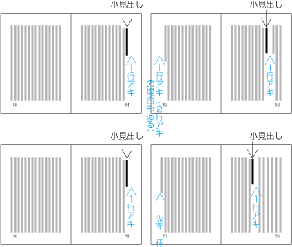
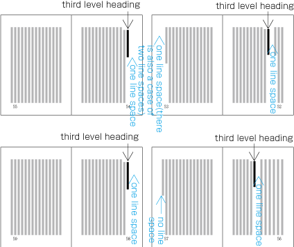
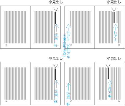
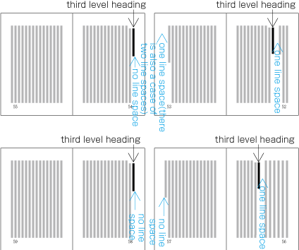
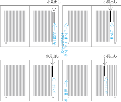
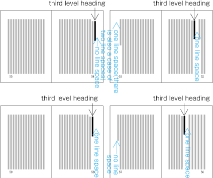
同行見出しは,小見出しに利用されている.いくつかの同行見出しの例を次に掲げる.同行見出しと次に続く本文とのアキは,一般に基本版面の文字サイズの全角アキとする.なお,同行見出しは,ページ末に配置してよい.
同行見出しは,小見出しに利用されている.いくつかの同行見出しの例を次に掲げる.同行見出しと次に続く本文とのアキは,一般に基本版面の文字サイズの全角アキとする.なお,同行見出しは,ページ末に配置してよい.
-
本文と同じ文字サイズにし,書体をゴシック体に変更する(dummygenerated参照).
本文と同じ文字サイズにし,書体をゴシック体に変更する(dummygenerated参照).
-
本文と1段階小さな文字サイズにし,書体をゴシック体に変更する(dummygenerated参照).
本文と1段階小さな文字サイズにし,書体をゴシック体に変更する(dummygenerated参照).
-
本文と同じ文字サイズにし,書体も変更しない.ただし,先頭に付くアラビア数字又は欧字の番号をゴシック体または太字にし,やや目立つようにする(dummygenerated参照).
本文と同じ文字サイズにし,書体も変更しない.ただし,先頭に付くアラビア数字又は欧字の番号をゴシック体または太字にし,やや目立つようにする(dummygenerated参照).
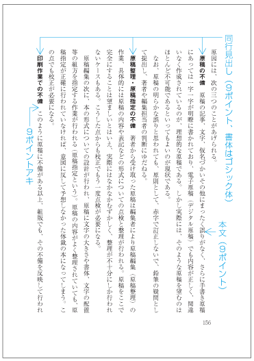
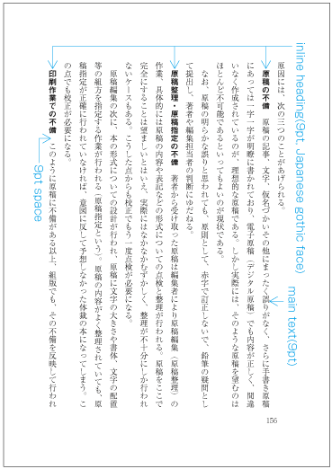

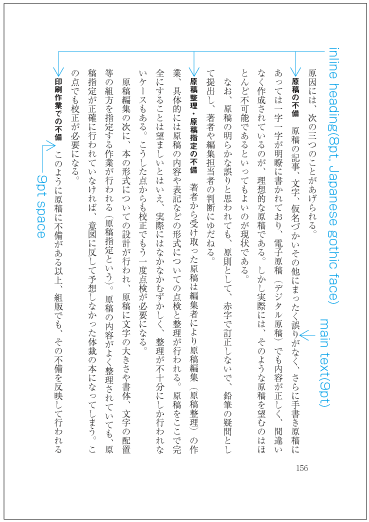
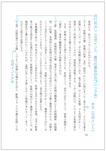
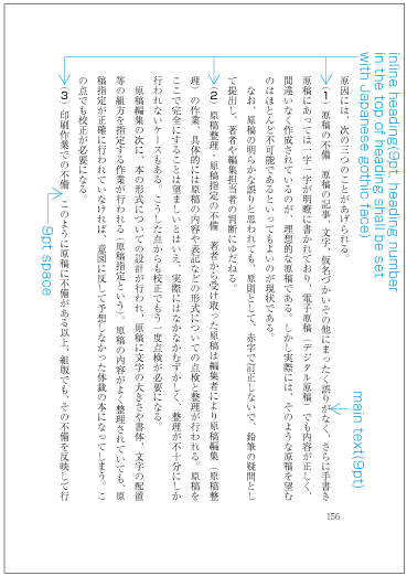
窓見出しも小見出しに利用される.窓見出しでは,ラベル名や番号を付けない.次のように処理する(dummygenerated参照).
窓見出しも小見出しに利用される.窓見出しでは,ラベル名や番号を付けない.次のように処理する(dummygenerated参照).
|
注1) 注1) |
-
窓見出しの行数は,最大3行とし,1行の字数は最大で10字くらいとすることが望ましい.JIS X 4051では,“窓見出しの文字数が6字までは1行,20字までは2行,21字以上は3行とすることを既定値とする”と規定している.窓見出しを折り返す場合,その字数の1/2又は1/3若しくは2/3の位置で折り返す.不足分は,最終行の末尾を空ける.窓見出しを2行または3行にする場合の行間は,窓見出しの文字サイズの四分くらいが望ましい.
窓見出しの行数は,最大3行とし,1行の字数は最大で10字くらいとすることが望ましい.JIS X 4051では,“窓見出しの文字数が6字までは1行,20字までは2行,21字以上は3行とすることを既定値とする”と規定している.窓見出しを折り返す場合,その字数の1/2又は1/3若しくは2/3の位置で折り返す.不足分は,最終行の末尾を空ける.窓見出しを2行または3行にする場合の行間は,窓見出しの文字サイズの四分くらいが望ましい.
-
同行見出しは,ページ末に配置してよい.ただし,配置する行数が不足する場合は,次ページに窓見出しを追い出し,そのページの末尾は空けておく.
同行見出しは,ページ末に配置してよい.ただし,配置する行数が不足する場合は,次ページに窓見出しを追い出し,そのページの末尾は空けておく.
注1)
注1)
|
注1) 注1) |
-
基本版面で設定した段数にする段抜きの別行見出しは,一般に改ページ又は改丁で開始する先頭ページに配置する.しかし,ページの途中に配置する場合もある.この場合は,基本版面で設定した段数より少ない段数を使った段抜きの別行見出しを含め,本文は,別行見出しを“かべ”として,その前で折り返すようにする(dummygenerated参照).
基本版面で設定した段数にする段抜きの別行見出しは,一般に改ページ又は改丁で開始する先頭ページに配置する.しかし,ページの途中に配置する場合もある.この場合は,基本版面で設定した段数より少ない段数を使った段抜きの別行見出しを含め,本文は,別行見出しを“かべ”として,その前で折り返すようにする(dummygenerated参照).
-
段抜きの見出しの前で折り返す場合,行数に半端が出るときは,その半端の不足行は,最も後ろになる段を空ける(dummygenerated参照).縦組では最下段,横組では最右段を空ける.
段抜きの見出しの前で折り返す場合,行数に半端が出るときは,その半端の不足行は,最も後ろになる段を空ける(dummygenerated参照).縦組では最下段,横組では最右段を空ける.
-
基本版面で設定した段数より少ない段抜きの別行見出しは,ページの途中に配置される場合が多い.この場合の配置位置,つまり,どの段から開始するかは,次のように処理する.
基本版面で設定した段数より少ない段抜きの別行見出しは,ページの途中に配置される場合が多い.この場合の配置位置,つまり,どの段から開始するかは,次のように処理する.
-
段の領域に配置していった結果,段抜きの別行見出しが版面内の先頭の段に出現した場合は,先頭の段を開始する段とする(dummygenerated参照).
段の領域に配置していった結果,段抜きの別行見出しが版面内の先頭の段に出現した場合は,先頭の段を開始する段とする(dummygenerated参照).
-
段の領域に配置していった結果,段抜きの別行見出しが版面内の2段目以降の段に出現した場合は,出現した段又はその上の段を開始する段とする.出現位置が段の領域の前(例えば1/2未満の位置)にきた場合は,すぐ上の段とする(dummygenerated参照).出現位置が段の領域の後ろになる場合は,出現した段とする(dummygenerated参照).ただし,配置した結果,段抜きの別行見出しが版面の領域をはみ出した場合は,上の段にする(dummygenerated参照).
段の領域に配置していった結果,段抜きの別行見出しが版面内の2段目以降の段に出現した場合は,出現した段又はその上の段を開始する段とする.出現位置が段の領域の前(例えば1/2未満の位置)にきた場合は,すぐ上の段とする(dummygenerated参照).出現位置が段の領域の後ろになる場合は,出現した段とする(dummygenerated参照).ただし,配置した結果,段抜きの別行見出しが版面の領域をはみ出した場合は,上の段にする(dummygenerated参照).
-
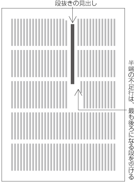
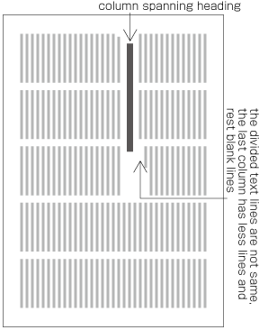
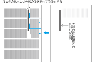
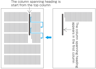
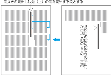
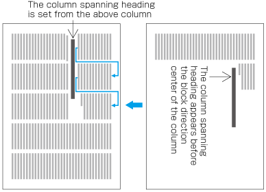
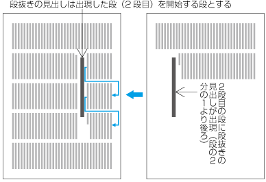
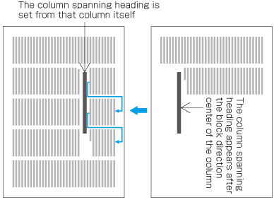
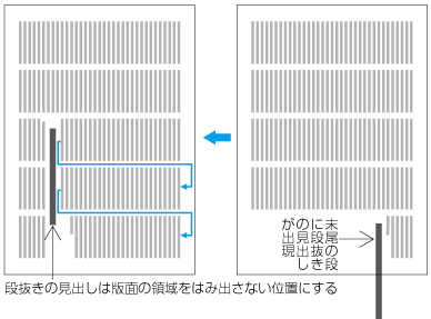
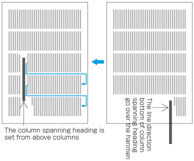
-
頭注(縦組) 縦組において,基本版面の上端に掲げられる注である.基本版面の設計段階であらかじめ注のための領域を確保し,ページ(又は見開き)を単位として,その範囲にある項目に関連した注をそこに配置していく(dummygenerated参照).頭注は,古典の注釈本において,語句に説明を施す場合によく利用されている.この場合,ページを上下に3つの領域に分け,一番上の領域を注,中央領域に原文,下端の領域に翻訳した現代文を掲げるという形式も行われている.
頭注(縦組) 縦組において,基本版面の上端に掲げられる注である.基本版面の設計段階であらかじめ注のための領域を確保し,ページ(又は見開き)を単位として,その範囲にある項目に関連した注をそこに配置していく(dummygenerated参照).頭注は,古典の注釈本において,語句に説明を施す場合によく利用されている.この場合,ページを上下に3つの領域に分け,一番上の領域を注,中央領域に原文,下端の領域に翻訳した現代文を掲げるという形式も行われている.
-
脚注(横組) 脚注は,基本版面の下端に掲げられる注である(dummygenerated参照).横組では,脚注の利用が最も多い.
脚注(横組) 脚注は,基本版面の下端に掲げられる注である(dummygenerated参照).横組では,脚注の利用が最も多い.
-
脚注(縦組) 縦組の脚注は,基本版面の設計段階であらかじめ注のための領域を確保し,そこに配置していく.頭注の形式に似ているが,注の配置位置を下端にした形式である.古典などの注釈本や啓蒙的な本で,専門的な事項の説明を施す場合などに利用されている.この形式の注を採用した場合で図版を配置するときは,図版のサイズにもよるが,できるだけ,注の領域に図版も配置するようにしている(dummygenerated参照).
脚注(縦組) 縦組の脚注は,基本版面の設計段階であらかじめ注のための領域を確保し,そこに配置していく.頭注の形式に似ているが,注の配置位置を下端にした形式である.古典などの注釈本や啓蒙的な本で,専門的な事項の説明を施す場合などに利用されている.この形式の注を採用した場合で図版を配置するときは,図版のサイズにもよるが,できるだけ,注の領域に図版も配置するようにしている(dummygenerated参照).
-
傍注(縦組) 縦組において,見開きを単位として,その範囲にある項目に関連した注を,見開きの左ページ(奇数ページ)掲げる注である(dummygenerated参照).縦組の傍注の使用例は少ないが,本文の流れを阻害しないで,かつ,関連項目の近くに注を掲げることができるので,もっと利用が増えてもよい形式である.
傍注(縦組) 縦組において,見開きを単位として,その範囲にある項目に関連した注を,見開きの左ページ(奇数ページ)掲げる注である(dummygenerated参照).縦組の傍注の使用例は少ないが,本文の流れを阻害しないで,かつ,関連項目の近くに注を掲げることができるので,もっと利用が増えてもよい形式である.
-
傍注(横組) 横組おける傍注は,サイドノートと呼ばれており,基本版面の設計段階であらかじめ注のための領域を小口側に確保し,ページを単位として,その範囲にある項目に関連した注をそこに配置していく(dummygenerated参照).注だけでなく,この領域に図版等も配置される.横組おける傍注の位置を小口側でなく,ページの右側とした例もある(dummygenerated参照).横組の傍注の使用例は,多くないが,図版等が入る啓蒙的な本で利用されている.
傍注(横組) 横組おける傍注は,サイドノートと呼ばれており,基本版面の設計段階であらかじめ注のための領域を小口側に確保し,ページを単位として,その範囲にある項目に関連した注をそこに配置していく(dummygenerated参照).注だけでなく,この領域に図版等も配置される.横組おける傍注の位置を小口側でなく,ページの右側とした例もある(dummygenerated参照).横組の傍注の使用例は,多くないが,図版等が入る啓蒙的な本で利用されている.
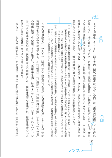
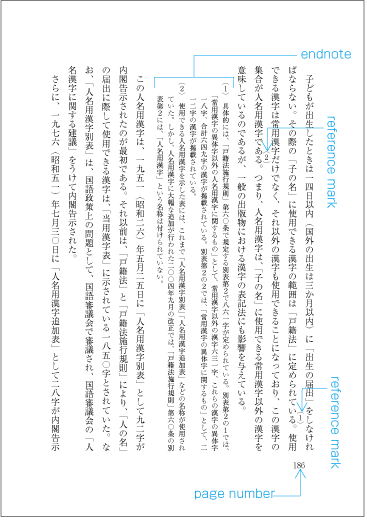
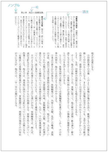
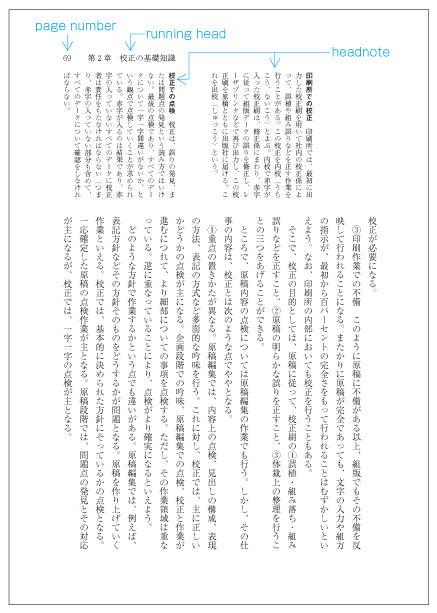
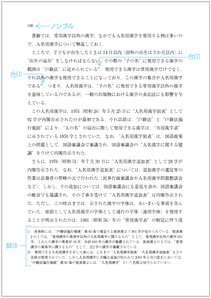
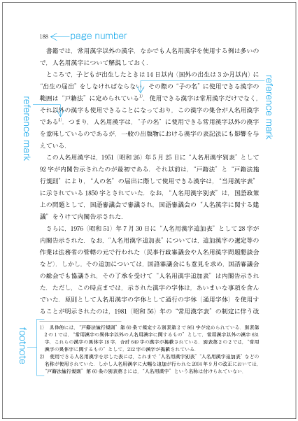
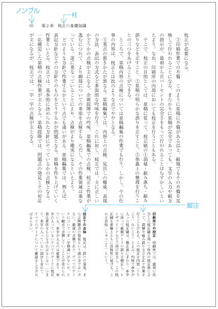
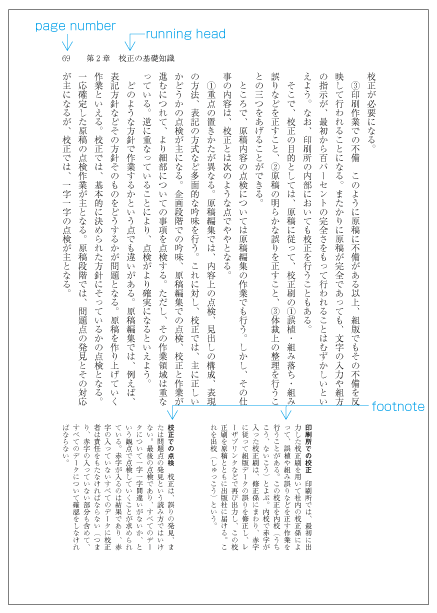
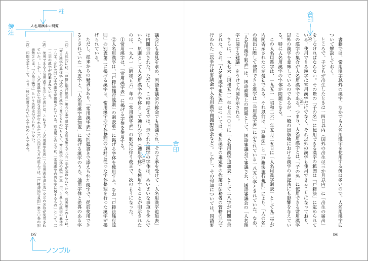
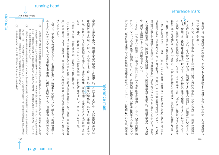
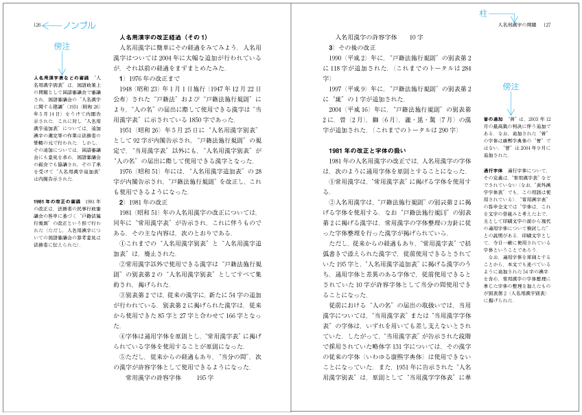
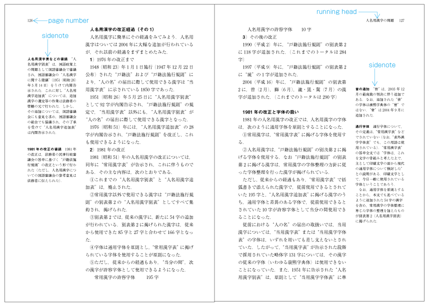
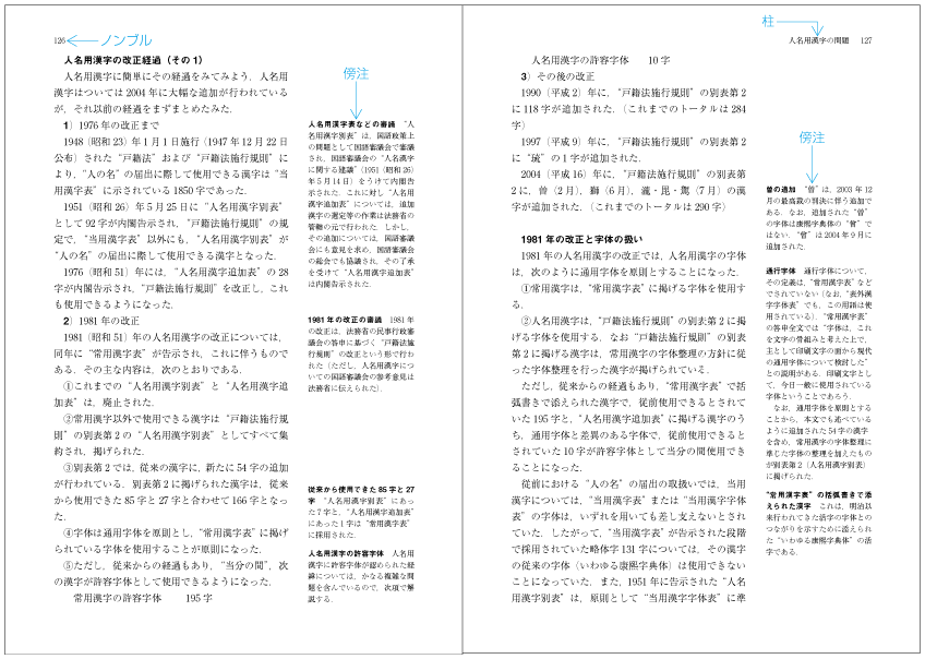
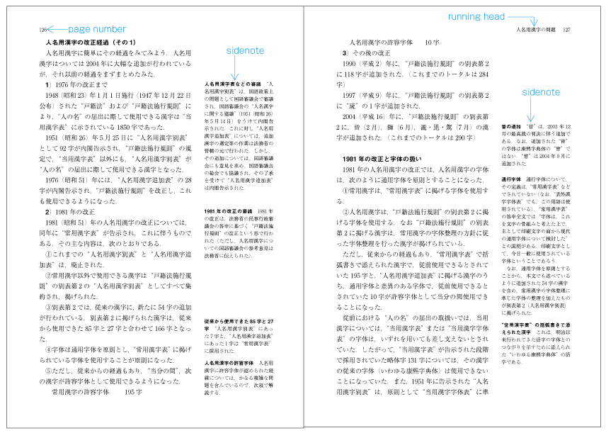
|
注1) 注1) |
|
|
注2) 注2) |
|
|
注3) 注3) |
上記に掲げた注の形式以外に,学習参考書や歴史の教科書などで人物や事項の簡単な説明,古典の現代文への翻訳などを行間に配置する例がある.このように行間に配置する注の形式もある(dummygenerated参照).行間注などとよばれている. 上記に掲げた注の形式以外に,学習参考書や歴史の教科書などで人物や事項の簡単な説明,古典の現代文への翻訳などを行間に配置する例がある.このように行間に配置する注の形式もある(dummygenerated参照).行間注などとよばれている. |
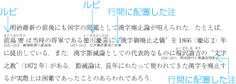
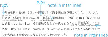
注は,本文の該当箇所との関連を示さないで,そのページにある項目に関連した注を配置する例もある.しかし,多くは本文の該当箇所との関連を示す注番号を付け,関連を示す方法をとっている.
注は,本文の該当箇所との関連を示さないで,そのページにある項目に関連した注を配置する例もある.しかし,多くは本文の該当箇所との関連を示す注番号を付け,関連を示す方法をとっている.
|
注1) 注1) |
|
|
注2) 注2) |
|
|
注3) 注3) |
縦組で注番号にアラビア数字を用いた場合は,一般に縦中横処理としている(dummygenerated参照). 縦組で注番号にアラビア数字を用いた場合は,一般に縦中横処理としている(dummygenerated参照). |
|
注4) 注4) |
縦組で注番号に漢数字を用いた場合は,文字を変形し,上下の仮想ボディのサイズを50%にした漢数字を使用する例が多い.このような文字は平字(ひらじ)とよばれている(dummygenerated参照). 縦組で注番号に漢数字を用いた場合は,文字を変形し,上下の仮想ボディのサイズを50%にした漢数字を使用する例が多い.このような文字は平字(ひらじ)とよばれている(dummygenerated参照). |
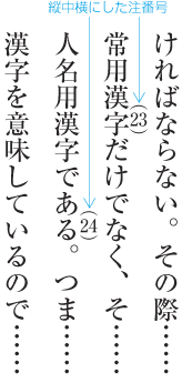
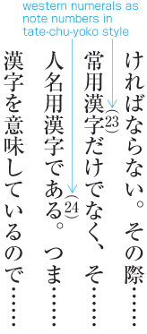
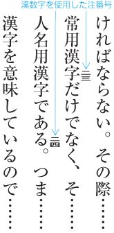
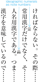
注番号の開始方法には,いくつかの方針がある.後注の場合は,配置位置にもよるが,章単位又は節単位などで開始する形式が多い.縦組の傍注は,見開き単位で開始する形式が多く,横組の脚注は,ページ単位で開始する形式が多い.
注番号の開始方法には,いくつかの方針がある.後注の場合は,配置位置にもよるが,章単位又は節単位などで開始する形式が多い.縦組の傍注は,見開き単位で開始する形式が多く,横組の脚注は,ページ単位で開始する形式が多い.
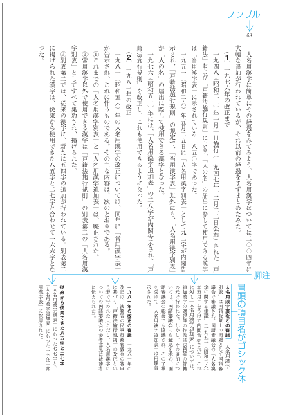
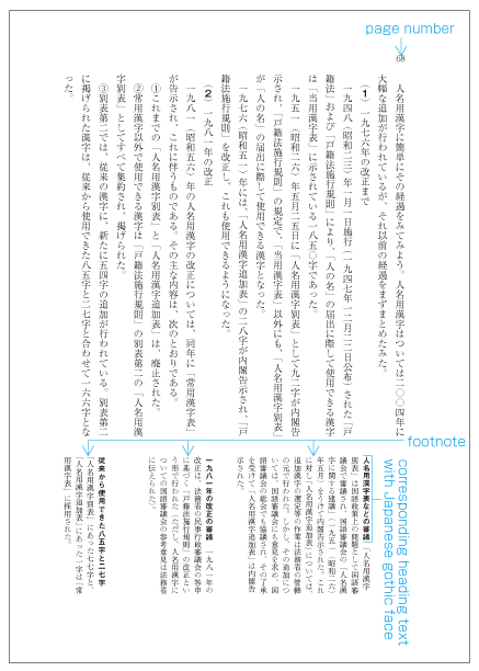
縦組又は横組の合印は,該当項目に接して,その右側(縦組)又は上側(横組)の行間に配置する方法と,該当項目の後ろの行中に配置する方法がある.
縦組又は横組の合印は,該当項目に接して,その右側(縦組)又は上側(横組)の行間に配置する方法と,該当項目の後ろの行中に配置する方法がある.
|
注1) 注1) |
該当項目の右側(縦組)又は上側(横組)に配置する場合は,次のようにする(dummygenerated,dummygenerated参照).
該当項目の右側(縦組)又は上側(横組)に配置する場合は,次のようにする(dummygenerated,dummygenerated参照).
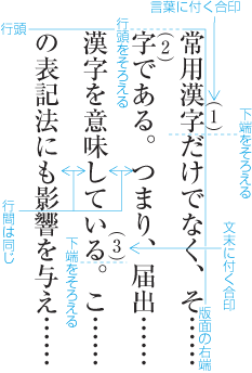
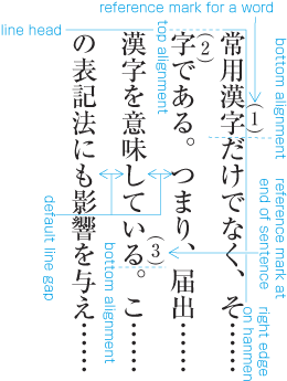
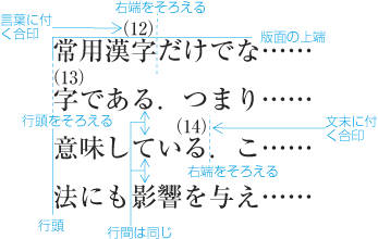
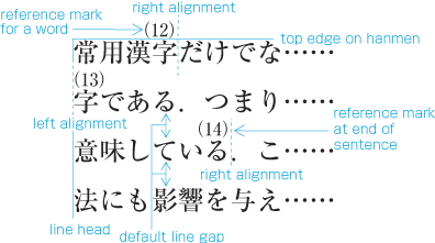
縦組において,合印を該当項目の後ろの行中に配置する場合は,次のようにする(dummygenerated参照).
縦組において,合印を該当項目の後ろの行中に配置する場合は,次のようにする(dummygenerated参照).
横組において,合印を該当項目の後ろの行中に配置する場合は,次のようにする(dummygenerated参照).
横組において,合印を該当項目の後ろの行中に配置する場合は,次のようにする(dummygenerated参照).
縦組における後注(段落の後ろに配置した例)の一般的な配置例を図解して示す(dummygenerated参照).
縦組における後注(段落の後ろに配置した例)の一般的な配置例を図解して示す(dummygenerated参照).
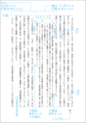
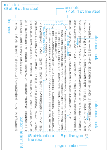
後注を配置する際に,特に問題となる事項を解説する.
後注を配置する際に,特に問題となる事項を解説する.
-
注1)
注1)
-
字下げは,基本版面の文字サイズの2倍くらいにする.後注の行長は,後注の文字サイズの整数倍にする.また,後注の末尾は,版面又は段の領域の下端(縦組)又は右端(横組)に接して配置する.これに従い,字下げ量は調整が必要になり,基本版面の文字サイズの整数倍にならない例も多い.
字下げは,基本版面の文字サイズの2倍くらいにする.後注の行長は,後注の文字サイズの整数倍にする.また,後注の末尾は,版面又は段の領域の下端(縦組)又は右端(横組)に接して配置する.これに従い,字下げ量は調整が必要になり,基本版面の文字サイズの整数倍にならない例も多い.
注1)
注1)
例えば,基本版面の文字サイズが9ポイント,字詰数が43字の場合,後注の文字サイズを7ポイントとすると,字下げの量は,次のように計算できる.
例えば,基本版面の文字サイズが9ポイント,字詰数が43字の場合,後注の文字サイズを7ポイントとすると,字下げの量は,次のように計算できる.
7ポイントの字数に換算 387ポイント=7ポイント×55字+2ポイント
7ポイントの字数に換算 387ポイント=7ポイント×55字+2ポイント
387ポイント-7ポイント×53字=16ポイント
387ポイント-7ポイント×53字=16ポイント
387ポイント-7ポイント×52字=23ポイント
387ポイント-7ポイント×52字=23ポイント
-
章末などに後注を配置する場合,改ページ等で開始される直前のページに後注は配置され,後注の後ろは空白となり,大きな問題はでない.しかし,段落の間などに後注を挿入する場合は,後注とその前に配置される本文との行間が問題となる.原則として,後注とその前後に配置する本文との最小の行間は,基本版面で設定した行間とする.また,通常,版面又は段の末尾に配置される行は,版面又は段の領域の末尾に揃える.この場合の行送り方向の半端は,原則として後注の後ろを増やして処理するが,版面又は段の末尾に後注がきたときは,後注の前にとる(dummygenerated参照).
章末などに後注を配置する場合,改ページ等で開始される直前のページに後注は配置され,後注の後ろは空白となり,大きな問題はでない.しかし,段落の間などに後注を挿入する場合は,後注とその前に配置される本文との行間が問題となる.原則として,後注とその前後に配置する本文との最小の行間は,基本版面で設定した行間とする.また,通常,版面又は段の末尾に配置される行は,版面又は段の領域の末尾に揃える.この場合の行送り方向の半端は,原則として後注の後ろを増やして処理するが,版面又は段の末尾に後注がきたときは,後注の前にとる(dummygenerated参照).
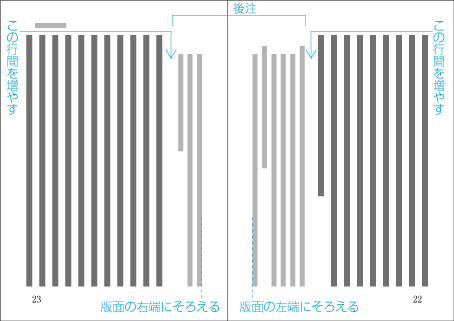
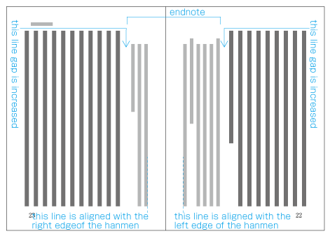
横組における脚注の配置位置は,1段組の場合は,合印があるページの版面の最下端に接して配置し,多段組の場合は,合印がある段の領域の最下端に接して配置する.そのページ又は段に対応する脚注の全部又は一部が入りきらない場合は,入りきらない脚注部分を次ページ又は次の段に,そのページ又は段に入る脚注の前に挿入する.
横組における脚注の配置位置は,1段組の場合は,合印があるページの版面の最下端に接して配置し,多段組の場合は,合印がある段の領域の最下端に接して配置する.そのページ又は段に対応する脚注の全部又は一部が入りきらない場合は,入りきらない脚注部分を次ページ又は次の段に,そのページ又は段に入る脚注の前に挿入する.
|
注1) 注1) |
多段組の場合,各段ごとに段の領域に脚注は配置する(dummygenerated参照).しかし,合印があるページの下端に全段を通して配置する方法も行われている(dummygenerated参照). 多段組の場合,各段ごとに段の領域に脚注は配置する(dummygenerated参照).しかし,合印があるページの下端に全段を通して配置する方法も行われている(dummygenerated参照). |
|
注2) 注2) |
改ページ等の直前ページなどに脚注を配置する場合も,脚注を区切る罫線を含めて版面の最下端に接して配置し,余白は,本文と脚注との間にとる(dummygenerated参照).本文に連続して配置し,脚注の後ろに余白とる方法もあるが,日本語組版では少ない(dummygenerated参照). 改ページ等の直前ページなどに脚注を配置する場合も,脚注を区切る罫線を含めて版面の最下端に接して配置し,余白は,本文と脚注との間にとる(dummygenerated参照).本文に連続して配置し,脚注の後ろに余白とる方法もあるが,日本語組版では少ない(dummygenerated参照). |
|
注3) 注3) |
次ページ又は次段に脚注を配置する場合は,合印があるページに配置する一部の脚注があるときは,そのページの脚注の最後及び次ページ又は次段に配置する脚注の先頭に矢印などのガイドをつけるとよい.特に配置先が偶数ページになる場合は,ガイドが必要になる.逆にいえば,このような配置になる場合はできるだけ避けた方がよく,例えば,可能であれば合印の位置を変更するなどの編集上の工夫を行うとよい. 次ページ又は次段に脚注を配置する場合は,合印があるページに配置する一部の脚注があるときは,そのページの脚注の最後及び次ページ又は次段に配置する脚注の先頭に矢印などのガイドをつけるとよい.特に配置先が偶数ページになる場合は,ガイドが必要になる.逆にいえば,このような配置になる場合はできるだけ避けた方がよく,例えば,可能であれば合印の位置を変更するなどの編集上の工夫を行うとよい. |
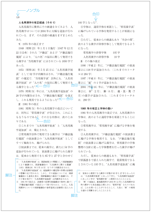
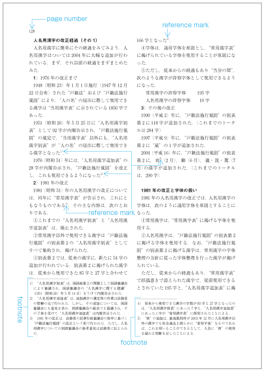
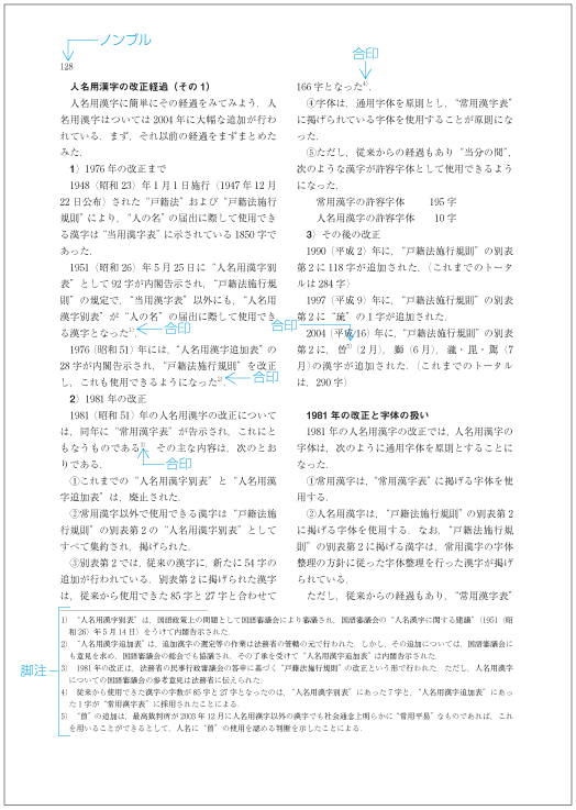
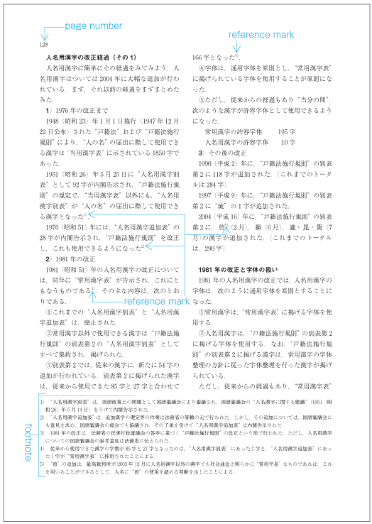
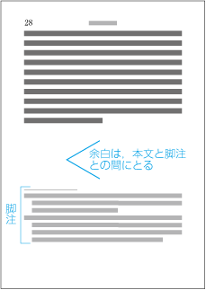
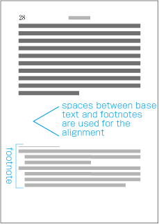
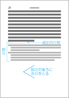
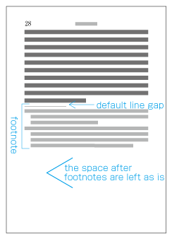
1段組の横組における脚注の一般的な配置例を図解して示す(dummygenerated参照).
1段組の横組における脚注の一般的な配置例を図解して示す(dummygenerated参照).
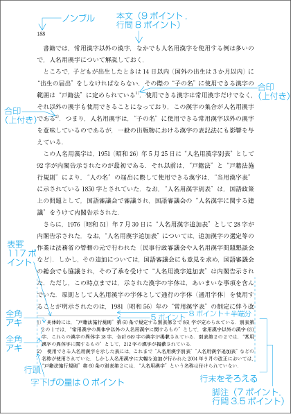
-
脚注は,一般にその前に区切りのための罫線を挿入するので,字下げは行わなくてよい.ただし,脚注の行長は,脚注の文字サイズの整数倍にする必要があるので,基本版面で設定した行長と脚注の行長との差は,左端にとり(字下げとなる),脚注の行末は版面又は段の領域の右端に接するようにする.
脚注は,一般にその前に区切りのための罫線を挿入するので,字下げは行わなくてよい.ただし,脚注の行長は,脚注の文字サイズの整数倍にする必要があるので,基本版面で設定した行長と脚注の行長との差は,左端にとり(字下げとなる),脚注の行末は版面又は段の領域の右端に接するようにする.
注1)
注1)
例えば,基本版面の文字サイズが9ポイント,字詰数が34字の場合,脚注の文字サイズを7ポイントとすると,字下げの量は,次のように計算できる.
例えば,基本版面の文字サイズが9ポイント,字詰数が34字の場合,脚注の文字サイズを7ポイントとすると,字下げの量は,次のように計算できる.
7ポイントの字数に換算 306ポイント=7ポイント×43字+5ポイント
7ポイントの字数に換算 306ポイント=7ポイント×43字+5ポイント
注2)
注2)
例えば,基本版面の文字サイズが9ポイント,字詰数が35字の場合,脚注の文字サイズを7ポイントとすると,字下げの量は,次のように計算できる.
例えば,基本版面の文字サイズが9ポイント,字詰数が35字の場合,脚注の文字サイズを7ポイントとすると,字下げの量は,次のように計算できる.
7ポイントの字数に換算 315ポイント=7ポイント×45字
7ポイントの字数に換算 315ポイント=7ポイント×45字
-
脚注とその前に配置する本文との間を区切るための罫線(表罫,おもてけい)を挿入する.罫線の長さは,基本版面で設定した行長にもよるが,その長さの1/3くらいにする.左端は版面又は段の左端に揃える.区切るための罫線と脚注との行間は,脚注の行間よりやや広くすることが望ましい.
脚注とその前に配置する本文との間を区切るための罫線(表罫,おもてけい)を挿入する.罫線の長さは,基本版面で設定した行長にもよるが,その長さの1/3くらいにする.左端は版面又は段の左端に揃える.区切るための罫線と脚注との行間は,脚注の行間よりやや広くすることが望ましい.
注1)
注1)
-
脚注と本文とを区切る罫線と,その前にくる本文との空き量(行間)は,最小を基本版面で設定した行間の大きさとする.脚注は版面又は段の領域の最下端に揃えるので,半端がでる.この半端は脚注と区切りのための罫線との間にとる.従って,この空き量は基本版面で設定した行間から,基本版面の文字サイズ+行間未満の値の間で変動する.
脚注と本文とを区切る罫線と,その前にくる本文との空き量(行間)は,最小を基本版面で設定した行間の大きさとする.脚注は版面又は段の領域の最下端に揃えるので,半端がでる.この半端は脚注と区切りのための罫線との間にとる.従って,この空き量は基本版面で設定した行間から,基本版面の文字サイズ+行間未満の値の間で変動する.
注1)
注1)
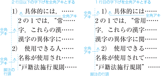
縦組における傍注の一般的な配置例を図解して示す(dummygenerated参照).
縦組における傍注の一般的な配置例を図解して示す(dummygenerated参照).
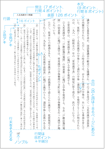
縦組の傍注は,横組の脚注の形式と似ている.したがって,その処理は,縦組の後注処理と横組の脚注処理との応用でもある.縦組の傍注を配置する際に,特に問題となる事項に限り解説する.
縦組の傍注は,横組の脚注の形式と似ている.したがって,その処理は,縦組の後注処理と横組の脚注処理との応用でもある.縦組の傍注を配置する際に,特に問題となる事項に限り解説する.
|
注1) 注1) |
-
注1)
注1)
注記の字詰め方向の長さ(行長)は,注の文字サイズの整数倍にする.判型や注の分量にもよるが,15字から20字くらいである.ケースによっては25字程度にする場合もある.
注記の字詰め方向の長さ(行長)は,注の文字サイズの整数倍にする.判型や注の分量にもよるが,15字から20字くらいである.ケースによっては25字程度にする場合もある.
|
注1) 注1) |
後注のように注記の2行目以下の字下げは,通常,行わない.先頭行は,天ツキとする例が多いが,一般の段落と同じように注記に使用する文字サイズの全角下げる方法もある.
後注のように注記の2行目以下の字下げは,通常,行わない.先頭行は,天ツキとする例が多いが,一般の段落と同じように注記に使用する文字サイズの全角下げる方法もある.
注番号とそれに続く注記との間は,注記に使用する文字サイズの二分くらいとする.注番号の書体を変更(例えば,ゴシック体)し,ベタ組で続ける例もある.強調した用語とそれに続く注記との間は,注記に使用する文字サイズの全角アキとする.注番号などの配置例をいくつか示す(dummygenerated参照).
注番号とそれに続く注記との間は,注記に使用する文字サイズの二分くらいとする.注番号の書体を変更(例えば,ゴシック体)し,ベタ組で続ける例もある.強調した用語とそれに続く注記との間は,注記に使用する文字サイズの全角アキとする.注番号などの配置例をいくつか示す(dummygenerated参照).
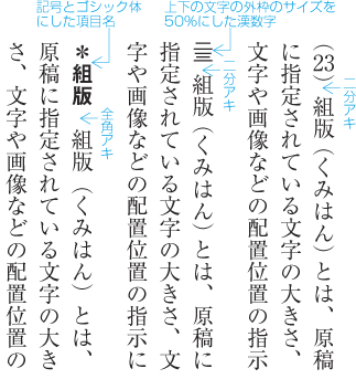
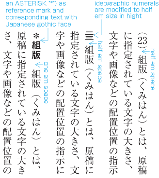
-
縦組では,該当項目の文字の右端と注記全体の最右端とを揃え,横組では,該当項目の文字の上端と注記全体の最上端とを揃える(dummygenerated参照).
縦組では,該当項目の文字の右端と注記全体の最右端とを揃え,横組では,該当項目の文字の上端と注記全体の最上端とを揃える(dummygenerated参照).
-
上記により配置した結果,注記が注記のページの領域をはみ出す場合は,ページ単位での調整を行う.ページ単位での調整を行う場合,縦組では右側,横組では上側に移動する(dummygenerated参照).この処理は,注記全体の最右端又は最上端を注記領域の先頭に達するまで行い,それでもはみ出しが出る場合は,はみ出した注記の全部又は一部を次のページの先頭に配置する.なお,縦組で注記が全体に多数入るような場合は,ページを単位としての調整だけでなく,見開きを単位とした調整の処理を行う方法もある.
上記により配置した結果,注記が注記のページの領域をはみ出す場合は,ページ単位での調整を行う.ページ単位での調整を行う場合,縦組では右側,横組では上側に移動する(dummygenerated参照).この処理は,注記全体の最右端又は最上端を注記領域の先頭に達するまで行い,それでもはみ出しが出る場合は,はみ出した注記の全部又は一部を次のページの先頭に配置する.なお,縦組で注記が全体に多数入るような場合は,ページを単位としての調整だけでなく,見開きを単位とした調整の処理を行う方法もある.
注1)
注1)
-
-
位置の調整を行う際には,前に配置した注記から位置を決めていき,次に配置する注記は,本文の該当箇所又は直前の注記との間に所定の空き量をとって配置していく.その結果,注記の領域をはみ出した場合は,注記の領域の末尾から配置していく.その結果,注記の先頭からはみ出した場合は,先頭から出現順に,各注記の間に所定の空き量を確保し,配置し,注記が注記の領域の末尾からはみ出したときは,はみ出した注記を次のページ又は見開きの先頭に配置する.
位置の調整を行う際には,前に配置した注記から位置を決めていき,次に配置する注記は,本文の該当箇所又は直前の注記との間に所定の空き量をとって配置していく.その結果,注記の領域をはみ出した場合は,注記の領域の末尾から配置していく.その結果,注記の先頭からはみ出した場合は,先頭から出現順に,各注記の間に所定の空き量を確保し,配置し,注記が注記の領域の末尾からはみ出したときは,はみ出した注記を次のページ又は見開きの先頭に配置する.
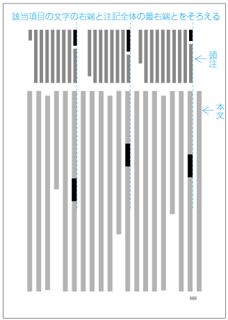
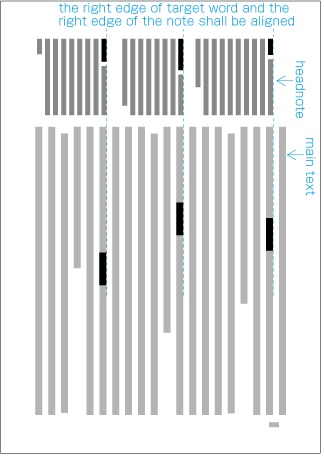
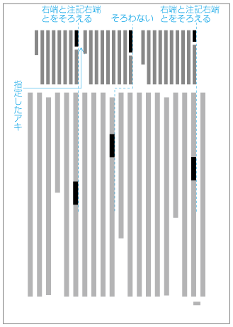
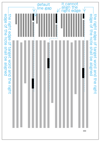
本などに図版(図や写真等)の配置を指定する方法としては,次の2つがある.
There are two methods for specifying the position of illustrations(Figures, Photographs etc.).
-
あらかじめ本文のテキストについて棒組などを作成しておき,ページごとにレイアウトを行い,図版を配置する具体的なページと,そのページ内での詳細な配置位置を指定する方法.
With this method, first, the in slip for the body of the book is being created. Then, for each page, layout processing is executed, and the positioning of illustrations on a specific page and its position in that page are specified.
-
図版と本文のテキストとの対応を指示し,ページ内での図版配置位置は原則のみを指定する方法.
With this method, the relation between the main text and the illustration is specified, and the position of the illustration within the page is specified only in principle.
注1)
(note 1)
一般的には,図版が多く入る場合はa.の方法,それほど入らない場合はb.の方法で指定を行う.b.の方法では,図版を配置する具体的なページは,組版の結果として決まるので,奇数ページになるか,偶数ページになるかも結果として決まるケースが多い.
Normally, if there are many illustrations inserted, method a) is used. If there are not so many illustrations, method b) is used. With method b), the concrete page for a given figure is determined as the result of the layout process. Hence, it is often the case that the choice of odd page or even page for a figure is determined as a result of the layout process.
注2)
(note 2)
b.の方法を縦組で採用した場合,普通は,dummygeneratedに示したように“天・小口寄り”に図版を配置する.偶数ページに図版を配置する場合はページの右側になり,奇数ページではページの左側になる.
Normally, when applying method b) for vertical layout, the illustration is placed on the Head or Fore-edge (See dummygenerated). For even pages, the figure will be on the left, for odd pages, it will be on the right side.
注3)
(note 3)
b.の方法を横組で採用した場合においては,代表的な配置法として図版を版面の左右中央に配置し,図版の左右には文字を配置しない方法がある.この場合,普通は,dummygeneratedの右ページに示したように段落の間に図版を配置するか,左ページに示したように版面の地(又は天)ということになる.
The prototypical method for horizontal layout is to position the illustration centered, without characters to the left or to the right. In this case, normally the illustration is either positioned between paragraphs (See right page in dummygenerated), or at the Foot or Head (See left page in dummygenerated).
注4)
(note 4)
図版には,キャプション及び注が付く場合が多い.キャプションは,一般に図の下部に配置する.また,キャプションには,図版番号が付く例も多い.キャプションは,本文の文字サイズよりは小さくし,フォントも変える場合も多い.2行以上になった場合では,キャプションがまとまって見えるように行間はあまり空けないようにする.キャプションのフォントを変える場合,キャプション全体をゴシック体にする方法と,図番号だけをゴシック体にする方法がある.後者の方法は,適度に強調されるので,図版をそれほど挿入しない場合に採用できる方法である(dummygenerated参照).
Illustrations are often accompaigned by captions or notes. Captions are normally positioned below the illustration. Captions also frequently encompass illustration numbers. The character size in captions is smaller than in the main text, and often a different font is used. If the caption streches across more than 2 lines, inter-line spacing is not too large, so that the caption looks compact. If the font of the caption is changed, the whole caption will be in a gothic typeface, or only the Illustration number will be in a gothic typeface. The latter case means a moderate emphasis of the illustration and can be used for putting the figure into the background (See dummygenerated).
 キャプションの組方例
 Example for layout of captions
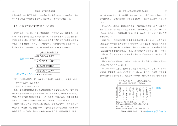
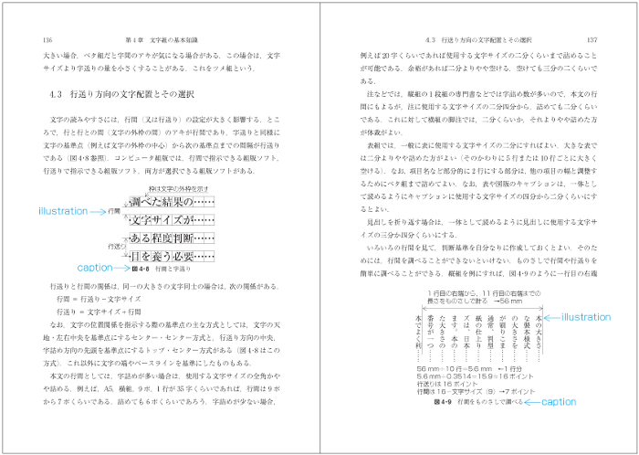
図版と本文のテキストとの対応を指示し,ページ内での図版配置位置は原則のみを指定する場合,本文のテキストの説明と図版配置位置との関係は,同一ページのできるだけ近い位置が望ましい.
In the case that the position of an illustration within a page is specified only by the relation between illustration and main text, it is desirable that the explanation of the illustration in the main text and the illustration are as close as possible to each other.
|
注1) (note 1) |
本文のテキストにおける参照箇所の出現位置,図版のサイズなどにより,本文のテキストにおける参照箇所と同じページに配置できない場合もでてくる.この場合は,次の事項を考慮して配置位置を決める. Depending on the size of an illustration, it may not be possible to have references to the illustration and the illustration itself on the same page. In such cases, the following considerations for illustration positioning are taken into account.
|
dummygeneratedの縦組の場合において,図版を配置する際に必要となる条件としては,次がある.
For vertical layout as in dummygenerated, the following requirements for illustration positioning apply.
-
本では見開きを基準に設計し,“天・小口寄り”などといった指定を行うので,見開きを基準とした指定ができなければならない.具体的には,“小口寄り”又は“のど寄り”という指定に対応しなければならない.
In books, the spread is the basis for the design, and the illustration position is specified towards the Head and Fore-edge. Hence it is necessary to use the spread as the basis for the specification of the position. Concretely it means that the position has to correspond "towards the Fore-edge" or towards the gutter.
-
縦組では,図版の上端を版面の天側に,かつ図版の左端又は右端を版面の小口側に接して配置する例が多いので,版面(又は仕上りサイズ)からの指定した位置に図版を配置できなければならない.なお,版面一杯に配置する場合でも,図版の内容によっては,版面から1mm程度内側に配置した方が体裁がよいケースもある.
In vertical layout, often the upper part of an illustration touches the Head of HANMEN, or the left or right part touches the Fore-edge. This makes it necessary to position the illustration relying on HANMEN (or the final size). Furthermore, even if the complete HANMEN is occupied by the illustration, depending on illustration content, in some cases it is better style to position the illustration about 1mm inside HANMEN.
注1)
(note 1)
-
通常は,b.で述べたように版面からの指定位置でよいが,裁切りにする場合などでは,仕上りサイズをはみ出して図版を配置できる必要がある(dummygenerated参照).なお,こうした場合などでは,仕上りサイズの角を原点としての位置指定ができれば,直感的な指定が可能になる.
As said in b), normally, a position specification starting from HANMEN is appropriate. However, in the case of bleed, it is necessary to jut out the final size and position the illustration (See dummygenerated). Furthermore, in such cases an intuitive position specification is possible, if position specification uses the edge of trim size as the origion.
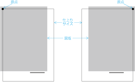 裁切りの配置
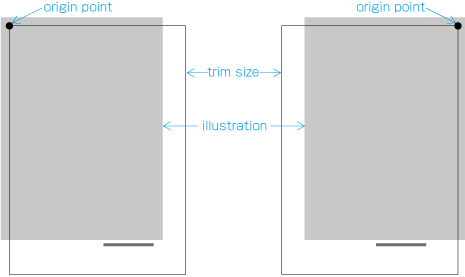 Bleed Positioning
-
図版を配置した周囲に文字を配置する場合は,通常,最小のアキ及び最大のアキを指定する.最小のアキは,一般に本文に使用する文字サイズ(基本版面で設定した文字サイズ)又は本文の行間(基本版面で設定した行間)である.また,周囲に配置する際の行長は,使用する文字サイズの整数倍にする必要がある.
If characters are placed around illustrations, normally the smallest space between them is specified. The smallest space is the character size used for the main text (which is specified for kihon hanmen), or the inter-line space (also specified for HANMEN). It is also necessary to specify the line length of surrounding text as n-fold of the character size in use.
注1)
(note 1)
基本版面で設定した文字サイズ9ポイント,行間8ポイントの場合の最小のアキ及び最大のアキの例を示す(dummygenerated参照).
Here an example is shown of the smallest and largest space between illustration and characters, for a character size of 9 points in kihon hanmen and 8 points for inter-line space (See dummygenerated).
又は
or
注2)
(note 2)
図版とその周囲の文字とのアキは,できれば統一した方がよい.例えば,本文に使用する文字サイズの1.5倍で統一する.この場合,配置する際の行長は,使用する文字サイズの整数倍にする必要があるので,図版サイズによっては不統一が発生する.しかし,図版サイズは,設計段階では多少の調整が可能である.そこで,字数又は行数について,それぞれの場合における図版サイズの一覧を作成しておき,その一覧の中から当てはまる数値を図版の設計段階で採用すれば,図版周囲のアキを統一できる.
If possible it is appropriate to unify the space between illustrations and surrounding characters. For example it can be unfied to be 1.5 times of the character size used in the main text. Depending on the size of the illustration it may happen that such unification is not possible, since it is necessary that the line-length will be n-fold of the character size in use. But, at the design step, some modifications of the illustration size are possible. Accordingly it is possible to unify the space around illustrations, by creating an overview of the various sizes of illustrations and the related numbers of characters and lines, and choose from that overview the applicable numbers and apply these during the design step.
-
字詰め方向の図版の周囲に配置する文字が極端に少ない(例えば行長の1/4又は9字以下の)場合は,文字は配置しないで,空けておいた方がよい(dummygenerated参照).また,dummygeneratedの左側の例のように,行送り方向の図版の前後には,本文のテキストを1行だけを配置することは体裁がよくないので避ける(dummygeneratedの例では右側のようにするとよい).
If the number of characters to be placed around illustrations in ZIZUME HOUKOU is very low (for example 1/4 of line length or less than 9 characters), it will be better to not place the characters and leave the space free (See dummygenerated). Also, as shown in the left part of dummygenerated, for the arrangement of illustrations in the block direction, it is bad style and should be avoided to have only one line of main text (In dummygenerated, the right side shows the appropriate way).
 Example of only one line of vertical text with illustrations in the block direction
注1)
(note 1)

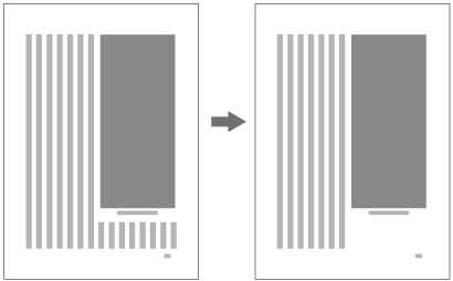
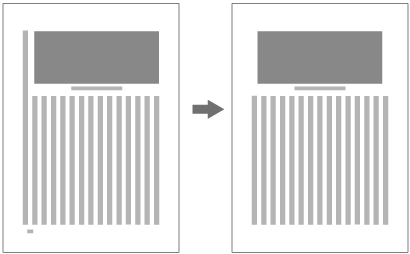
dummygeneratedの横組の場合において,図版を配置する際に必要となる条件としては,次のような事項がある.
In case of horizontal layout as in dummygenerated, the following requirements for illustration positioning apply.
|
注1) (note 1) |
以下では,主に1段組の場合に限定して問題を考えていくことにする. Below, the discussion is restriced to problems arising within one print space. |
-
dummygeneratedの場合,説明のある段落の直後に配置することが基本である(dummygenerated参照).
In case of dummygenerated, the basis is to position the illustration directly after the paragraph with its explanatation (See Fig. 3-7).
この位置にスペースの関係で配置できない場合は,版面の地又は次ページの天に配置する(dummygenerated参照).
If due to space it is not possible to position the illustration in that place, it is placed at the Head or Foot of HANMEN(See Fig. 3-8).
注1)
(note 1)
-
dummygeneratedのように図版の左右には文字は配置しないで空けておく方法が多い.しかし,ページの小口側(dummygenerated参照)又は右側(dummygenerated参照)に配置する方法もある.ページの小口側又は右側に配置する場合でも,縦組のように天側に配置するのではなく,dummygenerated又はdummygeneratedのように本文のテキストと連動して配置位置を決めることが多い.つまり,説明のあるページ途中の段落の横か,天又は地に配置する.
As shown in dummygenerated, often characters are not put to the right or left of an illustration, and the space is left free. However, there is also the possibility of placing the illustration at the side of the Fore-edge (See dummygenerated) or the right side (See dummygenerated). Also in these cases, the illustration is not placed - like in vertical layout - at the side of the Head, but often in linkage with the main text. That is, the illustration is placed on the page with its explanation, beside a midway paragraph or on the Head or Foot (See dummygenerated and dummygenerated).
 版面の右側に図版を配置した例
 Example of placing an illustration at the right side of HANMEN
-
dummygeneratedの右側のように行送り方向の図版の前後に本文のテキストを1行だけ配置するのは,縦組同様に体裁がよくないので避ける.dummygeneratedの例でいえば,図の下の1行を図版の上に移動し,図版は版面の下端に配置する.
As shown in the left part of dummygenerated, like in vertical layout, it is bad style and must be avoided to have just one line of the main text around an illustration in the block direction. In the example in dummygenerated, the problem is solved by transfering the one line below the illustration above it and placing the illustration at the bottom Fore-edge of HANMEN.
-
段組において,複数の段にまたがって配置する図版は,一般に天か地に配置する(dummygenerated参照).
Illustrations which stretch across several columns in a print space are normally placed at the Head or Foot (See Fig. 3-12).
 複数段にまたがって配置した図版の例
 Example of illustration stretching across several columns
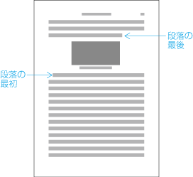
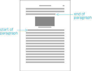

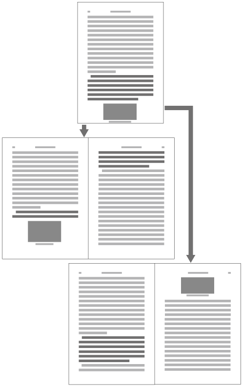
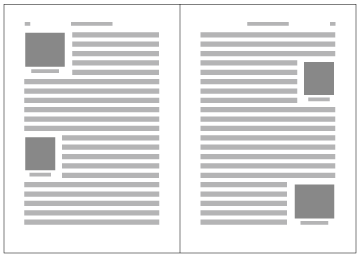


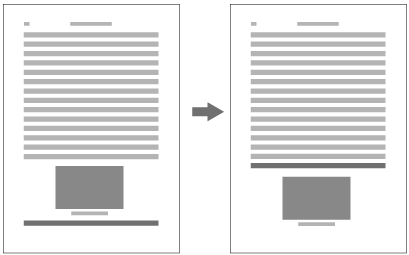
〈参考〉JIS X 4051における図版配置の基本的な考え方
Basic Ideas about Illustration Positioning in JIS X 4051 (Reference Material)
これまでの説明を前提にして,JIS X 4051の主な規定内容を紹介する.
To provide some premises of the preceding discussion, the main definitions of JIS X 4051 will be introduced below.
-
JIS X 4051では,図版配置については“相対位置指定”と“絶対位置指定”の2つの方法を規定している.次に同規格の用語の定義を掲げる.
JIS X 4051 defines for illustration positioning two methods: "relative position specification" and "absolute position specification". Below the definitions from this standard are described.
相対位置指定:ブロック類の指定が本文段落などの流れとともに出現した行を配置位置基準とし,行送り方向の分割を不可とする,ブロック類の配置位置指定方法.(ブロック類:図・写真等のブロック及び表のブロックの総称)
Relative position specification: the specification of block units appears together with the flow of e.g. paragraphs of the main text within lines. The lines are the basis for positioning, and segementation of the line feed is not possible. ("block unit": a general term for blocks of figures, images etc. and tables)
絶対位置指定:ブロック類の指定が出現した版面又は見開きを単位とする領域からの絶対的な位置を配置位置基準とする,ブロック類の配置位置指定方法.
Absolute position specification: the specification of block units appears within HANMEN or spread. An absolute position based on these is the basis for illustration placement.
dummygeneratedのように天及び小口からの2方向から指定する場合は,絶対位置指定の方法となる.
In the case of dummygenerated, where the position is specified from two directions (from the Head or the Fore-edge), the absolute position specification method is used.
dummygenerated,dummygenerated又はdummygeneratedのように,字詰め方向は指定の位置,行送り方向は,リンクした本文のテキストの位置により決まるものは,相対位置指定ということになる(もちろん天又は地に配置する場合は絶対位置指定の方法も可能である).
As shown in dummygenerated, dummygenerated or dummygenerated, when the position in the inline direction is given as specified, and the position in the block direction is determined depending on the position of the main text which refers to the block unit, the adopted method is the relative positioning (of course for placement at the Head or Foot absolute positioning is possible too).
なお,JIS X 4051では,絶対位置指定の方法では,のど・小口の指定方法の配置を規定している.しかし,相対位置指定では,のど・小口の指定方法の配置を規定していない.したがって,dummygeneratedの配置方法は可能であるが,dummygeneratedには対応できない.相対位置指定であっても,のど・小口の指定方法による配置ができることが望ましい.
Furthermore, JIS X 4051 defines the placement of the spefication method for gutter and Fore-edge with absolute positioning method, but not with relative positioning. That means that with JIS X 4051 a positioning method like in dummygenerated is possible, but it does not support a method like in dummygenerated. It is desireable to allow for a positioning based upon a specification method of gutter and Fore-edge, also for relative positioning.
-
いずれの方法もリンクした本文のテキスト(JIS X 4051の用語では本文段落)と配置する図版が同一ページにある場合は,dummygenerated 又はdummygenerated のように図版の行送り方向の前又は後ろに1行だけ配置する場合を除き問題はない.対応する本文のテキストの位置又は図版のサイズの関係から,図版が版面又は段の領域からはみ出した場合,また,本文のテキストと図版を配置するページが異なる場合が問題となる.JIS X 4051では,この点につき,以下のように規定している.
When both of the main text (or the main paragraph in JIS X 4051 terminology) and the illustration are on the same page, either method does not raise any problem unless there is only a single line of the main text to be laid out before the illustration in the block direction on the top of the content page area or after the illustration at the bottom as shown in dummygenerated or in dummygenerated. The problematic cases are if via the relation to the corresponding text or the size of the illustration, the illustration juts out of the HANMEN or the area of the column, or the page of the main text and the page of the illustration are different. About these issues JIS X 4051 makes the following definitions.
-
相対位置指定の方法では,本文のテキストにおけるリンクの指定が出現した行の直後に図版を配置することになっている.配置した結果,版面や段の領域から図版がはみ出した場合は,dummygeneratedのように版面又は段の領域内にある部分(a)と,領域からはみ出した部分(b)の長さを比較する.本文のテキストの説明より先になることはできれば避けたいので,単純に1/2ではなく,比重を変更してある.具体的には,dummygeneratedのように,aとbとの関係がa≧2bの場合は,dummygeneratedのように,図版はそのページ内に配置し(追い込み),リンクのある行を含め図版の領域と重なる行は次ページに移動する(追い出される).
With the relative positioning method, the illustration is placed directly after the line in which the anchor in the main text is defined. If as a result of the positioning the illustration juts out of HANMEN or the column, the length of the part of the illustration inside HANMEN or the column (a), and the part outside the area (b) will be compared (See dummygenerated). Since it should be avoided (if possible) that an illustration appears before its explanation in the main text, the comparison uses not simple 1/2, but a relative weight. If concretely like in dummygenerated the relation between a and b is a≧2b, the illustration is placed on that page (in the final stage), and the lines which overlap with the area of the illustration (including the line with the anchor) are put on the following page, they are put out (See dummygenerated).
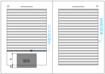 相対位置指定で同一ページに配置する例(a≧2bの場合の位置調整前)
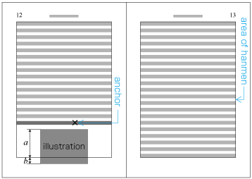 Example of positioning on the same page with relative positioning specification (before the adaptation in case of a≧2b)
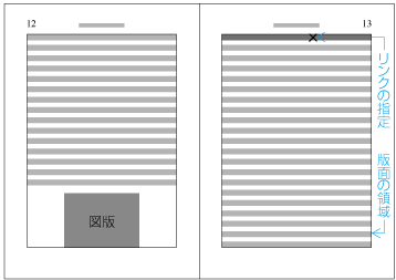 相対位置指定で同一ページに配置する例(a≧2bの場合の位置調整後)
 Example of positioning on the same page with relative positioning specification (after the adaptation in case of a≧2b)
また,dummygeneratedのようにa<2bの場合は,dummygeneratedのように図版を次ページに移動し(追い出し),その空いた領域には,次ページから本文のテキストをもってくる(追い込む)ことになる.
Also, in the case of a<2b (See Fig 3-15), the illustration is placed on the following page, and the free area is filled with main text taken from the following page.
 相対位置指定で次のページに配置する例(a<2bの場合の位置調整前)
 Example of positioning on the following page with relative positioning specification (before the adaptation in case of a<b)
 相対位置指定で次のページに配置する例(a<2bの場合の位置調整後)
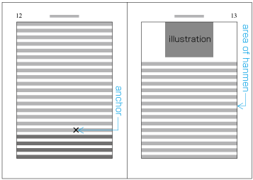 Example of positioning on the following page with relative positioning specification (after the adaptation in case of a<b)
注1)
(note 1)
本文のテキストにおける図版についての説明は必ずしも限定した特定の箇所ではなく,ある範囲の中で解説している例が多いので,リンク先が後になっても,ある程度は許容できるという考え方である.
There are many examples that the explanation of the illustration is not necessarily at a restricted, specific place, but it is within a given area. Hence, up to a certain extend it is regarded as ok to be permissive and have the anchor later.
注2)
(note 2)
追い出しと追い込みの比重を1/3(1:2)とすることが,すべてのケースで正解ということにはならないだろう.したがって,この比率は変更できると考えてよい.しかし,1/3とすることで,かなりのケースには対応できるものと考えることができよう.
Not in every case it is the right approach to set the relative weight of parts outside the area and inside the area to 1/3(1:2). Consequently, it is save to assume that these proportions can be modified. Nevertheless, with specifying 1/3, many cases can be matched.
注3)
(note 3)
配置する図版を追い出した場合は,空いた部分には,当然次ページから本文のテキストを追い込み,同一ページに配置するためには,その部分にある本文のテキストを次ページに追い出す処理が必要になる.
In the case of taking the illustration out, the free space on the page is naturally filled with text from the main text of the following page. For this purpose, processing is necessary to put text from that part of the main text on the following page.
-
絶対位置指定の方法でも,同様の考え方である.しかし,比較する量は相対位置指定の方法とは異なる.
The same basic ideas apply also for absolute positioning. However, the portions to be compared are different than with relative positioning.
絶対位置指定の方法では,まず本文のテキストにおいてリンク先が出現した時点における指定の出現位置と版面又は段の領域の最後までの距離を計算する(dummygeneratedの右側のa).次にそのページの指定位置に図版を配置した結果としてリンク先が移動し,その移動したリンク先が同一ページの場合は,そのページに図版を配置すればよい.
With the absolute positioning method, first the distance between the specification of the position via the anchor in the main text, and the distance to the end of the area of HANMEN or the column are calculated (See a in the right part of dummygenerated). Next, as a result of the positioning of the illustration, the anchor will be moved. If the moved anchor is on the same page, the illustration will be placed on that page.
リンク先が次ページになった場合は,そのリンク先と版面又は段の領域の先頭までの距離を計算する(dummygeneratedの左側のb).
If the anchor has moved to the following page, the distance between that anchor and the beginning of the area of HANMEN or the column will be computed (See b in the left part of dummygenerated).
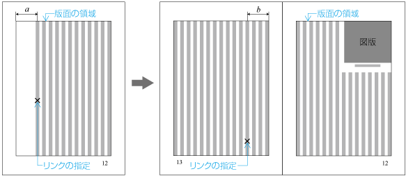 絶対位置指定における配置例1(左は図版配置前,右は配置後)(a<2bの場合)
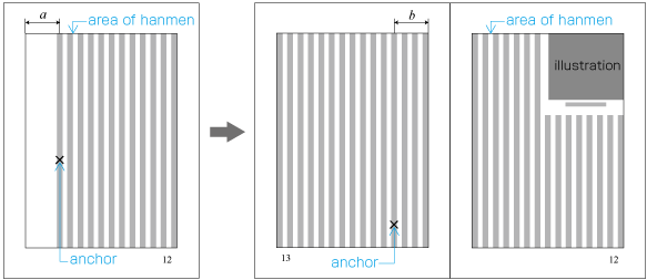 Example of positioning with absolute positioning specification (in case of a<2b)
そのうえで,aとbを比較し,a≧2bの場合は,最初にリンク先が出現したページに図版を配置し,a<2bの場合は,最初にリンク先が出現した次のページに図版を配置する.dummygeneratedの例ではa<2bとなるので,図版は左ページ(13ページ)の左側に移動することになる(dummygenerated参照).
In addition, a and b are compared. If a≧2b, the illustration is placed on the page where the anchor appeared first. In the case of a<2b, the illustration is placed after the page where the anchor appeared first. In the example in dummygenerated, a<2b, the illustration is moved to the left page (page 13), see dummygenerated.
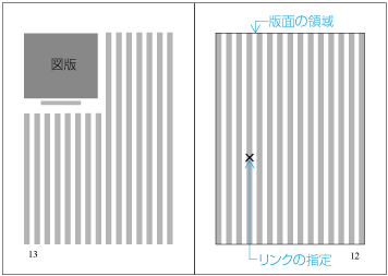 図版の配置例1の最終的な配置位置
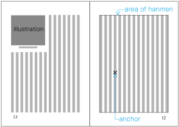 Illustration positioning example 1, final position
例えば,dummygeneratedのように,最初にリンク先が出現したページ(12ページ)のページ末から数えて5行目に出現し,図版を配置した結果,リンク先が左ページ(13ページ)の2行目に移動した場合はa≧2bとなるので,右ページ(12ページ)に図版を配置したままとなる.
dummygenerated shows an example that an anchor appears in the 5th line of a page (page 12), and as a result of illustration placement, the anchor is moved to the second line of the left page (page 13). In this case a≧2b, and the illustration is left on the right page (page 12).
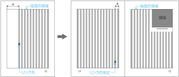 絶対位置指定における配置例2(左は図版配置前,右は配置後)
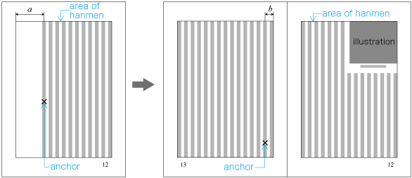 Absolute positioning example 2 (left is before illustration positioning, right is after)
-
-
その他の図版配置についての規定をいくつか紹介しておくことにする.
In addition some more definitions related to illustration positioning are introduced below.
-
絶対位置指定の方法では,行送り方向の前後に1行だけテキストを配置するケースは予想できるので避けることができる.これに対して相対位置指定の方法では,結果として行送り方向の前後に1行だけテキストを配置するケースが発生する.これは体裁がよくないので,避けるための処理法をJIS X 4051では規定している.
With the absolute positioning method, a stranded line before or after the illustration in the block direction can be predicted and hence avoided. In contrast, with the relative positioning method, it happens that a stranded line in the block direction is left out as a result. This is bad style, and JIS X 4051 defines a processing method for avoiding it.
-
横組では,段落の間などに様々な要素が入り,行送り方向の版面サイズの領域調整が必要になる.この場合に,基本版面で設定した体裁(文字サイズや行間など)と異なる体裁となる要素について,その要素の前後のアキを均一にする考え方と,できるだけ基本版面で設定した行の配置位置を維持する考え方とがある.JIS X 4051では,これら2つの方法を規定している(詳細は“3.5 行送り方向の版面の調整処理”で解説する).
In horizontal layout, several elements come inbetween e.g. paragraphs, and it is necessary to adapt the area of HANMEN size in the block direction. For this case, there are several approaches about style designed via KIHONHAMEN (character size, line spacing etc.) and different style elements: the approach of unifying the space around such elements, or the approach of maintaining (if ever possible) the position of lines specified during the design of HANMEN. JIS X 4051 defines two methods for this topic (See Sec. 3.5 Adjustment of HANMEN in the Block Direction).
-
図版では,その回り込みの問題も多い.図版の周囲に必要なアキを確保し,空いた領域にテキストを配置する場合の行長は,そこに使用する文字の整数倍にする必要があり,その規定も行われている(dummygenerated参照).
Often there are problems of the surroundings of illustrations. When the space around an illustration is maintained and text is inserted in the free area, it is necessary to adapt the line length to n-fold of the characters used. Such aspects are defined in JIS X 4051 as well (See dummygenerated).
-
また,回り込みでは,極端に字数が少ない場合は,空けておいた方がよい.回り込みする字数が行長の1/4以下又は9字以下の場合は,文字を配置しないことを規定している.dummygenerated又はdummygeneratedで,ページの途中に相対位置指定の方法で配置した場合,図版の上と下のアキは揃える必要があり,その点も規定している(dummygenerated参照).
Also, if the number of surrounding characters is extremely low, it is better to keep the surrounding free. If the number of surrounding characters is 1/4 of the line length or 9 characters below, JIS X 4051 specifies that no characters should surround an illustration. In dummygenerated or dummygenerated the illustration is placed midway the page using the relative positioning method, so it is necessary to unify the space above and below the illustration. JIS X 4051 also provides definitions for this aspect (See dummygenerated).
-
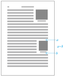
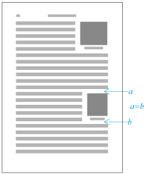
表は,こま(小間,セル)内に数字や事項などを配置し,そのこまを縦及び横の列又は行として配置,一覧できるようにしたものである.
表は,こま(小間,セル)内に数字や事項などを配置し,そのこまを縦及び横の列又は行として配置,一覧できるようにしたものである.
|
注1) 注1) |
表の構成については,JIS X 4051では,横組の例として次のような図を掲げている(dummygenerated参照).以下では,ここで用いている用語を使用する.
表の構成については,JIS X 4051では,横組の例として次のような図を掲げている(dummygenerated参照).以下では,ここで用いている用語を使用する.
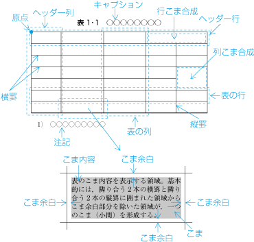
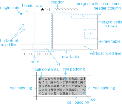
|
注1) 注1) |
|
|
注2) 注2) |
一部のこまの組方向を,表の全体の組方向と異なる組方向にする表の例は,それなりにある(dummygenerated参照). 一部のこまの組方向を,表の全体の組方向と異なる組方向にする表の例は,それなりにある(dummygenerated参照). |
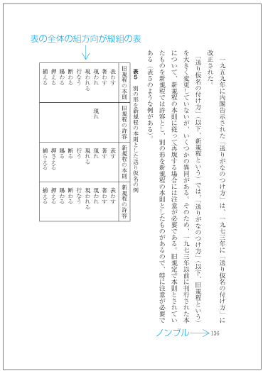
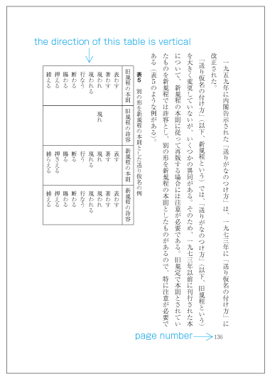
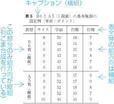
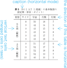
表の全体の組方向が横組の場合の原点の位置及びこま内容の配列順序は,次のようにする(dummygenerated参照).
表の全体の組方向が横組の場合の原点の位置及びこま内容の配列順序は,次のようにする(dummygenerated参照).
-
行内でのこまの順序は,左のこまから右のこまへとする.
行内でのこまの順序は,左のこまから右のこまへとする.
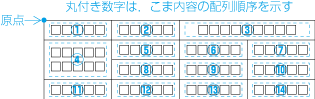
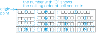
表の全体の組方向が縦組の場合の原点の位置及びこま内容の配列順序は,次のようにする(dummygenerated参照).
表の全体の組方向が縦組の場合の原点の位置及びこま内容の配列順序は,次のようにする(dummygenerated参照).
-
行内でのこまの順序は,上のこまから下のこまへとする.
行内でのこまの順序は,上のこまから下のこまへとする.
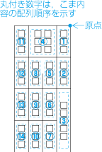
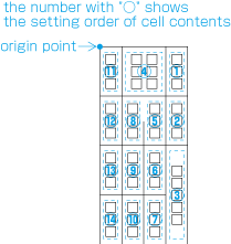
基本版面の組方向が縦組の本に表を配置した例を次に掲げる(dummygenerated参照).この配置された表について,問題となる事項について補足しておく.
基本版面の組方向が縦組の本に表を配置した例を次に掲げる(dummygenerated参照).この配置された表について,問題となる事項について補足しておく.
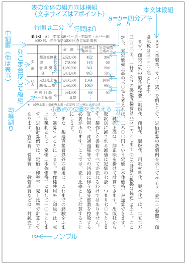
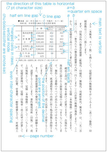
-
罫線は,必要な部分に限定して使用している.一番上の罫線のみ強調して中細(ちゅうぼそ)けいとし(この部分を裏(うら)けい又は表(おもて)けいとする例もある),その他は表けいを使用している.
罫線は,必要な部分に限定して使用している.一番上の罫線のみ強調して中細(ちゅうぼそ)けいとし(この部分を裏(うら)けい又は表(おもて)けいとする例もある),その他は表けいを使用している.
注1)
注1)
表けい,中細けい及び裏けいの太さについては,JIS X 4051では参考として,次の数値を掲げている.
表けい,中細けい及び裏けいの太さについては,JIS X 4051では参考として,次の数値を掲げている.
-
中細けい 0.25 mm
中細けい 0.25 mm
-
裏けい 0.4 mm
裏けい 0.4 mm
注2)
注2)
表けい,裏けい及び中細けいの名称は,活字組版からのものであるが,コンピュータ組版でも使用されている.活字組版における表けい及び裏けいは,dummygeneratedのような形をしており,細くなった部分を上にして使用すると表けいとなり,上下を反対にして太い部分を上にすると裏けいとなる.そのことから上である表と,上下を反対にした裏という名称がついている.中細けいは,上部の細い部分を,表けいと裏けいの中間の幅になるようにしたもので,中細けいも上下反対にすると裏けいになる.なお,これらの罫線の幅は,1ポイント又は五号(=10.5ポイント)の1/8(≒1.3ポイント)の幅のものが使用されていた.
表けい,裏けい及び中細けいの名称は,活字組版からのものであるが,コンピュータ組版でも使用されている.活字組版における表けい及び裏けいは,dummygeneratedのような形をしており,細くなった部分を上にして使用すると表けいとなり,上下を反対にして太い部分を上にすると裏けいとなる.そのことから上である表と,上下を反対にした裏という名称がついている.中細けいは,上部の細い部分を,表けいと裏けいの中間の幅になるようにしたもので,中細けいも上下反対にすると裏けいになる.なお,これらの罫線の幅は,1ポイント又は五号(=10.5ポイント)の1/8(≒1.3ポイント)の幅のものが使用されていた.
注3)
注3)
注4)
注4)
JIS X 4051の備考に“けい線は,けい線の太さの中心までの距離を指定された空き量としてけい線を配置する”との記載がある.したがって,この方法で処理する場合は,罫線とこま内容の空き量の処理では罫線の幅は“0”ということになる.しかし,表けいなどは,その幅を無視してよいが,太い罫線を用いる場合は,そのことを考慮して空き量(こま余白)を設定する必要がある.
JIS X 4051の備考に“けい線は,けい線の太さの中心までの距離を指定された空き量としてけい線を配置する”との記載がある.したがって,この方法で処理する場合は,罫線とこま内容の空き量の処理では罫線の幅は“0”ということになる.しかし,表けいなどは,その幅を無視してよいが,太い罫線を用いる場合は,そのことを考慮して空き量(こま余白)を設定する必要がある.
-
各列の幅は,同一の列のこまに配置する項目のうちで,最も左右の幅の大きな文字列を計算し,その左右の空き量として各二分を加え,かつ,表に使用した文字サイズの整数倍になるように設定してある.また,同じような内容が配置される場合は,その幅が同じになるようにしてある.
各列の幅は,同一の列のこまに配置する項目のうちで,最も左右の幅の大きな文字列を計算し,その左右の空き量として各二分を加え,かつ,表に使用した文字サイズの整数倍になるように設定してある.また,同じような内容が配置される場合は,その幅が同じになるようにしてある.
注1)
注1)
-
ヘッダー行の左右の位置は,中央そろえにしてある.
ヘッダー行の左右の位置は,中央そろえにしてある.
-
ヘッダー行以外の列のこまでは,その列内で最も長い文字列をほぼ中央の位置(後ろの空き量は前の空き量よりは大きくしない)とし,他のこまは,そのこまの位置に揃えてある.
ヘッダー行以外の列のこまでは,その列内で最も長い文字列をほぼ中央の位置(後ろの空き量は前の空き量よりは大きくしない)とし,他のこまは,そのこまの位置に揃えてある.
-
上下方向の罫線との空き量は,可視の罫線との間は二分,不可視の罫線との間は四分としてある.したがって,ヘッダー列以外の部分は,見た目の行間が二分ともいえる.
上下方向の罫線との空き量は,可視の罫線との間は二分,不可視の罫線との間は四分としてある.したがって,ヘッダー列以外の部分は,見た目の行間が二分ともいえる.
注1)
注1)
項目と不可視の罫線との間は四分として,見た目の部分では,一般に表の行間は,二分くらいが体裁がよいといわれている.しかし,1ページ大になるような大きな表では,二分の行間では空き過ぎに見える場合がある.こうした場合には,見た目の行間を四分くらいにすることがある.ただし,この場合は,5行または10行のグループ分けして,グループ間の行間をやや大きくとると見やすい.
項目と不可視の罫線との間は四分として,見た目の部分では,一般に表の行間は,二分くらいが体裁がよいといわれている.しかし,1ページ大になるような大きな表では,二分の行間では空き過ぎに見える場合がある.こうした場合には,見た目の行間を四分くらいにすることがある.ただし,この場合は,5行または10行のグループ分けして,グループ間の行間をやや大きくとると見やすい.
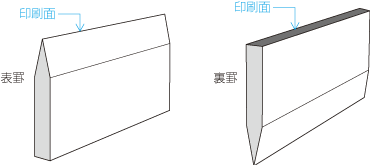
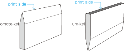
-
-
表と対応がある本文の行(リンク先)の出現位置を基準に配置する表(3.3.5で解説した“JIS X 4051における図版配置の基本的な考え方”の用語でいえば,“相対位置指定”によるもの,dummygenerated参照).
表と対応がある本文の行(リンク先)の出現位置を基準に配置する表(3.3.5で解説した“JIS X 4051における図版配置の基本的な考え方”の用語でいえば,“相対位置指定”によるもの,dummygenerated参照).
-
版面からの絶対的な位置を配置位置基準として配置する表(3.3.5で解説した“JIS X 4051における図版配置の基本的な考え方”の用語でいえば,“絶対位置指定”によるもので,見開きを単位とする領域からの絶対的な位置を配置位置基準とするものを除外したもの,dummygenerated参照).
版面からの絶対的な位置を配置位置基準として配置する表(3.3.5で解説した“JIS X 4051における図版配置の基本的な考え方”の用語でいえば,“絶対位置指定”によるもので,見開きを単位とする領域からの絶対的な位置を配置位置基準とするものを除外したもの,dummygenerated参照).
-
-
見開きを単位とする領域からの絶対的な位置を配置位置基準として配置する表(dummygenerated参照).
見開きを単位とする領域からの絶対的な位置を配置位置基準として配置する表(dummygenerated参照).
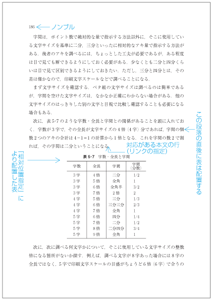
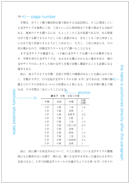
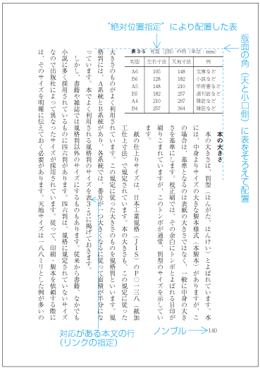
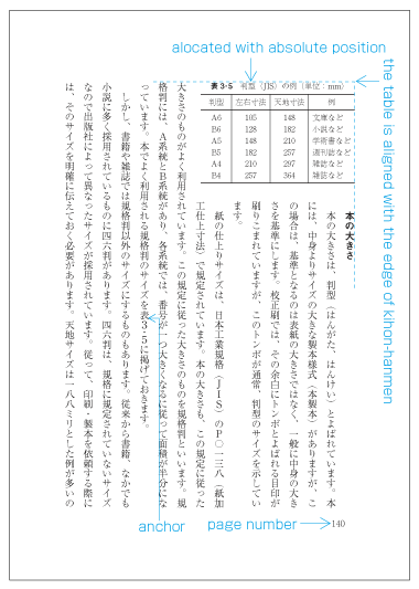
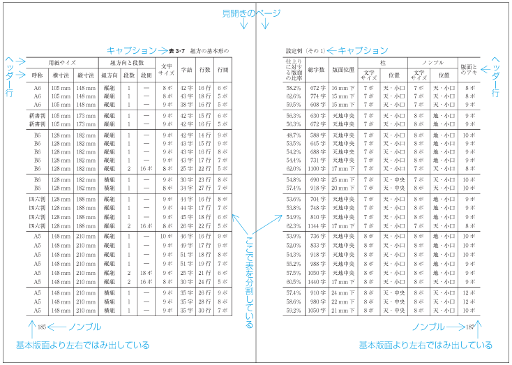
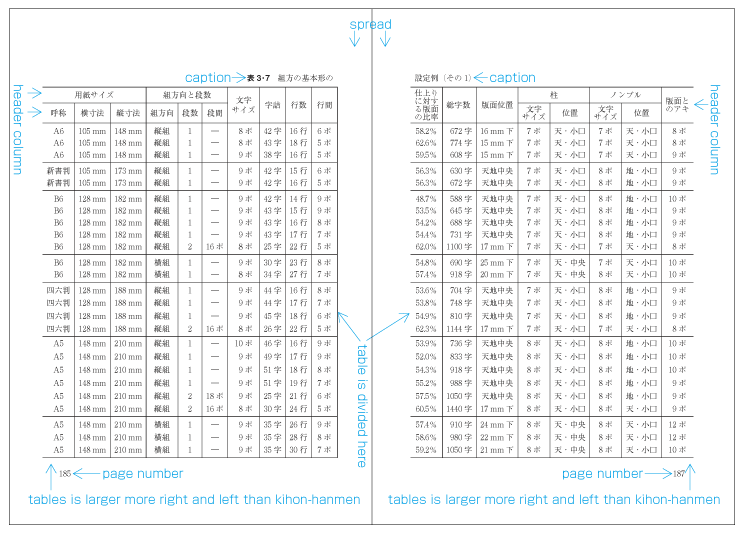
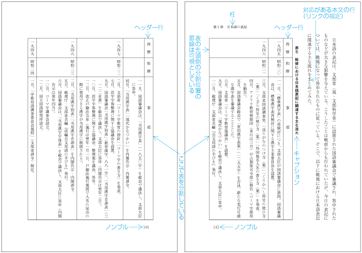
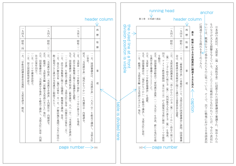
|
注1) 注1) |
|
|
注2) 注2) |
|
|
注3) 注3) |
|
|
注4) 注4) |
上記のaの1は,図版などと同様に横組の本に挿入される表でよく利用されている.縦組でのこの形式は,漢数字を用いた表の使用が減っていることから,その例は少ない.aの2は,主に縦組の本に挿入される表(表全体の組方向は横組)で利用されている.bは,大きな表の場合に利用されているが,その例はあまり多くない.cは,年表・年譜などを表形式で掲げる場合に利用されている. 上記のaの1は,図版などと同様に横組の本に挿入される表でよく利用されている.縦組でのこの形式は,漢数字を用いた表の使用が減っていることから,その例は少ない.aの2は,主に縦組の本に挿入される表(表全体の組方向は横組)で利用されている.bは,大きな表の場合に利用されているが,その例はあまり多くない.cは,年表・年譜などを表形式で掲げる場合に利用されている. |
見開きに配置する場合,配置の指示があった行(リンク先)と同じ見開きに表(又は図)が配置できればよい.しかし,異なる場合も多い.この場合の処理方法も3.3.5で解説したように(ただし,版面でなく,見開きの領域を単位に),リンク先が出現した時点における指定の出現位置と見開きの領域の最後までの距離を計算し,さらに,表(又は図)を配置した結果,次の見開きにはみ出した配置の指示があった行(リンク先)と見開きの領域の最後までの距離を計算し,両者の大きさを比べ,どの見開きに配置するかを決定する(dummygenerated参照).
見開きに配置する場合,配置の指示があった行(リンク先)と同じ見開きに表(又は図)が配置できればよい.しかし,異なる場合も多い.この場合の処理方法も3.3.5で解説したように(ただし,版面でなく,見開きの領域を単位に),リンク先が出現した時点における指定の出現位置と見開きの領域の最後までの距離を計算し,さらに,表(又は図)を配置した結果,次の見開きにはみ出した配置の指示があった行(リンク先)と見開きの領域の最後までの距離を計算し,両者の大きさを比べ,どの見開きに配置するかを決定する(dummygenerated参照).
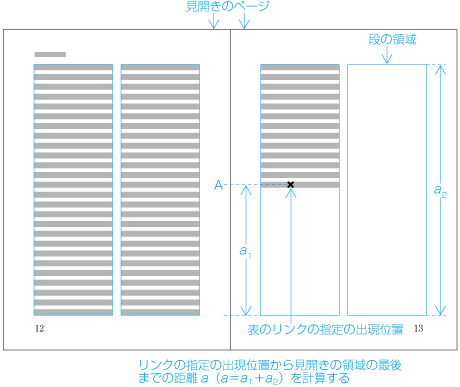
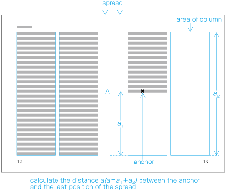
次にどの位置で表を分割するかが問題となる.図版の分割の場合は,ある意味どこでもよいわけなので,指定によるか,版面内に入る範囲ということになる.これに対し表の場合は,分割位置に制限があり,また罫線の扱いも決める必要がある.次のような事項を考慮し,分割位置を決める.
tbd
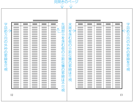
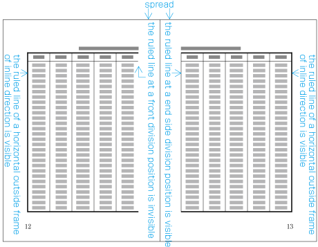
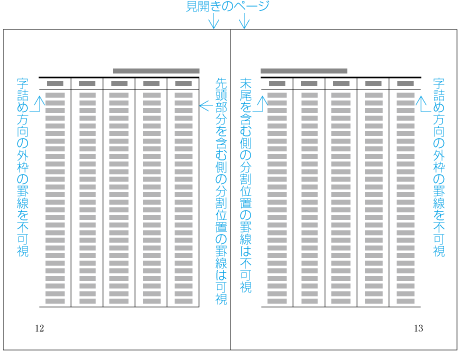
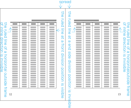
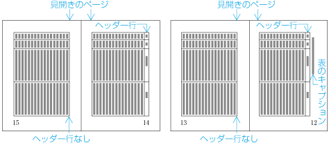
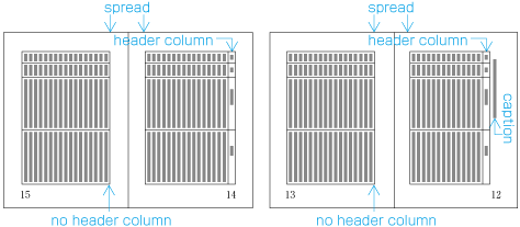
また,1段組の版面,多段組の段にあって,改ページ等の直前ページなど以外では,その版面又は段の末尾に配置する行は,原則として版面又は段の末尾に接して配置する必要がある.
また,1段組の版面,多段組の段にあって,改ページ等の直前ページなど以外では,その版面又は段の末尾に配置する行は,原則として版面又は段の末尾に接して配置する必要がある.
-
下線及び傍線
下線及び傍線
-
割注
割注
-
文字そろえで行位置を変更した文字列
文字そろえで行位置を変更した文字列
-
段落で指定された文字サイズより大きいサイズの文字列(dummygenerated参照)
段落で指定された文字サイズより大きいサイズの文字列(dummygenerated参照)
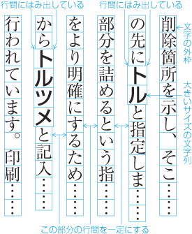
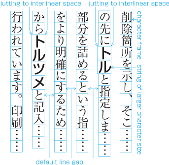
逆に,次のように段落で指定された文字サイズより小さいサイズの文字列が挿入される場合は,基本版面で設定した行位置を維持するために,見た目の行間が広くなる(dummygenerated参照).
逆に,次のように段落で指定された文字サイズより小さいサイズの文字列が挿入される場合は,基本版面で設定した行位置を維持するために,見た目の行間が広くなる(dummygenerated参照).
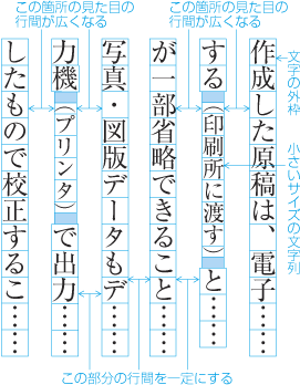
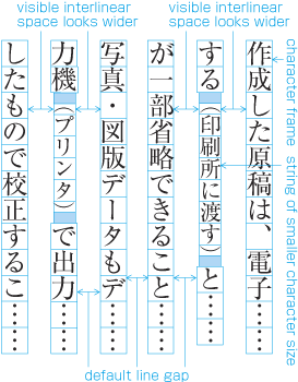
以上のような例が版面または段の先頭行に配置される場合は,版面又は段の領域の外側又ははみ出して配置する(dummygenerated,dummygenerated参照).
以上のような例が版面または段の先頭行に配置される場合は,版面又は段の領域の外側又ははみ出して配置する(dummygenerated,dummygenerated参照).
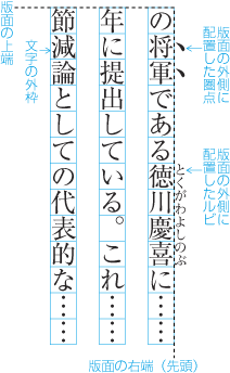 版面の外側に配置する例
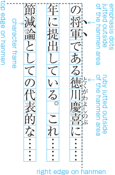 版面の外側に配置する例
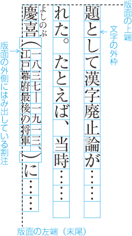 版面の外側にはみ出して配置する例
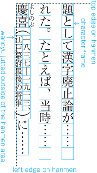 版面の外側にはみ出して配置する例
また,版面又は段の末尾の行にルビなどが左側又は下側に付いた場合は,版面又は段の領域の外側に配置し,割注などがある場合は,版面又は段の領域の外側にはみ出して配置する.
tbd
|
注1) 注1) |
段落の間の空き量が指定されている場合は,その空き量にする.JIS X 4051では,段落の前の空き量を“段落前アキ”,段落の後ろの空き量を“段落後アキ”とよんでいる.
段落の間の空き量が指定されている場合は,その空き量にする.JIS X 4051では,段落の前の空き量を“段落前アキ”,段落の後ろの空き量を“段落後アキ”とよんでいる.
“段落前アキ”又は“段落後アキ”が指定されている場合は,その空き量を段落の間にとる(dummygenerated参照).
“段落前アキ”又は“段落後アキ”が指定されている場合は,その空き量を段落の間にとる(dummygenerated参照).
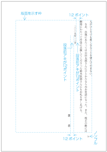
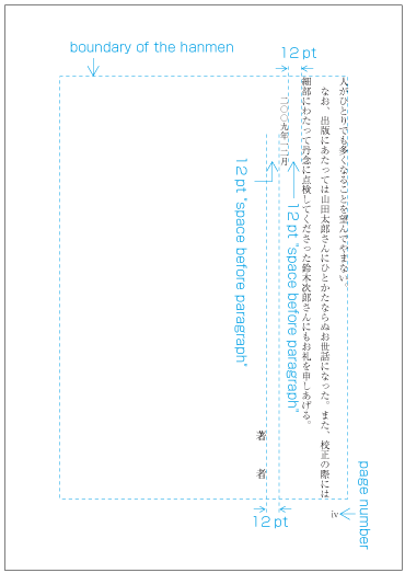
|
注1) 注1) |
“段落前アキ”又は“段落後アキ”が指定されている段落が版面又は段の先頭又は末尾に配置される場合は,JIS X 4051では,次のように処理するとなっている. “段落前アキ”又は“段落後アキ”が指定されている段落が版面又は段の先頭又は末尾に配置される場合は,JIS X 4051では,次のように処理するとなっている.
|
|
注2) 注2) |
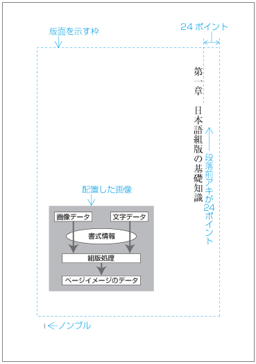
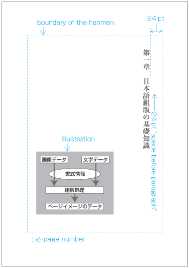
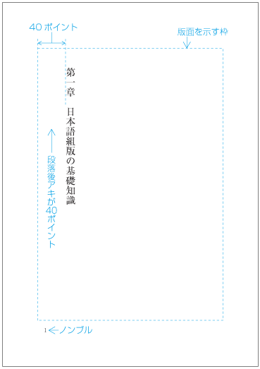
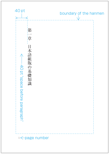
JIS X 4051でいう段落前アキ又は段落後アキは,絶対的な空き量で指定する場合以外に,行数で指定する場合もある.この場合,その段落で指定されている文字サイズ及び行間を基準に段落の間を空ける.見出しの場合は,基本版面で設定で設定した文字サイズ及び行間が基準となる.2行の空き量をとった場合で,基本版面で設定した文字サイズと行間のときについて図で示しておく(dummygenerated,dummygenerated,dummygenerated参照).
JIS X 4051でいう段落前アキ又は段落後アキは,絶対的な空き量で指定する場合以外に,行数で指定する場合もある.この場合,その段落で指定されている文字サイズ及び行間を基準に段落の間を空ける.見出しの場合は,基本版面で設定で設定した文字サイズ及び行間が基準となる.2行の空き量をとった場合で,基本版面で設定した文字サイズと行間のときについて図で示しておく(dummygenerated,dummygenerated,dummygenerated参照).
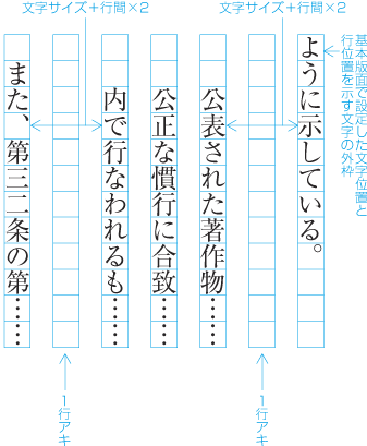
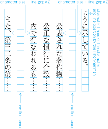
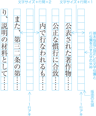
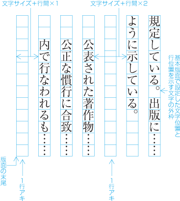
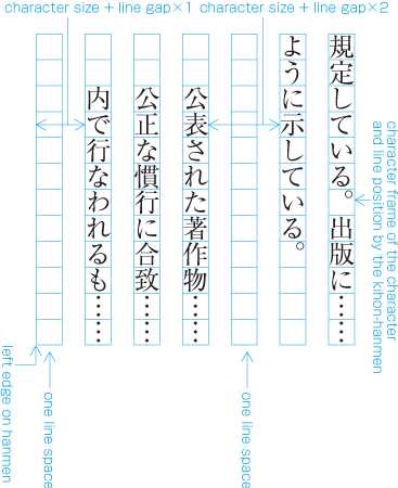
基本版面で設定した行位置への配置を行うのが原則であるが,そうでない場合も配置する内容により発生する.あるいは,次に連続する部分があるが,版面又は段の末尾に空きが発生することもある.次のような例がある.
基本版面で設定した行位置への配置を行うのが原則であるが,そうでない場合も配置する内容により発生する.あるいは,次に連続する部分があるが,版面又は段の末尾に空きが発生することもある.次のような例がある.
行への配置位置は,ずれることもあるが,後に配置されるものに影響を与えないようにする例としては,次がある.
行への配置位置は,ずれることもあるが,後に配置されるものに影響を与えないようにする例としては,次がある.
-
注1)
注1)
行送り方向の幅が,その段落の文字サイズより大きくなる別行にする数式(例えば,やぐら組とする分数)では,見出しと同様に,行取りで指定する方法と,数式の行送り方向の前後の最低の行間(一般にその段落での行間)を設定し,行送り方向の半端が出た場合は,版面又は段を単位に調整を行う方法がある.なお,やぐら組とする分数とは,水平の分数罫の上下に分母と分子を配置する方法である.
行送り方向の幅が,その段落の文字サイズより大きくなる別行にする数式(例えば,やぐら組とする分数)では,見出しと同様に,行取りで指定する方法と,数式の行送り方向の前後の最低の行間(一般にその段落での行間)を設定し,行送り方向の半端が出た場合は,版面又は段を単位に調整を行う方法がある.なお,やぐら組とする分数とは,水平の分数罫の上下に分母と分子を配置する方法である.
-
その他,鑑賞するための俳句などを大きな文字サイズで掲げる場合などでも,行送り方向の配置領域を整数の行数で設定する方法が行われている.
その他,鑑賞するための俳句などを大きな文字サイズで掲げる場合などでも,行送り方向の配置領域を整数の行数で設定する方法が行われている.
注1)
注1)
後ろに連続する部分があるが,版面又は段の末尾に空きが発生しても,そのまま空けておく例としては,次がある.
後ろに連続する部分があるが,版面又は段の末尾に空きが発生しても,そのまま空けておく例としては,次がある.
後ろに連続する部分があるが,基本版面で設定した内容と異なる要素を版面又は段の末尾に配置し,版面又は段の領域の調整は,その末尾に配置したものと本文との間で行う例としては,次がある.
後ろに連続する部分があるが,基本版面で設定した内容と異なる要素を版面又は段の末尾に配置し,版面又は段の領域の調整は,その末尾に配置したものと本文との間で行う例としては,次がある.
後ろに連続する部分があり,かつ,所定の空き量で配置していった結果,版面又は段の末尾に空きが発生した場合で,行送り方向の版面又は段の領域の調整を版面又は段の途中で行う例としては,次がある.
後ろに連続する部分があり,かつ,所定の空き量で配置していった結果,版面又は段の末尾に空きが発生した場合で,行送り方向の版面又は段の領域の調整を版面又は段の途中で行う例としては,次がある.
-
JIS X 4051でいうところの相対位置指定により配置した図版又は表が回り込みがなしで挿入された場合(1.5.1参照)
JIS X 4051でいうところの相対位置指定により配置した図版又は表が回り込みがなしで挿入された場合(1.5.1参照)
注1)
注1)
注2)
注2)
-
後注を挿入する場合(3.2.5参照)
後注を挿入する場合(3.2.5参照)
-
注1)
注1)
別行にした引用文の文字サイズを小さくした場合の字下げ及び行間の処理方法は,段落の間に挿入する後注の処理と基本は同じである(dummygenerated参照).
別行にした引用文の文字サイズを小さくした場合の字下げ及び行間の処理方法は,段落の間に挿入する後注の処理と基本は同じである(dummygenerated参照).
注2)
注2)
版面又は段の領域の調整を行う箇所が複数あった場合は,通常,複数の箇所で均等に版面又は段の領域の調整を行う.
版面又は段の領域の調整を行う箇所が複数あった場合は,通常,複数の箇所で均等に版面又は段の領域の調整を行う.
注2)
注2)
版面又は段の領域の調整を行う箇所がない場合は,一般に,版面又は段の末尾を空けておく.
版面又は段の領域の調整を行う箇所がない場合は,一般に,版面又は段の末尾を空けておく.


