Device Independence Web Application Framework (DIWAF)
Position Paper for the W3C Device Independent Authoring Techniques Workshop,
25-26 September 2002.
Fabio Giannetti
HP Labs
Fabio_Giannetti@hp.com
Abstract
A framework is presented for adapting content to make it suitable for delivery to many kinds of devices. The framework is founded on the “single authoring” principle of designing for the most capable device and automatically adapting the content for different device classes, based on author-provided metadata that guides the adaptation process. By separating content, layout and style, each can be reused whenever possible. Content alternatives allow better matching to device capabilities.
Introduction
With a wide range of devices with different capabilities it can be very hard to re-use existing web content across devices; even if all devices support the same mark-up language, differences in screen size, interaction modalities or other capabilities make reuse difficult or even impossible.
A higher-level description of web content and interaction is needed that supports adaptation to give users appropriate access across different devices.
The framework outlined here, and shown in Figure 1, is founded on a basic concept: design for the most capable device and automatically adapt the web content for different device classes. This approach is usually defined as single authoring.
Single authoring here is intended as a paradigm to maximise re-use of content, layout and style. For completely different devices, such as a voice-driven device and a PC, it may be necessary for the author to enrich the original version with specialised content that better suites each kind of device.
Our approach is to start with a single device-independent description that includes metadata that can guide the adaptation process. The automatic adaptation may be discovered not to be acceptable for some device classes, through a feedback channel provided by the authoring environment. If the author needs to change the content, layout or style, these could affect only a device class or a single device inside that class, providing full control over the adaptation process.
The author can also express rules to drive the adaptation, imposing parameters that are not really related to the device capabilities nor to the content capabilities but to the way in which the content and device capabilities must be used or exploited.
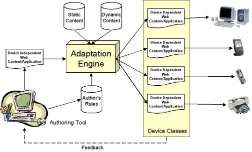
Figure 1 - Single Authoring Environment
The success of a single authoring environment is related to the ability to capture the essential semantics in defining the content or web application elements. If these elements are expressed in a semantically rich notation, and they have sufficient independence from each other, it will be possible to manipulate them to adapt the content/application for each device class and subsequently for each device.
In the next sections we describe two of the four main elements of our framework:
- View-port and Layout Model;
- Alternative Content Selection.
We will discuss our approach to each of these topics after describing the general framework.
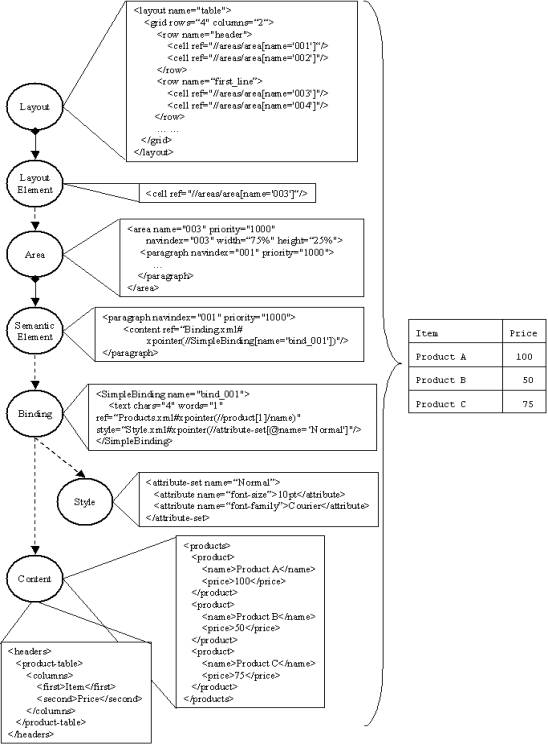
Figure 2 - Content Indirection Multiple Levels
Framework
Our Device Independent Web Application Framework (DIWAF) is based on a series of indirections or bindings, illustrated in Figure 2. To achieve the flexibility necessary for adaptation, the content has at least two levels of indirection from the layout. This enables layout adaptation to be separable from content selection and styling.
The layout is described using a hierarchy that captures the relationships between the layout elements. Each element points to an Area (first level of indirection). An Area is a placeholder for a collection of Semantic Elements; a Semantic Element could be simply a paragraph or any appropriate tag name that captures the “essence” of the styling semantics given to the enclosed content. The content is not included inside a Semantic Element but is referred using a Binding Element (second level of indirection). The Binding Element is used to link together content and style, it could also provide a set of metadata and a mime type for the referenced content. The binding gives the possibility of re-using content and style.
View-port and Layout Model
View-port and Layout are based on a nested area model, similar to that of XSL-FO or CSS. A view-port is the top-level unit of application presentation, and contains one or more areas, in conformance to an expressed layout.
There are two main kinds of layouts: flows and grids.
The flow layout describes a collection of areas sequenced in an author’s defined order. Each area either defines a sub-layout and reference to sub-areas or contains semantic elements describing the content.
The grid layout is meant to describe more sophisticated layouts like tables, columns and so on. It is also possible to nest areas, and subsequently, layouts to achieve greater flexibility and complexity.
|
Figure 3 – View-port/Layout/Area Model |
Figure 4 - Layout Example |
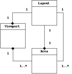
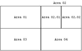
Both the layout and view-port reference the areas indirectly without embedding them inside the layout structure. This gives greater flexibility, enabling layout changes without involving the content and vice versa. Areas represent the bridge between content and layout as shown in Figure 5. An Area can embed either a Semantic Element (e.g. Area 01) or a Layout of further areas (e.g. Area 02).
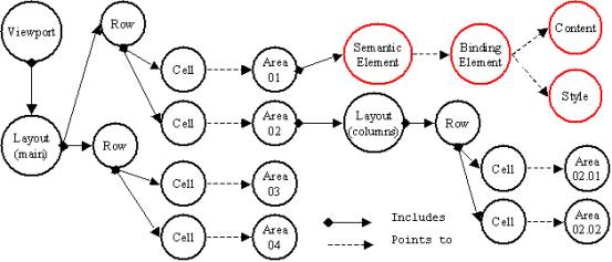
Figure 5 - Layout Representation with the Area Model
The associated markup in our system looks like this:
<root xmlns:xforms="http://www.w3.org/2001/06/xforms" xmlns:diml="http://hplb.hpl.hp.com/diml" xmlns:xlink="http://www.w3.org/1999/xlink">
<viewport name="Test">
<layout name="main">
<grid rows="2" columns="4">
<row name="first">
<cell ref="//areas/area[name='01']"/>
<cell ref="//areas/area[name='02']"/>
</row>
<row name="second">
<cell ref="//areas/area[name='03']"/>
<cell ref="//areas/area[name='04']"/>
</row>
</grid>
</layout>
<areas>
<area name="01" priority="100" navindex="001" width="50%" height="50%">
<paragraph priority=”100”>
<content ref=”Binding.xml#xpointer(
//AlternativesBinding[name='alt_bind_1']))”/>
</paragraph>
</area>
<area name="02" priority="1000" navindex="002" width="50%" height="50%">
<layout name="columns">
<grid rows="1" columns="2">
<row name="first">
<cell ref="//areas/area[name='02.01']"/>
<cell ref="//areas/area[name='02.02']"/>
</row>
</grid>
</layout>
</area>
.. .. ..
<area name="02.01" priority="100" navindex="003" width="50%" height="100%">
.. .. ..
</area>
<area name="02.02" priority="100" navindex="004" width="50%" height="100%">
.. .. ..
</area>
.. .. ..
</areas>
</viewport>
</root>
Selection of Alternative Content
Our solution provides a means for selecting content based on priorities and alternatives.
The author can give priorities to Semantic Elements. Using priorities in conjunction with content alternatives the author will also be able to give to the adaptation engine a way of selecting content to be preserved during adaptation.
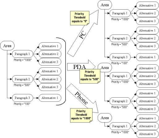
Figure 6 - Content Selection based on Priorities for Semantic Elements
Each alternative is represented by a combination of content and style, this separation allows the author to re-use the same content applying different style or re-use the style for different content.
<areas>
<area name="01" priority="1000" navindex="001" ... >
<paragraph priority=”1000”>
<content ref=”Binding.xml#xpointer(
//AlternativesBinding[name='alt_bind_1']))”/>
</paragraph>
<paragraph priority=”500”>
<content ref=”Binding.xml#xpointer(
//AlternativesBinding [name='alt_bind_2']))”/>
</paragraph>
<paragraph priority=”100”>
<content ref=”Binding.xml#xpointer(
//SimpleBinding[name='simple_bind_1']))”/>
</paragraph>
</area>
.. .. ..
</areas>
The alternatives are expressed inside the binding entry that points to the content and the style information. In the adaptation processes the priority is used to select the content to be rendered for the device class and the alternative is chosen to better suit the device capabilities and author wishes.
<AlternativesBinding name="alt_bind_1">
<image width="100px" height="83px" ref="images/test.gif" type="image/gif" aspect-ratio="12" />
<text chars="12" words="2" ref="Cont.xml#xpointer(//text[@id='1'])" style="Style.xsl#xpointer(//attribute-set[@name='Heading2']"/>
<text chars="12" words="2" ref=" Cont.xml#xpointer(//text[@id='1'])" style="Style.xsl#xpointer(//attribute-set[@name='Heading3']"/>
</AlternativesBinding>
...
When the device, from the device class, requests the information, the system will select the most suitable alternative from the available one and will send the content adapted to the device dependent format.
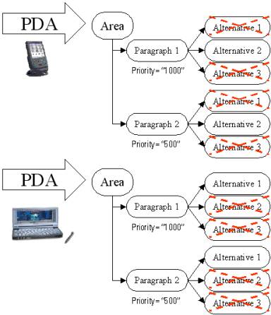
Figure 7 - Alternatives Selection for Specific Device inside a Device Class
Interaction and Navigation
Two further elements of our framework, which are still under development, are interaction and navigation.
The interaction model is expected to be provided by XForms, extended to support priorities and the binding model.
<xforms:button navindex="007" diml:priority="1000">
<xforms:caption>
<content ref="Binding.xml#xpointer(
//AlternativesBinding[name='alt_bind_1'])"/>
</xforms:caption>
</xforms:button>
XForms elements are treated as standard Semantic Elements.
Navigation may be either implicit or explicit. Implicit navigation can be automatically generated, for example to link together elements of a view-port that have been split into multiple units for a smaller device. Explicit navigation may be represented as standard Semantic Elements, based for example on new proposals for XHTML 2.0 navigation lists.
Conclusion
The DIWAF approach to structuring web content, as a starting point for device-specific adaptation, adds a few simple constructs: areas, explicit layout (flows and grids), binding and priorities.
Otherwise, it makes use of existing semantic markup elements whenever possible.
So far, our approach is oriented largely towards visual media. However, it is expected that the principles of separating content, layout (or sequencing of linear media) and style will be equally useful in adapting for non-visual presentations.