
HCLS/HCLS semantic web map
Mapping the Semantic Web for life science and health care
This wiki page is used for coordinating the creation of a map of the Semantic Web in Health Care and Life Science, from here on called the HCLS map. The resulting illustration should give an overview of the different disciplines, information/knowledge types and data source; as well as the connection between them. The illustrations will be used for various HCLS poster presentations and will also be put on the web. We might also want to use the HCLS map for future journal papers. Generally, the illustration will be of utmost importance if we want to communicate our achievements and plans.
Phase 4: Drawing the map based on the final Graphviz layout
(we have not reached that phase yet)
Phase 3: Creating a graph/map layout with Graphviz
Wiki page containing the Graphviz code -- PLEASE EDIT IF YOU SEE SOMETHING MISSING
We use the Graphviz syntax to describe the ontologies, the ontology clusters and the connections between ontologies. Graphviz will be used to generate a graph layout, which will then be used to draw the final map with Inkscape.
You can edit the graph file on this wiki page. I will regularly run Graphviz and upload the updated image file.
Content guidelines
- Only make connections where there really are substantial connections on the RDF level, i.e. relations spanning the two ontologies. As a counter-example, several ontologies have some kind of mapping or annotation with Uniprot entries, but since Uniprot RDF and these ontologies do not use the same URIs, these are not shown as connections. If two ontologies are mapped in a separate mapping file, there should be a direct connection between both ontologies and the mapping file should not be depicted. Connections should also be omitted if the number of actual relations is minimal (e.g. only one or two). If in doubt, do not introduce a connection.
- Only add ontologies that have at least a bit of community recognition and that have reached at least a modest level of maturity.
- An ontology ('town') can only be part of one cluster ('country'), not of several. If an ontology spans several topics, choose the one for which it has most coverage. If this is not possible, split the ontology into two or several 'towns' -- but this should be avoided.
- Add 'nations' that are not covered by any Semantic Web developments, if they are of importance! Seeing where the Semantic Web developments have yet to start is just as valuable as seeing where we have already made good progress.
- If there are several ontologies covering the exactly same data (e.g. Reactome in different ontologies), merge them into a single 'town'.
- Please contact samwald (at) gmx.at if you want to make substantial changes or want to give feedback (I need it).
Syntax guidelines
- all lowercase
- words separated by underscores
- use names consistently
- The numbers in the comments to the right of each 'city' are the interoperability&maturity&coverage scores (1 = low, 2 = medium, 3 = high). They are not reflected in the Graphviz output, but will be taken into consideration when drawing the final map.
- try to adhere to the syntax
- the direction of arrows has no meaning
- If you add new entities, try to give some descriptive text in the comment, so that everyone knows where the ontology can be found, what it contains, and if it should really be on the map
Incomplete example output of Graphviz (fdp.exe):
Phase 2: Choosing a style
This is an example of the style I (Matthias Samwald) finally chose, a geographical metaphor (the connections here are fictional):
Short description of the visualization
- Fields of information in life science and health care are represented as separated 'countries'.
- If two 'countries' represent related fields of information, they share a common boundary.
- Semantic Web resources (mostly ontologies) are represented as 'towns' in these 'countries'.
- If two ontologies are connected (by sharing URIs), this is visualised as a 'railway line'.
- 'Towns' have different 'sizes'. The size depends on three scores: Interoperability (how well does it play along with others?), coverage (how much of its field of information does it cover?) and maturity (is it still very buggy and rapidly changing?). Each score is a number between 1 and 3. The end score for each ontology is the lowest of these scores, i.e., an ontology only gets a score of 3 when all of the separate factors are scored with 3. For example, if someone creates a very large (score 3) and mature (score 3) ontology, but it does not even try to interoperate with anything else (score 1), the whole ontology will only achieve a score of 1. The higher the score, the larger the size of the 'town' on the map.
- 'Lakes' can be used to separate 'countries' that happen to be positioned near each other, but are unrelated.
Reasons for choosing this visualization
- Easy to draw.
- Intuitive.
- Easy to extend in the future. Ideally, we could make bi-yearly snapshots of the map and observe how our 'towns' are growing, become more numerous and interconnected, and spread out into areas that were previously uninhabited.
- It expands the metaphor of bioinformatics nation(s) coined by Lincoln Stein (link to Nature article). This metaphor was also used recently by Carole Goble in her talk at Banff (pdf file).
- Relatedness between fields of information can be visualized as common boundaries. Compared to 'clouds', this approach has the advantage that 'countries' can stretch and bend around other 'countries', which gives more freedom in representing relatedness. It also saves space.
- It allows us to differentiate between ontologies that connect to other ontologies and those that do not. If there are several disconnected ontologies in one area, we have a problem that needs to be solved.
- It shows not only the resources that we have created so far, but also the goals we have to meet in the future ('uninhabited areas'). This is very importandt to set things into perspective.
Phase 1: Collecting and Categorizing existing illustrations
Please add links to images that we could use as an inspiration for the HCLS map. If you have something that could be remotely interesting, please add a link to this Wiki page. Alternatively you can e-mail the illustration to samwald (at) gmx.at, and they will be uploaded and linked. Please add a short description or label above each image.
Some categories that have been proposed on the HCLSIG list are:
- Ecosystem Diagrams
- Spheres of Activity Diagrams
- Data Flow Maps
- Knowledge Flow Maps
- Application Map
- Taxonomies
- Data Taxonomies/Clouds/Continuum
- Knowledge Taxonomies/Clouds/Continuum
- Data Source Taxonomies/Clouds/Continuum
- Knowledge Source Taxonomies/Clouds/Continuum
The illustrations are now presented below:
- A cloud of data sources
- Author: Susie Stephens
- Category: Data + Knowledge Sources Cloud
- Citation: Banff Demo
- A more detailed version of (1)
- Author: Susie Stephens
- Category: Data + Knowledge Sources Cloud
- Citation: Banff Demo
- Figure: owl:imports hierarchy of the SenseLab ontologies (bold) and other ontologies that have been mapped to the SenseLab ontologies
- Author: Matthias Samwald
- Category: Knowledge Flow Map
- Citation: SenseLab Project
- The relationship between SenseLab ontologies based on proximity
- Author: Matthias Samwald
- Category: Knowledge - Data Flow Maps
- Citation: SenseLab Project
- HCLS Ecosystem
- Author: Eric Neumann
- Category: Ecosystem Diagram
- Comment: "I was more concerned about how SW data can easily move between very different org domains and uses. TimBL's app map was a nice example of "data interoperability" and "app independence", though it takes place only in software app OS space (calendars, email, photos, CRMs). I attempted to move from software apps to community functions (e.g., clincial trials, patient record mgmt)."
- Bio2RDF Project Map Sparql Endpoint List
- Author: François Belleau, Marc-Alexandre Nolin, Peter Ansell
- Category: Knowledge + Data Flow Map + Sparql Endpoint List
- Citation: Bio2RDF Project
- Example of Connectivity of the Semantic Web
- Author: Matthias Samwald
- Category: Knowledge + Data Flow Map
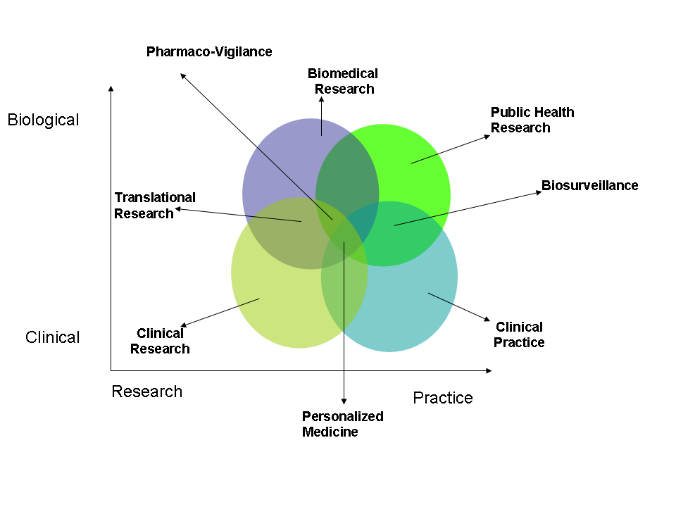
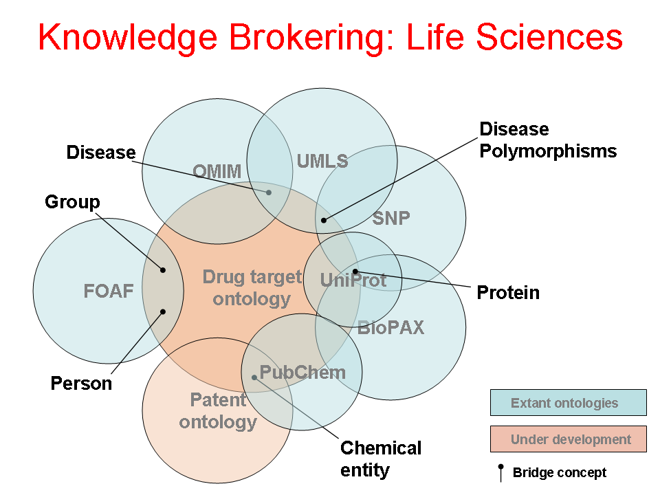
- Author: Vipul Kashyap
- Category: Spheres of Activity Diagram
- Citation: WWW 2006 Tutorial on Semantics for the Healthcare and Life Sciences
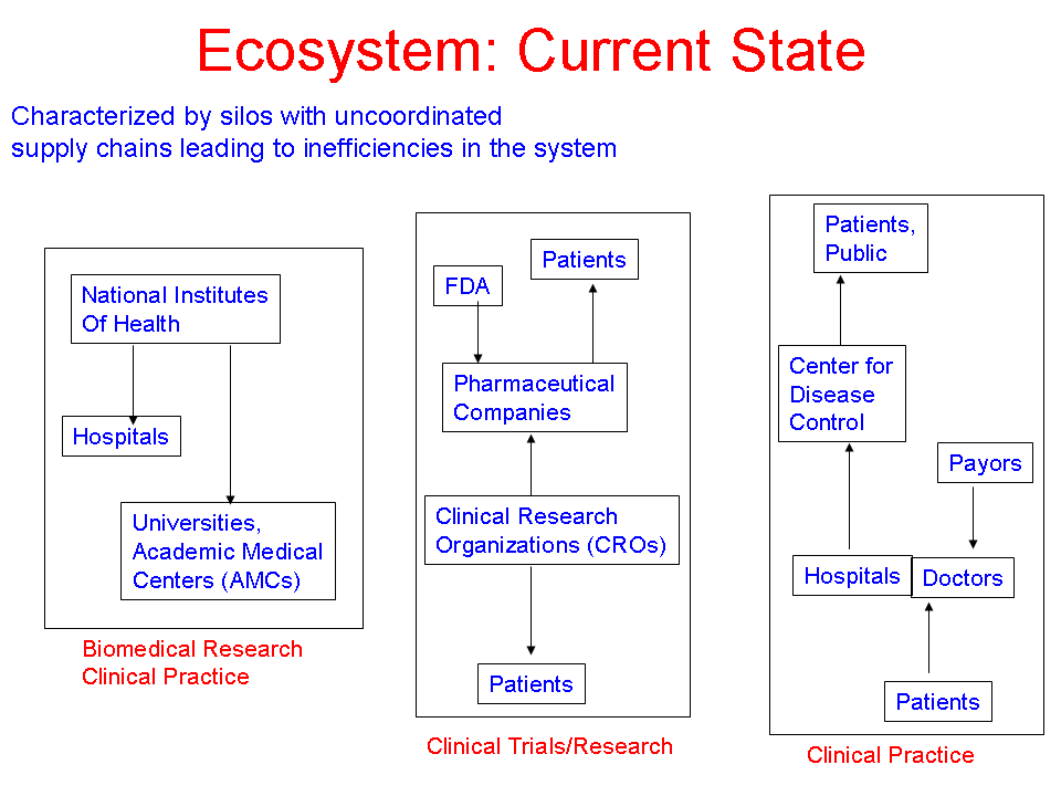
- Author: Vipul Kashyap
- Category: Ecosystem Diagram
- Citation: WWW 2006 Tutorial on Semantics for the Healthcare and Life Sciences
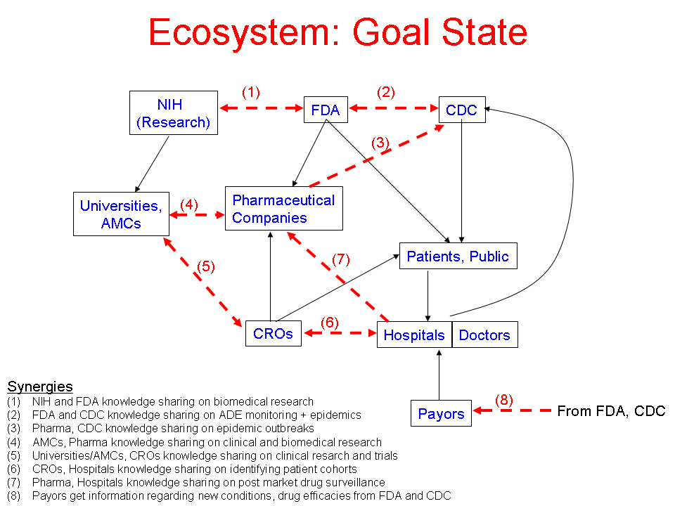
- Author: Vipul Kashyap
- Category: Ecosystem Diagram
- Citation: WWW 2006 Tutorial on Semantics for the Healthcare and Life Sciences
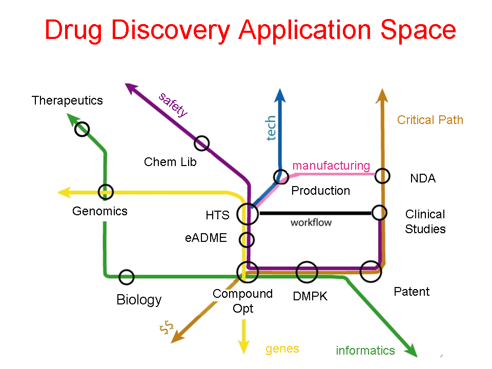
- Author: Eric Neumann
- Category: Application Space Diagram
- Citation: WWW 2006 Tutorial on Semantics for the Healthcare and Life Sciences
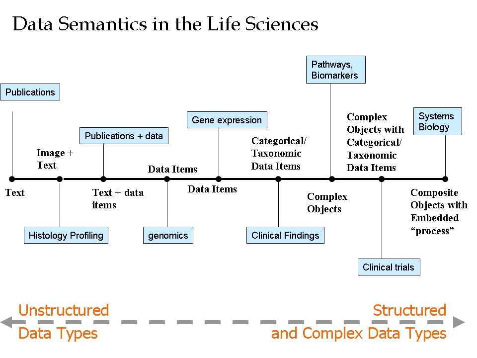
- Author: Vipul Kashyap
- Category: Data Continuum
- Citation: WWW 2006 Tutorial on Semantics for the Healthcare and Life Sciences
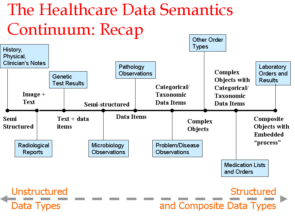
- Author: Eric Neumann
- Category: Data Continuum
- Citation: WWW 2006 Tutorial on Semantics for the Healthcare and Life Sciences
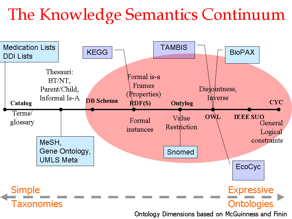
- Author: Vipul Kashyap
- Category: Knowledge Continuum
- Citation: WWW 2006 Tutorial on Semantics for the Healthcare and Life Sciences
- Author: Eric Neumann
- Category: Knowledge Flow Map
- Citation: WWW 2006 Tutorial on Semantics for the Healthcare and Life Sciences
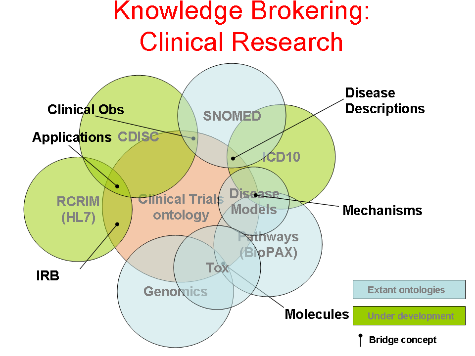
- Author: Eric Neumann
- Category: Knowledge Flow Map
- Citation: WWW 2006 Tutorial on Semantics for the Healthcare and Life Sciences
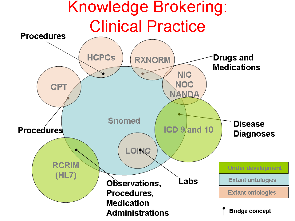
- Author: Tonya Hongsermeier
- Category: Knowledge Flow Map
- Citation: WWW 2006 Tutorial on Semantics for the Healthcare and Life Sciences


![[1]](http://neuroweb.med.yale.edu/senselab/temporary_files/sw_map.gif)
![[2]](http://neuroweb.med.yale.edu/senselab/temporary_files/map-draft-2.png)
Broader Semantic Web/Web/Web Science Maps
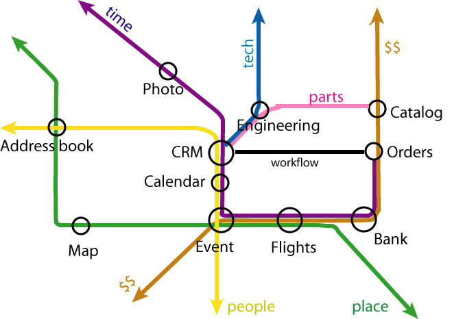
- Semantic Web Metro Map
- Author: Tim Berners-Lee
- Web Science Map
Graphics tools
We could use Graphviz for automatic layouting of a graph (but not for the creation of the graphics, as the output of graphviz does not look that good).
We could use Inkscape, a free vector / SVG graphics editor to make the graphics.