This section describes the status of this document at the time of its
publication. Other documents may supersede this document. A list of current
W3C publications and the latest revision of this technical report can be
found in the W3C technical reports index at http://www.w3.org/TR/.
This document is a Working Draft by the Protocols & Formats Working
Group of the Web Accessibility
Initiative. The Working Group believes engineering is mostly complete. This draft is being published to allow for public review prior to entering finalization stages, and to support ongoing discussion with other Working Groups about the impact of this specification on other W3C technologies. There is expanded information about how states and properties support roles in Roles for
Accessible Rich Internet Applications (WAI-ARIA Roles) [ARIA_ROLE]. The document has also been restructured for easier comprehension, and explanatory materials expanded. An expanded definition section attempts to clarify the usages of particular terms used in this suite. Refer to the history of changes to WAI-ARIA States and Properties for more details.
The Working Group believes that a complete understanding of this document requires an in-depth understanding of the mechanics of assistive technology that most implementors would not be expected to have. Therefore the Working Group is developing a set of Best Practices, which are still only in draft form but expected to be published the next time this document is updated. Where topics appear to be unclear, please consider that document as one of the potential places of clarification.
This version of the document presents details for roles in two forms. The main form is tabular, and a version using definition lists is provided in an appendix. There are questions about the accessibility and efficacy of both these forms, and the Working Group seeks feedback, particulary from reviewers with disabilities, about which version is more successful.
Feedback on the model set out here is important to the success of the Web community in creating accessible Rich Internet Applications. The PFWG would like to know, in particular:
- Is it clear how to create Rich Internet Applications with this added capability?
- Is the usage of states and properties clear?
- Will this module will combine well with host languages?
- What information should be enhanced in the future Best Practices, and what needs clarification within this specification?
- Is the presentation of states and properties accessible?
- Are the presentational changes that could enhance understanding of this document?
When addressing these questions, please consider them in the context of the companion documents mentioned above in the abstract. Comments on this document may be sent to public-pfwg-comments@w3.org (Archive). The Working Group requests that comments be made by 16 November 2007.
To assist you in your review, refer to the history of changes to WAI-ARIA States and Properties.
Publication as a Working Draft does not imply endorsement by the W3C
Membership. This is a draft document and may be updated, replaced or
obsoleted by other documents at any time. It is inappropriate to cite this
document as other than work in progress.
This document was produced by a group operating under the 5 February 2004
W3C Patent Policy. W3C maintains a public list of any
patent disclosures made in connection with the deliverables of the group;
that page also includes instructions for disclosing a patent. An individual
who has actual knowledge of a patent which the individual believes contains Essential
Claim(s) must disclose the information in accordance with section
6 of the W3C Patent Policy.
The disclosure obligations of the Participants of this group are described
in the charter.
1 Introduction
This section is informative.
The domain of Web accessibility defines how to make Web content usable by people with disabilities. People with some types of disabilities use Assistive Technology (AT) to interact with content. AT can transform the presentation of content into a format more suitable to the user, and can allow the user to interact in different ways than the author designed. In order to accomplish this, AT must understand the semantics of the content. Semantics are knowledge of roles, states, and properties, as a person would understand them, that apply to elements within the content. For instance, if a paragraph is semantically identified as such, AT can interact with it as a unit separable from the rest of the content, knowing the exact boundaries of that paragraph. A slider or tree control is a more complex example, in which various parts of a widget each have semantics that must be properly identified for the computer to support effective interaction.
Established content technologies define semantics for elements commonly used in those technologies. However, new technologies can overlook some of the semantics required for accessibility. Furthermore, new authoring practices evolve which override the intended semantics—elements that have one defined semantic meaning in the technology are used with a different semantic meaning intended to be understood by the user.
For example, Dynamic HTML can be used to present a tree control even though HTML lacks a semantic element for that. A different element must be used, possibly a list element with display instructions to make it look and behave like a tree control. Assistive technology, however, must re-present the element in a different modality and the display instructions may not be applicable. The AT will present it as a list, which has very different display and interaction from a tree control, and the user may be unsuccessful at understanding and operating the control.
Roles for
Accessible Rich Internet Applications [ARIA_ROLE] provides a way to identify element types that do not change with time or user actions. Changeable states and properties of elements are defined in this specification. States and Properties are used to declare important properties of an
element that affect and describe interaction. These properties enable the
user agent or operating system to properly handle the element even when
these properties are altered dynamically by scripts. For example, alternative input and output technology such as screen readers, speech dictation software and on-screen keyboards must recognize the state of an element (such as: if an object is disabled, checked, focused, collapsed, hidden, etc.).
While it is possible for assistive technologies
to access these properties through the Document Object Model [DOM],
the preferred mechanism is for the user agent to map the States and
Properties to the accessibility API of the operating
system.
Figure 1.0 illustrates a typical Document
Object Model (DOM) [DOM] node. Placed within the
DOM node and the assistive technology is a box containing the contract
provided by the user agent to the assistive technology. This data includes
typical accessibility information found in the accessibility API for many of
our accessible platforms for GUIs (role, state, caret, selection, event
notification, parent/child information, relationship, and descriptions).
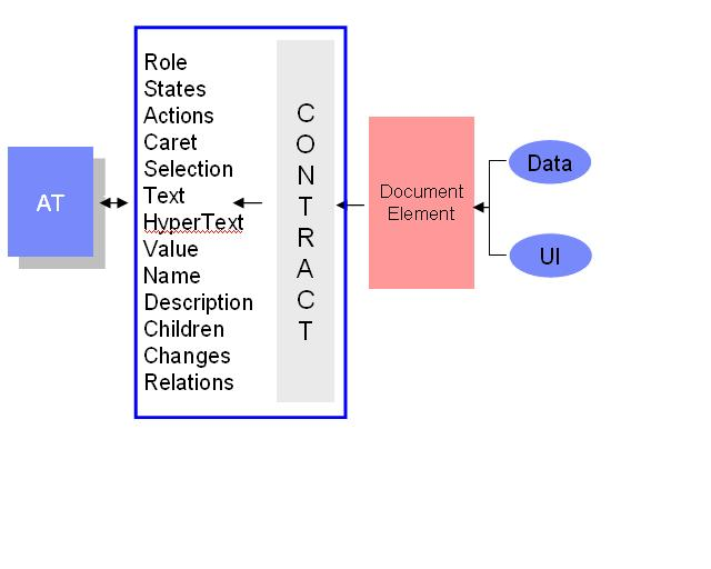
Figure 1: The contract model with accessibility APIs
For more information see the Roadmap for Accessible Rich
Internet Applications for the use of roles in making interactive
content accessible.
The keywords "MUST", "MUST NOT", "REQUIRED", "SHALL", "SHALL NOT",
"SHOULD", "RECOMMENDED", "MAY", and "OPTIONAL" in this document are to be
interpreted as described in RFC 2119 [RFC2119].
1.1 Terms and Definitions
This section is informative.
While some terms are defined in place, the following definitions are used
throughout this document. Familiarity with W3C XHTML 1.1
Recommendation [XHTML] and the W3C XML 1.0
Recommendation [XML] is highly
recommended to understand these definitions.
- Accessibility API
-
Operating systems and other platforms provide a set of interfaces that expose information about objects and events to assistive technology. Assistive technology uses these interfaces to get information about and interact with those controls. Examples of this
are the Java
Accessibility API [JAPI], Microsoft
Active Accessibility [MSAA], Apple
Accessibility for COCOA [AAC], the Gnome Accessibility
Toolkit (ATK) [GAP], and IAccessible2 [IA2].
- Assistive Technology
-
Hardware and/or software that acts as a user agent, or along with a mainstream user agent, to provide services to meet the requirements of users with disabilities that go beyond those offered by the mainstream user agents.
Services provided by assistive technology include alternative presentations (e.g., as synthesized speech or magnified content), alternative input methods (e.g., voice), additional navigation or orientation mechanisms, and content transformations (e.g., to make tables more accessible).
Assistive technologies often communicate data and messages with mainstream user agents by using and monitoring APIs.
The distinction between mainstream user agents and assistive technologies is not absolute. Many mainstream user agents provide some features to assist individuals with disabilities. The basic difference is that mainstream user agents target broad and diverse audiences that usually include people with and without disabilities. Assistive technologies target narrowly defined populations of users with specific disabilities. The assistance provided by an assistive technology is more specific and appropriate to the needs of its target users. The mainstream user agent may provide important services to assistive technologies like retrieving Web content from program objects or parsing markup into identifiable bundles.
Examples of assistive technologies that are important in the context of this document include the following:
- screen magnifiers, and other visual reading assistants, which are used by people with visual, perceptual and physical print disabilities to change text font, size, spacing, color, synchronization with speech, etc. in order to improve the visual readability of rendered text and images;
- screen readers, which are used by people who are blind to read textual information through synthesized speech or braille;
- text-to-speech software, which is used by some people with cognitive, language, and learning disabilities to convert text into synthetic speech;
- voice recognition software, which may be used by people who have some physical disabilities;
- alternative keyboards, which are used by people with certain physical disabilities to simulate the keyboard (including alternate keyboards that use headpointers, single switches, sip/puff and other special input devices.);
- alternative pointing devices, which are used by people with certain physical disabilities to simulate mouse pointing and button activations
- Attribute
-
In this specification, attribute is used as it is in markup languages. Attributes are structural features added to elements to provide information about the states and properties of the object represented by the element.
- Characteristic
-
An assertion which can be a constraint.
- Class
-
An abstract type of object.
- Element
-
In this specfication, element is used as it is in markup languages. Elements are the structural elements in markup language that contains the data profile for objects.
- Event
-
A
programmatic message used to communicate discrete changes in the state of an object to other objects in a computational system. User input to a web page is commonly mediated through abstract events that describe the interaction and can provide notice of changes to the state of a
document object.
- Namespace
-
A collection of related names. Qualifying a name in terms of the namespace to which it belongs allows these names to be distinguished from names in other namespaces that are spelled alike. Namespaces in this document are used in accordance with Namespaces in XML [XML-NAMES].
- Object
-
A "thing" in the perceptual user experience, instantiated in markup languages by one or more elements, and converted into the object-oriented pattern by user agents. Objects are instances of abstract classes, which defines the general characteristics of object instances. A single DOM object may or may not correspond with a single object in accessibility API. An object in accessibility API encapsulates one ore more DOM objects.
- Property
-
Attributes that are essential to the nature of a given object. As such, they are less likely to change than states; a change of a property may significantly impact the meaning or presentation of an object. Properties mainly provide limitations on objects from the most general case implied by roles without properties applied.
- Relationship
-
A fact connecting two distinct, articulable things. Relationships may be of various types to indicate which object labels another, controls another, etc.
- Role
-
An indicator of type. The object's role is the class of objects of which it is a member. This semantic association allows tools to present and support interaction with the object in a manner that is consistent with user expectations about other objects of that type.
- State
-
A state is a dynamic property expressing characteristics of an object that may change in response to user action or automated processes. States do not affect the essential nature of the object, but represent data associated with the object or user interaction possibilities.
- User Agent
-
Any software that retrieves and renders Web content for users, such as Web browsers, media players, plug-ins, and other programs
including assistive technologies that help retrieve and render Web
content.
- Value
-
A literal that concretizes the information expressed by a state or property.
1.2 Design Aims
This section is informative.
The design aims of creating this specification include:
- Define what state information may be controlled by the author.
- Support device independence - new devices coming on line, such as
telephones, PDA's, tablets, televisions, etc. mean that it is imperative
to have a design that allows you to author once and render in different
ways on different devices, rather than authoring new versions of the
document for each type of device.
- Improve the accessibility of dynamic content such as that generated by
script.
- Provide for interoperability with Assistive Technologies.
1.3 Building Accessible Applications
This section is informative.
An application becomes accessible when:
- Each element or widget has with full and correct semantics that
completely describes its behavior (using element names or roles).
- The relationships between elements and groups are known.
- States, properties, and relationships are valid for each element's
behavior and are accessible via the Document
Object Model [DOM].
- Allow script author to move focus to allow all document elements in the body to receive focus with or without effecting the tab order.
Features of the States and Properties Module can be used to provide information about any missing states, properties, and relationships that
the assistive technology needs to understand the behavior of the elements
inside the application.
States and Properties can be used to assign meaningful properties that
change with time and events. For element types and semantics that do not
change with time, use a role taxonomy such as such as that defined in Roles
for Accessible Rich Internet Applications [ARIA-ROLE].
To build an accessible application first check that each element or widget
is marked with full and correct semantics that fully describes its behavior. The procedure for this is described in ARIA Roles [ARIA-ROLE, Section 2.1].
Then use the features of this specification to ensure:
- States, properties, and relationships are valid for each element's
behavior and are accessible via the [DOM].
- Elements have the correct input focus.
This requires the author to:
- Set properties to define the behavior of the element.
- Control the behavior of the element using device-independent events,
states, and properties.
- Where possible, tie the behavior of the user interface to accessible
states and properties using style sheet selectors.
For example: If the user is required to fill in a form element, set the aria:required property to "true" on that element.
The States and Properties module also defines ways to indicate certain relationships. For example: If container A contains search results, and
container B contains the search controls, then mark each container as a
region and set the aria:controls property in region B to reference region
A (by ID).
Sometimes the relationships can be made clear via facilities of the native markup
language, such as the label tag in [HTML]. Relationships can also be implied via the [DOM]. For example, when a
well marked-up list contains list items, it is known that they belong to the
containing list. In such cases you do not need to set properties
from this specification to make the relationship explicit.
This specification corrects keyboard focus gaps in XHTML. For details on those changes see
section 4.4.
2 The States and Properties Module
This section is normative.
This specification defines the States and Properties module for XHTML [XHTML]. It also defines a representative profile which
extends the XHTML 1.1 - Full profile by adding this module.
All examples are informative. Examples in this document that use the
namespace prefix "aria" all assume a valid XML namespace declaration xmlns:aria = "http://www.w3.org/2005/07/aaa" in the document involved.
Section 3.1 below discusses examples of how the module may be integrated
into language profiles. Section 3.2 below then defines the particulars of the
module.
2.1 Using States and
Properties Attached to an Element
This section is normative.
The use of ARIA states and properties in other non-xml host languages may help accessibility. If the host language produced a dynamic user interface where content may be scripted to produce new user interface concepts. Outside the host markup, the use of ARIA states and properties will help authors support platform assistive technologies when made available to them by the user agent.
Language profiles wishing to use these states and properties must
integrate the module in a way which makes this document the governing
specification for the semantics of these language features. Appropriate
methods of module integration include but are not limited to all methods as
specified in XHTML
Modularization [XHTMLMOD].
2.1.1 XHTML 1.1
Appendix A.2 provides a driver DTD which integrates a new profile for
XHTML which augments XHTML 1.1 Full with the capabilities in the new module
introduced here.
Valid XHTML 1.1 documents that wish to use this profile must use the
following DOCTYPE declaration:
<DOCTYPE html PUBLIC "-//W3C//DTD XHTML 1.1 For Accessible Rich Internet Applications//EN"
 "http://www.w3.org/2005/07/aaa/xhtml11-aria.dtd">
Note
that XHTML 1.0 does not support modularization. The ARIA States and Properties attributes will be understood by user agents in XHTML 1.0 by declaring and using the appropriate namespace the same as for XHTML 1.1, but such documents will not validate to the XHTML 1.0 DTD.
2.1.1.1 The default
prefix
Attributes for States and Properties should be used with prefix "aria". For
example:
<?xml version="1.0" encoding="UTF-8"?>

<DOCTYPE html PUBLIC "-//W3C//DTD XHTML 1.1 For Accessible Rich Internet Applications//EN">

<html xmlns="http://www.w3.org/1999/xhtml" xml:lang="en">

<head>
<title>DHTML Checkbox</title>
</head>

<body>

<p>Here's a three state checkbox that you can click on.</p>

<div class="checkbox " role="checkbox" id="chbox1" aria:required="true"
  aria:readonly="true" onkeydown="return checkBoxEvent(event);"
  onclick="return checkBoxEvent(event);" >
Sign me up for all the weekly rdf and xml newsletters :)
</div>

</body>
</html>
2.1.1.2 Changing the
prefix
You can change the default prefix by extending the DOCTYPE of your XHTML
document.
The following code would define "state" as the prefix for the WAI-ARIA
attributes.
<!DOCTYPE html PUBLIC "-//W3C//ELEMENTS DTD XHTML 1.1 For Accessible Adaptable Applications//EN"

"http://www.w3.org/2005/07/aaa/xhtml11-aria-base.dtd" [

<!ENTITY % aria.prefixed "INCLUDE">

<!ENTITY % aria.prefix "state">

]>
2.1.2 States and Properties with other
XML languages
States and Properties can also be used with other XML languages using the
following namespace :
xmlns:aria="http://www.w3.org/2005/07/aaa"
The following example demonstrates using States and Properties with SVG [SVG]:
<?xml version="1.0" encoding="UTF-8"?>
<!DOCTYPE svg PUBLIC "-//W3C//DTD SVG 1.1//EN" "http://www.w3.org/Graphics/SVG/1.1/DTD/svg11-flat-20030114.dtd">
<svg xmlns="http://www.w3.org/2000/svg " xmlns:aria="http://www.w3.org/2005/07/aaa " width="100% " height="100% ">

<desc>
Example of using state-attributes from Accessible Adaptable Applications Namespace:

</desc>

<!-- an expanded group of rectangles -->
<g aria:expanded="true ">
<!-- this rectangle is zoomed -->

<rect x="1cm " y="3cm " width="1cm " height="1cm " />
<rect x="3cm " y="3cm " width="1cm " height="1cm " />
</g>
</svg>
2.1.3 States and Properties with HTML 4
There is no normative way to apply states and properties in HTML, but it is recommended to use the Embedding ARIA in HTML [ARIA-HTML] technique.
2.1.4 States and Properties with HTML 5
At the time of this writing, HTML 5 is an incomplete specification, and therefore it is not possible to make recommendations about use of ARIA States and Properties. It is expected that many of the features of this specfication will be adopted by HTML 5 and thus not require the use of their counterparts from this specification. Some features from ARIA States and Properties, however, may still be needed. When HTML 5 is mature, the Working Group intends to release a recommended technique to use ARIA States and Properties with it. That technique is not anticipated to be the same as the technique for HTML 4 referenced above.
2.1.5 Note on Tabindex
tabindex is not a state and has not been added to the http://www.w3.org/2005/07/aaa namespace. However, to help the accessibility of accessible XHTML
applications, tabindex has been added to all visible elements in the extended XHTML Doctype. The tabindex change enables support of User Agent
Accessibility Guidelines ([UAAG]). tabindex should not be used with a prefix, because it is an existing XHTML attribute. The States and Properties DTD simply adds this attribute, without a prefix, to an extended set of elements. The list of elements to which tabindex is added is in the appendix Elements with Tabindex added.
tabindex also supports the values of "0" and "-1." See section 4.4 for details.
Tabindex is used only to provide focus support to (X)HTML documents. Therefore, tabindex is not defined and not expected to be used when ARIA is used in other languages.
2.2 Examples
This section is informative.
This example shows a role being used to make a simple widget known to the
user agent, so that the user agent can handle it correctly.
In this example a div has been used with scripts to act as a tristate
checkbox. The ARIA State and Properties of checked has been set to true.
The XHTML role element gives the use agent information about the behavior
of the widget. For more information on Roles see the Roles for Accessible Rich Internet
Applications [ARIA_ROLE].
<span
    class="checkbox"
    id="chbox1"
    role="wairole:checkbox"
    aria:checked="true"
    tabindex="0"
    onkeydown="return checkBoxEvent(event);"
    onkeyup="return checkBoxEvent(event);" >
  A checkbox label
</span>
JavaScript can then manipulate the widget via the DOM. However, because
States and Properties are mapped to the accessibility platforms, the
assistive technology and user agents can understand the widget behavior and
respond appropriately.
java script snippet :
  if ((event.type == "keyup" && event.button == 0)) {

    // Toggle checkbox

    var checkbox = event.target;

    if (checkbox.getAttributeNS("http://www.w3.org/2005/07/aaa",
      "checked") == "true") {

        checkbox.removeAttributeNS("http://www.w3.org/2005/07/aaa",
        "checked");


      return false;  // Don't continue propagating event}
    }

    return true;  // Browser can still use event

}
Typically, States and Properties will work well with other supporting
technologies, such as the Roles for
Accessible Rich Internet Applications [ARIA_ROLE] and [XML
events].
3 Supported States and
Properties
This section is normative.
The terms "states" and "properties" refer to similar features. Both provide specific information about an object, and both form part of the definition of the nature of roles. In this document, states and properties are treated nearly identically. However, they are maintained conceptually distinct because there is a subtle difference in their meaning. In the definitions for states and properties in this document, states are introduced with the "State" prefix and properties are introduced with the "Property" prefix.
3.1 Characteristics of States and Properties
This section is normative.
The States and Properties Module supports the following characteristics:
Editorial note: The information below is presented with details arranged in a data table. Concerns about accessibility of this have been raised. An experimental alternate presentation is provided in Characteristics of States and Properties in list form, using definition lists instead of tables to organize the details. We appreciate feedback about which form is more effective, or proposals for other forms.
Characteristics of States and Properties
| Characteristic |
Description |
| Related Concepts |
Advisory information about features from this or other languages that correspond to this state or property. While the correspondence may not be exact, it is useful to help understand the intent of the state or property. |
| Used in Roles |
Advisory information about roles from the ARIA Roles specification that use this state or property. This information is provided to help understand the appropriate usage of the state or property. Since the ARIA Roles and the ARIA States and Properties are separate specifications, use of a given state or property is not limited just to the roles identified here. |
| Inherits into Roles |
Advisory information about roles from the ARIA Roles specification that inherit the state or property from an ancestor role. |
| Value |
Value restrictions for the state or property. These restrictions are expressed in terms of XML Schema Datatypes [XSD]. The following XSD Datatypes are used in this specification.
- boolean: a true/false value, expressed in attribute values as "true" or "false".
- integer: a positive or negative integer, expressed as a decimal number.
- string: an arbitrary string value.
- IDREF: a reference to the ID of another element in the same document.
- IDREFS: a whitespace-delimited list of references to the ID of one or more elements in the same document.
- NMTOKEN: a value selected from a set of allowed values, which are defined by an enumeration constraint.
- NMTOKENS: a whitespace-delimited list of one or more values selected from a set of allowed values, which are defined by an enumeration constraint.
- anyURI: a Uniform Resource Identifier Reference (URI).
Values of type boolean, NMTOKEN, and NMTOKENS are further explained by listing the allowed values and their meanings below the table of characteristics. When a value is indicated as the default, the behavior prescribed by this value should be followed when the state or property is not provided.
Note: in the XHTML module, value restrictions are necessarily expressed in DTD notation, not XSD. DTD notation does not provide the precise value restrictions supported by XSD, and therefore the values in the DTD often have a wider scope of allowed values than what is actually allowed by this specification. Implementors should be sure to observe the value restrictions defined here and not rely simply on DTD validation. |
3.2 Definitions for States and Properties
This section is normative.
States and properties are categorized as follows:
- Widget states
- Live Regions
- Drag and Drop
- Focus
- Relationships
- User Interface Properties
Below is an alphabetical list of ARIA states and properties to be used by rich internet application authors. A detailed definition of the taxonomy supporting these ARIA states and properties follows.
Editorial note: The information below is presented with details arranged in a data table. Concerns about accessibility of this have been raised. An experimental alternate presentation is provided in Definitions for States and Properties in list form, using definition lists instead of tables to organize the details. We appreciate feedback about which form is more effective, or proposals for other forms.
States| State | Definition |
|---|
| busy | Indicates whether a live region is finished updating. |
| checked | The checked state indicates something has been rendered as being chosen by the user in the sense that it is a binary or terciary operation. An example is a checkbox. |
| disabled | Indicates that the widget is present,
but the value cannot be set and it cannot be internally navigated. |
| expanded | Indicates whether an
expandable/collapsible group of elements is currently expanded or
collapsed. |
| grab | This property is set to show an
object's state in drag and drop. |
| hidden | Defines whether or not the object is visible to the user. |
| invalid | Indicates that the element's value
is currently invalid, which discourages the form from being
submitted. |
| pressed | Used for buttons that are toggleable to indicate their current pressed state. |
| selected | Sets whether the user has
selected an item or not. |
Properties| State | Definition |
|---|
| activedescendent | An element which has focus may
specify its current active child. This is used when a element is
responsible for managing its current active child to reduce the
overhead of having all children be focusable. |
| atomic | Atomic is an optional property of
live regions. When the region is updated, the atomic property is used
to indicate if the assistive technology should present all or part of
the changed region to the user. |
| autocomplete | Indicates whether user input completion suggestions are provided. |
| channel | This property specifies which channel should be used to present the
updates for its associated live region. |
| controls | Defines the
elements that are controlled by the current element. |
| datatype | Datatype defines the format type of an
element. |
| describedby | Points to an element which
describes the object. |
| dropeffect | This property is set for the target of a drag and drop operation to show the effect when the dragged object is released. |
| flowto | Establishes the recommended reading order of content, overriding the general default to read in document order. |
| haspopup | Indicates that element may launch a pop-up window
such as a context menu or submenu. |
| labelledby | Points to the element which labels the
current element. |
| level | Level is the hierarchical level of an
element within a structure. |
| live | Describes the types of updates the
user agent, assistive technology, and user can expect from an alert
or live region of Web content. |
| multiline | Indicates whether a text box accepts only a single line, or if it can accept multiline input. |
| multiselectable | Indicates that the user may select more
than one item from the current list. |
| owns | Defines an object as
a parent of another document element, when the child does not
appear directly in the subtree of the owner. |
| posinset | Indicates an item's number or position within the current level of a tree or list. |
| readonly | Indicates that the widget is not
editable. |
| relevant | Indicates the relevant areas of
change within a live region. |
| required | Indicates that user input is
required on the control before a form may be submitted. |
| secret | Provides the user with the ability to supply information to the system in a manner that makes it difficult for someone else (who may be watching) to discern the value that is being supplied. |
| setsize | The setsize property refers to the
number of items in the current level of a list or tree. |
| sort | The sort property is used to indicate
if items in a table or grid are sorted in ascending or descending order. |
| tabindex | Indicates tab order of elements. Elements with negative values are able to receive focus but are not included in the basic
tabbing navigation list or cycle. |
| templateid | The templateid is a unique identifier, represented as a URI, for which an assistive technology may customize its user interface. |
| valuemax | Maximum allowed value for a range
type of widget. |
| valuemin | Minimum allowed value for a range
type of widget. |
| valuenow | The current value of a widget. |
3.2.1 Widget states and properties
This section contains states specific to user common interface elements found on GUI systems or in rich Internet applications which receive user input and process user actions. These states are used to support the widget roles found in the ARIA Roles taxonomy. Widget states may be mapped by a user agent to platform accessibility API states, for access by an assistive technology, or they may be accessed directly from the [DOM]. Changes in states should result in a notification to an assistive technology either through DOM attribute change events or platform accessibility API events.
States and properties in this section include:
Property: autocomplete
Indicates whether user input completion suggestions are provided.
For a text box, it is assumed that the completion suggestion appears inline after the caret. The haspopup property can be used to indicate that a popup containing choices appears, notwithstanding the fact that it is a simple text box.
For an element which already has a drop-down (i.e., a combobox), it is assumed that the dropdown behavior is still present. This means that if autocomplete is true, haspopup should also be true on a combobox.
Characteristics:
| Related Concepts: |
XForms selection attribute in select |
| Used in Roles: |
|
| Inherits into Roles: |
|
| Value: |
NMTOKEN |
Values:
| inline: |
|
the system provides text after the caret as a suggestion for how to complete the field |
| list: |
|
a list of choices appears from which the user can choose, but the edit box retains focus |
| both: |
|
a list of choices appears and the top-rated selection also appears inline |
| none: |
(default) |
Only values from the value list can be selected |
State: checked
The checked state indicates something has been rendered as being chosen by the user in the sense that it is a binary or terciary operation. An example is a checkbox.
Characteristics:
| Related Concepts: |
|
| Used in Roles: |
option |
| Inherits into Roles: |
|
| Value: |
NMTOKEN |
Values:
| true: |
|
indicates that the current item is checked. |
| false: |
|
roles that support being checked but are not
currently checked. |
| mixed: |
|
indicates a mixed mode for a tri-state
checkbox. This is only supported on checkbox and menuitemcheckbox. |
| undefined |
(default) |
the object does not support being checked. |
Property: datatype
Datatype defines the format type of an
element.
Datatype should be a qname that refer to an XML Schema Datatypes [XSD] defined type. For example, a
datatype may be xsd:integer. The author may also reference their own custom datatypes as long
as they are simple types. Clearly XSD base types are simpler for the user agent to
understand.
Datatype applies to the content of an element, e.g., the value of an input element that the user could change. This can facilitate automatic validation of user input. Datatype also applies to the value of valuenow when provided. If no datatype
is provided, the default value the user agent should assume is "xsd:string", which is a simple character string with no intrinsic format.
Characteristics:
| Related Concepts: |
|
| Used in Roles: |
All elements of the base markup |
| Inherits into Roles: |
|
| Value: |
string |
State: disabled
Indicates that the widget is present,
but the value cannot be set and it cannot be internally navigated.
For example, irrelevant options
in a radio group may be disabled. Disabled elements often do not receive focus.
There should be a change of appearance to indicate that the item
has been disabled (grayed out, etc.).
Characteristics:
| Related Concepts: |
|
| Used in Roles: |
|
| Inherits into Roles: |
|
| Value: |
boolean |
Values:
| true: |
|
todo |
| false: |
(default) |
todo |
State: expanded
Indicates whether an
expandable/collapsible group of elements is currently expanded or
collapsed.
Examples include: to expand or collapse a portion of the tree, or
an "expanded" version such as acronyms, rollovers, diagram
sections.
Characteristics:
| Related Concepts: |
Tapered prompts in voice
browsing. Switch in [SMIL] . |
| Used in Roles: |
|
| Inherits into Roles: |
|
| Value: |
NMTOKEN |
Values:
| true: |
|
the group is expanded |
| false: |
|
the group is collapsed |
| undefined: |
(default) |
the group is neither expandable nor
collapsible (all its child elements are shown) |
Property: haspopup
Indicates that element may launch a pop-up window
such as a context menu or submenu.
This is a special case of owns where activation renders conditional
content. Note that tooltips are not considered popups in this context.
Characteristics:
| Related Concepts: |
|
| Used in Roles: |
All elements of the base markup |
| Inherits into Roles: |
|
| Value: |
boolean |
Values:
| true: |
|
indicates it has a popup menu, either as a descendant or pointed to by owns |
| false: |
(default) |
has no popup |
State: invalid
Indicates that the element's value
is currently invalid, which discourages the form from being
submitted.
If the state is computed to be invalid, out-of-range, or required
this value should be set as true.
Characteristics:
| Related Concepts: |
[XForms]
'invalid' event
http://www.w3.org/TR/2006/REC-xforms-20060314/slice4.html#evt-revalidateNote: This state is true if a form field is required but empty.
However, [XForms]'s valid property would be
set to false. |
| Used in Roles: |
input |
| Inherits into Roles: |
|
| Value: |
boolean |
Values:
| true: |
|
Todo: |
| false: |
(default) |
Todo |
Property: level
Level is the hierarchical level of an
element within a structure.
This can be applied inside trees to tree
items, to headings inside a document, to nested grids, and to other structural items that may appear inside a container or participate in an ownership hierarchy. Levels must be 1 or greater.
Levels should increase with depth increases relative to the level of the parent. Level information should be maintained by the author.
This property is applied to leaf nodes, not to containers. This means that multiple elements in a set may have the same value for this property. Although it would be less repetitive to provide a single value on the container, it is not always possible for authors to do so. Restricting this to leaf nodes ensures that there is a single way for assistive technology to use the property.
In many cases the user agent may be able to calculate the level of an item if it can be determined correctly from the document structure. This property may be used to provide an explicit indication of the level if that is not possible from the document structure. User agent automatic support for automatic calculation of level may vary; it is recommended that authors test with user agents and assistive technologies to determine whether this property is needed.
Characteristics:
| Related Concepts: |
|
| Used in Roles: |
|
| Inherits into Roles: |
|
| Value: |
integer |
Property: multiline
Indicates whether a text box accepts only a single line, or if it can accept multiline input.
Characteristics:
| Related Concepts: |
|
| Used in Roles: |
textbox |
| Inherits into Roles: |
|
| Value: |
boolean |
Values:
| true: |
|
this is a multiline text box |
| false: |
(default) |
this is a single-line text box |
Property: multiselectable
Indicates that the user may select more
than one item from the current list.
Examples include: lists, trees, spreadsheets
Characteristics:
| Related Concepts: |
|
| Used in Roles: |
|
| Inherits into Roles: |
|
| Value: |
boolean |
Values:
| true: |
|
todo |
| false: |
(default) |
todo |
State: pressed
Used for buttons that are toggleable to indicate their current pressed state.
Toggle buttons require a full pressed and released cycle to toggle their value. Activating it once changes the pressed state to "true", and activating it another time changes the pressed state back to "false". If the state is not present, the button is not a toggle button.
The pressed state is similar but not identical to the checked state. Operating systems support pressed on buttons and checked on checkboxes.
Characteristics:
| Related Concepts: |
|
| Used in Roles: |
button |
| Inherits into Roles: |
|
| Value: |
NMTOKEN |
Values:
| true: |
|
indicates that the button is depressed. |
| false: |
|
the button is not depressed. |
| mixed: |
|
The elements on the page that are affected by the button do not all share the same value. Direct user action on the object having the pressed state cannot automatically put it into the mixed state. |
| undefined: |
(default) |
The button is not a toggle button. |
Property: readonly
Indicates that the widget is not
editable.
This means the user can read but not set the value of the widget. Readonly objects are relevant to
the user and can navigated internally..
Examples include:
- A form element which represents a constant.
- Row or column headers in a spreadsheet.
- The result of a calculation such as a shopping cart total.
Characteristics:
| Related Concepts: |
[XForms]
Readonly |
| Used in Roles: |
|
| Inherits into Roles: |
|
| Value: |
boolean |
Values:
| true: |
|
todo |
| false: |
(default) |
todo |
Property: required
Indicates that user input is
required on the control before a form may be submitted.
For example, if a user must fill in an
address field, then required is set to true.
Note: the fact that the element is required is often visually
presented (such as a sign or symbol after the control). Using the
required attribute makes it much easier for user agents to pass on
this important information to the user.
Characteristics:
| Related Concepts: |
|
| Used in Roles: |
input |
| Inherits into Roles: |
|
| Value: |
boolean |
Values:
| true: |
|
todo |
| false: |
(default) |
todo |
Property: secret
Provides the user with the ability to supply information to the system in a manner that makes it difficult for someone else (who may be watching) to discern the value that is being supplied.
Disadvantage: Passwords are entered without the usual echo to the screen. Web users who type badly and are used to having their input echoed are unable to confirm what is entered. This can create problems such as having their account locked if they enter the wrong password too many times.
Disadvantage: The policy not to display entered text is usually taken to be absolute. However, a user with their screen blank and audio output via an earphone may prefer to have their input echoed since in this situation it does not run the risk of being viewed by a bystander.
Characteristics:
| Related Concepts: |
|
| Used in Roles: |
|
| Inherits into Roles: |
|
| Value: |
boolean |
Values:
| true: |
|
text input should be masked or not echoed. |
| false: |
(default) |
no text input masking |
State: selected
Sets whether the user has
selected an item or not.
Selecting an element indicates that it is chosen for an action, and most likely has focus. However, this does not imply anything about other states. For example, a role such as a radio button
may support being selected, but that does not affect the value of the checked state, though it may need to first be selected in order to be checked.
Characteristics:
| Related Concepts: |
|
| Used in Roles: |
|
| Inherits into Roles: |
|
| Value: |
NMTOKEN |
Values:
| true: |
|
a selectable element is actually selected. |
| false: |
|
the element is not selected. |
| undefined: |
(default) |
the element is not selectable. |
Property: valuemax
Maximum allowed value for a range
type of widget.
A range control may start with a given value, which can be increased until a maximum value, defined by this property, is reached.
Declaring the valuemax will allow for alternate device to
calibrate an arrow up effect, validate, or simply let the user know
the size of the range on offer.
An author has the option of specifying a datatype for valuenow to help an assistive
technology process the value in a meaningful way, such as providing a datatype="xsd:date". If the valuenow has a known maximum and minimum, the
author should provide properties for valuemax and valuemin.
Characteristics:
| Related Concepts: |
[XForms]
range |
| Used in Roles: |
|
| Inherits into Roles: |
|
| Value: |
string |
Property: valuemin
Minimum allowed value for a range
type of widget.
A range control may start with a given value, which can be decreased until a minimum value, defined by this property, is reached.
Declaring the valuemin allows for alternate device to calibrate an
arrow up effect, validate, or simply let the user know the size of
the range on offer.
An author has the option of specifying a datatype for valuenow to help an assistive
technology process the value in a meaningful way, such as providing a datatype="xsd:date". If the valuenow has a known maximum and minimum, the
author should provide properties for valuemax and valuemin.
Characteristics:
| Related Concepts: |
[XForms]
range |
| Used in Roles: |
|
| Inherits into Roles: |
|
| Value: |
string |
Property: valuenow
The current value of a widget.
Used,
for example, for a range control such as a slider or progress bar, and
for a date.
If the value is not known (as often occurs with progress bars)
then the valuenow attribute should not be set at all. If the valuenow attribute is
absent, no information is implied about the current value.
An author has the option of specifying a datatype for valuenow to help an assistive
technology process the value in a meaningful way, such as providing a datatype="xsd:date". If the valuenow has a known maximum
and minimum, the author should provide properties for valuemax and valuemin.
Characteristics:
| Related Concepts: |
[XForms]
range, start |
| Used in Roles: |
|
| Inherits into Roles: |
|
| Value: |
string |
3.2.2 Live Regions
This section contains properties specific to live regions in rich Internet applications. These properties may be applied to any element. The purpose of these properties is to indicate that changes to this section may occur without it having focus and to provide the assistive technology information on how to process live updates in this section of the page. If possible, it is best that the live property be assigned to sections of the document with a pre-defined specific role such as the standard XHTML role landmarks or custom regions such as log.
States and properties in this section include:
Property: atomic
Atomic is an optional property of
live regions. When the region is updated, the atomic property is used
to indicate if the assistive technology should present all or part of
the changed region to the user.
Both accessibility APIs and the Document Object Model [DOM] provide events to allow the assistive
technology to determine changes areas of the document.
When a node changes, the AT should look at the current element and then traverse the ancestors to find the first element with aria:atomic set.
- If none of the ancestors have explicitly set atomic, this is the default (aria:atomic="false") case, and the AT only needs to present the changed node to the user.
- If aria:atomic is explicitly set to false, then the AT can stop searching up the ancestor chain, and should present only the changed node to the user.
- If aria:atomic is explicitly set to true, then the AT should present the entire subtree that aria:atomic="true" was set on.
The AT may choose to combine several changes and present the entire changed region at once.
Characteristics:
| Related Concepts: |
|
| Used in Roles: |
|
| Inherits into Roles: |
|
| Value: |
boolean |
Values:
| true: |
|
the assistive technology should present the entire
region as a whole. |
| false: |
(default) |
a change within the region may be
processed by the assistive technology on its own |
State: busy
Indicates whether a live region is finished updating.
The default is that busy is false. For example, if authors know that multiple parts of the same live region need to be loaded, they can set busy to true when the first part is loaded and then set busy to false when the last part is loaded.
Characteristics:
| Related Concepts: |
|
| Used in Roles: |
|
| Inherits into Roles: |
|
| Value: |
NMTOKEN |
Values:
| true: |
|
The live region is still being updated |
| false: |
(default) |
There are no more expected updates for that live region |
| error: |
|
An error has occurred and the live region may not have received all the updates that it should have |
Property: channel
This property specifies which channel should be used to present the
updates for its associated live region.
The default value is "main".
The mapping of hardware channels (speech synthesizer, braille, etc.) to
the main and notify channels is implementation/configuration dependent.
If multiple hardware channels are available, the AT should allow users
to map the general and notify channels as they wish.
If there is only one hardware channel available, the AT should render
both channels on the same hardware channel. The notify channel is higher priority
than the main channel for live regions of the same politeness; if the
events from the two channels are of differing politeness levels, the
channel with the higher priority event should have higher priority than
the other channel. Note that events from one channel cannot interrupt or
clear out events on another channel.
Characteristics:
| Related Concepts: |
|
| Used in Roles: |
|
| Inherits into Roles: |
|
| Value: |
NMTOKEN |
Values:
| main: |
(default) |
|
| notify: |
|
|
Property: live
Describes the types of updates the
user agent, assistive technology, and user can expect from an alert
or live region of Web content.
It is essential to describe the types of updates the user agent
and user can expect from a live region of Web content. The values of this state are expressed in terms of "politeness" levels. "Polite" regions notify of updates but do not interrupt users, and updates take low priority. An appropriate use of more assertive content would be to notify users of a site that
the connection is going down in 5 minutes, since the importance of the message is greater than the problem caused by the interruption.
Examples of live regions include:
- A section of updated basketball statistics.
- A region that updates in response to a user's control of a Web
page (such as requesting a photograph).
When the property is not set on an object that needs to send upates, the politeness level is inherited from the value of the nearest ancestor that sets the live property.
Characteristics:
| Related Concepts: |
|
| Used in Roles: |
|
| Inherits into Roles: |
|
| Value: |
NMTOKEN |
Values:
| off: |
(default) |
The region is not currently
live. |
| polite: |
|
(Background change) This is normal
operation and the default behavior for live regions. It is not
necessary to respond until user completes their current
activity. |
| assertive: |
|
This information has a higher
priority than normal but does not necessarily interrupt
immediately. |
| rude: |
|
This information has the highest
priority and should typically result in an interrupt to the user.
This may disorientate users causing them not to continue in their
current task. |
Property: relevant
Indicates the relevant areas of
change within a live region.
The property is represented as space delimited list of the following values: additions, removals, text, all.
Relevant is an optional property of
live regions within a document. Relevant is unrestrictive as to how an
assistive technology processes attributes. When the relevant property is not provided, the default is to
assume there are text changes and additions.
Both accessibility APIs and the Document Object Model [DOM] provide events to allow the assistive
technology to determine changes areas of the document.
When this value is not set, the value inherits from an object's nearest ancestor. It is not additive, meaning the set of values provided and not provided on an object completely override any inheritance of values.
Characteristics:
| Related Concepts: |
|
| Used in Roles: |
|
| Inherits into Roles: |
|
| Value: |
NMTOKENS |
Values:
| additions: |
|
Nodes are added to the [DOM]
within the region |
| removals: |
|
Nodes are removed from the [DOM] |
| text: |
(default) |
Text is added or removed from the [DOM] |
| all: |
|
Additions, removals, text |
3.2.3 Drag and Drop
This section defines properties which must be applied by an author to indicate the state of objects which may be "grabbed" for a drag operation as well as the state of drop targets once a drag operation has been started. This information is designed to facilitate a drag and drop operation by identifying "draggable" objects and drop target. This information should either be rendered visually or provided to the user by an assistive technology through an alternative modality.
States and properties in this section include:
Property: dropeffect
This property is set for the target of a drag and drop operation to show the effect when the dragged object is released.
More than one drop effect may be supported for a given element. Therefore, the value of this property is a space-delimited set of tokens indicating the possible effects, or "none" if there is no supported operation. This property also allows authors to
provide a visual indication of the drag source to the user during
drag operations with a style sheet. If only one type of
operation is supported, it can be set at page load.
Characteristics:
| Related Concepts: |
|
| Used in Roles: |
All elements of the base markup |
| Inherits into Roles: |
|
| Value: |
NMTOKENS |
Values:
| copy: |
|
A duplicate of the source object will be dropped into the target. |
| move: |
|
The source object will be removed from its original location and dropped into the target. |
| reference: |
|
A reference or short cut to the dragged object will be created in the target object. |
| none: |
(default) |
No operation can be performed; effectively cancels the drag operation if an attempt is made to drop on this object |
State: grab
This property is set to show an
object's state in drag and drop.
When it is set to "true" it has been selected for dragging,
"supported" indicates that the object is grabable, but is not currently
grabbed, "false" indicates the object is not grabable (default).
Characteristics:
| Related Concepts: |
|
| Used in Roles: |
All elements of the base markup |
| Inherits into Roles: |
|
| Value: |
NMTOKEN |
Values:
| true: |
|
Indicates that the document element has been "grabbed" for dragging.: |
| supported: |
|
Indicates that the document element supports being dragged. |
| false: |
(default) |
Indicates that the document element does not support being dragged. |
3.2.4 Focus
This section defines properties that are used to help the user agent and assistive technology process user focus.
States and properties in this section include:
Property: activedescendent
An element which has focus may
specify its current active child. This is used when a element is
responsible for managing its current active child to reduce the
overhead of having all children be focusable.
Examples include: multi-level lists, trees, spreadsheets.
Characteristics:
| Related Concepts: |
[SVG] [DOM] active |
| Used in Roles: |
|
| Inherits into Roles: |
|
| Value: |
IDREF |
Property: tabindex
Indicates tab order of elements. Elements with negative values are able to receive focus but are not included in the basic
tabbing navigation list or cycle.
Elements of types div, span, p, td, th and li for which no
TABINDEX value is given likewise do not participate in the 'tabbing'
navigation list.
Elements with disabled="true" do not participate in the tabbing
navigation list.
Elements bearing positive values of TABINDEX are navigated first as specified in
the HTML 4.01 Specification [HTML, section 17.11.1]:
Those elements that support the tabindex attribute and assign a
positive value to it are navigated first. Navigation proceeds from
the element with the lowest tabindex value to the element with the
highest value. Values need not be sequential nor must they begin
with any particular value. Elements that have identical tabindex
values should be navigated in the order they appear in the
character stream.
Elements bearing a zero value
of TABINDEX, together with elements of types A, AREA, BUTTON, INPUT,
OBJECT, SELECT, TEXTAREA bearing a zero value or no value of
TABINDEX, are navigated next, as specified in HTML 4.01. These elements are navigated in the order they appear in the
character stream.
Elements with a negative value for tabindex can be programmatically focused, but do not participate in the tab order. They therefore receive focus only when an event handler sets the focus. It is necessary to provide a value for tabindex because otherwise scripts cannot set the focus. Typically, the value -1 is used for this scenario.
Note: The applicability of this attribute has been extended to
all visible elements, within the XHTML namespace.
It should not be used with a prefix referring to the [aria namespace]. Refer to the earlier discussion on tabindex for more background.
When tabindex is used on elements with the
presentation role or state
hidden set to "true", it overrides the default behaviour not to render such elements. This is becaues there must be an object in the accessibility hierarchy for the focus event to be fired on, and the element must be visible if it receives focus.
Note this is not the case for
disabled = "true". It is common for disabled menu items to be key navigable.
Characteristics:
| Related Concepts: |
[SVG]:
focus |
| Used in Roles: |
All elements of the base markup |
| Inherits into Roles: |
|
| Value: |
integer |
3.2.5 Relationships
This section defines relationships or associations between elements which cannot be readily determined from the document structure.
States and properties in this section include:
Property: controls
Defines the
elements that are controlled by the current element.
Property: describedby
Points to an element which
describes the object.
(A label should provide the user with the essence of the what the
object does whereas describedby is intended to provide additional
information which some users might need. )
Characteristics:
| Related Concepts: |
Related concepts:
[HTML] label element, and [HTML] table cell headers are de facto
describedby values. |
| Used in Roles: |
All elements of the base markup |
| Inherits into Roles: |
|
| Value: |
IDREFS |
Property: flowto
Establishes the recommended reading order of content, overriding the general default to read in document order.
When flowto has a single IDREF, it instructs assistive technology to skip normal document reading order to go to the targeted ID. Flowto in subsequent elements would follow a process similar to next focus in XHTML2 [XHTML, Section 13]. However, when flowto is provided with muliple IDs, then they should be processed as path choices by the AT, such as the case in a model based auhoring tool. This means that the user shoudl be given the option of navigating to any of the elements targeted. The name of the path can be determined by the target element of the flowto. Accessibility APIs can provide named path relationships.
Characteristics:
| Related Concepts: |
[XHTML]
2.0 :nextfocus[XHTML] 2.0 :prevfocus |
| Used in Roles: |
All elements of the base markup |
| Inherits into Roles: |
|
| Value: |
IDREFS |
Property: labelledby
Points to the element which labels the
current element.
The label should provide the user with the essence of the what the
object does whereas describedby provides additional information which
some users might need.
Note: the expected spelling of this property in U.S. English would be "labeledby". However, the accessibility API features to which this property is mapped have established the "labelledby" spelling. This property is spelled that way to match the convention and minimize the difficulty for developers.
Characteristics:
| Related Concepts: |
A related concept is label in [XForms] and [HTML]. |
| Used in Roles: |
All elements of the base markup |
| Inherits into Roles: |
|
| Value: |
IDREFS |
Property: owns
Defines an object as
a parent of another document element, when the child does not
appear directly in the subtree of the owner.
Characteristics:
| Related Concepts: |
|
| Used in Roles: |
All elements of the base markup |
| Inherits into Roles: |
|
| Value: |
IDREFS |
Property: posinset
Indicates an item's number or position within the current level of a tree or list.
For example, if this element is the third
item in a group then posinset is equal to three. The range of values is 1 to the size of the set.
If all items in a set are present in the document structure, the user agent should be able to calculate the set size and position in the set of each item. However, if the set is elided and only a portion of it is present in the document structure, this property is needed to provide an explicit indication. User agent automatic support for automatic calculation of position and setsize may vary; it is recommended that authors test with user agents and assistive technologies to determine whether this property is needed.
Posinset should be used together with setsize.
Characteristics:
| Related Concepts: |
|
| Used in Roles: |
|
| Inherits into Roles: |
|
| Value: |
integer |
Property: setsize
The setsize property refers to the
number of items in the current level of a list or tree.
For
example, if this element is in a group of six items at the same level
then setsize is equal to six. Setsize must be >= 1.
This property is applied to leaf nodes, not to containers. This means that multiple elements in a set may have the same value for this property. Although it would be less repetitive to provide a single value on the container, it is not always possible for authors to do so. Restricting this to leaf nodes ensures that there is a single way for assistive technology to use the property.
If all items in a set are present in the document structure, the user agent should be able to calculate the set size and position in the set of each item. However, if the set is elided and only a portion of it is present in the document structure, this property is needed to provide an explicit indication. User agent automatic support for automatic calculation of position and setsize may vary; it is recommended that authors test with user agents and assistive technologies to determine whether this property is needed.
Setsize should be used together with posinset.
Characteristics:
| Related Concepts: |
|
| Used in Roles: |
listitem |
| Inherits into Roles: |
|
| Value: |
integer |
3.2.6 User interface properties
This section defines properties that are affect or describe user interface rendering.
States and properties in this section include:
State: hidden
Defines whether or not the object is visible to the user.
For example, if a menu is only visible after some user action, this property would be set to true until the user performs the necessary action at which time this property would then be set to false.
It is recommended that authors key visibility of objects off this attribute, rather than change visibility and separately have to remember to update this property. CSS 2 provides a way to select on attribute values [CSS, Section 5.8.1]. The following pair of CSS declarations make content visible unless the hidden property is true; scripts need only update the value of this property to change visibility:
@namespace waistate url("http://www.w3.org/2005/07/aaa");
[waistate|hidden=true] {visibility: collapsed;}
Note that this CSS example, while technically correct, will not work in most browsers at the time of this writing. It may be necessary to set the style using script.
Characteristics:
| Related Concepts: |
|
| Used in Roles: |
All elements of the base markup |
| Inherits into Roles: |
|
| Value: |
boolean |
Values:
| true: |
|
Indicates that this section of the document and its children are hidden from the rendered view. |
| false: |
(default) |
Indicates that this section of the document is rendered. |
Property: sort
The sort property is used to indicate
if items in a table or grid are sorted in ascending or descending order.
Should be
applied only to table or grid headers. If the property is not provided, there is no defined sort order.
Characteristics:
| Related Concepts: |
|
| Used in Roles: |
|
| Inherits into Roles: |
|
| Value: |
NMTOKEN |
Values:
| ascending: |
|
items are sorted in ascending order by this column |
| descending: |
|
items are sorted in descending order by this column |
| none: |
(default) |
there is no special sort applied to the column |
| other: |
|
a sort algorithm other than ascending or descending has been applied |
Property: templateid
The templateid is a unique identifier, represented as a URI, for which an assistive technology may customize its user interface.
Values of this can be set to any appropriate URI. The W3C does not maintain information about URIs that are in common use for this purpose.
Characteristics:
| Related Concepts: |
|
| Used in Roles: |
section |
| Inherits into Roles: |
|
| Value: |
anyURI |