Affiliation: IBM Deutschland Entwicklung GmbH, Boeblingen, Germany.
List your research goal(s) or the research question(s) you are trying to answer:
IBM DB2 Intelligent Miner Visualization is a Java application for visualizing data mining results. In order to make this information accessible to users with disabilities, special presentation and interaction techniques had to be developed.
Describe or list the complex information that you are concerned about making accessible:
Intelligent Miner Visualization presents the results of data-mining functions and statistical functions. Customized visualizers are used for depicting clustering, tree classification, or association analyses. Each visualizer deploys various types of diagrams and color-coding techniques to facilitate the comprehension of complex data and relationships. Diagram types are pie charts, histograms, directed graphs, and binary tree graphs.
Which user task are you studying? Provide a scenario.
The main user task is to interpret the diagrams that show the results of a data mining run, for example, a cluster analysis.
Clustering is a data mining function that sorts the analysed data into clusters of similar data. An example of this data mining function is the segmentation of customer profiles. For instance, a bank wants to understand how its different segments of customers look like, so that it can predict their preferences.
The source data may contain information like customer income, marital status, profession, age, etc. The clustering algorithm analyses these data and builds segments of customers presenting similarities.
An example of such a customers segment could be: "married men over 50 with a high income, representing 15% of all customers". Another segment could be like "single student under 30, with a low income, representing 20% of all customers". The result of such an analysis is presented to the user as a collection of graphs, histograms and pie charts describing the statistical characteristics of each cluster and comparing these information against the statistical characteristics of the whole population of customers. The challenge for accessibility is that the user can only interpret the result if he or she has an overview of all the diagrams describing a cluster. For instance, a normal-sighted user would conclude from the diagrams that a specific segment represents the "married men over 50 with a high income", because he or she sees that the pie-chart showing the distribution of men and women in this segment shows a predominance of men, that the histogram showing the age distribution in this segment shows a peak at 60, and that the histogram representing the income shows a peak for income values which are much higher than the avarage income. If the aggregation of all these informations is not a real problem for a user who is able to see all diagrams at the same time, it presents a lot of difficulties for a blind user. Even if the values represented by the diagrams are available in tabular format, it does not help such a user, who needs an overview of all the data, before he or she can use the single data values provided in the tables.
Which modalities (haptic, aural, visual) and input or output devices are you using to address accessibility issues? List any thoughts you have about using multiple modalities to create accessible interfaces:
Visual output as data tables or textual descriptions is used to make all information available that the diagrams comprise. Thus, all information can be accessed by assistive technologies, for instance, screen readers.
In 5 sentences, how are you attempting to address your research goal(s) or question(s)? Either list the specific technologies you are using or provide a general description of how you are using the technologies.
a) Provide equivalent alternatives to visual content:
Each visualizer provides the data that make up charts and graphs also in tabular format. In this way, assistive technologies like screen readers can access this information. For the clustering visualizer, we offer a special view that summarizes the most important characteristics of each cluster in textual form. We have developed an algorithm that interprets the statistical informations (minimum, maximum, mean value, and standard deviation) contained in each graph, and generates a textual description that summarizes the different diagrams describing a cluster. Such a description could be like: "Marital status is predominantly 'married', sex is predominantly 'male', age is high, income is high". By using this description algorithm that uses the statistical information of the population to better describe the characteristic of a subset of this population, the user can get a quick interpretation of complex diagrams.
b) Don't rely on color alone:
For users with normal color vision, the visualizers provide color coding on multiple dimensions. The needs of users with color vision deficiencies are accounted for in several ways: The default color palette is suitable for the most common forms of color vision deficiencies, all color coding is customizable, and monochrome textures can be used instead of colors
c) Provide context and orientation information:
Each visualizer is divided into a number of graphical and textual views, presented on tabbed pages. Within a page, information is logically grouped into sections that allow users to quickly navigate to the desired location.
d) Provide clear navigation mechanisms:
The visualizers are fully enabled for mouse-less operation via the keyboard. This includes navigation and interaction in directed graphs and tree graphs.
Include any visual or aural illustrations that you would like to use during your presentation:
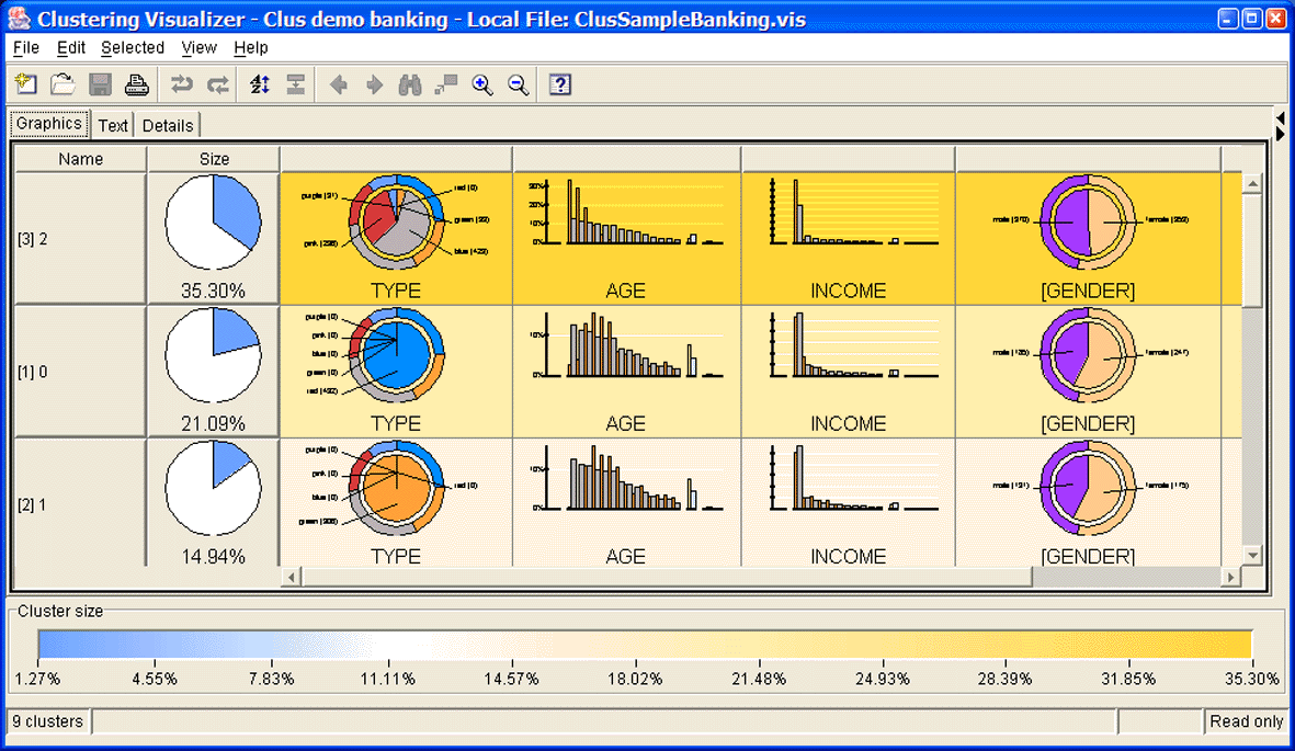
Figure 1: The Graphics View of the Clustering Visualizer of IBM Intelligent Miner.
Description: Figure 1 shows the graphical representation of the clusters in the mininig model. The view consists of a multi-column table. Column 1 contains the cluster name and column 2 contains the cluster size. The remaining columns show diagrams of the data fields that characterize the cluster. Pie charts are used for categorical fields, bar charts are used for numerical fields. Additional color coding for the chart background is used to indicate the cluster size.
End of Figure 1.
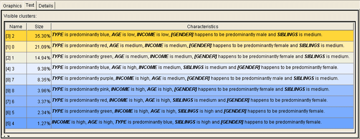
Figure 2: The Textual Description.
Description: Figure 2 shows the Text View of the Clustering Visualizer. This view consists of a tree-column table. Again, columns 1 and 2 show the values for the cluster name and size. Column 3 contains the textual descriptions that are generated from the diagrams. The descriptions for the first two clusters are:
Cluster 1 "TYPE is predominantly blue, AGE is low, INCOME is low, [GENDER] happens to be predominantly male and SIBLINGS is medium"
Cluster 2 "TYPE is predominantly red, AGE is medium, INCOME is medium, [GENDER] happens to be predominantly female and SIBLINGS is medium".
End of Figure 2.
List resources that you will reference during your presentation:
[1] Willuhn, C. Schulz, L. Knoth-Weber, S. Feger, and Y. Saillet, Developing Accessible Software for Data Visualization, IBM Systems Journal, Vol. 42, No. 4, 2003; http://www.research.ibm.com/journal/sj/424/willuhn.pdf.