Quick Start Guides/Styling of Examples
Background
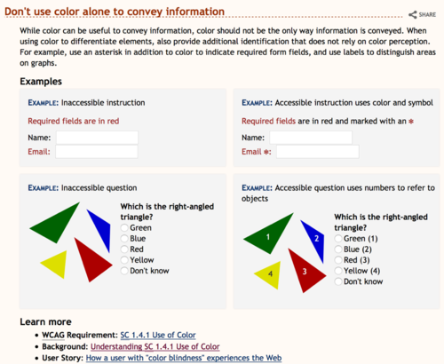
A new concern was raised about how well example captions stand out and introduce examples. Additionally, we have an existing open issue about the examples being too distracting. GitHub #89 is a short one worth a skim, and if you want to more, follow the links to issues 30 and 53.
The following alternatives present complete examples, yet you might prefer some elements from different alternatives. Feel free to comment on elements from different approaches that might be combined into a different approach, or add your own suggestion.
This was explored in the EO Survey of 21 Aug 2015.
EOWG participants: Please add your comments to each alternative below.
General Comments on Example Styling
- Comment {Name, date}
- This is a good selection for the sample because it is pretty visually noisy - there is a lot going on. The differences seem quite subtle to me because I don't relate that much to illustration. I am naturally more drawn to text and so will look for explanation rather than expect to learn from the graphic. So I am not at all sure if my opinion has any value at all but here it is. I don't at all like alternative 3, it seems confusing with all the horizontal lines. Any of the others seem OK to me and my actual mild preference is for the existing graphic. {Sharron, 01 Sept}
- example numbers — Some Alternatives below have examples labelled 1,2,3,4. I strongly disagree that these are 4 different unrelated examples, as the numbering indicates. There are 2 sets of related examples. {Shawn}
- bad examples — I think it's not clear enough that some examples are BAD examples that you should NOT do, for example, under Make link text meaningful. Even if the caption kinda tells you it's bad, I think it would be good to have a clearer indication; for example, a red X before the bad caption and a green checkmark before the good caption. (although I wouldn't want them to be too attention-grabbing, so maybe pale colors and small :-) [medium] {Shawn}
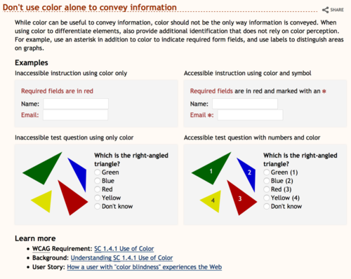
Existing style
Comments existing
- Comment {Name, date}
- Examples are well delineated
- Will work for any of the examples
- Captions do not stand out enough
- -1. visually there is too much going on. {Shawn}
Alternative 1
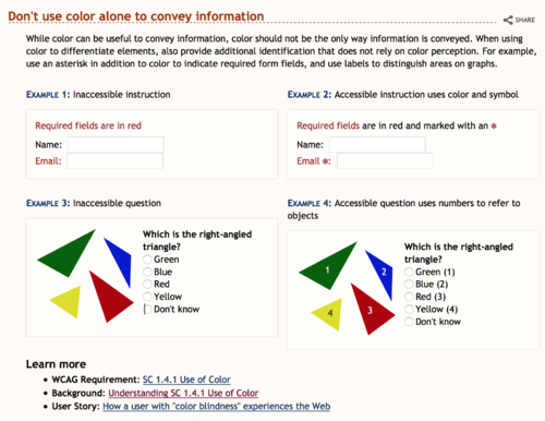
In this approach I have removed the 'Examples' heading (simply hidden from the viewport), use the 'Example \d: ... ' structure to highlight the captions, toned down the grey background to make it less prominent.
Comments 1
- Comment {Name, date}
- Caption highly visible with clear association
- Presentation of examples is not as visually outstanding
- Examples are kept distinct
- Will work for all example types
- Is consistent with other WAI resources (Easy Checks)
- Suppressing 'Examples' as a heading might make it difficult for screen readers to find the examples quickly on the page.
- This would be my recommended approach subject to comment as it is the most usable and, IMHO, addresses all the comments {Kevin, 21 Aug}
- 0. not my preference (see comments on others below), but I could live with it. -- except not sure about "EXAMPLE" being all caps and blue... {Shawn}
- +1 The least visual noise, but provides clear separate. We should come up with global styling standards for these types of styling so that we don't have to revisit every time a new tutorial is made. {Melody, 2 Sept}
- -1 does not solve the problem of making the captions more visible. {James, 3 Sept}
Alternative 2
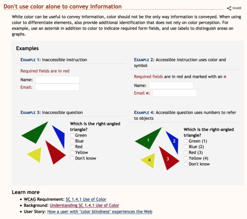
Greyed out entire example block, used caption label with different color to make stand out a bit, used a bottom border on the caption to separate caption from example.
Comments 2
- Comment {Name, date}
- Brings all the examples together
- Works ok in mobile view
- Examples heading now has to be indented
- When the caption splits over two lines the underline makes it more prominent
- Difficult to pull out relationship between examples (significant in this case but not always)
- Approach will not support all example types
- This is one example, looking at it in the whole page results in big blocks of grey for each of the examples
- Might reduce the relationship of ‘Learn more’ with the rest of the tip.
- [strong] I really dislike using horizontal lines as a method for splitting text. It adds a significant amount of visual noise and seriously interrupts the flow {Kevin, 21 Aug}
- I dislike horizontal lines to separate text as well {Sharron, 01 Sept}
- +1. [strong] I like that the Examples are all on one background color, and the Examples heading is indented. I think it really helps with the overall clutter and focus problem -- e.g., "I also found the page cluttered and so my attention was pulled in many directions while I was looking for its flow." review e-mail.
Personally I like the separator line, and I respect that others don't. So I propose "we" tweak this design to have the benefit of the examples on one background, but without that separator line -- using another way to separate the caption. {Shawn}
Alternative 3
This approach incorporates some of the design ideas from the tutorials. It uses the bar, same color for the caption, and changes to all caps (actually small-caps but only one capital so not worth quibbling).
Comments 3
- Comment {Name, date}
- Caption may be lost in the example
- Caption may be considered part of the example
- Heading may be too long and involved
- Heading may end up repeating some information that needs to be in the caption
- Border may grab too much attention
- Examples are well delineated
- Approach will not support all example types
- -1. I agree that the lines on the left give the examples more attention than we want in these Tips pages (which is different from the Tutorials in that respect). {Shawn}
Suggested tweaks 3
- Don't use small caps
Alternative 4
This approach simply changes the example heading.
Comments 4
- Comment {Name, date}
- Will work for all existing examples
- Examples are well delineated
- May not address original concern as caption is still simple and above the example box
- Heading may be too long and involved
- Heading may end up repeating some information that needs to be in the caption
- -1. It has the same problems as the current approach -- there's too much going on visually -- e.g., "I also found the page cluttered and so my attention was pulled in many directions while I was looking for its flow." review e-mail) {Shawn}
- i like the subheadings here, but feel that it still doesn't solve the original problem. i think i would prefer this if you just extended the gray boxes up to include the caption and made the captions bold.{James, 3 Sep}
Alternative 5
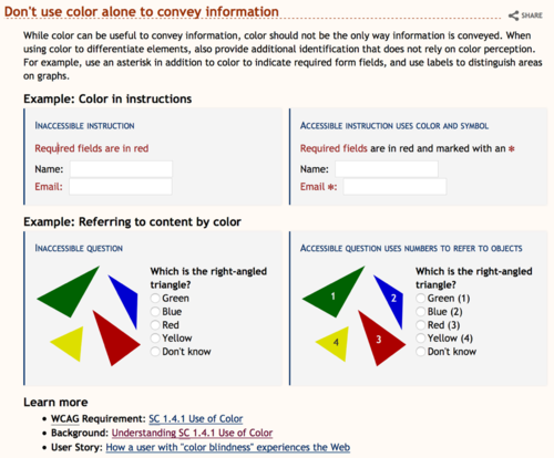
Incorporates the caption into the example box with a leading ‘Example:’ to help distinguish it from the actual example content. Styles the label to help differentiate it from surrounding content. Avoids styling the caption itself to maintain readability and avoid it looking like a link. Removes border to reduce visual noise.
Comments 5
- Comment {Name, date}
- Caption stands out well from example without being separated
- Does not grab too much attention
- Heading does not introduce specific example content.
- Says ‘Example’ quite a bit
- Might additionally benefit from index for the examples, so ‘Example 1:…’, ‘Example 2:…’, etc. where there is more than one example
- Examples are well delineated
- Approach will not support all example types
- -1. It's not as cluttered as other above, but not as good as others, too. :) Also, I disagree with "Caption stands out well from example without being separated" - I think it's not as easy to distinguish the caption form the example, without a line or something. {Shawn}
Suggested tweaks 5
- Don't use small caps
- suggest moving the mandatory '*' outside of the colon. ex. Email:* instead of Email*:
