
Prelim Eval 2013-October-25
Nav: EOWG wiki main page > Evaluation Pages
[Old Web Accessibility Preliminary Evaluation page]
This is an old archive of the Easy Checks wiki page
To Do
Page titles
- [OPEN action] Find a keyboard way to display the full page title in IE 9 and later and chrome.
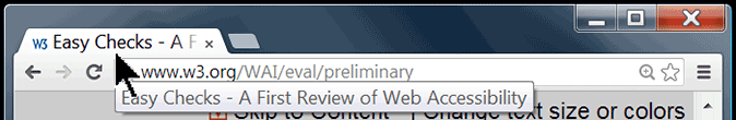
- Chrome and some versions of IE do not have a title bar. In those browsers you can see the full page title by hovering over the tab [@@keyboard way to do this?], like this: [@@ need to redo this image with a browser that does not have a title bar]
- comment {name}
Headings
- [EOWG comment] Learn more about headings - Delete the techniques? Elsewhere we just have links understanding success criteria. Would it be too much -- and beyond Easy Checks goal -- to list all the relevant techniques for each section?
- comment {name}
Contrast
- [OPEN action] To check contrast with IE WAT - finish instructions
- comment {name}
Keyboard access and visual focus
- [EOWG thoughts?] Is it specific and clear enough to write: "To select a specific item within an element such as a drop-down list, press the Enter key or Space bar."
- comment {name}
Multimedia (video, audio) alternatives
- [OPEN action] In Section "captions", look for a way to turn on open captions with the keyboard, for example in Youtube activating the CC button. (How to do it with nvda from Howard.)- Did some more checking with NVDA & YouTube - see my updated comments at this url - Howard
- [EOWG thoughts?] "If there are captions, transcripts are not usually required; however providing transcripts in addition to captions has many benefits — both to people with disabilities and to website owners. [EOWG: OK to say??]" Should we point to Benefits?
- [EOWG thoughts?] "Check that transcripts include all audio information, including dialogue with the speakers identified, and all important sound [repeat examples above or not?]."
- comment {name}
Forms and errors
(Other open issues are being discussed in the Forms section below.)
- [EOWG thoughts] In BAD, it seems that the focus does not go to the error messages. Shall we still include BAD for checking errors? We can submit a change request for BAD, but it will likely be a while before it gets implemented.
- [OPEN action] suggest edit for: "Data tables will not make sense when linearized -- that's OK -- screen readers have functionality to make them usable (when the table is marked up correctly)."
- [EOWG thoughts] suggest edit for: "Check that the information makes sense, for example, [@@ reading order]."
- [New item] Added draft text for "Check labels if you are comfortable looking at code" in Forms section, below
- comment {name}
Plain text view / Linearize
- [EOWG thoughts] [ Make sure that there are reasonable ways to skip around long lists of links and other boiler plate content that is repeated on every page in the site. @@ need to be more specific on this one - how do they check that? what specifically are they looking for? or is this not a priority and we should leave it out?]
- [EOWG thoughts] To practice checking plain text view with BAD section: Do we want to point out other things?
- comment {name}
Next Steps
- What else to list as other accessibility issues not covered in these easy checks?
- comment {name}
Throughout:
- [wait until illustration strategy is decided] Check img alts - some might have @@
- [wait until illustration strategy is decided] Decide if we want more images for the steps. Search for [image].
- [done for now] Search for other open things in [brackets].
- Search throughout for the perspective that the content needs to work, rather than the user has a limitation. e.g., 'users need to be able to' vs. 'websites need to enable users to' {Shawn}
- comment {name}
Misc:
- Ask Identifying Web Accessibility Issues to link to Easy Checks when it's more done.
- Zoom - keyboard shortcuts. Following up public comments I rechecked the content of text only and whole page zoom. In Mac Safari and Mac FF, when you use the View drop down and select text only zoom - it puts in a tick and then any increase/decrease impacts text only (using cmd with + or -). BUT in Windows FF, you can chose either page or text zoom from View menu. However, the keyboard short cuts are different for text an page zoom. Zoom page is the default ctrl + or - with ctrl zero for reset to default. Text only zoom is thus "control key AND shift key with + key all at the same time". I recommend we add this as an extra line to step 2.
I don't use IE much and I don't use a mouse - but does anyone know if it still does zoom using the mouse wheel? Also is this only page zoom? (For reference I am on v22 for both Mac FF and Windows FF){Suzette}
- comment {name}
Using these Easy Checks
Draft wording for the beginning of Using these Easy Checks <- follow link to see it in context.
Click button next to headings to get hidden information
Some sections of this page might not apply to your situation, for example, they are for a browser you don't have, or you only need to read them once. These sections are hidden by default so they don't clutter the page. You can expand them to see the information. The headings of hidden sections have a plus button [+] before them. Screen readers will say something like: "graphic, expand this section". To get the hidden information, click the button next to the heading.
The sections below all have hidden information with expandable headings. We recommend that you expand the headings and and read these sections the first time you read this page.
Comments? Other suggestions?
- To be more clear maybe: To get the hidden information, click this image button next to the heading. And since de effect also occurs by clicking in the heading itself the text could be: To get the hidden information, click this image button next to the heading or the heading itself {Emmanuelle Gutiérrez y Restrepo}
- Agree with Emmanuelle's comment above regarding clicking the link. It might be helpful to add something like expand all sections by clicking the expand all sections button, and collapse all sections by clicking the collapse all sections button OR rephrase the bold text to read We recommend that you click the "expand all" button and read all these sections the first time you read this page.{Paul Schantz, 2013/10/24}
- Last sentence should be made clearer:
Maybe write the sentence the other way and delete one "and".We recommend that you expand the headings and and read these sections the first time you read this page.
This would be: The first time you read this page, we recommend that you use the "expand all" button to display all headings. This would enable you to read all sections. {Sylvie, october 25, 2013} - I read this differently from Sylvie as "We recommend that you expand the next four headings and read these sections the first time you read this page." {Andrew, 25 Oct}
Page Title
Under "What to do", "In those browsers you can see the full page title by hovering over the tab [@@keyboard way to do this?],". You can access the page title by pressing Control+D to add a bookmark (you can copy it or read it and then just press cancel). Chrome has a "View page info" option in the context menu (I'm using Windows here) but unlike Fireofx it doesn't display the page title.
In my installation of Internet Explorer 9, the title is displayed. However, if it isn't, you can press the context menu key or shift+F10 and select "Properties", which shows the title in the properties sheet.
{Alan via e-mail}
EOWG: Does Shift+F10, Properties bring up the Properties dialog box with the page title at the top in different versions of IE?
Comments:
- IE8 on Windows Vista - yes (but the page title is shown anyway)
- Tested in IE9 with Win7 Professional = works but you need to reach the Properties modal first {dboudreau, 20130809}.
- comment {name}
Zoom Text
Comments:
- comment {name}
Keyboard
Comments:
- comment {name}
Previous Comments:
- [last sentence of the introduction] The sentence "Keyboard focus should be visible and logical through the page elements" is not as understandable as it could be. The words "visible and logical" are different concepts. It might work better expanding a little and keeping the user's point of view used in the rest of the paragraph. For example, "As a user moves the focus from one page element to the next, she/he needs to be able to see which one currently has focus. The order needs to match the way the user reads the content." {Alan via e-mail}
EOWG proposal: just drop this sentence all together. The details of what to check and how to check it are below and don't need to be said here.- comment {name}
- [done - deleted "indicator" so it reads: "Check that the focus is clearly visible as you tab through the elements..."] Under "Visual focus," "the focus indicator" suggests some kind of device, rather than simply a change in appearance. Maybe it would be clearer as "the focus is clearly indicated." {Alan via e-mail}
[changed "for example: to "e.g.,". didn't start new sentence because it would have given the example too much weight] Maybe start a new sentence in "has focus, for example...", like "has focus. For example, ..." {Alan via e-mail}
- [done - added "without triggering an action." (didn't bold "all")] n the "Drop-down lists and image links" section, maybe add emphasis to "all" in "move through **all** the options." Perhaps append "without triggering an action." {Alan via e-mail}
- Illustrations of focus indication would be useful. Shall I send screen shots to the list or how to provide? {Sharron}
Send them to Shawn & she'll upload them :) {Shawn}
Forms, form labels, and error messages
DRAFT of addition to Forms Section
If you have a basic familiarity with HTML, you can drill down on how the form is coded. While HTML allows both explicit and implicit form labels, some assistive technologies do not correctly handle implicit labels. One of the most reliable techniques for making forms accessible to assistive technology is therefore to use the label element to explicitly associate the form control with the label. This ensures that however the user comes to the form control, its purpose will be clear. If you are comfortable looking at the code, the following will help you identify accessibility features.
What to do:
- Open the source code of the page you are testing and find the section that contains the form.
What to look for:
- Verify that a
labelis attached to the form control through the use of theforattribute. The value of theforattribute must be the same as the value of theidattribute of the form control. Theidattribute may have the same value as thenameattribute, but both must be provided, and theidmust be unique in the Web page.
{Sharron, 3 Sept 2013}
Comments after 14 June
- comment {name}
- Completing forms: I think some illustrations will be useful to the novice trying to understand forms using the WAT results. I am not sure how the proposed image in step 2 will differ from the image in step 3. In either case showing a present and absent label for or id will be sufficient. For step 5 however, I cannot see how WAT helps - surely you have to look at the code view to see if the asterisk is included or excluded - or am I missing something? Would an image help? {Suzette}
- Update to WAT: Many many thanks are due to both Steve Faulkner and Jim Thatcher for resolving some issues with form checking using WAT. Newest version of WAT is currently 2013-07-19 and not 2013-06-13 as stated in Easychecks introduction. {Suzette}
- [EOWG] Reconsider: are the labels checks are too hard for Easy Checks? (Suzette say more here? : I'm trying a typical college application form with no apparent track record on accessibility: http://www.newham.ac.uk/pages/studentshomepage/findacourse/onlineapplication. The tabbing seems to work, including the drop down boxes.
Downloaded new version of WAT - it is clearer that something is wrong than in previous version - many things are labelled now as input errors and also select errors and container errors - which Easychecks don't mention. Some specific fields picked up as lacking 'label for'. Is there a simple explanation for input and select errors? WAVE was easier to understand with its red and green luggage labels but there is a lot of other issues identified too. FF has a feature on Forms/ outline form fields without labels - the outline is a bit too subtle and easy to miss! On the other hand, if the form passed most success criteria I guess the whole thing would be much simpler! Is it sufficient that the novice tester can just say that this form needs further investigation?)
- [EOWG review] "Check that the focus is at the error message."
Proposal for clearer guidance:
After you have submitted the form with errors, check that your browser brings you directly to the first error on the page. One best practice is to list all errors at the beginning of the form that contain an internal link leading directly to each error."{Sylvie, 17 June}- Two questions with this:
- How do people "Check that the focus is at the error message" or "check that your browser brings you directly to the first error on the page"? I think this is easy to check with a screen reader but maybe not visually?
Response from Sylvie on June 18: if you take the example of search engines like Google, when you open the home page your browser prompts you directly to the search field, and this even without a screen reader. I am right?
Response from Shawn on 25 June: Yes, but how can the the person doing the check check that? Visually, if it is a text box, there is a cursor. How check non-visually? What if it's a control other than a text box? Or just a plain text message? How check that the focus is there? - The next bullet says: "Generally it is best if the error messages are before the form, rather than after the form." Is saying "One best practice is to list all errors at the beginning of the form that contain an internal link leading directly to each error." too prescriptive? If not, how can we integrate it into the existing bullet?
{Shawn, 17 June}
I am not sure if it is too prescriptive. It is only an example of what can be done to help the users find the errors. {Sylvie, 18 June}
- [EOWG review] In the note for labels checks, clarify following sentence:
{Sylvie, 14 June}"Note: These instructions help you check if labels are marked up with 'label', 'for', and 'id'; they do not check if form controls are identified in other ways. Therefore, even if a form does not pass these checks, it might still meet WCAG 2.0 another way."
- I added the sentence before in your blockquote. Can you say what is not clear? How me might clarify it? {Shawn, 17 June}
- I mean the sentence: "Therefore, even if a form does not pass these checks, it might still meet WCAG 2.0 another way." I am not sure that this "another way" is clear. {Sylvie, 18 June}
- [EOWG]: Do we want to be more specific? Or how else can we be clear without being too techy and detailed?
- Would it be any clearer if "be WCAG another way" were changed to "meet WCAG in another way"? {Bim, 28 June}
- [closed ?] In Check labels with FF, I don't understand following note:
What does this enable you to do? Why do you mention that it requires installation, as FF toolbar also requires installation. More explanations are needed here. {Sylvie, 14 June}(There's not an easy way to check form control labels with the FF toolbar. The Form Labels favelet works with Firefox, yet it requires installation.)
- OK, I added more explanation: "The Form Labels favelet works with Firefox and provides the same information as from IE WAT above." We mention it requires installation because in the beginning we say we only use to 2 tools that require installation, so this is an exception. {Shawn, 17 June}
Closed comments:
- [done. changed to drop-down lists] I thought we talked in one eowg conference about the term "drop-down list box". Is it really the right term or don't you call them drop-down lists? {Sylvie, 17 June}
- "drop-down list box" seems clearest. Is that OK? {Shawn, 17 June}
- I never heard that before but if it is the current term, it is ok. {Sylvie, 18 June}
- [closed.] I am not sure if it is linked to my screen reader, but I am not able to have the links work, such as the link to drop-down list box. {Sylvie, 17 June}
That's because the in-page links go to other sections that are now in the main document at /WAI/eval/ but not in this draft (at /WAI/EO/Drafts...) anymore. They should work when we move this section into the main document. - [fixed.] In the paragraph "Error handling", first sentence, there seem to be a typo:"Some single simple forms, such as a single search fields,"write "a single search field". {Sylvie, 17 June}
Earlier comments still open 18 June
- [EOWG open - heading for this section simply "Forms?" or more?]
Title on current version is "Forms and Error Messages" but in this wiki it's "Forms, Form Labels, and Error Messages." I prefer the latter {Howard, 6 June}- Currently the section covers: Labels, Keyboard Access, Instructions, and Error Handling" Maybe keep it short and just use "Forms" ? {Shawn 10 June}
Linearize
- comment {name, date}
[EOWG open]What to call this section?
(Keep in mind how it fits with the other items in the contents list.)
Brainstorms:
- Plain Text View
- Linearize the Page for Experiential Learning
- Basic Display
- Bare Bones Display
- How some people "see" the web page
- Information Organization
- Different Presentation
- ...
Comments:
- I think plain text is a misleading term. It makes me think of the <pre> element. Very fixed and very rigid. Linearized text, is marked
up HTML. There are links, headings, paragraphs everything but style, and regrettably data tables. Actually it is styled with the default
HTML style. Links are blue, headings are big and lists are lists.
Linearizatized text is very structured markup in a different format. If linearize is to geeky how about "reading order" --convert the page to reading order.
For me plain text has a very bad connotation. People used to give ASCII page equivalents that were rarely equivalent. These alternatives were referred to as "plain text" alternatives.
{Wayne, 17 June} - It's more than linearize or reading order, it turns off images & CSS as well. {Shawn}
- I think "Linearize" has a foundation that can be explained and is traditional. But it could also be something like, "undress the page", or "stripping the page".{Emmanuelle, 18 June}
- I agree with Wayne about the bad roof of plain text. I am afraid people think that making a page accessible is providing a text version without images and anythhing else. I like Emmanuelle's "undress the page" (I mean the idea in it). From the proposals above I would prefer "different view", or what about "alternate view or presentation?"? {Sylvie, 20 June}
- I find the current draft of this section somewhat confusing - sometimes "linearize" is used, sometime "plain text". The difference between the 2 are not clear, at least not spelled out. I found the diagrams confusing because there's no explanation of how you render in 1 column versus "page linearized with styles off." I'm a little concerned with the term linearized - it's not a term, I believe, that is used in any other tool such as Wave or Web Dev'l Toolbar, etc. Perhaps there should be only one example (since this is easy checks) - a page with styles turned off. Explain this is used to hear how a screenreader will render the page. {Howard, 27 June}
- How about "Text view" or "Reading order"? {Bim, 28 June}
- Among the suggestions above, I prefer:
- How some people "see" the web page
- Information Organization
- Or Bim's suggested "reading order".
- I also like the idea behind "undress the page". What about "simplify the page" or "basics of the page" or "See the page framework" or similar {Andrew, 28 June}
- comment {name, date}
Next Steps
- comment {name, date}
Contributors
Thanks to:
- Those who participated in the F2F before CSUN in February: Andrew, Anna Belle, Helle, Jennifer, Shadi, Sharron, Shawn, Wayne
- Those who edited in December and January: Suzette (forms, @@), Sharron (Intro, @@), Shawn (Intro, page titles, headings, alt text), Ian (zoom n text resize).
- Those who commented in December and January: Sylvie, Wayne, Anna Belle, ...
- Those who drafted checks 16-28 November:
- Sharron for drafting {list sections!}
- Suzette for drafting : Check usable with page zoomed and text enlarged, Check color contrast, Check color coding and shape coding, {?other sections}
- Wayne for drafting {list sections!}
- Andrew & Shawn for editing the keyboard access & visual focus section in early Nov.
- Ian, Suzette, Vicki, Sylvie, Helle, Shawn for working on an early draft at the f2f in Nov.
- Sharron for help making all the early drafts and versions less confusing.
- Wayne and Ian for sharing colleagues' related work.
- Denis for edits to the old page content.
testing image: ![]()
Internal Notes
Illustrations
Note:
- To see all illustrations, make sure to "expand all sections" because some of the illustrations are in collapsed sections. (however, keep in mind that most of the images will be collapsed by default)
- Make sure to evaluate the images in context, that is, read the text around it and imagine you are a user.
Questions: How is the current use of images for illustrations throughout the draft? Too much? Not enough? Mostly helpful? Too cluttering? Feel free to comment in general, and on specific images.
- comment {name}
- From 24 May teleconference:
- Generally the conceptual images are useful for contrast and zoom; simply the page title images {done 24 May}.
- Mixed perspectives on the images showing menu items and such. For some people they are just clutter, the word instructions are clear enough. For other people, the images really help.
- For now:
- Include images showing menu items and such judiciously — if in doubt, do not include an image.
- Crop or gray out all unnecessary clutter in images. (for example, page-title-image has the content of the web page grayed out.)
Strategy:
I'd like to discuss strategy for illustrations. {Anna Belle, June 9} Here are questions to consider:
- Do we want to use captions? Always? Sometimes? If sometimes, then what distinguishes when they are needed?
- I think it is visually simplier without captions. The images are all illustrations of specific points and the images are right after the points, then I don't think they need captions. {Shawn, 12 June} Agree {Andrew, 13 June}
- If we use captions, then how? E.g. do we give a 10 pixel padding with a border that encloses both image and captions?
- Do we have images embedded in the text flow or do we separate them out (e.g. float to right)?
- I suggest embedded in the text flow. {Shawn, 12 June} Agree {Andrew, 13 June}
- In some images do we want to use embedded explanatory text and arrows? This may be necessary if we aren't using captions. And even if we do use captions, for some concepts it may illustrate the point more clearly.
- I suggest keep them simple -- both for the users reading the page and for us developing the images. I think it would be best to crop and gray out an irrelevant information in the images, and not have to use arrows. Also, if the images are embedded and they are illustrating the text right above them, then they shouldn't need explanatory text. {Shawn, 12 June}
- What is the maximum width for an image?
- We previously decided to make most images 700px wide. We can revisit that decision. {Shawn, 12 June}
- If width is narrow (e.g. 350 pixels), some images will need to be shrunk to a size where detail may be lost. Is that okay? Or do we want to offer a link to a larger version of the image in such cases?
- I vote let's try to make the images useable in the page, and not add the complexity of linking to a larger image. {Shawn, 12 June}
- Do we want to number illustrations? Thus in the text we could say, "See Figure 3" multiple times if Figure 3 is relevant multiple times.
- If we were referring to a single image multiple times, then we would need to do something like this. However, I think we don't refer to an image more than once. Also, currently the images are embedded in the text right after what they illustrate. Therefore, I think it would add unnecessary complexity (both for users and for us ;-) to number the illustrations. {Shawn, 12 June} Agree {Andrew, 13 June}
- Do we want to incorporate all illustrations into the expand sections button? Or perhaps have a separate "See illustrations" button? (I dislike both of these ideas, by the way.)
- Currently there are 3 types of images:
1. Illustrate the concept (e.g., page titles, contrast, zoom).
2. Illustrate the toolbar things to click.
3. Illustrate the results from the tool, e.g., alt text next to images.
Currently the concept images (1) are always shown, and the toolbar images (2 & 3) are shown only when that specific checks step is expanded. I think this works well. [Agree {Andrew, 13 June}]
For the checks steps, we could have the illustrations not visible by default and a button to show illustrations. That might be best for usability; however, I don't think it's a high enough priority for our time. We do not currently have such functionality developed so it would be a new thing to do. {Shawn, 12 June} [Agree - and we don't need more delays in releasing {Andrew, 13 June}]
To see how it might work, I put Images illustrating linearized and changed display (click to show images)
- Currently there are 3 types of images:
- Do we want to limit illustrations to one per concept? If the concept is tricky to illustrate (e.g. how to see titles) do we want to offer the option of clicking through to more illustrations?
- I don't think we want the complexity (for the users or for us) of adding the option to get more illusrations on a different page. Right now we have the following concept images:
- Page titles - 1. shows page title in title bar and cut off in tabs. 2. shows how to get the title from the tab when there is not a title bar. [@@ we need to redo this image with a browser that does not have a title bar :-]
- Contrast - several images that show different color combinations that are mentioned in the text.
- Zoom - 2 that show a page not zoomed and zoomed.
- I don't think we want the complexity (for the users or for us) of adding the option to get more illusrations on a different page. Right now we have the following concept images:
- Do we want to standardize the format to the image? JPG? SVG? PNG?
- I think png {Shawn, 12 June}
- Would it be helpful to specifically state the goal for each illustration in the wiki? E.g. with titles, is it to show people how to see the title at the top of a browser (whether embedded in a tab or not)?
- Yes. Please do! ;-) {Shawn, 12 June}
- What should be the alt (&/or title) for illustrations in different cases, e.g., if the images are sufficiently described in the text, then null? {Shawn, 12 June}
- For the Page Title images: Let me change the suggestion to indicating this information with a title attribute - the images look different from what I see on my setup, so hovering would show what browser & version was being illustrated {Andrew, 15/March}
Recommendations for Illustrations:
Version 5
Examples of multiple image with long caption under zoom, plus single image, and another double image.
Current questions:
- Does this zoom well?
- Does the width shrink well? (This is aside from the figure container overhang on the right in the multiple image example at decreased widths.)
- In other words, is this a good base for tackling the next issues?
- Anything else about version 5?
(Next step: Get rid of the style in the HTML.)
CSS:
div.figure {
  max-width: 100%;
  margin: 1em 0;
  padding: 10px;
  border: 1px solid #aaa;
  background: #fff;
}
div.figure img {
  border: 1px solid #888;
  max-width: 100%;
  height:auto;
}
   /*
   div.figure.multimg {padding: 10px 5px;}
   div.multimg img {margin: 0 5px;}
   */
.figcaption {
  margin: 7px 0 0 0;
  font-size: 85%;
  color: #444;
  line-height:115%
}
HTML:
<!-- width is the width of the image(s) + for multiple images, 11px for in between images (to keep them from stacking) -->

<div class="figure" style="width:@@px;"><img.../> <img.../>
   <div class="figcaption">Figure:....</div>
   </div>
Version 5 Comments
- ... {name}
- in CSS:
div.figure... background: #fff;
Why have a white background? This makes the figure stand out even more from the text, which I think it not s good. {shawn} - the CSS from ABL &/or Wayne included:
div.figure.multimg {padding: 10px 5px;}
div.multimg img {margin: 0 5px;}
I don't see the reason for these. {shawn} - div.multimg img {margin: 0 5px;}
That's to give horizontal space of 10px between multiple images; in combo with the "div.figure.multimg {padding: 10px 5px;}" instead of "padding 10px;" it gives same border spacing as single images. I wonder if it wouldn't be good to do the same with vertical space for then they stack? {Anna Belle}
Version 2, 5 August 2013
Phase I
- Visually separate illustrations from the text flow by using a border and 10 pixel padding around them.
- Do not float illustrations that are intrinsic to the text.
- Use captions as a general rule.
- Gray out irrelevant information in the images, and avoid using arrows if possible.
- The maximum width is 700 pixels. Use CSS of max-width 100% and height auto so images shrink in narrower windows.
- Illustrations and their captions will be left-aligned -- not centered or right/left justified.
- Use PNG for the format.
- Specifically state the goal for each illustration in the wiki. This will help select the best illustration.
- The main text, not the captions, is used to convey the important information.
- Alt text should (1) briefly explain what is being illustrated and (2) reflect the browser (including the version) and operating system used for browser illustrations.
- In preparation for HTML5, embed illustrations in a div element with a class of "figure" and captions in a div with a class of "figcaption".
Phase II
- Convert to HTML5 so we can use <figure> and <figcaption> elements for illustrations.
- Add a widget to toggle illustrations on and off.
HTML:
<div class="figure" style="width:622px;"> <!--width of images + 20px for padding -->
  <img src="contrast-b-on-w.png" width="301" height="127" alt="black text on white background" />
  <img src="contrast-yellow.png" width="301" height="127" alt="yellow text on black background" />
  <div class="figcaption">Figure: High contrast examples.</div>
</div><!--.figure-->
CSS:
div.figure {
	max-width: 100%;
	margin: 1em 0;
	border: 1px solid #aaa;
	padding: 10px;
	background: #fff;
	text-align: center;
}
div.figure img {
	border: 1px solid #888;
	max-width: 100%;
	height:auto;
}
.figcaption {
	margin: .7em 0 0 2px;
	font-size: 85%;
	color: #444;
	text-align: left;
}
Comments on Version 2
- We should think about the overall approach to the main text, captions, alt, and title — to make sure we're not unnecessarily duplicating information, esp. for screen reader users. I think we run the risk of having unnecessarily verbose captions that add visual clutter — for example, they don't need to describe the visual: people who can see, see it - and people who can't, get it from the alt. What is the goal of the captions? {Shawn}
- I think the captions serve an important purpose. I agree they shouldn't be verbose. Using the luminosity contrast illustrations as examples, captions: immediately inform the reader what the illustrations signify before reading the text; it clarifies what the text refers to. It can take a few scans between the illustrations and the surrounding text to figure out exactly what graphics are referred to by what text. Captions avoid or help to eliminate this step. {Howard, 15 August}
- Not sure why the captions should be left aligned and not centered. What's the convention? (I think it's centered captions). Also, why no arrows or circles to emphasize the key portion of the illustration?{Howard, 15 August}
- 1) Centred text is hard for some people with reading difficulties to deal with as they have difficulty finding the start of the line (see also the advisory technique at Guideline 3.1); 2) I think arrows or circles would be useful in some illustration i.e. judicious use{Andrew, 23/Aug}
- comment {name}
OLD Version 1, Andrew and Anna Belle, 6/27/13
Phase I
- Visually separate illustrations from the text flow by putting border and 10 pixel padding around them.
- Do not float illustrations. Width issues and where they fall relative to the text are too complicated.
- Use captions as a general rule. Illustrations including captions within a border are visually simpler because the reason for their inclusion is explained rather than having to be deduced.
- Gray out irrelevant information in the images, and avoid using arrows if possible.
- The maximum width is 600 pixels.
- Illustrations will not centered, not right/left justified.
- Use PNG for the format.
- Specifically state the goal for each illustration in the wiki. This will help select the best illustration.
- Alt text should (1) briefly explain what is being illustrated and (2) reflect the browser (including the version) and operating system used for browser illustrations.
- Aside: We might consider embedding illustrations in a div element with a class of "figure" in preparation for HTML5. If we do this then the captions can go in a span with a class of "figcaption."
Phase II
- Convert to HTML5 so we can use <figure> and <figcaption> elements for illustrations.
- Add a widget to toggle illustrations on and off.
Illustration Goals
Plain text view:
- Visually illustrate the concept of linearize
- Simple example of how a layout can linearize in different order
- Show what they can expect when they follow the steps
- Show how people with low vision might change the display, to help show it's not just screen readers
Usability Testing
Features to test with users
- Expand/Collapse: test to see if the "+/-" icons convey this feature
- might want to consider putting text such as "expand/collapse" in addition to the "+/-" icons
- Meaning of terms such as "accessibility," "page title"
- Do users understand the term "accessibility"
- We assume that by the time users access this page they understand the term "usability." Perhaps this needs to be reconsidered.
- Do users understand what we mean by "page title" or do we need to explain further
- Do users understand the term "accessibility"
Case study notes
See SK/MC Case Study Notes in the 30 May 2013 snapshot
Consider for Later
- The text says: "The first thing screen readers say when the user goes to a different web page is the page title. Page titles are important for orientation — to help users know where they are and move between open pages."
Would it be useful to have a sound clip of the screen reader going through page titles? Low priority, but maybe neat for people who don't know screen readers? {Shawn}