

Tips and Tricks
-
Keep it simple: Complex tables are more work for content creators as well as being harder to interpret for users. It’s usually better to break up complex tables into simple individual tables, each containing the data for one sub-topic.
-
Table separation: If several tables follow one another, don’t use a single table and put in an additional row of
<th>cells. Screen readers may read aloud all<th>cells in a column, resulting in confusion. Start a new<table>when the topic changes. -
Data separation:
-
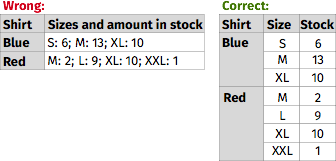
Make sure that each separate piece of data has its own cell. Don’t use headers in one column and all data in a second column, as this will make it almost impossible for screen readers to work out the relationships between data across columns.
-
Don‘t use line breaks (
<br>elements) to create table rows as the data in the pseudo-rows may no longer align correctly when text is resized.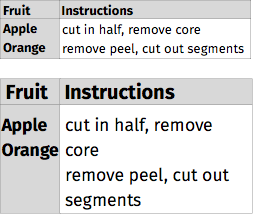
-
-
Alignment: Align text to the left and numeric data to the right (in left-to-right languages), so that people using screen magnification, larger text sizes, or smaller screens will be able to find it. This is especially useful if a cell spans more than one column. It’s helpful to give column headers the same alignment as the data in the cells below.
-
Styling header cells:
<th>elements are used for header cells, using<td>elements with different styling will make tables less accessible if not inaccessible. It is also helpful to differentiate<th>and<td>cells visually. For example, on these tutorial pages header cells have a dark gray background. -
Zebra tables: Styling even and odd rows in a different way can be helpful to people who have reading difficulties or who use screen magnification to enlarge text. It acts as a visual guide. Highlighting the cell (and row/column) on mouseover and keyboard focus to help people to see where they are also helps. Make sure that the contrast ratio between the text and background is good for both headers and data cells. Here is how to check the contrast ratio.
-
Flexibility: Due to the layout model of tables, they sometimes don’t fit on small screens small or are too wide if the user is using zoom. In such circumstances it’s important that the table isn’t cut off (for example by using
overflow: hiddenin CSS). In these tutorialsoverflow: scrollis applied to an element wrapping the table so users can scroll through the table horizontally but there are many more options to display table in such circumstances. -
Tables for Layout: Tables should not be used for layout purposes. Use Cascading Style Sheets (CSS) for layout. If there are already layout tables present, don’t use structural elements (like
<th>or<caption>) and attributes discussed in this tutorial, and do addrole="presentation"to the<table>element.
Other W3C Resources
- Content can be presented in different ways secton of Accessibility Principles in How People with Disabilities Use the Web.