
Bert Bos | CSS
masterclass – Amsterdam 2012
CSS Transitions
Allows property changes, such as those on
:hover or :focus, to occur smoothly over a specified
duration – rather than happening instantaneously as is the normal
behavior.
li#transition {
  transition-property: background, width;
}
April 2012: experimental implementations (prefixes)
(Module: css3-transitions)
Transition-property
Step 1: Specify which CSS property (or properties) the
transition effect will be applied to
transition-property: all;
transition-property: none;
transition-property: background-color;
transition-property: background-color,
  height, width;
Transition-duration
Step 2: transition-duration
transition-duration: 2s;
transition-duration: 4000ms;
transition-duration: 4000ms, 8000ms;
Note: Usually, you only need 'transition-duration', because
'transition-property' is by default 'all'
Transition-timing-function
Step 3: transition-timing-function
ease | linear | ease-in | ease-out | ease-in-out |
    cubic-bezier(<number>, <number>, <number>, <number>)
transition-timing-function: ease;
transition-timing-function: ease, linear;
transition-timing-function:
  cubic-bezier(0.6, 0.1, 0.15, 0.8);
Default is 'ease'
Cubic bezier function
Custom timing functions
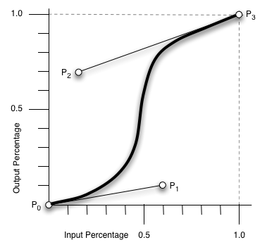
ease is equivalent to cubic-bezier(0.25, 0.1, 0.25, 1.0)
linear is equivalent to cubic-bezier(0.0, 0.0, 1.0, 1.0)
:nth-child(1):hover {
  transition-timing-function:
   cubic-bezier(0.3, -0.3, 0.7, 1.3) }
CSS Transitions
Step 4: transition-delay
transition-delay: 5s;
transition-delay: 4000ms, 8000ms;
transition-delay: -5s;