W3C

Bert Bos | CSS masterclass – Amsterdam 2012

Perspective context

To use the transform 3d keywords, we need an ancestor with a 3d rendering context.

.container {
    	perspective: 500px;
}
.container .transformed_rotate_x {
	transform: rotatex(50deg);
}

The value of the perspective represents the distance beetween the user and the screen.

3D rotate

From the demo:

.transformed_rotate_y:target{
  transform: rotateY(50deg);
}
.transformed_rotate_x:target {
  transform: rotateX(50deg);
}
.transformed_rotate_x_y:target {
  transform:rotateX(50deg) rotateY(50deg);
}

Nested 3D transforms

If a transformed element has a child itself transformed, the parent should preserve the 3D context for its children with 'transform-style: preserve-3d'

From the demo:

.parent {
	transform: rotateY(50deg);
  	transform-style: preserve-3d }
.yellow_child {
	transform: rotateX(50deg) }

3D translations

TranslateY and translateX are 2D transforms. Only translateZ uses the 3D context.

.transformed_translate_y:target {
  transform:translateY(40px)
}
.transformed_translate_x:target {
  transform: translateX(40px)
}
.transformed_translate_xy:target {
  transform:translateY(40px) translateX(20px)
}
.transformed_translate_z {
  transform:translateZ(80px)
}

Perspective origin

Changing the perspective origin

(Like in a renaissance painting, we can change the vanishing point)

From the demo:

.container.un {
  perspective-origin: 50% 50%  /* default */
}
.container.deux {
  perspective-origin: 0 50%;
}

Playing with perspective

From the demo:

.container {
	perspective: 500px;
	transform-style: preserve-3d;
	perspective-origin: 65% 10%;
}
.child {
	transform-origin:top left;
	transform: rotateX(90deg);
	transition:height 1s ease; /* movement */
}
.container:hover .child {
	height:472px;
	transition:height 1s ease;
}

A cube

Generalized 3D rotations

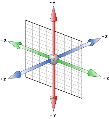
Turn around an arbitrary axis (x,y,z)

.rotated {
  transform: rotate3d(1, -1, 0, 60deg);
}

CSS Transforms

What's that fish!?

.fish{
  translate3d(-10px,40px,100px);
}
.open-face{
  transform: rotatez(-50deg)
    rotatey(90deg);
}