
Bert Bos | CSS
masterclass – Amsterdam 2012
border-image-slice & border-image-repeat
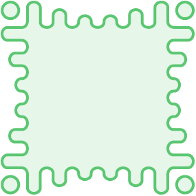
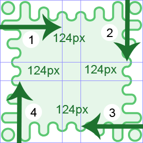
From the demo:
.border_groovy{
	border-image: url(groovy.png);
   	border-image-slice:124;
   	border-image-repeat: round }
2012: experimental implementations
(prefixes)
(Module: css3-background)
Gradients as border images
From the demo:
span {
     border-image: linear-gradient(blue, green)
      33% round stretch;
}
Border radius
From the demo:
div:nth-child(6) {
	border-radius: 160px 0 60px 0 / 160px 0 30px 0;
}
/* 4 horizontal angles / 4 vertical angles  */
Box Shadow
From the demo:
div:nth-child(2) div{
	box-shadow:rgba(102,90,74, .7) 3px 3px inset;
}