
Bert Bos &
Eva Kasal | CSS3 in Style
●
●
●
●
●
●
●
CSS3 Transitions are a presentational effect which allows property changes in CSS values, such as those that may be defined to occur on :hover or :focus, to occur smoothly over a specified duration – rather than happening instantaneously as is the normal behaviour.
Transition effects can be applied to a wide variety of CSS properties, including background-color, width, height, opacity, and many more.
li#transition{
	transition-property: background, width;
}
April 2012: experimental implementations
(prefixes)
●
●
●
●
●
●
●
Step 1: transition-property
The first step in creating a transition effect is to specify which CSS property (or properties) the transition effect will be applied to.
This can be done using the transition-property property, which can accept one of two keywords, all (the initial value) or none, or a comma-separated list of properties.
examples:

transition-property: all;

transition-property: none;

transition-property: background-color;

transition-property: background-color, height, width;
●
●
●
●
●
●
●
Step 2: transition-duration
The transition-duration property accepts a comma-separated list of times, specified in seconds or milliseconds, which determine how long the corresponding properties (specified using transition-property) take to complete their transition.
examples:

transition-duration: 2s;
transition-duration: 4000ms;
transition-duration: 4000ms, 8000ms;
Notabene: The transition-duration property is in fact the only property required to create a transition effect; if transition-property is not supplied, all properties that are able to undergo a transition will do so.
●
●
●
●
●
●
●
Step 3: transition-timing-function
The transition-timing-function property is used to specify how the pace of the transition changes over its duration. This can be done in one of two ways. Either by specifying a number of pre-defined keywords (ease, linear, ease-in, ease-out or ease-in-out), or by defining a custom timing function (by specifying four coordinates to define a cubic bezier curve).
the syntax:
 = ease | linear | ease-in | ease-out | ease-in-out
or
 = cubic-bezier(, , , )
examples:

transition-timing-function: ease;
transition-timing-function: ease, linear;
transition-timing-function: cubic-bezier(0.6, 0.1, 0.15, 0.8);
If no timing function is specified, the default value is ease.
●
●
●
●
●
●
●
Step 3 bis: transition-timing-function: bezier curve
In addition to the pre-defined timing functions, custom timing functions can be declared using the cubic-bezier function.
According to the specification:
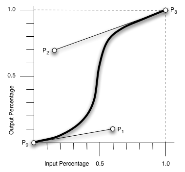
<timing-function> = cubic-bezier(<number>, <number>, <number>, <number>)
ease
The ease function is equivalent to cubic-bezier(0.25, 0.1, 0.25, 1.0).
linear
The linear function is equivalent to cubic-bezier(0.0, 0.0, 1.0, 1.0).
from the demo examples:

:nth-child(1):hover{
transition-timing-function:
cubic-bezier(0.3, -0.3, 0.7, 1.3);
}
●
●
●
●
●
●
●
Step 4: transition-delay (optional)
The transition-delay property accepts a comma-separated list of times, specified in seconds or milliseconds, which in this case determines the length of time between the transition being triggered and the transition starting. The default value is 0, the transition will commence as soon as triggered.
examples:
transition-delay: 5s;
transition-delay: 4000ms, 8000ms;
transition-delay: -5s;