1. Dependencies on other modules
This CSS module depends on the following other CSS modules:
2. Introduction & definitions
How to center the text of a block element horizontally (more precisely: in the inline direction) even if (part of) the block is next to a float?
How to center a block horizontally in its CB if the block is wider than the CB? (I.e., when 'margin: auto' doesn’t work and the document structure doesn’t allow transforms or flexbox.)
How to center or distribute blocks vertically when flexbox doesn’t apply (e.g., because the blocks aren’t siblings)?
Investigate if it is possible to make a pseudo-element to select anonymous boxes ('::paragraph'). See minutes of 10 Aug 2011.
Note: The model in this specification differs from the model described in the CSS level 2 specification [CSS21], because it is generalized to apply also to vertical text. A document using only features from level 2 renders exactly as described there, except possibly for features that are undefined in that specification and have become defined since.
CSS assumes that the document to lay out is modeled as a tree of elements. Each element has an ordered list of zero or more child elements, with an optional string of text before the list, in-between the children and after the list. Each child has one parent, except for the unique element that has no parent, which is called the root element.
Note that such a tree can be described in XML or SGML, but also in other notations and that it is the definition of that notation, not CSS, that determines the equivalence between the abstract tree and the concrete notation. E.g., SGML often allows white space to be added between elements for readability, which does not result in a string of spaces in the abstract tree.
CSS describes how each element and each string of text is laid out by transforming the document tree into a set of boxes, whose size, position, and stacking level on the canvas depend on their properties. We say that an element generates one or more boxes.
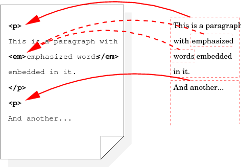
Relation between four displayed boxes in the rendered document (on the right) and the three corresponding elements in the source document on the (left).
For example, a fragment of HTML such as
<ul> <li>The first item in the list.
 <li>The second item.
</ul>
may result in [rewrite the following
sentence?] one block-level box for the ul element,
containing two block-level boxes for the two li elements,
each of which has one line box (i.e., one line of text). Both line
boxes contain two inline-level boxes: one that contains the list
bullet and one that contains the text.
Note how the li is transformed into multiple boxes, including
one that contains “generated content,” viz., the list bullet,
which is not present in the source document.
If the document is rendered in a narrow window, it may be that the li elements get transformed into even more boxes, because the
text requires multiple lines. And if the document is rendered on paper
or in multiple columns, it
may be that a page break falls in the middle of the ul element,
so that it is not transformed into a single block-level box, but into two
smaller ones, each on a different page or column.
Each box belongs to exactly one element. It is either generated directly by the element, or it is an anonymous box, which has been inserted to ensure that every box and its parent are of mutually compatible types as defined by the layout rules of CSS. An anonymous box is defined to belong to whichever element generates the box’s closest element-generated ancestor box. When we need to be precise, we say that the anonymous box is induced, rather than generated, by the element it belongs to.
For example, an anonymous table wrapper box that is created around a table cell because the table cell element doesn’t have a table element as parent, belongs to the parent element of the table cell, not to the table cell itself.
An anonymous box is never a principal box. Except for that, an anonymous box cannot be distinguished by its property values and characteristics from a box generated by some hypothetical document element. Remove this note? Do we actually use the concept of “principal box” anywhere?
Do boxes have properties? Or do they just have margins, borders, padding, a size and some content (which may be text in a certain font and a certain color, but without the box itself having a font or a color property)?
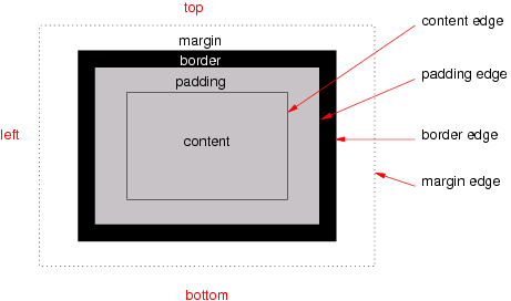
The various areas and edges of a typical box
Boxes have padding, a border and margins (see the figure). Different properties determine the thickness of each of these (which may be zero). The margins of adjacent boxes are also subject to collapsing (i.e., the actual margin between adjacent boxes may be less than the sum of the boxes' individual margins).
Each box has a content area (a.k.a. content box). The rectangle that bounds this area is the content edge. Around the content area is the padding area and its outside bounds are called the padding edge. The padding area and content area together form the padding box. Outside the padding is the border area and the outside boundary of that area is the border edge/ The border area, padding area and content area together form the border box. Finally, outside the border is the margin area and its outer edge is the margin edge.
When the specification says that the padding or border is “absent” on some side of the box, that means that its thickness is zero.
Line boxes cannot have any padding, border or margin, and therefore their margin edge, border edge, padding edge and content edge all coincide.
Note that the margin, unlike the border and padding, may have a negative thickness. That is one way to make adjacent boxes overlap each other.
Note that the edges always form rectangles, even if there is a border-radius [CSS3BG] or a shape [CSS3-EXCLUSIONS].
We say that a box or element is horizontal if its writing-mode property is horizontal-tb, otherwise it is vertical (see [CSS3-WRITING-MODES]).
Calculations of the size and position of boxes are usually very similar for horizontal and vertical boxes, except that the horizontal and vertical directions are interchanged. To avoid many almost identical definitions, this specification therefore often uses abstract terms instead of top, right, bottom, left, width and height: four terms (block-start, block-end, inline-start and inline-end) for the four edges of a box, four terms (A edge, B edge, C edge and D edge) for the edges of the children of a box and two terms (measure and extent) for the width and height of a box.
XSL-FO [XSL11] uses “inline-progression dimension” for “measure” and “block-progression dimension” for “extent.”
The following terms are defined in [CSS3-WRITING-MODES]. For convenience, here is a short summary.
The block-start, block-end, inline-start and inline-end edge of a box refer to the top, right, bottom and left edges, depending on the writing-mode and direction properties of that box, as follows:
| writing-mode | direction | “block-start” | “inline-end” | “block-end” | “inline-start” | Diagram |
|---|---|---|---|---|---|---|
| horizontal-tb | ltr | top | right | bottom | left | 
|
| rtl | top | left | bottom | right | 
| |
| vertical-rl, sideways-rl | ltr | right | bottom | left | top | 
|
| rtl | right | top | left | bottom | 
| |
| vertical-lr, sideways-lr | ltr | left | bottom | right | top | 
|
| rtl | left | top | right | bottom | 
|
For example, the “block-start padding” by default refers to the padding-top and the “inline-end border” is by default the border-right.
Similarly, the specification sometimes refers to the measure and extent of a box, instead of width and height, as follows:
| Writing-mode | “measure” | “extent” |
|---|---|---|
| horizontal-tb | width | height |
| vertical-rl | height | width |
| sideways-rl | height | width |
| vertical-lr | height | width |
| sideways-lr | height | width |
These correspond to the dimensions in the inline base direction and the block flow direction, respectively.
An alternative term for the measure is logical width and an alternative term for extent is logical height. These terms occasionally occur in other CSS modules.
The extent of a box is thus the distance between the block-start and block-end edges, while the measure of the box is the distance between the inline-start and inline-end edges.
When boxes are laid out to form a flow (see below), their edges play different roles in the alignment of the boxes within that flow. The orientation of the flow determines which edge of a box is aligned to which edge of another box. These roles are independent of the orientation of the box itself. We distinguish four roles for the edges of a box, called A edge, B edge, C edge and D edge. They depend on the writing-mode and direction properties of the box’s containing block (defined below), and map to the four sides as follows:
| writing-mode of containing block | direction of containing block | “A edge” | “B edge” | “C edge” | “D edge” |
|---|---|---|---|---|---|
| horizontal-tb | ltr | top | right | bottom | left |
| rtl | top | left | bottom | right | |
| vertical-rl, sideways-rl | ltr | right | bottom | left | top |
| rtl | right | top | left | bottom | |
| vertical-lr, sideways-lr | rtl | left | bottom | right | top |
| ltr | left | top | right | bottom |
The edges of a box whose containing block is horizontal.
For example, block-level boxes in a flow are laid out such that the A edge of the first box is against the block-start edge of the containing block and then the A edge of each subsequent box is put against the C edge of its predecessor. For typical English text (i.e., horizontal text), this means the top edge (= A edge) of the first paragraph is at the top edge (= block-start) of the document, the top (A edge) of the second paragraph is against the bottom (C edge) of the first paragraph, and so on, until the bottom (C edge) of the last paragraph becomes the bottom (block-end) of the document.
An element is called orthogonal if it is either a vertical element with a horizontal containing block or a horizontal element with a vertical containing block. An orthogonal flow is a flow whose flow root is an orthogonal element.
3. The viewport and the canvas
User agents for continuous media generally offer users a viewport (a window or other viewing area on the screen) through which users consult a document. User agents may change the document’s layout when the viewport is resized (see the initial containing block).
When the viewport is smaller than the area of the canvas (see below) on which the document is rendered, the user agent usually offers a scrolling mechanism. There is at most one viewport per canvas, but user agents may render to more than one canvas (i.e., provide different views of the same document).
For all media, the term canvas describes the space where the formatting structure is rendered. The canvas is infinite for each dimension of the space.
4. Containing blocks
The containing block of a box is a rectangle that is associated with the box and that is used in various definitions in this specification. Apart from a size and a position, the rectangle also has direction and writing-mode properties. The containing block of a box is defined as follows:
- The containing block of the root element’s top-level boxes is a rectangle with the dimensions of the viewport, anchored at the canvas’s origin for continuous media and the page area for paged media. (See [MEDIAQ] and [CSS3PAGE] for definitions of continuous and paged media.) This containing block is called the initial containing block. The direction and writing-mode of the initial containing block are the same as those of the root element.
-
For other elements, the containing block is one of the
following:
- If the element is a run-in that is rendered inline in a sibling element, then its containing block is the content edge of the principal box of that sibling.
- Otherwise, if the parent has a principal box that is a block container box (e.g., if the parent is a table-cell or a block), then the containing block is the content edge of the parent’s principal box.
- Otherwise the containing block is the same as that of the parent.
Other modules may introduce other types of boxes with other rules for how to find their containing block. E.g., the containing block of an absolutely positioned element.
In the above, a block container box is, informally, a box that can contain block boxes. More precisely: any box generated by a (pseudo-)element with a computed value for display of block, inline-block, table-caption, table-cell or list-item. Note that most floating and absolutely positioned elements have a computed display of block. Also, a flow root has a computed display of block. Or insert the definition of block container box from CSS 2.1 here?
Also define principal box somewhere.
Note that the above is modified by the Absolute Positioning module [CSS3POS]: in particular, if a box’s position property is neither static nor relative, its containing block is established differently.
If an element [or a viewport?] has scrollbars (see overflow), then any space taken up by the scrollbars should be excluded from (subtracted from the dimensions of) any containing block formed by that element.
5. Flows
The flow (sometimes called normal flow) is one of the two basic kinds of layout in CSS, together with line layout [CSS3LINE]. It can be used, e.g., to layout a sequence of paragraphs, headings, lists and floated elements in a single column. Other CSS modules, such as tables [CSS3TBL], positioning [CSS3POS], flex boxes [CSS3-FLEXBOX] and grid templates [CSS-TEMPLATE-3], build on the flow model by defining ways to split a document into more than one flow and positioning and aligning those flows in various ways on the canvas.
A flow is constructed starting from a box called the flow root by the rules below. We say the flow is channeled by the flow root.
Are there more intuitive names than flow root?
The initial flow is the flow that contains the root of the box tree.
Despite not being a box, the initial containing block is said to be the flow root of the initial flow.
How do we model pagination? If a flow is broken over two pages or columns, do we call it a single flow or two flows? I.e., is the page box the flow root of the flow, or is the page box something else, more like the viewport, which influences the layout of a flow but isn’t part of it? See [CSS3-BREAK].
Only block container boxes (defined below) can be flow roots. (Which implies that the children of a flow root are laid out in a block formatting context.)
Several (combinations of) properties cause an element to generate boxes that are flow roots. This module defines a few. Other modules may define more.
For example, this module defines that any of the following make a box into a flow root:
- The value of float is not none.
- The used value of overflow is not visible.
- The box is vertical and its parent is horizontal. [Add link to the relevant section.]
- The box is horizontal and its parent is vertical.
Other examples: The table layout module [CSS3TBL] defines that a table cell generates a box that is a flow root; the positioning module [CSS3POS] defines that an absolutely positioned element generates a flow root; the grid template module [CSS-TEMPLATE-3] defines that a template element generate several flow roots; and the transforms module [CSS3-TRANSFORMS] defines that an element with a transform generates a flow root.
The flow of a given flow root is a set of boxes. A box belongs to the flow if all of the following are true:
- The used value of display is block, list-item, table or flex.
- The used value of float is none.
- The used value of position is static or relative.
- The used value of flow-into [CSS3-REGIONS] a.k.a. flow [CSS-TEMPLATE-3] is none.
- It is not a flex item [CSS3-FLEXBOX].
- It is either a child of the flow root or a child of a box that belongs to the flow.
Note that the flow root is itself not part of the flow it channels and that each flow root channels at most one flow.
Note that the last rule above implies that a flow with its flow root together are always a connected subset of the box tree. In other words; together, they form a subtree of the box tree with possibly some branches removed.
Note that the element tree and the box tree are not necessarily parallel: the element a box belongs to need not be the child of the element that generated the box’s parent. E.g., run-in elements may generate boxes that become children of boxes from sibling elements; and the flow property [CSS-TEMPLATE-3] and the position property [CSS3POS] may cause an element to generate a box that becomes the child of a box from a grandparent or other ancestor element. E.g., 'DIV {flow: b}' (see [CSS-TEMPLATE-3]) makes the DIV generate boxes that become children of the box generated by slot b in some ancestor. And 'DIV {position: absolute}' causes the DIV to generate a box that becomes a child of the box generated by the ancestor that established the DIV’s containing block.
For example, the fragment
<div class=sidebar>
 <p>Text in a sidebar.
 <p>Here is quote:
 <blockquote lang=ja>
  <p>...
 </blockquote>
 <p>Etc. etc.
</div>
with the style
div.sidebar { writing-mode: horizontal-tb; float: left }
blockquote[lang|=ja] { writing-mode: vertical-rl; height: 10em }
defines two flows:
- The
divis a flow root, because it floats. Its flow consist of the 1st, 2nd and 4thpand theblockquote. - The
blockquoteis an orthogonal element (in this case a vertical box inside a horizontal parent) and it is thus a flow root. Its flow is formed by the 3rdp.
(The div itself belongs to a third flow, but its flow
root is not shown in the fragment.)
Note that a flow root is not necessarily block-level, it may be an inline-block, e.g.
Note that a box belongs to at most one flow. (Some boxes do not belong to any flow, because they are part of a different kind of layout, such as table layout.)
An element that generates a flow root box is itself also called a flow root.
Note: The terminology in the CSS level 2 specification is different. A flow root is called “an element that establishes a new formatting context.”
A consequence of this terminology is that an element, unlike a box, can be the flow root of several flows. E.g., template elements [CSS-TEMPLATE-3] generate several flow root boxes. Depending on what properties are set on a list item and on its marker pseudo-element, a list item can also generate zero, one or two flow roots.
6. Types of boxes
The layout of boxes in the flow is in large part determined by the interplay of the display properties of an element and its parent, and then fine-tuned with margins and padding.
6.1. Block-level boxes, containing blocks and anonymous boxes
A block-level box is a box that has a computed value for display of block, list-item, table, table-* (i.e., all table boxes, see [CSS3TBL]), run-in (under certain circumstances), or compact (under certain circumstances).
An inline-level box is a box that has a computed value for display of inline, inline-block, inline-table, ruby, run-in (under certain circumstances), or compact (under certain circumstances).
[What about the other ruby values?]
An anonymous box, informally, is a box that cannot be addressed with CSS selectors. All its properties, except for display, have their default values (either the initial value or inherited). Anonymous boxes are created when the CSS box model requires a child box with a certain value for display, but the child actually has a different value. In that case an anonymous box of the right kind is created and wraps the child (or children).
This module defines one kind of anonymous box:
A block-level box may contain either line boxes or block-level boxes, but not both. If necessary, any line boxes that belong to this box’s element are wrapped in one or more (as few as possible) anonymous boxes with a display of block.
Other modules (e.g., [CSS3TBL], [CSS3TEXT]) may also define anonymous boxes.
An example of anonymous boxes is this document fragment:
<p>Somebody whose name I haveforgotten, said, long ago: <q>a box is
a box,</q> and he probably meant it.</p>
with these style rules:
p { display: block }q { display: block; margin: 1em }
The p element has both line boxes and a child box for the q element, which is a block-level element. The line boxes before
the q are wrapped in an anonymous block-level box and so are the
line boxes after the q. The resulting tree of boxes might be as
follows (refer to the figure):
-
block-level box [p]
-
block-level box [anonymous]
- line box: “Somebody…”
- line box: “forgotten…”
-
block-level box [q]
- line box: “a box…”
-
block-level box [anonymous]
- line box: “and he…”
-
block-level box [anonymous]
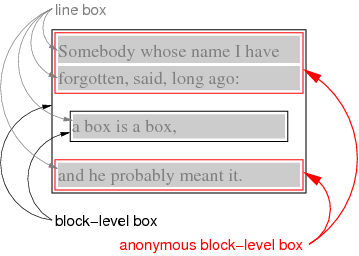
When the fragment is rendered, the text before the q is wrapped in an anonymous block and the text after the q in another.
Note that the anonymous boxes defined in this module are block-level, but anonymous boxes defined in other modules may be different.
6.2. Compact boxes
A compact box is a box that is either put in the margin of the next box or becomes a block of its own, depending on whether it is small enough to fit in the margin or not. The typical use case is for lists where most labels are small enough to fit in the margin, except for a few.
An example is the DL list in HTML. Its COMPACT attribute indicates to the formatter that the labels of the list are good candidates for display as compact boxes:
<h3>Farm animals</h3>
<dl compact>
 <dt>cat
 <dd>Lorem ipsum dolor sit amet, consectetaur adipisicing elit…
 <dt>dog
 <dd>Ut enim ad minim veniam, quis nostrud exercitation…
 <dt>hippopotamus
 <dd>Duis aute irure dolor in reprehenderit in voluptate velit…
 <dt>fly
 <dd>Excepteur sint occaecat cupidatat non proident, sunt in…
</dl>
With a style rule like
dl[compact] dt {display: compact}
this might be rendered as in the figure below.
Three of the four labels are narrow enough to fit in the left margin. The one that is too wide is converted into a block.
6.3. Mixing the box model with other formatting models
There may be documents that combine different layout models, such as documents that combine HTML (typically rendered with the CSS box model) and SVG (rendered with its own graphics model).
Do we need one or more display values to signal that an element is not to be formatted with CSS?
An element that is not rendered according to the CSS box model is treated as a replaced element for the purposes of determining its size, position, margins, padding and border.
Should we allow a more complex model, where such a child may negotiate with the CSS environment to have several boxes and several baselines, so that it can take part in line breaking and page breaking?
7. Block-level formatting
The boxes that belong to a fow are laid out according to the rules of block-level formatting:
Define how boxes in a flow are positioned. (Basically, each C edge against the A edge of the next box and their B edge and D edge against, respectively the inline-end edge and inline-start edge of the containing block.)
8. The padding properties
| Name: | padding |
|---|---|
| Value: | <length>{1,4} |
| Initial: | (see individual properties) |
| Applies to: | all elements |
| Inherited: | no |
| Percentages: | width* of containing block |
| Media: | visual |
| Computed value: | as specified |
| Canonical order: | N/A |
| Applies to: | all elements |
| Animatable: | yes |
| Computed value: | see individual properties |
*) if the containing block is horizontal, otherwise the height
| Name: | padding-top, padding-right, padding-bottom, padding-left |
|---|---|
| Value: | <length> |
| Initial: | 0 |
| Applies to: | all elements |
| Inherited: | no |
| Percentages: | width* of containing block |
| Media: | visual |
| Computed value: | as specified |
| Canonical order: | N/A |
| Applies to: | all elements |
| Animatable: | yes |
| Computed value: | <length> |
*) if the containing block is horizontal, otherwise the height
Sets the thickness of the padding area. The value may not be negative.
Padding is a shorthand for the other four properties. If padding has four values, they are for top, right, bottom and left in that order. If left is omitted, it is the same as right. If bottom is omitted it is the same as top, if right is omitted it is the same as top.
For example, the following two ways to set the padding of h1 are equivalent:
h1 { padding: 0.5em }h1 { padding-top: 0.5em;
     padding-right: 0.5em;
     padding-bottom: 0.5em;
     padding-left: 0.5em }
9. The margin properties
Margins in CSS serve to add both horizontal and vertical space between boxes.
| Name: | margin-top, margin-right, margin-bottom, margin-left |
|---|---|
| Value: | <length> | <percentage> | auto |
| Initial: | 0 |
| Applies to: | all elements |
| Inherited: | no |
| Percentages: | width* of containing block |
| Media: | visual |
| Computed value: | as specified |
| Canonical order: | N/A |
| Applies to: | see text |
| Animatable: | yes |
| Computed value: | the percentage as specified or the absolute length or auto |
*) if the containing block is horizontal, otherwise the height
| Name: | margin |
|---|---|
| Value: | [ <length> | <percentage> | auto]{1,4} |
| Initial: | (see individual properties) |
| Applies to: | all elements |
| Inherited: | no |
| Percentages: | width* of containing block |
| Media: | visual |
| Computed value: | as specified |
| Canonical order: | N/A |
| Applies to: | see text |
| Animatable: | yes |
| Computed value: | see individual properties |
*) if the containing block is horizontal, otherwise the height
These properties set the thickness of the margin area. The value may be negative.
Margin is a shorthand for the other four. If margin has four values, they set top, right, bottom and left in that order. If left is omitted, it is the same as right. If bottom is omitted, it is the same as top. If right is omitted it is the same as top.
For example, the following two ways of setting the margins of p are equivalent:
p { margin: 1em 2em }p { margin-top: 1em;
    margin-right: 2em;
    margin-bottom: 1em;
    margin-left: 2em }
The values are as follows:
- <length>
- Sets the margin to the given length. Note that the actual distance to the next element may be different, due to margin collapsing.
- <percentage>
- Sets the margin to the given percentage of the extent of the containing block. If that dimension depends on the value of this percentage, then the percentage is taken relative to 100vw or 100vh instead, depending on whether the containing block is horizontal, respectively vertical.
- auto
- On the A edge and C edge, the used value of auto is 0. On the B edge and D edge, the used value depends on the available space, as defined in “Calculating widths, heights and margins.”
The case of the containing block’s extent depending on this element’s margin can occur with floating elements. E.g.:
<div style="float: left">
 <p style="margin: 5%">...
</div>
In this case the 5% computes to 5vw.
Note that the case of a containing block’s extent depending on the percentages was undefined in CSS level 2.
Some UAs implementing CSS level 2 try to solve the set of linear equations when containing-block is unkown:
margin + width = containing-block
margin = percentage × containing-block
If different elements in a flow yield different values they may take the biggest.
Note that inside flexboxes [CSS3-FLEXBOX], the meaning of auto is different, because there it also has an effect on the A edge and C edge.
One idea to distribute boxes better than with auto (which only works in the inline direction and fails to distribute negative space) is to add a “fill” keyword, possibly combined with a minimum margin: fill or 1.2em + fill or ''calc(1.2em + fill)''). “Fill” could also be a unit, so that some fills can get more space than others: margin: 0.5fill or margin: 2fill.
Andrew Fedoniouk proposed the '%%' unit. '50%%' is 50% of the remaining space. This allows fills to sum up to more or less than 100%. More than 100% is probably not useful, it guarantees overflow. But less than 100% might be.
The keywords min-content, max-content and available could also be useful, at least for the inline-start and inline-end margin of a box. Then you can make a box that takes up no space by setting 'width: available; margin-right: calc(0 - available)'
The properties apply to all boxes except certain table-* boxes (see [CSS3TBL]) and certain inline-level boxes (see [CSS3TEXT]).
Note that in a horizontal flow, percentages on margin-top and margin-bottom are relative to the width of the containing block, not the height (and in vertical flow, margin-left and margin-right are relative to the height, not the width).
10. The width and height properties
| Name: | width |
|---|---|
| Value: | [<length> | <percentage>] | available | min-content | max-content | fit-content | auto |
| Initial: | auto |
| Applies to: | all elements but non-replaced inline elements, table rows, and row groups |
| Inherited: | no |
| Percentages: | refer to width of containing block |
| Media: | visual |
| Computed value: | the specified keyword; or the specified percentage (with border-box or content-box if present); or the absolute length (with border-box or content-box if present); or auto if the property does not apply; (also see prose under <percentage>) |
| Canonical order: | the length or percentage before the keyword, if both are present |
| Animatable: | yes |
| Name: | height |
|---|---|
| Value: | [<length> | <percentage>] | available | min-content | max-content | fit-content | complex | auto |
| Initial: | auto |
| Applies to: | all elements but non-replaced inline elements, table columns, and column groups |
| Inherited: | no |
| Percentages: | see prose |
| Media: | visual |
| Computed value: | the specified keywords, the specified percentage (see prose under <percentage>) or the absolute length; auto if the property does not apply |
| Canonical order: | the length or percentage before the keyword, if both are present |
| Animatable: | yes |
These properties specify the width and height of the content area or border area (depending on box-sizing) of certain boxes.
Values have the following meanings:
- <length>
- Specifies the size using a length unit. Negative values are illegal.
- <percentage>
- Specifies a percentage width or height. The percentage is calculated with respect to the width (in the case of width) or height (for height) of the generated box’s containing block. Negative percentages are illegal. If the containing block’s width, resp. height depends on this element, then the percentage is relative to 100vw, resp. 100vh.
- available
- Equal to the containing block width or height minus the current element’s margin, border, and padding. If the required width, resp. height of the containing block is unknown (depends on this element), then available is equal to 100vw, resp. 100vh.
- max-content
- The max-content width or height.
- min-content
- The min-content width or height.
- fit-content
- Equal to max(min-content, min(max-content, available)).
- auto
- The width or height depends on the values of other properties. See Calculating widths, heights and margins below.
- complex
- (Only on height.) The same as auto, except that elements with a complex aspect ratio (defined below) are considered to have an intrinsic ratio. More precisely: for the purposes of the section on “Calculating widths, heights and margins,” the element is treated as if its height was auto and it had an intrinsic ratio.
Another possible value is <non-negative-number>, which would mean min-content times that number.
Another idea is to allow optional keywords border-box and content-box before or after a length or percentage. This would mean the same as (and overrides) setting the box-sizing property to that property, but allows width and height to be treated differently and avoids that width and box-sizing getout of sync.
The width property of @viewport [CSS-DEVICE-ADAPT] is a shorthand for min-width and max-width and can have either one or two values. Anything we can do to alleviate risk of the confusion?
Note that available, max-content, min-content, fit-content, border-box, content-box and complex do not exist in level 2.
The keyword values (in contrast to length and percentage values) are not influenced by the box-sizing property, they always set the size of the content box.
Available, max-content, min-content and fit-content only have effect in the inline progression direction: they are equivalent to auto when set on the height of horizontal elements or on the width of vertical elements.
Note that 'width: fit-content' is the same as 'width: auto' for floats and tables, and 'width: available' is the same as 'width: auto' for blocks in the normal flow.
This example shows the use of the keyword values. Assume these style rules:
div {width: 20em}
p.available {width: available}
p.min-content {width: min-content}
p.max-content {width: max-content}
p.fit-content {width: fit-content}
p.float {float: left; width: auto}
p.auto {width: auto}
* {outline: thin solid red}
Then a document like this might be rendered as in the figure below:
<div>
  <p class=available>available: as wide as parent.
  <p class=min-content>min-content: as narrow as possible.
  <p class=max-content>max-content: As wide as needed, even
    if that means wider than the parent.
  <p class=fit-content>fit-content: As wide as needed.
  <p class=fit-content>fit-content: As wide as needed, but
    no wider than the parent.
  <p class=float>auto: depends on flow (=float).
  <p class=auto>auto: depends on flow (=normal).
</div>
Rendering of the example: min-content and max-content depend only on the content; available depends only on the containing block; fit-content depends on both; and auto acts either like available or like fit-content, depending on the type of box.
11. The min-width, max-width, min-height and max-height properties
| Name: | min-width, min-height |
|---|---|
| Value: | [ [<length> | <percentage>] && [border-box | content-box]? ] | available | min-content | max-content | fit-content |
| Initial: | 0 |
| Applies to: | all elements but non-replaced inline elements, table rows, and row groups |
| Inherited: | no |
| Percentages: | refer to width, resp. height of containing block |
| Media: | visual |
| Computed value: | the percentage as specified (with border-box or content-box, if present), the keyword as specified, or the absolute length (with border-box or content-box, if present) |
| Canonical order: | the length or percentage before the keyword, if both are present |
| Animatable: | yes |
| Name: | max-width, max-height |
|---|---|
| Value: | [ [<length> | <percentage>] && [border-box | content-box]? ] | available | min-content | max-content | fit-content | none |
| Initial: | none |
| Applies to: | all elements but non-replaced inline elements, table rows, and row groups |
| Inherited: | no |
| Percentages: | refer to width, resp. height of containing block |
| Media: | visual |
| Computed value: | the percentage as specified (with border-box or content-box, if present); the keyword as specified; the absolute length (with border-box or content-box, if present); or none |
| Canonical order: | the length or percentage before the keyword, if both are present |
| Animatable: | yes |
These properties allow authors to constrain content widths and heights to a certain range. Values have the following meanings:
- <length>
- Specifies a fixed minimum or maximum for width or height. Negative values are illegal.
- <percentage>
- Specifies a minimum or maximum for width or height as a percentage of the corresponding dimension of the containing block. Negative percentages are illegal. If the containing block’s dimension is negative, the used value is zero. If that containing block’s dimension depends on this element’s dimension, then the resulting layout is undefined. Or: use the initial value?
- max-content
- The max-content width or height.
- min-content
- The min-content width or height.
- available
- The containing block width or height minus margin, border, and padding.
- fit-content
- For max-width/max-height, same as max-content. For min-width/min-height, same as min-content.
- none
- No limit on the width or height of the box.
The keyword values (in contrast to length and percentage values) are not influenced by the box-sizing property, they always set the size of the content box.
Available, max-content, min-content and fit-content only have effect in the inline progression direction: they are equivalent to 0 when set on the min-height of horizontal elements or on the min-width of vertical elements; they are equivalent to none when set on the max-height of horizontal elements or on the max-width of vertical elements.
12. Aspect ratios of replaced elements
For the purposes of the width and height calculations below, CSS distinguishes four kinds of replaced elements:
- Type 1: replaced elements with both intrinsic width and intrinsic height.
- These are replaced elements that are meant to be displayed with a certain fixed factor (the intrinsic ratio) between their width and height and also have a default size. Different formats may have different ways of specifying the size, e.g., a width and a ratio, or a raster and a resolution in dots per inch. Raster images fall in this category.
- Type 2: replaced elements with only an intrinsic ratio
- These are replaced elements that are meant to be displayed with a certain fixed factor between their width and height, but without a default size. SVG images often fall in the this category.
- Type 3: replaced elements with a complex aspect ratio
- These are replaced elements that do not have a fixed ratio between their width and height, but that do have a functional relation between them in the sense that to every width corresponds a certain height. HTML documents are examples of this: the width can be chosen freely, but at every width there is a definite intrinsic height.
- Type 4: replaced elements without an intrinsic ratio
- These are replaced elements that have no relation between their width and height. Certain SVG images are examples of this.
Raster images are always of type 1. See the image-resolution property for how their size in px is determined.
E.g., according to the section on inline replaced elements below, if the replaced element is an HTML document and the height is specified as auto, e.g.:
... <object data="example.html"
      style="width: 30em; height: auto"></object>...
then the used height will be 150px, which is unlikely to be the real height of the example.html document. But if the height is specified as complex, e.g.:
... <object data="example.html"
      style="width: 30em; height: complex"></object>...
then the height will be the height the example.html document normally has when displayed on its own with the given width. This enables almost seamless integration of external text in a document, without a scrollbar or other scrolling mechanism. (The external text is still displayed with its own style sheet.)
An external mathematical formula in MathML is an example of replaced content with an intrinsic width and height. Assume the file m.mml contains a formula, then the HTML fragment
... derive <img src="m.mml"
alt="that the sum of p(i) for i greater than 0 equals N">
for the case...
renders the formula at its intrinsic size.
(Note, however, that it is often better to specify the formula directly in the HTML file, rather than as an external reference. That way it shares the style of the surrounding text and can be broken over several lines if it is too long.)
13. Collapsing margins
Certain adjoining margins, as defined in this section, combine to form a single margin. Those margins are said to collapse. Margins are adjoining if there are no nonempty content, padding or border areas or clearance to separate them.
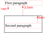
For example, in the following fragment with the given style rules:
p { display: block; margin-bottom: 2em 0 1em 0 }div { display: block; margin: 2.5em 0 }
...
<p>First paragraph</p>
<div>
  <p>Second paragraph</p>
</div>
the bottom margin of the first p (=1em), the top margin of
the div (=2.5em) and the top margin of the second p (=2em) collapse. The result is a single margin of 2.5em (the maximum of the
three) between the bottom of the first p and the top of the
second.
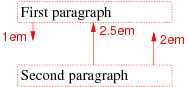
Schematic representation of the previous example.
In the following fragment,
p { display: block; margin: 2em 0 1em 0 }div { display: block; margin: 2.5em 0;
      border: thin solid }
...
<p>First paragraph</p>
<div>
  <p>Second paragraph</p>
</div>
the bottom margin of the first p and the top margin of
the div collapse, but the top margin of the second p does not collapse with them, because it is not adjoining; the border of the div separates them.
Schematic representation of the previous example.
If a set of adjoining margins collapses, then the width of the resulting margin is M - N, where M is the maximum of the adjoining margins that are positive, or zero if there are none; and N is the minimum of the adjoining margins that are negative, or zero if there are none. But if any of the margins is fill, then the resulting margin is also fill.
We call an element or box collapsed through if two of its margins collapse with each other.
The most common use of collapsing through elements is that empty paragraphs don’t cause extra white space:
<p>First paragraph<p>Second paragraph
<p>
<p>Last paragraph
There is equal space between the first and the second paragraphs as between the second and the last.
The following two sets of rules determine which margins collapse.
- Only margins of block-level boxes can collapse.
- Margins of a floated box do not collapse with any other margins.
- Margins of a flow root do not collapse with its children’s margins.
- Margins of an absolutely positioned box (see [CSS3POS]) do not collapse with any other margins.
- Margins of the root element’s box do not collapse with any other margins.
- If a box is collapsed through and it has clearance applied to one of its two collapsed margins, then those two margins do not collapse with certain of the parent’s margins, as follows: If clearance is applied to, respectively, the top, right, bottom or left margin, then the two margins do not collapse with the parent’s bottom, left, top or right margin, respectively.
- If the top margin of a box with non-zero computed min-height and auto computed height collapses with the bottom margin of its last in-flow child, then the child’s bottom margin does not collapse with the parent’s bottom margin.
- If the right margin of a box with non-zero computed min-width and auto computed width collapses with the left margin of its last in-flow child, then the child’s left margin does not collapse with the parent’s left margin.
- If the left margin of a box with non-zero computed min-width and auto computed width collapses with the right margin of its last in-flow child, then the child’s right margin does not collapse with the parent’s right margin.
Except when forbidden by the list above, the following margins collapse:
-
If a margin P collapses with a margin Q and margin Q with a margin R, then P, Q and R collapse together. (“Collapsing is transitive”)
-
A margin of a box collapses with the block-start margin of its parent box if those two margins are adjoining.
-
A margin of a box collapses with the block-end margin of its parent box if those two margins are adjoining.
-
The C margin of a box collapses with the A margin of a sibling box if the two margins are adjoining.
-
The A and C margins of a box collapse with each other if the two margins are adjoining. (The box is “collapsed through.”)
If a box X is collapsed through then the position of its A border edge is defined as follows.
- If X’s margins are collapsed with its parent’s block-start margin, the A border edge of X is defined to be the same as the parent’s block-start border edge.
- Otherwise, either the parent is not taking part in the margin collapsing, or only the parent’s block-end margin is involved. The position of X’s A border edge is defined to be the same as it would have been if X had a nonzero C border.
Note that box X itself is invisible and its position has no effect on the positions of the other elements with whose margins it is being collapsed; the border edge position is only required for laying out descendants of X.
In a horizontal flow, the bottom margin of an in-flow block-level element is adjoining to the top margin of its next in-flow block-level sibling, unless that sibling has clearance:
<p style="margin-bottom: 2em">The bottom margin of this
box…</p>

<p style="margin-top: 3em">… collapses with the top margin
of this box, to yield max(2em, 3em) = 3em margin.</p>
The top margin of an in-flow block-level element is adjoining to its first in-flow block-level child’s top margin if the element has no top border, no top padding, and the child has no clearance:
<div style="margin-top: 2em; padding: 0; border: 0">
  <p style="margin-top: 3em">
    The top margin of the DIV and the P
    collapse, to yield max(2em, 3em) = 3em margin.
  </p>
</div>
The bottom margin of an in-flow block-level element with a height of auto and min-height less than the element’s used height and max-height greater than the element’s used height is adjoining to its last in-flow block-level child’s bottom margin if the element has no bottom padding or border:
<div style="margin-bottom: 2em; padding: 0; border: 0;
    height: auto; min-height: 0; max-height: 100em">
  <p style="margin-bottom: 3em">
    The bottom margin of the DIV and the P collapse, to yield max(2em,
    3em) = 3em margin.
  </p>
</div>
An element’s own margins are adjoining if the min-height property is zero, and it has neither vertical borders nor vertical padding, and it has a height of either 0 or auto, and it does not contain a line box, and all of its in-flow children’s margins (if any) are adjoining:
<div style="margin-top: 2em; margin-bottom: 3em">
  <p style="position: absolute">
    The DIV is empty and its top and bottom margins collapse.
  </p>
</div>
When an element’s own margins collapse, and that element has had clearance applied to it, its top margin collapses with the adjoining margins of subsequent siblings but that resulting margin does not collapse with the bottom margin of the parent block:
<div style="margin-bottom: 2em">
  <p style="float: left">
    The margins of the next two Ps collapse
  <p style="clear: left; margin-top: 4em; margin-bottom: 3em">
  </p>
  <p style="margin-top: 1em; margin-bottom: 1em">
  </p>
</div>
The top and bottom margins of the two empty Ps collapse all together. But they can’t collapse with the bottom of the DIV, because one of the two empty P’s has clearance.
Check this. This is probably the only possible interpretation of the rules, but it is certainly not obvious that the clearance of one element may stop later elements from collapsing…
Collapsing is based on the used value of padding, margin, and border (i.e., after resolving any percentages). The collapsed margin is calculated over the used value of the various margins.
14. Inline-level formatting
In an inline formatting context, inline-level boxes are laid out in the manner of a run of words and sentences. Inline-level formatting, and the behavior of inline-level boxes, is specified in the Text module [CSS3TEXT].
15. Calculating widths, heights and margins
The following two algorithms define the used value of width and height respectively and also the used values of the margin properties and of top, right bottom and left.
Note that they do not affect the computed values of width and height. Also note that in some cases the used width has to be known in order to calculate the used height, or vice versa,
For width:
- The tentative used width is calculated following the rules in the subsections below. If transform is not none, it is assumed to be 'rotate(0)' (i.e., the identity transform) for the purposes of this calcutlation.
- If the tentative used width is greater than max-width, the same rules are applied again, but this time using the computed value of max-width as the computed value for width.
- If the resulting width is smaller than min-width, the same rules are applied again, but this time using the computed value of min-width as the computed value for width.
For height:
- The tentative used height is calculated following the rules in the sections below. If transform is not none, it is assumed to be 'rotate(0)' (i.e., the identity transform) for the purposes of this calcutlation.
- If the tentative used height is greater than max-height, the same rules are applied again, but this time using the computed value of max-height as the computed value for height.
- If the resulting height is smaller than min-height, the same rules are applied again, but this time using the computed value of min-height as the computed value for height.
If transform is not none, the used width or height is further modified as follows:
- If the element is horizontal and height is auto, then the used height is the height of the content box after the transformation is applied.
- If the element is vertical and width is auto, then the used width is the width of the content box after the transformation is applied.
Note that translations [CSS3-TRANSFORMS] do not affect the width or height and also do not affect the placement of boxes in the normal flow (see “Block-level formatting”).
However, for replaced elements with an intrinsic ratio and both width and height specified as auto, the algorithm is as follows:
Select from the table the resolved height and width values for the appropriate constraint violation. Take the max-width and max-height as max(min, max) so that min ≤ max holds true. In this table w and h stand for the results of the width and height computations ignoring the min-width, min-height, max-width and max-height properties. Normally these are the intrinsic width and height, but they may not be in the case of replaced elements with intrinsic ratios.
| Constraint violation | Resolved width | Resolved height |
|---|---|---|
| none | w | h |
| w > max-width | max-width | max(max-width * h/w, min-height) |
| w < min-width | min-width | min(min-width * h/w, max-height) |
| h > max-height | max(max-height * w/h, min-width) | max-height |
| h < min-height | min(min-height * w/h, max-width) | min-height |
| (w > max-width) and (h > max-height), where (max-width/w ≤ max-height/h) | max-width | max(min-height, max-width * h/w) |
| (w > max-width) and (h > max-height), where (max-width/w > max-height/h) | max(min-width, max-height * w/h) | max-height |
| (w < min-width) and (h < min-height), where (min-width/w ≤ min-height/h) | min(max-width, min-height * w/h) | min-height |
| (w < min-width) and (h < min-height), where (min-width/w > min-height/h) | min-width | min(max-height, min-width * h/w) |
| (w < min-width) and (h > max-height) | min-width | max-height |
| (w > max-width) and (h < min-height) | max-width | min-height |
Then apply the appropriate rules in the subsections below, as if width and height were computed as these values.
The following subsections apply if the element’s containing block is horizontal. If it is vertical, the same rules apply, but with every occurrence of “left” replaced by “top,” “right” by “bottom,” “top” by “right,” “bottom” by “left”, “height” by “width” and “width” by “height.”
For the purposes of evaluating percentages in the following subsections, if the width of the containing block is unknown, then assume the width is 100vw. Likewise, if the height of the containing block is unknown, then assume it is 100vh.
15.1. Inline, non-replaced elements
The width and height properties do not apply. For each of left, right, top, bottom, margin-left, margin-right, margin-top and margin-bottom, the used value is calculated from the computed value by evaluating percentages and replacing auto and fill by 0.
Note that this section applies equally when the containing block is horizontal as when it is vertical.
15.2. Inline or floating, replaced elements
The used values of margin-left, margin-right, margin-top and margin-bottom derive from the computed value, except that a computed value of auto becomes a used value of 0.
If height and width both have computed values of auto and the element also has an intrinsic width, then that intrinsic width is the used value of width.
If height and width both have computed values of auto and the element also has an intrinsic height, then that intrinsic height is the used value of height.
If height and width both have computed values of auto and the element has no intrinsic width, but does have an intrinsic height and intrinsic ratio; or if width has a computed value of auto, height has some other computed value, and the element has an intrinsic ratio; then the used value of width is:
(used height) * (intrinsic ratio)
If height and width both have computed values of auto and the element has no intrinsic height, but does have an intrinsic width and intrinsic ratio; or if height has a computed value of auto, width has some other computed value, and the element has an intrinsic ratio; then the used value of height is:
(used width) / (intrinsic ratio)
If height and width both have computed values of auto and the element has an intrinsic ratio but no intrinsic height or width and the containing block’s width doesn’t itself depend on the replaced element’s width, then the used value of width is calculated from the constraint equation used for block-level, non-replaced elements in normal flow. The used value for height is: (used width) / (intrinsic ratio).
If width has a computed value of auto, and the element has an intrinsic width but no intrinsic ratio, then that intrinsic width is the used value of width.
If height has a computed value of auto, and the element has an intrinsic height but no intrinsic ratio, then that intrinsic width is the used value of width.
If width has a computed value of auto, but none of the conditions above are met, then the used value of width becomes 300px. If 300px is too wide to fit the device, UAs should use the width of the largest rectangle that has a 2:1 ratio and fits the device instead.
If height has a computed value of auto and none of the rules above define its used value, then the used value of height must be set to the height of the largest rectangle that has a 2:1 ratio, has a height not greater than 150px, and has a width not greater than the device width.
Theoretically, a device may be wider than than 300px but not tall enough for 150px. In that case the resulting replaced element will be too tall. But this is the formulation in CSS 2.1 and it seems not worth improving such an edge case.
Percentage intrinsic widths are first evaluated with respect to the containing block’s width, if that width doesn’t itself depend on the replaced element’s width. If it does, then a percentage intrinsic width on that element can’t be resolved and the element is assumed to have no intrinsic width.
Note that this section applies equally when the containing block is horizontal as when it is vertical.
15.3. Block-level, non-replaced elements in normal flow when overflow computes to visible
This section also applies to block-level non-replaced elements in normal flow when overflow does not compute to visible but has been propagated to the viewport.
The used values of the block-start padding, block-end padding, block-start margin and block-end margin are calculated from their computed values, with any auto values replaced by 0.
The complexity of this section comes from the fact that auto values on width and height are resolved differently for horizontal and for vertical elements, and differently for parallel flows then for orthogonal flows (i.e., when the containing block is horizontal and the element itself vertical, or vice-versa). In paginated contexts, the element may further be split into boxes of unequal sizes.
There are three principles. The first is: If the element’s size in the direction of the containing block’s measure (i.e., between the B edge and the D edge) is auto, then that size is the same as the containing block (minus the element’s own margins, padding and borders, if applicable).
The second principle applies to orthogonal flows only, and only if they are not in a paginated environment: If an element is orthogonal and its measure (i.e., the distance between its A edge and C edge) is auto, then it is treated as a multi-column element [CSS3COL] and column-width, if not already set, is set to a value derived from the containing block’s size and the initial containing block
The last principle applies to orthogonal flows in a paginated environment, e.g., in paged media or inside a multi-column element: Just like in a non-paginated environment, if an element is orthogonal and its measure is auto, then it is treated as a multi-column element [CSS3COL] and column-width, if not already set, is set to a certain value. But, in addition, if that means that the first column would be so wide as stick out of the page or column (the “fragmentainer,” see [CSS3-BREAK]), then that first column is made narrower until it fits. But not narrower than min-content. (If at that size it still doesn’t fit, it may instead be moved to the next page/column or, if that is not possible, overflow.)
If the computed value of the extent is not auto, then the used value is calculated by evaluating the computed value. Otherwise, the extent is the distance between two edges that are defined as follows:
- For the first edge: If the element is the root element or if it has a non-zero block-start padding or a non-zero block-start border, then the first edge is the headside margin edge of the first line box or block-level box (whichever comes first); otherwise the first edge is the headside border edge of the first line box or block-level box (whichever comes first) that doesn’t have its margins collapsed through.
- For the second edge: If the element is the root element or if it has a non-zero block-end padding or a non-zero block-end border, then the second edge is the footside margin edge of the last line box or block-level box (whichever comes last); otherwise the second edge is the footside border edge of the last line box or block-level box (whichever comes last) that doesn’t have its margins collapsed through.
The above reflects the fact that the margins of the element may collapse with the margins of its first and last children (unless the element has a border or padding). In that case the children’s margins fall outside the block flow dimension.
The position of the edges is calculated without applying relative positioning, if any, to the children. And only children in the normal flow are taken into account, i.e., floating boxes and absolutely positioned boxes are ignored.
For example, the DIV in this fragment has a bottom border but no padding or border at the top. The height is thus calculated from the border edge of the first child (img1) to the margin edge of the last child (img2). The result is 8em.
div {border-bottom: 0.2em dashed}
img {height: 3em; display: block; margin: 1em}
...
<div>
  <img src="img1" alt=...>
  <img src="img2" alt=...>
</div>
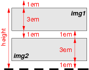
The height is measured from the top border edge of the first IMG to the bottom margin edge of the last.
With respect to the measure, one of the following constraints must hold among the used values of the given properties.
-
If the element has the same orientation as its containing block
(i.e., both are horizontal or both are vertical):
inline-start margin + inline-start border + inline-start padding + measure + inline-end padding + inline-end border + inline-end margin = measure of containing block
-
Otherwise the constraint is relative to the height or width of
the initial containing block, depending on whether the
element is horizontal or vertical, respectively:
inline-start margin + inline-start border + inline-start padding + measure + inline-end padding + inline-end border + inline-end margin = width or height of initial containing block
The used values of the above properties, except for any values that are auto, are calculated from the computed values, evaluating percentages. If this makes the measure negative, then set its used value to 0. Ditto for inline-start padding and inline-end padding. Note that such negative values can only happen when the specified value includes 'calc()'. Then apply one of the following cases:
- If none of the values is auto, then the used value of the inline-end margin is set to the value that satisfies the constraint.
- If the measure is auto, then set the used value of all other properties in the constraint that are auto to 0 and set the used value of the measure so that the constraint is satisfied. If that makes the used value negative, then set it to 0 instead and apply case 1 above.
- If both the inline-start and inline-end margins are auto, then solve the constraint under the extra condition that the inline-start and inline-end margins are equal. But if that makes them negative, then set both to 0 and apply case 1 above.
- If only the inline-start margin is auto , then set the inline-start margin to the value that satisfies the constraint.
- If only the inline-end margin is auto, then set the inline-end margin to the value that satisfies the constraint.
15.4. Other block-level, non-replaced elements in normal flow
This section applies to block-level, non-replaced elements when overflow does not compute to visible (except if the overflow property’s value has been propagated to the viewport).
The used values of block-start padding, block-end padding, block-start margin and block-end margin are calculated from the computed values, with any auto values replaced by 0.
If the block flow dimension is auto, the used value is defined by “auto heights for flow roots.” Otherwise, the used value is evaluated from the computed value.
Apply the rules for inline-start margin, inline-start padding, measure, inline-end padding and inline-end margin as given above in “Block-level, non-replaced elements in normal flow when overflow computes to visible.”
15.5. Inline-block or floating, non-replaced elements
Not yet generalized with block-start, block-end, etc.
The used values of margin-left, margin-right, margin-top and margin-bottom are derived from their computed values, except that a computed value of auto gives a used value of 0.
If the computed value of width is auto, the used value is the same as for fit-content. Otherwise the computed value is evaluated to give the used value.
If the computed value of height is auto, the used value is defined by “auto heights for flow roots.” If it contains a percentage and the height of the containing block is not known (depends on this element), then the used value is also defined by “auto heights for flow roots.” Otherwise it is calculated by evaluating the computed value.
For inline-block boxes, the margin box is used when calculating the height of the line box. Does this belong here?
15.6. Absolutely positioned, non-replaced elements
For the purposes of this section and the next, the term static position (of an element) refers, roughly, to the position an element would have had in the normal flow. More precisely:
- The static position for left is the distance from the left edge of the containing block to the left margin edge of a hypothetical box that would have been the first box of the element if its position property had been static and float had been none. The value is negative if the box’s margin is to the left of the containing block’s edge.
- The static position for right is the distance from the right edge of the containing block to the right margin edge of the same hypothetical box as above. The value is positive if the box’s margin is to the left of the containing block’s edge.
- The static position for top is the distance from the top edge of the containing block to the top margin edge of the same hypothetical box as above. The value is negative if the box’s margin is above the containing block’s edge.
- The static position for bottom is the distance from the bottom edge of the containing block to the bottom margin edge of the same hypothetical box as above. The value is positive if the box’s margin is above the containing block’s edge.
But rather than actually calculating the dimensions of that hypothetical box, user agents are free to make a guess at its probable position.
For the purposes of calculating the static position, the containing block of fixed positioned elements is the initial containing block instead of the viewport, and all scrollable boxes should be assumed to be scrolled to their origin.
This constraint must hold among the used values:
left + margin-left + border-left-width + padding-left + width + padding-right + border-right-width + margin-right + right = width of containing block
If all three of left, width, and right are auto: First set any auto values for margin-left and margin-right to 0. Then, if the direction property of the containing block is ltr set left to the static position and apply rule number three below; otherwise, set right to the static position and apply rule number one below.
If none of the three is auto: If both margin-left and margin-right are auto, solve the equation under the extra constraint that the two margins get equal values, unless this would make them negative, in which case when direction of the containing block is ltr (rtl), set margin-left (margin-right) to zero and solve for margin-right (margin-left). Should we remove the phrase starting with “unless”? If one of margin-left or margin-right is auto, solve the equation for that value. If the values are over-constrained, ignore the value for left (in case the direction property of the containing block is rtl) or right (in case direction is ltr) and solve for that value.
Otherwise, set auto values for margin-left and margin-right to 0, and pick the one of the following six rules that applies.
- left and width are auto and right is not auto, then the width is as for fit-content. Then solve for left.
- left and right are auto and width is not auto, then if the direction property of the containing block is ltr set left to the static position, otherwise set right to the static position. Then solve for left (if direction is rtl) or right (if direction is ltr).
- width and right are auto and left is not auto, then the width is fit-content. Then solve for right.
- left is auto, width and right are not auto, then solve for left.
- width is auto, left and right are not auto, then solve for width.
- right is auto, left and width are not auto, then solve for right.
This constraint must also hold among the used values:
top + margin-top + border-top-width + padding-top + height + padding-bottom + border-bottom-width + margin-bottom + bottom = height of containing block
If all three of top, height, and bottom are auto, set top to the static position and apply rule number three below.
If none of the three are auto: If both margin-top and margin-bottom are auto, solve the equation under the extra constraint that the two margins get equal values. If one of margin-top or margin-bottom is auto, solve the equation for that value. If the values are over-constrained, ignore the value for bottom and solve for that value.
Otherwise, pick the one of the following six rules that applies.
- top and height are auto and bottom is not auto: The used value of bottom is its computed value. The used height is defined by “auto heights for flow roots.” The used values of margin-top and margin-bottom are their computed values, except that any auto gives a used value of 0. Finally, the constraint gives the used value of top.
- top and bottom are auto and height is not auto: The used value of top is its static position. The used values of margin-top and margin-bottom are their computed values, except that any auto gives a used value of 0. Finally, the constraint gives the used value for bottom.
- height and bottom are auto and top is not auto: The used height is defined by “auto heights for flow roots.” The used values of margin-top and margin-bottom are their computed values, except that any auto gives a used value of 0. Finally, the constraint gives the used value of bottom.
- top is auto, height and bottom are not auto: The used values of margin-top and margin-bottom are their computed values, except that any auto gives a used value of 0. The constraint gives the used value for top.
- height is auto, top and bottom are not auto: The used values of margin-top and margin-bottom are their computed values, except that any auto gives a used value of 0. The constraint gives the used value for height.
- bottom is auto, top and height are not auto: The used values of margin-top and margin-bottom are their computed values, except that any auto gives a used value of 0. The constraint gives the used value for bottom.
15.7. Absolutely positioned, replaced elements
This situation is similar to the previous one, except that the element may have an intrinsic size or ratio. The sequence of substitutions is now:
- The used value of width and height is determined as for inline replaced elements.
- For each of top, right, bottom, left, margin-top, margin-right, margin-bottom and margin-left, if the computed value is not auto, the used value is equal to the computed value.
- If both left and right have the value auto, then if direction of the containing block is ltr, the used value of left is its static position; else if direction is rtl, the used value of right is its static position.
- If both top and bottom have the value auto, then the used value of top is its static position.
- If left or right (or both) are auto, and margin-left is auto, then the used value of margin-left is 0.
- If left or right (or both) are auto, and margin-right is auto, then the used value of margin-right is 0.
- If neither left nor right are auto and both margin-left and margin-right are auto, then the used values satisfy the extra constraint that margin-right and margin-left are equal, unless this would make them negative, in which case when the direction of the containing block is ltr (rtl), the used value of margin-left (margin-right) is 0. Remove the part starting with “unless”? It looks better to center the image.
The remaining used values, if any, follows from these two constraints:
left + margin-left + border-left-width + padding-left + width + padding-right + border-right-width + margin-right + right = width of containing block
top + margin-top + border-top-width + padding-top + height + padding-bottom + border-bottom-width + margin-bottom + bottom = height of containing block
If the first equation is over-constrained, ignore the value for either left (in case the direction property of the containing block is rtl) or right (in case direction is ltr) and solve for that value.
If the second equation is over-constrained, ignore the value for bottom and solve for that value.
15.8. Block-level, replaced elements in normal flow
Apply the rules for inline replaced elements, but ignore the resulting values for margin-left and margin-right. To compute the used value of those, apply the rules for block-level, non-replaced elements using the used values just found for width, border and padding as if they were the computed values.
15.9. Floating, non-replaced elements
The used values of the margins are derived from the computed values, except that the used values of any margins computed as auto are 0.
The used value of width is derived from the computed value, except that if width is computed as auto, the used value is the same as for fit-content.
If the computed value of height is auto, the used value is given by “auto heights for flow roots.” If the computed value includes a percentage and the height of the containing block is not known (depends on this element), then the used value is computed as if the computed value were auto. Otherwise the computed value is evaluated to give the used value.
15.10. Auto heights for flow roots
In certain cases (see the preceding sections), the height of an element is computed as follows:
If it only has inline-level children, the height is the distance between the top of the topmost line box and the bottom of the bottommost line box.
If it has block-level children, the height is the distance between the top margin-edge of the topmost block-level child box and the bottom margin-edge of the bottommost block-level child box.
Absolutely positioned children are ignored, and relatively positioned boxes are considered without their offset. Note that the child box may be an anonymous block box.
In addition, if the element has any floating descendants whose bottom margin edge is below the bottom, then the height is increased to include those edges. Only floats that are children of the element itself or of descendants in the normal flow are taken into account, e.g., floats inside absolutely positioned descendants or other floats are not.
16. The float property
| Name: | float |
|---|---|
| Value: | left | right | top | bottom | start | end | none | <page-floats> |
| Initial: | none |
| Applies to: | all, but see text |
| Inherited: | no |
| Percentages: | N/A |
| Media: | visual |
| Computed value: | as specified |
| Canonical order: | order of grammar |
| Animatable: | no |
This property specifies whether a box should float to the left, right, or not at all. It only applies if the element has a display other than none and a position of static or relative.
The float property in turn influences the computed value of display.
The values of this property have the following meanings:
- top
- Same as left
- left
- If writing-mode is tb, the element generates a box that is floated to the left and content flows on the right side of the box (subject to the clear property). If writing-mode has a different value, the element generates a box that is floated to the top and content flows on the bottom side of the box (subject to the clear property).
- bottom
- same as right
- right
- Similar to left, except the box is floated to the right (if writing-mode is tb) or to the bottom (otherwise), and content flows on the left or top side of the box.
- start
- If the containing block’s direction is ltr, then the same as left; otherwise the same as right.
- end
- If the containing block’s direction is rtl, then the same as right; otherwise the same as left.
- none
- The box is not floated.
- <page-floats>
- See Generated Content for Paged Media [CSS3GCPM]. Check that the names page-top, page-bottom, next-top, or otherwise do not clash with top and bottom
User agents may treat float as none on the root element.
16.1. Introduction to floats
(This section is not normative.)
A float is a box that is shifted to the left or right on the current line. The most interesting characteristic of a float (or “floating” box) is that content may flow along its side (or be prohibited from doing so by the clear property). Content flows down the right side of a left-floated box and down the left side of a right-floated box. The following is a (non-normative) introduction to float positioning and content flow; the exact rules governing float positioning are given in the next section.
A floated box is shifted to the left or right until its margin edge touches the containing block edge or the margin edge of another float. If there is a line box, the top of the floated box is aligned with the top of the current line box.
If there isn’t enough horizontal room for the float, it is shifted downward until either it fits or there are no more floats present.
Since a float is not in the flow, non-positioned block boxes created before and after the float box flow vertically as if the float didn’t exist. However, line boxes created next to the float are shortened to make room for the margin box of the float. If a shortened line box is too small to contain any further content, then it is shifted downward until either it fits or there are no more floats present. Any content in the current line before a floated box is re-flowed in the first available line on the other side of the float. In other words, if inline boxes are placed on the line before a left float is encountered that fits in the remaining line box space, the left float is placed on that line, aligned with the top of the line box, and then the inline boxes already on the line are moved accordingly to the right of the float (the right being the other side of the left float) and vice versa for rtl and right floats.
In the following document fragment, the containing block is too narrow to contain the content next to the float, so the content gets moved to below the floats where it is aligned in the line box according to the text-align property.
p { width: 10em; border: solid aqua; }
span { float: left; width: 5em; height: 5em; border: solid blue; }

...

<p>
  <span> </span>
  Supercalifragilisticexpialidocious
</p>
This fragment might look like this:
The text is too long to fit in a shortened line box next to the float (dark blue box) and so it is pushed down until it is passed the float.
Several floats may be adjacent, and this model also applies to adjacent floats in the same line.
The following rule floats all IMG boxes with class="icon" to the left (and sets the left margin to 0):
img.icon {
  float: left;
  margin-left: 0;
}
Consider the following HTML source and style sheet:
<!DOCTYPE HTML PUBLIC "-//W3C//DTD HTML 4.01//EN">
<HTML>
  <HEAD>
    <TITLE>Float example</TITLE>
    <STYLE type="text/css">
      IMG { float: left }
      BODY, P, IMG { margin: 2em }
    </STYLE>
  </HEAD>
  <BODY>
    <P><IMG src=img.png alt="This image will illustrate floats">
       Some sample text that has no other...
  </BODY>
</HTML>
The IMG box is floated to the left. The content that follows is formatted to the right of the float, starting on the same line as the float. The line boxes to the right of the float are shortened due to the float’s presence, but resume their “normal” width (that of the containing block established by the P element) after the float. This document might be formatted as:
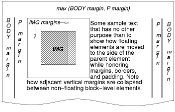
An image showing the various margins of the BODY, P and IMG element. Not that the top margin of the floating IMG does not collapse with the top margins of the P and BODY elements.
Formatting would have been exactly the same if the document had been:
<BODY>
  <P>Some sample text
  <IMG src=img.png alt="This image will illustrate floats">
           that has no other...
</BODY>
because the content to the left of the float is displaced by the float and re-flowed down its right side.
As stated in “Collapsing margins,” the margins of floating boxes never collapse with margins of adjacent boxes. Thus, in the previous example, vertical margins do not collapse between the P box and the floated IMG box.
The contents of floats are stacked as if floats generated new stacking contexts, except that any elements that actually create new stacking contexts take part in the float’s parent’s stacking context. A float can overlap other boxes in the normal flow (e.g., when a normal flow box next to a float has negative margins). When this happens, floats are rendered in front of non-positioned in-flow blocks, but behind in-flow inlines.
Here is another illustration, showing what happens when a float overlaps borders of elements in the normal flow.
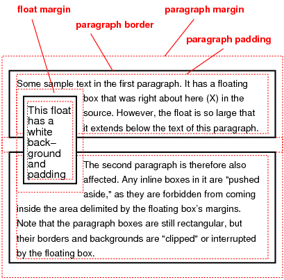
A floating image obscures borders of block boxes it overlaps.
The following example illustrates the use of the clear property to prevent content from flowing next to a float.
Assuming a rule such as this:
p { clear: left }
formatting might look like this:
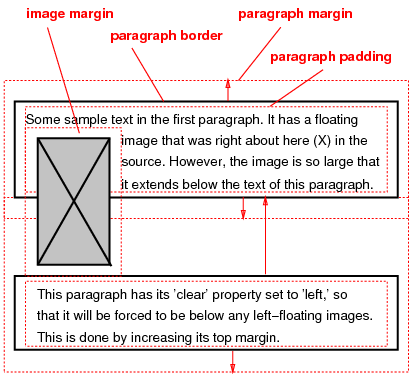
Both paragraphs have set 'clear: left', which causes the second paragraph to be “pushed down” to a position below the float – clearance is added above its top margin to accomplish this (see the clear property).
16.2. Rules for positioning floats
Here are the precise rules that govern the positions of floats with a horizontal containing block. References to other elements in these rules refer only to other elements in the same flow as the float’s parent.
- The left margin edge of a left-floating box may not be to the left of the left edge of its containing block. An analogous rule holds for right-floating elements.
- If the current box is left-floating, and there are any left-floating boxes generated by elements earlier in the source document, then for each such earlier box, either the left margin edge of the current box must be to the right of the right margin edge of the earlier box, or its top must be lower than the bottom of the earlier box. Analogous rules hold for right-floating boxes.
- The right margin edge of a left-floating box may not be to the right of the left margin edge of any right-floating box that is to the right of it. Analogous rules hold for right-floating elements.
- A floating box’s top margin edge may not be higher than the top of its containing block. When the float occurs between two collapsing margins, the float is positioned as if it had an otherwise empty anonymous block parent taking part in the flow. The position of such a parent is defined by the rules in the section on margin collapsing.
- The top margin edge of a floating box may not be higher than the margin top of any block-level or floated box generated by an element earlier in the source document.
- The top margin edge of an element’s floating box may not be higher than the top of any line-box containing a box generated by an element earlier in the source document.
- A left-floating box that has another left-floating box to its left may not have its right margin edge to the right of its containing block’s right edge. (Loosely: a left float may not stick out at the right edge, unless it is already as far to the left as possible.) An analogous rule holds for right-floating elements.
- A floating box must be placed as high as possible.
- A left-floating box must be put as far to the left as possible, a right-floating box as far to the right as possible. A higher position is preferred over one that is further to the left/right.
This HTML fragment results in the b floating to the right.
<P>a<SPAN style="float: right">b</SPAN></P>
If the P element’s width is enough, the a and the b will be side by side. It might look like this:
The rules for a float with a containing block with 'writing-mode: rl' are exactly the same after replacing left with top, right with bottom, top with right, bottom with left and adjusting the text accordingly. Here they are:
[Still some words like lower and higher to replace...]
- The top margin edge of a top-floating box may not be above the top edge of its containing block. An analogous rule holds for bottom-floating elements.
- If the current box is top-floating, and there are any top-floating boxes generated by elements earlier in the source document, then for each such earlier box, either the top margin edge of the current box must be below the bottom margin edge of the earlier box, or its right must be to the left of the left margin edge of the earlier box. Analogous rules hold for bottom-floating boxes.
- The bottom margin edge of a top-floating box may not be below the top margin edge of any bottom-floating box that is below it. Analogous rules hold for bottom-floating elements.
- A floating box’s right margin edge may not be to the right of the right edge of its containing block. When the float occurs between two collapsing margins, the float is positioned as if it had an otherwise empty anonymous block parent taking part in the flow. The position of such a parent is defined by the rules in the section on margin collapsing.
- The right margin edge of a floating box may not be to the right of the right margin edge of any block-level or floated box generated by an element earlier in the source document.
- The right margin edge of an element’s floating box may not be to the right of the right edge of any line-box containing a box generated by an element earlier in the source document.
- A top-floating box that has another top-floating box above it may not have its bottom margin edge below its containing block’s bottom edge. (Loosely: a top float may not stick out at the bottom edge, unless it is already as far to the top as possible.) An analogous rule holds for bottom-floating elements.
- A floating box must be placed as far to the right as possible.
- A top-floating box must be put as far to the top as possible, a bottom-floating box as far to the bottom as possible. A position further to the right is preferred over one that is further to the top/bottom.
The rules for a float with a containing block with 'writing-mode: lr' are exactly the same after replacing left with top, right with bottom, top with left and bottom with right. They are given here for completeness:
Note that a box with a value of float other than none is a flow root.
The border box of a table, a block-level replaced element, or an element in the normal flow that is a flow root (such as an element with overflow other than visible) must not overlap any floats in the same flow as the element itself. If necessary, implementations should clear the said element by placing it below any preceding floats, but may place it adjacent to such floats if there is sufficient space, by increasing one margin and decreasing the opposite margin. (“Sufficient space” means that the opposite margin does not become negative.)
17. The clear property
| Name: | clear |
|---|---|
| Value: | none | left | right | both |
| Initial: | none |
| Applies to: | block-level elements |
| Inherited: | no |
| Percentages: | N/A |
| Media: | visual |
| Computed value: | as specified |
| Canonical order: | N/A |
| Animatable: | no |
[To do: copy from CSS2 [CSS21] and generalize to vertical text, define clearance.]
18. The clear-after property
| Name: | clear-after |
|---|---|
| Value: | none | left | right | top | bottom | inside | outside | start | end | both | descendants |
| Initial: | none |
| Applies to: | block-level elements |
| Inherited: | no |
| Percentages: | N/A |
| Media: | visual |
| Computed value: | as specified |
| Canonical order: | N/A |
| Animatable: | no |
| Computed value: | specified value |
It is sometimes useful to make sure that the bottom border of a block-level element goes below floating elements. The clear-after property increases the element’s padding as needed. More precisely: If the element has a block-end padding or block-end border, and there are any floats on the indicated side(s) in the current flow up to and including the end of this element, then find the one whose C margin edge is furthest away from the block-start content edge of the containing block. If that C margin edge is further from the containing block’s block-start than the element’s block-end content edge is, then increase the element’s block-end padding by the difference.
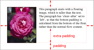
The effect of 'clear-after: left' on a paragraph next to a floating image: the bottom padding of the paragraph is stretched, so that the original padding and the border go below the float.
Note: Since a floating element is a flow root, setting clear-after on such an element only takes into account any descendant floats in the flow established by the element itself.
These four images illustrate the effect of clear-after on elements with and without padding or border. They show two documents, both have two paragraphs and the top paragraph contains a floating image. In the document on the left, the first paragraph does not have any bottom padding or border. In the document on the right it does. The top row shows the layout without any clear-after, the bottom row shows the effect of setting 'clear-after: left' on the first paragraph.
| clear-after | Without padding or border | With padding and border |
|---|---|---|
| none |
The text of the second paragraph wraps around the floating image that started in the first paragraph. |
The floating image that starts in the first paragraph overlaps the bottom border of that paragraph. The text of second paragraph wraps around the image as well. |
| left |
As the first paragraph has no padding that can be stretched or border that can be moved, the clear-after has no effect on it and the layout is exactly the same as in the first image. |
The effect of clear-after on the first paragraph is to increase the bottom padding so that the bottom border is now below the floating image. The second paragraph thus starts lower as well and doesn’t have to wrap around the image. |
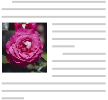
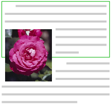
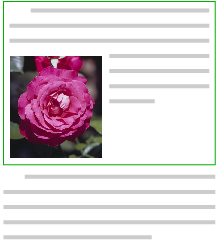
The value of the property determines which kinds of floats are taken into account:
- none
- No effect.
- left, top
- Only left and top floating elements are considered.
- right, bottom
- Only right and bottom floating elements are considered,
- inside
- If the bottom of the element occurs on a right-hand page, only left floating elements are considered. On a left-hand page, only right floating elements. On media that are not paged, inside means the same as left.
- outside
- Analogous
- start
- If the direction of the element is ltr, same as left, otherwise same as right.
- end
- If the direction of the element is ltr, same as right, otherwise same as left.
- both
- Both left/top and right/bottom floats are considered.
- descendants
- All floats in the element’s flow that are descendants of the element are considered, but not any other floats.
In simple cases, the effect of 'overflow: hidden' can be quite similar to 'clear-after: both', e.g., this documents looks the same whether it contains overflow: hidden or clear-after: both:
<html>
<style>
 div {overflow: hidden; border: solid}
 .float {float: left; width: 20%;
   margin: 1em; border: solid}
</style>
<div>
 <p class=float>This paragraph floats and is quite long.
 <p>short text
</div>
![[screendump]](clear-after4.png)
The DIV’s border goes around the floating box.
But in more complex cases, the fact that overflow: hidden affects overflow and creates a flow root can be visible. This is the same document, but now there is a floating box before the DIV:
<html>
<style>
 div {overflow: hidden; border: solid}
 .float {float: left; width: 20%;
   margin: 1em; border: solid}
</style>
<p class=float>This paragraph floats and is quite long.
<div>
 <p>short text
</div>
![[screendump]](clear-after5.png)
With overflow: hidden, the floating box before the DIV causes the DIV as a whole to become narrower
![[screendump]](clear-after6.png)
With clear-after: both instead of ''overflow: hidden'', the floating box before the DIV doesn’t change the width of the DIV, but it does change the height.
Use only two values: height-includes-floats and height-does-not-include floats? [DavidB 2004-02-29]
Daniel Beardsmore proposed a property 'underhang-limit: <count of full lines>' to protect against the case that the last line of a paragraph (or the last few lines) is shown under a float. In that case it looks better to indent that line like the other lines of the paragraph. The default is 1, i.e., no protection.
Alternative ideas to clear-after are new values on overflow, height, min-height or display, e.g.: height: contain.
19. Overflow
When some content of an element is placed outside the element’s content box, the element is said to overflow. This module allows overflow to be clipped, other modules may add other treatments, e.g., scale it down or to scroll it (“marquee,” see [CSS3-MARQUEE]).
19.1. The overflow, overflow-x and overflow-y properties
In the preceding sections, several things (such as flow roots) depend on the value of overflow. We probably need to rewrite them in terms of “overflow-x and/or -y” or similar.
| Name: | overflow-x, overflow-y |
|---|---|
| Value: | visible | hidden | scroll | auto | no-display | no-content |
| Initial: | visible |
| Applies to: | non-replaced block-level elements and non-replaced inline-block elements |
| Inherited: | no |
| Percentages: | N/A |
| Media: | visual |
| Computed value: | as specified |
| Canonical order: | N/A |
| Animatable: | no |
| Computed value: | as specified, except visible, see text |
| Name: | overflow |
|---|---|
| Value: | [ visible | hidden | scroll | auto | no-display | no-content ]{1,2} |
| Initial: | see individual properties |
| Applies to: | non-replaced block-level elements and non-replaced inline-block elements |
| Inherited: | no |
| Percentages: | N/A |
| Media: | visual |
| Computed value: | as specified |
| Canonical order: | N/A |
| Animatable: | no |
| Computed value: | as specified, except visible, see text |
These properties specify whether content is clipped when it overflows the element’s content area. It affects the clipping of all of the element’s content except any descendant elements (and their respective content and descendants) whose containing block is the viewport or an ancestor of the element. Overflow-x determines clipping at the left and right edges, overflow-y at the top and bottom edges.
Overflow is a shorthand. If it has one keyword, it sets both overflow-x and overflow-y to that keyword; if it has two, it sets overflow-x to the first and overflow-y to the second. Keywords have the following meanings:
- visible
- This value indicates that content is not clipped, i.e., it may be rendered outside the content box.
- hidden
- This value indicates that the content is clipped and that no scrolling mechanism should be provided to view the content outside the clipping region.
- scroll
- This value indicates that the content is clipped and that if the user agent uses a scrolling mechanism that is visible on the screen (such as a scroll bar or a panner), that mechanism should be displayed for a box whether or not any of its content is clipped. This avoids any problem with scrollbars appearing and disappearing in a dynamic environment. When this value is specified and the target medium is print, overflowing content may be printed.
- auto
- The behavior of the auto value is UA-dependent, but should cause a scrolling mechanism to be provided for overflowing boxes.
- no-display
- When the content doesn’t fit in the content box, the whole box is removed, as if 'display: none' were specified. [This idea is due to Till Halbach <tillh@opera.com>, July 21, 2005]
- no-content
- When the content doesn’t fit in the content box, the whole content is hidden, as if 'visibility: hidden' were specified. [This idea is due to Till Halbach <tillh@opera.com>, July 21, 2005]
Even if overflow is set to visible, content may be clipped to a UA’s document window by the native operating environment.
UAs must apply the overflow property set on the root element to the viewport. HTML UAs must instead apply the overflow property from the BODY element to the viewport, if the value on the HTML element is visible. The visible value when used for the viewport must be interpreted as auto. The element from which the value is propagated must have a used value for overflow of visible.
The para above is from CSS 2.1. Need to check if the introduction of overflow-x/y changes anything.
In the case of a scrollbar being placed on an edge of the element’s box, it should be inserted between the inner border edge and the outer padding edge. The space taken up by the scrollbars affects the computation of the dimensions in the rendering model.
A UA may use multiple scrolling mechanisms at the same time. E.g., if content overflows both to the right and to the bottom, it may use a marquee effect for the overflow to the right and a scrollbar for the overflow to the bottom.
Note that a box with overflow other than visible is a flow root.
Consider the following example of a block quotation (<blockquote>) that is too big for its containing block (established by a <div>). Here is the source:
<div>
<blockquote>
<p>I didn’t like the play, but then I saw
it under adverse conditions - the curtain was up.</p>
<cite>- Groucho Marx</cite>
</blockquote>
</div>
Here is the style sheet controlling the sizes and style of the generated boxes:
div { width : 100px; height: 100px;
      border: thin solid red;
      }

blockquote   { width : 125px; height : 100px;
      margin-top: 50px; margin-left: 50px;
      border: thin dashed black
      }

cite { display: block;
       text-align : right;
       border: none
       }
The initial value of overflow is visible, so the <blockquote> would be formatted without clipping, something like this:
Possible rendering with 'overflow: visible'
Setting overflow to for the <div>, on the other hand, causes the <blockquote> to be clipped by the containing block:
Possible rendering with 'overflow: hidden'
A value of scroll would tell UAs that support a visible scrolling mechanism to display one so that users could access the clipped content.
Consider this case where an absolutely positioned element is mixed with an overflow parent. Style sheet:
container { position: relative; border: solid; }
scroller { overflow: scroll; height: 5em; margin: 5em; }
satellite { position: absolute; top: 0; }
body { height: 10em; }
Document fragment:
<container>
 <scroller>
  <satellite/>
  <body/>
 </scroller>
</container>
In this example, the “scroller” element will not scroll the “satellite” element, because the latter’s containing block is outside the element whose overflow is being clipped and scrolled.
The combination of collapsing margins, max-height and overflow: auto can lead to subtle differences in implementations, unless special care is taken. A UA should assume that an element can be rendered without a scrolling mechanism first, perform all the collapsing of margins, and check that the content height is indeed less than the max-height. If it is not, the process is repeated under the assumption that a scrolling mechanism is needed.
In the following document fragment, the outer DIV has ''height: auto, but max-height: 5em''. The inner DIV has large margins and would normally just fit:
...
    #d1 { overflow: auto; max-height: 5em }
    #d2 { margin: 2em; line-height: 1 }
...
<div id=d1>
  <div id=d2>
    This DIV has big margins.
  </DIV>
</DIV>
If we assume that d1 needs scroll bars, then the height of d1, including the single line of text and twice 2em of margins, adds up to 5em plus a scrollbar. Since that is greater than 5em, the maximum allowed height, it seems we made the right assumption and d1 indeed needs scrollbars.
However, we should have started by assuming that no scrollbars are needed. In that case the content height of d1 is exactly the maximum height of 5em, proving that the assumption was correct and d1 indeed should not have scrollbars.
The computed values of overflow-x and overflow-y are the same as their specified values, except that some combinations with visible are not possible: if one is specified as visible and the other is scroll or auto, then visible is set to auto. The computed value of overflow is equal to the computed value of overflow-x if overflow-y is the same; otherwise it is the pair of computed values of overflow-x and overflow-y.
The scrolling mechanism depends on the UA. The most common mechanism is a scrollbar, but panners, hand cursors, page flickers, etc. are also possible. A value of scroll would tell UAs that support a visible scrolling mechanism to display one so that users can access the clipped content. The overflow-style property lets an author specify one or more preferred scrolling mechanism.
Note that overflow-x and overflow-y did not exist in CSS2.
Note that text-overflow (see [CSS3TEXT]) can be used to give a visual indication where text has been clipped.
20. The visibility property
| Name: | visibility |
|---|---|
| Value: | visible | hidden | collapse |
| Initial: | visible |
| Applies to: | all elements |
| Inherited: | yes |
| Percentages: | N/A |
| Media: | visual |
| Computed value: | as specified |
| Canonical order: | N/A |
| Applies to: | all elements |
| Animatable: | no |
This property specifies whether the boxes generated by an element are rendered. Invisible boxes still affect layout (set the display property to none to suppress box generation altogether). Values have the following meanings:
- visible
- The generated box is visible.
- hidden
- The generated box is invisible (fully transparent, nothing is drawn), but still affects layout. Furthermore, descendants of the element will be visible if they have 'visibility: visible'.
- collapse
- See the Tables module [CSS3TBL]. If used on elements other than rows, row groups, columns, or column groups, collapse has the same meaning as hidden.
21. Stacking contexts
This section defines the painting order in more detail than described in the rest of the specification.
21.1. Definitions
- Tree Order
- Preorder depth-first traversal of the rendering tree, in logical (not visual) order for bidirectional content, after taking into account properties that move boxes around.
- Element
- In this description, “element” refers to actual elements, pseudo-elements, and anonymous boxes. Pseudo-elements and anonymous boxes are treated as descendants in the appropriate places. For example, an outside list marker comes before an adjoining '::before' box in the line box, which comes before the content of the box, and so forth.
21.2. Painting order
The bottom of the stack is the furthest from the user, the top of the stack is the nearest to the user:
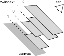
Schematic diagram of a stacking context with four layers.
The stacking context background and most negative positioned stacking contexts are at the bottom of the stack, while the most positive positioned stacking contexts are at the top of the stack.
The canvas is transparent if contained within another, and given a UA-defined color if it is not. It is infinite in extent and contains the root element. Initially, the viewport is anchored with its top left corner at the canvas origin.
The painting order for the descendants of an element generating a stacking context (see the z-index property) is:
-
If the element is a root element:
- background color of element over the entire canvas.
- background image of element, over the entire canvas, anchored at the origin that would be used if it was painted for the root element.
-
If the element is a block, list-item, or other block equivalent:
- background color of element unless it is the root element.
- background image of element unless it is the root element.
- border of element.
Otherwise, if the element is a block level table:
- table backgrounds (color then image) unless it is the root element.
- column group backgrounds (color then image).
- column backgrounds (color then image).
- row group backgrounds (color then image).
- row backgrounds (color then image).
- cell backgrounds (color then image).
- all table borders (in tree order for separated borders).
-
Stacking contexts formed by positioned descendants with negative z-indices (excluding 0) in z-index order (most negative first) then tree order.
-
For all its in-flow, non-positioned, block-level descendants in tree order: If the element is a block, list-item, or other block equivalent:
- background color of element.
- background image of element.
- border of element.
Otherwise, the element is a table:
- table backgrounds (color then image).
- column group backgrounds (color then image).
- column backgrounds (color then image).
- row group backgrounds (color then image).
- row backgrounds (color then image).
- cell backgrounds (color then image).
- all table borders (in tree order for separated borders).
-
All non-positioned floating descendants, in tree order. For each one of these, treat the element as if it created a new stacking context, but any positioned descendants and descendants which actually create a new stacking context should be considered part of the parent stacking context, not this new one.
-
If the element is an inline element that generates a stacking context, then:
-
For each line box that the element is in:
- Jump to 7.2.1 for the box(es) of the element in that line box (in tree order).
-
-
Otherwise: first for the element, then for all its in-flow, non-positioned, block-level descendants in tree order:
-
If the element is a block-level replaced element, then: the replaced content, atomically.
-
Otherwise, for each line box of that element:
-
For each box that is a child of that element, in that line box, in tree order:
-
background color of element.
-
background image of element.
-
border of element.
-
For inline elements:
-
For all the element’s in-flow, non-positioned, inline-level children that are in this line box, and all runs of text inside the element that is on this line box, in tree order:
-
If this is a run of text, then:
- any underlining affecting the text of the element, in tree order of the elements applying the underlining (such that the deepest element’s underlining, if any, is painted topmost and the root element’s underlining, if any, is drawn bottommost).
- any overlining affecting the text of the element, in tree order of the elements applying the overlining (such that the deepest element’s overlining, if any, is painted topmost and the root element’s overlining, if any, is drawn bottommost).
- the text.
- any line-through affecting the text of the element, in tree order of the elements applying the line-through (such that the deepest element’s line-through, if any, is painted topmost and the root element’s line-through, if any, is drawn bottommost).
-
Otherwise, jump to 7.2.1 for that element.
-
For inline-block and inline-table elements:
- For each one of these, treat the element as if it created a new stacking context, but any positioned descendants and descendants which actually create a new stacking context should be considered part of the parent stacking context, not this new one.
For inline-level replaced elements:
- the replaced content, atomically.
-
Some of the boxes may have been generated by line splitting or the Unicode bidirectional algorithm.
-
-
Optionally, the outline of the element (see 10 below).
-
-
Optionally, if the element is block-level, the outline of the element (see 10 below).
-
-
All positioned descendants with 'z-index: auto' or 'z-index: 0', in tree order. For those with 'z-index: auto', treat the element as if it created a new stacking context, but any positioned descendants and descendants which actually create a new stacking context should be considered part of the parent stacking context, not this new one. For those with 'z-index: 0', treat the stacking context generated atomically.
-
Stacking contexts formed by positioned descendants with z-indices greater than or equal to 1 in z-index order (smallest first) then tree order.
-
Finally, implementations that do not draw outlines in steps above must draw outlines from this stacking context at this stage. (It is recommended to draw outlines in this step and not in the steps above.)
21.3. Notes
The background of the root element is only painted once, over the whole canvas.
While the backgrounds of bidirectional inlines are painted in tree order, they are positioned in visual order. Since the positioning of inline backgrounds is unspecified , the exact result of these two requirements is UA-defined. CSS may in the future define this in more detail.
22. The float-displace and indent-edge-reset properties [alternative 1]
The float-displace property defines different ways in which text can wrap around a float.
Could this property be merged with wrap-flow in [CSS3-EXCLUSIONS]?
22.1. The float-displace property
| Name: | float-displace |
|---|---|
| Value: | line | indent | block | block-within-page |
| Initial: | line |
| Applies to: | all elements |
| Inherited: | yes |
| Percentages: | N/A |
| Media: | visual |
| Computed value: | as specified |
| Canonical order: | N/A |
| Applies to: | all block-level elements |
| Animatable: | no |
| Computed value: | Same as specified value |
This property determines the line wrapping policy in the presence of floats. Values have the following meanings:
- line
- Line boxes should be shortened and moved so as to avoid floats. The margin, border, padding and background of the element are not affected by floats. (This is the behavior as described in CSS2.) [add description or image?]
- indent
-
The distance between the margin edge of the floats and the start of
the line box is set to the distance between the active reference
indent edge (see the indent-edge-reset property) and the content
edge of the block box. This ensures that relative indents are preserved
in the presence of floats.
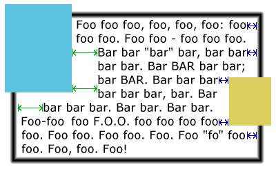
Example of 'float-displace: indent'. Note that the “bar” paragraph has the same indent (green arrow) next to the float as below it .
- block
-
The containing block’s width as used by the horizontal formatting model is reduced by the width of the floats intruding upon its content area (not taking into account floating descendants or floating elements that appear later in the document tree). The block is then flowed in this reduced containing block width.
If the effective containing block width is, by the algorithm given above, reduced to a value smaller than the sum of the margin-left, border-width-left, padding-left, width, padding-right, border-width-right, and margin-right values (treating any auto values as zero) then the margin-top of the block is increased until the effective containing block width is no longer so constrained or until all floats have been cleared, whichever occurs first.
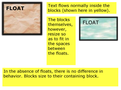
Example of 'float-displace: block'
- block-within-page
- As for the block value, but the determination of intrusions that adjust the width of the block is done separately on each page on which the block appears. Thus, the block may be narrowed on the first page due to one or more intrusions, but may expand (or contract) its width on subsequent pages with different intrusions.
A set of rules for HTML might look like this:
OL, UL, LI {float-displace: indent}TABLE {float-displace: block}
Lines in a list will get extra indentation when they are next to a float, so you can still see that they are part of the list, and tables will be made narrower as a whole.
22.2. The indent-edge-reset property
| Name: | indent-edge-reset |
|---|---|
| Value: | none | margin-edge | border-edge | padding-edge | content-edge |
| Initial: | none |
| Applies to: | all elements with a block-level inner formatting context. |
| Inherited: | no |
| Percentages: | n/a |
| Media: | visual |
| Computed value: | specified value |
| Canonical order: | N/A |
| Animatable: | yes |
This property determines which edge to use as the reference indent edge when calculating the amount of indent to preserve when the value of float-displace is set to indent.
- none
- This block does not introduce a new reference edge.
- margin-edge
- border-edge
- padding-edge
- content-edge
- border-edge
- A new reference indent edge is introduced by this block. Which edge is used as the reference indent edge is determined by which value is given.
The reference indent edge is the nearest ancestor in the same formatting context which has a non-none value for indent-edge-reset. If no ancestor in the formatting context has a value specified for this property, then the content edge of the root of the formatting context is used.
The ‘float-displace’ property [alternative 2]
Alternative definition, that (1) avoids the need for indent-edge-reset and (2) changes not just the line boxes, but also the content edge, so that list markers stay close to the content:
| Name: | float-displace--alternative-2 |
|---|---|
| Value: | line | indent | block | block-within-page |
| Initial: | line |
| Applies to: | all elements |
| Inherited: | yes |
| Percentages: | N/A |
| Media: | visual |
| Computed value: | as specified |
| Canonical order: | N/A |
| Applies to: | all block-level elements |
| Animatable: | no |
| Computed value: | Same as specified value |
- line
-
Line boxes are shortened so they don’t overlap floats. See below for the details. The element’s margin, border or padding are not influenced by the presence of floats. (This is the only behavior in CSS level 2.)
- indent
-
Line boxes are first shortened as for line. If the distance between the inline-start edge of the content box and the inline-start edge of the line box is then not zero, then that distance is further increased by the element’s relative indent (defined below). Ditto for the inline-end edge. The element’s margin, border or padding are not influenced by the presence of floats.
- block
-
The margins of the element are increased (and the width thus reduced) by the amount necessary so that the border box of the element doesn’t overlap any floats in the same flow that are created by elements earlier in the document; and then the margins are increased even more by the amount of the relative indent on the relevant side of the element. If that causes the element to have more overflow than it would have had with a value of line, the element is moved down instead (by adding clearance) just enough that it doesn’t have more overflow, or that its top border edge is just below the bottom margin edge of all floats.
Line boxes inside the element are shortened and/or moved as needed the same way as for line.
Note that floats that are descendants of the element do not influence the element’s margins, but they may influence the line boxes.
- block-within-page
-
Like block, except that the parts of the element on different pages are treated as separate blocks for the purpose of this property and are only indented as necessary to avoid floats on the same page.
Note that centered text (text-align is center) is centered relative to the content edges, not relative to the edges of the line box.
Note also that block and block-within-page influence the position of the element’s list marker (if any), because list markers are positioned relative to the content edge. Indeed, this may be the main reason for using float-displace: to move the list markers from one side of the float (or on top of the float) to the other side.
A line box normally stretches from an element’s content edge to the opposite content edge, unless it overflows (see [CSS3TEXT]), but if the element’s float-displace is line or indent it may fall short of either or both content edges. The following defines how line boxes are shortened in the case of line:
For all elements E, and all floats F whose parent is in the same flow as E, and all line boxes L of E: if L contains any inline boxes that are generated by elements that come after F in the document, then L may not overlap the exclusion zone of F.
Note that a line box next to a float cannot overflow: if an inline box is too wide for a shortened line box, the line box is left empty and the inline box is put in the next line box in which it fits, or the next one that is not shortened by floats. [Is this indeed correctly defined in [CSS3TEXT]?]
Implementation note: Note that the height of a line box depends on its content. It may be, e.g., that a line box next to a float has enough room horizontally for three words, but adding the third word would increase the height of the line box and make it overlap the next float further down. In that case the third word cannot be added to that line box and must be put in the next line box (or even further down).
The relative indent on side S of an element E is defined recursively as follows:
- If E has no parent, or the parent is not in the same flow, or the parent’s float-displace has a different value than E’s, then the value is 0.
- Otherwise, the value is the relative indent on side S of the parent, plus the computed values of the parent’s margin, padding and border-width on side S.
How line boxes are constructed is explained in the CSS Text Module [CSS3TEXT]. The presence of a float modifies that construction in two ways: the length of the line box can become shorter (i.e., shorter than the distance between the element’s content edges) and, unlike a normal line box, such a shorter line box may be empty. The following describes these effects in detail.
The ‘float-displace’ property [alternative 3]
Yet another alternative. This one adds a fixed indent rather than one that depends on the context:
| Name: | float-displace--alternative-3 |
|---|---|
| Value: | auto | <length> && [ block | block-within-page ]? |
| Initial: | auto |
| Applies to: | all elements |
| Inherited: | no |
| Percentages: | N/A |
| Media: | visual |
| Computed value: | as specified |
| Canonical order: | N/A |
| Applies to: | all block-level elements |
| Animatable: | no |
| Computed value: | Same as specified value |
- auto
-
Line boxes are shortened and/or moved so they don’t overlap floats. (This is the only behavior in CSS level 2.)
- <length>
-
Line boxes are shortened and/or moved as for auto, except that the amount they are shortened by, if possible, is equal to the amount necessary to not overlap any float plus the given <length>.
- block
-
If the keyword block is present in addition to a <length>, the margins of the element are increased (and the width thus reduced) by the amount necessary so that the border box of the element doesn’t overlap any floats in the same flow that are created by elements earlier in the document; and then the margins are increased even more by the given <length>. If that causes the element to have more overflow than it would have had with a value of auto, the element is moved down instead (by adding clearance) just enough that it doesn’t have more overflow, or that its top border edge is just below the bottom margin edge of all earlier floats in the same flow.
Line boxes inside the element are shortened and/or moved as needed the same was as for auto.
Note that floats that are descendants of the element do not influence the element’s margins, but they may influence the line boxes.
- block-within-page
-
Like block, except that the parts of the element on different pages are treated as separate blocks for the purpose of this property and are only indented as necessary to avoid floats on the same page.
Note that all values, except auto, also cause centered lines to no longer be centered if they are next to a float.
Note also that block and block-within-page influence the position of the element’s list marker (if any), because list markers are positioned relative to the content edge. Indeed, this may be the main reasons for using float-displace: to move the list markers from one side of the float (or on top of the float) to the other side.
Example: Assume that the floating image is tall than the paragraph it is part of.
img {float: left}ul {float-displace: 2em block}
li {margin-left: 2em}
with document fragment
<p>
  <img src=... alt=... style="float: left">
  Paragraph before the list.

<ul>
  <li>First item
  <li>Second item
</ul>
Without the image, the rendering might look like this:
Paragraph before the list.

  * First item
  * Second item
With the image, but without the rule for float-displace, the output might look like this:
+----+Paragraph before the list.
|\  /|
| */ |First item
| *\ |Second item
|/  \|
+----+
With the float-displace rule, the UL is indented extra to avoid the image, plus 2em more:
+----+Paragraph before the list.
|\  /|
| \/ |  * First item
| /\ |  * Second item
|/  \|
+----+