Abstract
This module describes the page model that partitions a flow into pages. It
builds on the CSS3 Box model module and introduces
and defines the page model and paged media. It adds functionality for
pagination, page margins, headers and footers, image orientation. Finally it
extends generated content for the purpose of cross-references with page
numbers.
Status of this document
This section describes the status of this document at the time of its
publication. Other documents may supersede this document. A list of current
W3C publications and the latest revision of this technical report can be
found in the W3C technical reports index
at http://www.w3.org/TR/.
This specification is a Last Call
Working Draft from the CSS working group, which is part of the Style activity (see summary) and is released with the consensus of the
group. This document is in the Last Call review period, which ends on 31
January 2004 and is one of the modules of the upcoming CSS3
specification.
Please send comments to the mailing list www-style@w3.org (see
instructions), which is
preferred for discussion of this and other drafts in the Style area.
Patent disclosures relevant to CSS may be found on the Working Group's
public patent disclosure
page.
It is inappropriate to use a W3C Working Draft as reference material or to
cite it as other than "work in progress". Its publication does not imply
endorsement by the W3C membership.
Table of contents
1. Dependencies on other
modules
This CSS3 module depends on the following other CSS3 modules:
2. Introduction
Paged media (e.g., paper, transparencies, pages that are displayed on
computer screens, etc.) differ from
continuous media
in that
the content of the document is split into one or more discrete pages. To
handle pages, CSS3 describes how:
- page breaks are created,
- the page size, margins, border, and padding are specified,
- headers and footers are established within the page margins, and
- content such as page counters and string-sets placed in the headers and
footers.
CSS3 defines a page model that specifies how a
document is formatted within a rectangular area, called the page box, that has finite width and height.
The page box does not necessarily have a one-to-one correspond to the real sheet where the document will ultimately be rendered
(paper, transparency, screen etc.). The CSS3 page model specifies formatting
within the page box, but it is the user agent's responsibility to transfer
the page box to the sheet. Some user agent transfer possibilities that are
not addressed by CSS3 include:
- Transferring one page box to one sheet (e.g. single-sided printing)
- Transferring two page boxes to both sides of the same sheet (e.g.
double-sided printing).
- Transferring N (small) page boxes to one sheet (called "N-up").
- Transferring one (large) page box to N x M sheets (called "tiling").
- Creating signatures. A signature is a group of pages printed on a sheet,
which, when folded and trimmed like a book, appear in their proper sequence.
- Printing one document to several output trays.
- Outputting to a file.
Although CSS3 does not specify how user agents transfer page boxes to
sheets, it does include certain mechanisms for telling user agents about the
page sheet size and orientation. Furthermore, CSS3
assumes that one page box will be transfer to a side of a sheet.
2.1. Terminology
The keywords "MUST", "SHALL", "MUST NOT", "SHALL NOT", "REQUIRED", "SHOULD", "SHOULD NOT", "RECOMMENDED", "MAY", and "OPTIONAL" when used in this document are to be interpreted as
described in RFC 2119 [RFC2119]. However, for readability, these words do not
appear in all uppercase letters in this specification.
3. Page boxes: the
@page rule
In the page model the document is transferred into one or more page boxes.
The properties of a page box are determined by
properties within the page context, which is
the rule set of the @page rule. Like normal boxes a page box consists of
margin, border, padding and content areas. Page boxes differ from other boxes
in the following characteristics:
- The 'width' and 'height' properties do not apply to a page box. The
size of the page box is specified using the 'size' property in a page context.
- Boxes, called margin boxes, can be placed in the
page box margin area.
3.1. The page model
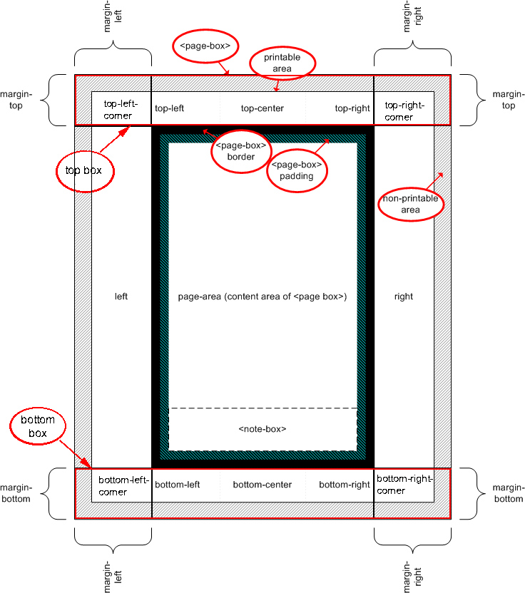
The following terminology and accompanying diagram make up the page model:
- Page sheet
- The page sheet is the area that corresponds to the area of the physical
media.
- Non-printable area
- The non-printable area is the area of a page sheet that a physical device
such as a printer is not capable of marking. This value is printing device
dependent. Non-page marking user agents such as a browser MAY not be aware of this area or how it
varies from printing device to printing device. Printing devices MUST adjust the layout
of the document so that content is not lost. How this adjustment is
accomplished is device dependent within the constraints expressed below in
the sections Rendering page boxes that do not fit a
page sheet and Content outside the page
box.
- Printable area
- The printable area is the area of page sheet that a printer is capable of
marking. The size of the printable area is the size of the page sheet reduced
by the size of the non-printable area. This value is printing device
dependent. Non-page marking user agents such as a browser MAY not be aware of this area or how it
varies from printing device to printing device. Printing devices MUST adjust the layout
of the document so that content is within the printable area. How this
adjustment is accomplished is device dependent within the constraints
expressed below in the sections Rendering page
boxes that do not fit a page sheet and Content outside the page box.
- Page box
- A page box is derived from the box model and contains
portions of the document flow destined for rendering on a page sheet. The
width and height of the page box are determined by the size property. Unlike
other boxes, the margins of the page box are subdivided into margin boxes. In the simplest case the page box is
congruent with the page sheet. However, there are more complex uses cases
(see the transfer possibilities in the Introduction) where the page box differs from the page
sheet in values such as size or orientation.
- Page area
- The page area is a synonym for the content area of the page box. The page
area acts as a container for all the boxes laid out within a given page box.
- Margin box
- Margin boxes act as containing boxes for header/footer content. The
following margin boxes are defined and illustrated in the diagram below:
Margin box definitions
| top |
a box filling the area defined by the top margin of the page box for
compatibility with previous versions of this document. |
| top-left-corner |
a fixed size box filling the area defined by the intersection of the top
and left margins of the page box |
| top-left |
a variable width box within the area defined by the top margin and
adjoining the top-left-corner margin box |
| top-center |
a variable width box within the area defined by the top margin, centered
on the page area, and between the top-left and top-right margin boxes |
| top-right |
a variable width box within the area defined by the top margin and
adjoining the top-right-corner margin box |
| top-right-corner |
a box filling the area defined by the intersection of the top and right
margins of the page box |
| left |
a box filling the area defined by the left margin of the page box
exclusive of the areas defined by the intersection of the left margin and the
top margin and the left margin and the bottom margin |
| right |
a box filling the area defined by the right margin of the page box
exclusive of the areas defined by the intersection of the right margin and
the top margin and the right margin and the bottom margin |
| bottom |
a box filling the area defined by the bottom margin of the page box for
compatibility with previous versions of this document. |
| bottom-left-corner |
a box filling the area defined by the intersection of the bottom and left
margins of the page box |
| bottom-left |
a variable width box within the area defined by the bottom margin and
adjoining the bottom-left-corner margin box |
| bottom-center |
a variable width box within the area defined by the bottom margin,
centered on the page area, and between the bottom-left and bottom-right
margin boxes |
| bottom-right |
a variable width box within the area defined by the bottom margin and
adjoining the bottom-right corner margin box |
| bottom-right-corner |
a box filling the area defined by the intersection of the bottom and
right margins of the page box |
The following diagram is a pictorial representation of the page model
(note that in the diagram one page box is mapped to the page sheet and the
non-printable area intrudes into the margin boxes):
3.2. Page types
Not all pages are alike, they can vary in orientation and size.
Furthermore, a set of pages can have special treatments applied based on the
page's place in the document: first, left, and right. The following
terminology is used to describe page types:
- Page Orientation
- The page orientation, or more simply orientation, is the page's
orientation as defined by a comparison of the length of a page sheet's edges.
Each page has a long edge and a short edge. When a page
sheet is square the long edge is the same length as the short edge, otherwise
the length of the long edge is greater than the length of the short edge.
- Portrait Orientation
- A portrait page's height is greater than its width. Horizontal elements
are parallel to the short edge and vertical elements to the long edge.
- Landscape Orientation
- A landscape page's width is greater than its height. Horizontal elements
are parallel to the long edge and vertical elements to the short edge.
- Front Side
- Media used as a stack of sheets have two sides known as the front and the
back. The front side is the side in view. Typically, the user agent prints on
the front side of the media although it MAY place the page in an output bin after printing so that
the back is visible. Media used from a roll or continuous form only have a
front side.
- Back Side
- The back side of a sheet medium, is the side that cannot be seen when
looking at the front side. Typically, the back side is only used when
printing on both side of the medium. Media from a roll or continuous form do
not have a back side
- First Page
 The first page in a set
of pages. The UA determines which page is the first page. The first page is
generally printed on the front side of a medium, however documents where the
writing direction is right-to-left my cause the printer to place the first
page on the back side of the first sheet.
The first page in a set
of pages. The UA determines which page is the first page. The first page is
generally printed on the front side of a medium, however documents where the
writing direction is right-to-left my cause the printer to place the first
page on the back side of the first sheet.- Facing Pages
 Facing pages are two pages in order as printed, with the even numbered page
on the left and odd numbered on the right for documents where the righting
order is left to right. When front and back side printing occurs these two
page will face each other in the document.
Facing pages are two pages in order as printed, with the even numbered page
on the left and odd numbered on the right for documents where the righting
order is left to right. When front and back side printing occurs these two
page will face each other in the document.- Left Page
- The left facing page, usually even numbered. Also called versos.
The UA distinguishes the left page from the first and right pages. This page
will be printed on front side of a medium when printing on only one side of
the media and on the back when printing on both sides for left-to-right
documents.
- Right Page
- The right facing page, usually odd numbered. Also called rectos.
The UA distinguishes the right page from the first and left pages. This is
page is printed on the front of a medium for left-to-right documents.
- Binding Edge
- The binding edge is the page edge that will be stitched, stapled, or
punched with holes when preparing the pages of the document for binding.
Typically, the margin of the binding edge is larger than other margins to
accommodate the space needed for binding. Usually the binding edge is the
left side of a page when printing in portrait mode on the right page. The
binding edge is usually on the right side of a portrait oriented left page.
Similarly, The top and bottom edges can be the binding edges when printing in
landscape orientation. There are no provisions within CSS3 for specifying a
binding edge and an accompanying increased margin size. However, the :left and :right page selectors
can be used to write style sheet rule sets for binding edges.
3.3. Page size
Different parts of the world uses different paper sizes. It is a goal of
this specification that web content should be adaptable to a range of
different sizes without having to write a specific style sheet for each paper
size.
However, in some situations it is important that a certain page size
achieves a certain style. This proposal describes two ways of achieving this
goal: Media Queries [MEDIAQ] allow
different style sheets to be applied to different page sizes, and the 'size'
property requests that the document is printed on a page which has a certain
size. The CSS Working Group specifically welcomes feedback on the need for
and feasibility of these features.
3.3.1. Media
Queries
By using Media Queries [MEDIAQ],
one style sheet can express different stylistic preferences for different
page sizes. Consider this example:
   /* style sheet for "A4" printing */
   @media print and (width: 21cm) and (height: 29.7cm) {
      @page {
         margin: 3cm;
      }
   }

   /* style sheet for "letter" printing */
   @media print and (width: 8.5in) and (height: 11in) {
      @page {
          margin: 1in;
      }
   }
In the example above, "A4" sheets are given a "3cm" page margin, and
"letter" sheets are given a "1in" page margin.
In Media Queries, the page is always considered to be in Portrait
Orientation. That is, it is not necessary to write Media Queries that swap
the width and height values to make sure the style sheet is applied.
3.3.2. Page size: the
'size' property
| Name: |
size |
| Value: |
<length>{1,2} | auto | [ <page-size> || [ portrait |
landscape] ] |
| Initial: |
auto |
| Applies to: |
page context |
| Inherited: |
N/A |
| Percentages: |
N/A |
| Media: |
paged |
| Computed value: |
specified value |
This property specifies the size and orientation of the containing box of
the page box. The assumption is that there is only
one page box mapped to a page sheet (or one page
box mapped to either side of a page sheet) the 'size' property specifies the size of the page sheet.
The size of a page box MAY either be "absolute" (fixed size) or "relative" (scalable,
i.e., fitting available sheet sizes). Relative page boxes allow user agents
to scale a document and make optimal use of the page size.
Three values for the 'size' property create a relative page box:
- auto
- The page box will be set to the size and orientation of the page sheet
chosen by the UA.
- landscape
- Specifies that the page's content be printed in landscape orientation.
The page box is the same size as the page, and the longer sides are
horizontal. If a '<length>' or '<page-size>' is not used, the size of the page
sheet is chosen by the UA.
- portrait
- Specifies that the page's content be printed in portrait orientation. The
page box is the same size as the page, and the shorter sides are horizontal.
If a '<length>' or '<page-size>' is not used, the size of the page
sheet is chosen by the UA.
In the following example, the outer edges of the page box will align with
the page. The percentage value on the 'margin'
property is relative to the page size so if the page sheet dimensions are
21.0cm x 29.7cm (i.e., A4), the margins are 2.10cm and 2.97cm.
@page {
  size: auto;/* auto is the initial value */
  margin: 10%;
}
- <length>
- The page box will be set to the given absolute length, If only one
length value is specified, it sets both the width and height of the page box
(i.e., the box is a square). The page context has
no notion of fonts, so 'em' and 'ex' units are not allowed.
For example:
@page {
  size: 8.5in 11in;/* width height */
}
The above example sets the width of the page box to be 8.5in and the
height to be 11in. The page box in this example requires a page sheet size of
8.5"x11"; or larger.
A page size can be specified using one of the following media names. This
is the equivalent of specifying the '<page-size>' using length values.
- A4
- The page box will be set to the size of A4 media: 210 cm wide and 297 cm
high. This is synonymous with portrait orientation. Landscape printing on A4
media can be specified by using 'landscape' with
'A4'.
- letter
- The page box will be set to the size of letter media: 8.5 inches wide and
11 inches high. This is synonymous with portrait orientation. Landscape
printing on letter media can be specified by using 'landscape' with 'letter'.
For example:
@page {
  size: letter landscape;
}
The above example sets the width of the page box to be 11in and the height
to be 8.5in. The page box in this example requires a page sheet size of 8.5
inches by 11 inches, or larger.
User agents MAY
allow users to control the transfer of the page box to the sheet (e.g.,
rotating an absolute page box that's being printed). This is outside the
scope of this document
3.3.3. Rendering page
boxes that do not fit a page sheet
If a page box does not fit the page sheet dimensions, the user agent MAY choose to:
- Rotate the page box 90° if this will make the page box fit.
- Scale the page box to fit the UA's page.
- Reformat the page if the page box will not fit in the UA's printable area.
The user agent SHOULD consult the user before performing these operations.
3.3.4. Positioning
the page box on the sheet
When the page box is smaller than the page size, the user agent SHOULD center the
page box on the sheet since this will align double-sided pages and avoid
accidental loss of information that is printed near the edge of the sheet.
3.4. Page
selector and page context
Authors specify dimensions, orientation, margins etc. of a page box within
an @page rule. An @page rule consists of the keyword
'@page', an OPTIONAL page name followed with no
intervening space by an OPTIONAL page pseudo-class and a block of declarations and
margin rules (said to be in the page context).
The OPTIONAL
page name and OPTIONAL page pseudo-class constitutes the page selector. The page selector specifies for which
pages the declarations apply. In CSS3, page selectors MAY designate first page, all left
pages, all right pages, or a page with a specific name.
Properties for the page box are specified within a
page context.
3.4.1. Page selector
The syntax for a page selector is a specialization of the generic at-rule
and MUST adhere to
the following (more strict) grammar:
Each new lexical token are all specializations of the ATKEYWORD lexical
token:
PAGE_SYM              ::= "@page"
TOP_SYM               ::= "@top"
TOPLEFTCORNER_SYM     ::= "@top-left-corner"
TOPLEFT_SYM           ::= "@top-left"
TOPCENTER_SYM         ::= "@top-center"
TOPRIGHT_SYM          ::= "@top-right"
TOPRIGHTCORNER_SYM    ::= "@top-right-corner"
BOTTOM_STYM           ::= "@bottom"
BOTTOMLEFTCORNER_SYM  ::= "@bottom-left-corner"
BOTTOMLEFT_SYM        ::= "@bottom-left"
BOTTOMCENTER_SYM      ::= "@bottom-center"
BOTTOMRIGHT_SYM       ::= "@bottom-right"
BOTTOMRIGHTCORNER_SYM ::= "@bottom-right-corner"
LEFT_SYM              ::= "@left"
RIGHT_SYM             ::= "@right"

page :
       PAGE_SYM S* IDENT? pseudo_page? S*
       '{' S* [ declaration | margin ] [ ';' S* [ declaration | margin ]? ]* '}' S*
       ;

pseudo_page :
       ':' [ "left" | "right" | "first" ]
       ;

margin :
       margin_sym S* '{' declaration [ ';' S* declaration? ]* '}' S*
       ;

margin_sym :
       TOP_SYM |
       TOPLEFTCORNER_SYM |
       TOPLEFT_SYM |
       TOPCENTER_SYM |
       TOPRIGHT_SYM |
       TOPRIGHTCORNER_SYM |
       BOTTOM_SYM |
       BOTTOMLEFTCORNER_SYM |
       BOTTOMLEFT_SYM |
       BOTTOMCENTER_SYM |
       BOTTOMRIGHT_SYM |
       BOTTOMRIGHTCORNER_SYM |
       LEFT_SYM |
       RIGHT_SYM
       ;
The following restrictions and relaxations are made to the syntax above:
- The top margin box defined by the '@top' at-rule
is deprecated in favor of those defined by '@top-left-corner', '@top-left',
'@top-center', '@top-right', and '@top-right-corner'. Whenever, the deprecated '@top' at-rule occurs with any of the non-deprecated
at-rules listed above, the UA MUST ignored the declarations of the deprecated at-rule. This behavior allows a single document with both deprecated and
non-deprecated at-rules to be processed by UA's that only support the
deprecated at-rule, as well as by UA's that support the non-deprecated
at-rules list above.
- The bottom margin box defined by the '@bottom'
at-rule is deprecated in favor of those defined by '@bottom-left-corner', '@bottom-left', '@bottom-center',
'@bottom-right', and '@bottom-right-corner'. Whenever, the deprecated '@bottom' at-rule occurs with any of the non-deprecated, bottom
margin box defining at-rules listed above, the UA MUST ignored the declarations of
the deprecated at-rule.
The following are examples of page selectors (declaration block
intentionally left blank)
@page { ... }
@page :left { ... }
@page :right { ... }
@page LandscapeTable { ... }
@page CompanyLetterHead:first { ... }
@page:first { ... }; /*  identifier and pseudo page. */
The following are examples of margin boxes where the declaration blocks
are intentionally left blank.
@page {
    @top { ... }  /* defines a header the width of the page */
    @bottom { ... } /* footer is the width of the page */
}
@page {
   @top { ... }     /* used by UA that doesn't know about @top-left */
   @top-left { ... }/* used by UA that does know about @top-left */
   @bottom  { ... } /* @top-left only eclipses @top }
}
@page {
   @top-left { ... /* document name */ }
   @bottom-center { ... /* page number */}
}
@page :left { @left { ... /* page number in left margin */ }}
@page :right{ @right { ... /* page number in right margins of right pages */ }

@page :left { @bottom-left-corner { ... /* left page numbers */ }
@page :right { @bottom-right-corner { ... /* right page numbers */ }
@page :first { @bottom-right-corner { ... /* empty footer on 1st page */ }
3.4.2.
Cascading in the page context
Declarations in the page context obey the
cascade just like normal CSS3 declarations.
Properties specified in a ':left' (or ':right') '@page' rule override those specified in an '@page' rule that has no pseudo-class
specified. Properties specified in a ':first' '@page' rule override those specified
in ':left' (or ':right')
'@page' rules.
Consider the following example:
@page {
  margin-left: 3cm;
}

@page :left {
  margin-left: 4cm;
}
Due to the higher specificity of the pseudo-class selector, the left
margin on left pages will be '4cm' and all other
pages (i.e., the right pages) will have a left margin of '3cm'.
3.5. Page box
margin, border and padding
The margin, border and padding properties apply to the page box. They are
specified within the page context. They follow
the normal rules for box properties with the following exceptions:
- The page context has no notion of fonts, so
'em' and 'ex' units are not
allowed.
- Percentage values on the margin, padding and border properties are
relative to the dimensions of the containing box (defined by the 'size' property in the page
context). For left and right margin, border and padding percentages are
relative to the width of the containing box; for right and bottom margin,
border and padding percentages are relative to the height of the containing
box.
- The 'width' and 'height' properties do not apply to the page box (and
SHOULD be treated
as if they were set to 'auto').
3.6. Left, right, and
first pages
When printing double-sided documents, the page
boxes on left and right pages MAY be different. This MAY be expressed through CSS pseudo-classes defined in the
page context.
All pages are automatically classified by user agents into either the
':left' or ':right'
pseudo-class. The following example creates left and right binding edges
using these pseudo-classes.
@page :left {
  margin-left: 3cm;
  margin-right: 4cm;
}

@page :right {
  margin-left: 4cm;
  margin-right: 3cm;
}
If different declarations have been given for left and right pages, the
user agent MUST
honor these declarations even if the user agent does not transfer the page
boxes to left and right sheets (e.g., a printer that only prints
single-sided).
Authors MAY also
specify style for the first page of a document with the ':first' pseudo-class:
@page { margin: 2cm } /* All margins set to 2cm */

@page :first {
  margin-top: 10cm /* Top margin on first page 10cm */
}
Whether the first page of a document is ':left'
or ':right' depends on the major writing direction
of the document and is outside the scope of this document. However, to force
a ':left' or ':right' first
page, authors MAY
insert a page break before the first generated box (e.g., in HTML, specify
this for the BODY element).
Note. Adding declarations to the ':left' or ':right' pseudo-class
does not influence whether the document comes out of the printer double- or
single-sided (which is outside the scope of this specification).
Note. Future versions of CSS may include other page
pseudo-classes.
3.7. Content outside
the page box
When formatting content in the page model, some content MAY end up outside the
page box. For example, an element whose 'white-space' property has the value 'pre' MAY generate a box that is wider than the page box. Also, when
boxes are positioned absolutely, they MAY end up in "inconvenient" locations. For example,
images MAY be placed
on the edge of the page box. Similarly when boxes are positioned fixed they
MAY also end up
outside of the page box.
A specification for the exact formatting of such elements lies outside the
scope of this document. However, we recommend that authors and user agents
observe the following general principles concerning content outside the page
box:
- User agents SHOULD avoid generating a large number of empty page boxes to
honor the positioning of elements (e.g., you don't want to print 100 blank
pages). Note, however, that generating a small number of empty page boxes MAY be necessary to
honor the 'left' and 'right' values for 'page-break-before' and 'page-break-after'.
- Authors SHOULD not position elements in inconvenient locations just to
avoid rendering them. Instead:
- To suppress box generation entirely, set the 'display' property to 'none'.
- To make a box invisible, set the 'visibility' property.
- User agents MAY
handle boxes positioned outside the page box in several ways, including
discarding them or creating page boxes for them at the end of the document.
4. Margin boxes
Margin boxes are used for headers and footers.
- Header row
- Margin boxes 'top-left-corner', 'top-left', 'top-center', 'top-right' and 'top-right-corner' are collectively referred to as the
header row. The entire header row can be addressed using 'top'. However, use of 'top'
cannot occur with any of the other top margin boxes.
- Footer row
- Margin boxes 'bottom-left-corner', 'bottom-left', 'bottom-center',
'bottom-right' and 'bottom-right-corner' are collectively referred to the
footer row. The entire footer row can be addressed using 'bottom'. However, use of 'bottom' cannot occur with any of the other bottom margin
boxes.
In addition the are two more margin boxes - 'left' and 'right' that MAY be used for
vertically oriented headers and footers. Please note that the margin boxes
are oriented with respect to the content and are independent of page
orientation, for example the top margin box is above the page box in both
portrait and landscape orientation.
Margin boxes are instantiated through margin
at-rules inside the page context.
4.1. At-rules for margin
boxes
A margin at-rule consists of an ATKEYWORD
that identifies the margin box (e.g. '@top-left')
and a block of declarations (said to be in the margin context).
The following style sheet establishes a page header containing the title
("Hamlet") on the left side and the page number, preceded by "Page ", on the
right side:
@page {
  size: 8.5in 11in;
  margin: 10%;

  @top-left {
    content: "Hamlet";
  }
  @top-right {
    content: "Page " counter(pages);
  }
}
4.2. Maximum Dimension
of margin boxes
The width and height of each margin box is determined by establishing the
containing box for the margin box in the following steps:
- The margin areas of the page box are determined.
This establishes the containing boxes for the margin boxes.
When the page size approximates the page sheet, the non-printable area
intrudes into the margin area are the page, so margins of approximately
.125in for margin boxes are suggested.
- If a single top or bottom margin box is created by the '@top' or '@bottom' rule,
respectively, it is treated as if it were a table with one row containing one
cell the width of the page box, including the areas defined by the
intersection of the left and right page box margins with the top or bottom
margin. For example, given an 8.5 inch wide page with one inch margins, the
boxes established with the '@top' or '@bottom' rules fill an area one inch high and 8.5 inches
wide.
- When multiple top and bottom margin boxes are created, the five margin
boxes at the top and bottom are each treated as if they formed a table with
one row and five cells. The left and right margin boxes are treated as if
they each formed a table with one row and one cell.
- In both cases, the margin boxes are treated as follows:
- Each margin box is contained within a anonymous table cell. Margin,
border and padding properties take on their initial value - i.e. no margin,
no border and no padding and the margin's content box is congruent with the
containing box.
- As a consequence of the above, when the top and bottom margin boxes are
used there are no visible borders between the cells.
- The right edge of the containing box for margin boxes 'top-left-corner' and 'bottom-right-corner' MUST line up with the left border edge of the page
box. Similarly, the left edge of the containing box for margin boxes 'top-right-corner' and 'bottom-right-corner' MUST line up with the right border edge of the page
box.
- If the cell doesn't have any content and its width is set to 'auto,' it acts as if it is not there.
- If the top or bottom center cell has content, the middle of the cell is
always aligned horizontally with the middle of the page box content area,
causing the left and right cells to always have the same width. If the center
cell does not have content and 'width' is 'auto', its width is zero and margin, padding and border
properties do not apply.
- The maximum width of the top center cell is determined by the following
situations (the same calculations are used for the maximum width of the
bottom cell):
- If the cell contains something and both the left and right cells are
empty, that is, they don't have content, then the maximum width of the center
cell is the width of the page sheet.
- If the cell is not empty, and the left or right cells, or both are not
empty then the maximum widths of the left, right and center cells are set
proportional to their content within the constraints that the center cell is
aligned on the center of the page and that the left and right cells are the
same width. The maximum width of the center cell is the width of the
page-area multiplied by the ratio of the size of the content of the center
cell to the sum of the sizes of the center cell's content and the largest
content of either the left or right cells.
max width = (width of page-area
× size of the center content)
÷
∑( size of center content, 2
× max (size of the top left content, size of
the top right content))
- The maximum width of the left top and left bottom cells is determined by
the following:
- If the cell is empty, the width is zero.
- If the cell is not empty, and the center and right cells are empty, then
the maximum width is the width of the page-area.
max width = width of page-area
- If both the left and center cells have content, then the maximum width of
the left cell is half of the subtraction of the maximum width of the center
cell from the page width.
max width = (width of page-area
- max width of center cell)
÷ 2
- The maximum width of the right top and right bottom cells is determined
by the following:
- If the cell is empty, the width is zero.
- If the cell is not empty, and the center and left cells are empty, then
the maximum width is the width of the page-area.
max width = width of page-area
- If both the right and center cells have content, then the maximum width
of the right cell is half of the subtraction of the maximum width of the
center cell from the page width.
max width = (width of page-area
- max width of center cell)
÷ 2
The maximum widths for the containing boxes discussed above, are the
maximum width for the margin boxes. Values of the 'width', 'padding',
'margin', and 'border' properties for these boxes that result in a
value larger than the maximum MUST be ignored. This keeps the margin boxes from intruding
into the page area or off the page.
4.3. Margin boxes
and default values
Margin boxes have an initial value of zero for padding, border and margin.
The default height of top boxes is the value of page box's top margin. The
default height of the bottom boxes is the value of the page box's bottom
margin. The initial value for 'content' is
'none'. The initial value of text-align,
vertical-align, and width for top and bottom margin boxes is defined
below:
| Margin box |
Initial value of 'text-align' |
Initial value of 'vertical-align' |
Initial width |
| top |
left |
middle |
width of page sheet |
| top-left-corner |
right |
middle |
left margin |
| top-left |
left |
middle |
if the content is empty then
width ← 0
else if width of top-center > 0 then
width ← (width of
page-area -(width of top-center)) ÷ 2
else if width of top-right = 0 then
width ← width of page-area
else
width ← (width of
page-area × width of top-left)
÷ ∑(width of top-left, width of top-right)
end if |
| top-center |
center |
middle |
if top left content is empty AND top right content is empty then
max width ← width of
page-area
else
max width ← (width of
page-area × content width) ÷ ∑(content width, 2 ×
max (top left content width, top right
content width)
end if |
| top-right |
right |
middle |
if the content is empty then
width ← 0
else if width of top-center > 0 then
width ← (width of
page-area -(width of top-center)) ÷ 2
else if width of top-left = 0 then
width ← min
(content width, width of page-area)
else
width ← (width of
page-area × width of top-right)
÷ ∑(width of top-left, width of top-right)
end if |
| top-right-corner |
left |
middle |
right margin |
| left |
center |
middle |
left margin |
| right |
center |
middle |
right margin |
| bottom |
left |
middle |
width of page sheet |
| bottom-left-corner |
right |
middle |
left margin |
| bottom-left |
left |
middle |
if the content is empty then
max width ← 0
else if width of bottom-center > 0 then
max width ← (width of
page-area -(width of bottom-center))
÷ 2
else if width of bottom-right = 0 then
max width ← width of
page-area
else
max width ← (width of
page-area × width of bottom-left)
÷ ∑(width of bottom-left, width of bottom-right)
end if |
| bottom-center |
center |
middle |
if bottom left content is empty AND bottom right content is empty then
max width ← width of
page-area
else
max width ← (width of
page-area × content width) ÷ ∑(content width, 2 ×
max (bottom left content width, bottom right
content width)
end if |
| bottom-right |
right |
middle |
if the content is empty then
max width ← 0
else if width of bottom-center > 0 then
max width ← (width of
page-area -(width of bottom-center))
÷ 2
else if width of bottom-left = 0 then
max width ← width of
page-area
else
max width ← (width of
page-area × width of bottom-right)
÷ ∑(width of bottom-left, width of bottom-right)
end if |
| bottom-right-corner |
left |
middle |
right margin |
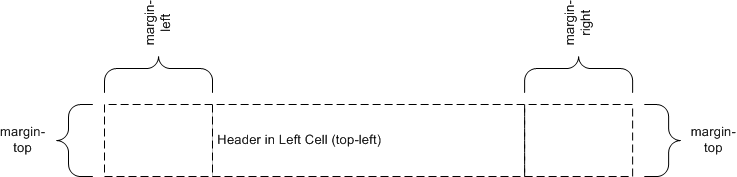
4.3.1. Margin box examples
The following is a collection of examples of headers.
The following is an example of:
@page {
  @top-left { content: "Header in Left Cell (top-left)" }
}
Because there is no center cell the extent of the top-left is allowed to
cross the center.
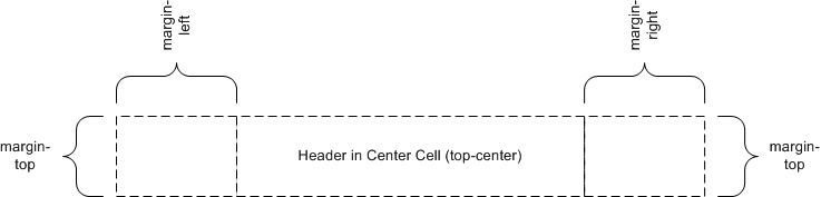
The following is an example of:
@page {
  @top-center { content: "Header in Center Cell (top-center)" }
}
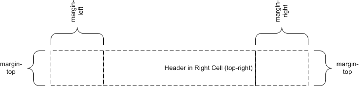
The following is an example of:
@page {
  @top-right { content: "Header in Right Cell (top-right)" }
}
Because there is no center cell the extent of the top-right is allowed to
cross the center.
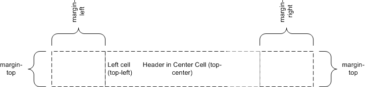
The following is an example of:
@page {
  @top-left { content: "Left Cell (top-left)" }
  @top-center { content: "Header in Center Cell (top-center)" }
}
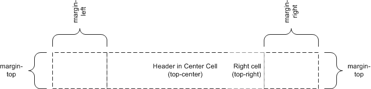
The following is an example of:
@page {
  @top-center { content: "Header in Center Cell (top-center)" }
  @top-right { content: "Right Cell (top-right)" }
}
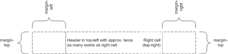
The following is an example of:
@page {
  @top-left { content: "Header in top-left with approx. "
                     "twice as many words as right cell." }
  @top-right { content: "Right cell (top-right)" }
}
Because there is no center cell the extent of the top-left is allowed to
cross the center. As the intrinsic width of top-left is approx. twice the
intrinsic width of top-right the top-left margin box is approx. twice as wide
as the top-right margin box.
4.4. Populating
margin boxes
A margin box is instantiated if a margin context and one of the following
conditions hold:
- If the computed value of 'content' is not
'none'.
- The properties 'width' and 'height' are set in the margin
context.
The example following style sheet could be used to create a top centered
header with the current chapter name:
h1 { string-set: chapter content() }
@page {
  margin: 10%;
  @top-center { content: string(chapter) }
}
Both counters and string-sets could be updated many times on a given page.
Which value of a string-set or a counter is being referred to in a margin box
is specified using the 'page-policy' property in the @string context
or @counter context.
h1 { string-set: chapter content() }
@string chapter { page-policy: last }
@page {
  margin: %10;
  @top-center { content: string (chapter) }
}
To use the chapter name as it was when the processing of the page started,
the designer would specify a 'page-policy' of 'start' instead of 'last'.
Designers can also use the value of a string or counter after its first state
change on a page by specifying 'first'.
5. Page breaks
The following sections explain page formatting in CSS3 paged media. Five
properties indicate where the user agent MAY or SHOULD break pages, and on what page (left or right) the
subsequent content SHOULD resume. Each page break ends layout in the current page box and causes remaining pieces of the document
tree to be laid out in a new page box.
| Name: |
page-break-before |
| Value: |
auto | always | avoid | left | right |
| Initial: |
auto |
| Applies to: |
block-level elements |
| Inherited: |
yes |
| Percentages: |
N/A |
| Media: |
paged |
| Computed value: |
specified value |
| Name: |
page-break-after |
| Value: |
auto | always | avoid | left | right |
| Initial: |
auto |
| Applies to: |
block-level elements |
| Inherited: |
yes |
| Percentages: |
N/A |
| Media: |
paged |
| Computed value: |
specified value |
| Name: |
page-break-inside |
| Value: |
auto | avoid |
| Initial: |
auto |
| Applies to: |
block-level elements |
| Inherited: |
yes |
| Percentages: |
N/A |
| Media: |
paged |
| Computed value: |
specified value |
Values for these properties have the following meanings:
- auto
- Neither force nor forbid a page break before (after, inside) the
generated box.
- always
- Always force a page break before (after) the generated box.
- avoid
- Avoid a page break before (after, inside) the generated box.
- left
- Force one or two page breaks before (after) the generated box so that the
next page is formatted as a left page.
- right
- Force one or two page breaks before (after) the generated box so that the
next page is formatted as a right page.
A potential page break location is typically under the influence of the
parent element's 'page-break-inside' property, the 'page-break-after'
property of the preceding element, and the 'page-break-before' property of the
following element. When these properties have values other than 'auto', the values 'always',
'left', and 'right' take
precedence over 'avoid'. See the section on allowed page breaks for the exact rules on how
these properties MAY
force or suppress a page break.
5.2. Using named pages:
'page'
| Name: |
page |
| Value: |
auto | <identifier> |
| Initial: |
auto |
| Applies to: |
block-level elements |
| Inherited: |
yes |
| Percentages: |
N/A |
| Media: |
paged |
| Computed value: |
specified value |
The 'page' property can
be used to specify a particular type of page where an element SHOULD be displayed.
This example will put all tables on a right-hand side landscape page
(named "rotated"):
@page rotated { size: landscape }
table { page: rotated; page-break-before: right }
The 'page' property
works as follows: If a block box with inline content has a 'page' property that is different
from the preceding block box with inline content, then one or two page breaks
are inserted between them, and the boxes after the break are rendered on a
page box of the named type. See "Forced page breaks"
below.
In this example, the two tables are rendered on landscape pages (indeed,
on the same page, if they fit), and the page type "narrow" is not used at
all, despite having been set on the div:
@page narrow { size: 9cm 18cm }
@page rotated { size: landscape }
div { page: narrow }
table { page: rotated }
with this document::
<div>
<table>...</table>
<table>...</table>
</div>
5.3. Breaks inside
elements: 'orphans', 'widows'
| Name: |
orphans |
| Value: |
<integer> |
| Initial: |
2 |
| Applies to: |
block-level elements |
| Inherited: |
yes |
| Percentages: |
N/A |
| Media: |
visual |
| Computed value: |
specified value |
| Name: |
widows |
| Value: |
<integer> |
| Initial: |
2 |
| Applies to: |
block-level elements |
| Inherited: |
yes |
| Percentages: |
N/A |
| Media: |
visual |
| Computed value: |
specified value |
The 'orphans'
property specifies the minimum number of lines of a paragraph that MUST be left at the
bottom of a page. The 'widows' property specifies the minimum number of
lines of a paragraph that MUST be left at the top of a page. Examples of how they are
used to control page breaks are given below.
5.4. Allowed page breaks
In the normal flow, page breaks can occur at the following places:
- In the vertical margin between block boxes (or rows in a table). When a
page break occurs here, the computed values of the relevant 'margin-top' and 'margin-bottom' properties are set to '0'.
- Between line boxes inside a block box.
These breaks are subject to the following rules:
- Rule A: Breaking at (1) is allowed only if the 'page-break-after'
and 'page-break-before' properties of all
the elements generating boxes that meet at this margin allow it, which is
when at least one of them has the value 'always',
'left', or 'right', or when
all of them are 'auto'.
- Rule B: However, if all of them are 'auto' and the nearest common ancestor of all the elements
has a 'page-break-inside' value of 'avoid', then breaking here is not allowed.
- Rule C: Breaking at (2) is allowed only if the number of
line boxes between the break and the start of the enclosing block box is the
value of 'orphans' or
more, and the number of line boxes between the break and the end of the box
is the value of 'widows'
or more.
- Rule D: In addition, breaking at (2) is allowed only if
the 'page-break-inside' property is 'auto'.
If the above doesn't provide enough break points to keep content from
overflowing the page boxes, then rules B and D are dropped in order to find
additional breakpoints.
If that still does not lead to sufficient break points, rules A and C are
dropped as well, to find still more break points.
5.5. Forced page breaks
A page break MUST occur at (1) if, among the 'page-break-after' and 'page-break-before'
properties of all the elements generating boxes that meet at this margin,
there is at least one with the value 'always', 'left', or 'right'.
A page break MUST also occur at (1) if the last line box above this margin
and the first one below it do not have the same value for 'page'.
5.6. "Best" page breaks
CSS3 does not define which of a set of allowed page breaks MUST be used; CSS3 does
not forbid a user agent from breaking at every possible break point, or not
to break at all. But CSS3 does recommend that user agents observe the
following heuristics (while recognizing that they are sometimes
contradictory):
- Break as few times as possible.
- Make all pages that don't end with a forced break appear to have about
the same height.
- Avoid breaking inside a block that has a border.
- Avoid breaking inside a table.
- Avoid breaking inside a floated element.
Suppose, for example, that the style sheet contains 'orphans : 4', 'widows : 2', and
there are 20 lines (line boxes) available at the bottom of the current page:
- If a paragraph at the end of the current page contains 20 lines or fewer,
it SHOULD be
placed on the current page.
- If the paragraph contains 21 or 22 lines, the second part of the
paragraph MUST not
violate the 'widows'
constraint, and so the second part MUST contain exactly two lines.
- If the paragraph contains 23 lines or more, the first part SHOULD contain 20
lines and the second part the remaining lines.
Now suppose that 'orphans' is '10', 'widows' is '20', and there are 8 lines available at the bottom of the
current page:
- If a paragraph at the end of the current page contains 8 lines or fewer,
it SHOULD be
placed on the current page.
- If the paragraph contains 9 lines or more, it cannot be split (that would
violate the orphan constraint), so it SHOULD move as a block to the next page.
6. Page-based
extensions to counters and string-sets
6.1. Page-based
counters
Counters apply to page contexts defined by means of the '@page' rule. This is useful for
maintaining a page count.
The following rules result in the placement of the current page number in
the middle of the outside margin of each page.
@page {
  margin: 10%;
  counter-increment: page;

  @top-center {
    font-family: sans-serif;
    font-weight: bold;
    font-size: 2em;
    content: counter(page);
  }
}
6.2. Determining which
counter or string-set value to use: the 'page-policy' property
| Name: |
page-policy |
| Value: |
start | first | last |
| Initial: |
start |
| Applies to: |
counter and string declarations |
| Inherited: |
N/A |
| Percentages: |
N/A |
| Media: |
paged |
| Computed value: |
specified value |
'page-policy'
determines which page-based occurrence of a given element is applied to a
counter or string value:
- start
- Takes the value of the counter or string at the beginning of the page
(before applying style to the elements of the page).
- first
- Takes the value after the first state change in the counter or string
during processing of the page.
- last
- Takes the value following the final state change on the page.
6.3. Number of pages -
'pages' counter
It is often useful to refer to the total number of pages in a document. A
UA MUST act as if
there was a counter with the name of 'pages'
and its initial value was set to the total number of pages.
The following example produces a centered footer with content like "Page 2
of 5":
@page {
  counter-increment: page;
  @bottom-center { content: "Page " counter(page) " of " counter(pages);
}
Some CSS profiles might make 'pages' OPTIONAL because it
would be too much work for the UAs to compute it. A UA that doesn't support
'pages' SHALL ignore any 'content'
property that uses the 'pages' counter. It is
therefore possible to write a simple stylesheet that covers UAs with
differing capabilities:
The following example produces a centered footer with content like "Page 2
of 5" (if the UA supports 'pages') or something like
"Page 2" (if the UA doesn't support 'pages')
@page {
  counter-increment: page;
  @bottom-center {
       content: "Page " counter(page);
       content: "Page " counter(page) " of " counter(pages);
  }
}
7. Page based floats
The float model is extended to allow for paged based floats:
- Floating elements to the top or bottom of the page (in horizontal writing
mode) or to the left or right of the page (in vertical writing mode).
7.1. "Next" page floats
Motivation?
Sometimes it is useful floating an element to a page by itself or having a
page with only floating elements on it. An example of this would be a large
figure in a document.
The following style sheet rules puts large figures on a page by themselves
and not side by side.
.figure.large {
  float: left; clear: both
  page: large-figures
}

.figure::after {
  text-align: center;
  display: block;
  font-weight: bold;
  content: "Figure " counter(figure) ".";
  counter-increment: figure;
}

@page large-figures { }

<div class="large figure">
  <img src="figure-1.png" alt="Figure-1 - Very large image"/>
</div>
7.2. Top and bottom
page floats (in horizontal writing mode)
- Top page floats are stacked vertically in the top float area.
- The height of the top float area is determined by 'height', 'min-height'
and 'max-height' in the float top context.
- If a float doesn't fit in the top float area and the top float area
contains other top floats then the float is moved to the next page's top
float area.
- If a float doesn't fit in the top float area and the top float area is
otherwise empty then the 'overflow' property determines what happens.
- A top float appear below all top floats that precedes it in the document.
Bottom page floats follow analogous rules.
The following example creates two elements that are floated to the bottom
of the page - the second is placed below the first.
*.float { float: bottom }

<div class="float">This text SHOULD appear near the bottom of the page</div>
<div class="float">The second float SHOULD appear after the first float</div>
7.3. Left and right
page floats (in vertical writing mode)
- Left floats are stacked horizontally in the left float area.
- The width of the left float area is determined by 'width', 'min-width'
and 'max-width' in the float bottom context.
- If a float doesn't fit in the left float area and the left float area
contains other left floats then the float is moved to the next page's left
float area.
- If a float doesn't fit in the left float area and the left float area is
otherwise empty then the 'overflow' property determines what happens.
- A left float appear to the right all left floats that precedes it in the
document if 'direction' is 'ltr' and to the left if
'direction' is 'rtl'.
Right page float floats follow analogous rules.
7.4. Page float area
contexts
A page float area context is used to set properties for float areas. There
are four page float areas - top, bottom, left and right.
The following set the bottom float area to have a top border and to have a
maximum height of 50% (relative to the content height of the page box).
@page {
  @float-area bottom {
       border-top: solid thin black;
       max-height: 50%
  }
}
8. Orienting an image on the
page
Images from camera phones, digital cameras or scanners can appear crooked
or sideways. Furthermore, devices such as a camera phone, might not
have the capability to correct the image. However, this type of device
can accept input from its user on the the kind of correction to perform, such
as rotating the image by 90 degrees. The image-orientation property
provides a way to specify a rotation to be applied to an image, and,
presumably, improve the image's presentation. This facility is not
intended to specify other image transformations such as flipping the image in
the horizontal or vertical direction. Also, this facility is not needed
to correctly orient an image when printing in landscape or portrait
orientation.
| Name: |
image-orientation |
| Value: |
auto | <integer> |
| Initial: |
auto |
| Applies to: |
images |
| Inherited: |
N/A |
| Percentages: |
N/A |
| Media: |
paged |
| Computed value: |
specified value |
'image-orientation' specifies a rotation in the right or clockwise
direction that a user agent should apply to an image.
Tow values for the 'image-orientation' property apply to an
image:
- auto
- The image will be set to the orientation of the page.
- <integer>
- The image will be rotated to the right (in a clockwise direction) by the
given number of degrees. Values range from zero to 360. The user agent
MAY reduce values
larger than 359 by a modulo of 360, however the orientation are
equivalent. For example, the orientation an image after a rotation of 450 is
always equivalent to a 90 rotation.
The following examples rotate the an image in four major orientations:
img.original   { image-orientation: auto  }
img.zero       { image-orientation: 0 }
img.ninety     { image-orientation: 90 }
img.oneEighty  { image-orientation: 180 }
img.twoSeventy { image-orientation: 270 }
...
<img class="twoSeventy" src=... />
References
Normative references
-
- [MEDIAQ]
- Håkon Wium Lie; Tantek Çelik; Daniel Glazman. Media queries.
23 January 2002. W3C Working Draft. (Work in progress.) URL: http://www.w3.org/TR/2002/CR-css3-mediaqueries-20020708
- [RFC2119]
- S. Bradner. Key words for use in RFCs to Indicate Requirement
Levels. Internet RFC 2119. URL: http://www.ietf.org/rfc/rfc2119.txt
Other references
-