This chapter is normative.
This document describes:
User interface controls are declared using markup elements, and their behavior refined via markup attributes. This markup may be further decorated with style properties that can be set using CSS stylesheets to deliver a customized look and feel. User interface controls defined here are bound to the underlying data instance by using the binding attributes as defined in the Binding chapter.
This chapter addresses accessibility by taking a uniform approach to such features as captions, help text, tabbing and short cuts.
The group plans to address internationalization and conformance profiles once the initial work on user interfaces has gone through the first round of publication.
The following cases have been considered in this design:
Eventually, this chapter will describe functionality for most or all of the above cases.
Because many types of form controls share similar properties, we here specify a few abstract form controls which serves no purpose but to contain common attributes, properties, and elements. It is an error to include an abstract form control directly. Other form controls are later defined in terms of these abstract form controls.
Note: This approach does not constrain implementations to utilize abstract form controls.
The following pieces of markup (core elements and attributes) are common to all user interface controls defined in this document.
An abstract form control anyControl is the basis for all XForms form controls. It is defined as follows:
XML Representation Summary: anyControl<anyControl
xml:lang
id
class
style
accesskey
navindex>
{ child elements specified separately}
</anyControl>
In addition to the common elements and attributes defined here, see the chapter on binding for common attributes specific to binding.
xml:LangidclassstyleStyle properties specify custom look and feel, such as color and border styles. The specification uses the box model and style properties defined in the Cascading Style Sheets level 2 specification [CSS2] and also introduces a few new properties for an extended layout model for XForms. Note that the XForms Working Group is aware that the definition of new CSS properties is beyond the scope of our work. The additional style properties mentioned in this chapter are meant as an initial basis for discussions with the CSS Working Group. Style properties can be specified via style sheets, and changed via scripts though the DOM.
Some common properties include:
display: used to hide or display the form controlwidth: the width of the form controlheight: the height of the form controlborder: (and related longhand properties) the style
of the form control's bordercaption-style: Style for the form control label.Note that interpretation of attributes like height
are dependent on the layout model we use.
The new caption-style style property may be used to specify the
position of the caption text relative to the form control. The value is top,
left, right, bottom or hidden. It may be used together with the CSS text-align
property to set left, center or right alignment.
The above list is illustrative; for the exhaustive list of CSS style properties, refer to the CSS specification.
caption elementThis element labels the form control
with a descriptive summary. The caption makes it possible for someone who can't
see the form controls to obtain a
short description as they navigate between form
controls. This element is required. It contains inline content as defined
by XHTML. Attributes xml:lang, class and style
can be used to further qualify the caption element. Attribute style
on element caption styles the caption text; attribute captionStyle
on the form control containing the
caption determines the position of the caption text relative to the associated
form control.
help elementThis element provides a longer description that will help users to understand
how to fill out this form control.
The help text will normally be shown only on request. This optional
element contains inline content as defined by XHTML. Attributes xml:lang,
class and style can be used to further qualify the
help element. Attribute style on element help styles
the caption text; attribute helpStyle on the containing form
control determines the position of the help text relative to the associated
form control.
hint elementThis optional element provides a short hint for the user, typically represented
as a tooltip by graphical XForms Processors.
The tooltip text will normally be shown when the user remains on the form
control for more than a certain length of time. It contains inline content
as defined by XHTML. Attributes xml:lang, class and
style can be used to further qualify the hint element.
Attribute style on element hint styles the hint
text; attribute hintStyle on the containing form
control determines the position of the hint text relative to
the associated form control.
onevent elementThis element can be used to bind event handlers to form controls. It is defined in [XHTML Events]. Details on XForms events can be found in the Reference Processing Model chapter.
The abstract form control anyNavControl represents any navigable
form control. It is based on anyControl, sharing all its attributes
and stylable properties. The following attributes are additionally defined:
accesskeynavindexThe default navigation order is a depth first traversal of the hierarchy of form controls.
The following form controls are defined in terms of the abstract form control on which they are based in terms of syntax. Unless noted otherwise, all form controls here are treated as inline text for purposes of XHTML processing.
Issue: Given a separate XForms Model that can store data values not visible to the end user, is there a need for a "hidden" form control, perhaps for compatibility with XHTML forms?
Description: The output form control allows the display
of a view of a data value, typically as part of other content. The resulting
form control cannot be modified by the user.
Based On: anyControl
Syntax Definition: The element name is output.
Example:
The output form control may be used in a caption
, for instance when authors want to say: "I charged you 100.0 - and here is
why".
Description: allows for the single or multiple line entry of text values.
Based On: anyNavControl
Syntax Definition: The element name is textbox.
Two additional attributes, rows and cols specify
a number to be used as the form control's height and width in characters, respectively.
rows defaults to 1. Note that these do not constrain
the amount of text that can be entered.
[Ed. We need a default for cols.]
Example:
Description: allows for binary (yes/no) input.
Based On: anyNavControl
Syntax Definition: The element name is checkbox.
Example:
The checkbox element is used for yes/no questions.
Description: allows for various representations of form controls that allow the user to choose one option out of many.
Based On: anyNavControl
Syntax Definition: The element name is exclusiveSelect.
One or more child item elements define the caption text for an
individual radio button or menu item, with an optional attribute of value,
which specifies the associated value to be used in the instance data.
Example:
These constructs are used to encapsulate various forms of selection. We support
two broad classes of selection characterized by the type of data being obtained
from the user. When the XForms Model allows the user to pick one or more from
a set of choices, the type of the underlying instance is a container; contrast
this with the case where the XForms Model permits the user to pick only
one. We parallel this distinction in the user interface markup by introducing
elements multipleSelect and exclusiveSelect.
User interfaces typically support a wide range of selection widgets characterized
by distinctive appearances and behaviors. We capture these distinctions e.g.,
pull down list versus a combo box, via style attributes on elements
exclusiveSelect and multipleSelect.
The list-ui style property must be one of the following values:
radiocheckboxmenulistboxEach option may have a platform-specific behavior.
[Ed. We need a default representation, to be used in the absence of a style sheet.]
The items are bound to the choices in the data type in the lexical order in which they appear in the markup. This avoids the need to redundantly name things in both the presentation markup and in the XForms Model.
Layout can be handled through the automated layout mechanisms described later, or can use absolute positioning via style properties.
Accessibility requirement: long lists of choices are easier to use if they are grouped in some way, preferably with associated captions. Is there a need for hierarchical menus? An itemgroup or empty separator element would do the trick.
Description: allows for various representations of form controls that allow the user to choose several options out of many.
Based On: anyNavControl
Syntax Definition: The element name is multipleSelect.
One or more child item elements are allowed, as for exclusiveSelect.
Example:
This construct can be used to populate structures like array in
the XForms Model.
Description: similar to the XHTML form control of the same name, allows for one-time actions to occur.
Based On: anyNavControl
Syntax Definition: The element name is button. The attribute
action may contain an XForms Dynamic Constraint to call when the
form control is activated.
Example:
The button element is derived from XHTML. It allows you to submit
the instance data, or to set one
or more data values at the same time. The caption is generally shown on the
face of the button.
Description: a specific control for submitting the instance data.
Based On: button
Syntax Definition: The element name is submit. The attribute
action defaults to the binding
expression submit(). The attribute to of type
xsd:IDREF points to a <submit> element that
defines the specifics of where and how to submit the instance
data.
Example:
The binding expression on submit should select the instance data that will be submitted.
In future revisions, we will define similar controls, like reset
or suspend.
The XForms Working Group is continuing to investigate and design additional controls for use within the XForms User Interface. These include sliders, spin controls, rotary controls, image maps, tree controls, and scrolling record controls.
The following section outlines some of our ideas for reusing user interface markup.
Custom pickers allow us to create reusable user interface components. Just as we can define data types and structures that can be reused within the XForms Model, reusable user interface components allow us to design complex XForms using the basic building blocks described above, and then reuse these components in multiple situations. As with any component framework, this has two basic requirements:
Here, we describe such a component framework along with sample markup. For
this example, assume that USShippingAddress is a reusable data
type that is used in multiple places in the XForms Model, e.g. the user will
be asked for a billingAddress and shippingAddress
--both of type USShippingAddress.
First, we show a simple example that is designed to bind a user interface to
a model item of type USShippingAddress
with no attention to making the component reusable.
<groupbox>
  <textbox ref="address/street">
    <caption>Please enter your street address</caption>
  </textbox>
  <textbox ref="address/zip">
    <caption>Zip Code</caption>
  </textbox>
</groupbox>
Next, we prepare the above XForms Model fragment to become a reusable component that could be used for obtaining both the shipping and billing address. To do this, we need to parameterize those portions of the component that the caller will wish to modify.
<component name="AddressWidget" dataType="USShippingAddress">
  <param name="streetPrompt"/>
  <param name="zipPrompt"/>
  <param name="border" value="line"/>
  <groupbox border="$border">
    <textbox ref="address/street">
      <caption>
        <value-of name="streetPrompt"/>
      </caption>
    </textbox>
    <textbox ref="address/zip">
      <caption>
        <value-of name="zipPrompt"/>
      </caption>
    </textbox>
  </groupbox>
</component>
Note that the UI component as defined above does not create a user interface;
user interface is created by explicitly instantiating the component via element
use-component described next.
Finally, we use this component to instantiate the user interface for obtaining the shipping and billing address.
<use-component name="address" component="AddressWidget">
  <with-param name="streetPrompt">
    Shipping Street Address
  </with-param>
  <with-param name="zipPrompt">
    Zip Code for state where we are shipping to
  </with-param>
  <with-param name="border" value="dotted"/>
</use-component>
The reusable component is instantiated by element use-component;
parameter values are specified by the contained with-param elements.
The following section outlines some of our ideas for allowing multiple-page forms.
Subpages provide a means to present XForms one bit at a time, breaking a complex
task into smaller, simpler parts. Presentation of a subpage can occupy the entire
"page" or just part of a page. Different presentations are possible, e.g. a
stack of pages with visible name tags, or as a set of buttons for flipping
through the stack or navigating directly to a particular subpage. One possible
representation is a formset element enclosing one or more subpage
elements, each of which starts with a caption element.
As the name implies subpage is not specific to XForms --our intent
is to design subpage so that it can be used within XForms --and
more generally within XHTML to create presentations where document views are
presented to progressively reveal the document structure and content.
The following section outlines some of our ideas for making XForms independent from any particular presentation technology, for example XHTML tables.
Note: All style properties used by XForms to specify layout will be as defined by the CSS working group.
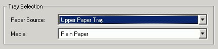
The groupbox element is used as a container for defining a hierarchy
of form controls. A groupbox element can contain other groupbox elements.
The hierarchy defined by nested groupbox elements is used to determine the
traversal order specified by attribute navindex on form controls.
Setting the input focus on a group box results in the focus being set to the
lowest form control in the tabbing order within that group box.
[Ed. Currently, groupbox is being used to both group
controls and provide binding context. It
is an open issue whether the binding attribute ref is allowed here.]
The following are preliminary ideas intended to start a dialog with the CSS Working Group and other interested parties.
Element groupbox allows the following additional layout attributes
to control the layout of the form controls
being packed inside the container. The layout property can be used
to control whether the form controls
within a group box are laid out from left to right or top to bottom. The value
of the property is horizontal, vertical or inherit.
It can be used together with CSS padding properties.
As we develop the layout model, we may factor out some of the
more common behaviors desired of element groupbox into elements
such as grid to avoid overloading element groupbox
with multiple functions.
The field-align property controls the amount of whitespace between
the caption and the form control so
as to ensure the desired alignment of all the form
controls within the group box. The value of the property can be one of:
left, right, top, bottom,
center, justify or inherit. The default
is justify.
[Ed. This could meet our requirement to not be dependent on XHTML tables.].
The width and height of a group box can be set via the corresponding CSS properties. The default is to size the box to the minimum needed for the contents of the group box. Setting the width to 100% ensures that the box is the maximum width permitted by the enclosing CSS block.
In the following example, the form controls are laid out horizontally and justified to fill the available space.
Here is another example, but this time with a vertical layout:
To justify the form controls for a vertical layout, the XForms Processor adjusts
the spacing between each form control and its caption. In the next example,
the field-align property has been set to left. As a result,
the spacing between the controls and the caption is the same for all form controls.
Sometimes a simple horizontal or vertical layout is not enough. The next example uses a grid layout:
Note that we plan to introduce distinct markup elements for grouping
constructs like grids --rather than overloading element groupbox.
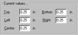
Note: "in" in the example is an output form control that can display either "in" or "cm".
Grid layout is potentially complex, and further study is needed to find the most appropriate solution for XForms. Here are several possibilities:
Use explicit positioning for each form control. This is how most Windowing systems specify dialog boxes. It is common for the form controls to be constrained to positions on a grid with a spacing relative to the dialog font size. A subtlety is to make text input form controls use the same baseline as the caption text. This is a simple approach, and works fine provided the width and height of the group box are fixed.
Use explicit positioning, but distinguish between hard and soft spacings. The soft spacings are adjusted automatically to match the width and height of the group box, and the font size etc. This is inspired by the approach used by Donald Knuth for TEX.
Use a style property on form controls to force that form control to appear
on the next row, e.g. break-before. This could be combined
with another style property to specify which form controls need to be vertically
aligned with one another. One possibility for this is a named tab stop (such
as "foo" in tab-stop: foo), where the position of the
stop is determined automatically by the XForms Processor. Another possibility
is to define a penalty scheme where layout engine adjusts the positioning
to minimize the sum over the positioning penalties. This approach would
involve little or no effort on behalf of the author.
Use explicit markup for each row, either a container element similar to XHTML's table row element <tr>...</tr> or an empty element such as <br/>
A generalization is to allow explicit markup to divide the remaining space up progressively horizontally or vertically, similar to the mechanism provided by XHTML's frames.
Issue: What about "repeating structures" when these are specified in the XForms Model? One possibility is a record set control which allows users to add and delete records, where all of the records satisfy the same XForms Model. An example is a line item in an order form, consisting of the quantity, product code and unit price.
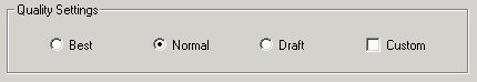
It is often desirable to include graphics and additional text within group boxes, for instance, the following uses graphics to illustrate the idea of printing in black & white versus printing in color.
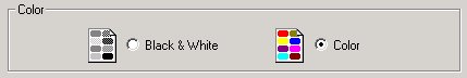
Group boxes can, in principle, include graphics marked up using the XHTML img
element, or vector graphics marked up in SVG etc.