 PR-CSS2-19980324
 PR-CSS2-19980324
This specification defines Cascading Style Sheets, level 2 (CSS2). CSS2 is a style sheet language that allows authors and users to attach style (e.g., fonts, spacing, and aural cues) to structured documents (e.g., HTML documents and XML applications). By separating the presentation style of documents from the content of documents, CSS2 simplifies Web authoring and site maintenance.
CSS2 builds on CSS1 (see [CSS1]) and all valid CSS1 style sheets are valid CSS2 style sheets. CSS2 supports media-specific style sheets so that authors may tailor the presentation of their documents to visual browsers, aural devices, printers, braille devices, handheld devices, etc. This specification also supports content positioning, downloadable fonts, table layout, features for internationalization, automatic counters and numbering, and some properties related to user interface.
This document is currently undergoing review by the members of the World Wide Web Consortium. It is a stable document derived from a series of working drafts produced over the last year as deliverables of the Style Sheets activity. Details of this review have been distributed to Member's representatives. Comments by non-Members should be sent to www-style@w3.org.
The review period will end on 21 April, 1998 at 24:00 GMT. Within 14 days from that time, the document's disposition will be announced: it may become a W3C Recommendation (possibly with minor changes), or it may revert to Working Draft status, or it may be dropped as a W3C work item.
As a Proposed Recommendation, this document does not imply any endorsement by the Consortium's staff or Member organizations.
The CSS2 specification is available in the following formats:
In case of a discrepancy between the various forms of the specification, the HTML version is considered the definitive version.
The English version of this specification is the only normative version. However, for translations in other languages see http://www.w3.org/TR/1998/PR-CSS2-19980324/translations.html.
Contents
This specification has been written with two types of readers in mind: CSS authors and CSS implementors. We hope the specification will provide authors with the tools they need to write efficient, attractive, and accessible documents, without overexposing them to CSS's implementation details. Implementors, however, should find all they need to build conforming user agents. The specification begins with a general presentation of CSS and becomes more and more technical and specific towards the end. For quick access to information, a general table of contents, specific tables of contents at the beginning of each section, and an index provide easy navigation, in both the electronic and printed versions.
The specification has been written with two modes of presentation in mind: electronic and printed. Although the two presentations will no doubt be similar, readers will find some differences. For example, links will not work in the printed version (obviously), and page numbers will not appear in the electronic version. In case of a discrepancy, the electronic version is considered the authoritative version of the document.
The specification is organized into the following sections:
Each CSS property definition begins with a summary of key information that resembles the following:
| Value: | legal values & syntax |
| Initial: | initial value |
| Applies to: | elements this property applies to |
| Inherited: | whether the property is inherited |
| Percentages: | how percentage values are interpreted |
| Media: | which media groups the property applies to |
This part specifies the set of valid values for the property. Value types may be designated in several ways:
Other words in these definitions are keywords that must appear literally, without quotes (e.g., red). The slash (/) and the comma (,) must also appear literally.
Values may be arranged as follows:
Juxtaposition is stronger than the double bar, and the double bar is stronger than the bar. Thus, the following lines are equivalent:
    a b   |   c || d e
  [ a b ] | [ c || [ d e ]]
Every type, keyword, or bracketed group may be followed by one of the following modifiers:
The following examples illustrate different value types:
Value: N | NW | NE
Value: [ <length> | thick | thin ]{1,4}
Value: [<family-name> , ]* <family-name>
Value: <uri>? <color> [ / <color> ]?
Value: <uri> || <color>
This part specifies the property's initial value. If the property is inherited, this is the value that is given to the root element of the document tree. Please consult the section on the cascade for information about the interaction between style sheet-specified, inherited, and initial values.
This part lists the elements to which the property applies. All elements are considered to have all properties, but some properties have no rendering effect on some types of elements. For example, 'white-space' only affects block-level elements.
This part indicates whether the value of the property is inherited from an ancestor element. Please consult the section on the cascade for information about the interaction between style sheet-specified, inherited, and initial values.
This part indicates how percentages should be interpreted, if they occur in the value of the property. If "N/A" appears here, it means that the property does not accept percentages as values.
This part indicates the media groups to which the property applies. The conformance conditions state that user agents must support this property if they support rendering to the media types included in these media groups.
Some properties are shorthand rules that allow authors to specify the values of several properties with a single property.
For instance, the 'font' property is a shorthand property for setting 'font-style', 'font-variant', 'font-weight', 'font-size', 'line-height', and 'font-family' all at once.
When values are omitted from a shorthand form, each "missing" property is assigned its initial value (see the section on the cascade).
The multiple style rules of this example:
H1 {
  font-weight: bold;
  font-size: 12pt;
  line-height: 14pt;
  font-family: Helvetica;
  font-variant: normal;
  font-style: normal;
  font-stretch: normal;
  font-size-adjust: none
}
may be rewritten with a single shorthand property:
H1 { font: bold 12pt/14pt Helvetica }
In this example, 'font-variant', 'font-stretch', 'font-size-adjust', and 'font-style' could be omitted from the shorthand form, since they have their initial value ('normal').
All examples that illustrate illegal usage are clearly marked as "ILLEGAL EXAMPLE".
All HTML examples conform to the strict DTD (defined in [HTML40]) unless otherwise indicated by a document type declaration.
All notes are informative only.
Examples and notes are marked within the source HTML for the specification and CSS1 user agents will render them specially.
This specification is the product of the W3C Working Group on Cascading Style Sheets and Formatting Properties. In addition to the editors of this specification, the members of the Working Group are: Brad Chase (Bitstream), Chris Wilson (Microsoft), Daniel Glazman (Electricité de France), Dave Raggett (W3C/HP), Ed Tecot (Microsoft), Jared Sorensen (Novell), Lauren Wood (SoftQuad), Laurie Anna Kaplan (Microsoft), Mike Wexler (Adobe), Murray Maloney (Grif), Powell Smith (IBM), Robert Stevahn (HP), Steve Byrne (JavaSoft), Steven Pemberton (CWI), Thom Phillabaum (Netscape), Douglas Rand (Silicon Graphics), Robert Pernett (Lotus), Dwayne Dicks (SoftQuad), and Sho Kuwamoto (Macromedia). We thank them for their continued efforts.
A number of invited experts to the Working Group have contributed: George Kersher, Glenn Rippel (Bitstream), Jeff Veen (HotWired), Markku T. Hakkinen (The Productivity Works), Martin Dürst (W3C, formerly Universität Zürich), Roy Platon (RAL), Todd Fahrner (Verso), Frederick Boland (NIST), Eric Meyer (Case Western Reserve University), and Vincent Quint (W3C).
The section on Web Fonts was strongly shaped by Brad Chase (Bitstream) David Meltzer (Microsoft Typography) and Steve Zilles (Adobe). The following people have also contributed in various ways to the section pertaining to fonts: Alex Beamon (Apple), Ashok Saxena (Adobe), Ben Bauermeister (HP), Dave Raggett (W3C/HP), David Opstad (Apple), David Goldsmith (Apple), Ed Tecot (Microsoft), Erik van Blokland (LettError), François Yergeau (Alis), Gavin Nicol (Inso), Herbert van Zijl (Elsevier), Liam Quin, Misha Wolf (Reuters), Paul Haeberli (SGI), and the late Phil Karlton (Netscape).
The section on Paged Media was in large parts authored by Robert Stevahn (HP) and Stephen Waters (Microsoft).
Robert Stevahn (HP), Scott Furman (Netscape), and Scott Isaacs (Microsoft) were key contributors to CSS Positioning.
Mike Wexler (Adobe) was the editor of the interim Working Draft which described many of the new features of CSS2.
T.V. Raman (Adobe) made pivotal contributions towards Aural Cascading Style Sheets (ACSS) and the concepts of aural presentation based on his work on AsTeR (Audio System For Technical Readings). He contributed an initial draft of the ACSS specification that shaped the current specification. Values for aural properties in the HTML 4.0 sample style sheet are of his devising; he currently uses them on a daily basis on his audio desktop in conjunction with Emacspeak and the Emacs W3 browser (authored by William Perry, who also implemented the aural extensions on the W3 side of the fence).
Todd Fahrner (Verso) researched contemporary and historical browsers to develop the sample style sheet in the appendix.
Thanks to Jan Kärrman, author of html2ps for helping so much in creating the PostScript version of the specification.
Through electronic and physical encounters, the following people have contributed to the development of CSS2: Robert Cailliau, Liz Castro, James Clark, Dan Connolly, Donna Converse, Daniel Dardailler, Scott Isaacs, Geir Ivarsøy, Lou Montulli, Henrik Frystyk Nielsen, Jacob Nielsen, Vincent Mallet, Eva von Pepel, William Perry, David Siegel, Al Gilman, and Jason White.
The discussions on www-style@w3.org have been influential in many key issues for CSS. Especially, we would like to thank Bjorn Backlund, Todd Fahrner, Lars Marius Garshol, Ian Hickson, Susan Lesch, Andrew Marshall, MegaZone, Eric Meyer, Russell O'Connor, David Perrell, Liam Quinn, Neil St.Laurent, Taylor, Brian Wilson, and Chris Wilson for their participation.
Many thanks to Philippe Le Hégaret, whose CSS validator helped ensure correct examples and a sensible grammar.
Special thanks to Arnaud Le Hors, whose engineering contributions made this document work.
Adam Costello improved this specification by performing a detailed review.
Lastly, thanks to Tim Berners-Lee without whom none of this would have been possible.
Copyright © 1997 World Wide Web Consortium, (Massachusetts Institute of Technology, Institut National de Recherche en Informatique et en Automatique, Keio University). All Rights Reserved.
Documents on the W3C site are provided by the copyright holders under the following license. By obtaining, using and/or copying this document, or the W3C document from which this statement is linked, you agree that you have read, understood, and will comply with the following terms and conditions:
Permission to use, copy, and distribute the contents of this document, or the W3C document from which this statement is linked, in any medium for any purpose and without fee or royalty is hereby granted, provided that you include the following on ALL copies of the document, or portions thereof, that you use:
When space permits, inclusion of the full text of this NOTICE should be provided. In addition, credit shall be attributed to the copyright holders for any software, documents, or other items or products that you create pursuant to the implementation of the contents of this document, or any portion thereof.
No right to create modifications or derivatives is granted pursuant to this license.
THIS DOCUMENT IS PROVIDED "AS IS," AND COPYRIGHT HOLDERS MAKE NO REPRESENTATIONS OR WARRANTIES, EXPRESS OR IMPLIED, INCLUDING, BUT NOT LIMITED TO, WARRANTIES OF MERCHANTABILITY, FITNESS FOR A PARTICULAR PURPOSE, NON-INFRINGEMENT, OR TITLE; THAT THE CONTENTS OF THE DOCUMENT ARE SUITABLE FOR ANY PURPOSE; NOR THAT THE IMPLEMENTATION OF SUCH CONTENTS WILL NOT INFRINGE ANY THIRD PARTY PATENTS, COPYRIGHTS, TRADEMARKS OR OTHER RIGHTS.
COPYRIGHT HOLDERS WILL NOT BE LIABLE FOR ANY DIRECT, INDIRECT, SPECIAL OR CONSEQUENTIAL DAMAGES ARISING OUT OF ANY USE OF THE DOCUMENT OR THE PERFORMANCE OR IMPLEMENTATION OF THE CONTENTS THEREOF.
The name and trademarks of copyright holders may NOT be used in advertising or publicity pertaining to this document or its contents without specific, written prior permission. Title to copyright in this document will at all times remain with copyright holders.
Contents
In this tutorial, we show how easy it can be to design simple style sheets. For this tutorial, you will need to know a little HTML (see [HTML40]) and some basic desktop publishing terminology.
We begin with a small HTML document:
<HTML>
  <TITLE>Bach's home page</TITLE>
  <BODY>
    <H1>Bach's home page</H1>
    <P>Johann Sebastian Bach was a prolific composer.
  </BODY>
</HTML>
To set the text color of the H1 elements to blue, you can write the following CSS rule:
H1 { color: blue }
A CSS rule consists of two main parts: selector ('H1') and declaration ('color: blue'). The declaration has two parts: property ('color') and value ('blue'). While the example above tries to influence only one of the properties needed for rendering an HTML document, it qualifies as a style sheet on its own. Combined with other style sheets (one fundamental feature of CSS is that style sheets are combined) it will determine the final presentation of the document.
The HTML 4.0 specification defines how style sheet rules may be specified for HTML documents: either within the HTML document, or via an external style sheet. To put the style sheet into the document, use the STYLE element:
<HTML>
  <TITLE>Bach's home page</TITLE>
  <STYLE type="text/css">
    H1 { color: blue }
  </STYLE>
  <BODY>
    <H1>Bach's home page</H1>
    <P>Johann Sebastian Bach was a prolific composer.
  </BODY>
</HTML>
For maximum flexibility, we recommend that authors specify external style sheets; they may be changed without modifying the source HTML document, and they may be shared among several documents. To link to an external style sheet, you can use the LINK element:
<HTML>
  <TITLE>Bach's home page</TITLE>
  <LINK rel="stylesheet" href="bach.css" type="text/css">
  <BODY>
    <H1>Bach's home page</H1>
    <P>Johann Sebastian Bach was a prolific composer.
  </BODY>
</HTML>
The LINK element specifies:
To show the close relationship between a style sheet and the structured markup, we continue to use the STYLE element in this tutorial. Let's add more colors:
<HTML>
  <TITLE>Bach's home page</TITLE>
  <STYLE type="text/css">
    BODY { color: red }
    H1 { color: blue }
  </STYLE>
  <BODY>
    <H1>Bach's home page</H1>
    <P>Johann Sebastian Bach was a prolific composer.
  </BODY>
</HTML>
The style sheet now contains two rules: the first one sets the color of the BODY element to 'red', while the second one sets the color of the H1 element to 'blue'. Since no color value has been specified for the P element, it will inherit the color from its parent element, namely BODY. The H1 element is also a child element of BODY but the second rule overrides the inherited value. In CSS there are often such conflicts between different values, and this specification describes how to resolve them.
CSS2 has more than 100 different properties and 'color' is one of them. Let's look at some of the others:
<HTML>
  <TITLE>Bach's home page</TITLE>
  <STYLE type="text/css">
    BODY {
      font-family: "Gill Sans", sans-serif;
      font-size: 12pt;
      margin: 3em;
    }
  </STYLE>
  <BODY>
    <H1>Bach's home page</H1>
    <P>Johann Sebastian Bach was a prolific composer.
  </BODY>
</HTML>
The first thing to notice is that several declarations are grouped within a block enclosed by curly braces ({...}), and separated by semicolons, though the last declaration may also be followed by a semicolon.
The first declaration on the BODY element sets the font family to "Gill Sans". If that font isn't available, the user agent (often referred to as a "browser") will use the 'sans-serif' font family which is one of five generic font families which all users agents know. Child elements of BODY will inherit the value of the 'font-family' property.
The second declaration sets the font size of the BODY element to 12 points. The "point" unit is commonly used in print-based typography to indicate font sizes and other length values. It's an example of an absolute unit which does not scale relative to the environment.
The third declaration uses a relative unit which scales with regard to its surroundings. The "em" unit refers to the font size of the element. In this case the result is that the margins around the BODY element are three times wider than the font size.
CSS can be used with any structured document format, for example with applications of the eXtensible Markup Language [XML10]. In fact, XML depends more on style sheets than HTML, since authors can make up their own elements that user agents don't know how to display.
Here is a simple XML fragment:
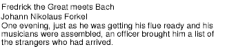
<ARTICLE>
  <HEADLINE>Fredrick the Great meets Bach</HEADLINE>
  <AUTHOR>Johann Nikolaus Forkel</AUTHOR>
  <PARA>
    One evening, just as he was getting his
    <INSTRUMENT>flute</INSTRUMENT> ready and his
    musicians were assembled, an officer brought him a list of
    the strangers who had arrived.
  </PARA>
</ARTICLE>
To display this fragment in a document-like fashion, we must first declare which elements are inline-level (i.e., do not cause line breaks) and which are block-level (i.e., cause line breaks).
INSTRUMENT { display: inline }
ARTICLE, HEADLINE, AUTHOR, PARA { display: block }
The first rule declares INSTRUMENT to be inline and the second rule, with its comma-separated list of selectors, declares all the other elements to be block-level.
One proposal for linking a style sheet to an XML document is to use a processing instruction:
<?XML:stylesheet type="text/css" href="bach.css"?>
<ARTICLE>
  <HEADLINE>Fredrick the Great meets Bach</HEADLINE>
  <AUTHOR>Johann Nikolaus Forkel</AUTHOR>
  <PARA>
    One evening, just as he was getting his
    <INSTRUMENT>flute</INSTRUMENT> ready and his
    musicians were assembled, an officer brought him a list of
    the strangers who had arrived.
  </PARA>
</ARTICLE>
A visual user agent could format the above example as:
Notice that the word "flute" remains within the paragraph since it is the content of the inline element INSTRUMENT.
Still, the text isn't formatted the way you would expect. For example, the headline font size should be larger than then rest of the text, and you may want to display the author's name in italic:
INSTRUMENT { display: inline }
ARTICLE, HEADLINE, AUTHOR, PARA { display: block }
HEADLINE { font-size: 1.3em }
AUTHOR { font-style: italic }
ARTICLE, HEADLINE, AUTHOR, PARA { margin: 0.5em }

Adding more rules to the style sheet will allow you to further improve the presentation of the document.
This section presents one possible model of how user agents that support CSS work. This is only a conceptual model; real implementations may vary.
In this model, a user agent processes a source by going through the following steps:
Part of the calculation of values depends on the formatting algorithm appropriate for the target media type. For example, if the target medium is the screen, user agents apply the visual rendering model. If the destination medium is the printed page, user agents apply the page model. If the destination medium is an aural rendering device (e.g., speech synthesizer), user agents apply the aural rendering model.
Note that the CSS user agent does not alter the document tree during this phase. In particular, content generated due to style sheets is not fed back to the document language processor (e.g., for reparsing).
Step 1 lies outside the scope of this specification (see, for example, [DOM]).
Steps 2-5 are addressed by the bulk of this specification.
Step 6 lies outside the scope of this specification.
For all media, the term canvas describes "the space where the rendering structure is rendered." The canvas is infinite for each dimension of the space, but rendering generally occurs within a finite region of the canvas, established by the user agent according to the target medium. For instance, user agents rendering to a screen generally impose a minimum width and choose an initial width based on the dimensions of the viewport. User agents rendering to a page generally impose width and height constraints. Aural user agents may impose limits in audio space, but not in time.
CSS2 selectors and properties allow style sheets to refer to the following characteristics of a document:
CSS2, as CSS1 before it, is based on a set of design principles:
Forward and backward compatibility. CSS2 user agents will be able to understand CSS1 style sheets. CSS1 user agents will be able to read CSS2 style sheets and discard parts they don't understand. Also, user agents with no CSS support will be able to display style-enhanced documents. Of course, the stylistic enhancements made possible by CSS will not be rendered, but all content will be presented.
Complementary to structured documents. Style sheets complement structured documents (e.g., HTML and XML applications), providing stylistic information for the marked-up text. It should be easy to change the style sheet with little or no impact on the markup.
Vendor, platform, and device independence. Style sheets enable documents to remain vendor, platform, and device independent. Style sheets themselves are also vendor and platform independent, but CSS2 allows you to target a style sheet for a group of devices (e.g., printers).
Maintainability. By pointing to style sheets from documents, webmasters can simplify site maintenance and retain consistent look and feel throughout the site. For example, if the organization's background color changes, only one file needs to be changed.
Simplicity. CSS2 is more complex than CSS1, but it remains a simple style language which is human readable and writable. The CSS properties are kept independent of each other to the largest extent possible and there is generally only one way to achieve a certain effect.
Network performance. CSS provides for compact encodings of how to present content. Compared to images or audio files, which are often used by authors to achieve certain rendering effects, style sheets most often decrease the content size. Also, fewer network connections have to be opened which further increases network performance.
Flexibility. CSS can be applied to content in several ways. The key feature is the ability to cascade style information specified in the default (user agent) style sheet, user style sheets, linked style sheets, the document head, and in attributes for the elements forming the document body.
Richness. Providing authors with a rich set of rendering effects increases the richness of the Web as a medium of expression. Designers have been longing for functionality commonly found e.g., in desktop publishing and slide-show applications. Some of the requested rendering effects conflict with device independence, but CSS2 goes a long way toward granting designers their requests.
Alternative language bindings. The set of CSS properties described in this specification form a consistent formatting model for visual and aural presentations. This formatting model can be accessed through the CSS language, but bindings to other languages are also possible. For example, a JavaScript program may dynamically change the value of a certain element's 'color' property.
Accessibility. Last, but not least, CSS will increase accessibility to Web documents, not just for people with handicaps, but for everybody, and even for robots. By retaining textual information in text form, robots and human users alike will have more options for digesting the content. Users can provide their personal style sheets if author-suggested style sheets hinder accessibility. The cascading mechanism combines and selects from different style sheets.
Contents
In this section, we begin the formal specification of CSS2, starting with the contract between authors, users, and implementers.
The key words "MUST", "MUST NOT", "REQUIRED", "SHALL", "SHALL NOT", "SHOULD", "SHOULD NOT", "RECOMMENDED", "MAY", and "OPTIONAL" in this document are to be interpreted as described in RFC 2119 (see [RFC2119]). However, for readability, these words do not appear in all uppercase letters in this specification.
At times, this specification recommends good practice for authors and user agents. These recommendations are not normative and conformance with this specification does not depend on their realization. These recommendations contain the expression "We recommend ...", "This specification recommends ...", or some similar wording.
Style sheets may have three different origins: author, user, and user agent. The interaction of these sources is described in the section on cascading and inheritance.
A valid CSS2 style sheet must be written according to the grammar of CSS2. Furthermore, it must contain only at-rules, property names, and property values defined in this specification. An illegal or invalid at-rule, property name, or property value is one that is not valid.
Here is an example of a source document encoded in HTML:
<HTML>
  <TITLE>My home page</TITLE>
  <BODY>
    <H1>My home page</H1>
    <P>Welcome to my home page! Let me tell you about my favorite
		composers:
    <UL>
      <LI> Elvis Costello
      <LI> Johannes Brahms
      <LI> Georges Brassens
    </UL>
  </BODY>
</HTML>
This results in the following tree:

According to the definition of HTML, HEAD elements will be inferred during parsing and become part of the document tree even if the HEAD tags are not in the document source. Similarly, the parser knows where the P and LIs end, even though there are no </P> and </LI> tags in the source.
This section defines conformance with the CSS2 specification only. There may be other levels of CSS in the future that may require a user agent to implement a different set of features in order to conform.
In general, the following points must be observed by a user agent claiming conformance to this specification:
Not every user agent must observe every point, however:
The inability of a user agent to implement part of this specification due to the limitations of a particular device (e.g., a user agent cannot render colors on a monochrome monitor or page) does not imply non-conformance.
This specification recommends that a user agent allow the user to specify user style sheets.
In general, this document does not specify error handling behavior for user agents (e.g., how they behave when they cannot find a resource designated by a URI).
However, user agents must observe the rules for handling parsing errors.
Since user agents may vary in how they handle error conditions, authors and users must not rely on specific error recovery behavior.
CSS style sheets that exist in separate files are sent over the Internet as a sequence of bytes accompanied by encoding information (see [HTML40], chapter 5). The structure of the transmission, termed a message entity, is defined by RFC 2045 and RFC 2068 (see [RFC2045] and [RFC2068]). A message entity with a content type of "text/css" represents an independent CSS document.
Note. The "text/css" content type is currently being registered through IETF.
Contents
This section describes a grammar common to any version of CSS (including CSS2). Future versions of CSS will adhere to this core syntax, although they may add additional syntactic constraints.
These descriptions are normative. They are also complemented by the normative grammar rules presented in Appendix D.
All levels of CSS -- level 1, level 2, and any future levels -- use the same core syntax. This allows UAs to parse (though not completely understand) style sheets written in levels of CSS that didn't exist at the time the UAs were created. Designers can use this feature to create style sheets that work with older user agents, while also exercising the possibilities of the latest levels of CSS.
At the lexical level, CSS style sheets consist of a sequence of tokens. The list of tokens for CSS2 is as follows. The definitions use Lex-style regular expressions. Octal codes refer to ISO 10646 ([ISO10646]). As in Lex, in case of multiple matches, the longest match determines the token.
| Token | Definition |
|---|---|
| IDENT | {ident}
|
| ATKEYWORD | @{ident}
|
| STRING | {string}
|
| HASH | #{name}
|
| NUMBER | {num}
|
| PERCENTAGE | {num}%
|
| DIMENSION | {num}{ident}
|
| URI | url\({w}{string}{w}\)
|
| UNICODE-RANGE | U\+[0-9A-F?]{1,6}(-[0-9A-F]{1,6})?
|
| CDO | <!--
|
| CDC | -->
|
| ; | ;
|
| { | \{
|
| } | \}
|
| ( | \(
|
| ) | \)
|
| [ | \[
|
| ] | \]
|
| S | [ \t\r\n\f]+
|
| COMMENT | \/\*[^*]*\*+([^/][^*]*\*+)*\/
|
| FUNCTION | {ident}\(
|
| INCLUDES | ~=
|
| DASHMATCH | |=
|
| DELIM | any other character not matched by the above rules |
The macros in curly braces ({}) above are defined as follows:
| Macro | Definition |
|---|---|
| ident | {nmstart}{nmchar}*
|
| nmstart | [a-zA-Z]|{nonascii}|{escape}
|
| nonascii | [^\0-\177]
|
| unicode | \\[0-9a-f]{1,6}[ \n\r\t\f]?
|
| escape | {unicode}|\\[ -~\200-\4177777]
|
| nmchar | [a-z0-9-]|{nonascii}|{escape}
|
| num | [0-9]+|[0-9]*\.[0-9]+
|
| string | {string1}|{string2}
|
| string1 | \"([\t !#$%&(-~]|\\\n|\'|{nonascii}|{escape})*\"
|
| string2 | \'([\t !#$%&(-~]|\\\n|\"|{nonascii}|{escape})*\'
|
| w | [ \t\r\n\f]*
|
Below is the core syntax for CSS. The sections that follow describe how to use it. Appendix D describes a more restrictive grammar that is closer to the CSS level 2 language.
stylesheet  : [ CDO | CDC | S | statement ]*;
statement   : ruleset | at-rule;
at-rule     : ATKEYWORD S* any* [ block | ';' S* ];
block       : '{' S* [ any | block | ATKEYWORD S* | ';' ]* '}' S*;
ruleset     : selector? '{' S* declaration? [ ';' S* declaration? ]* '}' S*;
selector    : any+;
declaration : property ':' S* value;
property    : IDENT S*;
value       : [ any | block | ATKEYWORD S* ]+;
any         : [ IDENT | NUMBER | PERCENTAGE | DIMENSION | STRING
              | DELIM | URI | HASH | UNICODE-RANGE | INCLUDES
              | FUNCTION | DASHMATCH | '(' any* ')' | '[' any* ']' ] S*;
COMMENT tokens do not occur in the grammar (to keep it readable), but any number of these tokens may appear anywhere between other tokens.
The token S in the grammar above stands for whitespace. Only the characters "space" (Unicode code 32), "tab" (9), "line feed" (10), "carriage return" (13), and "form feed" (12) can occur in whitespace. Other space-like characters, such as "em-space" (8195) and "ideographic space" (12288), are never part of whitespace.
Keywords have the form of identifiers. Keywords must not be placed between quotes ("..." or '...'). Thus,
red
is a keyword, but
"red"is not. (It is a string.) Other illegal examples:
width: "auto";
border: "none";
font-family: "serif";
background: "red";
The following rules always hold:
Note that Unicode is code-by-code equivalent to ISO 10646 (see [UNICODE] and [ISO10646]).
First, inside a string, a backslash followed by a newline is ignored (i.e., the string is deemed not to contain either the backslash or the newline).
Second, it cancels the meaning of special CSS characters. Any character (except a hexadecimal digit) can be escaped with a backslash to remove its special meaning. For example, "\"" is a string consisting of one double quote. Style sheet preprocessors must not remove these backslashes from a style sheet since that would change the style sheet's meaning.
Third, backslash escapes allow authors to refer to characters they can't easily put in a document. In this case, the backslash is followed by at most six hexadecimal digits (0..9A..F), which stand for the ISO 10646 ([ISO10646]) character with that number. If a digit or letter follows the hexadecimal number, the end of the number needs to be made clear. There are two ways to do that:
In fact, these two methods may be combined. Only one whitespace character is ignored after a hexadecimal escape. Note that this means that a "real" space after the escape sequence must itself either be escaped or doubled.
A CSS style sheet, for any version of CSS, consists of a list of statements (see the grammar above). There are two kinds of statements: at-rules and rule sets. There may be whitespace around the statements.
In this specification, the expressions "immediately before" or "immediately after" mean with no intervening white space or comments.
At-rules start with an at-keyword, an '@' character followed by an identifier (for example, '@import', '@page').
An at-rule consists of everything up to and including the next semicolon (;) or the next block, whichever comes first. A CSS user agent that encounters an unrecognized at-rule must ignore the whole of the @-rule and continue parsing after it.
CSS2 user agents must ignore any '@import' rule that occurs inside a block or that doesn't precede all rule sets.
Here is an example. Assume a CSS2 parser encounters this style sheet:
@import "subs.css";
H1 { color: blue }
@import "list.css";
The second '@import' is illegal according to CSS2. The CSS2 parser ignores the whole at-rule, effectively reducing the style sheet to:
@import "subs.css";
H1 { color: blue }
In the following example, the second '@import' rule is invalid, since it occurs inside a '@media' block.
@import "subs.css";
@media print {
  @import "print-main.css";
  BODY { font-size: 10pt }
}
H1 {color: blue }
A block starts with a left curly brace ({) and ends with the matching right curly brace (}). In between there may be any characters, except that parentheses (( )), brackets ([ ]) and braces ({ }) must always occur in matching pairs and may be nested. Single (') and double quotes (") must also occur in matching pairs, and characters between them are parsed as a string. See Tokenization above for the definition of a string.
Here is an example of a block. Note that the right brace between the double quotes does not match the opening brace of the block, and that the second single quote is an escaped character, and thus doesn't match the first single quote:
{ causta: "}" + ({7} * '\'') }
Note that the above rule is not valid CSS2, but it is still a block as defined above.
A rule set (also called "rule") consists of a selector followed by a declaration block.
A declaration-block (also called a {}-block in the following text) starts with a left curly brace ({) and ends with the matching right curly brace (}). In between there must be a list of zero or more semicolon-separated (;) declarations.
The selector (see also the section on selectors) consists of everything up to (but not including) the first left curly brace ({). A selector always goes together with a {}-block. When a user agent can't parse the selector (i.e., it is not valid CSS2), it must ignore the {}-block as well.
CSS2 gives a special meaning to the comma (,) in selectors. However, since it is not known if the comma may acquire other meanings in future versions of CSS, the whole statement should be ignored if there is an error anywhere in the selector, even though the rest of the selector may look reasonable in CSS2.
For example, since the "&" is not a valid token in a CSS2 selector, a CSS2 user agent must ignore the whole second line, and not set the color of H3 to red:
H1, H2 {color: green }
H3, H4 & H5 {color: red }
H6 {color: black }
Here is a more complex example. The first two pairs of curly braces are inside a string, and do not mark the end of the selector. This is a valid CSS2 statement.
P[example="public class foo\
{\
    private int x;\
\
    foo(int x) {\
        this.x = x;\
    }\
\
}"] { color: red }
A declaration is either empty or consists of a property, followed by a colon (:), followed by a value. Around each of these there may be whitespace.
Because of the way selectors work, multiple declarations for the same selector may be organized into semicolon (;) separated groups.
Thus, the following rules:
H1 { font-weight: bold }
H1 { font-size: 12pt }
H1 { line-height: 14pt }
H1 { font-family: Helvetica }
H1 { font-variant: normal }
H1 { font-style: normal }
are equivalent to:
H1 {
  font-weight: bold;
  font-size: 12pt;
  line-height: 14pt;
  font-family: Helvetica;
  font-variant: normal;
  font-style: normal
}
A property is an identifier. Any character may occur in the value, but parentheses ("( )"), brackets ("[ ]"), braces ("{ }"), single quotes (') and double quotes (") must come in matching pairs, and semicolons not in strings must be escaped. Parentheses, brackets, and braces may be nested. Inside the quotes, characters are parsed as a string.
The syntax of values is specified separately for each property, but in any case, values are built from identifiers, strings, numbers, lengths, percentages, URIs, colors, angles, times, and frequencies.
A user agent must ignore a declaration with an invalid property name or an invalid value. Every CSS2 property has its own syntactic and semantic restrictions on the values it accepts.
For example, assume a CSS2 parser encounters this style sheet:
H1 { color: red; font-style: 12pt }  /* Invalid value: 12pt */
P { color: blue;  font-vendor: any;  /* Invalid prop.: font-vendor */
    font-variant: small-caps }
EM EM { font-style: normal }
The second declaration on the first line has an invalid value '12pt'. The second declaration on the second line contains an undefined property 'font-vendor'. The CSS2 parser will ignore these declarations, effectively reducing the style sheet to:
H1 { color: red; }
P { color: blue;  font-variant: small-caps }
EM EM { font-style: normal }
Comments begin with the characters "/*" and end with the characters "*/". They may occur anywhere between tokens, and their contents have no influence on the rendering. Comments may not be nested.
CSS also allows the SGML comment delimiters ("<!--" and "-->") in certain places, but they do not delimit CSS comments. They are permitted so that style rules appearing in an HTML source document (in the STYLE element) may be hidden from pre-HTML 3.2 user agents. See the HTML 4.0 specification ([HTML40]) for more information.
In some cases, user agents must ignore part of an illegal style sheet. This specification defines ignore to mean that the user agent parses the illegal part (in order to find its beginning and end), but otherwise acts as if it had not been there.
To ensure that new properties and new values for existing properties can be added in the future, user agents are required to obey the following rules when they encounter these parsing errors:
H1 { color: red; rotation: 70minutes }
the user agent will treat this as if the style sheet had been
H1 { color: red }
IMG { float: left }       /* correct CSS2 */
IMG { float: left here }  /* "here" is not a value of 'float' */
IMG { background: "red" } /* keywords cannot be quoted in CSS2 */
IMG { border-width: 3 }   /* a unit must be specified for length values */
A CSS2 parser would honor the first rule and
ignore
the rest, as if the style sheet had been:
IMG { float: left }
IMG { }
IMG { }
IMG { }
A user agent conforming to a future CSS specification may accept one or more of the other rules as well.
@three-dee {
  @background-lighting {
    azimuth: 30deg;
    elevation: 190deg;
  }
  H1 { color: red }
}
H1 { color: blue }
The '@three-dee' at-rule is not part of CSS2. Therefore, the whole at-rule (up to, and including, the third right curly brace) is ignored. A CSS2 user agent ignores it, effectively reducing the style sheet to:
H1 { color: blue }
Some value types may have integer values (denoted by <integer>) or real number values (denoted by <number>). Real numbers and integers are specified in decimal notation only. An <integer> consists of one or more digits "0" to "9". A <number> can either be an <integer>, or it can be zero or more digits followed by a dot (.) followed by one or more digits. Both integers and real numbers may be preceded by a "-" or "+" to indicate the sign.
Note that many properties that allow an integer or real number as a value actually restrict the value to some range, often to a non-negative value.
Lengths refer to horizontal or vertical measurements.
The format of a length value (denoted by <length> in this specification) is an optional sign character ('+' or '-', with '+' being the default) immediately followed by a <number> (with or without a decimal point) immediately followed by a unit identifier (e.g., px, deg, etc.). After the '0' length, the unit identifier is optional.
Some properties allow negative length values, but this may complicate the formatting model and there may be implementation-specific limits. If a negative length value cannot be supported, it should be converted to the nearest value that can be supported.
There are two types of length units: relative and absolute. Relative length units specify a length relative to another length property. Style sheets that use relative units will more easily scale from one medium to another (e.g., from a computer display to a laser printer).
Relative units are:
H1 { margin: 0.5em }      /* em */
H1 { margin: 1ex }        /* ex */
P  { font-size: 12px }    /* px */
The 'em' unit is equal to the computed value of the 'font-size' property of the element on which it is used. The exception is when 'em' occurs in the value of the 'font-size' property itself, in which case it refers to the font size of the parent element. It may be used for vertical or horizontal measurement. (This unit is also sometimes called the quad-width in typographic texts.)
The 'ex' unit is defined by the font's 'x-height'. The x-height is so called because it is often equal to the height of the lowercase "x". However, an 'ex' is be defined even for fonts that don't contain an "x".
The rule:
H1 { line-height: 1.2em }
means that the line height of H1 elements will be 20% greater than the font size of the H1 elements. On the other hand:
H1 { font-size: 1.2em }
means that the font-size of H1 elements will be 20% greater than the font size inherited by H1 elements.
When specified for the root of the document tree (e.g., "HTML" in HTML), 'em' and 'ex' refer to the property's initial value.
Pixel units are relative to the resolution of the viewing device, i.e., most often a computer display. If the pixel density of the output device is very different from that of a typical computer display, the user agent should rescale pixel values. It is recommended that the reference pixel be the visual angle of one pixel on a device with a pixel density of 90dpi and a distance from the reader of an arm's length. For a nominal arm's length of 28 inches, the visual angle is therefore about 0.0227 degrees.
For reading at arm's length, 1px thus corresponds to about 0.28 mm (1/90 inch). When printed on a laser printer, meant for reading at a little less than arm's length (55 cm, 21 inch), 1px is about 0.21 mm. On a 300 dots-per-inch (dpi) printer, that may be rounded up to 3 dots (0.25 mm); on a 600 dpi printer, it can be rounded to 5 dots.
The two images below illustrate the effect of viewing distance on the size of a pixel and the effect of a device's resolution. In the first image, a reading distance of 71 cm (28 inch) results in a px of 0.28 mm, while a reading distance of 3.5 m (12 feet) requires a px of 1.4 mm.
In the second image, an area of 1px by 1px is covered by a single dot in a low-resolution device (a computer screen), while the same area is covered by 16 dots in a higher resolution device (such as a 400 dpi laser printer).
Child elements do not inherit the relative values specified for their parent; they inherit the actual values. For example:
BODY {
  font-size: 12pt;
  text-indent: 3em;  /* i.e., 36pt */
}
H1 { font-size: 15pt }
In these rules, the 'text-indent' value of H1 elements will be 36pt, not 45pt, if H1 is a child of the BODY element (assuming the actual font size is the same as the specified one: 12pt).
Absolute length units are only useful when the physical properties of the output medium are known. The absolute units are:
For example:
H1 { margin: 0.5in }      /* inches  */
H2 { line-height: 3cm }   /* centimeters */
H3 { word-spacing: 4mm }  /* millimeters */
H4 { font-size: 12pt }    /* points */
H4 { font-size: 1pc }     /* picas */
In cases where the specified length cannot be supported, user agents must approximate it. For all CSS2 properties, further computations and inheritance is be based on the approximated value.
The format of a percentage value (denoted by <percentage> in this specification) is an optional sign character ('+' or '-', with '+' being the default) immediately followed by a number immediately followed by '%'.
Percentage values are always relative to another value, for example a length. Each property that allows percentages also defines the value to which the percentage refers. The value may be that of another property for the same element, a property for an ancestor element, or a value of the rendering context (e.g., the width of a containing block). When a percentage value is set for a property of the root element and the percentage is defined as referring to the inherited value of some property, the resultant value is the percentage times the initial value of that property.
Since child elements inherit the actual values of their parent, in the following example, the children of the P element will inherit a value of 12pt for 'line-height', not the percentage value (120%):
P { font-size: 10pt }
P { line-height: 120% }  /* relative to 'font-size', i.e., 12pt */
URLs (Uniform Resource Locators, see [RFC1738] and [RFC1808]) provide the address of a resource on the Web. An expected new way of identifying resources is called URN (Uniform Resource Name). Together they are called URIs (Uniform Resource Identifiers, see [URI]). This specification uses the term URI throughout.
URI values in this specification are denoted by <uri>. The functional notation used to designate URIs in property values is "url()".
For example:
BODY { background: url(http://www.bg.com/pinkish.gif) }
The format of a URI value is 'url(' followed by optional whitespace followed by an optional single quote (') or double quote (") character followed by the URI itself, followed by an optional single quote (') or double quote (") character followed by optional whitespace followed by ')'. Quote characters must be balanced.
Parentheses, commas, whitespace characters, single quotes (') and double quotes (") appearing in a URI must be escaped with a backslash: '\(', '\)', '\,'.
Depending on the type of URI, it might also be possible to write the above characters as URI-escapes (where "(" = %28, ")" = %29, etc.) as described in [URI].
In order to create modular style sheets that are not dependent on the absolute location of a resource, authors may use relative URIs. Relative URIs (as defined in [RFC1808]) are resolved to full URIs using a base URI. RFC 1808, section 3, defines the normative algorithm for this process. For CSS style sheets, the base URI is that of the style sheet, not that of the source document.
For example, suppose the following rule is located in a style sheet designated by the URI http://www.myorg.org/style/basic.css:
BODY { background: url(yellow) }
The background of the source document's BODY will be tiled with whatever image is described by the resource designated by the URI http://www.myorg.org/style/yellow.
User agents may vary in how they handle URIs that designate unavailable or inapplicable resources.
Counters are denoted by identifiers (see the 'counter-increment' and 'counter-reset' properties). To refer to the value of a counter, the notation 'counter(<identifier>)' or 'counter(<identifier>, <list-style-type>)' is used. The default style is 'decimal'.
To refer to a sequence of nested counters of the same name the notation is 'counters(<identifier>, <string>)' or 'counters(<identifier>, <string>, <list-style-type>)'. See "Nested counters and scope" in the chapter on generated content.
In CSS2, the values of counters can only be referred to from the 'content' property. Note that 'none' is a possible style; 'counter(x, none)' yields an empty string.
Here is a style sheet that numbers paragraphs (P) for each chapter (H1). The paragraphs are numbered with roman numerals, followed by a period and a space:
P {counter-increment: par-num}
H1 {counter-reset: par-num}
P:before {content: counter(par-num, upper-roman) ". "}
Counters that are not in the scope of any 'counter-reset', are assumed to have been reset to 0 by a 'counter-reset' on the root element.
The list of keyword color names is: aqua, black, blue, fuchsia, gray, green, lime, maroon, navy, olive, purple, red, silver, teal, white, and yellow. These 16 colors are defined in HTML 4.0 ([HTML40]).
BODY {color: black; background: white }
H1 { color: maroon }
H2 { color: olive }
The RGB color model is used in numerical color specifications. These examples all specify the same color:
EM { color: #f00 }              /* #rgb */
EM { color: #ff0000 }           /* #rrggbb */
EM { color: rgb(255,0,0) }      /* integer range 0 - 255 */
EM { color: rgb(100%, 0%, 0%) } /* float range 0.0% - 100.0% */
In addition to these color keywords, users may specify keywords that correspond to the colors used by certain objects in the user's environment. Please consult the section on system colors for more information.
The format of an RGB value in hexadecimal notation is a '#' immediately followed by either three or six hexadecimal characters. The three-digit RGB notation (#rgb) is converted into six-digit form (#rrggbb) by replicating digits, not by adding zeros. For example, #fb0 expands to #ffbb00. This makes sure that white (#ffffff) can be specified with the short notation (#fff) and removes any dependencies on the color depth of the display.
The format of an RGB value in the functional notation is 'rgb(' followed by a comma-separated list of three numerical values (either three integer values, or three percentage values) followed by ')'. The integer value 255 corresponds to 100%, and to F or FF in the hexadecimal notation: rgb(255,255,255) = rgb(100%,100%,100%) = #FFF. Whitespace characters are allowed around the numerical values.
Values outside the device gamut should be clipped: the red, green and blue values must be changed to fall within the range supported by the device. For a device whose gamut is exactly 0-255 in each of red, green, and blue (typical for CRT monitors), the three rules below are equivalent:
EM { color: rgb(255,0,0) }       /* integer range 0 - 255 */
EM { color: rgb(300,0,0) }       /* clipped to rgb(255,0,0) */
EM { color: rgb(255,-10,0) }     /* clipped to rgb(255,0,0) */
EM { color: rgb(110%, 0%, 0%) }  /* clipped to rgb(100%,0%,0%) */
All RGB colors are specified in the sRGB color space (see [SRGB]). User agents may vary in the fidelity with which they represent these colors, but using sRGB provides an unambiguous and objectively measurable definition of what the color should be, which can be related to international standards (see [COLORIMETRY]).
Conforming user agents may limit their color-displaying efforts to performing a gamma-correction on them. sRGB specifies a display gamma of 2.2 under specified viewing conditions. User agents should adjust the colors given in CSS such that, in combination with an output device's "natural" display gamma, an effective display gamma of 2.2 is produced. See the section on gamma correction for further details. Note that only colors specified in CSS are affected; e.g., images are expected to carry their own color information.
Angle values (denoted by <angle> in the text) are used with aural style sheets.
Their format is an optional sign character ('+' or '-', with '+' being the default) immediately followed by a <number> immediately followed by an angle unit identifier.
The following are valid angle unit identifiers:
Angle values may be negative. They should be normalized to the range 0-360deg by the user agent. For example, -10deg and 350deg are equivalent.
For example, a right angle is '90deg' or '100grad' or '1.570796326794897rad'.
Time values (denoted by <time> in the text) are used with aural style sheets.
Their format is a <number> immediately followed by a time unit identifier.
The following are valid time unit identifiers:
Time values may not be negative.
Frequency values (denoted by <frequency> in the text) are used with aural cascading style sheets.
Their format is a <number> immediately followed by a frequency unit identifier.
There are two valid frequency unit identifiers:
For example, 200Hz (or 200hz) is a bass sound, and 6kHz (or 6khz) is a treble sound.
Strings can either be written with double quotes or with single quotes. Double quotes cannot occur inside double quotes, unless escaped (as '\"' or as '\22'). Analogously for single quotes ("\'" or "\27"). Examples:
"this is a 'string'"
"this is a \"string\""
'this is a "string"'
'this is a \'string\''
A string cannot directly contain a newline. To include a newline in a string, use the escape "\A" (hexadecimal A is the line feed character in Unicode, but represents the generic notion of "newline" in CSS).
It is possible to break strings over several lines, for aesthetic or other reasons, but in such a case the newline itself has to be escaped with a backslash (\). For instance, the following two selectors are exactly the same:
A[TITLE="a not s\
o very long title"] {/*...*/}
A[TITLE="a not so very long title"] {/*...*/}
A CSS style sheet is a sequence of characters from the Universal Character Set (see [ISO10646]). For transmission and storage, these characters must be encoded by a character encoding that supports the set of characters available in US-ASCII (e.g., ISO 8859-x, SHIFT JIS, etc.). For a good introduction to character sets and character encodings, please consult the HTML 4.0 specification ([HTML40], chapter 5), See also the XML 1.0 specification ([XML10], sections 2.2 and 4.3.3, and Appendix F.
When a style sheet is embedded in another document, such as in the STYLE element or STYLE attribute of HTML, the style sheet shares the character encoding of the whole document.
When a style sheet resides in a separate file, user agents must observe the following priorities when determining a document's character encoding (from highest priority to lowest):
At most one @charset rule may appear in an external style sheet -- it must not appear in an embedded style sheet -- and it must appear at the very start of the document, not preceded by any characters. After "@charset", authors specify the name of a character encoding. The name must be a charset name as described in the IANA registry (See [IANA]. Also, see [CHARSETS] for a complete list of charsets). For example:
@charset "ISO-8859-1";
This specification does not mandate which character encodings a user agent must support.
Note that reliance on the @charset construct theoretically poses a problem since there is no a priori information on how it is encoded. In practice, however, the encodings in wide use on the Internet are either based on ASCII, UTF-16, UCS-4, or (rarely) on EBCDIC. This means that in general, the initial byte values of a document enable a user agent to detect the encoding family reliably, which provides enough information to decode the @charset rule, which in turn determines the exact character encoding.
A style sheet may have to refer to characters that cannot be represented in the current character encoding. These characters must be written as escaped references to ISO 10646 characters. These escapes serve the same purpose as numeric character references in HTML or XML documents (see [HTML40], Chapters 5 and 25).
The character escape mechanism should be used when only a few characters must be represented this way. If most of a document requires escaping, authors should encode it with a more appropriate encoding (e.g., if the document contains a lot of Greek characters, authors might use "ISO-8859-7" or "UTF-8").
Intermediate processors using a different character encoding may translate these escaped sequences into byte sequences of that encoding. Intermediate processors must not, on the other hand, alter escape sequences that cancel the special meaning of an ASCII character.
Conforming user agents must correctly map to Unicode all characters in any character encodings that they recognize (or they must behave as if they did).
For example, a document transmitted as ISO-8859-1 (Latin-1) cannot contain Greek letters directly: "κουρος" (Greek: "kouros") has to be written as "\3BA\3BF\3C5\3C1\3BF\3C2".
Note. In HTML 4.0, numeric character references are interpreted in "style" attribute values but not in the content of the STYLE element. Because of this asymmetry, we recommend that authors use the CSS character escape mechanism rather than numeric character references for both the "style" attribute and the STYLE element. For example, we recommend:
<SPAN style="voice-family: D\FC rst">...</SPAN>
rather than:
<SPAN style="voice-family: Dürst">...</SPAN>
Contents
In CSS, pattern matching rules determine which style rules apply to elements in the document tree. These patterns, called selectors, may range from simple element names to rich contextual patterns. If all conditions in the pattern are true for a certain element, the selector matches the element.
The case-sensitivity of document language element names in selectors depends on the document language. For example, in HTML, element names are case-insensitive, but in XML they are case-sensitive.
The following table summarizes CSS2 selector syntax:
| Pattern | Meaning | Described in section |
|---|---|---|
| * | Matches any element. | Universal selector |
| E | Matches any E element (i.e., an element of type E). | Type selectors |
| E F | Matches any E element that is a descendant of an F element. | Descendant selectors |
| E > F | Matches any F element that is a child of an element E. | Child selectors |
| E:first-child | Matches element E when E is the first child of some other element | The :first-child pseudo-class |
| E:link E:visited | Matches element E if E is the source anchor of a hyperlink of which the target is not yet visited (:link) or already visited (:visited) | The link pseudo-classes |
| E:active E:hover E:focus | Matches E during certain user actions | The dynamic pseudo-classes |
| E:lang(c) | Matches element of type E if it is in (human) language c (the document language specifies how language is determined) | The :lang() pseudo-class |
| E + F | Matches any F element immediately preceded by an element E. | Adjacent selectors |
| E[foo] | Matches any E element with the "foo" attribute set (whatever the value). | Attribute selectors |
| E[foo="warning"] | Matches any E element whose "foo" attribute value is exactly equal to "warning". | Attribute selectors |
| E[foo~="warning"] | Matches any E element whose "foo" attribute value is a list of space-separated values, one of which is exactly equal to "warning". | Attribute selectors |
| E[lang|="en"] | Matches any E element whose "lang" attribute has a hyphen-separated list of values beginning (from the left) with "en". | Attribute selectors |
| DIV.warning | HTML only. The same as DIV[class~="warning"]. | Class selectors |
| E#myid | Matches any E element ID equal to "myid". | ID selectors |
A simple selector is either a type selector or universal selector followed immediately by zero or more attribute selectors, ID selectors or pseudo-classes, in any order. The simple selector matches if all of its components match.
A selector is a chain of one or more simple selectors separated by combinators. Combinators are: whitespace, ">", and "+". Whitespace may appear between a combinator and the simple selectors around it.
The elements of the document tree that match a selector are called subjects of the selector. A selector consisting of a single simple selector matches any element satisfying its requirements. Prepending a simple selector and combinator to a chain imposes additional matching constraints, so the subjects of a selector are always a subset of the elements matching the rightmost simple selector.
One pseudo-element may be appended to the last simple selector in a chain, in which case the style information applies to a subpart of each subject.
When several selectors share the same declarations, they may be grouped into a comma-separated list.
In this example, we condense three rules with identical declarations into one. Thus,
H1 { font-family: sans-serif }
H2 { font-family: sans-serif }
H3 { font-family: sans-serif }
is equivalent to:
H1, H2, H3 { font-family: sans-serif }
CSS offers other "shorthand" mechanisms as well, including multiple declarations and shorthand properties.
The universal
selector, written "*", matches the name of any element
type. It matches any single element in the document tree.
If the universal selector is not the only component of a simple selector, the '*' may be omitted. For example:
*[LANG=fr] and [LANG=fr] are equivalent.
*.warning and .warning are equivalent.
*#myid and #myid are equivalent.
A type selector matches the name of a document language element type. A type selector matches every instance of the element type in the document tree.
The following rule matches all H1 elements in the document tree:
H1 { font-family: sans-serif }
At times, authors may want selectors to match an element that is
the descendant of another element in the document tree (e.g., "Match
those EM elements that are contained by an H1 element"). Descendant
selectors express such a relationship in a pattern. A
descendant selector is made up of two or more selectors separated by
whitespace. A descendant
selector of the form "A B" matches when an element
B is an arbitrary descendant of some ancestor element A.
For example, consider the following rules:
H1 { color: red }
EM { color: red }
Although the intention of these rules is to add emphasis to text by changing its color, the effect will be lost in a case such as:
<H1>This headline is <EM>very</EM> important</H1>
We address this case by supplementing the previous rules with a rule that sets the text color to blue whenever an EM occurs anywhere within an H1:
H1 { color: red }
EM { color: red }
H1 EM { color: blue }
The third rule will match the EM in the following fragment:
<H1>This <SPAN class="myclass">headline
is <EM>very</EM> important</SPAN></H1>
The following selector:
DIV * P
matches a P element that is a grandchild or later descendant of a DIV element.
The selector in the following rule, which combines descendant and attribute selectors, matches any element with an "href" attribute inside a P that is itself inside a DIV:
DIV P *[href]
A child selector matches when an element is the child of some element. A child selector is made up of two or more selectors separated by ">".
The following rule sets the style of all P elements that are children of BODY:
BODY > P { line-height: 1.3 }
The following example combines descendant selectors and child selectors:
DIV OL > LI P
matches a P element that is a descendant of an LI; the LI element must be the child of an OL element; the OL element must be a descendant of a DIV.
For information on selecting the first child of an element, please see the section on the :first-child pseudo-class below.
Often, special formatting rules apply when two types of elements appear next to each other in a document. For example, when block-level elements are laid out, the vertical space between them collapses. In this case, the special formatting is handled by the rules for collapsing margins, but in other cases of adjacent selectors, authors may want to specify their own special formatting rules.
Adjacent selectors have the following syntax: E1 + E2, where E2 is the subject of the selector. The selector matches if E1 and E2 share the same parent in the document tree and E1 immediately precedes E2.
Thus, the following rule states that when a P element immediately follows a MATH element, it should not be indented:
MATH + P { text-indent: 0 }
The next example reduces the vertical space separating an H1 and an H2 that immediately follows it:
H1 + H2 { margin-top: -5mm }
The following rule is similar to the one in the previous example, except that it adds an attribute selector. Thus, special formatting only occurs when H1 has class="opener":
H1.opener + H2 { margin-top: -5mm }
CSS2 allows authors to specify rules that match attributes defined in the source document.
Attribute selectors may match in four ways:
[att]
[att=val]
[att~=val]
[att|=val]
Attribute values must be identifiers or strings. The case-sensitivity of attribute names and values in selectors depends on the document language.
For example, the following attribute selector matches all H1 elements that specify the "title" attribute, whatever its value:
H1[title] { color: blue; }
In the following example, the selector matches all SPAN elements whose "class" attribute has exactly the value "example":
SPAN[class=example] { color: blue; }
Multiple attribute selectors can be used to refer to several attributes of an element, or even several times the same attribute.
Here, the selector matches all SPAN elements whose "hello" attribute has exactly the value "Cleveland" and whose "goodbye" attribute has exactly the value "Columbus":
SPAN[hello="Cleveland"][goodbye="Columbus"] { color: blue; }
The following selectors illustrate the differences between "=" and "~=". The first selector will match, for example, the value "copyright copyleft copyeditor" for the "rel" attribute. The second selector will only match when the "colspan" attribute has the value "2".
A[rel~="copyright"]
TD[colspan="2"]
The following rule hides all elements for which the value of the "lang" attribute is "fr" (i.e., the language is French).
*[LANG=fr] { display : none }
The following rule will match for values of the "lang" attribute that begin with "en", including "en", "en-US", and "en-cockney":
*[LANG|="en"] { color : red }
Similarly, the following aural style sheet rules allow a script to be read aloud in different voices for each role:
DIALOGUE[character=romeo]
     { voice-family: "Lawrence Olivier", charles, male }

DIALOGUE[character=juliet]
     { voice-family: "Vivien Leigh", victoria, female }
Matching takes place on attribute values in the document tree. For document languages other than HTML, default attribute values may be defined in a DTD or elsewhere. Style sheets should be designed so that they work even if the default values are not included in the document tree.
For example, consider an element EXAMPLE with an attribute "notation" that has a default value of "decimal". The DTD fragment might be
<!ATTLIST EXAMPLE notation (decimal,octal) "decimal">
If the style sheet contains the rules
EXAMPLE[notation=decimal] { /*... default property settings ...*/ }
EXAMPLE[notation=octal] { /*... other settings...*/ }
then to catch the cases where this attribute is set by default, and not explicitly, the following rule might be added:
EXAMPLE { /*... default property settings ...*/ }
Because this selector is less specific than an attribute selector, it will only be used for the default case. Care has to be taken that all other attribute values that don't get the same style as the default are explicitly covered.
For style sheets used with HTML, authors may use the dot (.) notation as an alternative to the "~=" notation when matching on the "class" attribute. Thus, for HTML, "DIV.value" and "DIV[class~=value]" have the same meaning. The attribute value must immediately follow the ".".
For example, we can assign style information to all elements with class~="pastoral" as follows:
*.pastoral { color: green } /* all elements with class~=pastoral */
or just
.pastoral { color: green } /* all elements with class~=pastoral */
The following assigns style only to H1 elements with class~="pastoral":
H1.pastoral { color: green } /* H1 elements with class~=pastoral */
Given these rules, the first H1 instance below would not have green text, while the second would:
<H1>Not green</H1>
<H1 class="pastoral">Very green</H1>
To match a subset of "class" values, each value must be preceded by a ".", in any order.
For example, the following rule matches any P element whose "class" attribute has been assigned a list of space-separated values that includes "pastoral" and "marine":
P.pastoral.marine { color: green }
This rule matches when class="pastoral blue aqua marine" but does not match for class="pastoral blue".
Note. CSS gives so much power to the "class" attribute, that authors could conceivably design their own "document language" based on elements with almost no associated presentation (such as DIV and SPAN in HTML) and assigning style information through the "class" attribute. Authors should avoid this practice since the structural elements of a document language have recognized and accepted meanings and author-defined classes may not.
Document languages may contain attributes that are declared to be of type ID. What makes attributes of type ID special is that no two such attributes can have the same value; whatever the document language, an ID attribute can be used to uniquely identify its element. In HTML all ID attributes are named "id"; XML applications may name ID attributes differently, but the same restriction applies.
The ID attribute of a document language allows authors to assign an identifier to one element instance in the document tree. CSS ID selectors match an element instance based on its identifier. A CSS ID selector contains a "#" immediately followed by the ID value.
The following ID selector matches the H1 element whose ID attribute has the value "chapter1":
H1#chapter1 { text-align: center }
In the following example, the style rule matches the element that has the ID value "z98y". The rule will thus match for the P element:
<HEAD>
  <TITLE>Match P</TITLE>
  <STYLE type="text/css">
    *#z98y { letter-spacing: 0.3em }
  </STYLE>
</HEAD>
<BODY>
   <P id=z98y>Wide text</P>
</BODY>
In the next example, however, the style rule will only match an H1 element that has an ID value of "z98y". The rule will not match the P element in this example:
<HEAD>
  <TITLE>Match H1 only</TITLE>
  <STYLE type="text/css">
    H1#z98y { letter-spacing: 0.5em }
  </STYLE>
</HEAD>
<BODY>
   <P id=z98y>Wide text</P>
</BODY>
ID selectors have a higher precedence than attribute selectors. For example, in HTML, the selector #p123 is more specific than [ID=p123] in terms of the cascade.
Note: In XML, the information about which
attribute contains an element's IDs is contained in a DTD. When
parsing XML, UAs do not always read the DTD, and thus may not know
what the ID of an element is. If a style sheet designer knows or
suspects that this will be the case, he should use normal attribute
selectors instead: [name=p371] instead of
#p371. However, the cascading order of normal attribute
selectors is different from ID selectors. It may be necessary to add
an "!important" priority to the declarations: [name=p371]
{color: red ! important}. Of course, elements in XML documents
without a DTD do not have IDs at all.
In CSS2, style is normally attached to an element based on its position in the document tree. This simple model is sufficient for many cases, but some common publishing scenarios may not be possible due to the structure of the document tree. For instance, in HTML 4.0 (see [HTML40]), no element refers to the first line of a paragraph, and therefore no simple CSS selector may refer to it.
CSS introduces the concepts of pseudo-elements and pseudo-classes to permit formatting based on information that lies outside the document tree.
Neither pseudo-elements nor pseudo-classes appear in the document source or document tree.
Pseudo-classes are allowed anywhere in selectors while pseudo-elements may only appear after the subject of the selector.
Pseudo-elements and pseudo-class names are case-insensitive.
Some pseudo-classes are mutually exclusive, while others can be applied simultaneously to the same element. In case of conflicting rules, the normal cascading order determines the outcome.
Conforming HTML user agents may ignore all rules with :first-line or :first-letter in the selector, or, alternatively, may only support a subset of the properties on these pseudo-elements.
The :first-child pseudo-class matches an element that is the first child of some other element.
In the following example, the selector matches any P element that is the first child of a DIV element. The rule suppresses indentation for the first paragraph of a DIV:
DIV > P:first-child { text-indent: 0 }
This selector would match the P inside the DIV of the
following fragment:
<P> The last P before the note.
<DIV class="note">
   <P> The first P inside the note.
</DIV>
but would not match the second P in the following fragment:
<P> The last P before the note.
<DIV class="note">
   <H2>Note</H2>
   <P> The first P inside the note.
</DIV>
The following rule sets the font weight to "bold" for any EM element that is some descendant of a P element that is a first child:
P:first-child EM { font-weight : bold }
Note that since anonymous boxes are not part of the document tree, they are not counted when calculating the first child.
For example, the EM in:
<P>abc <EM>default</EM>is the first child of the P.
The following two selectors are equivalent:
* > A:first-child   /* A is first child of any element */
A:first-child       /* Same */
User agents commonly display unvisited links differently from previously visited ones. CSS provides the pseudo-classes ':link' and ':visited' to distinguish them:
Note. After a certain amount of time, user agents may choose to return a visited link to the (unvisited) ':link' state.
The two states are mutually exclusive.
The document language determines which elements are hyperlink source anchors. For example, In HTML 4.0, the link pseudo-classes only apply to A elements with an "href" attribute. Thus, the following two CSS2 declarations are equivalent:
A:link { color: red }
:link  { color: red }
If the following link:
<A class="external" href="http://out.side/">external link</A>has been visited, this rule:
A.external:visited { color: blue }
will cause it to be blue.
Interactive user agents sometimes change the rendering in response to user actions. CSS provides three pseudo-classes for common cases:
These pseudo-classes are not mutually exclusive. An element may match several of them at the same time.
CSS doesn't define which elements may be in the above states, or how the states are entered and left. Scripting may change whether elements react to user events or not, and different devices and UAs may have different ways of pointing to, or activating elements.
User agents are not required to reflow a currently displayed document due to pseudo-class transitions. For instance, a style sheet may specify that the 'font-size' of an :active link should be larger than that of an inactive link, but since this may cause letters to change position when the reader selects the link, a UA may ignore the corresponding style rule.
Example:
A:link    { color: red }    /* unvisited links */
A:visited { color: blue }   /* visited links   */
A:hover   { color: yellow } /* user hovers     */
A:active  { color: lime }   /* active links    */
Note that the A:hover must be placed after the A:link and A:visited rules, since otherwise the cascading rules will hide the 'color' property of the A:hover rule. Similarly, because A:active is placed after A:hover, the active color (lime) will apply when the user both activates and hovers over the A element.
An example of combining dynamic pseudo classes:
A:focus { background: yellow }
A:focus:hover { background: white }
The last selector matches A elements which are in pseudo-class :focus and in pseudo-class :hover.
For information about the presentation of focus outlines, please consult the section on dynamic focus outlines.
Note. In CSS1, the ':active' pseudo-class was mutually exclusive with ':link' and ':visited'. That is no longer the case. An element can be both ':visited' and ':active' (or ':link' and ':active') and the normal cascading rules determine which properties apply.
If the document language specifies how the human language of an element is determined, it is possible to write selectors in CSS that match an element based on its language. For example, in HTML [HTML40], the language is determined by a combination of the LANG attribute, the META element, and possibly by information from the protocol (such as HTTP headers). XML uses an attribute called XML:LANG, and there may be other document language-specific methods for determining the language.
The pseudo-class ':lang(C)' matches if the element is in language C. Here C is a language code as specified in HTML 4.0 [HTML40] and RFC 1766 [RFC1766]. It is matched the same way as for the '|=' operator.
The following rules set the quotation marks for an HTML document that is either in French or German:
HTML:lang(fr) { quotes: '« ' ' »' }
HTML:lang(de) { quotes: '»' '«' '\2039' '\203A' }
:lang(fr) > Q { quotes: '« ' ' »' }
:lang(de) > Q { quotes: '»' '«' '\2039' '\203A' }
The second pair of rules actually set the 'quotes' property on Q elements according to the language of its parent. This is done because the choice of quote marks is typically based on the language of the element around the quote, not the quote itself: like this piece of French “à l'improviste” in the middle of an English text uses the English quotation marks.
The :first-line pseudo-element applies special styles to the first formatted line of a paragraph. For instance:
P:first-line { text-transform: uppercase }
The above rule means "change the letters of the first line of every paragraph to uppercase". However, the selector "P:first-line" does not match any real HTML element. It does match a pseudo-element that conforming user agents will insert at the beginning of every paragraph.
Note that the length of the first line depends on a number of factors, including the width of the page, the font size, etc. Thus, an ordinary HTML paragraph such as:
<P>This is a
somewhat long HTML
paragraph that will be
broken into several
lines. The first line will be identified
by a fictional tag sequence. The other lines will
be treated as ordinary lines in the paragraph.</P>
the lines of which happen to be broken as follows:
THIS IS A SOMEWHAT LONG HTML PARAGRAPH THAT WILL
be broken  into  several  lines. The  first line
will   be    identified  by    a fictional   tag
sequence. The  other  lines  will be treated  as
ordinary lines in the paragraph.
might be "rewritten" by user agents to include the fictional tag sequence for :first-line. This fictional tag sequence helps to show how properties are inherited.
<P><P:first-line> This is a
somewhat long HTML
paragraph that will</P:first-line> be
broken into several
lines. The first line will be identified
by a fictional tag sequence. The other lines will
be treated as ordinary lines in the paragraph.</P>
If a pseudo-element breaks up a real element, the desired effect can often be described by a fictional tag sequence that closes and then re-opens the element. Thus, if we mark up the previous paragraph with a SPAN element:
<P><SPAN class="test"> This is a
somewhat long HTML
paragraph that will be
broken into several
lines.</SPAN> The first line will be identified
by a fictional tag sequence. The other lines will
be treated as ordinary lines in the paragraph.</P>
the user agent could generate the appropriate start and end tags for SPAN when inserting the fictional tag sequence for :first-line.
<P><P:first-line><SPAN class="test"> This is a
somewhat long HTML
paragraph that will </SPAN></P:first-line><SPAN class="test"> be
broken into several
lines.</SPAN> The first line will be identified
by a fictional tag sequence. The other lines will
be treated as ordinary lines in the paragraph.</P>
The :first-line pseudo-element can only be attached to a block-level element.
The :first-line pseudo-element is similar to an inline-level element, but with certain restrictions. Only the following properties apply to a :first-line element: font properties, color properties, background properties, 'word-spacing', 'letter-spacing', 'text-decoration', 'vertical-align', 'text-transform', 'line-height', 'text-shadow', and 'clear'.
The :first-letter pseudo-element may be used for "initial caps" and "drop caps", which are common typographical effects. This type of initial letter is similar to an inline-level element if its 'float' property is 'none', otherwise it is similar to a floating element.
These are the properties that apply to :first-letter pseudo-elements: font properties, color properties, background properties, 'text-decoration', 'vertical-align' (only if 'float' is 'none'), 'text-transform', 'line-height', margin properties, padding properties, border properties, 'float', 'text-shadow', and 'clear'.
The following CSS2 will make a dropcap initial letter span two lines:
<HTML>
 <HEAD>
  <TITLE>Dropcap initial letter</TITLE>
  <STYLE type="text/css">
   P              { font-size: 12pt; line-height: 12pt }
   P:first-letter { font-size: 200%; font-style: italic;
                    font-weight: bold; float: left }
   SPAN           { text-transform: uppercase }
  </STYLE>
 </HEAD>
 <BODY>
  <P><SPAN>The first</SPAN> few words of an article
    in The Economist.</P>
 </BODY>
</HTML>
This example might be formatted as follows:
The fictional tag sequence is:
<P>
<SPAN>
<P:first-letter>
T
</P:first-letter>he first
</SPAN>
few words of an article in the Economist.
</P>
Note that the :first-letter pseudo-element tags abut the content (i.e., the initial character), while the :first-line pseudo-element start tag is inserted right after the start tag of the element to which it is attached.
In order to achieve traditional drop caps formatting, user agents may approximate font sizes, for example to align baselines. Also, the glyph outline may be taken into account when formatting.
Punctuation (i.e, characters defined in Unicode [UNICODE] in the "open" (Ps), "close" (Pe), and "other" (Po) punctuation classes), that precedes the first letter should be included, as in:
The :first-letter pseudo-element matches parts of block-level elements only.
Some languages may have specific rules about how to treat certain letter combinations. In Dutch, for example, if the letter combination "ij" appears at the beginning of a word, they should both be considered within the :first-letter pseudo-element.
The following example illustrates how overlapping pseudo-elements may interact. The first letter of each P element will be green with a font size of '24pt'. The rest of the first formatted line will be 'blue' while the rest of the paragraph will be 'red'.
P { color: red; font-size: 12pt }
P:first-letter { color: green; font-size: 200% }
P:first-line { color: blue }

<P>Some text that ends up on two lines</P>
Assuming that a line break will occur before the word "ends", the fictional tag sequence for this fragment might be:
<P>
<P:first-line>
<P:first-letter>
S
</P:first-letter>ome text that
</P:first-line>
ends up on two lines
</P>
Note that the :first-letter element is inside the :first-line element. Properties set on :first-line are inherited by :first-letter, but are overridden if the same property is set on :first-letter.
The ':before' and ':after' pseudo-elements can be used to insert fixed text before or after an element. They are explained in the section on generated text.
Example:
H1:before {content: counter(chapno, upper-roman) ". "}
When the :first-letter and :first-line pseudo-elements are combined with :before and :after, they apply to the first letter or line of the element including the inserted text.
Example:
P.special:before {content: "Special! "}
P.special:first-letter {color: #ffd800}
This will render the "S" of "Special!" in gold.
Contents
Once a user agent has parsed a document and constructed a document tree, it must assign, for every element in the tree, a value to every property that applies to the target media type.
The final value of a property is the result of a three-step calculation: the value is determined through specification (the "specified value"), then resolved into an absolute value if necessary (the "computed value"), and finally transformed according to the limitations of the local environment (the "actual value").
User agents must first assign a specified value to a property based on the following mechanisms (in order of precedence):
Since it has no parent, the root of the document tree cannot use values from the parent element; in this case, the initial value is used if necessary.
Specified values may be absolute (i.e., they are not specified relative to another value, as in 'red' or '2mm') or relative (i.e., they are specified relative to another value, as in 'auto', '2em', and '12%'). For absolute values, no computation is needed to find the computed value.
Relative values, on the other hand, must be transformed into computed values: percentages must be multiplied by the referenced actual value (each property defines which value that is), values with relative units (em, ex, px) must be made absolute by multiplying with the appropriate font or pixel size, 'auto' values must be computed by the formulas given with each property, certain keywords ('smaller', 'bolder', 'inherit') must be replaced according to their definitions.
A computed value is in principle ready to be used, but a user agent may not be able to make use of the value in a given environment. For example, a user agent may only be able to render borders with integer pixel widths and may therefore have to approximate the computed width. The actual value is the computed value after any approximations have been applied.
In most cases, elements inherit actual values. However, there are some properties whose specified or computed values may be inherited (e.g., the 'font-size' property and the number value for the 'line-height' property). The definition of a property whose actual value is not what other elements inherit will clearly say so.
Some values are inherited by the children of an element in the document tree. Each property defines whether it is inherited or not.
Suppose there is an H1 element with an emphasizing element (EM) inside:
<H1>The headline <EM>is</EM> important!</H1>
If no color has been assigned to the EM element, the emphasized "is" will inherit the color of the parent element, so if H1 has the color blue, the EM element will likewise be in blue.
To set a "default" style property for a document, authors may set the property on the root of the document tree. In HTML, for example, the HTML or BODY elements can serve this function. Note that this will work even if the author omits the BODY tag in the HTML source since the HTML parser will infer the missing tag.
For example, since the 'color' property is inherited, all descendants of the BODY element will inherit the color 'black':
BODY { color: black; }
The following example illustrates that specified percentage values are not inherited; only actual values are inherited. Consider the style sheet:
BODY { font-size: 10pt }
H1 { font-size: 120% }
and the document fragment:
<BODY>
  <H1>A <EM>large</EM> heading</H1>
</BODY>
The computed value of the 'font-size' property for the H1 element is 12pt (120% times 10pt). If the user agent has the appropriate 12pt font available, 12pt will also be the property's actual value and the EM will inherit that value for the 'font-size' property. However, if the user agent does not have the 12pt font available, it may assign an actual value of, for example, 11pt to the 'font-size' property of the H1 element. In that case, the EM will inherit a value of 11pt for the same property.
Each property may also have a specified value of 'inherit', which means that, for a given element, the property takes the same actual value as the property for the element's parent. The inherited value, which is normally only used as a fallback value, can be strengthened by setting 'inherit' explicitly.
In the example below, the 'color' and 'background' properties are set on the BODY element. On all other elements, the 'color' value will be inherited and the background will be transparent. If these rules are part of the user's style sheet, black text on a white background will be enforced throughout the document.
BODY {
  color: black !important;
  background: white !important;
}

* {
  color: inherit !important;
  background: transparent;
}
The '@import' rule allows users to import style rules from other style sheets. The '@import' keyword must be followed by the URI of the style sheet to include. (A string is also allowed: it will be interpreted as if it had url(...) around it.). Any @import rules must precede all rule sets in a style sheet.
Two examples: both of these import rules are valid; the first one illustrates that the "url()" syntax may be replaced by a string in the @import rule:
@import "mystyle.css";
@import url(herstyle.css);
So that user agents can avoid retrieving resources for unsupported media types, authors may specify media-dependent @import rules. These conditional imports specify comma-separated media types after the URI.
The following rules have the same effect as if the imported style sheet were wrapped in an @media rule for the same media, but it may save the UA a fruitless download.
@import url(fineprint.css) print;
@import url(bluish.css) projection, tv;
In the absence of any media types, the import is unconditional. Specifying 'all' for the medium has the same effect.
Style sheets may have three different origins: author, user, and user agent.
Note that the default style sheet may change if system settings are modified by the user (e.g., system colors). However, due to limitations in a user agent's internal implementation, it may be impossible to change the values in the default style sheet.
Style sheets from these three origins will overlap in scope, and they interact according to the cascade.
The CSS cascade assigns a weight to each style rule. When several rules apply, the one with the greatest weight takes precedence.
By default, rules in a user's personal style sheets have less weight than rules in the author's style sheets. Thus, if there are conflicts between the style sheets of an incoming document and the reader's personal sheets, the author's rules will be used. Both reader and author rules override the UA's default style sheet.
Imported style sheets also cascade and their weight depends on their import order. Rules specified in a given style sheet override rules imported from other style sheets. Imported style sheets can themselves import and override other style sheets, recursively, and the same precedence rules apply.
To find the value for an element/property combination, user agents must apply the following algorithm:
The search for the property value must be terminated when any of the above steps yields a rule that has a higher weight than the other rules that apply to the same element/property combination.
Apart from the "!important" setting on individual declarations, this strategy gives author's style sheets higher weight than those of the reader. It is therefore important that the User Agent gives the user the ability to turn off the influence of a certain style sheet, e.g., through a pull-down menu.
CSS attempts to create a balance of power between author and user style sheets. By default, rules in an author's style sheet override those in a user's style sheet (see cascade rule 3).
However, for balance, an "!important" declaration (the keywords "!" and "important" follow the declaration) takes precedence over a normal declaration. Both author and user style sheets may contain "!important" declarations, and user "!important" rules override author "!important" rules.
Note. This is a semantic change since CSS1. In CSS1, author "!important" rules took precedence over user "!important" rules.
Declaring a shorthand property (e.g., 'background') to be "!important" is equivalent to declaring all of its sub-properties to be "!important".
The first rule in the user's style sheet in the following example contains an "!important" declaration, which override the corresponding declaration in the author's styles sheet. The second declaration will also win due to being marked "!important". However, the third rule in the user's style sheet is not "!important" and will therefore lose to the second rule in the author's style sheet (which happens to set style on a shorthand property). Also, the third author rule will lose to the second author rule since the second rule is "!important". This shows that "!important" declarations have a function also within author style sheets.
/* From the user's style sheet */
P { text-indent: 1em ! important }
P { font-style: italic ! important }
P { font-size: 18pt }

/* From the author's style sheet */
P { text-indent: 1.5em !important }
P { font: 12pt sans-serif !important }
P { font-size: 24pt }
A selector's specificity is calculated as follows:
Concatenating the three numbers a-b-c (in a number system with a large base) gives the specificity.
Some examples:
*             {}  /* a=0 b=0 c=0 -> specificity =   0 */
LI            {}  /* a=0 b=0 c=1 -> specificity =   1 */
UL LI         {}  /* a=0 b=0 c=2 -> specificity =   2 */
UL OL+LI      {}  /* a=0 b=0 c=3 -> specificity =   3 */
H1 + *[REL=up]{}  /* a=0 b=1 c=1 -> specificity =  11 */
UL OL LI.red  {}  /* a=0 b=1 c=3 -> specificity =  13 */
LI.red.level  {}  /* a=0 b=2 c=1 -> specificity =  21 */
#x34y         {}  /* a=1 b=0 c=0 -> specificity = 100 */
In HTML, values of an element's "style" attribute are style sheet rules. These rules have no selectors, but for the purpose of step 3 of the cascade algorithm, they are considered to have an ID selector (specificity: a=1, b=0, c=0). For the purpose of step 4, they are considered to be after all other rules.
<HEAD>
<STYLE type="text/css">
  #x97z { color: blue }
</STYLE>
</HEAD>
<BODY>
<P ID=x97z style="color: red">
</BODY>
In the above example, the color of the P element would be red. Although the specificity is the same for both declarations, the declaration in the "style" attribute will override the one in the STYLE element because of cascading rule 4.
The UA may choose to honor presentational hints from other sources than style sheets, for example the FONT element or the "align" attribute in HTML. If so, the non-CSS presentational hints must be translated to the corresponding CSS rules with specificity equal to zero. The rules are assumed to be at the start of the author style sheet and may be overridden by subsequent style sheet rules.
Note. In a transition phase, this policy will make it easier for stylistic attributes to coexist with style sheets.
Note. In CSS1, the non-CSS presentational hints were given a specificity equal to 1, not 0. The change is due to the introduction of the universal selector which has a specificity of 0.
Contents
Certain CSS properties are only designed for certain media (e.g., the 'cue-before' property for aural style sheets). On occasion, however, style sheets for different media types may share a property, but require different values for that property. For example, the 'font-size' property is useful both for screen and print media. However, the two media are different enough to require different values for the common property; a document will typically need a larger font on a computer screen than on paper. Experience also shows that sans serif fonts are easier to read on screen, while fonts with serifs are easier to read on paper. For these reasons, it is necessary to express that a style sheet -- or a section of a style sheet -- applies to certain media types.
There are currently two ways to specify media dependencies for style sheets:
@import url(loudvoice.css) aural;
@media print {
  /* style sheet for print goes here */
}
<HTML>
<HEAD>
<TITLE>Link to a target medium</TITLE>
<LINK rel="stylesheet" type="text/css"
	 media="print" href="foo.css">
</HEAD>
<BODY>
<P>The body...
</BODY>
</HTML>
The @import rule is defined in the chapter on the cascade.
An @media rule lists the media types (separated by commas) affected by a set of rules delimited by curly braces.
The @media construct allows style sheet rules for various media in the same style sheet:
  @media print {
    BODY { font-size: 10pt }
  }
  @media screen {
    BODY { font-size: 12pt }
  }
  @media screen, print {
    BODY { line-height: 1.2 }
  }
A CSS media type names a set of CSS properties. A user agent that claims to support a media type by name must implement all of the properties that apply to that media type.
The names chosen for CSS media types reflect target devices for which the relevant properties make sense. In the list of CSS media types, the parenthetical descriptions are not normative. They only give a sense of what device the media type is meant to refer to.
Due to rapidly changing technologies, CSS2 does not specify a definitive list of media types that may be values for @media.
Media type names are case-insensitive.
Note. Future versions of CSS may extend this list. Authors should not rely on media type names that are not yet defined by a CSS specification.
Each CSS property definition specifies the media types for which the property must be implemented by a conforming user agent. Since properties generally apply to several media, the "Applies to media" section of each property definition indicates a media group rather than a list of media types. A property applies to all media types that belong to a given media group.
CSS2 defines the following media groups:
The following table shows the relationships between media groups and media types:
| Media Types | Media Groups | |||
|---|---|---|---|---|
| continuous/paged | visual/aural/tactile | grid/bitmap | interactive/static | |
| aural | continuous | aural | N/A | both |
| braille | continuous | tactile | grid | both |
| emboss | paged | tactile | grid | both |
| handheld | both | visual | both | both |
| paged | visual | bitmap | static | |
| projection | paged | visual | bitmap | static |
| screen | continuous | visual | bitmap | both |
| tty | continuous | visual | grid | both |
| tv | both | visual, aural | bitmap | both |
Contents
The CSS box model describes the rectangular boxes that are generated for elements in the document tree and formatted by the visual rendering model. The page box is a special kind of box that is described in detail in the section on paged media.
Each box has a content area (e.g., text, an image, etc.) and optional surrounding padding, border, and margin areas; the size of each area is specified by properties defined below. The following diagram shows how these areas relate and the terminology used to refer to pieces of margin, border, and padding:
The margin, border, and padding can be broken down into left, right, top, and bottom segments (e.g., in the diagram, "LM" for left margin, "RP" for right padding, "TB" for top border, etc.
The perimeter of each of the four areas (content, padding, border, and margin) is called an "edge", so each box has four edges:
Each edge may be broken down into a left, right, top, and bottom edge.
The dimensions of the content area of a box -- the content width and content height -- depend on several factors: whether the element generating the box has the 'width' or 'height' property set, whether the box contains text or other boxes, whether the box is a table, etc. Box widths and heights are discussed in the chapter on visual rendering model details.
The box width (height) is given by the sum of the content width (height), the padding, the border, and the margin.
Note that there are no properties to set the color of margins and padding; margins are always transparent and padding areas always use the background of the element itself. The background of an element extends to the padding edge of the box it generates.
<HTML>
  <HEAD>
    <STYLE type="text/css">
      UL {
        background: orange;
        margin: 12px 12px 12px 12px;
        padding: 3px 3px 3px 3px;
                                     /* No borders set */
      }
      LI {
        color: white;                /* text color is white */
        background: blue;            /* Content, padding will be blue */
        margin: 12px 12px 12px 12px;
        padding: 12px 0px 12px 12px; /* Note 0px padding right */
        list-style: none             /* no glyphs before a list item */
                                     /* No borders set */
      }
      LI.withborder {
        border-style: dashed;
        border-width: medium;        /* sets border width on all sides */
        border-color: green;
      }
    </STYLE>
  </HEAD>
  <BODY>
    <UL>
      <LI>First element of list
      <LI class="withborder">Second element of list is longer
           to illustrate wrapping.
    </UL>
  </BODY>
</HTML>
results in a document tree with (among other relationships) a UL element that has two LI children.
The first of the following diagrams illustrates what this example would produce. The second illustrates the relationship between the margins, padding, and borders of the UL elements and those of its children LI elements.

Note that:
Margin properties specify the width of the margin area of a box. The 'margin' shorthand property sets the margin for all four sides while the other margin properties only set their respective side. These properties apply to all elements generating block boxes and also if 'display' is set to 'caption'.
The properties defined in this section refer to the <margin-width> value type, which may take one of the following values:
Negative values for margin properties are allowed, but there may be implementation-specific limits.
| Value: | <margin-width> | inherit |
| Initial: | 0 |
| Applies to: | all elements |
| Inherited: | no |
| Percentages: | refer to width of containing block |
| Media: | visual |
These properties set the top, right, bottom, resp. left margin of a box.
H1 { margin-top: 2em }
| Value: | <margin-width>{1,4} | inherit |
| Initial: | not defined for shorthand properties |
| Applies to: | all elements |
| Inherited: | no |
| Percentages: | refer to width of containing block |
| Media: | visual |
The 'margin' property is a shorthand property for setting 'margin-top', 'margin-right' 'margin-bottom' and 'margin-left' at the same place in the style sheet.
Note that percentages, even for 'margin-top' and 'margin-bottom', are relative to the 'width' property, not the 'height' property. If they were dependent on the height, they might result in a mutual dependency, and they would also make progressive rendering impossible.
If there is only one value, it applies to all sides. If there are two values, the top and bottom margins are set to the first value and the right and left margins are set to the second. If there are three values, the top is set to the first value, the left and right are set to the second, and the bottom is set to the third. If there are four values, they apply to the top, right, bottom, and left, respectively.
BODY { margin: 2em } /* all margins set to 2em */
BODY { margin: 1em 2em } /* top & bottom = 1em, right & left = 2em */
BODY { margin: 1em 2em 3em } /* top=1em, right=2em, bottom=3em, left=2em */
The last rule of the example above is equivalent to the example below:
BODY {
  margin-top: 1em;
  margin-right: 2em;
  margin-bottom: 3em;
  margin-left: 2em;        /* copied from opposite side (right) */
}
In this specification, the expression collapsing margins means that adjoining margins (no padding or border areas separate them) of two or more boxes (which may be next to one another or nested) combine to form a single margin.
In CSS2, horizontal margins never collapse.
Vertical margins may collapse between certain boxes:
Please consult the examples of margin, padding, and borders for an illustration of collapsed margins.
The padding properties specify the width of the padding area of a box. The 'padding' shorthand property sets the padding for all four sides while the other padding properties only set their respective side. These properties apply to all elements.
The properties defined in this section refer to the <padding-width> value type, which may take one of the following values:
Unlike margin properties, values for padding values cannot be negative. Like margin properties, percentage values for padding properties refer to the width of the generated box's containing block.
| Value: | <padding-width> | inherit |
| Initial: | 0 |
| Applies to: | all elements |
| Inherited: | no |
| Percentages: | refer to width of containing block |
| Media: | visual |
These properties set the top, right, bottom, resp. left padding of a box.
BLOCKQUOTE { padding-top: 0.3em }
| Value: | <padding-width>{1,4} | inherit |
| Initial: | not defined for shorthand properties |
| Applies to: | all elements |
| Inherited: | no |
| Percentages: | refer to width of containing block |
| Media: | visual |
The 'padding' property is a shorthand property for setting 'padding-top', 'padding-right', 'padding-bottom', and 'padding-left' at the same place in the style sheet.
If there is only one value, it applies to all sides. If there are two values, the top and bottom paddings are set to the first value and the right and left paddings are set to the second. If there are three values, the top is set to the first value, the left and right are set to the second, and the bottom is set to the third. If there are four values, they apply to the top, right, bottom, and left, respectively.
The surface color or image of the padding area is specified via the 'background' property:
H1 {
  background: white;
  padding: 1em 2em;
}
The example above specifies a '1em' vertical padding ('padding-top' and 'padding-bottom') and a '2em' horizontal padding ('padding-right' and 'padding-left'). The 'em' unit is relative to the element's font size: '1em' is equal to the size of the font in use.
The border properties specify the width, color, and style of the border area of a box. These properties apply to all elements.
The border width properties specify the width of the border area. The properties defined in this section refer to the <border-width> value type, which may take one of the following values:
The interpretation of the first three values depends on the user agent. The following relationships must hold, however:
'thin' <='medium' <= 'thick'.
Furthermore, these widths must be constant throughout a document.
| Value: | <border-width> | inherit |
| Initial: | medium |
| Applies to: | all elements |
| Inherited: | no |
| Percentages: | N/A |
| Media: | visual |
These properties set the width of the top, right, bottom, resp. left border of a box.
| Value: | <border-width>{1,4} | inherit |
| Initial: | see individual properties |
| Applies to: | all elements |
| Inherited: | no |
| Percentages: | N/A |
| Media: | visual |
This property is a shorthand property for setting 'border-top-width', 'border-right-width', 'border-bottom-width', and 'border-left-width' at the same place in the style sheet.
If there is only one value, it applies to all sides. If there are two values, the top and bottom borders are set to the first value and the right and left are set to the second. If there are three values, the top is set to the first value, the left and right are set to the second, and the bottom is set to the third. If there are four values, they apply to the top, right, bottom, and left, respectively.
In the examples below, the comments indicate the resulting widths of the top, right, bottom and left borders:
H1 { border-width: thin }                   /* thin thin thin thin */
H1 { border-width: thin thick }             /* thin thick thin thick */
H1 { border-width: thin thick medium }      /* thin thick medium thick */
The border color properties specify the color of a box's border.
| Value: | <color> | inherit |
| Initial: | the value of the 'color' property |
| Applies to: | all elements |
| Inherited: | no |
| Percentages: | N/A |
| Media: | visual |
| Value: | <color>{1,4} | transparent | inherit |
| Initial: | see individual properties |
| Applies to: | all elements |
| Inherited: | no |
| Percentages: | N/A |
| Media: | visual |
The 'border-color' property sets the color of the four borders. Values have the following meanings:
The 'border-color' property can have from one to four values, and the values are set on the different sides as for 'border-width'.
If an element's border color is not specified with a border property, user agents must use the value of the element's 'color' property as the computed value for the border color.
In this example, the border will be a solid black line.
P {
  color: black;
  background: white;
  border: solid;
}
The border style properties specify the line style of a box's border (solid, double, dashed, etc.). The properties defined in this section refer to the <border-style> value type, which make take one of the following:
All borders are drawn on top of the box's background. The color of borders drawn for values of 'groove', 'ridge', 'inset', and 'outset' depends on the element's 'color' property.
Conforming HTML user agents may interpret 'dotted', 'dashed', 'double', 'groove', 'ridge', 'inset', and 'outset' to be 'solid'.
| Value: | <border-style> | inherit |
| Initial: | none |
| Applies to: | all elements |
| Inherited: | no |
| Percentages: | N/A |
| Media: | visual |
| Value: | <border-style>{1,4} | inherit |
| Initial: | see individual properties |
| Applies to: | all elements |
| Inherited: | no |
| Percentages: | N/A |
| Media: | visual |
The 'border-style' property sets the style of the four borders. It can have from one to four values, and the values are set on the different sides as for 'border-width' above.
#xy34 { border-style: solid dotted }
In the above example, the horizontal borders will be 'solid' and the vertical borders will be 'dotted'.
Since the initial value of the border styles is 'none', no borders will be visible unless the border style is set.
| Value: | [ <'border-top-width'> || <'border-style'> || <color> ] | inherit |
| Initial: | see individual properties |
| Applies to: | all elements |
| Inherited: | no |
| Percentages: | N/A |
| Media: | visual |
This is a shorthand property for setting the width, style, and color of the top, right, bottom, resp. left border of a box.
H1 { border-bottom: thick solid red }
The above rule will set the width, style, and color of the border below the H1 element. Omitted values will be set to their initial values:
H1 { border-bottom: thick solid }
Since the color value is omitted in the above example, the border color will be the same as the 'color' value of the element itself.
Note that while the 'border-style' property accepts up to four values, this property only accepts one style value.
| Value: | [ <'border-width'> || <'border-style'> || <color> ] | inherit |
| Initial: | see individual properties |
| Applies to: | all elements |
| Inherited: | no |
| Percentages: | N/A |
| Media: | visual |
The 'border' property is a shorthand property for setting the same width, color, and style for all four borders of a box. Unlike the shorthand 'margin' and 'padding' properties, the 'border' property cannot set different values on the four borders. To do so, one or more of the other border properties must be used.
For example, the first rule below is equivalent to the set of four rules shown after it:
P { border: solid red }
P {
  border-top: solid red;
  border-right: solid red;
  border-bottom: solid red;
  border-left: solid red
}
Since, to some extent, the properties have overlapping functionality, the order in which the rules are specified is important.
Consider this example:
BLOCKQUOTE {
  border-color: red;
  border-left: double;
  color: black
}
In the above example, the color of the left border is black, while the other borders are red. This is due to 'border-left' setting the width, style, and color. Since the color value is not given by the 'border-left' property, it will be taken from the 'color' property. The fact that the 'color' property is set after the 'border-left' property is not relevant.
Contents
This chapter and the next describe the visual rendering model: how user agents process the document tree for visual media.
In the visual rendering model, each element in the document tree generates zero or more boxes according to the box model. The layout of these boxes is governed by:
The properties defined in this chapter and the next apply to both continuous media and paged media. However, the meanings of the margin properties vary when applied to paged media (see the page model for details).
The visual rendering model does not specify all aspects of formatting (e.g., it does not specify a letter-spacing algorithm). Conforming user agents may behave differently for those formatting issues not covered by this specification.
User agents for continuous media generally offer users a viewport (a window or other viewing area on the screen) through which users consult a document. User agents may change the document's layout when the viewport is resized (see the initial containing block). When the viewport is smaller than the document's initial containing block, the user agent should offer a scrolling mechanism. There is at most one viewport per canvas, but user agents may offer users several views of a document.
In CSS2, all box positions are calculated with respect to the edges of a rectangular box called a containing block. A box establishes reference edges for its descendants and is itself positioned with respect to its containing block. The phrase "a box's containing block" means "the containing block in which the box lives", not the one it generates.
Each box is positioned with respect to its containing block, but it is not confined by this containing block (it may overflow)
The root of the document tree generates a box that serves as the initial containing block for subsequent layout. If the 'width' property for the root element has the value 'auto', the user agent supplies an initial width (e.g., the user agent uses the current width of the viewport). The initial containing block cannot be positioned or floated (i.e., user agents ignore the 'position' 'float' properties for the root element).
The details of how a containing block's dimensions are calculated are described in the next chapter.
The following sections describe the types of boxes that may be generated in CSS2. A box's type affects, in part, its behavior in the visual rendering model. The 'display' property, described below, specifies a box's type.
Block-level elements are those elements of the source document language that are formatted visually as blocks (e.g., paragraphs). Several values of the 'display' property make an element block-level: 'block', 'list-item', 'compact' and 'run-in' (part of the time; see compact and run-in boxes), and 'table'.
Block-level elements generate a principal block box that contains block boxes. The principal block box establishes the containing block for descendant boxes and is also the box involved in any positioning scheme. Sibling block boxes participate in a block formatting context.
Some block-level elements generate additional boxes outside of the principal box: 'list-item' elements and those with markers. These additional boxes follow the principal box when it is positioned.
In a document like this:
<DIV>
  Some text
  <P>Some more text
</DIV>
(and assuming the DIV and the P both have 'display: block'), the DIV appears to have both inline content and block content. To make it easier to define the formatting, we assume that there is an anonymous block box around "Some text".

Diagram showing the three boxes, of which one is anonymous, for the example above
In other words: if a block box (such as that generated for the DIV above) has another block box inside it (such as the P above), then we force it to have only block boxes inside it, by wrapping any inline boxes in an anonymous block box.
The properties of these anonymous boxes are inherited from the enclosing non-anonymous box (in the example: the one for DIV). Non-inherited properties have their initial value. For example, the font of the anonymous box is inherited from the DIV, but the margins will be 0.
Inline-level elements are those elements of the source document that do not form new blocks of content; the content is distributed in lines (e.g., emphasized pieces of text within a paragraph, inline images, etc.). Several values of the 'display' property make an element inline: 'inline', 'inline-table', 'compact' and 'run-in' (part of the time; see compact and run-in boxes). Inline-level elements generate inline boxes.
An inline box participates in an inline formatting context with its siblings and children.
In a document like this:
<P>Some <EM>emphasized</em> text
The P generates a block box, with several inline boxes inside it. The box for "emphasized" is an inline box generated by an inline element (EM), but the other boxes ("Some" and "text") are inline boxes generated by a block-level element (P). The latter are called anonymous inline boxes, because they don't have an associated inline-level element.
Such anonymous inline boxes inherit inheritable properties from their block parent box. Non-inherited properties have their initial value.
In the example, the color of the anonymous initial boxes is inherited from the P, but the background is transparent.
If it is clear from the context which type of anonymous box is meant, both anonymous inline boxes and anonymous block boxes are simply called anonymous boxes in his specification.
There are more types of anonymous boxes in the table context.
A compact box behaves as follows:
The compact box is positioned in the margin as follows: it is outside (to the left or right) of the first line box of the block, but it affects the calculation of that line box's height. The 'vertical-align' property of the compact box determines the vertical position of the compact box relative to that line box. The horizontal position of the compact box is always in the margin of the block box.
An element that cannot be rendered on one line cannot be placed in the margin of the following block. For example, a 'compact' element in HTML that contains a <BR> element will always be rendered as a block box (assuming the default style for BR, which inserts a newline). For placing multi-line texts in the margin, the 'float' property is often more adequate.
The following example illustrates a compact box.
<!DOCTYPE HTML PUBLIC "-//W3C//DTD HTML 4.0 Transitional//EN">
<HTML>
  <HEAD>
    <TITLE>A compact box example</TITLE>
    <STYLE type="text/css">
      DT { display: compact }
      DD { margin-left: 4em }
    </STYLE>
  </HEAD>
  <BODY>
    <DL>
      <DT>Short
        <DD><P>Description goes here.
      <DT>too long for the margin
        <DD><P>Description goes here.
    </DL>
  </BODY>
</HTML>
This example might be rendered as:
short    Description goes here

too long for the margin
         Description goes here
The 'text-align' property can be used to align the compact element inside the margin: against the left edge of the margin ('left'), against the right edge ('right'), or centered in the margin ('center'). The value 'justify' doesn't apply, and is handled as either 'left' or 'right', depending on the 'direction' of the block-level element in whose margin the compact element is rendered. ('left' if the direction is 'ltr', 'right' if it is 'rtl'.)
Please consult the section on generated content for information about how compact boxes interact with generated content.
A run-in box behaves as follows:
A 'run-in' box is useful for run-in headers, as in this example:
<HTML>
  <HEAD>
    <TITLE>A run-in box example</TITLE>
    <STYLE type="text/css">
      H3 { display: run-in }
    </STYLE>
  </HEAD>
  <BODY>
    <H3>A run-in heading.</H3>
    <P>And a paragraph of text that
       follows it.
  </BODY>
</HTML>
This example might be rendered as:
  A run-in heading. And a
  paragraph of text that
  follows it.
The properties of the run-in element are inherited from its parent in the source tree, not from the block box it visually becomes part of.
Please consult the section on generated content for information about how run-in boxes interact with generated content.
| Value: | inline | block | list-item | run-in | compact | marker | table | inline-table | table-row-group | table-column-group | table-header-group | table-footer-group | table-row | table-cell | table-caption | none | inherit |
| Initial: | inline |
| Applies to: | all elements |
| Inherited: | no |
| Percentages: | N/A |
| Media: | all |
The values of this property have the following meanings:
Please note that a display of 'none' does not create an invisible box; it creates no box at all. CSS includes mechanisms that enable an element to generate boxes in the rendering structure that affect formatting but are not visible themselves. Please consult the section on visibility for details.
Note that although the initial value of 'display' is 'inline', rules in the user agent's default style sheet may override this value. See the sample style sheet for HTML 4.0 in the appendix.
Here are some examples of the 'display' property:
P   { display: block }
EM  { display: inline }
LI  { display: list-item }
IMG { display: none }      /* Don't display images */
Conforming HTML user agents may ignore the 'display' property when specified in author and user style sheets but must specify a value for it in the default style sheet.
In CSS2, a box may be laid out according to three positioning schemes
The 'position' and 'float' properties determine which CSS2 positioning algorithms are used to calculate the coordinates of a box.
| Value: | static | relative | absolute | fixed | inherit |
| Initial: | static |
| Applies to: | all elements (except generated content) |
| Inherited: | no |
| Percentages: | N/A |
| Media: | visual |
The values of this property have the following meanings:
@media screen {
  H1#first { position: fixed }
}
@media print {
  H1#first { position: static }
}
The position of a relatively or absolutely (including fixed) positioned box is established by four properties:
| Value: | <length> | <percentage> | auto | inherit |
| Initial: | auto |
| Applies to: | all elements |
| Inherited: | no |
| Percentages: | refer to height of containing block |
| Media: | visual |
This property specifies how far a box's top content edge is offset below the top edge of the box's containing block.
| Value: | <length> | <percentage> | auto | inherit |
| Initial: | auto |
| Applies to: | all elements |
| Inherited: | no |
| Percentages: | refer to width of containing block |
| Media: | visual |
This property specifies how far a box's right content edge is offset to the left of the right edge of the box's containing block.
| Value: | <length> | <percentage> | auto | inherit |
| Initial: | auto |
| Applies to: | all elements |
| Inherited: | no |
| Percentages: | refer to height of containing block |
| Media: | visual |
This property specifies how far a box's bottom content edge is offset above the bottom of the box's containing block.
| Value: | <length> | <percentage> | auto | inherit |
| Initial: | auto |
| Applies to: | all elements |
| Inherited: | no |
| Percentages: | refer to width of containing block |
| Media: | visual |
This property specifies how far a box's left content edge is offset to the right of the left edge of the box's containing block.
The values for the four properties have the following meanings:
For absolutely positioned boxes, the offsets are with respect to the box's containing block. For relatively positioned boxes, the offsets are with respect to the outer edges of the box itself (i.e., the box is normally positioned, then offset from that position according to these properties).
Boxes in the normal flow belong to a formatting context, which may be block or inline, but not both simultaneously. Block boxes participate in a block formatting context. Inline boxes participate in an inline formatting context.
In a block formatting context, boxes are laid out one after the other, vertically, beginning at the top of a containing block. The vertical distance between two sibling boxes is determined by the 'margin' properties. Vertical margins between adjacent block boxes in a block formatting context collapse.
In a block formatting context, each box's left outer edge touches the left edge of the containing block (for right-to-left formatting, right edges touch).
For information about page breaks in paged media, please consult the section on allowed page breaks.
In an inline formatting context, boxes are laid out horizontally, one after the other, beginning at the top of a containing block. Horizontal margins, borders, and padding are respected between these boxes. They may be aligned vertically in different ways: their bottoms or tops may be aligned, or the baselines of text within them may be aligned. The rectangular area that contains the boxes that form a line is called a line box. The margin between the first inline box in a line box and the near line box edge is respected; the same holds for the last inline box and the opposite line box edge.
The width of a line box is determined by a containing block. The height of a line box is determined by the rules given in the section on line height calculations. A line box is always tall enough for all of the boxes it contains. However, it may be taller than the tallest box it contains (if, for example, boxes are aligned so that baselines line up). When the height of a box B is less than the height of the line box containing it, the vertical alignment of B within the line box is determined by the 'vertical-align' property.
When several inline boxes cannot fit within a single line box, they are distributed among two or more vertically-stacked line boxes. Thus, a paragraph is a vertical stack of line boxes. Line boxes are stacked with no vertical separation and they never overlap.
In left-to-right formatting, the left edge of a line box generally touches the left edge of its containing block (right edges touch in right-to-left formatting). However, floating boxes may come between the containing block edge and the line box edge. Thus, although line boxes in the same inline formatting context generally have the same width (that of the containing block), they may vary in width if available horizontal space is reduced due to floats. Line boxes in the same inline formatting context generally vary in height (e.g., one line might contain a tall image while the others contain only text).
When the total width of the boxes on a line is less than the width of the line box containing them, their horizontal distribution within the line box is determined by the 'text-align' property. If that property has the value 'justify', the user agent may stretch the inline boxes as well.
Since an inline box may not exceed the width of a line box, long inline boxes are split into several boxes and these boxes distributed across several line boxes. When an inline box is split, margins, borders, and padding have no visual effect where the split occurs. Rendering of margins, borders, and padding may not be fully defined if the split occurs within a bidirectional embedding.
Inline boxes may also be split into several boxes within the same line box due to bidirectional text processing.
Here is an example of inline box construction. The following paragraph (created by the HTML block-level element P) contains anonymous text interspersed with the elements EM and STRONG:
<P>Several <EM>emphasized words</EM> appear
<STRONG>in this</STRONG> sentence, dear.</P>
The P element generates a block box that contains five inline boxes, three of which are anonymous:
To format the paragraph, the user agent flows the five boxes into line boxes. Since the parent box in normal flow acts as the containing block for an inline box, the width of the P box determines the width of these line boxes. If the width of P is sufficient, all the inline boxes will fit into a single line box:
Several emphasized words appear
in this sentence, dear.
If the boxes do not fit within a single line box, they will be split up and distributed across several line boxes. The previous paragraph might be split as follows:
Several emphasized
words appear in this
sentence, dear.
or like this:
Several emphasized words appear in this sentence, dear.
In the previous example, the EM box was split into two EM boxes (call them "split1" and "split2"). Margins, borders, padding, or text decorations have no visible effect after split1 or before split2.
Consider the following example:
<HTML>
  <HEAD>
    <TITLE>Example of inline flow on several lines</TITLE>
    <STYLE type="text/css">
      EM {
        padding: 2px;
        margin: 1em;
        border-width: medium;
        border-style: dashed;
        line-height: 2.4em;
      }
    </STYLE>
  </HEAD>
  <BODY>
    <P>Several <EM>emphasized words</EM> appear here.</P>
  </BODY>
</HTML>
Depending on the width of the P, the boxes may be distributed as follows:
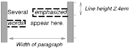
Note that with a small line height, the padding and borders around text in different lines may overlap.
Once a box has been assigned a position according to the normal flow, it may be shifted relative to this position. This is called relative positioning. Offsetting a box in this way has no effect on the following box: it is positioned as if the preceding box were not offset and it is not repositioned after the offset is applied. This implies that relative positioning may cause boxes to overlap.
Relatively positioned boxes keep their normal flow size, including line breaks and the space originally reserved for them. A relatively positioned box establishes a new containing block for descendant boxes.
A relatively positioned box is generated when the 'position' property for an element has the value 'relative'. The offset is specified by the 'top', 'bottom', 'left', and 'right' properties.
Dynamic movement of relatively positioned boxes can produce animation effects in scripting environments (see also the 'visibility' property). Relative positioning may also be used as a general form of superscripting and subscripting except that line height is not automatically adjusted to take the positioning into consideration. See the description of line height calculations for more information.
Examples of relative positioning are provided in the section comparing normal, relative, floating, and absolute positioning.
A float is a box that is shifted to the left or right on the current line. The most interesting characteristic of a floated box is that content may flow along its side (or be prohibited from doing so by the 'clear' property). Content flows down the right side of a left-floated box and down the left side of a right-floated box. The following is an introduction to float positioning and content flow; the exact rules governing float behavior are given in the description of the 'float' property.
A floated box must have an explicit width (assigned via the 'width' property, or its intrinsic width in the case of replaced elements). A floated box becomes a block box that is shifted to the left or right until its outer edge touches the containing block edge or the outer edge of another float. The top of the floated box is aligned with the top of the current line box (or bottom of the preceding block box if no line box exists). If there isn't enough horizontal room on the current line for the float, it is shifted downward, line by line, until a line has room for it.
Since a float is not in the flow, non-positioned block boxes created before and after the float box flow vertically as if the float didn't exist. However, line boxes created next to the float are shortened to make room for the float. Any content in the current line before a floated box is reflowed in the first available line on the other side of the float.
Several floats may be adjacent, and this model also applies to adjacent floats in the same line.
The following rule floats all IMG boxes with class="icon" to the left (and sets the left margin to '0'):
IMG.icon {
  float: left;
  margin-left: 0;
}
Consider the following HTML source and style sheet:
<HTML>
  <HEAD>
    <STYLE type="text/css">
      IMG { float: left }
      BODY, P, IMG { margin: 2em }
    </STYLE>
  </HEAD>
  <BODY>
    <P><IMG src=img.gif alt="This image will illustrate floats">
       Some sample text that has no other...
  </BODY>
</HTML>
The IMG box is floated to the left. The content that follows is rendered to the right of the float, starting on the same line as the float. The line boxes to the right of the float are shortened due to the float's presence, but resume their "normal" width (that of the containing block established by the P element) after the float. This document might be formatted as:

Rendering would have been exactly the same if the document had been:
  <BODY>
    <P>Some sample text
    <IMG src=img.gif alt="This image will illustrate floats">
             that has no other...
  </BODY>
because the content to the left of the float is displaced by the float and reflowed down its right side.
The margins of floating boxes never collapse with margins of adjacent boxes. Thus, in the previous example, vertical margins do not collapse between the P box and the floated IMG box.
A float can overlap other boxes in the normal flow (e.g., when a normal flow box next to a float has negative margins). When an inline box overlaps with a float, it is rendered in front of the float. When a block box overlaps, the background and borders of the block box are "clipped" by the non-transparent parts of the float, but the content is rendered in front of the float.
Here is another illustration, showing what happens when a float overlaps borders of elements in the normal flow.

The floating image is larger than the block that it is a child of, so it interrupts the border of the block, and also the border of the next block. Borders are "clipped" by floats".
The following example illustrates the use of the 'clear' property to prevent content from flowing next to a float.
This style rule means that no H1 element may have a floating element to its left; this means that H1 elements will be positioned below any left floating box.
H1 { clear: left }
Here is an example illustrating the effect of 'clear: left' on two paragraphs. Assuming a rule such as this:
P {clear: left }
a rendering might look like this:

Both paragraphs have set 'clear: left', which causes the second paragraph to be "pushed down" to a position below the float.
This property specifies whether a box should float to the left, right, or not at all. It may be set for elements that generate boxes that are not positioned absolutely (i.e., not 'absolute' or 'fixed'). The values of this property have the following meanings:
Here are the precise rules that govern the behavior of floats:
This property indicates which sides of an element's box(es) may not be adjacent to an earlier floating box. (It may be that the element itself has floating descendants; the 'clear' property has no effect on those.)
This property may only be specified for block-level elements (including floats). For compact and run-in boxes, this property applies to the final block box to which the compact or run-in box belongs.
Values have the following meanings when applied to non-floating block boxes:
When the property is set on floating elements, it results in a modification of the rules for positioning the float. An extra constraint (#9) is added:
In the absolute positioning model, a box is assigned explicit coordinates with respect to its containing block. It is removed from the normal flow entirely (it has no impact on later siblings). Like other boxes, an absolutely positioned box establishes a new containing block for descendant boxes. However, the contents of an absolutely positioned element do not flow around any other boxes. They may or may not obscure the contents of another box, depending on the stack levels of the overlapping boxes.
Fixed positioning is a variant of absolute positioning. The only difference is that for a fixed positioned box, the containing block is established by the viewport. For continuous media, fixed boxes do not move when the document is scrolled. In this respect, they are similar to fixed background images. For paged media, boxes with fixed positions are repeated on every page. This is useful for placing, for instance, a signature at the bottom of each page.
Authors may use fixed positioning to create frame-like presentations. Consider the following frame layout:

This might be achieved with the following HTML document and style rules:
<HTML>
  <HEAD>
    <TITLE>A frame document with CSS2</TITLE>
    <STYLE type="text/css">
      #header {
        position: fixed;
        width: 100%;
        height: 15%;
        top: 0;
        right: 0;
        bottom: auto;
        left: 0;
      }
      #sidebar {
        position: fixed;
        width: 10em;
        height: auto;
        top: 15%;
        right: auto;
        bottom: 100px;
        left: 0;
      }
      #main {
        position: fixed;
        width: auto;
        height: auto;
        top: 15%;
        right: 0;
        bottom: 100px;
        left: 10em;
      }
      #footer {
        position: fixed;
        width: 100%;
        height: 100px;
        top: auto;
        right: 0;
        bottom: 0;
        left: 0;
      }
    </STYLE>
  </HEAD>
  <BODY>
    <DIV id="header"> ...  </DIV>
    <DIV id="sidebar"> ...  </DIV>
    <DIV id="main"> ...  </DIV>
    <DIV id="footer"> ...  </DIV>
  </BODY>
</HTML>
When specified for the same elements, the three properties that affect box generation and layout -- 'display', 'position', and 'float' -- interact according to the following precedences (highest to lowest):
Note. CSS2 does not specify layout behavior when values for these properties are changed by scripts. For example, what happens when an element having 'width: auto' is repositioned? Do the contents reflow, or do they maintain their original formatting? The answer is outside the scope of this document, and such behavior is likely to differ in initial implementations of CSS2.
To illustrate the relationship between normal flow, relative positioning, floats, and absolute positioning, we provide a series of examples based on the following HTML fragment:
<HTML>
  <HEAD>
    <TITLE>Comparison of positioning schemes</TITLE>
  </HEAD>
  <BODY>
    <P>Beginning of body contents.
      <SPAN id="outer"> Start of outer contents.
      <SPAN id="inner"> Inner contents.</SPAN>
      End of outer contents.</SPAN>
      End of body contents.
    </P>
  </BODY>
</HTML>
The final positions of boxes generated by the outer and inner elements vary in each example. In each illustration, the numbers to the left of the illustration indicate the normal flow position of the double-spaced (for clarity) lines. (Note: the illustrations use different horizontal and vertical scales.)
Consider the following CSS declarations for outer and inner that don't alter the normal flow of boxes:
#outer { color: red }
#inner { color: blue }
This results in something like the following:
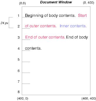
To see the effect of relative positioning, consider the following CSS rules:
BODY { line-height: 200% }
#outer { position: relative; top: -12px; color: red }
#inner { position: relative; top: 12px; color: blue }
First, the outer text is flowed into its normal flow position and dimensions at the end of line 1. Then, the inline boxes containing the text (distributed over three lines) are shifted as a unit upwards by 12px.
The contents of inner, as a child of outer, would normally flow immediately after the words "of outer contents" (on line 1.5). However, the inner contents are themselves offset relative to the outer contents by 12px downwards, back to their original position on line 2.
Note that the content following outer is not affected by the relative positioning of outer.
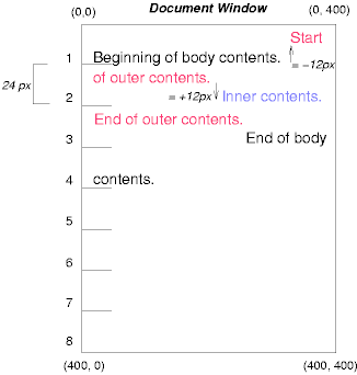
Note also that if the relative positioning of outer were -24px, the text of outer and the body text would have overlapped.
Now consider the effect of floating the inner element's text to the right by means of the following rules:
#outer { color: red }
#inner { float: right; width: 130px; text-align: top; color: blue }
First, the inner box (whose width has been set explicitly) is floated to the right margin. Then, the text of the outer element that follows the inner element text flows in the space vacated by the inner box. This flow respects the new right margin established by the left border of the inner box.
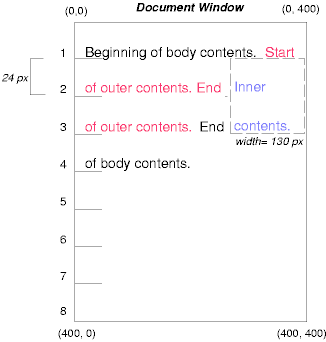
To show the effect of the 'clear' property, we add a sibling element to the example:
<HTML>
  <HEAD>
    <TITLE>Comparison of positioning schemes II</TITLE>
  </HEAD>
  <BODY>
    <P>Beginning of body contents.
      <SPAN id=outer> Start of outer contents.
      <SPAN id=inner> Inner contents.</SPAN>
      <SPAN id=sibling> Sibling contents.</SPAN>
      End of outer contents.</SPAN>
      End of body contents.
    </P>
  </BODY>
</HTML>
The following rules:
  #inner { float: right; width: 130px;
           text-align: top; color: blue }
  #sibling { color: red }
cause the inner box to float to the right and the text of the sibling element to flow in the vacated space:

However, if the 'clear' property on the sibling element is set to 'right' (i.e., the generated sibling box will not accept being positioned next to floating boxes to its right), the sibling box is moved below the float:
  #inner { float: right; width: 130px;
           text-align: top; color: blue }
  #sibling { clear: right; color: red }
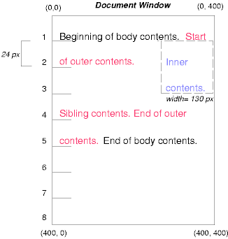
Finally, we consider the effect of absolute positioning. Consider the following CSS declarations for outer and inner:
  #outer {
    position: absolute;
    top: 200px;
    left: 200px;
    width: 200px;
    color: red;
  }
  #inner { color: blue }
which cause the top of the outer box to be positioned with respect to the containing block (which we suppose is established by the initial containing block). The top side of the outer box is 200px from the top of the containing block and the left side is 200px from the left side. The child box of outer is flowed normally with respect to its parent.
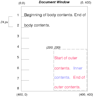
Note that because outer has been absolutely positioned, it establishes a new containing block for descendant boxes.
The following example shows an absolutely positioned box that is a child of a relatively positioned box. Although the parent outer box is not actually offset, setting its 'position' property to 'relative' causes its box to serve as the containing block for any descendant boxes. Since the outer box is an inline box that is split across several lines, only the first box (whose upper left-hand corner is designated by a "@" in the illustration below) establishes the containing block for the descendants.
  #outer {
    position: relative;
    color: red
  }
  #inner {
    position: absolute;
    top: 200px;
    left: -100px;
    height: 130px;
    width: 130px;
    color: blue;
  }
This results in something like the following:
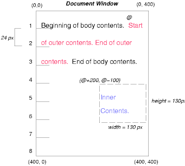
The following rules don't establish a new positioning context for inner:
  #outer { color: red }
  #inner {
    position: absolute;
    top: 200px;
    left: -100px;
    height: 130px;
    width: 130px;
    color: blue;
  }
but cause the inner box to be positioned with respect to the containing block (which we assume here is initial containing block).
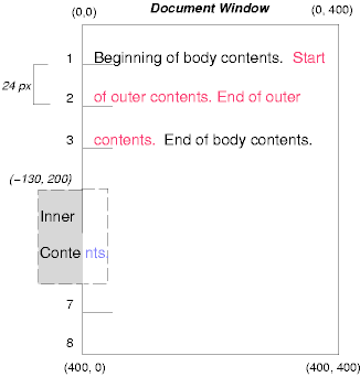
Relative and absolute positioning may be used to implement change bars, as shown in the following example. We use a value of 'auto' for the 'top' property, which results in the box being placed at the "current" location, just as if the box were being flowed into that space. The following HTML text:
<P style="position: relative; margin-right: 10px; left: 10px;">
I used two red hyphens to serve as a change bar. They
will "float" to the left of the line containing THIS
<SPAN style="position: absolute; top: auto; left: 0px; color: red;">--</SPAN>
word.</P>
might result in something like:

In the following sections, the expression "in front of" means closer to the user as the user faces the screen.
In CSS2, each box has a position in three dimensions. In addition to their horizontal and vertical positions, boxes lie along a "z-axis" and are rendered one on top of the other. Z-axis positions are particularly relevant when boxes overlap visually. This section discusses how boxes may be positioned along the z-axis.
Each box belongs to one stacking context. Each box in a given stacking context has an integer stack level, which is its position on the z-axis relative to other boxes in the same stacking context. Boxes with greater stack levels are always rendered in front of boxes with lower stack levels. Boxes may have negative stack levels. Boxes with the same stack level in a stacking context are stacked bottom-to-top according to document tree order.
The root element creates a root stacking context, but other elements may establish local stacking contexts. Stacking contexts are inherited. A local stacking context is atomic; boxes in other stacking contexts may not come between any of its boxes.
An element that establishes a local stacking context generates a box that has two stack levels: one for the stacking context it creates (always '0') and one for the stacking context to which it belongs (given by the 'z-index' property).
An element's box has the same stack level as its parent's box unless given a different stack level with the 'z-index' property.
For an absolutely or relatively positioned box, the 'z-index' property specifies:
Values have the following meanings:
In the following example, the stack levels of the boxes (named with their "id" attributes) are: "text2"=0, "image"=1, "text3"=2, and "text1"=3. The "text2" stack level is inherited from the root box. The others are specified with the 'z-index' property.
<!DOCTYPE HTML PUBLIC "-//W3C//DTD HTML 4.0 Transitional//EN">
<HTML>
  <HEAD>
    <TITLE>Z-order positioning</TITLE>
    <STYLE type="text/css">
      .pile {
        position: absolute;
        left: 2in;
        top: 2in;
        width: 3in;
        height: 3in;
      }
    </STYLE>
  </HEAD>
  <BODY>
    <P>
      <IMG id="image" class="pile"
           src="butterfly.gif" alt="A butterfly image"
           style="z-index: 1">

    <DIV id="text1" class="pile"
         style="z-index: 3">
      This text will overlay the butterfly image.
    </DIV>

    <DIV id="text2">
      This text will be beneath everything.
    </DIV>

    <DIV id="text3" class="pile"
         style="z-index: 2">
      This text will underlay text1, but overlay the butterfly image
    </DIV>
  </BODY>
</HTML>
This example demonstrates the notion of transparency. The default behavior of a box is to allow boxes behind it to be visible through transparent areas in its content. In the example, each box transparently overlays the boxes below it. This behavior can be overridden by using one of the existing background properties.
The characters in certain scripts are written from right to left. In some languages, in particular those written with the Arabic or Hebrew script, and in some mixed-language contexts, text in a single (visually displayed) block can therefore appear with mixed directionality. This phenomenon is called bidirectionality, or "bidi" for short. For an introduction to bidirectionality issues, please consult the HTML 4.0 specification ([HTML40], section 8.2).
The Unicode ([UNICODE]) specification assigns directionality to characters and defines a complex algorithm for determining the proper directionality of text. The 'direction' and 'unicode-bidi' properties allow authors to specify how the elements and attributes of a document language correspond to units of the Unicode bidi algorithm.
Because the directionality of a text depends on the structure and semantics of the document language, these properties should in most cases be used only by designers of document type descriptions (DTDs), or authors of special documents. A typical exception would be to override bidi behavior in a user agent if that user agent transliterates Yiddish (usually written with Hebrew letters) to Latin letters at the user's request.
If a document contains right-to-left characters, and if the user agent displays these characters (with appropriate glyphs, not arbitrary substitutes such as a question mark, a hex code, a black box, etc.), the user agent must apply the bidirectional algorithm. This seemingly one-sided requirement reflects the fact that, although not every Hebrew or Arabic document contains mixed-directionality text, such documents are much more likely to contain left-to-right text (e.g., numbers, text from other languages) than are documents written in left-to-right languages.
Conforming HTML user agents may ignore the 'direction' and 'unicode-bidi' properties in author and user style sheets but must behave as if they used the style sheet fragment given below.
| Value: | ltr | rtl | inherit |
| Initial: | ltr |
| Applies to: | all elements, but see prose |
| Inherited: | yes |
| Percentages: | N/A |
| Media: | visual |
This property specifies the direction of inline box flow, embedded text direction (see 'unicode-bidi'), table column layout, and content overflow.
Values for this property have the following meanings:
| Value: | normal | embed | bidi-override | inherit |
| Initial: | normal |
| Applies to: | all elements, but see prose |
| Inherited: | no |
| Percentages: | N/A |
| Media: | visual |
The writing direction of text within an inline box depends on two factors:
User agents following the bidirectional algorithm will display characters in the correct writing direction automatically, except when elements with reversed writing direction are embedded more than one level deep. In such cases, authors must assist the user agent by signaling that an element opens a new level of embedding with respect to the bidirectional algorithm.
Thus, values for 'unicode-bidi' have the following meanings:
For the 'direction' property to have any effect on inline-level elements, the 'unicode-bidi' property must have as value either 'embed' or 'override'.
If a default style sheet specifies values for 'unicode-bidi', authors and users should not specify rules to override them.
The following example shows an XML document with bidirectional text. It illustrates an important design principle: DTD designers should take bidi into account both in the language proper (elements and attributes) and in any accompanying style sheets. The style sheets should be designed so that bidi rules are separate from other style rules. The bidi rules should not be overridden by other style sheets so that the document language's or DTD's bidi behavior is preserved.
In this example, lowercase letters stand for inherently left-to-right characters and uppercase letters represent inherently right-to-left characters:
<HEBREW>
  <PAR>HEBREW1 HEBREW2 english3 HEBREW4 HEBREW5</PAR>
  <PAR>HEBREW6 <EMPH>HEBREW7</EMPH> HEBREW8</PAR>
</HEBREW>
<ENGLISH>
  <PAR>english9 english10 english11 HEBREW12 HEBREW13</PAR>
  <PAR>english14 english15 english16</PAR>
  <PAR>english17 <HE-QUO>HEBREW18 english19 HEBREW20</HE-QUO></PAR>
</ENGLISH>
Since this is XML, the style sheet is responsible for setting the writing direction. This is the style sheet:
/* Rules for bidi */
HEBREW, HE-QUO  {direction: rtl; unicode-bidi: embed}
ENGLISH         {direction: ltr; unicode-bidi: embed}

/* Rules for presentation */
HEBREW, ENGLISH, PAR  {display: block}
EMPH                  {font-weight: bold}
The HEBREW element is a block with a right-to-left base direction, the ENGLISH element is a block with a left-to-right base direction. The PARs are blocks that inherit the base direction from their parents. Thus, the first two PARs are read starting at the top right, the final three are read starting at the top left.
The EMPH element is inline-level, and since its value for 'unicode-bidi' is 'normal' (the initial value), it has no effect on the ordering of the text. The HE-QUO element, on the other hand, creates an embedding.
The rendering of this text might look like this if the line length is long:
               5WERBEH 4WERBEH english3 2WERBEH 1WERBEH

                                8WERBEH 7WERBEH 6WERBEH

english9 english10 english11 13WERBEH 12WERBEH

english14 english15 english16

english17 20WERBEH english19 18WERBEH
Note that the HE-QUO embedding causes HEBREW18 to be to the right of english19.
If lines have to be broken, it might be more like this:
       2WERBEH 1WERBEH
  -EH 4WERBEH english3
                 5WERB

   -EH 7WERBEH 6WERBEH
                 8WERB

english9 english10 en-
glish11 12WERBEH
13WERBEH

english14 english15
english16

english17 18WERBEH
20WERBEH english19
Because HEBREW18 must be read before english19, it is on the line above english19. Just breaking the long line from the earlier rendering would not have worked. Note also that the first syllable from english19 might have fit on the previous line, but hyphenation of left-to-right words in a right-to-left context, and vice versa, is usually suppressed to avoid having to display a hyphen in the middle of a line.
Note that the default style sheet "states" that the HEBREW, HE-QUO, and ENGLISH elements all create embeddings. This bidi behavior should be preserved even if a user decides to change 'display: inline' for these elements. The rules that specify 'unicode-bidi: embed' achieve this as long as they are not overridden by user rules.
The 'direction' property determines the direction of several types of flow:
In order to ensure the proper application of the bidirectional algorithm, inline boxes (including anonymous inline boxes) must be constructed, split up if necessary, and flowed so that the final order of the characters on each line conforms to the Unicode bidirectional algorithm. This means that left-to-right character sequences and right-to-left character sequences can occur within an element's content, but inline boxes are constructed so that flow remains in one direction. Non-textual entities such as images are treated as neutral characters, unless their 'unicode-bidi' property has a value other than 'normal', in which case they are treated as strong characters in the 'direction' specified for the element.
For instance, suppose that in the middle of a paragraph of Hebrew (right-to-left) text, we embed an English quotation:
<P lang="he">WERBEH WERBEH WERBEH WERBEH WERBEH
WERBEH WERBEH WERBEH WERBEH WERBEH
WERBEH WERBEH WERBEH <SPAN lang="en">English
quote here</SPAN> WERBEH WERBEH</>
The right-to-left flow of Hebrew text stops at the asterisk (*) in the following diagram:
WERBEH WERBEH WERBEH WERBEH WERBEH
WERBEH WERBEH WERBEH WERBEH WERBEH
             *WERBEH WERBEH WERBEH
While inline flow continues right-to-left after the asterisk, the English text is laid out left-to-right. Thus, successive letters will fill in the available space as follows:
            E *WERBEH WERBEH WERBEH
           En *WERBEH WERBEH WERBEH
          Eng *WERBEH WERBEH WERBEH
         Engl *WERBEH WERBEH WERBEH
        Engli *WERBEH WERBEH WERBEH
       Englis *WERBEH WERBEH WERBEH
Etc., onto the following line:
English quote *WERBEH WERBEH WERBEH
                                  h

English quote *WERBEH WERBEH WERBEH
                                 he

English quote *WERBEH WERBEH WERBEH
                                her

English quote *WERBEH WERBEH WERBEH
                               here
Hebrew text continues to flow right-to-left at the end of the English text.
In order to preserve the expected behavior of HTML 4.0 elements, their bidirectionality must be preserved however they are rendered. For example, people expect paragraphs to behave like a block with respect to bidirectionality, so even if a paragraph is displayed as an 'inline' element, it must introduce a new level of bidi embedding.
The following rules capture the remaining bidi semantics of HTML 4.0:
  BDO[DIR="ltr"]  { direction: ltr; unicode-bidi: bidi-override }
  BDO[DIR="rtl"]  { direction: rtl; unicode-bidi: bidi-override }

  *[DIR="ltr"]    { direction: ltr; unicode-bidi: embed }
  *[DIR="rtl"]    { direction: rtl; unicode-bidi: embed }

  /* Block-level elements */
  ADDRESS, BLOCKQUOTE, BODY, DD, DIV, DL, DT, FIELDSET,
  FORM, FRAME, FRAMESET, H1, H2, H3, H4, H5, H6, IFRAME,
  NOSCRIPT, NOFRAMES, OBJECT, OL, P, UL, APPLET, CENTER,
  DIR, HR, MENU, PRE, LI, TABLE, TR, THEAD, TBODY, TFOOT,
  COL, COLGROUP, TD, TH, CAPTION
                  { unicode-bidi: embed }
Contents
The containing block for a box other than the root box is determined as follows:
When a containing block is established by a block box, it has the same width, height, and position as the box's padding edge. The edges are called the top, bottom, left, and right of the containing block.
When a containing block is established by an inline-level element, it has the same width, height, and position as the padding edge of the first (in the source tree) inline box generated by the inline-level element.
Relatively positioned inline boxes must be considered specially since (1) the rendered content of an inline-level element may not be rectangular in shape but (2) a relatively positioned box establishes a new containing block and containing blocks must be rectangular. The reference edges for descendants are the following:
Box and line box widths and heights may be established in one of several ways:
The sections below describe these calculations in detail.
As discussed in the section on box dimensions, the content width of a box is assigned explicitly (via the 'width' property), given "intrinsically" (for replaced elements), or calculated "top-down" (based on the width of the box's containing block).
The following sections explain the exact computation of a box's width-related properties.
| Value: | <length> | <percentage> | auto | inherit |
| Initial: | auto |
| Applies to: | all elements but non-replaced inline elements, table rows and row groups |
| Inherited: | no |
| Percentages: | refer to width of containing block |
| Media: | visual |
This property specifies the content width of a block box. Values have the following meanings:
Negative values for 'width' are illegal. User agents must ignore this property for elements with 'display' set to 'row' or 'row-span'.
For example, the following rule fixes the width of paragraphs to 100 pixels:
P { width: 100px }
The 'width' property does not apply to non-replaced inline-level elements. These elements generate boxes that flow into line boxes. The width of line boxes is given by the their containing block, but may be shorted by the presence of floats.
For other types of boxes in the normal flow and for floats, a box's margin, padding, border, and content width must equal the width of its containing block. These widths are specified with the following seven properties: 'margin-left', 'border-left', 'padding-left', 'width', 'padding-right', 'border-right', and 'margin-right'. However, if the 'border-style' for an element has the value 'none', the corresponding border widths will be '0'.
Three of these properties ('margin-left', 'width', and 'margin-right') may take the value 'auto'. Their computed values are determined as follows.
When the 'width' property has the value 'auto', user agents should assign it a computed value based on computed margin widths. In addition:
User agents should assign computed values for 'margin-left', 'width', and 'margin-right' as follows:
The width of an absolutely positioned box may be computed in three ways:
In cases one and two, for left-to-right formatting, values of 'left' and 'right' are computed as follows:
In case three, for left-to-right formatting, values of 'left', 'right', and 'width' are computed as follows:
For all of the above cases, analogous rules hold for right-to-left formatting, switching right and left.
| Value: | <length> | <percentage> | inherit |
| Initial: | 0 |
| Applies to: | all |
| Inherited: | no |
| Percentages: | refer to width of containing block |
| Media: | visual |
| Value: | <length> | <percentage> | inherit |
| Initial: | 100% |
| Applies to: | all |
| Inherited: | no |
| Percentages: | refer to width of containing block |
| Media: | visual |
These two properties allow authors to constrain box widths to a certain range. Values have the following meanings:
The following algorithm describes how the two properties influence the computed value of the 'width' property:
The user agent may define a non-negative minimum value for the 'width' property, which may vary from element to element and even depend on other properties. If 'width' goes below this limit, either because it was set explicitly, or because it was 'auto' and the rules below would make it too small, the user agent may use the minimum value as the computed value.
As discussed in the section on box dimensions, the content height of a box is assigned explicitly (via the 'height' property), given "intrinsically" (for replaced elements), or calculated as the minimal height necessary to include the vertical content of the element and that of all its flowed children. This is the height necessary before any relative offset of children.
The following sections explain the exact computation of a box's height-related properties.
| Value: | <length> | <percentage> | auto | inherit |
| Initial: | auto |
| Applies to: | all elements but non-replaced inline elements, table columns and column groups |
| Inherited: | no |
| Percentages: | see prose |
| Media: | visual |
This property specifies a box's content height. Values have the following meanings:
Negative values for 'height' are illegal. User agents must ignore this property for elements with 'display' set to 'col' or 'column-span'.
For example, the following rule fixes the height of paragraphs to 100 pixels:
P { height: 100px }
Paragraphs that require more than 100 pixels of height will overflow according to the 'overflow' property.
The height may be enforced by the user interface (e.g., a scrollbar).
When the 'height' property has the value 'auto', user agents should assign it a computed value based on the space required by the element's rendered content. In addition:
The height of an absolutely positioned box may be computed in three ways:
In cases one and two, values of 'top' and 'bottom' are computed as follows:
In case three, the values of 'top', 'bottom', and 'height' are computed as follows:
It is sometimes useful to constrain the height of elements to a certain range. Two properties offer this functionality:
| Value: | <length> | <percentage> | inherit |
| Initial: | 0 |
| Applies to: | all |
| Inherited: | no |
| Percentages: | refer to height of containing block |
| Media: | visual |
| Value: | <length> | <percentage> | inherit |
| Initial: | 100% |
| Applies to: | all |
| Inherited: | no |
| Percentages: | refer to height of containing block |
| Media: | visual |
These two properties allow authors to constrain box heights to a certain range. Values have the following meanings:
The following algorithm describes how the two properties influence the computed value of the 'height' property:
As described in the section on inline formatting contexts, user agents flow inline boxes into a vertical stack of line boxes. The height of a line box is determined as follows:
Empty inline elements generate empty inline boxes, but these boxes still have margins, padding, borders and a line height, and thus influence these calculations just like elements with content.
Note that if all the boxes in the line box are aligned along their bottoms, the line box will be exactly the height of the tallest box. If, however, the boxes are aligned along a common baseline, the line box top and bottom may not touch the top and bottom of the tallest box.
Note that top and bottom margins, borders, and padding specified for inline-level elements do not enter into the calculation of line box heights but are visible (inside and outside line boxes).
Since the height of an inline box may be different from the font size of text in the box (e.g., 'line-height' > 1em), there may be space above and below rendered glyphs. The difference between the font size and the (actual) value of 'line-height' is called the leading. Half the leading is called the half-leading.
User agents center the glyph vertically in the box, adding half-leading on the top and bottom. For example, if a piece of text is '12pt' high and the 'line-height' value is '14pt', 2pts of extra space should be added: 1pt above and 1pt below the letters. (This applies to empty boxes as well, as if the empty box contained an infinitely narrow letter.)
When the 'line-height' value is less than the font size, the final line box height will be less than the font size and the rendered glyphs will "bleed" outside the box. If such a box touches the edge of a line box, the rendered glyphs will also "bleed" into the adjacent line box.
Although margins, borders, and padding do not enter into the line box height calculation, they are still rendered around inline boxes (except where boxes are split across lines). This means that if the height of a line box is shorter than the outer edges of the boxes it contains, backgrounds and colors may "bleed" into adjacent line boxes. However, in this case, some user agents may use the line box to "clip" the border and padding areas (i.e., not render them).
| Value: | normal | <number> | <length> | <percentage> | inherit |
| Initial: | normal |
| Applies to: | all elements |
| Inherited: | yes |
| Percentages: | relative to the font size of the element itself |
| Media: | visual |
If the property is set on a block-level element whose content is composed of inline-level elements, it specifies the minimal height of each inline box.
If the property is set on an inline-level element, it specifies the exact height of each box generated by the element. (Except for inline replaced elements, where the height of the box is given by the 'height' property.)
Values for this property have the following meanings:
Note that replaced elements have a 'font-size' and a 'line-height' property, even if they are not used directly to determine the height of the box. The 'font-size' is, however, used to define the 'em' and 'ex' units, and the 'line-height' has a role in the 'vertical-align' property.
The three rules in the example below have the same resultant line height:
DIV { line-height: 1.2; font-size: 10pt }     /* number */
DIV { line-height: 1.2em; font-size: 10pt }   /* length */
DIV { line-height: 120%; font-size: 10pt }    /* percentage */
When an element contains text that is rendered in more than one font, user agents should determine the 'line-height' value according to the largest font size.
Generally, when there is only one value of 'line-height' for all inline boxes in a paragraph (and no tall images), the above will ensure that baselines of successive lines are exactly 'line-height' apart. This is important when columns of text in different fonts have to be aligned, for example in a table.
| Value: | baseline | sub | super | top | text-top | middle | bottom | text-bottom | <percentage> | <length> | inherit |
| Initial: | baseline |
| Applies to: | inline-level and table cell elements |
| Inherited: | no |
| Percentages: | refer to the 'line-height' of the element itself |
| Media: | visual |
This property affects the vertical positioning inside a line box of the boxes generated by an inline-level element. The following values only have meaning with respect to a parent inline-level element, or to a parent block-level element, if that element generates anonymous inline boxes; they have no effect if no such parent exists
Note. Values of this property have slightly different meanings in the context of tables. Please consult the section on vertical alignment of table context for details.
The remaining values refer to the line box in which the generated box appears:
Contents
The visual effects discussed in these sections do not alter layout, only presentation.
Generally, the contents of a block box are confined within the content edges of the box. In certain cases, a box may overflow, meaning its content lies partly or entirely outside of the block:
Whenever overflow occurs, the 'overflow' property specifies how a box is clipped. The 'clip' property specifies the size and shape of the clipping region. Specifying a small clipping region may cause clipping of otherwise visible contents.
| Value: | visible | hidden | scroll | auto | inherit |
| Initial: | visible |
| Applies to: | block-level and replaced elements |
| Inherited: | no |
| Percentages: | N/A |
| Media: | visual |
This property specifies whether the contents of a block-level element are clipped when they overflow the element's box. Values have the following meanings:
Even if 'overflow' is set to 'visible', contents may be clipped to a UA's document window by the native operating environment.
Consider the following example, of a block quotation (BLOCKQUOTE) that is too big for its containing block (established by a DIV). Here is the source document:
<DIV>
<BLOCKQUOTE>
I didn't like the play, but then I saw
it under adverse conditions - the curtain was up.
<DIV class="attributed-to">- Groucho Marx</DIV>
</BLOCKQUOTE>
</DIV>
Here is the style sheet controlling the sizes and style of the generated boxes:
DIV { width : 100px; height: 100px;
      border: thin solid red
      }

BLOCKQUOTE   { width : 125px; height : 100px;
      position: absolute;
      top: 50px; left: 50px;
      border: thin dashed black
      }

DIV.attributed-to { text-align : right; }
The initial value of 'overflow' is 'visible', so the BLOCKQUOTE would be formatted without clipping, something like this:

Setting 'overflow' to 'hidden' for the DIV element, on the other hand, causes the BLOCKQUOTE to be clipped by the containing block:

A value of 'scroll' would tell UAs that support a visible scrolling mechanism to display one so that users could access the clipped content.
A clipping region defines what portion of an element's rendered content is visible. By default, the clipping region for an element has the dimensions of the containing block of its generated boxes. However, the clipping region may be modified by the 'clip' property.
Values have the following meanings:
<top>, <right>, <bottom>, and <left> may either have a <length> value or 'auto'. Negative lengths are permitted. The value 'auto' means that a given edge of the clipping region will be the same as the edge of the element's generated box. (I.e., 'auto' is the same as '0'.)
When converted to pixel coordinates, the bottom-right corner is excluded from the clipping rectangle. This rule is necessary to permit the definition of zero-width or zero-height rectangles.
If the clipping region exceeds the bounds of the UA's document window, contents may be clipped to that window by the native operating environment.
The following two rules:
P { clip: rect(5px, 10px, 10px, 5px); }
P { clip: rect(5px, -5px, 10px, 5px); }
will create the rectangular clipping regions delimited by the dotted line in the following illustrations:
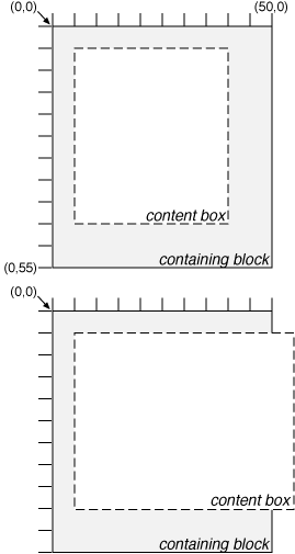
Note. In CSS2, all clipping regions are rectangular. We anticipate future extensions to permit non-rectangular clipping.
| Value: | visible | hidden | collapse | inherit |
| Initial: | inherit |
| Applies to: | all elements |
| Inherited: | no |
| Percentages: | N/A |
| Media: | visual |
The 'visibility' property specifies whether the boxes generated by an element are rendered. Invisible boxes still affect layout (set the 'display' property to 'none' to suppress box generation altogether). Values have the following meanings:
This property may be used in conjunction with scripts to create dynamic effects.
In the following example, pressing either form button invokes a user-defined script function that causes the corresponding box to become visible and the other to be hidden. Since these boxes have the same size and position, the effect is that one replaces the other.
<HTML>
<HEAD>
<STYLE type="text/css">
<!--
   #container1 { position: absolute; top: 2in; left: 2in; width: 2in}
   #container2 { position: absolute; top: 2in; left: 2in; width: 2in;
                 visibility: hidden; }
-->
</STYLE>
</HEAD>
<BODY>
<P>Choose a suspect:</P>
<DIV id="container1">
   <IMG alt="Al Capone" width="100" height="100" src="suspect1.jpg">
   <P>Name: Al Capone</P>
   <P>Residence: Chicago</P>
</DIV>

<DIV id="container2">
   <IMG alt="Lucky Luciano" width="100" height="100" src="suspect2.jpg">
   <P>Name: Lucky Luciano</P>
   <P>Residence: New York</P>
</DIV>

<FORM method="post" action="http://www.suspect.org/process-bums">
   <P>
   <INPUT name="Capone" type="button" value="Capone" onclick='show("container1");hide("container2")'>
   <INPUT name="Luciano" type="button" value="Luciano" onclick='show("container2");hide("container1")'>
</FORM>
</BODY>
</HTML>
Note that the 'position' property of each DIV element has the value 'relative'. A more visually appealing version of the above might be designed using overlapping absolutely positioned boxes.
Contents
In some cases, authors may want user agents to render content that does not come from the document tree. One familiar example of this is a numbered list; the author does not want to list the numbers explicitly, he or she wants the user agent to generate them automatically. Similarly, authors may want the user agent to insert the word "Figure" before the caption of a figure, or "Chapter 7" before the seventh chapter title. For audio or braille in particular, user agents should be able to insert these strings.
In CSS2, content may be generated by several mechanisms:
Below we describe the mechanisms associated with the 'content' property.
Authors specify the style and location of generated content with the :before and :after pseudo-elements. The 'content' property, in conjunction with these pseudo-elements, specifies what is inserted. As their names indicate, the :before and :after pseudo-elements specify content before and after an element's document tree content.
For example, the following rules insert the keyword "Note: " before the content of every P element whose "class" attribute has the value "note":
P.note:before { content: "Note: " }
The rendering objects (e.g., boxes) generated by an element include generated content. So, for example, changing the above style sheet to:
P.note:before { content: "Note: ";
                border: solid green}
would cause a solid green border to be rendered around the entire paragraph, including the initial string.
The :before and :after pseudo-elements inherit any inheritable properties from the element in the document tree to which they are attached.
For example, the following rules insert an open quote mark before every Q element. The color of the quote mark will be red, but the font will be the same as the font of the rest of the Q element:
Q:before {
  content: open-quote;
  color: red
}
In a :before or :after pseudo-element declaration, non-inherited properties take their initial values.
So, for example, because the initial value of the 'display' property is 'inline', the quote in the previous example is inserted as an inline box (i.e., on the same line as the element's initial text content). The next example explicitly sets the 'display' property to 'block', so that the inserted text becomes a block:
BODY:after {
    content: "The End";
    display: block;
    margin-top: 2em;
    text-align: center;
}
Note that an audio user agent would speak the words "The End" after rendering the rest of the BODY content.
User agents must ignore the following properties with :before and :after pseudo-elements: 'position', 'float', list properties, and table properties.
The :before and :after pseudo-elements elements allow values of the 'display' property as follows:
Note. Other values may be permitted in future levels of CSS.
This property is used with the :before and :after pseudo-elements to generate content in a document. The 'display' property controls whether the content is placed in an inline or block box.
The values have the following meanings:
Authors should put 'content' declarations in @media rules when the content requires media consideration. For instance, literal text may be used for any media group, but images only apply to the visual, bitmap media groups, and sound files only apply to the aural media group.
The following rule causes a sound file to be played at the end of a quotation (see the section on aural style sheets for additional mechanisms):
@media aural {
   BLOCKQUOTE:after {content: url(beautiful-music.wav)}
   }
The next rule inserts the text of the HTML "alt" attribute before the image. If the image is not displayed, the reader will still see the "alt" text.
IMG:before {content: attr(alt)}
Authors may include newlines in the generated content by writing the "\A" escape sequence in one of the strings after the 'content' property. This inserts a forced line break, similar to the BR element in HTML. See "Strings" and "Characters and case" for more information on the "\A" escape sequence.
Example:
H1:before {
    display: block;
    text-align: center;
    content: "chapter\A hoofdstuk\A chapitre"
}
Generated content does not alter the document tree. In particular, it is not fed back to the document language processor (e.g., for reparsing).
Note. In future levels of CSS, the 'content' property may accept additional values, allowing it to vary the style of pieces of the generated content, but in CSS2, the content of the :before or :after pseudo-element all has the same style.
The following cases can occur:
Here is an example of a 'run-in' header with an :after pseudo-element, followed by a paragraph with a :before pseudo-element. All pseudo-elements are inline (the default) in this example. When the style sheet:
H3 { display: run-in }
H3:after { content: ": " }
P:before { content: "... " }
is applied to this source document:
<H3>Centaurs</H3>
<P>have hoofs
<P>have a tail
The visual rendering will resemble:
Centaurs: ... have hoofs
... have a tail
In CSS2, authors may specify how user agents should render quotation marks in a style-sensitive and context-dependent manner. The 'quotes' property specifies pairs of quotation marks for each level of embedded quotation. The 'content' property gives access to those quotation marks and causes them to be inserted before and after a quotation.
This property specifies quotation marks for any number embedded quotations. Values have the following meanings:
For example, applying the following style sheet:
/* Specify pairs of quotes for two levels in two languages */
Q:lang(en) { quotes: '"' '"' "'" "'" }
Q:lang(no) { quotes: "«" "»" "'" "'" }

/* Insert quotes before and after Q element content */
Q :before { content : open-quote }
Q :after  { content : close-quote }
to the following HTML fragment:
<HTML lang="en">
  <BODY>
    <P><Q>Quote me!</Q>
  </BODY>
</HTML>
would allow a user agent to render:
"Quote me!"
while this HTML fragment:
<HTML lang="no">
  <BODY>
    <P><Q>Han sa <Q>vet ikke</Q>!</Q>
  </BODY>
</HTML>
would produce:
«Han sa 'vet ikke'!»
Note. While the quotation marks specified by 'quotes' in the previous examples are conveniently located on computer keyboards, high quality typesetting would require different ISO 10646 characters. The following informative table lists some of the ISO 10646 quotation mark characters:
| Ascii approximation | ISO 10646 code (hex) | Description |
|---|---|---|
| " | 0022 | QUOTATION MARK [the ASCII double quotation mark] |
| ' | 0027 | APOSTROPHE [the ASCII single quotation mark] |
| [<] | 2039 | SINGLE LEFT-POINTING ANGLE QUOTATION MARK |
| [>] | 203A | SINGLE RIGHT-POINTING ANGLE QUOTATION MARK |
| « | 00AB | LEFT-POINTING DOUBLE ANGLE QUOTATION MARK |
| » | 00BB | RIGHT-POINTING DOUBLE ANGLE QUOTATION MARK |
| [`] | 2018 | LEFT SINGLE QUOTATION MARK [single high-6] |
| ['] | 2019 | RIGHT SINGLE QUOTATION MARK [single high-9] |
| [``] | 201C | LEFT DOUBLE QUOTATION MARK [double high-6] |
| [''] | 201D | RIGHT DOUBLE QUOTATION MARK [double high-9] |
| [,,] | 201E | DOUBLE LOW-9 QUOTATION MARK [double low-9] |
Quotation marks are inserted in appropriate places in a document with the 'open-quote' and 'close-quote' values of the 'content' property. Each occurrence of 'open-quote' or 'close-quote' is replaced by one of the strings from the value of 'quotes', based on the depth of nesting.
'Open-quote' refers to the first of a pair of quotes, 'close-quote' refers to the second. Which pair of quotes is used depend on the nesting level of quotes: the number of occurrences of 'open-quote' in all generated text before the current occurrence, minus the number of occurrences of 'close-quote'. If the depth is 0, the first pair is used, if the depth is 1, the second pair is used, etc. If the depth is greater than the number of pairs, the last pair is repeated.
Note that this quoting depth is independent of the nesting of the source document or the rendering structure.
Some typographic styles require open quotation marks to be repeated before every paragraph of a quote spanning several paragraphs, but only the last paragraph ends with a closing quotation mark. In CSS, this can be achieved by inserting "phantom" closing quotes. The keyword 'no-close-quote' decrements the quoting level, but does not insert a quotation mark.
The following style sheet puts opening quotation marks on every paragraph in a BLOCKQUOTE, and inserts a single closing quote at the end:
BLOCKQUOTE P:before { content: open-quote }
BLOCKQUOTE P:after { content: no-close-quote }
BLOCKQUOTE P.last:after { content: close-quote }
This relies on the last paragraph being marked with a class "last", since there are no selectors that can match the last child of an element.
For symmetry, there is also a 'no-open-quote' keyword, which inserts nothing, but increments the quotation depth by one.
Note. If a quotation is in a different language than the surrounding text, it is customary to quote the text with the quote marks of the language of the surrounding text, not the language of the quotation itself. For example, French inside English:
The device of the order of the garter is “Honi soit qui mal y pense.”English inside French:
Il disait: « Il faut mettre l'action en ‹ fast forward ›.»
A style sheet like the following will set the 'quotes' property so that 'open-quote' and 'close-quote' will work correctly on all elements. These rules are for documents that contain only English, French, or both. One rule is needed for every additional language. Note the use of the child combinator (">") to set quotes on elements based on the language of the surrounding text:
[LANG|=fr] > *  {quotes: "«" "»" "\2039" "\203A"}
[LANG|=en] > *  {quotes: "\201C" "\201D" "\2018" "\2019"}
The quotation marks for English are shown here in a form that most people will be able to type. If you can type them directly, they will look like this:
[LANG|=fr] > * {quotes: "«" "»" "‹" "›"}
[LANG|=en] > * {quotes: "“" "”" "‘" "’"}
Automatic numbering in CSS2 is controlled with two properties, 'counter-increment' and 'counter-reset'. The counters defined by these properties can be used to generate text for the 'content' property (see the counter() function).
| Value: | [ <identifier> <integer>? ]+ | none | inherit |
| Initial: | none |
| Applies to: | all elements |
| Inherited: | no |
| Percentages: | N/A |
| Media: | all |
| Value: | [ <identifier> <integer>? ]+ | none | inherit |
| Initial: | none |
| Applies to: | all elements |
| Inherited: | no |
| Percentages: | N/A |
| Media: | all |
The 'counter-increment' property accepts one or more names of counters (identifiers), each one optionally followed by an integer. The integer indicates by how much the counter is incremented for every occurrence of the element. The default increment is 1. Zero and negative integers are allowed.
The 'counter-reset' property also contains a list of one or more names of counters, each one optionally followed by an integer. The integer gives the value that the counter is set to on each occurrence of the element. The default is 0.
If 'counter-increment' refers to a counter that is not in the scope (see below) of any 'counter-reset', the counter is assumed to have been reset to 0 by the root element.
This example shows a way to number chapters and sections with "Chapter 1", "1.1", "1.2", etc.
H1:before {
    content: "Chapter " counter(chapter) ". ";
    counter-increment: chapter;  /* Add 1 to chapter */
    counter-reset: section;      /* Set section to 0 */
}
H2:before {
    content: counter(chapter) "." counter(section) " ";
    counter-increment: section;
}
If an element increments/resets a counter and also uses it (in the 'content' property of its :before or :after pseudo-element), the counter is used after being incremented/reset.
If an element both resets and increments a counter, the counter is reset first and then incremented.
The 'counter-reset' property follows the cascading rules. Thus, due to cascading, the following stylesheet:
H1 {counter-reset: section -1}
H1 {counter-reset: imagenum 99}
will only reset 'imagenum'. To reset both counters, they have to be specified together:
H1 {counter-reset: section -1 imagenum 99}
Counters are "self-nesting", in the sense that re-using a counter in a child element automatically creates a new instance of the counter. This is important for situations like lists in HTML, where elements can be nested inside themselves to arbitrary depth. It would be impossible to define uniquely named counters for each level.
Thus the following suffices to number nested list items. The result is very similar to that of setting 'display:list-item' and 'list-style: inside' on the LI element:
OL {counter-reset: item}
LI {display: block}
LI:before {content: counter(item) ". "; counter-increment: item}
The self-nesting is based on the principle that every element that has a 'counter-reset' for a counter X, creates a fresh counter X, the scope of which is the element, its younger siblings, and all the descendants of the element and its younger siblings.
In the example above, an OL will create a counter, and all children of the OL will refer to that counter.
If we denote by item[n] the nth counter, and by "(" and ")" the beginning and end of a scope, then the following HTML fragment will use the indicated counters. (We assume the style sheet as given in the example above).
<OL>               <!-- (set item[0] to 0          -->
  <LI>item         <!--  increment item[0] (= 1)   -->
  <LI>item         <!--  increment item[0] (= 2)   -->
    <OL>           <!--  (set item[1] to 0         -->
      <LI>item     <!--   increment item[1] (= 1)  -->
      <LI>item     <!--   increment item[1] (= 2)  -->
      <LI>item     <!--   increment item[1] (= 3)  -->
        <OL>       <!--   (set item[2] to 0        -->
          <LI>item <!--    increment item[2] (= 1) -->
        </OL>      <!--   )                        -->
        <OL>       <!--   (set item[3] to 0        -->
          <LI>     <!--    increment item[3] (= 1) -->
        </OL>      <!--   )                        -->
      <LI>item     <!--   increment item[1] (= 4)  -->
    </OL>          <!--  )                         -->
  <LI>item         <!--  increment item[0] (= 3)   -->
  <LI>item         <!--  increment item[0] (= 4)   -->
</OL>              <!-- )                          -->
<OL>               <!-- (reset item[4] to 0        -->
  <LI>item         <!--  increment item[4] (= 1)   -->
  <LI>item         <!--  increment item[4] (= 2)   -->
</OL>              <!-- )                          -->
The 'counters()' function generates a string composed of all counters with the same name, separated by a given string.
The following style sheet numbers nested list items as "1", "1.1", "1.1.1", etc.
OL {counter-reset: item}
LI {display: block}
LI:before {content: counters(item, "."); counter-increment: item}
By default, counters are rendered with decimal numbers, but all the styles available for the 'list-style-type' property are also available for counters. The notation is:
counter(name)
for the default, decimal style, or:
counter(name, 'list-style-type')
All the styles are allowed, including 'disc', 'circle', 'square', and 'none'.
Examples:
H1:before { content: counter(chno, upper-latin) ". " }
H2:before { content: counter(section, upper-roman) " - " }
BLOCKQUOTE:after { content: " [" counter(bq, hebrew) "]" }
DIV.note:before { content: counter(notecntr, disc) " " }
P:before { content: counter(p, none) }
An element that is not displayed ('display' set to 'none') cannot increment or reset a counter.
For example, with the following style sheet, H2s with class "secret" do not increment 'count2'.
H2.secret {counter-increment: count2; display: none}
Elements with 'visibility' set to 'hidden', on the other hand, do increment counters.
There are very few situations in CSS2 where an element causes the generation of more than one box. The most common case occurs for elements with 'display: list-item' (see the section on lists). The two generated boxes are the principal box (the list item content) and the list item marker (to the side of the principal box). Authors have very limited control of the style or position of the list item marker through the list style properties.
Markers are used together with the :before and :after pseudo-elements to offer similar functionality, but give authors more control over the position of the generated content. Markers may be used with automatic counters to create a wider variety of list styles than available with the list properties. They may also be used to create numbered margin notes, etc.
An element may generate two marker boxes: one for :before content and one for :after content, in addition to one principal box (that of the element's content). Marker boxes must only contain one line of content (i.e., one line box), so they are not as flexible as floats, which may be used to align entire blocks horizontally.
Marker boxes have padding and borders, but no margins.
To create a marker box for :before or :after content, the 'display' property must be given the value 'marker'. The marker box is only created if the 'content' property for the pseudo-element actually generates content. The content will be formatted as a single line.
For the :before pseudo-element, the baseline of text in the marker box will be vertically aligned with the baseline of text in the first line of content in the principal box. If the principal box contains no text, the top outer edge of the marker box will be aligned with the top outer edge of the principal box. For the :after pseudo-element, the baseline of text in the marker box will be vertically aligned with the baseline of text in the last line of content in the principal box. If the principal box contains no text, the bottom outer edge of the marker box will be aligned with the bottom outer edge of the principal box.
The vertical alignment of content within the marker box may be specified with the 'vertical-align' property.
The height of the :before marker and of the first line box of the principal box is computed as if they were a single line box. Analogously for the :after marker and the last line box. The 'line-height' property sets the height of the marker box.
The width of a marker box defaults to the natural width of its content, but may be specified with the 'width' property. If the width of a marker box's content is greater than the specified width, the 'overflow' property specifies overflow behavior. Marker boxes may overlap principal boxes.
If the 'width' is not 'auto', and is larger than the natural width, the 'text-align' property determines the horizontal alignment of the content in the marker box.
The 'marker-offset' property specifies the horizontal offset between a marker box and the associated principal box. The distance is measured between their nearest border edges.
When the 'display' property has the value 'marker' for content generated by an element with 'display: list-item', a marker box generated for ':before' replaces the normal list item marker.
The following example illustrates how markers may be used to add periods after each numbered list item. This HTML program and style sheet:
<HTML>
   <HEAD>
     <STYLE type="text/css">
	  LI:before {
	      display: marker;
	      content: counter(mycounter, lower-roman) ".";
	      counter-increment: mycounter;
	  }
     </STYLE>
  </HEAD>
  <BODY>
    <OL>
      <LI> This is the first item.
      <LI> This is the second item.
      <LI> This is the third item.
    </OL>
  </BODY>
</HTML>
should produce something like this:
   i. This is the first item.
  ii. This is the second item.
 iii. This is the third item.
This next example shows a different horizontal alignment: the content is centered within a box of a fixed width. This document:
 <HTML>
    <HEAD>
      <STYLE type="text/css">
           LI:before {
               display: marker;
               content: "(" numeric(counter) ")";
               width: 6em;
               text-align: center;
           }
      </STYLE>
   </HEAD>
   <BODY>
     <OL>
       <LI> This is the first item.
       <LI> This is the second item.
       <LI> This is the third item.
     </OL>
   </BODY>
 </HTML>
should produce something like this:
  (1)    This is the
         first item.
  (2)    This is the
         second item.
  (3)    This is the
         third item.
The next example creates markers before and after list items. This document:
<HTML>
  <HEAD>
    <STYLE type="text/css">
      @media screen, print {
         LI:before {
   	      display: marker;
	      content: url(smiley.gif);
         LI:after {
	      display: marker;
   	      content: url(sad.gif);
         }
      }
    </STYLE>
  </HEAD>
  <BODY>
    <UL>
      <LI>first list item comes first
      <LI>second list item comes second
    </UL>
  </BODY>
</HTML>
should produce something like this (ascii art is used instead of smiley gif images here):
  :-) first list item
      comes first      :-(
  :-) second list item
      comes second     :-(
The next example uses markers to number notes (paragraphs). The following document:
<HTML>
  <HEAD>
    <STYLE type="text/css">
      P { margin-left: 12 em; }
      @media screen, print {
         P.Note:before         {
  	      display: marker;
	      content: url(note.gif)
                       "Note " numeric(note-counter) ":";
              counter-increment: note-counter;
              text-align: left;
              width: 10em;
         }
     }
    </STYLE>
  </HEAD>
  <BODY>
    <P>This is the first paragraph in this document.</P>
    <P CLASS="Note">This is a very short document.</P>
    <P>This is the end.</P>
  </BODY>
</HTML>
should produce something like:
            This is the first paragraph
            in this document.

  Note 1:   This is a very short
            document.

            This is the end.
| Value: | <length> | auto | inherit |
| Initial: | auto |
| Applies to: | elements with 'display' set to 'marker' |
| Inherited: | no |
| Percentages: | N/A |
| Media: | visual |
This property specifies the distance between the nearest border edges of a marker box and its associated principal box. The offset may either be a user-specified (<length>) or chosen by the UA ('auto'). Lengths may be negative, but there may be implementation-specific limits.
The following example illustrates how markers may be used to add periods after each numbered list item. This HTML program and style sheet:
 <HTML>
    <HEAD>
      <STYLE type="text/css">
           LI:before {
               display: marker;
               marker-offset: 3em;
               content: counter(mycounter, lower-roman) ".";
               counter-increment: mycounter;
           }
      </STYLE>
   </HEAD>
   <BODY>
     <P> This is a long preceding paragraph ...
     <OL>
       <LI> This is the first item.
       <LI> This is the second item.
       <LI> This is the third item.
     </OL>
     <P> This is a long following paragraph ...
   </BODY>
 </HTML>
should produce something like this:
        This is a long preceding
        paragraph ...

   i.   This is the first item.
  ii.   This is the second item.
 iii.   This is the third item.

        This is a long following
        paragraph ...
Contents
Paged media (e.g., paper, transparencies, pages that are displayed on computer screens, etc.) differ from continuous media in that the content of the document is split into one or more discrete pages. To handle page breaks, CSS2 extends the visual rendering model as follows:
The CSS2 page model specifies how a document is formatted within a rectangular area -- the page box -- that has a finite width and height. The page box does not necessarily correspond to the real sheet where the document will ultimately be rendered (paper, transparency, screen, etc.). The CSS page model specifies formatting in the page box, but it is the user agent's responsibility to transfer the page box to the sheet. Some transfer possibilities include:
Although CSS2 does not specify how user agents transfer page boxes to sheets, it does include certain mechanisms for telling user agents about the target sheet size and orientation.
The page box is a rectangular region that contains two embedded areas:
Note. In CSS2, the border properties and padding properties do not apply to pages; they may in the future.
Authors specify the dimensions, orientation, margins, etc. of a page box within an @page rule. An @page rule consists of the keyword "@page", a page selector, and a block of declarations (said to be in the page context).
The page selector specifies for which pages the declarations apply. In CSS2, page selectors may designate the first page, all left pages, all right pages, or a page with a specific name.
The dimensions of the page box are set with the 'size' property. The 'marks' property specifies crop and cross marks.
For example, the following @page rule sets the margins of the page to 2cm.
@page { margin: 2cm }
The margin properties ('margin-top', 'margin-right', 'margin-bottom', 'margin-left', and 'margin') apply within the page context. The following diagram shows the relationships between the sheet, page box, and page margins:

The actual value of element margins that fall at the top or bottom of a page is set to 0.
The page context has no notion of fonts, so 'em' and 'ex' units are not allowed. Percentage values on the margin properties are relative to the dimensions of the page box. All other units associated with the respective CSS2 properties are allowed.
Due to negative margin values (either on the page box or on elements) or absolute positioning content may end up outside the page box, but this content may be "cut" -- by the user agent, the printer, or ultimately, the paper cutter.
This property specifies the size and orientation of a page box.
The size of a page box may either be "absolute" (fixed size) or "relative" (scalable, i.e., fitting available sheet sizes). Relative page boxes allow user agents to scale a document and make optimal use of the target size.
Three values for the 'size' property create a relative page box:
In the following example, the outer edges of the page box will align with the target. The percentage value on the 'margin' property is relative to the target size so if the target sheet dimensions are 21.0cm x 29.7cm (i.e., A4), the margins are 2.10cm and 2.97cm.
@page {
  size: auto;   /* auto is the initial value */
  margin: 10%;
}
Length values for the 'size' property create an absolute page box. If only one length value is specified, it sets both the width and height of the page box (i.e., the box is a square). Since the page box is the initial containing block, percentage values are not allowed for the 'size' property.
For example:
@page {
  size: 8.5in 11in;  /* width height */
}
The above example set the width of the page box to be 8.5in and the height to be 11in. The page box in this example requires a target sheet size of 8.5"x11" or larger.
User agents may allow users to control the transfer of the page box to the sheet (e.g., rotating an absolute page box that's being printed).
If the page box does not fit the target sheet dimensions, the user agent may choose to:
The user agent should consult the user before performing these operations.
When the page box is smaller than the target size, the user agent is free to place the page box anywhere on the sheet. However, it is recommended that the page box be centered on the sheet since this will align double-sided pages and avoid accidental loss of information that is printed near the edge of the sheet.
In high-quality printing, marks are often added outside the page box. This property specifies whether cross marks or crop marks or both should be rendered just outside the page box edge.
Crop marks indicate where the page should be cut. Cross marks (also known as register marks or registration marks) are used to align sheets.
Marks are visible only on absolute page boxes (see the 'size' property). In relative page boxes, the page box will be aligned with the target and the marks will be outside the printable area.
The size, style, and position of cross marks depend on the user agent.
When printing double-sided documents, the page boxes on left and right pages should be different. This can be expressed through two CSS pseudo-classes that may be defined in the page context.
All pages are automatically classified by user agents into either the :left or :right pseudo-class.
@page :left {
  margin-left: 4cm;
  margin-right: 3cm;
}

@page :right {
  margin-left: 3cm;
  margin-right: 4cm;
}
If different declarations have been given for left and right pages, the user agent must honor these declarations even if the user agent does not transfer the page boxes to left and right sheets (e.g., a printer that only prints single-sided).
Authors may also specify style for the first page of a document with the :first pseudo-class:
@page { margin: 2cm } /* All margins set to 2cm */

@page :first {
  margin-top: 10cm    /* Top margin on first page 10cm */
}
Whether the first page of a document is :left or :right depends on the major writing direction of the document and is outside the scope of this document. However, to force a :left or :right first page, authors may insert a page break before the first generated box (e.g., in HTML, specify this for the BODY element).
Properties specified in a :left (or :right) @page rule override those specified in an @page rule that has no pseudo-class specified. Properties specified in a :first @page rule override those specified in :left (or :right) @page rules.
Note. Adding declarations to the :left or :right pseudo-class does not influence whether the document comes out of the printer double- or single-sided (which is outside the scope of this specification).
Note. Future versions of CSS may include other page pseudo-classes.
When formatting content in the page model, some content may end up outside the page box. For example, an element whose 'white-space' property has the value 'pre' may generate a box that is wider than the page box. Also, when boxes are positioned absolutely, they may end up in "inconvenient" locations. For example, images may be placed on the edge of the page box or 100,000 inches below the page box.
A specification for the exact formatting of such elements lies outside the scope of this document. However, we recommend that authors and user agents observe the following general principles concerning content outside the page box:
The following sections explain page formatting in CSS2. Five properties indicate where the user agent may or should break pages, and on what page (left or right) the subsequent content should resume. Each page break ends layout in the current page box and causes remaining pieces of the document tree to be laid out in a new page box.
| Value: | auto | always | avoid | left | right | inherit |
| Initial: | auto |
| Applies to: | block-level elements |
| Inherited: | no |
| Percentages: | N/A |
| Media: | visual, paged |
| Value: | auto | always | avoid | left | right | inherit |
| Initial: | auto |
| Applies to: | block-level elements |
| Inherited: | no |
| Percentages: | N/A |
| Media: | visual, paged |
| Value: | avoid | auto | inherit |
| Initial: | auto |
| Applies to: | block-level elements |
| Inherited: | yes |
| Percentages: | N/A |
| Media: | visual, paged |
Values for these properties have the following meanings:
A potential page break location is typically under the influence of the parent element's 'page-break-inside' property, the 'page-break-after' property of the preceding element, and the 'page-break-before' property of the following element. When these properties have values other than 'auto', the values 'always', 'left', and 'right' take precedence over 'avoid'. See the section on allowed page breaks for the exact rules on how these properties may force or suppress a page break.
| Value: | <identifier> [ :left | :right ]? | auto |
| Initial: | auto |
| Applies to: | block-level elements |
| Inherited: | yes |
| Percentages: | N/A |
| Media: | visual, paged |
The 'page' property can be used to specify a particular type of page where an element should be displayed.
By adding ':left' or ':right' the element can be forced to fall on a left or right page as well.
This example will put all tables on a right-hand side landscape page (named "rotated"):
@page rotated {size: landscape}
TABLE {page: rotated:right}
The 'page' property works as follows: If a block box with inline content has a 'page' property that is different from the preceding block box with inline content, then one or two page breaks are inserted between them, and the boxes after the break are rendered onto a page box of the named type. See "Forced page breaks" below.
In this example, the two tables are rendered on landscape pages (indeed, on the same page, if they fit), and the page type "narrow" is not used at all, despite having been set on the DIV:
@page narrow {size: 9cm 18cm}
@page rotated {size: landscape}
DIV {page: narrow}
TABLE {page: rotated}
with this document::
<DIV>
<TABLE>...</TABLE>
<TABLE>...</TABLE>
</DIV>
The 'orphans' property specifies the minimum number of lines of a paragraph that must be left at the bottom of a page. The 'widows' property specifies the minimum number of lines of a paragraph that must be left at the top of a page. Examples of how they are used to control page breaks are given below.
The 'page-break-inside' property can be used to turn off page breaking inside an element completely, i.e., keep the whole element on one page. The 'widows' and 'orphans' properties are not used if 'page-break-inside' is 'avoid'. However, if the element is larger than the page, so that it has to be broken, then the 'page-break-inside' property is ignored (treated as if it were 'auto') and page breaks are determined using the 'widows' and 'orphans' properties.
For information about paragraph formatting, please consult the section on line boxes.
In the normal flow, page breaks can occur at the following places:
These breaks are subject to the following rules:
If the above doesn't provide enough break points to keep content from overflowing the page boxes, then rules B and D are dropped in order to find additional breakpoints.
If that still does not lead to sufficient break points, rules A and C are dropped as well, to find still more break points.
Page breaks cannot occur inside boxes that are absolutely-positioned.
A page break must occur at (1) if, among the 'page-break-after' and 'page-break-before' properties of all the elements generating boxes that meet at this margin, there is at least one with the value 'always', 'left', or 'right'.
A page break must also occur at (1) if the last line box above this margin and the first one below it do not have the same value for 'page'.
CSS2 does not define which of a set of allowed page breaks must be used; CSS2 does not forbid a user agent from breaking at every possible break point, or not to break at all. But CSS2 does recommend that user agents observe the following heuristics (while recognizing that they are sometimes contradictory):
Suppose, for example, that the style sheet contains 'orphans : 4', 'widows : 2', and there are 20 lines (line boxes) available at the bottom of the current page:
Now suppose that 'orphans' is '10', 'widows' is '20', and there are 8 lines available at the bottom of the current page:
Declarations in the page context obey the cascade just like normal CSS2 declarations.
Consider the following example:
@page {
  margin-left: 3cm;
}

@page :left {
  margin-left: 4cm;
}
Due to the higher specificity of the pseudo-class selector, the left margin on left pages will be '4cm' and all other pages (i.e., the right pages) will have a left margin of '3cm'.
Contents
CSS properties allow authors to specify the foreground color and background of an element. Backgrounds may be colors or images. Background properties allow authors to position the image, repeat it, and declare whether it should be fixed with respect to the viewport or scrolled along with the document.
See the section on color units for the syntax of valid color values.
This property describes the foreground color of an element's text content. There are different ways to specify red:
EM { color: red }              /* predefined color name */
EM { color: rgb(255,0,0) }     /* RGB range 0-255   */
Authors may specify the background of an element (i.e., its rendering surface) as either a color or an image. In terms of the box model, "background" refers to the background of the content and the padding area. Border colors and styles are set with the border properties. Margins are always transparent so the background of the parent box always shines through.
Background properties are not inherited, but the parent box's background will shine through by default because of the initial 'transparent' value on 'background-color'.
The background of the box generated by the root element covers the entire canvas.
For HTML documents, however, we recommend that authors specify the background for the BODY element rather than the HTML element. User agents should observe the following precedence rules to fill in the background: if the value of the 'background' property for the HTML element is different from 'transparent' then use it, else use the value of the 'background' property for the BODY element. If the resulting value is 'transparent', the rendering is undefined.
According to these rules, the canvas underlying the following HTML document will have a "marble" background and the background of the box generated by the BODY element will be red:
<!DOCTYPE HTML PUBLIC "-//W3C//DTD HTML 4.0 Transitional//EN">
<HTML>
  <HEAD>
    <STYLE type="text/css">
       BODY { background: url(http://style.com/marble.png) }
    </STYLE>
    <TITLE>Setting the canvas background</TITLE>
  </HEAD>
  <BODY style="background: red">
    <P>My background is red.
  </BODY>
</HTML>
| Value: | <color> | transparent | inherit |
| Initial: | transparent |
| Applies to: | all elements |
| Inherited: | no |
| Percentages: | N/A |
| Media: | visual |
This property sets the background color of an element, either a <color> value or the keyword 'transparent', to make the underlying colors shine through.
H1 { background-color: #F00 }
| Value: | <uri> | none | inherit |
| Initial: | none |
| Applies to: | all elements |
| Inherited: | no |
| Percentages: | N/A |
| Media: | visual |
This property sets the background image of an element. When setting a background image, authors should also specify a background color that will be used when the image is unavailable. When the image is available, it is rendered on top of the background color. (Thus, the color is visible in the transparent parts of the image).
The values are <uri>, to specify the image, or 'none', when no image is used.
Example:
BODY { background-image: url(marble.gif) }
P { background-image: none }
| Value: | repeat | repeat-x | repeat-y | no-repeat | inherit |
| Initial: | repeat |
| Applies to: | all elements |
| Inherited: | no |
| Percentages: | N/A |
| Media: | visual |
If a background image is specified, this property specifies whether the image is repeated (tiled), and how. All tiling covers the content and padding areas of a box. Values have the following meanings:
Example:
BODY {
  background: red url(pendant.gif);
  background-repeat: repeat-y;
  background-position: center;
}

One copy of the background image is centered, and other copies are put above and below it to make a vertical band behind the element.
| Value: | scroll | fixed | inherit |
| Initial: | scroll |
| Applies to: | all elements |
| Inherited: | no |
| Percentages: | N/A |
| Media: | visual |
If a background image is specified, this property specifies whether it is fixed with regard to the viewport ('fixed') or scrolls along with the document ('scroll').
Even if the image is fixed, it is still only visible when it is in the background or padding area of the element. Thus, unless the image is tiled ('background-repeat: repeat'), it may be invisible.
This example creates an infinite vertical band that remains "glued" to the viewport when the element is scrolled.
BODY {
  background: red url(pendant.gif);
  background-repeat: repeat-y;
  background-attachment: fixed;
}
User agents may treat 'fixed' as 'scroll'. However, it is recommended they interpret 'fixed' correctly, at least for the HTML and BODY elements, since there is no way for an author to provide an image only for those browsers that support 'fixed'. See the section on conformance for details.
| Value: | [ [<percentage> | <length> ]{1,2} | [ [top | center | bottom] || [left | center | right] ] ] | inherit |
| Initial: | 0% 0% |
| Applies to: | block-level and replaced elements |
| Inherited: | no |
| Percentages: | refer to the size of the element itself |
| Media: | visual |
If a background image has been specified, this property specifies its initial position. Values have the following meanings:
If only one percentage or length value is given, it sets the horizontal position only, the vertical position will be 50%. If two values are given, the horizontal position comes first. Combinations of length and percentage values are allowed, (e.g., '50% 2cm'). Negative positions are allowed. Keywords cannot be combined with percentage values or length values (all possible combinations are given above).
Examples:
BODY { background: url(banner.jpeg) right top }    /* 100%   0% */
BODY { background: url(banner.jpeg) top center }   /*  50%   0% */
BODY { background: url(banner.jpeg) center }       /*  50%  50% */
BODY { background: url(banner.jpeg) bottom }       /*  50% 100% */
If the background image is fixed within the viewport (see the property), the image is placed relative to the viewport instead of the element's box. For example,
BODY {
  background-image: url(logo.png);
  background-attachment: fixed;
  background-position: 100% 100%;
}
In the example above, the image is placed in the lower-right corner of the viewport.
| Value: | [<'background-color'> || <'background-image'> || <'background-repeat'> || || <'background-position'>] | inherit |
| Initial: | not defined for shorthand properties |
| Applies to: | all elements |
| Inherited: | no |
| Percentages: | allowed on 'background-position' |
| Media: | visual |
The 'background' property is a shorthand property for setting the individual background properties (i.e., 'background-color', 'background-image', 'background-repeat', and 'background-position') at the same place in the style sheet.
The 'background' property always sets all the individual background properties.
In the first rule of the following example, only a value for 'background-color' has been given and the other individual properties are set to their initial value. In the second rule, all individual properties have been specified.
BODY { background: red }
P { background: url(chess.png) gray 50% repeat fixed }
For information about gamma issues, please consult the the Gamma Tutorial in the PNG specification ([PNG10]).
In the computation of gamma correction, UAs displaying on a CRT may assume an ideal CRT and ignore any effects on apparent gamma caused by dithering. That means the minimal handling they need to do on current platforms is:
"Applying gamma" means that each of the three R, G and B must be converted to R'=Rgamma, G'=Ggamma, B'=Bgamma, before handing to the OS.
This may rapidly be done by building a 256-element lookup table once per browser invocation thus:
  for i := 0 to 255 do
    raw := i / 255.0;
    corr := pow (raw, gamma);
    table[i] := trunc (0.5 + corr * 255.0)
  end
which then avoids any need to do transcendental math per color attribute, far less per pixel.
Contents
When a document's text is to be displayed visually, characters (abstract information elements) must be mapped to abstract glyphs. One or more characters may be depicted by one or more abstract glyphs, in a possibly context-dependent fashion. A glyph is the actual artistic representation of an abstract glyph, in some typographic style, in the form of outlines or bitmaps that may be drawn on the screen or paper. A font is a set of glyphs, all observing the same basic motif according to design, size, appearance, and other attributes associated with the entire set, and a mapping from characters to abstract glyphs.
A visual user agent must address the following issues before actually rendering a character:
In both CSS1 and CSS2, authors specify font characteristics via a series of font properties.
How the user agent handles with properties, when there is no matching font on the client, has expanded between CSS1 and CSS2. In CSS1, all fonts were assumed to be present on the client system and were identified solely by name. Alternate fonts could be specified through the properties, but beyond that, user agents had no way to propose other fonts to the user (even stylistically similar fonts that the user agent had available) other than generic default fonts.
CSS2 changes all that, and allows much greater liberty for:
CSS2 improves client-side font matching, enables font synthesis and progressive rendering, and enables fonts to be downloaded over the Web.
In the CSS2 font model, as in CSS1, each user agent has a "font database" at its disposition. CSS1 referred to this database but gave no details about what was in it. CSS2 defines the information in that database and allows style sheet authors to contribute to it. When asked to display a character with a particular font, the user agent first identifies the font in the database that "best fits" the specified font (according to the font matching algorithm) Once it has identified a font, it retrieves the font data locally or from the Web, and may display the character using those glyphs.
In light of this model, we have organized the specification into two sections. The first concerns the font specification mechanism, whereby authors specify which fonts they would like to have used. The second concerns the font selection mechanism, whereby the client's user agent identifies and loads a font that best fits the author's specification.
How the user agent constructs the font database lies outside the scope of this specification since the database's implementation depends on such factors as the operating system, the windowing system, and the client.
The first phase of the CSS font mechanism concerns how style sheet authors specify which fonts should be used by a user agent. At first, it seem that the obvious way to specify a font is by it's name, a single string - which appears to be separated into distinct parts; for example "BT Swiss 721 Heavy Italic".
Unfortunately, there exists no well-defined and universally accepted taxonomy for classifying fonts based on their names, and terms that apply to one font family name may not be appropriate for others. For example, the term 'italic' is commonly used to label slanted text, but slanted text may also be labeled Oblique, Slanted, Incline, Cursive or Kursiv. Similarly, font names typically contain terms that describe the "weight" of a font. The primary role of these names is to distinguish faces of differing darkness within a single font family. There is no accepted, universal meaning to these weight names and usage varies widely. For example a font that you might think of as being bold might be described as being Regular, Roman, Book, Medium, Semi- or Demi-Bold, Bold, or Black, depending on how black the "normal" face of the font is within the design.
This lack of systematic naming makes it impossible, in the general case, to generate a modified font face name that differs in a particular way, such as being bolder.
Because of this, CSS uses a different model. Fonts are requested not through a single font name but through setting a series of font properties. These property values form the basis of the user agent's font selection mechanism. The font properties can be individually modified, for example to increase the boldness, and the new set of font property values will then be used to select from the font database again. The result is an increase in regularity for style sheet authors and implementors, and an increase in robustness.
CSS2 specifies fonts according to these characteristics:
On all properties except 'font-size', 'em' and 'ex' length values refer to the font size of the current element. For 'font-size', these length units refer to the font size of the parent element. Please consult the section on length units for more information.
These font properties in CSS are used to describe the desired appearance of text in the document. The font descriptors, in contrast, are used to describe the characteristics of fonts, so that a suitable font can be chosen to create the desired appearance. For information about the classification of fonts, please consult the section on font descriptors.
| Value: | [[ <family-name> | <generic-family> ],]* [<family-name> | <generic-family>] | inherit |
| Initial: | depends on user agent |
| Applies to: | all elements |
| Inherited: | yes |
| Percentages: | N/A |
| Media: | visual |
This property specifies a prioritized list of font family names and/or generic family names. To deal with the problem that a single font may not contain glyphs to display all the characters in a document, or that not all fonts are available on all systems, this property allows authors to specify a list of fonts, all of the same style and size, that are tried in sequence to see if they contain a glyph for a certain character. This list is called a font set.
For example, text that contains English words mixed with mathematical symbols may need a font set of two fonts, one containing Latin letters and digits, the other containing mathematical symbols. Here is an example of a font set suitable for a text that is expected to contain text with Latin characters, Japanese characters, and mathematical symbols:
BODY { font-family: Baskerville, "Heisi Mincho W3", Symbol, serif }
The glyphs available in the "Baskerville" font (a font which covers only Latin characters) will be taken from that font, Japanese glyphs will be taken from "Heisi Mincho W3", and the mathematical symbol glyphs will come from "Symbol". Any others will come from the generic font family 'serif'.
The generic font family will be used if one or more of the other fonts in a font set is unavailable. Although many fonts provide the "missing character" glyph, typically an open box, as its name implies this should not be considered a match except for the last font in a font set.
There are two types of font family names:
Authors are encouraged to offer a generic font family as a last alternative, for improved robustness.
For example:
<!DOCTYPE HTML PUBLIC "-//W3C//DTD HTML 4.0//EN">
<HTML>
  <HEAD>
    <TITLE>Font test</TITLE>
    <STYLE type="text/css">
      BODY { font-family: "new century schoolbook", serif }
    </STYLE>
  </HEAD>
  <BODY>
   <H1 style="font-family: 'My own font', fantasy">Test</H1>
    <P>What's up, Doc?
  </BODY>
</HTML>
The richer selector syntax of CSS2 may be used to create language-sensitive typography. For example, some Chinese and Japanese characters are unified to have the same Unicode codepoint, although the abstract glyphs are not the same in the two languages.
*:lang(ja-jp) { font: 900 14pt/16pt "Heisei Mincho W9", serif }
*:lang(zh-tw) { font: 800 14pt/16.5pt "Li Sung", serif }
This selects any element which has the given language - Japanese or Traditional Chinese - and requests the appropriate font.
| Value: | normal | italic | oblique | inherit |
| Initial: | normal |
| Applies to: | all elements |
| Inherited: | yes |
| Percentages: | N/A |
| Media: | visual |
The 'font-style' property requests normal (sometimes referred to as "roman" or "upright"), italic, and oblique faces within a font family. Values have the following meanings:
In this example, normal text in an H1, H2, or H3 element will be displayed with an italic font. However, emphasized text (EM) within an H1 will appear in a normal face.
H1, H2, H3 { font-style: italic }
H1 EM { font-style: normal }
| Value: | normal | small-caps | inherit |
| Initial: | normal |
| Applies to: | all elements |
| Inherited: | yes |
| Percentages: | N/A |
| Media: | visual |
In a small-caps font, the glyphs for lowercase letters look similar to the uppercase ones, but in a smaller size and with slightly different proportions. The 'font-variant' property requests such a font for bicameral (having two cases, as with Latin script). This property has no visible effect for scripts which are unicameral (having only one case, as with most of the world's writing systems). Values have the following meanings:
The following example results in an H3 element in small-caps, with emphasized words (EM) in oblique small-caps:
H3 { font-variant: small-caps }
EM { font-style: oblique }
Insofar as this property causes text to be transformed to uppercase, the same considerations as for 'text-transform' apply.
| Value: | normal | bold | bolder | lighter | 100 | 200 | 300 | 400 | 500 | 600 | 700 | 800 | 900 | inherit |
| Initial: | normal |
| Applies to: | all elements |
| Inherited: | yes |
| Percentages: | N/A |
| Media: | visual |
The 'font-weight' property specifies the weight of the font. Values have the following meanings:
P { font-weight: normal }   /* 400 */
H1 { font-weight: 700 }     /* bold */
BODY { font-weight: 400 }
STRONG { font-weight: bolder } /* 500 if available */
Child elements inherit the computed value of the weight.
| Value: | normal | wider | narrower | ultra-condensed | extra-condensed | condensed | semi-condensed | semi-expanded | expanded | extra-expanded | ultra-expanded | inherit |
| Initial: | normal |
| Applies to: | all elements |
| Inherited: | yes |
| Percentages: | N/A |
| Media: | visual |
The 'font-stretch' property specifies between normal, condensed and extended faces within a font family. Absolute keyword values have the following ordering, from narrowest to widest :
The relative keyword 'wider' sets the value to the next more expanded value more than the inherited value (while not increasing it above ultra-expanded); the relative keyword 'narrower' sets the value to the next more condensed value than the inherited value (while not decreasing it below ultra-condensed).
| Value: | <absolute-size> | <relative-size> | <length> | <percentage> | inherit |
| Initial: | medium |
| Applies to: | all elements |
| Inherited: | yes, the computed value is inherited |
| Percentages: | relative to parent element's font size |
| Media: | visual |
This property describes the size of the font when set solid. Values have the following meanings:
[ xx-small | x-small | small | medium | large | x-large | xx-large ]
On a computer screen a scaling factor of 1.2 is suggested between adjacent indexes; if the 'medium' font is 12pt, the 'large' font could be 14.4pt. Different media may need different scaling factors. Also, the user agent should take the quality and availability of fonts into account when computing the table. The table may be different from one font family to another.
Note: In CSS1, the suggested scaling factor between adjacent indexes was 1.5 which user experience proved to be too large.
[ larger | smaller ]
For example, if the parent element has a font size of 'medium', a value of 'larger' will make the font size of the current element be 'large'. If the parent element's size is not close to a table entry, the user agent is free to interpolate between table entries or round off to the closest one. The user agent may have to extrapolate table values if the numerical value goes beyond the keywords.
The actual value of this property may differ from the computed value due a numerical value on 'font-size-adjust' and the unavailability of certain font sizes.
Child elements inherit the computed 'font-size' value. Otherwise, the effect of 'font-size-adjust' would have been applied multiple times.
Examples:
P { font-size: 12pt; }
BLOCKQUOTE { font-size: larger }
EM { font-size: 150% }
EM { font-size: 1.5em }
| Value: | <number> | none | inherit |
| Initial: | none |
| Applies to: | all elements |
| Inherited: | yes |
| Percentages: | relative to parent element's font size |
| Media: | visual |
In bicameral scripts, the subjective apparent size (and general character of a font on screen) is less dependent on its 'font-size' than on the value of its 'x-height', or, more usefully, on the ratio of these two values, called the z value (font size divided by x-height). The lower the z value, the more likely it is that a font at smaller em sizes will be legible. Inversely, faces with a higher z value will become illegible more rapidly below a given threshold size than faces with a lower z value. Straightforward font substitution that relies on font size alone may lead to illegible characters.
For example, the popular font Verdana has a z value of 1.72; in an instance of Verdana with 'font-size' 100 points, the 'x-height' is 58 pt (100/58=1.72). For comparison, Times New Roman has a z value of 2.17. As the z value increases, a font for a bicameral script becomes less legible at a given point size.
This property allows authors to specify a z value for an element that preserves the 'x-height' of the first choice substitute font. Values have the following meanings:
a(z'/z) = b
where:
a = 'font-size' of first-choice font
z' = z of available font
b = 'font-size' to apply to available font
For example, if 14px Verdana (with a z value of 1.72) was unavailable and the generic sans-serif on a particular platform had a z value of 2.09, the size of the sans-serif would be 14 times (2.09/1.72) = 17px.
Font size adjustments are based on the computed value of 'font-size'.
The first image below shows several typefaces as rasterized on a Macintosh at 12-point, together with their z values. No matter what the typographical family (or nominal base size, unit, or platform), faces with lower z values look bigger than those with higher z values. Faces with very high z values are illegible at the size shown.
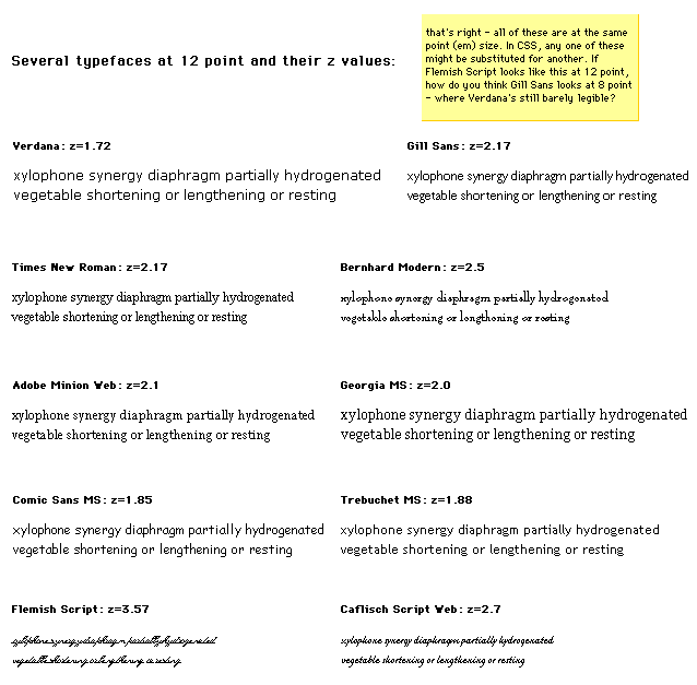
The next image shows the results of 'font-size-adjust' with the fonts shown in the previous image. These fonts' em sizes range all the way up to 25-point, but appear subjectively to be about as large as 12-point Verdana, whose z value served as the base for scaling. As adjusted, the legibility characteristics of these faces on screen are nearly linear across faces. Note that 'font-size-adjust' tends to stabilize the horizontal metrics of lines, as well.
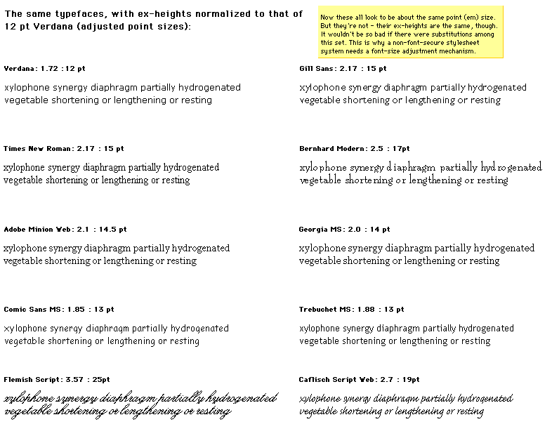
| Value: | [ [ <'font-style'> || <'font-variant'> || <'font-weight'> ]? <'font-size'> [ / <'line-height'> ]? <'font-family'> ] | caption | icon | menu | message-box | small-caption | status-bar | inherit |
| Initial: | see individual properties |
| Applies to: | all elements |
| Inherited: | yes |
| Percentages: | allowed on 'font-size' and 'line-height' |
| Media: | visual |
The 'font' property is, except as described below, a shorthand property for setting 'font-style', 'font-variant', 'font-weight', 'font-size', 'line-height', and 'font-family', at the same place in the style sheet. The syntax of this property is based on a traditional typographical shorthand notation to set multiple properties related to fonts.
All font related properties are first reset to their initial values, including those listed in the preceding paragraph plus 'font-stretch' and 'font-size-adjust'. Then, those properties that are given explicit values in the 'font' shorthand are set to those values. For a definition of allowed and initial values, see the previously defined properties. For reasons of backwards compatibility, it is not possible to set 'font-stretch' and 'font-size-adjust' to other than their initial values using the 'font' shorthand property; instead, set the individual properties.
Examples:
P { font: 12pt/14pt sans-serif }
P { font: 80% sans-serif }
P { font: x-large/110% "new century schoolbook", serif }
P { font: bold italic large Palatino, serif }
P { font: normal small-caps 120%/120% fantasy }
P { font: oblique "Helvetica Nue", serif; font-stretch: condensed }
In the second rule, the font size percentage value ('80%') refers to the font size of the parent element. In the third rule, the line height percentage ('110%') refers to the font size of the element itself.
The first three rules do not specify the 'font-variant' and 'font-weight' explicitly, so these properties receive their initial values ('normal'). Notice that the font family name "new century schoolbook", which contains spaces, is enclosed in quotes. The fourth rule sets the 'font-weight' to 'bold', the 'font-style' to 'italic', and implicitly sets 'font-variant' to 'normal'.
The fifth rule sets the 'font-variant' ('small-caps'), the 'font-size' (120% of the parent's font size), the 'line-height' (120% of the font size) and the 'font-family' ('fantasy'). It follows that the keyword 'normal' applies to the two remaining properties: 'font-style' and 'font-weight'.
The sixth rule sets the 'font-style' and 'font-family', the other font properties being set to their initial values; it then sets 'font-stretch' to 'condensed' since it cannot be set to that value using the 'font' shorthand property.
The following values refer to system fonts:
System fonts may only be set as a whole; that is, the font family, size, weight, style, etc. are all set at the same time.These values may then be altered individually if desired. If no font with the indicated characteristics exists on a given platform, the user agent should either intelligently substitute (e.g., a smaller version of the 'caption' font might be used for the 'smallcaption' font), or substitute a user agent default font. As for regular fonts, if, for a system font, any of the individual properties are not part of the operating system's available user preferences, those properties should be set to their initial values.
That is why this property is "almost" a shorthand property: system fonts can only be specified with this property, not with 'font-family' itself, so 'font' allows authors to do more than the sum of its subproperties. However, the individual properties such as 'font-weight' are still given values taken from the system font, which can be independently varied.
Example:
BUTTON { font: 300 italic 1.3em/1.7em "FB Armada", sans-serif }
BUTTON P { font: menu }
BUTTON P EM { font-weight: bolder }
If the font used for dropdown menus on a particular system happened to be 9-point Charcoal, with a weight of 600, then P elements which were descendants of BUTTON would be displayed as if this rule were in effect (the values for the remaining properties being taken from the initial values):
BUTTON P {
  font-style: normal;
  font-variant: normal;
  font-weight: 600;
  font-size: 9pt;
  line-height: normal;
  font-family: Charcoal
}
Generic font families are a fallback mechanism, a means of preserving some of the style sheet writer's intent in the worst case when none of the specified fonts can be selected. For optimum typographic control, particular named fonts should be used in style sheets.
All five generic font families are defined to exist in all CSS implementations (they need not necessarily map to five distinct actual fonts, in all cases). User agents should provide reasonable default choices for the generic font families, which express the characteristics of each family as well as possible within the limits allowed by the underlying technology.
User agents are encouraged to allow users to select alternative choices for the generic fonts.
Glyphs of serif fonts, as the term is used in CSS, have finishing strokes, flared or tapering ends, or have actual serifed endings (including slab serifs). Serif fonts are typically proportionately spaced. They often display a greater variation between thick and thin strokes than fonts from the 'sans-serif' generic font family. CSS uses the term 'serif' to apply to a font for any script, although other names may be more familiar for particular scripts, such as Mincho (Japanese), Sung or Song (Chinese), Totum or Kodig (Korean), and any font which is so described may be used to represent the generic 'serif' family.
Examples of fonts that fit this description include:
| Latin fonts | Times New Roman, Bodoni, Garamond, Minion Web, ITC Stone Serif, MS Georgia, Bitstream Cyberbit |
| Greek fonts | Bitstream Cyberbit |
| Cyrillic fonts | Adobe Minion Cyrillic, Excelcior Cyrillic Upright, Monotype Albion 70, Bitstream Cyberbit, ER Bukinst |
| Hebrew fonts | New Peninim, Raanana, Bitstream Cyberbit |
| Japanese fonts | Ryumin Light-KL, Kyokasho ICA, Futo Min A101 |
| Arabic fonts | Bitstream Cyberbit |
| Cherokee fonts | Lo Cicero Cherokee |
Glyphs in sans-serif fonts, as the term is used in CSS, have stroke endings that are plain -- without any flaring, cross stroke, or other ornamentation. Sans-serif fonts are typically proportionately spaced. They often have little variation between thick and thin strokes, compared to fonts from the 'serif' family. CSS uses the term 'sans-serif' to apply to a font for any script, although other names may be more familiar for particular scripts, such as Gothic (Japanese), Kai (Chinese), Pathang (Korean), and any font which is so described may be used to represent the generic 'sans-serif' family.
Examples of fonts that fit this description include:
| Latin fonts | MS Trebuchet, ITC Avant Garde Gothic, MS Arial, MS Verdana, Univers, Futura, ITC Stone Sans, Gill Sans, Akzidenz Grotesk, Helvetica |
| Greek fonts | Attika, Typiko New Era, MS Tahoma, Monotype Gill Sans 571, Helvetica Greek |
| Cyrillic fonts | Helvetica Cyrillic, ER Univers, Lucida Sans Unicode, Bastion |
| Hebrew fonts | Arial Hebrew, MS Tahoma |
| Japanese fonts | Shin Go, Heisei Kaku Gothic W5 |
| Arabic fonts | MS Tahoma |
Glyphs in cursive fonts, as the term is used in CSS, generally have either joining strokes or other cursive characteristics beyond those of italic typefaces. The glyphs are partially or completely connected, and the result looks more like handwritten pen or brush writing than printed letterwork. Fonts for some scripts, such as Arabic, are almost always cursive. CSS uses the term 'cursive' to apply to a font for any script, although other names such as Chancery, Brush, Swing and Script are also used in font names.
Examples of fonts that fit this description include:
| Latin fonts | Caflisch Script, Adobe Poetica, Sanvito, Ex Ponto, Snell Roundhand, Zapf-Chancery |
| Cyrillic fonts | ER Architekt |
| Hebrew fonts | Corsiva |
| Arabic fonts | DecoType Naskh, Monotype Urdu 507 |
Fantasy fonts, as used in CSS, are primarily decorative while still containing representations of characters (as opposed to Pi or Picture fonts, which do not represent characters). Examples include:
| Latin fonts | Alpha Geometrique, Critter, Cottonwood, FB Reactor, Studz |
The sole criterion of a monospace font is that all glyphs have the same fixed width. (This can make some scripts, such as Arabic, look most peculiar.) The effect is similar to a manual typewriter, and is often used to set samples of computer code.
Examples of fonts which fit this description include:
| Latin fonts | Courier, MS Courier New, Prestige, Everson Mono |
| Greek Fonts | MS Courier New, Everson Mono |
| Cyrillic fonts | ER Kurier, Everson Mono |
| Japanese fonts | Osaka Monospaced |
| Cherokee fonts | Everson Mono |
The second phase of the CSS2 font mechanism concerns the user agent's selection of a font based on author-specified font properties, available fonts, etc. The details of the font matching algorithm are provided below.
There are four possible font selection actions: name matching, intelligent matching, synthesis, and download.
Progressive rendering is a combination of download and one of the other methods; it provides a temporary substitute font (using name matching, intelligent matching, or synthesis) to allow content to be read while the requested font downloads. Once the real font has been successfully downloaded, it replaces the temporary font, hopefully without the need to reflow.
Note. Progressive rendering requires metric information about the font in order to avoid re-layout of the content when the actual font has been loaded and rendered. This metric information is sufficiently verbose that it should only be specified at most once per font in a document.
The font description provides the bridge between an author's font specification and the font data, which is the data needed to format text and to render the abstract glyphs to which the characters map - the actual scalable outlines or bitmaps. Fonts are referenced by style sheet properties.
The font description is added to the font database and then used to select the relevant font data. The font description contains descriptors such as the location of the font data on the Web, and characterizations of that font data. The font descriptors are also needed to match the style sheet font properties to particular font data. The level of detail of a font description can vary from just the name of the font up to a list of glyph widths.
Font descriptors may be classified into three types:
All font descriptions are specified via a @font-face at-rule. The general form is:
@font-face { <font-description> }
where the <font-description> has the form:
descriptor: value;
descriptor: value;
[...]
descriptor: value;
Each @font-face rule specifies a value for every font descriptor, either implicitly or explicitly. Those not given explicit values in the rule take the initial value listed with each descriptor in this specification. These descriptors apply solely within the context of the @font-face rule in which they are defined, and do not apply to document language elements. Thus, there is no notion of which elements the descriptors apply to, or whether the values are inherited by child elements.
The available font descriptors are described in later sections of this specification.
For example, here the font 'Robson Celtic' is defined and referenced in a style sheet contained in an HTML document.
<HTML>
  <HEAD>
    <TITLE>Font test</TITLE>
    <STYLE TYPE="text/css" MEDIA="screen, print">
      @font-face {
        font-family: "Robson Celtic";
        src: url(http://site/fonts/rob-celt)
      }
      H1 { font-family: "Robson Celtic", serif }
    </STYLE>
  </HEAD>

  <BODY>
    <H1> This heading is displayed using Robson Celtic</H1>
  </BODY>
</HTML>
The style sheet (in the STYLE element) contains a CSS rule that sets all H1 elements to use the 'Robson Celtic' font family.
A CSS1 implementation will search the client for a font whose family name and other properties match 'Robson Celtic' and, if it fails to find it, will use the UA-specific fallback serif font (which is defined to exist).
A user agent implementing CSS2 will first examine @font-face rules in search of a font description defining 'Robson Celtic'. This example contains a rule which matches. Although this rule doesn't contain much font data, it does have a URI where the font can be retrieved for rendering this document. Downloaded fonts should not be made available to other applications. If no matching @font-face is found, the user agent will attempt the same match as a user agent implementing CSS1.
Note that if the font 'Robson Celtic' had been installed on the client system, this would cause the UA to add an entry in the font database for the installed copy as described in the section on the font matching algorithm. The installed copy would have been matched before the downloadable font in the example above.
CSS1 implementations, which do not understand the @font-face rule, will encounter the opening curly brackets and will ignore forward until the matching closing curly brackets. This at-rule conforms with the forward-compatible parsing requirement of CSS. Parsers may ignore these rules without error.
Having the font descriptors separate from the font data has a benefit beyond being able to do font selection and/or substitution. The data protection and replication restrictions on the font descriptors may be much weaker than on the full font data. Thus, it may be possible to locally install the font definition, or at least to have it in a local cache if it occurs in a commonly-referenced style sheet; which would not require accessing the full font definition over the Web more than once per named font.
If a font descriptor is duplicated, the last occurring descriptor wins and the rest must be ignored.
Also, any descriptors that are not recognized or useful to the user agent should be ignored. Future versions of CSS may allow additional descriptors for the purpose of better font substitution, matching, or synthesis.
The following descriptors have the same names as the corresponding CSS2 font properties, and take a single value or comma-separated list of values.
The values within that list are, except as explicitly noted, the same as those for the corresponding CSS2 property. If there is a single value, that is the value that must be matched. If there is a list, any list item constitutes a match. If the descriptor is omitted from the @font-face, the initial value for the descriptor is used.
| Value: | [ <family-name> | <generic-family> ] [, [<family-name> | <generic-family> ]]* |
| Initial: | depends on user agent |
| Media: | visual |
This is the descriptor for the font family name of a font and takes the same values as the 'font-family' property.
| Value: | all | [ normal | italic | oblique ] [, [normal | italic | oblique] ]* |
| Initial: | all |
| Media: | visual |
This is the descriptor for the style of a font and takes the same values as the 'font-style' property, except that a comma-separated list is permitted.
| Value: | [normal | small-caps] [,[normal | small-caps]]* |
| Initial: | normal |
| Media: | visual |
This is the CSS indication of whether this face is the small-caps variant of a font. It takes the same values as the 'font-variant' property except that a comma-separated list is permitted.
Note. Cyrillic pryamoĭ faces may be labeled with a 'font-variant' of small-caps, which will give better consistency with Latin faces (and the companion kursiv face labeled with 'font-style' italic for the same reason).
| Value: | all | [normal | bold | 100 | 200 | 300 | 400 | 500 | 600 | 700 | 800 | 900] [, [normal | bold | 100 | 200 | 300 | 400 | 500 | 600 | 700 | 800 | 900]]* |
| Initial: | all |
| Media: | visual |
This is the descriptor for the weight of a face relative to others in the same font family. It takes the same values as the 'font-weight' property with three exceptions:
| Value: | all | [ normal | ultra-condensed | extra-condensed | condensed | semi-condensed | semi-expanded | expanded | extra-expanded | ultra-expanded ] [, [ normal | ultra-condensed | extra-condensed | condensed | semi-condensed | semi-expanded | expanded | extra-expanded | ultra-expanded] ]* |
| Initial: | normal |
| Media: | visual |
This is the CSS indication of the condensed or expanded nature of the face relative to others in the same font family. It takes the same values as the 'font-stretch' property except that:
| Value: | all | [<length> [,[<length>]]* ] |
| Initial: | all |
| Media: | visual |
This is the descriptor for the sizes provided by this font. Only absolute length units are permitted, in contrast to the 'font-size' property, which allows both relative and absolute lengths and sizes. A comma-separated list of absolute lengths is permitted.
The initial value of 'all' is suitable for most scalable fonts, so this descriptor is primarily for use in an @font-face for bitmap fonts, or scalable fonts designed to be rasterised at a restricted range of font sizes.
The following descriptor is optional within a font definition, but is used to avoid checking or downloading a font that does not have sufficient glyphs to render a particular character.
| Value: | <urange>+ |
| Initial: | U+0-7FFFFFFF |
| Media: | visual |
This is the descriptor for the range of ISO 10646 characters covered by the font.
The values of <urange> are expressed using hexadecimal numbers prefixed by "U+", corresponding to character code positions in ISO 10646 ([ISO10646]).
For example, U+05D1 is the ISO 10646 character 'Hebrew letter bet'. For values outside the Basic Multilingual Plane (BMP), additional leading digits corresponding to the plane number are added, also in hexadecimal, like this: U+A1234 which is the character on Plane 10 at hexadecimal code position 1234. At the time of writing no characters had been assigned outside the BMP. Leading zeros (for example, 0000004D) are valid, but not required.
The initial value (i.e., the value used when no value is given in the style sheet) covers not only the entire Basic Multilingual Plane (BMP), which would be expressed as U+0-FFFF, but also the whole repertoire of ISO 10646. Thus, the initial value says that the font may have glyphs for characters anywhere in ISO 10646. Specifying a value for 'unicode-range' provides information to make searching efficient, by declaring a constrained range in which the font may have glyphs for characters. The font need not be searched for characters outside this range.
Values may be written with any number of digits. For single numbers, the character '?' is assumed to mean 'any value' which creates a range of character positions. Thus, using a single number:
A pair of numbers in this format can be combined with the dash character to indicate larger ranges. For example:
Multiple, discontinuous ranges can be specified, separated by a comma. As with other comma-separated lists in CSS, any whitespace before or after the comma is ignored. For example:
A more likely representation for a typical Chinese font would be:
unicode-range: U+3000-33FF, U+4E00-9FFF
The following descriptor specifies the number of "units" per em; these units may be used by several other descriptors to express various lengths, so 'units-per-em' is required if other descriptors depend on it.
| Value: | <number> |
| Initial: | undefined |
| Media: | visual |
This is the descriptor for the number of the coordinate units on the em square, the size of the design grid on which glyphs are laid out.
This descriptor is required for referencing actual font data, whether downloadable or locally installed.
| Value: | [ <uri> [format(<string> [, <string>]*)] | <font-face-name> ] [, <uri> [format(<string> [, <string>]*)] | <font-face-name> ]* |
| Initial: | undefined |
| Media: | visual |
This is a prioritized, comma-separated list of external references and/or locally installed font face names. The external reference points to the font data on the Web. This is required if the WebFont is to be downloaded. The font resource may be a subset of the source font, for example it may contain only the glyphs needed for the current page or for a set of pages.
The external reference consists of a URI, followed by an optional hint regarding the format of font resource to be found at that URI, and this information should be used by clients to avoid following links to fonts in formats they are unable to use. As with any hypertext reference, there may be other formats available, but the client has a better idea of what is likely to be there, in a more robust way than trying to parse filename extensions in URIs.
The format hint contains a comma-separated list of format strings that denote well-known font formats. The user agent will recognize the name of font formats that it supports, and will avoid downloading fonts in formats that it does not recognize.
An initial list of format strings defined by this specification and representing formats likely to be used by implementations on various platforms is:
| String | Font Format | Examples of common extensions |
|---|---|---|
| "truedoc-pfr" | TrueDoc™ Portable Font Resource | .pfr |
| "embedded-opentype" | Embedded OpenType | .eot |
| "type-1" | PostScript™ Type 1 | .pfb, .pfa |
| "truetype" | TrueType | .ttf |
| "opentype" | OpenType, including TrueType Open | .ttf |
| "truetype-gx" | TrueType with GX extensions | |
| "speedo" | Speedo | |
| "intellifont" | Intellifont |
As with other URIs in CSS, the URI may be partial, in which case it is resolved relative to the location of the style sheet containing the @font-face.
The <font-face-name> is the full font name of a locally installed font. The full font name is the name of the font as reported by the operating system and is the name most likely to be used in reader style sheets, browser default style sheets or possibly author style sheets on an intranet. Adornments such as bold, italic, underline are often used to differentiate faces within a font family. For more information about full font names please consult the notes below.
Examples:
Access to locally installed fonts is via the <font-face-name>. The font face name is not truly unique, nor is it truly platform or font format independent, but at the moment it is the best way to identify locally installed font data. The use of the font face name can be made more accurate by providing an indication of the glyph complement required. This may be done by indicating the range of ISO 10646 character positions for which the font provides some glyphs (see 'unicode-range').
These descriptors are optional for a CSS2 definition, but may be used if intelligent font matching or font size adjustment is desired by the author.
| Value: | [<number>]{10} |
| Initial: | 0 0 0 0 0 0 0 0 0 0 |
| Media: | visual |
This is the descriptor for the Panose-1 number and consists of ten decimal numbers, separated by whitespace. A comma-separated list is not permitted for this descriptor, because the Panose-1 system can indicate that a range of values are matched. The initial value is zero, which means "any", for each PANOSE digit; all fonts will match the Panose number if this value is used. Use of the Panose-1 descriptor is strongly recommended for latin fonts.
| Value: | <number> |
| Initial: | undefined |
| Media: | visual |
This is the descriptor for the vertical stem width of the font. If the value is undefined, the descriptor is not used for matching. If this descriptor is used, the 'units-per-em' descriptor must also be used.
| Value: | <number> |
| Initial: | undefined |
| Media: | visual |
This is the descriptor for the horizontal stem width of the font. If the value is undefined, the descriptor is not used for matching. If this descriptor is used, the 'units-per-em' descriptor must also be used.
| Value: | <number> |
| Initial: | 0 |
| Media: | visual |
This is the descriptor for the vertical stroke angle of the font.
| Value: | <number> |
| Initial: | undefined |
| Media: | visual |
This is the descriptor for the number of the height of uppercase glyphs of the font. If the value is undefined, the descriptor is not used for matching. If this descriptor is used, the 'units-per-em' descriptor must also be used.
| Value: | <number> |
| Initial: | undefined |
| Media: | visual |
This is the descriptor for the height of lowercase glyphs of the font. If the value is undefined, the descriptor is not used for matching. If this descriptor is used, the 'units-per-em' descriptor must also be used. This descriptor can be very useful when using the 'font-size-adjust' property, because computation of the z value of candidate fonts requires both the font size and the x-height; it is therefore recommended to include this descriptor.
| Value: | <number> |
| Initial: | undefined |
| Media: | visual |
This is the descriptor for the maximum unaccented height of the font. If the value is undefined, the descriptor is not used for matching. If this descriptor is used, the 'units-per-em' descriptor must also be used.
| Value: | <number> |
| Initial: | undefined |
| Media: | visual |
This is the descriptor for the Maximum unaccented depth of the font. If the value is undefined, the descriptor is not used for matching. If this descriptor is used, the 'units-per-em' descriptor must also be used.
Synthesizing a font means, at minimum, matching the width metrics of the specified font. Therefore, for synthesis, this metric information must be available. Similarly, progressive rendering requires width metrics in order to avoid reflow of the content when the actual font has been loaded. Although the following descriptors are optional for a CSS2 definition, some are required if synthesizing (or reflow-free progressive rendering) is desired by the author. Should the actual font become available, the substitute should be replaced by the actual font. Any of these descriptors that are present will be used to provide a better or faster approximation of the intended font.
Of these descriptors, the most important are the 'widths' descriptor and 'bbox' which are used to prevent text reflow should the actual font become available. In addition, the descriptors in the set of descriptors used for matching can be used to provide a better synthesis of the actual font appearance.
This is the descriptor for the glyph widths. The value is a comma-separated list of <urange> values each followed by one or more glyph widths. If this descriptor is used, the 'units-per-em' descriptor must also be used.
If the <urange> is omitted, a range of U+0-7FFFFFFF is assumed which covers all characters and their glyphs. If not enough glyph widths are given, the last in the list is replicated to cover that urange. If too many widths are provided, the extras are ignored.
For example:
widths: U+4E00-4E1F 1736 1874 1692
widths: U+1A?? 1490, U+215? 1473 1838 1927 1684 1356 1792
    1815 1848 1870 1492 1715 1745 1584 1992 1978 1770
In the first example a range of 32 characters is given, from 4E00 to 4E1F. The glyph corresponding to the first character (4E00) has a width of 1736, the second has a width of 1874 and the third, 1692. Because not enough widths have been provided, the last width replicates to cover the rest of the specified range. The second example sets a single width, 1490, for an entire range of 256 glyphs and then explicit widths for a range of 16 glyphs.
This descriptor cannot describe multiple glyphs corresponding to a single character, or ligatures of multiple characters. Thus, this descriptor can only be used for scripts which do not have contextual forms or mandatory ligatures. It is nevertheless useful in those situations. Scripts which require a one-to-many or many-to-many mapping of characters to glyphs cannot at present use this descriptor to enable font synthesis although they can still use font downloading or intelligent matching.
This is the descriptor for the maximal bounding box of the font. The value is a comma-separated list of exactly four numbers specifying, in order, the lower left x, lower left y, upper right x, and upper right y of the bounding box for the complete font.
| Value: | <uri> |
| Initial: | undefined |
| Media: | visual |
The font descriptors may either be within the font definition in the style sheet, or may be provided within a separate font definition resource identified by a URI. The latter approach can reduce network traffic when multiple style sheets reference the same fonts.
These optional descriptors are used to align runs of different scripts with one another.
| Value: | <number> |
| Initial: | 0 |
| Media: | visual |
This is the descriptor for the lower baseline of a font. If this descriptor is given a non-default (non-zero) value, the 'units-per-em' descriptor must also be used.
| Value: | <number> |
| Initial: | undefined |
| Media: | visual |
This is the descriptor for the central baseline of a font. If the value is undefined, the UA may employ various heuristics such as the midpoint of the ascent and descent values. If this descriptor is used, the 'units-per-em' descriptor must also be used.
| Value: | <number> |
| Initial: | undefined |
| Media: | visual |
This is the descriptor for the mathematical baseline of a font. If undefined, the UA may use the center baseline. If this descriptor is used, the 'units-per-em' descriptor must also be used.
| Value: | <number> |
| Initial: | undefined |
| Media: | visual |
This is the descriptor for the top baseline of a font. If undefined, the UA may use an approximate value such as the ascent. If this descriptor is used, the 'units-per-em' descriptor must also be used.
Given the following list of fonts:
| Swiss 721 light | light & light italic |
| Swiss 721 | roman, bold, italic, bold italic |
| Swiss 721 medium | medium & medium italic |
| Swiss 721 heavy | heavy & heavy italic |
| Swiss 721 black | black, black italic, & black #2 |
| Swiss 721 Condensed | roman, bold, italic, bold italic |
| Swiss 721 Expanded | roman, bold, italic, bold italic |
@font-face {
    font-family: "Swiss 721";
    src: url(swiss721lt.pfr); /* Swiss 721 light */
    font-style: normal, italic;
    font-weight: 200;
}
@font-face {
    font-family: "Swiss 721";
    src: url(swiss721.pfr); /* The regular Swiss 721 */
}
@font-face {
    font-family: "Swiss 721";
    src: url(swiss721md.pfr); /* Swiss 721 medium */
    font-style: normal, italic;
    font-weight: 500;
}
@font-face {
    font-family: "Swiss 721";
    src: url(swiss721hvy.pfr); /* Swiss 721 heavy */
    font-style: normal, italic;
    font-weight: 700;
}
@font-face {
    font-family: "Swiss 721";
    src: url(swiss721blk.pfr); /* Swiss 721 black */
    font-style: normal, italic;
    font-weight: 800,900; /* note the interesting problem that
                               the 900 weight italic doesn't exist */
}
@font-face {
    font-family: "Swiss 721";
    src: url(swiss721.pfr); /* The condensed Swiss 721 */
	font-stretch: condensed;
}
@font-face {
    font-family: "Swiss 721";
    src: url(swiss721.pfr); /* The expanded Swiss 721 */
	font-stretch: expanded;
}
In this section are listed the font characteristics that have been found useful for client-side font matching, synthesis, and download for heterogeneous platforms accessing the Web. The data may be useful for any medium that needs to use fonts on the Web by some other means than physical embedding of the font data inside the medium.
These characteristics are used to characterize fonts. They are not specific to CSS, or to style sheets. In CSS, each characteristic is described by a font descriptor. These characteristics could also be mapped onto VRML nodes, or CGM Application Structures, or a Java API, or alternative style sheet languages. Fonts retrieved by one medium and stored in a proxy cache could be re-used by another medium, saving download time and network bandwidth, if a common system of font characteristics are used throughout.
A non-exhaustive list of examples of such media includes:
This is the full name of a particular face of a font family. It typically includes a variety of non-standardized textual qualifiers or adornments appended to the font family name. It may also include a foundry name or abbreviation, often prepended to the font family name. It is only used to refer to locally installed fonts, because the format of the adorned name can vary from platform to platform.
For example, the font family name of the TrueType font and the PostScript name may differ in the use of space characters, punctuation, and in the abbreviation of some words (e.g., to meet various system or printer interpreter constraints on length of names). For example, spaces are not allow in a PostScript name, but are common in full font names. The TrueType name table can also contain the PostScript name, which has no spaces.
The name of the font definition is important because it is the link to any locally installed fonts. It is important that the name be robust, both with respect to platform and application independence. For this reason, the name should be one which is not application or language specific.
The ideal solution would be to have a name which uniquely identifies each collection of font data. This name does not exist in current practice for font data. Fonts with the same face name can vary over a number of descriptors. Some of these descriptors, such as different complements of glyphs in the font, may be insignificant if the needed glyphs are in the font. Other descriptors, such as different width metrics, make fonts with the same name incompatible. It does not seem possible to define a rule that will always identify incompatibilities, but will not prevent the use of a perfectly suitable local copy of the font data with a given name. Therefore, only the range of ISO 10646 characters will be used to qualify matches for the font face name.
Since a prime goal of the font face name in the font definition is to allow a user agent to determine when there is a local copy of the specified font data, the font face name must be a name which will be in all legitimate copies of the font data. Otherwise, unnecessary Web traffic may be generated due to missed matches for the local copy.
Certain values, such as width metrics, are expressed in units that are relative to an abstract square whose height is the intended distance between lines of type in the same type size. This square is called the em square and it is the design grid on which the glyph outlines are defined. The value of this descriptor specifies how many units the EM square is divided into. Common values are for example 250 (Intellifont), 1000 (Type 1) and 2048 (TrueType, TrueType GX and OpenType).
If this value is not specified, it becomes impossible to know what any font metrics mean. For example, one font has lowercase glyphs of height 450; another has smaller ones of height 890! The numbers are actually fractions; the first font has 450/1000 and the second has 890/2048 which is indeed smaller.
This gives the position in the em square of the central baseline. The central baseline is used by ideographic scripts for alignment, just as the bottom baseline is used for Latin, Greek and Cyrillic scripts.
Either explicitly or implicitly, each font has a table associated with it, the font encoding table, that tells what character each glyph represents. This table is also referred to as an encoding vector.
In fact, many fonts contain several glyphs for the same character. Which of those glyphs should be used depends either on the rules of the language, or on the preference of the designer.
In Arabic, for example, all letters have four (or two) different shapes, depending on whether the letter is used at the start of a word, in the middle, at the end, or in isolation. It is the same character in all cases, and thus there is only one character in the HTML document, but when printed, it looks different each time.
There are also fonts that leave it to the graphic designer to choose from among various alternative shapes provided. Unfortunately, CSS2 doesn't yet provide the means to select those alternatives. Currently, it is always the default shape that is chosen from such fonts.
This specifies the family name portion of the font face name. For example, the family name for Helvetica-Bold is Helvetica and the family name of ITC Stone Serif Semibold Italic is ITC Stone Serif. Some systems treat adornments relating to condensed or expanded faces as if they were part of the family name.
This is a list of widths, on the design grid, for the glyph corresponding to each character. The list is ordered by ISO10646 code point. Widths cannot usefully be specified when more than one glyph maps to the same character or when there are mandatory ligatures.
This value refers to the dominant stem of the font. There may be two or more designed widths. For example, the main vertical stems of Roman characters will differ from the thin stems on serifed "M" and "N", plus there may be different widths for uppercase and lowercase characters in the same font. Also, either by design or by error, all stems may have slightly different widths.
This measurement is the y-coordinate of the top of flat uppercase letters in Latin, Greek and Cyrillic scripts, measured from the baseline. This descriptor is not necessarily useful for fonts that do not contain any glyphs from these scripts.
This measurement is the y-coordinate of the top of unaccented, non-ascending lowercase letters in Latin, Greek and Cyrillic scripts, measured from the baseline. Flat-topped letters are used, ignoring any optical correction zone. This is usually used as a ratio of lowercase to uppercase heights, as a means of comparison between font families.

This descriptor is not useful for fonts that do not contain any glyphs from these scripts. Since the heights of lowercase and uppercase letters are often formed into a ratio for comparing different fonts, it may be useful to set both the lowercase and uppercase heights to the same value for unicameral scripts such as Hebrew, where for mixed Latin and Hebrew text the Hebrew characters are typically set at a height midway between the uppercase and lowercase heights of the Latin font.

This gives the position in the em square of the lower baseline. The lower baseline is used by Latin, Greek and Cyrillic scripts for alignment, just as the upper baseline is used for Sanscrit-derived scripts.
This gives the position in the em square of the mathematical baseline. The mathematical baseline is used by mathematical symbols for alignment, just as the lower baseline is used for Latin, Greek, and Cyrillic scripts.
The maximal bounding box is the smallest rectangle enclosing the shape that results if all glyphs in the font are placed with their origins coincident, and then painted.
If a dynamically downloadable font has been generated by subsetting a parent font, the bbox should be that of the parent font.
This measurement, on the em square, is from the baseline to the highest point reached by any glyph, excluding any accents or diacritical marks.

This measurement, on the em square, is from the baseline to the lowest point reached by any glyph, excluding any accents or diacritical marks.

Panose-1 is an industry standard TrueType font classification and matching technology. The PANOSE system consists of a set of ten numbers that categorize the key attributes of a Latin typeface, a classification procedure for creating those numbers, and Mapper software that determines the closest possible font match given a set of typefaces. The system could, with modification, also be used for Greek and Cyrillic, but is not suitable for unicameral and ideographic scripts (Hebrew, Armenian, Arabic, Chinese/Japanese/Korean).
This indicates the glyph repertoire of the font, relative to ISO 10646 (Unicode). Since this is sparse (most fonts do not cover the whole of ISO 10646) this descriptor lists blocks or ranges which do have some coverage (no promise is made of complete coverage) and is used to eliminate unsuitable fonts (ones that will not have the required glyphs). It does not indicate that the font definitely has the required glyphs, only that it is worth downloading and looking at the font. See [ISO10646] for information about useful documents.
This method is extensible to future allocation of characters in Unicode, without change of syntax and without invalidating existing content.
Font formats that do not include this information, explicitly or indirectly, may still use this characteristic, but the value must be supplied by the document or style sheet author.
There are other classifications into scripts, such as the Monotype system (see [MONOTYPE]) and a proposed ISO script system. These are not readily extensible.
Because of this, classification of glyph repertoires by the range of ISO 10646 characters that may be represented with a particular font is used in this specification. This system is extensible to cover any future allocation.
This gives the position in the em square of the top baseline. The top baseline is used by Sanscrit-derived scripts for alignment, just as the bottom baseline is used for Latin, Greek and Cyrillic scripts.
This is the width of vertical (or near-vertical) stems of glyphs. This information is often tied to hinting, and may not be directly accessible in some font formats. The measurement should be for the dominant vertical stem in the font because there might be different groupings of vertical stems (e.g., one main one, and one lighter weight one as for an uppercase M or N).
This is the angle, in degrees counterclockwise from the vertical, of the dominant vertical strokes of the font. The value is negative for fonts that slope to the right, as almost all italic fonts do. This descriptor may also be specified for oblique fonts, slanted fonts, script fonts, and in general for any font whose vertical strokes are not precisely vertical. A non-zero value does not of itself indicate an italic font.
This specification extends the algorithm given in the CSS1 specification. This algorithm reduces down to the algorithm in the CSS1 specification when the author and reader style sheets do not contain any @font-face rules.
Matching of descriptors to font faces must be done carefully. The descriptors are matched in a well-defined order to insure that the results of this matching process are as consistent as possible across UAs (assuming that the same library of font faces and font descriptions is presented to each of them). This algorithm may be optimized, provided that an implementation behaves as if the algorithm had been followed exactly.
Note. The above algorithm can be optimized to avoid having to revisit the CSS2 properties for each character.
The per-descriptor matching rules from (2) above are as follows:
The 'font-weight' property values are given on a numerical scale in which the value '400' (or 'normal') corresponds to the "normal" text face for that family. The weight name associated with that face will typically be Book, Regular, Roman, Normal or sometimes Medium.
The association of other weights within a family to the numerical weight values is intended only to preserve the ordering of weights within that family. User agents must map names to values in a way that preserves visual order; a face mapped to a value must not be lighter than faces mapped to lower values. There is no guarantee on how a user agent will map font faces within a family to weight values. However, the following heuristics tell how the assignment is done in typical cases:
There is no guarantee that there will be a darker face for each of the 'font-weight' values; for example, some fonts may have only a normal and a bold face, others may have eight different face weights.
The following two examples show typical mappings.
Assume four weights in the "Rattlesnake" family, from lightest to darkest: Regular, Medium, Bold, Heavy.
| Available faces | Assignments | Filling the holes |
|---|---|---|
| "Rattlesnake Regular" | 400 | 100, 200, 300 |
| "Rattlesnake Medium" | 500 | |
| "Rattlesnake Bold" | 700 | 600 |
| "Rattlesnake Heavy" | 800 | 900 |
Assume six weights in the "Ice Prawn" family: Book, Medium, Bold, Heavy, Black, ExtraBlack. Note that in this instance the user agent has decided not to assign a numeric value to "Example2 ExtraBlack".
| Available faces | Assignments | Filling the holes |
|---|---|---|
| "Ice Prawn Book" | 400 | 100, 200, 300 |
| "Ice Prawn Medium" | 500 | |
| "Ice Prawn Bold" | 700 | 600 |
| "Ice Prawn Heavy" | 800 | |
| "Ice Prawn Black" | 900 | |
| "Ice Prawn ExtraBlack" | (none) |
The following example defines a specific font face, Alabama Italic. A panose font description and source URI for retrieving a truetype server font are also provided. Font-weight and font-style descriptors are provided to describe the font. The declaration says that the weight will also match any request in the range 300 to 500. The font family is Alabama and the adorned font name is Alabama Italic.
@font-face {
  src: local(Alabama Italic),
       url(http://www.fonts.org/A/alabama-italic) format(truetype);
  panose-1: 2 4 5 2 5 4 5 9 3 3;
  font-family: Alabama, serif;
  font-weight:   300, 400, 500;
  font-style:  italic, oblique;
}
The next example defines a family of fonts. A single URI is provided for retrieving the font data. This data file will contain multiple styles and weights of the named font. Once one of these @font-face definitions has been dereferenced, the data will be in the UA cache for other faces that use the same URI.
@font-face {
  src: local(Helvetica Medium),
       url(http://www.fonts.org/sans/Helvetica_family) format(truedoc);
  font-family: "Helvetica";
  font-style: normal
}
@font-face {
  src: local(Helvetica Oblique),
       url(http://www.fonts.org/sans/Helvetica_family) format(truedoc);
  font-family: "Helvetica";
  font-style: oblique;
  slope: -18
}
The following example groups three physical fonts into one virtual font with extended coverage. In each case, the adorned font name is given in the src descriptor to allow locally installed versions to be preferentially used if available. A fourth rule points to a font with the same coverage, but contained in a single resource.
@font-face {
  font-family: Excelsior;
  src: local(Excelsior Roman), url(http://site/er) format(intellifont);
  unicode-range: U+??; /* Latin-1 */
}
@font-face {
  font-family: Excelsior;
  src: local(Excelsior EastA Roman), url(http://site/ear) format(intellifont);
  unicode-range: U+100-220; /* Latin Extended A and B */
}
@font-face {
  font-family: Excelsior;
  src: local(Excelsior Cyrillic Upright), url(http://site/ecr) format(intellifont);
  unicode-range: U+4??; /* Cyrillic */
}
@font-face {
  font-family: Excelsior;
  src: url(http://site/excels) format(truedoc);
  unicode-range: U+??,U+100-220,U+4??;
}
This next example might be found in a UA's default style sheet. It implements the CSS2 generic font family, serif by mapping it to a wide variety of serif fonts that might exist on various platforms. No metrics are given since these vary between the possible alternatives.
@font-face {
  src: local(Palatino),
	  local(Times New Roman),
	  local(New York),
	  local(Utopia),
	  url(http://somewhere/free/font);
  font-family: serif;
  font-weight: 100, 200, 300, 400, 500;
  font-style: normal;
  font-variant: normal;
  font-size: all
}
Contents
The properties defined in the following sections affect the visual presentation of characters, spaces, words, and paragraphs.
| Value: | <length> | <percentage> | inherit |
| Initial: | 0 |
| Applies to: | block-level elements |
| Inherited: | yes |
| Percentages: | refer to width of containing block |
| Media: | visual |
This property specifies the indentation of the first line of text in a block. More precisely, it specifies the indentation of the first box that flows into the block's first line box. The box is indented with respect to the left (or right, for right-to-left layout) edge of the line box. User agents should render this indentation as blank space.
Values have the following meanings:
The value of 'text-indent' may be negative, but there may be implementation-specific limits.
The following example causes a 3em text indent.
P { text-indent: 3em }
| Value: | left | right | center | justify | <string> | inherit |
| Initial: | depends on user agent and writing direction |
| Applies to: | block-level elements |
| Inherited: | yes |
| Percentages: | N/A |
| Media: | visual |
This property describes how a block of text is aligned. Values have the following meanings:
A block of text is a stack of line boxes. In all cases except for 'justify', this property specifies how the inline boxes within each line box align with respect to the line box's left and right sides; alignment is not with respect to the viewport. In the case of 'justify', the UA may stretch the inline boxes in addition to adjusting their positions.
In this example, note that since 'text-align' is inherited, all block-level elements inside the DIV element with 'class=center' will be centered.
DIV.center { text-align: center }
Note. The actual justification algorithm used is user-agent and written language dependent.
Conforming HTML user agents may interpret the value 'justify' as 'left' or 'right', depending on whether the element's default writing direction is left-to-right or right-to-left, respectively.
| Value: | none | [ underline || overline || line-through || blink ] | inherit |
| Initial: | none |
| Applies to: | all elements |
| Inherited: | no (see prose) |
| Percentages: | N/A |
| Media: | visual |
This property describes decorations that are added to the text of an element. If the property is specified for a block-level element, it affects all inline-level descendants of the element. If it is specified for (or affects) an inline-level element, it affects all boxes generated by the element. If the element has no content or no text content (e.g., the IMG element in HTML), user agents must ignore this property.
Values have the following meanings:
The color(s) required for the text decoration should be derived from the 'color' property value.
This property is not inherited, but descendant boxes of a block box should be rendered with the same decoration (e.g., they should all be underlined). The color of decorations should remain the same even if descendant elements have different 'color' values.
In the following example for HTML, the text content of all A elements acting as hyperlinks will be underlined:
A[href] { text-decoration: underline }
This property accepts a comma-separated list of shadow effects to be applied to the text of the element. The shadow effects are applied in the order specified and may thus overlay each other, but they will never overlay the text itself. Shadow effects do not alter the size of a box, but may extend beyond its boundaries. The stack level of the shadow effects is the same as for the element itself.
Each shadow effect must specify a shadow offset and may optionally specify a blur radius and a shadow color.
A shadow offset is specified with two <length> values that indicate the distance from the text. The first length value specifies the horizontal distance to the right of the text. A negative horizontal length value places the shadow to the left of the text. The second length value specifies the vertical distance below the text. A negative vertical length value places the shadow above the text.
A blur radius may optionally be specified after the shadow offset. The blur radius is a length value that indicates the boundaries of the blur effect. The exact algorithm for computing the blur effect is not specified.
A color value may optionally be specified before or after the length values of the shadow effect. The color value will be used as the basis for the shadow effect. If no color is specified, the value of the 'color' property will be used instead.
Text shadows may be used with the :first-letter and :first-line pseudo-elements.
The example below will set a text shadow to the right and below the element's text. Since no color has been specified, the shadow will have the same color as the element itself, and since no blur radius is specified, the text shadow will not be blurred:
H1 { text-shadow: 0.2em 0.2em }
The next example will place a shadow to the right and below the element's text. The shadow will have a 5px blur radius and will be red.
H2 { text-shadow: 3px 3px 5px red }
The next example specifies a list of shadow effects. The first shadow will be to the right and below the element's text and will be red with no blurring. The second shadow will overlay the first shadow effect, and it will be yellow, blurred, and placed to the left and below the text. The third shadow effect will be placed to the right and above the text. Since no shadow color is specified for the third shadow effect, the value of the element's 'color' property will be used:
H2 { text-shadow: 3px 3px red, yellow -3px 3px 2px, 3px -3px }
Consider this example:
  SPAN.glow {
    background: white;
    color: white;
    text-shadow: black 0px 0px 5px;
  }
Here, the 'background' and 'color' properties have the same value and the 'text-shadow' property is used to create a "solar eclipse" effect:

Note. This property is not defined in CSS1. Some shadow effects may render text invisible in UAs that only support CSS1.
| Value: | normal | <length> | inherit |
| Initial: | normal |
| Applies to: | all elements |
| Inherited: | yes |
| Percentages: | N/A |
| Media: | visual |
This property specifies spacing behavior between text characters. Values have the following meanings:
Character spacing algorithms are user agent-dependent. Character spacing may also be influenced by justification (see the 'text-align' property).
In this example, the space between characters in BLOCKQUOTE elements is increased by '0.1em'.
BLOCKQUOTE { letter-spacing: 0.1em }
In the following example, the user agent is not permitted to alter inter-character space, nor to add space:
BLOCKQUOTE { letter-spacing: 0cm } /* Same as '0' */
When the resultant space between two characters is not the same as the default space, user agents should not use ligatures.
Conforming HTML user agents may consider the value of the 'letter-spacing' property to be 'normal'.
| Value: | normal | <length> | inherit |
| Initial: | normal |
| Applies to: | all elements |
| Inherited: | yes |
| Percentages: | N/A |
| Media: | visual |
This property specifies spacing behavior between words. Values have the following meanings:
Word spacing algorithms are user agent-dependent. Word spacing may also be influenced by justification (see the 'text-align' property).
In this example, the word-spacing between each word in H1 elements is increased by '1em'.
H1 { word-spacing: 1em }
Conforming HTML user agents may consider the value of the 'word-spacing' property to be 'normal'.
| Value: | capitalize | uppercase | lowercase | none | inherit |
| Initial: | none |
| Applies to: | all elements |
| Inherited: | yes |
| Percentages: | N/A |
| Media: | visual |
This property controls capitalization effects of an element's text. Values have the following meanings:
The actual transformation in each case is written language dependent. See RFC 2070 ([RFC2070]) for ways to find the language of an element.
Conforming HTML user agents may consider the value of 'text-transform' to be 'none' for characters that are not from the Latin-1 repertoire and for elements in languages for which the transformation is different from that specified by the case-conversion tables of ISO 10646 ([ISO10646]).
In this example, all text in an H1 element is transformed to uppercase text.
H1 { text-transform: uppercase }
Please consult the sections on first line and first letter for information on specially formatting the first letter or line of a paragraph.
| Value: | normal | pre | nowrap | inherit |
| Initial: | normal |
| Applies to: | block-level elements |
| Inherited: | yes |
| Percentages: | N/A |
| Media: | visual |
This property declares how whitespace inside the element is handled. Values have the following meanings:
The following examples show what whitespace behavior is expected from the PRE and P elements in HTML.
  PRE { white-space: pre }
  P   { white-space: normal }
Conforming HTML user agents may ignore the 'white-space' property in author and user style sheets but must specify a value for it in the default style sheet.
To force a line break with CSS2, authors may specify one with the ':before' or ':after' pseudo-elements. Thus, the BR element in HTML may be described as follows:
BR:before { content: "\A"}
See "Generated content and automatic numbering" for explanations of the 'content' property and the use of the "\A" escape sequence.
Contents
An element with a 'display' property value of 'list-item' generates two boxes: a block box that contains its content and an inline box that contains a marker. Only the content box is involved with positioning (e.g, in the normal flow). The position of the marker box (see the 'list-style-position' property) does not affect the position of the content box. CSS properties allow authors to specify the marker type (image, glyph, or number) and its position with respect to the content box (outside the content or at the beginning of content). CSS properties do not allow authors to specify distinct style (colors, fonts, alignment, etc.) for the list marker.
The background properties apply to the content box only; the marker box is transparent.
The declaration in the following HTML program causes LI elements to generate 'list-item' boxes. The 'list-style' value 'none' suppresses preceding markers.
<HTML>
<HEAD>
   <STYLE type="text/css">
      LI { display: list-item; list-style: none }
   </STYLE>
</HEAD>
<BODY>
   <UL>
      <LI> This is the first list item, formatted as a block.
      <LI> This is the second list item.
      <LI> This is the third.
   </UL>
</BODY>
</HTML>
The list might be formatted as follows:

The illustration shows the relationship between the current left margin and the margins and padding of the list (UL) box and the list item (LI) boxes. (The lines delimiting the margins and padding are not rendered).
If we change the 'list-style' to "square":
LI { display: list-item; list-style: square }
each list item will be preceded by a small square. However, the placement of the square does not affect the block formatting of the list item box:
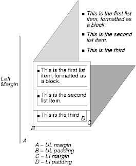
The list properties in this chapter do not allow authors to control the separation between a list marker and the content of its list item. Instead, this may be achieved with markers. Note that markers specified with 'display: marker' replace list markers specified with the list properties defined in this chapter.
Note. There is no "list" presentation for other types of list structures (e.g., "definition lists" declared by DL, DT, and DD in HTML). Each part of a definition list is simply a block element.
| Value: | disc | circle | square | decimal | leading-zero | western-decimal | lower-roman | upper-roman | lower-greek | lower-alpha | lower-latin | upper-alpha | upper-latin | hebrew | armenian | georgian | cjk-ideographic | hiragana | katakana | hiragana-iroha | katakana-iroha | none | inherit |
| Initial: | disc |
| Applies to: | elements with the 'display' property set to 'list-item' |
| Inherited: | yes |
| Percentages: | N/A |
| Media: | visual |
This property specifies appearance of the list item marker if 'list-style-image' has the value 'none' or if the image pointed to by the URI cannot be displayed. The value 'none' specifies no marker, otherwise there are three types of marker: glyphs, numbering systems, and alphabetic systems.
Glyphs are specified with disc, circle, and square. Their exact rendering depends on the user agent.
Numbering systems are specified with:
A user agent that does not recognize a numbering system should use 'western-decimal'.
Note. This document does not specify the exact mechanism of each numbering system (e.g., how roman numerals are calculated). A future W3C Note may provide further clarifications.
Alphabetic systems are specified with:
This specification does not define how alphabetic systems wrap at the end of the alphabet. For instance, after 26 list items, 'lower-latin' rendering is undefined. Therefore, for long lists, we recommend that authors specify true numbers.
For example, the following HTML document:
<HTML>
   <HEAD>
     <STYLE type="text/css">
          OL { list-style-type: lower-roman }
     </STYLE>
  </HEAD>
  <BODY>
    <OL>
      <LI> This is the first item.
      <LI> This is the second item.
      <LI> This is the third item.
    </OL>
  </BODY>
</HTML>
might produce something like this:
  i This is the first item.
 ii This is the second item.
iii This is the third item.
Note that the list marker alignment (here, right justified) depends on the user agent.
Note. Future versions of CSS may provide more complete mechanisms for international numbering styles.
| Value: | <uri> | none | inherit |
| Initial: | none |
| Applies to: | elements with the 'display' property set to 'list-item' |
| Inherited: | yes |
| Percentages: | N/A |
| Media: | visual |
This property sets the image that will be used as the list item marker. When the image is available, it will replace the marker set with the 'list-style-type' marker.
The following example sets the marker at the beginning of each list item to be the image "ellipse.png".
UL { list-style-image: url(http://png.com/ellipse.png) }
| Value: | inside | outside | inherit |
| Initial: | outside |
| Applies to: | elements with the 'display' property set to 'list-item' |
| Inherited: | yes |
| Percentages: | N/A |
| Media: | visual |
This property specifies the position of the marker box with respect to line item content box. Values have the following meanings:
For example:
<HTML>
  <HEAD>
    <STYLE type="text/css">
      UL         { list-style: outside }
      UL.compact { list-style: inside }
    </STYLE>
  </HEAD>
  <BODY>
    <UL>
      <LI>first list item comes first
      <LI>second list item comes second
    </UL>

    <UL class="compact">
      <LI>first list item comes first
      <LI>second list item comes second
    </UL>
  </BODY>
</HTML>
The above example may be formatted as:

In right-to-left text, the markers would have been on the right side of the box.
| Value: | [ <'list-style-type'> || <'list-style-position'> || <'list-style-image'> ] | inherit |
| Initial: | not defined for shorthand properties |
| Applies to: | elements with the 'display' property set to 'list-item' |
| Inherited: | yes |
| Percentages: | N/A |
| Media: | visual |
The 'list-style' property is a shorthand notation for setting the three properties 'list-style-type', 'list-style-image', and 'list-style-position' at the same place in the style sheet.
  UL { list-style: upper-roman inside }  /* Any UL*/
  UL > UL { list-style: circle outside } /* Any UL child of a UL*/
Although authors may specify 'list-style' information directly on list item elements (e.g., LI in HTML), they should do so with care. The following rules look similar, but the first declares a descendant selector and the second a (more specific) child selector.
  OL.alpha LI  { list-style: lower-alpha } /* Any LI descendant of an OL */
  OL.alpha > LI  { list-style: lower-alpha } /* Any LI child of an OL */
Authors who use only the descendant selector may not achieve the results they expect. Consider the following rules:
<HTML>
  <HEAD>
    <STYLE type="text/css">
      OL.alpha LI  { list-style: lower-alpha }
      UL LI        { list-style: disc }
    </STYLE>
  </HEAD>
  <BODY>
    <OL class="alpha">
      <LI>level 1
      <UL>
         <LI>level 2
      </UL>
    </OL>
  </BODY>
</HTML>
The desired rendering would have level 1 list items with 'lower-alpha' labels and level 2 items with 'disc' labels. However, the cascading order will cause the first style rule (which includes specific class information) to mask the second. The following rules solve the problem by employing a child selector instead:
    OL.alpha > LI  { list-style: lower-alpha }
    UL LI   { list-style: disc }
Another solution would be to specify 'list-style' information only on the list type elements:
OL.alpha { list-style: lower-alpha }
UL { list-style: disc }
Inheritance will transfer the 'list-style' values from OL and UL elements to LI elements. This is the recommended way to specify list style information.
A URI value may be combined with any other value, as in:
UL { list-style: url(http://png.com/ellipse.png) disc }
In the example above, the 'disc' will be used when the image is unavailable.
With a value of 'none', both 'list-style-type' and 'list-style-image' are set to 'none':
UL { list-style: none }
The result is that no list-item marker is displayed.
Contents
Tables represent relationships between data. Authors specify these relationships in the document language and specify their presentation in CSS, in two ways: visually and aurally.
Authors may specify the visual rendering of a table as a rectangular grid of cells. Rows and columns of cells may be organized into row groups and column groups. Rows, columns, row groups, row columns, and cells may have borders drawn around them (there are two border models in CSS2). Authors may align data vertically or horizontally within a cell and align data in all cells of a row or column.
Authors may also specify the aural rendering of a table; how headers and data will be spoken. In the document language, authors may label cells and groups of cells so that when rendered aurally, cell headers are spoken before cell data. In effect, this "serializes" the table: users browsing the table aurally hear a sequence of headers followed by data.
Here is a simple three-row, three-column table described in HTML 4.0:
<TABLE> <CAPTION>This is a simple 3x3 table</CAPTION> <TR id="row1"> <TH>Header 1 <TD>Cell 1 <TD>Cell 2 <TR id="row2"> <TH>Header 2 <TD>Cell 3 <TD>Cell 4 <TR id="row3"> <TH>Header 3 <TD>Cell 5 <TD>Cell 6 </TABLE>
This code creates one table (the TABLE element), three rows (the TR elements), three header cells (the TH elements), and six data cells (the TD elements). Note that the three columns of this example are specified implicitly: there are as many columns in the table as required by header and data cells.
The following CSS rule centers the text horizontally in the header cells and present the data with a bold font weight:
TH { text-align: center; font-weight: bold }
The next rules align the text of the header cells on their baseline and vertically centers the text in each data cell:
TH { vertical-align: baseline }
TD { vertical-align: middle }
The next rules specify that the top row will be surrounded by a 3px solid blue border and each of the other rows will be surrounded by a 1px solid black border:
TABLE { border-spacing: none }
TR#row1 { border-top: 3px solid blue }
TR#row2 { border-top: 1px solid black }
TR#row3 { border-top: 1px solid black }
Note, however, that the borders around the rows overlap where the rows meet. What color (black or blue) and thickness (1px or 3px) will the border between row1 and row2 be? We discuss this in the section on border conflict resolution.
The following rule puts the table caption above the table:
CAPTION { caption-side: top }
Finally, the following rule specifies that, when rendered aurally, each row of data is to be spoken as a "Header, Data, Data":
TH { speak-header: once }
For instance, the first row would be spoken "Header1 Cell1 Cell2". On the other hand, with the following rule:
TH { speak-header: always }
it would be spoken "Header1 Cell1 Header1 Cell2".
The preceding example shows how CSS works with HTML 4.0 elements; in HTML 4.0, the semantics of the various table elements (TABLE, CAPTION, THEAD, TBODY, TFOOT, COL, COLGROUP, TH, and TD) are well-defined. In other document languages (such as XML applications), there may not be pre-defined table elements. Therefore, CSS2 allows authors to "map" document language elements to table elements via the 'display' property. For example, the following rule makes the FOO element act like an HTML TABLE element and the BAR element act like a CAPTION element:
FOO { display : table }
BAR { display : table-caption }
We discuss the various table elements in the following section. In this specification, the term table element refers to any element involved in the creation of a table. An "internal" table element is one that produces a row, row group, column, column group, or cell.
The CSS table model is based on the HTML 4.0 table model, in which the structure of a table closely parallels the visual layout of the table. In this model, a table consists of an optional caption and any number of rows of cells. The table model is said to be "row primary" since authors specify rows, not columns, explicitly in the document language. Columns are derived once all the rows have been specified -- the first cell of each row belongs to the first column, the second to the second column, etc.). Rows and columns may be grouped structurally and this grouping reflected in presentation (e.g., a border may be drawn around a group of rows).
Thus, the table model consists of tables, captions, rows, row groups, columns, column groups, and cells.
The CSS model does not require that the document language include elements that correspond to each of these components. For document languages (such as XML applications) that do not have pre-defined table elements, authors must map document language elements to table elements; this is done with the 'display' property. The following 'display' values assign table semantics to an arbitrary element:
Elements with 'display' set to 'table-column' or 'table-column-group' are not rendered (exactly as if they had 'display: none'), but they are useful, because they may have attributes which induce a certain style for the columns they represent.
The default style sheet for HTML 4.0 in the appendix illustrates the use of these values for HTML 4.0:
TABLE { display: table }
TR { display: table-row }
THEAD { display: table-header-group }
TBODY { display: table-row-group }
TFOOT { display: table-footer-group }
COL { display: table-column }
COLGROUP { display: table-column-group }
TD, TH { display: table-cell }
CAPTION { display: table-caption }
User agents may ignore these 'display' property values for HTML documents, since authors should not alter an element's expected behavior.
Document languages other than HTML may not contain all the elements in the CSS2 table model. In these cases, the "missing" elements must be assumed in order for the table model to work. The missing elements generate anonymous boxes according to the following rules:
In this XML example, a 'table' element is assumed to contain the HBOX element:
<HBOX> <VBOX>George</VBOX> <VBOX>4287</VBOX> <VBOX>1998</VBOX> </HBOX>
because the associated style sheet is:
HBOX {display: table-row}
VBOX {display: table-cell}
In this example, three 'table-cell' elements are assumed to contain the text in the ROWs. Note that the text is further encapsulated in anonymous inline boxes, as explained in visual rendering model:
<STACK> <ROW>This is the <D>top</D> row.</ROW> <ROW>This is the <D>middle</D> row.</ROW> <ROW>This is the <D>bottom</D> row.</ROW> </STACK>
The style sheet is:
STACK {display: inline-table}
ROW {display: table-row}
D {display: inline; font-weight: bolder}
HTML user agents are not required to create anonymous boxes according to the above rules.
Table cells may belong to two contexts: rows and columns. However, in the source document cells are descendants of rows, never of columns. Nevertheless, some aspects of cells can be influenced by setting properties on columns.
The following properties apply to column and column-group elements:
Here are some examples of style rules that set properties on columns. The first two rules together implement the "rules" attribute of HTML 4.0 with a value of "cols". The third rule makes the "totals" column blue, the final two rules shows how to make a column a fixed size, by using the fixed layout algorithm.
COL {border-style: none solid}
TABLE {border-style: hidden}
COL.totals {background: blue}
TABLE {table-layout: fixed}
COL.totals {width: 5em}
In terms of the visual rendering model, a table may behave like a block-level or replaced inline-level element.
In both cases, the table element generates an anonymous box that contains the table box itself and the caption's box (if present). The table and caption boxes retain their own content, padding, margin, and border areas, and the dimensions of the rectangular anonymous box are the smallest required to contain both. Vertical margins collapse where the table box and caption box touch. Any repositioning of the table must move the entire anonymous box, not just the table box, so that the caption follows the table.
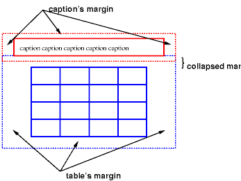
Diagram of a table with a caption above it; the bottom margin of the caption is collapsed with the top margin of the table.
| Value: | top | bottom | left | right | inherit |
| Initial: | top |
| Applies to: | 'table-caption' elements |
| Inherited: | yes |
| Percentages: | N/A |
| Media: | visual |
This property specifies the position of the caption box with respect to the table box. Values have the following meanings:
Captions above or below a 'table' element are rendered very much as if they were a block element before or after the table, except that (1) they inherit inheritable properties from the table, and (2) are not considered to be a block box for the purposes of any 'compact' or 'run-in' element that may precede the table.
The width of a caption that is above or below a 'table' element is computed as if the caption were a block-level child of the table's parent. In other words, the width of the caption is independent of the width of the table.
The width of a caption that is on the left or right side of the table must be set explicitly. The default value ('auto') will result in the narrowest possible box.
To align caption content horizontally within the caption box, use the 'text-align' property. For vertical alignment of captions on the left or right side, use the 'vertical-align' property. The only meaningful values in this case are 'top', 'middle', and 'bottom'. All other values are treated the same as 'top'.
In this example, the 'caption-side' property places captions below tables. The caption will be as wide as the parent of the table, and caption text will be left-justified.
CAPTION { caption-side: bottom;
width: auto; /* default */
text-align: left }
The following example shows how to put a caption in the left margin. The table itself is centered, by setting its left and right margins to 'auto', and the whole box with table and caption is shifted into the left margin by the same amount as the width of the caption.
BODY {
margin-left: 8em
}
TABLE {
margin-left: auto;
margin-right: auto
}
CAPTION {
caption-side: left;
margin-left: -8em;
width: 8em;
text-align: right;
vertical-align: bottom
}
Assuming the width of the table is less than the available width, the rendering will be similar to this:

Diagram showing a centered table with the caption extending into the left margin, as a result of a negative 'margin-left' property.
Like other elements of the document language, table elements generate rectangular boxes with content, padding, border, and margin areas.
| Value: | <integer> | inherit |
| Initial: | 1 |
| Applies to: | 'table-cell' elements |
| Inherited: | no |
| Percentages: | N/A |
| Media: | visual |
This property specifies the <integer> number of rows spanned by a cell.
| Value: | <integer> | inherit |
| Initial: | 1 |
| Applies to: | 'table-cell', 'table-column', and 'table-column-group' elements |
| Inherited: | no |
| Percentages: | N/A |
| Media: | visual |
This property specifies the <integer> number of grid columns spanned by a cell, column, or column group.
The visual layout of these boxes is governed by a rectangular, irregular grid of rows and columns. Each box occupies a whole number of grid cells, determined according to the following rules. These rules do not apply to HTML 4.0 or earlier HTML versions; HTML imposes its own limitations on row and column spans.
[Not true, need correct description.]
Here is an example:
<TABLE> <TR><TD>1 <TD rowspan=2>2 <TD>3 <TD>4 <TR><TD colspan=2>5 </TABLE>
This table is in error. According to HTML 4.0, the rendering on the left is allowed. However, CSS2 UAs must render this table as in the figure on the right:
Two renderings of an erroneous HTML 4.0 table. The rendering on the left is allowed by HTML 4.0, but in CSS2 the one on the right is compulsory.
For the purposes of finding the background of each table cell, the different table elements may be thought of as being on six superimposed layers. The background set on an element in one of the layers will only be visible if the layers above it have a transparent background.

Schema of table layers.
The lowest layer is a single plane, representing the table box itself. Like all boxes, it may be transparent.
The next layer contains the column groups. The columns groups are as tall as the table, but they need not cover the whole table horizontally.
On top of the column groups are the areas representing the column boxes. Like column groups, columns are as tall as the table, but need not cover the whole table horizontally.
Next is the layer containing the row groups. Each row group is as wide as the table. Together, the row groups completely cover the table from top to bottom.
The last but one layer contains the rows. The rows also cover the whole table.
The topmost layer contains the cells themselves. As the figure shows, although all rows contain the same number of cells, not every cell may have specified content These "empty" cells are transparent, letting lower layers shine through.
In the following example, the first row contains four cells, but the second row contains no cells, and thus the table background shines through, except where a cell from the first row spans into this row. The following HTML code and style rules
<!DOCTYPE HTML PUBLIC "-//W3C//DTD HTML 4.0//EN">
<HTML>
<HEAD>
<STYLE type="text/css">
TABLE { background: #ff0; border-collapse: collapse }
TD { background: red; border: double black }
</STYLE>
</HEAD>
<BODY>
<P>
<TABLE>
<TR>
<TD> 1
<TD rowspan="2"> 2
<TD> 3
<TD> 4
</TR>
<TR><TD></TD></TR>
</TABLE>
</BODY>
</HTML>
might be rendered as follows:

Table with three empty cells in the bottom row.
CSS does not define an "optimal" layout for tables since, in many cases, what is optimal is a matter of taste. CSS does define constraints that user agents must respect when laying out a table. User agents may use any algorithm they wish to do so, and are free to prefer rendering speed over precision, except when the "fixed layout algorithm" is selected.
| Value: | auto | fixed | inherit |
| Initial: | auto |
| Applies to: | 'table' and 'inline-table' elements |
| Inherited: | no |
| Percentages: | N/A |
| Media: | visual |
The 'table-layout' property controls the algorithm used to lay out the table cells, rows, and columns. Values have the following meaning:
The two algorithms are described below.
With this (fast) algorithm, the horizontal layout of the table does not depend on the contents of the cells; it only depends on the table's width and the width of the columns.
The table's width is determined by the 'width' property. If the value is 'auto', the table is as wide as the available horizontal space.
The width of each column is determined as follows:
In this manner, the user agent lays out the first row of the table immediately upon receiving the content. All subsequent rows have the same widths of columns of cells; nothing in subsequent rows can affect the widths of the columns. Any cell that has content that overflows its dimensions uses the 'overflow' property to determine how to handle the overflow content. However, a value of 'visible' will not increase the cell box dimensions; cell content will flow into the adjacent cell.
With this algorithm, the height of a row of cells may either be computed dynamically (the 'auto' value), or may be set explicitly, in which case overflow is handled in the same manner as with the width dimension.
It is possible that the sum of the widths of the columns exceeds the table's width. In that case the larger width is used as the actual value of the table's 'width' property.
This is a multiple-pass algorithm in which a table width is given by the width of its columns (and intervening borders). This algorithm reflects the behavior of several popular HTML user agents at the writing of this specification. UAs are not required to implement this algorithm to determine the table layout in the case that 'table-layout' is 'auto'; they can use any other algorithm.
In this algorithm, the width of each column is based on the largest unbreakable element in a cell in that column. This algorithm may be inefficient since it may demand multiple passes and requires the user agent to have access to all the content in the table before determining the final layout.
For this algorithm, a value of 'auto' for the 'width' property for the table element means that the final table width is computed dynamically: it is the sum of the column widths and the borders between them.
Column widths are determined as follows:
Now we have a maximum and minimum width per column. We now determine final column widths. Cell spacing is appropriately added into these calculations.
If there is a table width given, and it is larger than the minimum width needed, use it, and distribute the width over the columns in some way.
Note that a table may thus be wider than its 'width' property.
If the table width is 'auto', there are three cases:
A percentage is relative to the table width. If the table's width is 'auto', a percentage represents a constraint on the column's width, which a UA should try to satisfy. (Obviously, this is not always possible: if the column's width is '110%', the constraint cannot be satisfied.)
Note. In this algorithm, rows (and row groups) and columns (and column groups) both constrain and are constrained by the dimensions of the cells they contain. Setting the width of a column may indirectly influence the height of a row, and vice versa.
Cells may be aligned vertically (within a row) and horizontally (within a column).
Note. Table cells may be relatively and absolutely positioned, but this is not recommended: positioning and floating remove a box from the flow, affecting table alignment.
The height of a cell's box is constrained by the rows that contain it. A cell may be smaller than a row, in which case its vertical alignment is governed by the 'vertical-align' property (much as an inline box is aligned within a line box).
Each cell's content has a baseline, a top, a middle, and a bottom, and so does the row itself. The value of the 'vertical-align' property of the cells determines on which of these lines they are aligned. In the context of tables, values have the following meanings:
The baseline of a cell is the baseline of the first line of text in the cell. If there is no text, the baseline is the baseline of whatever object is displayed in the cell, or, if it has none, the bottom of the cell box. The maximum distance between the top of the cell box and the baseline over all cells that have 'vertical-align:baseline' is used to set the baseline of the row. Here is an example:

Diagram showing the effect of various values of 'vertical-align' on table cells.
Cell boxes 1 and 2 are aligned at their baselines. Cell box 2 has the largest height above the baseline, so that determines the baseline of the row. Note that if there is no cell box aligned at its baseline, the row will not have (nor need) a baseline.
To avoid ambiguous situations, the alignment of cells proceeds in a certain order. First the cells that are aligned on their baseline are positioned. This will establish the baseline of the row. Next the cells with alignment 'top' are positioned.
The row now has a top, possibly a baseline, and a provisional height, which is the distance from the top to the lowest bottom of the cells positioned so far. (See conditions on the cell padding below.)
If any of the remaining cells, those aligned at the bottom or the middle, have a height that is larger than the current height of the row, the height of the row will be increased to the maximum of those cells, by lowering the bottom.
Finally the remaining cells are positioned.
Cells that are smaller than the height of the row will get extra padding added at their top or bottom. As a result, the padding area at the top and bottom of each cell box after positioning must be at least as large as the 'padding' property specifies.
The horizontal alignment of a cell's contents within a cell box is specified with the 'text-align' property.
Cell boxes in the same column may also be aligned horizontally along a common axis, specified by the 'text-align' property. The <string> value of this property specifies how cell boxes in the same column will align horizontally.
When the 'text-align' property for more than one cell in a column is set to a <string> the content of those cells is placed in such a way that the beginnings of the first occurrence of the string in the respective cells are placed directly over each other.
If a cell has a string-values 'text-align', but the string doesn't occur in the cell, the cell is aligned at the end of its content.
Note that the strings do not have to be the same for each cell, although they usually are.
Aligning text in this way is only useful if the text fits on one line. The result is undefined if the text spans more than one line.
The following style sheet:
TD { text-align: "." }
TD:before { text-align: right; content: "$" }
will cause the column of dollar figures in the following HTML table:
<TABLE> <COL width="40"> <TR> <TH>Long distance calls <TR> <TD> 1.30 <TR> <TD> 2.50 <TR> <TD> 10.80 <TR> <TD> 111.01 <TR> <TD> 85. <TR> <TD> 90 <TR> <TD> .05 <TR> <TD> .06 </TABLE>
to align along the decimal point. For fun, we have used the :before pseudo-element to insert a dollar sign before each figure:
Long distance calls
$1.30
$2.50
$10.80
$111.01
$85.
$90
$.05
$.06
The 'visibility' property takes the value 'collapse' for row, row group, column, and column group elements. This value causes the entire row or column to be removed from the display, and the space normally taken up by the row or column to be made available for other content. The suppression of the row or column, however, does not otherwise affect the layout of the table. This allows dynamic effects to remove table rows or columns without forcing a re-layout of the table in order to account for the potential change in column constraints.
There are two distinct models for setting borders on table cells in CSS. One is most suitable for so-called "2½D" borders around individual cells, the other is suitable for borders that are continuous from one end of the table to the other. Many border styles can be achieved with either model, so it is often a matter of taste which one is used.
| Value: | collapse | separate | inherit |
| Initial: | collapse |
| Applies to: | 'table' and 'inline-table' elements |
| Inherited: | yes |
| Percentages: | N/A |
| Media: | visual |
This property selects a table's border model. The value 'separate' selects the separated borders border model. The value 'collapse' selects the collapsing borders model. The models are described below.
| Value: | <length> <length>? | inherit |
| Initial: | 0 |
| Applies to: | 'table' and 'inline-table' elements |
| Inherited: | yes |
| Percentages: | N/A |
| Media: | visual |
In this model, each cell has an individual border. The 'border-spacing' property specifies the distance between the borders of adjacent cells. This space is filled with the background of the table element. Rows, columns, row groups, and column groups cannot have borders (i.e., user agents must ignore the border properties for those elements.
The table in the figure below could be the result of a style sheet like this:
TABLE { border: outset 10pt;
border-collapse: separate;
border-spacing: 15pt }
TD { border: inset 5pt }
TD.special { border: inset 10pt } /* The top-left cell */
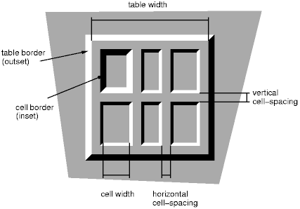
A table with 'border-spacing' set to a length value. Note that each cell has its own border, and the table has a separate border as well.
When this border model is used, the overall width of the table is the sum of the cells plus the border spacing between all borders. See the section on automatic table layout for more information about table dimension calculations.
| Value: | borders | no-borders | inherit |
| Initial: | borders |
| Applies to: | 'table-cell' elements |
| Inherited: | yes |
| Percentages: | N/A |
| Media: | visual |
In the separated borders model, this property controls the rendering of borders around cells that have no visible content. Empty cells and cells with the 'visibility' property set to 'hidden' are considered to have no visible content. Visible content includes " " and other whitespace except ASCII CR ("\0D"), LF ("\0A"), tab ("\09"), and space ("\20").
When this property has the value 'borders', borders are drawn around empty cells (like normal cells).
A value of 'no-borders' means that no borders are drawn around empty cells. Furthermore, if all the cells in a row have a value of 'no-borders' and have no visible content, the entire row behaves as if it had 'display : none'.
The following rule causes borders to be drawn around all cells:
TABLE { empty-cells: borders }
In the collapsing border model, it is possible to specify borders that surround all or part of a cell, row, row group, column, and column group. Borders for HTML's "rule" attribute can be specified this way.
Borders are centered on the grid lines between the cells. User agents must find a consistent rule for rounding off in the case of an odd number of discrete units (screen pixels, printer dots).
The diagram below shows how the width of the table, the widths of the borders, the padding, and the cell width interact. Their relation is given by the following equation, which holds for every row of the table:
row-width = border-width0 + padding-left1 + width1 + padding-right1 + border-width1 + padding-left2 +...+ padding-rightn + border-widthn
Here n is the number of cells in the row, and border-widthi refers to the border between cells i and i + 1.

Schema showing the widths of cells and borders and the padding of cells.
Note that in this model, the width of the table includes half the table border. Also, in this model, a table doesn't have padding (but does have margins).
In the collapsing border model, borders at every edge of every cell may be specified by border properties on a variety of elements that meet at hat edge (cells, rows, row groups, columns, column groups, and the table itself), and these borders may vary in width, style, and color. The following rules determine which border style "wins" in case of a conflict:
The rule of thumb is that at each edge the most "eye catching" border style is chosen, except that any occurrence of the style 'hidden' unconditionally turns the border off.
The following example illustrates the application of these precedence rules. This style sheet:
TABLE { border-collapse: collapse;
border: 5px solid yellow; }
*#col1 { border: 1px solid black; }
TD { border: 5px solid red; }
TD.solid-blue { border: 11px solid blue; }
TD.solid-green { border: 7px solid green; }
with this HTML source:
<P>
<TABLE>
<COL id="col1"><COL id="col2"><COL id="col3">
<TR id="row1">
<TD> </TD>
<TD> </TD>
<TD> </TD>
</TR>
<TR id="row2">
<TD> </TD>
<TD class="solid-blue"> </TD>
<TD class="solid-green"> </TD>
</TR>
<TR id="row3">
<TD> </TD>
<TD> </TD>
<TD> </TD>
</TR>
<TR id="row4">
<TD> </TD>
<TD> </TD>
<TD> </TD>
</TR>
<TR id="row5">
<TD> </TD>
<TD> </TD>
<TD> </TD>
</TR>
</TABLE>
would produce something like this:
[IMAGE HERE]
An example of a table with collapsed borders.
The next example shows a table with horizontal rules between the rows. The top border of the table is set to 'hidden' to suppress the top border of the first row. This implements the RULES="rows" attribute of HTML 4.0.
TABLE[rules=rows] TR {border-top: solid}
TABLE[rules=rows] {border-collapse: collapse;
border-top: hidden}
Table with horizontal rules between the rows.
In this case the same effect can also be achieved without setting a 'hidden' border on TABLE, by addressing the first row separately. Which method is preferred is a matter of taste.
TR:first-child {border-top: none}
TR {border-top: solid}
Here is another example of hidden collapsing borders:
Table with two omitted internal borders.
HTML source:
<TABLE style="border-collapse: collapse; border: solid;">
<TR><TD style="border-right: hidden; border-bottom: hidden">foo</TD>
<TD style="border: solid">bar</TD></TR>
<TR><TD style="border: none">foo</TD>
<TD style="border: solid">bar</TD></TR>
</TABLE>
Some of the values of the 'border-style' have different meanings in tables than for other elements. In the list below they are marked with an asterisk.
When a table is spoken by a speech generator, the relation between the data cells and the header cells must be expressed in a different way than by horizontal and vertical alignment. Some speech browsers may allow a user to move around in the 2-dimensional space, thus giving them the opportunity to map out the spatially represented relations. When that is not possible, the style sheet must specify at which points the headers are spoken.
| Value: | once | always | inherit |
| Initial: | once |
| Applies to: | elements that have header information |
| Inherited: | yes |
| Percentages: | N/A |
| Media: | aural |
This property specifies whether table headers are spoken before every cell, or only before a cell when that cell is associated with a different header than the previous cell. Values have the following meanings:
Each document language may have different mechanisms that allow authors to specify headers. For example, in HTML 4.0 ([HTML40]), it is possible to specify header information with three different attributes ("headers", "scope", and "axis"), and the specification gives an algorithm for determining header information when these attributes have not been specified.

Image of a table with header cells ("San Jose" and "Seattle") that are not in the same column or row as the data they apply to.
This HTML example presents the money spent on meals, hotels and transport in two locations (San Jose and Seattle) for successive days. Conceptually, you can think of the table in terms of a n-dimensional space. The headers of this space are: location, day, category and subtotal. Some cells define marks along an axis while others give money spent at points within this space. The markup for this table is:
<TABLE> <CAPTION>Travel Expense Report</CAPTION> <TR> <TH></TH> <TH>Meals</TH> <TH>Hotels</TH> <TH>Transport</TH> <TH>subtotal</TH> </TR> <TR> <TH id="san-jose" axis="san-jose">San Jose</TH> </TR> <TR> <TH headers="san-jose">25-Aug-97</TH> <TD>37.74</TD> <TD>112.00</TD> <TD>45.00</TD> <TD></TD> </TR> <TR> <TH headers="san-jose">26-Aug-97</TH> <TD>27.28</TD> <TD>112.00</TD> <TD>45.00</TD> <TD></TD> </TR> <TR> <TH headers="san-jose">subtotal</TH> <TD>65.02</TD> <TD>224.00</TD> <TD>90.00</TD> <TD>379.02</TD> </TR> <TR> <TH id="seattle" axis="seattle">Seattle</TH> </TR> <TR> <TH headers="seattle">27-Aug-97</TH> <TD>96.25</TD> <TD>109.00</TD> <TD>36.00</TD> <TD></TD> </TR> <TR> <TH headers="seattle">28-Aug-97</TH> <TD>35.00</TD> <TD>109.00</TD> <TD>36.00</TD> <TD></TD> </TR> <TR> <TH headers="seattle">subtotal</TH> <TD>131.25</TD> <TD>218.00</TD> <TD>72.00</TD> <TD>421.25</TD> </TR> <TR> <TH>Totals</TH> <TD>196.27</TD> <TD>442.00</TD> <TD>162.00</TD> <TD>800.27</TD> </TR> </TABLE>
By providing the data model in this way, authors make it possible for speech enabled-browsers to explore the table in rich ways, e.g. each cell could be spoken as a list, repeating the applicable headers before each data cell:
San Jose, 25-Aug-97, Meals: 37.74 San Jose, 25-Aug-97, Hotels: 112.00 San Jose, 25-Aug-97, Transport: 45.00 ...
The browser could also speak the headers only when they change:
San Jose, 25-Aug-97, Meals: 37.74
Hotels: 112.00
Transport: 45.00
26-Aug-97, Meals: 27.28
Hotels: 112.00
...
Contents
| Value: | [ [<uri> ,]* [ auto | crosshair | default | pointer | move | e-resize | ne-resize | nw-resize | n-resize | se-resize | sw-resize | s-resize | w-resize| text | wait | help ] ] | inherit |
| Initial: | auto |
| Applies to: | all elements |
| Inherited: | yes |
| Percentages: | N/A |
| Media: | visual, interactive |
This property specifies the type of cursor to be displayed for the pointing device. Values have the following meanings:
P { cursor : url(mything.cur), url(second.csr), text; }
In addition to being able to assign pre-defined color values to text, backgrounds, etc., CSS2 allows authors to specify colors in a manner that integrates them into the user's graphic environment. Style rules that take into account user preferences thus offer the following advantages:
The set of values defined for system colors is intended to be exhaustive. For systems that do not have a corresponding value, the specified value should be mapped to the nearest system attribute, or to a default color.
The following lists additional values for color related CSS attributes and their general meaning. Any color property (e.g., 'color' or 'background-color') can take one of the following names:
For example, to set the foreground and background colors of a paragraph to the same foreground and background colors of the user's window, write the following:
P { color: windowtext; background-color: window }
As for colors, authors may specify fonts in a way that makes use of a user's system resources. Please consult the 'font' property for details.
At times, style sheet authors may want to create outlines around visual objects such as buttons, active form fields, image maps, etc., to make them stand out. CSS2 outlines differ from borders in the following ways:
The outline properties control the style of these dynamic outlines.
| Value: | <'outline-color'> || <'outline-style'> || <'outline-width'> | inherit |
| Initial: | see individual properties |
| Applies to: | all elements |
| Inherited: | no |
| Percentages: | N/A |
| Media: | visual, interactive |
| Value: | <border-width> | inherit |
| Initial: | medium |
| Applies to: | all elements |
| Inherited: | no |
| Percentages: | N/A |
| Media: | visual, interactive |
| Value: | <border-style> | inherit |
| Initial: | none |
| Applies to: | all elements |
| Inherited: | no |
| Percentages: | N/A |
| Media: | visual, interactive |
| Value: | <color> | invert | inherit |
| Initial: | invert |
| Applies to: | all elements |
| Inherited: | no |
| Percentages: | N/A |
| Media: | visual, interactive |
The outline created with the outline properties is drawn "over" a box, i.e., the outline is always on top, and doesn't influence the position or size of the box, or of any other boxes.
The outline is drawn starting just outside the border edge.
Outlines may be non-rectangular. For example, if the element is broken across several lines, the outline is the minimum outline that encloses all the element's boxes. In contrast to borders, the outline is not open at the line box's end or start, but is always fully connected.
The 'outline-width' property accepts the same values as 'border-width'.
The 'outline-style' property accepts the same values as 'border-style', except that 'hidden' is not a legal outline style.
The 'outline-color' accepts all colors, as well as the keyword 'invert'. 'Invert' is expected to perform a color inversion on the pixels on the screen. This is a common trick to ensure the focus border is visible, regardless of color background.
The 'outline' property is a shorthand property, and sets all three of 'outline-style', 'outline-width', and 'outline-color'.
Note that the outline is the same on all sides. In contrast to borders, there is no "outline-top" or "outline-left" property.
This specification does not define how multiple overlapping outlines are drawn, or how outlines are drawn for boxes that are partially obscured behind other elements.
Note. Since the focus outline does not affect formatting (i.e., no space is left for it in the box model), it may well overlap other elements on the page.
Here's an example of drawing a thick outline around a BUTTON element:
BUTTON { outline-width : thick }
Scripts may be used to dynamically change the width of the outline, without provoking reflow.
Graphical user interfaces may use outlines to tell the user which element on the page has the focus. The focus is the subject of user interaction in a document (e.g., for entering text, selecting a button, etc.). User agents supporting the interactive media group must keep track of where the focus lies and must also represent the focus. This may be done by using dynamic outlines in conjunction with the :focus pseudo-class.
For example, to draw a thick black line around an element when it has the focus, and a thick red line when it is active, the following rules can be used:
:focus {outline: thick solid black}
:active {outline: thick solid red}
The CSS working group considers that the magnification of a document or portions of a document should not be specified through style sheets. User agents may support such magnification in different ways (e.g., larger images, louder sounds, etc.)
When magnifying a page, UAs should preserve the relationships between positioned elements. For example, a comic strip may be composed of images with overlaid text elements. When magnifying this page, a user agent should keep the text within the comic strip balloon.
Contents
The aural rendering of a document, already commonly used by the blind and print-impaired communities, combines speech synthesis and "auditory icons." Often such aural presentation occurs by converting the document to plain text and feeding this to a screen reader -- software or hardware that simply reads all the characters on the screen. This results in less effective presentation than would be the case if the document structure were retained. Style sheet properties for aural presentation may be used together with visual properties (mixed media) or as an aural alternative to visual presentation.
Besides the obvious accessibility advantages, there are other large markets for listening to information, including in-car use, industrial and medical documentation systems (intranets), home entertainment, and to help users learning to read or who have difficulty reading.
When using aural properties, the canvas consists of a three-dimensional physical space (sound surrounds) and a temporal space (one may specify sounds before, during, and after other sounds). The CSS properties also allow authors to vary the quality of synthesized speech (voice type, frequency, inflection, etc.).
Example:
H1, H2, H3, H4, H5, H6 {
voice-family: paul;
stress: 20;
richness: 90;
cue-before: url("ping.au")
}
P.heidi {azimuth: center-left}
P.peter {azimuth: right}
P.goat {volume: x-soft}
This will direct the speech synthesizer to speak headers in a voice called "paul" (cf. 'font-family'), on a flat tone, but in a very rich voice. Before speaking the headers, a sound sample will be played from the given URL. Paragraphs with class "heidi" will appear to come from front left (if the sound system is capable of spatial audio), and paragraphs of class "peter" from the right. Paragraphs with class "goat" will be very soft.
| Value: | <number> | <percentage> | silent | x-soft | soft | medium | loud | x-loud | inherit |
| Initial: | medium |
| Applies to: | all elements |
| Inherited: | yes |
| Percentages: | relative to inherited value |
| Media: | aural |
Volume refers to the median volume of the waveform. In other words, a highly inflected voice at a volume of 50 might peak well above that. The overall values are likely to be human adjustable for comfort, for example with a physical volume control (which would increase both the 0 and 100 values proportionately); what this property does is adjust the dynamic range.
Values have the following meanings:
User agents should allow the values corresponding to '0' and '100' to be set by the listener. No one setting is universally applicable; suitable values depend on the equipment in use (speakers, headphones), the environment (in car, home theater, library) and personal preferences. Some examples:
The same author style sheet could be used in all cases, simply by mapping the '0' and '100' points suitably at the client side.
This property specifies whether text will be rendered aurally and if so, in what manner (somewhat analogous to the 'display' property). The possible values are:
Note the difference between an element whose 'volume' property has a value of 'silent' and an element whose 'speak' property has the value 'none'. The former takes up the same time as if it had been spoken, including any pause before and after the element, but no sound is generated.
| Value: | <time> | <percentage> | inherit |
| Initial: | depends on user agent |
| Applies to: | all elements |
| Inherited: | no |
| Percentages: | see prose |
| Media: | aural |
| Value: | <time> | <percentage> | inherit |
| Initial: | depends on user agent |
| Applies to: | all elements |
| Inherited: | no |
| Percentages: | see prose |
| Media: | aural |
These properties specify a pause to be observed before (or after) speaking an element's content. Values have the following meanings:
The pause is inserted between the element's content and any 'cue-before' or 'cue-after' content.
Authors should use relative units to create more robust style sheets in the face of large changes in speech-rate.
| Value: | [ [<time> | <percentage>]{1,2} ] | inherit |
| Initial: | depends on user agent |
| Applies to: | all elements |
| Inherited: | no |
| Percentages: | see descriptions of 'pause-before' and 'pause-after' |
| Media: | aural |
The 'pause' property is a shorthand for setting 'pause-before' and 'pause-after'. If two values are given, the first value is 'pause-before' and the second is 'pause-after'. If only one value is given, it applies to both properties.
Examples:
H1 { pause: 20ms } /* pause-before: 20ms; pause-after: 20ms */
H2 { pause: 30ms 40ms } /* pause-before: 30ms; pause-after: 40ms */
H3 { pause-after: 10ms } /* pause-before: ?; pause-after: 10ms */
| Value: | <uri> | none | inherit |
| Initial: | none |
| Applies to: | all elements |
| Inherited: | no |
| Percentages: | N/A |
| Media: | aural |
| Value: | <uri> | none | inherit |
| Initial: | none |
| Applies to: | all elements |
| Inherited: | no |
| Percentages: | N/A |
| Media: | aural |
Auditory icons are another way to distinguish semantic elements. Sounds may be played before and/or after the element to delimit it. Values have the following meanings:
For example:
A {cue-before: url(bell.aiff); cue-after: url(dong.wav) }
H1 {cue-before: url(pop.au); cue-after: url(pop.au) }
| Value: | [ <'cue-before'> || <'cue-after'> ] | inherit |
| Initial: | not defined for shorthand properties |
| Applies to: | all elements |
| Inherited: | no |
| Percentages: | N/A |
| Media: | aural |
The 'cue' property is a shorthand for setting 'cue-before' and 'cue-after'. If two values are given, the first value is 'cue-before' and the second is 'cue-after'. If only one value is given, it applies to both properties.
The following two rules are equivalent:
H1 {cue-before: url(pop.au); cue-after: url(pop.au) }
H1 {cue: url(pop.au) }
If a user agent cannot render an auditory icon (e.g., the user's environment does not permit it), we recommend that it produce an alternative cue (e.g., popping up a warning, emitting a warning sound, etc.)
| Value: | <uri> mix? repeat? | auto | none | inherit |
| Initial: | auto |
| Applies to: | all elements |
| Inherited: | no |
| Percentages: | N/A |
| Media: | aural |
Similar to the 'cue-before' and 'cue-after' properties, this property specifies a sound to be played as a background while an element's content is spoken. Values have the following meanings:
Examples:
BLOCKQUOTE.sad { play-during: url(violins.aiff) }
BLOCKQUOTE Q { play-during: url(harp.wav) mix}
SPAN.quiet { play-during: none }
Spatial audio is an important stylistic property for aural presentation. It provides a natural way to tell several voices apart, as in real life (people rarely all stand in the same spot in a room). Stereo speakers produce a lateral sound stage. Binaural headphones or the increasingly popular 5-speaker home theater setups can generate full surround sound, and multi-speaker setups can create a true three-dimensional sound stage. VRML 2.0 also includes spatial audio, which implies that in time consumer-priced spatial audio hardware will become more widely available.
Values have the following meanings:
This property is most likely to be implemented by mixing the same signal into different channels at differing volumes. It might also use phase shifting, digital delay, and other such techniques to provide the illusion of a sound stage. The precise means used to achieve this effect and the number of speakers used to do so are user agent-dependent; this property merely identifies the desired end result.
Examples:
H1 { azimuth: 30deg }
TD.a { azimuth: far-right } /* 60deg */
#12 { azimuth: behind far-right } /* 120deg */
P.comment { azimuth: behind } /* 180deg */
If spatial-azimuth is specified and the output device cannot produce sounds behind the listening position, user agents should convert values in the rearwards hemisphere to forwards hemisphere values. One method is as follows:
| Value: | <angle> | below | level | above | higher | lower | inherit |
| Initial: | level |
| Applies to: | all elements |
| Inherited: | yes |
| Percentages: | N/A |
| Media: | aural |
Values of this property have the following meanings:
The precise means used to achieve this effect and the number of speakers used to do so are undefined. This property merely identifies the desired end result.
Examples:
H1 { elevation: above }
TR.a { elevation: 60deg }
TR.b { elevation: 30deg }
TR.c { elevation: level }
| Value: | <number> | x-slow | slow | medium | fast | x-fast | faster | slower | inherit |
| Initial: | medium |
| Applies to: | all elements |
| Inherited: | yes |
| Percentages: | N/A |
| Media: | aural |
This property specifies the speaking rate. Note that both absolute and relative keyword values are allowed (compare with 'font-size'). Values have the following meanings:
| Value: | [[<specific-voice> | <generic-voice> ],]* [<specific-voice> | <generic-voice> ] | inherit |
| Initial: | depends on user agent |
| Applies to: | all elements |
| Inherited: | yes |
| Percentages: | N/A |
| Media: | aural |
The value is a comma-separated, prioritized list of voice family names (compare with 'font-family'). Values have the following meanings:
Examples:
H1 { voice-family: announcer, male }
P.part.romeo { voice-family: romeo, male }
P.part.juliet { voice-family: juliet, female }
| Value: | <frequency> | x-low | low | medium | high | x-high | inherit |
| Initial: | medium |
| Applies to: | all elements |
| Inherited: | yes |
| Percentages: | N/A |
| Media: | aural |
Specifies the average pitch (a frequency) of the speaking voice. The average pitch of a voice depends on the voice family. For example, the average pitch for a standard male voice is around 120hz, but for a female voice, it's around 210hz.
Values have the following meanings:
| Value: | <number> | inherit |
| Initial: | 50 |
| Applies to: | all elements |
| Inherited: | yes |
| Percentages: | N/A |
| Media: | aural |
Specifies variation in average pitch. The perceived pitch of a human voice is determined by the fundamental frequency and typically has a value of 120Hz for a male voice and 200Hz for a female voice. Human languages are spoken with varying inflection and pitch; these variations convey additional meaning and emphasis. Thus, a highly animated voice, i.e., one that is heavily inflected, displays a high pitch range. This property specifies the range over which these variations occur, i.e., how much the fundamental frequency may deviate from the average pitch.
Values have the following meanings:
Specifies the height of "local peaks" in the intonation contour of a voice. For example, English is a stressed language, and different parts of a sentence are assigned primary, secondary, or tertiary stress. The value of 'stress' controls the amount of inflection that results from these stress markers. This property is a companion to the 'pitch-range' property and is provided to allow developers to exploit higher-end auditory displays.
Values have the following meanings:
| Value: | <number> | inherit |
| Initial: | 50 |
| Applies to: | all elements |
| Inherited: | yes |
| Percentages: | N/A |
| Media: | aural |
Specifies the richness, or brightness, of the speaking voice. A rich voice will "carry" in a large room, a smooth voice will not. (The term "smooth" refers to how the wave form looks when drawn.)
Values have the following meanings:
An additional speech property, speak-header, is described in the chapter on tables
| Value: | code | none | inherit |
| Initial: | none |
| Applies to: | all elements |
| Inherited: | yes |
| Percentages: | N/A |
| Media: | aural |
This property specifies how punctuation is spoken. Values have the following meanings:
| Value: | digits | continuous | inherit |
| Initial: | continuous |
| Applies to: | all elements |
| Inherited: | yes |
| Percentages: | N/A |
| Media: | aural |
This property controls how numerals are spoken. Values have the following meanings:
This appendix is informative, not normative.
This style sheet describes the typical rendering of all HTML 4.0 ([HTML40]) elements based on extensive research into current UA practice. Developers are encouraged to use it as a default style sheet in their implementations.
The full presentation of some HTML elements cannot be expressed in CSS2, including replaced elements (IMG, OBJECT), scripting elements (SCRIPT, APPLET), form control elements, and frame elements.
ADDRESS,
BLOCKQUOTE,
BODY, DD, DIV,
DL, DT,
FIELDSET, FORM,
FRAME, FRAMESET,
H1, H2, H3, H4,
H5, H6, IFRAME,
NOSCRIPT,
NOFRAMES,
OBJECT, OL, P,
UL, APPLET,
CENTER, DIR,
HR, MENU, PRE { display: block }
LI { display: list-item }
HEAD { display: none }
TABLE { display: table }
TR { display: table-row }
THEAD { display: table-header-group }
TBODY { display: table-footer-group }
TFOOT { display: table-row-group }
COL { display: table-column }
COLGROUP { display: table-column-group }
TD, TH { display: table-cell }
CAPTION { display: table-caption }
TH { font-weight: bolder; text-align: center }
CAPTION { text-align: center }
BODY { padding: 8px; line-height: 1.33 }
H1 { font-size: 2em; margin: .67em 0 }
H2 { font-size: 1.5em; margin: .83em 0 }
H3 { font-size: 1.17em; margin: 1em 0 }
H4, P,
BLOCKQUOTE, UL,
FIELDSET, FORM,
OL, DL, DIR,
MENU { margin: 1.33em 0 }
H5 { font-size: .83em; line-height: 1.17em; margin: 1.67em 0 }
H6 { font-size: .67em; margin: 2.33em 0 }
H1, H2, H3, H4,
H5, H6, B,
STRONG { font-weight: bolder }
BLOCKQUOTE { margin-left: 40px; margin-right: 40px }
I, CITE, EM,
VAR, ADDRESS { font-style: italic }
PRE, TT, CODE,
KBD, SAMP { font-family: monospace }
PRE { white-space: pre }
BIG { font-size: 1.17em }
SMALL, SUB, SUP { font-size: .83em }
SUB { vertical-align: sub }
SUP { vertical-align: super }
S, STRIKE, DEL { text-decoration: line-through }
HR { border: 1px inset }
OL, UL, DIR,
MENU, DD { margin-left: 40px }
OL { list-style-type: decimal }
OL UL, UL OL,
UL UL, OL OL { margin-top: 0; margin-bottom: 0 }
U, INS { text-decoration: underline }
CENTER { text-align: center }
BR:before { content: "\A" }
/* An example of style for HTML 4.0's new
ABBR/ACRONYM elements */
ABBR, ACRONYM { font-variant: small-caps; letter-spacing: 0.1em }
A[href] { text-decoration: underline }
:focus { outline: thin dotted invert }
/* For Unicode bidi */
BDO[DIR="ltr"] { direction: ltr; unicode-bidi: bidi-override }
BDO[DIR="rtl"] { direction: rtl; unicode-bidi: bidi-override }
*[DIR="ltr"] { direction: ltr; unicode-bidi: embed }
*[DIR="rtl"] { direction: rtl; unicode-bidi: embed }
/* Elements that are block-level in HTML4 */
ADDRESS, BLOCKQUOTE, BODY, DD, DIV, DL, DT, FIELDSET,
FORM, FRAME, FRAMESET, H1, H2, H3, H4, H5, H6, IFRAME,
NOSCRIPT, NOFRAMES, OBJECT, OL, P, UL, APPLET, CENTER,
DIR, HR, MENU, PRE, LI, TABLE, TR, THEAD, TBODY, TFOOT,
COL, COLGROUP, TD, TH, CAPTION
{ unicode-bidi: embed }
@media print {
@page { margin: 10% }
H1, H2, H3,
H4, H5, H6 { page-break-after: avoid; page-break-inside: avoid }
BLOCKQUOTE,
PRE { page-break-inside: avoid }
UL, OL, DL { page-break-before: avoid }
}
@media speech {
H1, H2, H3,
H4, H5, H6 { voice-family: paul, male; stress: 20; richness: 90 }
H1 { pitch: x-low; pitch-range: 90 }
H2 { pitch: x-low; pitch-range: 80 }
H3 { pitch: low; pitch-range: 70 }
H4 { pitch: medium; pitch-range: 60 }
H5 { pitch: medium; pitch-range: 50 }
H6 { pitch: medium; pitch-range: 40 }
LI,DT,DD { pitch: medium; richness: 60 }
DT { stress: 80 }
PRE,CODE,TT { pitch: medium; pitch-range: 0; stress: 0; richness: 80 }
EM { pitch: medium; pitch-range: 60; stress: 60; richness: 50 }
STRONG { pitch: medium; pitch-range: 60; stress: 90; richness: 90 }
DFN { pitch: high; pitch-range: 60; stress: 60 }
S,STRIKE { richness: 0}
I { pitch: medium; pitch-range: 60; stress: 60; richness: 50 }
B { pitch: medium; pitch-range: 60; stress: 90; richness: 90 }
U { richness: 0 }
A:link { voice-family: harry, male }
A:visited { voice-family: betty, female }
A:active { voice-family: betty, female; pitch-range: 80; pitch: x-high }
}
This appendix is informative, not normative.
CSS2 builds on CSS1 and all valid CSS1 style sheets are valid CSS2 style sheets. The changes between the CSS1 specification (see [CSS1]) and this specification fall into three groups: new functionality, updated descriptions of CSS1 functionality, and changes to CSS1.
In addition to the functionality of CSS1, CSS2 supports:
The CSS1 specification was short and concise. This specification is much more voluminous and more readable. Much of the additional content describes new functionality, but the description of CSS1 features has also been extended. Except in a few cases described below, the rewritten descriptions do not indicate a change in syntax nor semantics.
While all CSS1 style sheets are valid CSS2 style sheets, there are a few cases where the CSS1 style sheet will have a different meaning when interpreted as a CSS2 style sheet. Most changes are due to implementation experience feeding back into the specification, but there are also some error corrections.
Contents
This appendix is informative, not normative.


There are many different font formats in use by many different platforms. To select a preferred font format, transparent content negotiation is used (see [NEGOT]). It is always possible to tell when a font is being dereferenced, because the URI is inside a font description. Thus, only the relevant Accept headers need be sent (not headers related to images, HTML, etc).
If the "Family" digit has a value other than "2" (the most common case), the remaining nine digits have different meanings than those given here. For further details on Panose-1, see [PANOSE].
This information is available in the font by looking at the 'ulUnicodeRange' bits in the 'OS/2' table (if it has one), which holds a bitfield representation of the set. This table is defined in revision 1.66 of the TrueType specification, from Microsoft. Considering this information as a set, each element corresponds to a Unicode 1.1 character block, and the presence of that element in the set indicates that the font has one or more glyph representations to represent at least one character in that block. The set has 128 elements as described below. The order generally follows that in the Unicode 1.1 standard. This table may be used to convert the information in a TrueType font into a CSS 'unicode-range' descriptor.
| Block | Add | Block name | Unicode range |
|---|---|---|---|
| 0 | 1 | Basic Latin | U+0-7F |
| 1 | 2 | Latin-1 Supplement | U+80-FF |
| 2 | 4 | Latin-1 Extended-A | U+100-17F |
| 3 | 8 | Latin Extended-B | U+180-24F |
| 4 | 1 | IPA Extensions | U+250-2AF |
| 5 | 2 | Spacing Modifier Letters | U+2B0-2FF |
| 6 | 4 | Combining Diacritical Marks | U+300-36F |
| 7 | 8 | Greek | U+370-3CF |
| 8 | 1 | Greek Symbols and Coptic | U+3D0-3EF |
| 9 | 2 | Cyrillic | U+400-4FF |
| 10 | 4 | Armenian | U+530-58F |
| 11 | 8 | Hebrew | U+590-5FF |
| 12 | 1 | Hebrew Extended-A Hebrew Extended-B | ?? what ranges ?? |
| 13 | 2 | Arabic | U+600-69F |
| 14 | 4 | Arabic Extended | U+670-6FF |
| 15 | 8 | Devanagari | U+900-97F |
| 16 | 1 | Bengali | U+980-9FF |
| 17 | 2 | Gurmukhi | U+A00-A7F |
| 18 | 4 | Gujarati | U+A80-AFF |
| 19 | 8 | Oriya | U+B00-B7F |
| 20 | 1 | Tamil | U+B80-BFF |
| 21 | 2 | Telugu | U+C00-C7F |
| 22 | 4 | Kannada | U+C80-CFF |
| 23 | 8 | Malayalam | U+D00-D7F |
| 24 | 1 | Thai | U+E00-E7F |
| 25 | 2 | Lao | U+E80-EFF |
| 26 | 4 | Georgian | U+10A0-10EF |
| 27 | 8 | Georgian Extended | U+10F0-10FF ?? |
| 28 | 1 | Hangul Jamo | U+1100-11FF |
| 29 | 2 | Latin Extended Additional | - |
| 30 | 4 | Greek Extended | U+1F00-1FFF |
| 31 | 8 | General Punctuation | U+2000-206F |
| 32 | 1 | Superscripts and Subscripts | - |
| 33 | 2 | Currency Symbols | U+20A0-20CF |
| 34 | 4 | Combining Marks for Symbols | U+20D0-20FF |
| 35 | 8 | Letterlike Symbols | U+2100-214F |
| 36 | 1 | Number Forms | U+2150-218F |
| 37 | 2 | Arrows | U+2190-21FF |
| 38 | 4 | Mathematical Operators | U+2200-22FF |
| 39 | 8 | Miscellaneous Technical | U+2300-23FF |
| 40 | 1 | Control Pictures | U+2400-243F |
| 41 | 2 | Optical Character Recognition | U+2440-245F |
| 42 | 4 | Enclosed Alphanumerics | U+2460-24FF |
| 43 | 8 | Box Drawing | U+2500-257F |
| 44 | 1 | Block Elements | U+2580-259F |
| 45 | 2 | Geometric Shapes | U+25A0-25FF |
| 46 | 4 | Miscellaneous Symbols | U+2600-26FF |
| 47 | 8 | Dingbats | U+2700-27BF |
| 48 | 1 | CJK Symbols and Punctuation | U+3000-303F |
| 49 | 2 | Hiragana | U+3040-309F |
| 50 | 4 | Katakana | U+30A0-30FF |
| 51 | 8 | Bopomofo | U+3100-312F |
| 52 | 1 | Hangul Compatibility Jamo | U+3130-318F |
| 53 | 2 | CJK Miscellaneous | ?? |
| 54 | 4 | Enclosed CJK Letters and Months | U+3200-32FF |
| 55 | 8 | CJK compatibility | U+3300-33FF |
| 56 | 1 | Hangul | U+AC00-D7FF |
| 59 | 8 | CJK Unified Ideographs | U+4E00-9FFF |
| 60 | 1 | Private Use Area | U+E000-F8FF |
| 61 | 2 | CJK Compatibility Ideographs | U+F900-FAFF |
| 62 | 4 | Alphabetic Presentation Forms | U+FB00-FB4F |
| 63 | 8 | Arabic Presentation Forms-A | U+FB50-FDFF |
| 64 | 1 | Combining Half Marks | U+FE20-FE2F |
| 65 | 2 | CJK compatibility Forms | U+FE30-FE4F |
| 66 | 4 | Small Form Variants | U+FE50-FE6F |
| 67 | 8 | Arabic Presentation Forms-B | U+FE70-FEFF |
| 68 | 1 | Halfwidth and Fullwidth Forms | U+FF00-FFEF |
| 69 | 2 | Specials | U+FFF0-FFFD |
The TrueType bitfield system has the problem that it is tied to Unicode 1.1 and is unable to cope with Unicode expansion - it is unable to represent Tibetan for example, or other scripts introduced with Unicode 2.0 or later revisions.
Authoring tools should allow style sheet authors to add and edit font descriptors. In some cases, however, authoring tools can help by examining locally installed fonts and automatically generating descriptors for fonts referenced in the style sheet. This is also a function that can be carried out by tools which subset or convert fonts ready for dynamic download.
This table suggests where such information can be found, for common font formats.
| Descriptor | Type 1 | TrueType and OpenType | TrueType GX [TRUETYPEGX] |
| 'ascent' | 'Ascender' in AFM/PFM file | 'Ascender' in 'hhea' table or (preferably) 'sTypoAscender' in 'OS/2' table | 'horizontalBefore' in 'fmtx' table |
| 'baseline' | bsln table, see note | ||
| 'bbox' | FontBBox, font dictionary | 'xMin', 'xMax', 'yMin' and 'yMax' entries of the 'head' table | |
| 'cap-height' | CapHeight in AFM/PFM file | ||
| 'descent' | 'Descender' in the AFM/PFM file. | ||
| 'mathline' | bsln table | ||
| 'font-family' | FamilyName, fontinfo dictionary | name table | |
| 'stemh' | StdHW, private dictionary of AFM/PFM file | ||
| 'stemv' | /StdVW, private dictionary | cvt table | |
| 'topline' | bsln table | ||
| 'unicode-range' | cmap file | OS/2 table, see Appendix C | |
| 'units-per-em' | FontMatrix, font dictionary | unitsPerEm, head table. | |
| 'widths' | hmtx table |
This appendix is normative.
The grammar below defines the syntax of CSS2. It is in some sense, however, a superset of CSS2 as this specification imposes additional semantic constraints not expressed in this grammar. A conforming UA must also adhere to the forward-compatible parsing rules, the property and value notation, and the unit notation. In addition, the document language may impose restrictions, e.g. HTML imposes restrictions on the possible values of the "class" attribute.
The grammar below is LL(1) (but note that most UA's should not use it directly, since it doesn't express the parsing conventions, only the CSS2 syntax). The format of the productions is optimized for human consumption and some shorthand notation beyond Yacc (see [YACC]) is used:
The productions are:
stylesheet
: [ CHARSET_SYM S* STRING S* ';' S* ]?
[S|CDO|CDC]* [ import [S|CDO|CDC]* ]*
[ [ ruleset | media | page | font_face ] [S|CDO|CDC]* ]*
;
import
: IMPORT_SYM S*
[STRING|URI] S* [ medium [ ',' S* medium]* ]? ';' S*
;
media
: MEDIA_SYM S* medium [ ',' S* medium ]* '{' S* ruleset* '}' S*
;
medium
: IDENT S*
;
page
: PAGE_SYM S* pseudo_page?
'{' S* declaration [ ';' S* declaration ]* '}' S*
;
pseudo_page
: ':' IDENT S*
;
font_face
: FONT_FACE_SYM S*
'{' S* declaration [ ';' S* declaration ]* '}' S*
;
operator
: '/' S* | ',' S* | /* empty */
;
combinator
: '+' S* | '>' S* | /* empty */
;
unary_operator
: '-' | '+'
;
property
: IDENT S*
;
ruleset
: selector [ ',' S* selector ]*
'{' S* declaration [ ';' S* declaration ]* '}' S*
;
selector
: simple_selector [ combinator simple_selector ]*
;
/*
* simple selector cannot start with attrib selector
*/
simple_selector
: element_name [ HASH | class | attrib | pseudo ]* S*
| HASH [ HASH | class | attrib | pseudo ]* S*
| pseudo [ HASH | class | attrib | pseudo ]* S*
| class [ HASH | class | attrib | pseudo ]* S*
;
class
: '.' IDENT
;
element_name
: IDENT | '*'
;
attrib
: '[' S* IDENT S* [ [ '=' | INCLUDES | DASHMATCH ] S*
[ IDENT | STRING ] S* ]? ']'
;
pseudo
: ':' IDENT [ '(' IDENT ')' ]?
;
declaration
: property ':' S* expr prio?
| /* empty */
;
prio
: IMPORTANT_SYM S*
;
expr
: term [ operator term ]*
;
term
: unary_operator?
[ NUMBER S* | PERCENTAGE S* | LENGTH S* | EMS S* | EXS S* | ANGLE S* |
TIME S* | FREQ S* | function ]
| STRING S* | IDENT S* | URI S* | RGB S* | UNICODERANGE S* | hexcolor
;
function
: FUNCTION S* expr ')' S*
;
/*
* There is a constraint on the color that it must
* have either 3 or 6 hex-digits (i.e., [0-9a-fA-F])
* after the "#"; e.g., "#000" is OK, but "#abcd" is not.
*/
hexcolor
: HASH S*
;
The following is the tokenizer, written in Flex (see [FLEX]) notation. The tokenizer is case-insensitive.
The two occurrences of "\377" represent the highest character number that current versions of Flex can deal with (decimal 255). They should be read as "\4177777" (decimal 1114111), which is the highest possible code point in Unicode/ISO-10646.
%option case-insensitive
h [0-9a-f]
nonascii [\200-\377]
unicode \\{h}{1,6}[ \t\r\n\f]?
escape {unicode}|\\[ -~\200-\377]
nmstart [a-z]|{nonascii}|{escape}
nmchar [a-z0-9-]|{nonascii}|{escape}
string1 \"([\t !#$%&(-~]|\\\n|\'|{nonascii}|{escape})*\"
string2 \'([\t !#$%&(-~]|\\\n|\"|{nonascii}|{escape})*\'
ident {nmstart}{nmchar}*
name {nmchar}+
num [0-9]+|[0-9]*"."[0-9]+
string {string1}|{string2}
url ([!#$%&*-~]|{nonascii}|{escape})*
w [ \t\r\n\f]*
range \?{1,6}|{h}(\?{0,5}|{h}(\?{0,4}|{h}(\?{0,3}|{h}(\?{0,2}|{h}(\??|{h})))))
%%
[ \t\r\n\f]+ {return S;}
\/\*[^*]*\*+([^/][^*]*\*+)*\/ /* ignore comments */
"<!--" {return CDO;}
"-->" {return CDC;}
"~=" {return INCLUDES;}
"|=" {return DASHMATCH;}
{string} {return STRING;}
{ident} {return IDENT;}
"#"{name} {return HASH;}
"@import" {return IMPORT_SYM;}
"@page" {return PAGE_SYM;}
"@media" {return MEDIA_SYM;}
"@font-face" {return FONT_FACE_SYM;}
"@charset" {return CHARSET_SYM;}
"@"{ident} {return ATKEYWORD;}
"!{w}important" {return IMPORTANT_SYM;}
{num}em {return EMS;}
{num}ex {return EXS;}
{num}px {return LENGTH;}
{num}cm {return LENGTH;}
{num}mm {return LENGTH;}
{num}in {return LENGTH;}
{num}pt {return LENGTH;}
{num}pc {return LENGTH;}
{num}deg {return ANGLE;}
{num}rad {return ANGLE;}
{num}grad {return ANGLE;}
{num}ms {return TIME;}
{num}s {return TIME;}
{num}Hz {return FREQ;}
{num}kHz {return FREQ;}
{num}{ident} {return DIMEN;}
{num}% {return PERCENTAGE;}
{num} {return NUMBER;}
"url("{w}{string}{w}")" {return URI;}
"url("{w}{url}{w}")" {return URI;}
{ident}"(" {return FUNCTION;}
U\+{range} {return UNICODERANGE;}
U\+{h}{1,6}-{h}{1,6} {return UNICODERANGE;}
. {return *yytext;}
There are some differences in the syntax specified in the CSS1 recommendation ([CSS1]), and the one above. Most of these are because of new tokens in CSS2, that didn't exist in CSS1, others are because the grammar has been rewritten to be more readable. However, there are some incompatible changes, that were felt to be errors in the CSS1 syntax. They are explained below.
Panose numbers for some fonts are available online and may be queried.
| Name | Values | Initial value | Applies to (Default: all) | Inherited? (Default: no) | Percentages (Default: N/A) | Media groups |
|---|---|---|---|---|---|---|
| 'azimuth' | <angle> | [[ left-side | far-left | left | center-left | center | center-right | right | far-right | right-side ] || behind ] | leftwards | rightwards | inherit | center | yes | aural | ||
| 'background' | ['background-color' || 'background-image' || 'background-repeat' || || 'background-position'] | inherit | XX | allowed on 'background-position' | visual | ||
| scroll | fixed | inherit | scroll | visual | ||||
| 'background-color' | <color> | transparent | inherit | transparent | visual | |||
| 'background-image' | <uri> | none | inherit | none | visual | |||
| 'background-position' | [ [<percentage> | <length> ]{1,2} | [ [top | center | bottom] || [left | center | right] ] ] | inherit | 0% 0% | block-level and replaced elements | refer to the size of the element itself | visual | |
| 'background-repeat' | repeat | repeat-x | repeat-y | no-repeat | inherit | repeat | visual | |||
| 'border' | [ 'border-width' || 'border-style' || <color> ] | inherit | see individual properties | visual | |||
| 'border-collapse' | collapse | separate | inherit | collapse | 'table' and 'inline-table' elements | yes | visual | |
| 'border-color' | <color>{1,4} | transparent | inherit | see individual properties | visual | |||
| 'border-spacing' | <length> <length>? | inherit | 0 | 'table' and 'inline-table' elements | yes | visual | |
| 'border-style' | <border-style>{1,4} | inherit | see individual properties | visual | |||
| 'border-top border-right border-bottom border-left' | [ 'border-top-width' || 'border-style' || <color> ] | inherit | see individual properties | visual | |||
| 'border-top-color border-right-color border-bottom-color border-left-color' | <color> | inherit | the value of the 'color' property | visual | |||
| 'border-top-style border-right-style border-bottom-style border-left-style' | <border-style> | inherit | none | visual | |||
| 'border-top-width border-right-width border-bottom-width border-left-width' | <border-width> | inherit | medium | visual | |||
| 'border-width' | <border-width>{1,4} | inherit | see individual properties | visual | |||
| 'bottom' | <length> | <percentage> | auto | inherit | auto | refer to height of containing block | visual | ||
| 'caption-side' | top | bottom | left | right | inherit | top | 'table-caption' elements | yes | visual | |
| 'clear' | none | left | right | both | inherit | none | block-level elements | visual | ||
| 'clip' | <shape> | auto | inherit | auto | block-level and replaced elements | visual | ||
| 'color' | <color> | inherit | depends on user agent | yes | visual | ||
| 'column-span' | <integer> | inherit | 1 | 'table-cell', 'table-column', and 'table-column-group' elements | visual | ||
| 'content' | [ <string> | <uri> | <counter> | attr(X) | open-quote | close-quote | no-open-quote | no-close-quote ]+ | inherit | empty string | :before and :after pseudo-elements | all | ||
| 'counter-increment' | [ <identifier> <integer>? ]+ | none | inherit | none | all | |||
| 'counter-reset' | [ <identifier> <integer>? ]+ | none | inherit | none | all | |||
| 'cue' | [ 'cue-before' || 'cue-after' ] | inherit | XX | aural | |||
| 'cue-after' | <uri> | none | inherit | none | aural | |||
| 'cue-before' | <uri> | none | inherit | none | aural | |||
| 'cursor' | [ [<uri> ,]* [ auto | crosshair | default | pointer | move | e-resize | ne-resize | nw-resize | n-resize | se-resize | sw-resize | s-resize | w-resize| text | wait | help ] ] | inherit | auto | yes | visual, interactive | ||
| 'direction' | ltr | rtl | inherit | ltr | all elements, but see prose | yes | visual | |
| 'display' | inline | block | list-item | run-in | compact | marker | table | inline-table | table-row-group | table-column-group | table-header-group | table-footer-group | table-row | table-cell | table-caption | none | inherit | inline | all | |||
| 'elevation' | <angle> | below | level | above | higher | lower | inherit | level | yes | aural | ||
| 'empty-cells' | borders | no-borders | inherit | borders | 'table-cell' elements | yes | visual | |
| 'float' | left | right | none | inherit | none | elements that are not positioned absolutely | visual | ||
| 'font' | [ [ 'font-style' || 'font-variant' || 'font-weight' ]? 'font-size' [ / 'line-height' ]? 'font-family' ] | caption | icon | menu | message-box | small-caption | status-bar | inherit | see individual properties | yes | allowed on 'font-size' and 'line-height' | visual | |
| 'font-family' | [[ <family-name> | <generic-family> ],]* [<family-name> | <generic-family>] | inherit | depends on user agent | yes | visual | ||
| 'font-size' | <absolute-size> | <relative-size> | <length> | <percentage> | inherit | medium | yes, the computed value is inherited | relative to parent element's font size | visual | |
| 'font-size-adjust' | <number> | none | inherit | none | yes | relative to parent element's font size | visual | |
| 'font-stretch' | normal | wider | narrower | ultra-condensed | extra-condensed | condensed | semi-condensed | semi-expanded | expanded | extra-expanded | ultra-expanded | inherit | normal | yes | visual | ||
| 'font-style' | normal | italic | oblique | inherit | normal | yes | visual | ||
| 'font-variant' | normal | small-caps | inherit | normal | yes | visual | ||
| 'font-weight' | normal | bold | bolder | lighter | 100 | 200 | 300 | 400 | 500 | 600 | 700 | 800 | 900 | inherit | normal | yes | visual | ||
| 'height' | <length> | <percentage> | auto | inherit | auto | all elements but non-replaced inline elements, table columns and column groups | see prose | visual | |
| 'left' | <length> | <percentage> | auto | inherit | auto | refer to width of containing block | visual | ||
| 'letter-spacing' | normal | <length> | inherit | normal | yes | visual | ||
| 'line-height' | normal | <number> | <length> | <percentage> | inherit | normal | yes | relative to the font size of the element itself | visual | |
| 'list-style' | [ 'list-style-type' || 'list-style-position' || 'list-style-image' ] | inherit | XX | elements with the 'display' property set to 'list-item' | yes | visual | |
| 'list-style-image' | <uri> | none | inherit | none | elements with the 'display' property set to 'list-item' | yes | visual | |
| 'list-style-position' | inside | outside | inherit | outside | elements with the 'display' property set to 'list-item' | yes | visual | |
| 'list-style-type' | disc | circle | square | decimal | leading-zero | western-decimal | lower-roman | upper-roman | lower-greek | lower-alpha | lower-latin | upper-alpha | upper-latin | hebrew | armenian | georgian | cjk-ideographic | hiragana | katakana | hiragana-iroha | katakana-iroha | none | inherit | disc | elements with the 'display' property set to 'list-item' | yes | visual | |
| 'margin' | <margin-width>{1,4} | inherit | XX | refer to width of containing block | visual | ||
| 'margin-top margin-right margin-bottom margin-left' | <margin-width> | inherit | 0 | refer to width of containing block | visual | ||
| 'marker-offset' | <length> | auto | inherit | auto | elements with 'display' set to 'marker' | visual | ||
| 'marks' | [ crop || cross ] | none | inherit | none | page context | N/A | visual, paged | |
| 'max-height' | <length> | <percentage> | inherit | 100% | all | refer to height of containing block | visual | |
| 'max-width' | <length> | <percentage> | inherit | 100% | all | refer to width of containing block | visual | |
| 'min-height' | <length> | <percentage> | inherit | 0 | all | refer to height of containing block | visual | |
| 'min-width' | <length> | <percentage> | inherit | 0 | all | refer to width of containing block | visual | |
| 'orphans' | <integer> | inherit | 2 | block-level elements | yes | visual, paged | |
| 'outline' | 'outline-color' || 'outline-style' || 'outline-width' | inherit | see individual properties | visual, interactive | |||
| 'outline-color' | <color> | invert | inherit | invert | visual, interactive | |||
| 'outline-style' | <border-style> | inherit | none | visual, interactive | |||
| 'outline-width' | <border-width> | inherit | medium | visual, interactive | |||
| 'overflow' | visible | hidden | scroll | auto | inherit | visible | block-level and replaced elements | visual | ||
| 'padding' | <padding-width>{1,4} | inherit | XX | refer to width of containing block | visual | ||
| 'padding-top padding-right padding-bottom padding-left' | <padding-width> | inherit | 0 | refer to width of containing block | visual | ||
| 'page' | <identifier> [ :left | :right ]? | auto | auto | block-level elements | yes | visual, paged | |
| 'page-break-after' | auto | always | avoid | left | right | inherit | auto | block-level elements | visual, paged | ||
| 'page-break-before' | auto | always | avoid | left | right | inherit | auto | block-level elements | visual, paged | ||
| 'page-break-inside' | avoid | auto | inherit | auto | block-level elements | yes | visual, paged | |
| 'pause' | [ [<time> | <percentage>]{1,2} ] | inherit | depends on user agent | see descriptions of 'pause-before' and 'pause-after' | aural | ||
| 'pause-after' | <time> | <percentage> | inherit | depends on user agent | see prose | aural | ||
| 'pause-before' | <time> | <percentage> | inherit | depends on user agent | see prose | aural | ||
| 'pitch' | <frequency> | x-low | low | medium | high | x-high | inherit | medium | yes | aural | ||
| 'pitch-range' | <number> | inherit | 50 | yes | aural | ||
| 'play-during' | <uri> mix? repeat? | auto | none | inherit | auto | aural | |||
| 'position' | static | relative | absolute | fixed | inherit | static | (except generated content) | visual | ||
| 'quotes' | [<string> <string>]+ | none | inherit | depends on user agent | yes | visual | ||
| 'richness' | <number> | inherit | 50 | yes | aural | ||
| 'right' | <length> | <percentage> | auto | inherit | auto | refer to width of containing block | visual | ||
| 'row-span' | <integer> | inherit | 1 | 'table-cell' elements | visual | ||
| 'size' | <length>{1,2} | auto | portrait | landscape | inherit | auto | page context | N/A | visual, paged | |
| 'speak' | normal | none | spell-out | inherit | normal | yes | aural | ||
| 'speak-header' | once | always | inherit | once | elements that have header information | yes | aural | |
| 'speak-numeral' | digits | continuous | inherit | continuous | yes | aural | ||
| 'speak-punctuation' | code | none | inherit | none | yes | aural | ||
| 'speech-rate' | <number> | x-slow | slow | medium | fast | x-fast | faster | slower | inherit | medium | yes | aural | ||
| 'stress' | <number> | inherit | 50 | yes | aural | ||
| 'table-layout' | auto | fixed | inherit | auto | 'table' and 'inline-table' elements | visual | ||
| 'text-align' | left | right | center | justify | <string> | inherit | depends on user agent and writing direction | block-level elements | yes | visual | |
| 'text-decoration' | none | [ underline || overline || line-through || blink ] | inherit | none | no (see prose) | visual | ||
| 'text-indent' | <length> | <percentage> | inherit | 0 | block-level elements | yes | refer to width of containing block | visual |
| 'text-shadow' | none | [<color> || <length> <length> <length>? ,]* [<color> || <length> <length> <length>?] | inherit | none | all | no (see prose) | visual | |
| 'text-transform' | capitalize | uppercase | lowercase | none | inherit | none | yes | visual | ||
| 'top' | <length> | <percentage> | auto | inherit | auto | refer to height of containing block | visual | ||
| 'unicode-bidi' | normal | embed | bidi-override | inherit | normal | all elements, but see prose | visual | ||
| 'vertical-align' | baseline | sub | super | top | text-top | middle | bottom | text-bottom | <percentage> | <length> | inherit | baseline | inline-level and table cell elements | refer to the 'line-height' of the element itself | visual | |
| 'visibility' | visible | hidden | collapse | inherit | inherit | visual | |||
| 'voice-family' | [[<specific-voice> | <generic-voice> ],]* [<specific-voice> | <generic-voice> ] | inherit | depends on user agent | yes | aural | ||
| 'volume' | <number> | <percentage> | silent | x-soft | soft | medium | loud | x-loud | inherit | medium | yes | relative to inherited value | aural | |
| 'white-space' | normal | pre | nowrap | inherit | normal | block-level elements | yes | visual | |
| 'widows' | <integer> | inherit | 2 | block-level elements | yes | visual, paged | |
| 'width' | <length> | <percentage> | auto | inherit | auto | all elements but non-replaced inline elements, table rows and row groups | refer to width of containing block | visual | |
| 'word-spacing' | normal | <length> | inherit | normal | yes | visual | ||
| 'z-index' | auto | <integer> | inherit | auto | elements that generate absolutely and relatively positioned boxes | visual |
| Name | Values | Initial value |
|---|---|---|
| 'ascent' | <number> | undefined |
| 'baseline' | <number> | 0 |
| 'bbox' | <number>, <number>, <number>, <number> | undefined |
| 'cap-height' | <number> | undefined |
| 'centerline' | <number> | undefined |
| 'definition-src' | <uri> | undefined |
| 'descent' | <number> | undefined |
| 'font-family' | [ <family-name> | <generic-family> ] [, [<family-name> | <generic-family> ]]* | depends on user agent |
| 'font-size' | all | [<length> [,[<length>]]* ] | all |
| 'font-stretch' | all | [ normal | ultra-condensed | extra-condensed | condensed | semi-condensed | semi-expanded | expanded | extra-expanded | ultra-expanded | 100 | 200 | 300 | 400 | 500 | 600 | 700 | 800 | 900] [, [ normal | ultra-condensed | extra-condensed | condensed | semi-condensed | semi-expanded | expanded | extra-expanded | ultra-expanded | 100 | 200 | 300 | 400 | 500 | 600 | 700 | 800 | 900] ]* | 500 |
| 'font-style' | all | [ normal | italic | oblique ] [, [normal | italic | oblique] ]* | all |
| 'font-variant' | [normal | small-caps] [,[normal | small-caps]]* | normal |
| 'font-weight' | all | [normal | bold | 100 | 200 | 300 | 400 | 500 | 600 | 700 | 800 | 900] [, [normal | bold | 100 | 200 | 300 | 400 | 500 | 600 | 700 | 800 | 900]]* | all |
| 'mathline' | <number> | undefined |
| 'panose-1' | [<number>]{10} | 0 0 0 0 0 0 0 0 0 0 |
| 'slope' | <number> | 0 |
| 'src' | [ <uri> [format(<string> [, <string>]*)] | <font-face-name> ] [, <uri> [format(<string> [, <string>]*)] | <font-face-name> ]* | undefined |
| 'stemh' | <number> | undefined |
| 'stemv' | <number> | undefined |
| 'topline' | <number> | undefined |
| 'unicode-range' | <urange>+ | U+0-7FFFFFFF |
| 'units-per-em' | <number> | undefined |
| 'widths' | [<urange> ]? [<number> ]+ [,[<urange> ]? <number> ]+] | undefined |
| 'x-height' | <number> | undefined |