7.1 Scale
The scale is one of the first parameters to be set when designing a map. For the newspace map, the factors deciding the scale are the number of pages in the newspace, the size and resolution of the primary and secondary monitor, and the decimation algorithm.The number of pages in the newspace is currently set to 9 (3x3) because:
* Presuming the same granularity of section separation as newspapers use today, a good guess is that most people will be interested in around six sections. This leaves two pages for other purposes in addition to the front page.
* Since pages in the newspace are square and the map monitor is close to square, the tightest packing is achieved using a square grid.
The primary monitor has a resolution of 2048x2048 pixels, while the secondary screen offers 1152x900. The largest map possible is then (2048x3)/900 = 6.83, but since the decimation is simpler to compute given integer decimation factors, 7:1 is scale of the pixmaps.
The corresponding number for other newspace sizes are:
pages page grid newspace ratio
4 2x2 4096x4096 5:1
9 3x3 6144x6144 7:1
12 4x3 8192x6144 8:1
16 4x4 8192x8192 10:1
20 5x4 10240x8192 10:1
Comparing how different map scales should influence the map design would be interesting extension of this project.
The hardest decision to make was wether to create a line map (rendered), or a photo map (using image processing). See section 4.2 for a discussion of maps. The scale between the main display and the map is approximately 7:1. This means that a decimated version of an original news article pixmap is able to show the structure of the article, e.g., where the headline is, where the figures are, and how many paragraphs there are. In most cases it is not possible to read the headline. See figure 14.
Some argues that all available bandwidth in the map should be utilized to get the headline across to the user; everything else is secondary information. Following this reasoning, it makes sense to render a new pixmap for use in the map. One is then free to use a relatively large font for the headline. This solution would require much good design work.
The solution settled upon tries to take advantage of the best of both alternatives. It uses a decimated "photo" of the original and renders the headline on top of that--if necessary the headline will be relatively larger than in the original. This solution is in several ways similar to the weather map described in chapter 4. It improves the legibility of the headline fonts designed for that size, and by increasing the font size.
Cartographers have for centuries made a living from selecting a set of features of an area and rendering those features into a map. Selecting the right set of features is one of the first decisions the mapmaker has to make. Later, it has to be decided how these features should be rendered. A set of standards has evolved in cartography; this eases the design process and limits the number of solutions.
Since electronic newspaper maps don't have the same traditions, a significant part of the project has been dealing with the design of the map. There is a number of information items that readers may be interested in learning about without having to look at the actual article. There is also a limited number of design tools one can use to convey a message from the surface of a computer screen to the reader.
First, identifying the information items (from now or referred to as items) is not trivial. The system claims personalization, and there is an unbounded number of items that a reader may want to see. Naturally, the data available about each article is limited, and we can also make some guesses about which items will be the most popular with the readers. The list includes:
* Time/Age
* Sections
* Importance/Urgency/Priority
* Source
* Distribution
* Size/Length
Mackinlay [Mackinlay 86]
* Position ranks on top in all list.
* Except position, the perceived quality of the tools vary a lot from list to list, e.g., hue is ranked at position 2, 4, and 9 out of 14 entries.
* Shape scores poorly--it is considered not relevant for quantitative and ordinal presentation, and below average for nominal presentation. Still, an important school in computer vision targets shape recognition.
* Intensity (or value) is not in the diagram. The term "density" cover parts of what is known as intensity.
Presuming figure 15 is correct, one should assume that connecting an information item with the suitable tool should be easy. However, there are several problems. First, classifying an item as quantitative, ordinal or nominal is not trivial. One example: is age quantitative or ordinal in the context of a newspaper map?
Second, once the items are classified, several items might claim the same tool. This is likely to happen with position since it ranks highest for all three categories. But not all information can or should be coded through position alone, and the diagram does not answer in which order items should pick tools.
Jacobson and Bender [Jacobson, Bender 90]
A considerable amount of time has been spent juggling the relationship between items and design tools. The following description is sorted with regard to the information items, with a description of the solution following. This is not necessarily how the solution was pursued; it was sometimes easier to take a solution (design tool) and look for a problem (information item).
One property of paper, and especially newspaper pulp, is that it yellows when exposed to light. Therefore, an old newspaper will acquire a yellowish tint. When a new article pops up on the map its initial background color is relatively bright. As time passes the background hue of the icon will change to yellow and the value will decrease. In its current form, the aging process is fast; the time it takes from an article is displayed until it is maximum faded is only about 20 minutes. The rate of change should be adjusted to the reader's frequency of reading. To a reader that makes a living reading news (see scenario in 5.3.1) an article or piece of mail may be old after 20 minutes, but for a casual user (section 5.3.2) a 24-hour time frame seems appropriate--this is also the newspaper time frame.
When generating colors for the map, one must keep in mind that the reader will live with the colors over a long period of time. Subtle variations in hue, saturation or intensity will be recognized and appreciated; there is no need to "scream" in order to convey the message. This is a general rule that has been enforced throughout the design process.
In The Electronic Broadsheet, sections are currently laid out in a 3x3 two-dimensional grid with the front page in the middle. The surrounding pages each contains a section with topics similar to those found in traditional newspapers. This layout limits the number of sections to a maximum of 8. If the user wants to use some of the virtual space for other applications, the number decreases further. As discussed in section 7.1, six is a good guess for how many sections an average reader wants. However, this number may increase when huge amounts of information become available. Changing the number of section pages will change the scale of the map. Also, if the number of section pages is increased, each section will no longer border the front page.
The importance of an article is marked by the color of the icon border. By assigning this border a different hue from the background (blue versus the tan background) while keeping them isoluminent, important articles will "jump out" from the rest. See section 7.3.1.
Knowing the distribution of a message is a valuable clue for the user when planning what to read. Currently, the system does not tell the user about article distribution other than naming the recipients.
Since maps, including the newspace map, are drawn to scale, it is easy to grasp the length of an article by glancing at the map. The fact that newspace articles are rectangular and always printed in full (see chapter 8
During the last year, the X11 community has seen the introduction of several so-called "virtual window managers"
One of the first window managers available, TWM released by Tom LaStrange in April 1988, gained widespread popularity by offering the same functionality and ease of use as found in earlier window systems line Xerox Star and Apple Lisa [Håfjeld et al. 88]
Dave Edmondson of Imperial College modified the freely available source code for TWM to add the virtual feature. The new version, called VTWM (Virtual TWM), was made available in the summer of 1990 and quickly gained popularity. It was the first free window manager with virtual features.
The current release of VTWM creates a map of the virtual plane according to the user's specifications of scale and position. If VTWM manages more than one screen, each screen has its own map. Since it was feasible for the project to use a second screen for the map (see physical setup) VTWM had to be modified to allow a map from one screen to be displayed on another.
VTWM's representation of windows in the map consists of an isomorph rectangular area (technically an X11 window), optionally equipped with a name label. The user can specify background color and a label font. While this might be sufficient information in a programming environment where windows seldom are deleted or created, it is not sufficient in a news environment where new news comes in every minute. One way of increasing the information content in the window representations is to change the background pixmap. X11 already provides the functionality for clients to indicate icon pixmaps. While the use of icons is one way to manage a limited screen area, the virtual desktop model replaces traditional icons for most users. Using the icon pixmap functionality to set the background of the window representation was a natural modification to VTWM.
Generated with CERN WebMaker
7.2 Map Metaphors
Several of the different map types discussed have been implemented as a part of the project.
7.3 What to display
By designing a suitable map one can give users access to a lot of information about the domain it represents without actually seeing it. Applied to The Electronic Broadsheet, this means that by carefully crafting the map the reader can save both time and frustration by reducing unwanted searching.7.3.1 Display Tools
Identifying the design tools available to convey the information items is a little easier. A color display can only emit a limited bandwidth of electromagnetic radiation over a circumscribed 2D surface. Therefore, the design tools can be coarsely divided into two groups: chromatic and spatial.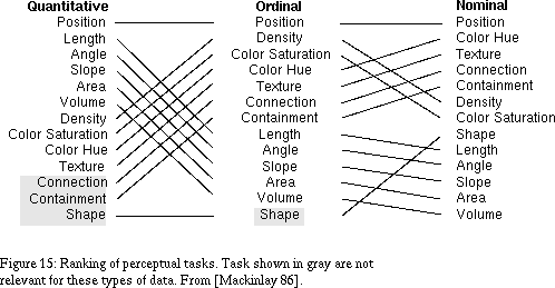
 ranks the design tools as perceptual tasks with regard to how well they perform presenting quantitative, ordeal and nominal data. See figure 15. The data have not been empirically confirmed, and should be used with care. However, we can make a number of interesting observations from it:
 extends the Mackinlay diagram by devising a method of quantifying the relative expressive qualities of color combinations. They show that hue alignment, coupled with contrast of value, is strongly correlated with reading speed. Therefore, when displaying text, the contrast of value should be high, while other information can afford less contrast of value. Also, they report the off-complementary dyad when contrast of value is low to be viewed as energetic. Studies by Jacobson, Bender and Feldman [Jacobsen et al. 91]
 show how hue alignment and value can be combined to provide a wide rage of legibility and highlighting capabilities. The authors of the two last referenced papers have been consultants in the color selection process.
7.3.2 Time/Age
The term "newspaper" indicates that the age of the content is an important factor for the medium. Age can be represented relative to the current time ("an article was received 14 minutes ago") , or one can use the absolute calendar as a reference ("the article was received Apr 2, 9:38pm"). The first representation is more useful in the short term, while only the second is acceptable for archives. Since newspapers by definition emphasize the short term, the first representation is most useful in this project. If the goal was to create a research tool to search through news archives, the time/date would be the natural solution.
7.3.3 Sections
Newspapers indicate the subject of an article in several ways. At a coarse level of granularity articles are categorized and put into one of several sections, e.g. the daily "sports" section or the weekly "real estate" section.
7.3.4 Importance
Traditional mass-produced newspapers assign priorities to articles by guessing at what the average reader will be interested in reading. Our personalized newspaper guesses at what each individual reader will be interested in. The guess boils down to a number indicating the priority of an article at a certain time. Provided the guess is somewhat accurate it will be an important factor when the user plans the "path" through the newspaper. As time passes the importance of the article will decrease. For some types of articles this will happen very quickly, while e.g. personal mail may be important until it's read.7.3.6 Distribution
A constant challenge for recipients of electronic mail is to filter out important messages from the "junk mail". Personal mail is often important, while messages form mailing lists often can be ignored. Paper-based mail recipients have the same problem, but handwritten letters are often easier to distinguish from junk mail.
7.3.7 Size/Length
When posting messages to USENET or mailing lists it is customary to warn readers if a message is extra long. By doing so, the sender provides recipients with clues for making the decision to read an article or not. The same information is hard to find in newspapers and especially in magazines where page jumps make articles longer than they look at first glance.7.3.8 Summary of Design
Figure 17 summarizes the relationships between information items and design tools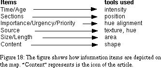
.7.4 The Electronic Map--Implementation
The pages in the electronic broadsheet are laid out in a "newspace", i.e., a two dimensional virtual plane. News articles naturally lend themselves to two-dimensional representations, and a map over the newspace is provided to ease navigation. The newspace map is based on a commonly used X11 window manager. . The interface is clearly based on the concept pioneered by SDMS (see section 4.3). The window managers allow X11 displays to have a virtual plane larger than the physical screen size. The user can pan the real screen over the virtual screen to view a different part of the plane. The user interface for all the virtual window managers is implemented through a map. The user can see the outline of all top-level windows in a special window that is an isomorph representation of the windows on the virtual plane. The implication of using a virtual window manager for the users is that they have more real estate to lay windows out on. Instead of using overlapping windows, the screen can pan over a large bulletin board with partial.
7.4.1 X11 Window Managers
One merit of the X11 Window System is that it clearly separates the different parts of a window system into different processes--e.g., the task of managing the windows and the screen space is handled by the window manager. The window manager is with few exceptions an application just like any other X11 client The window manager is given authority to control the layout of windows on the screen. Other clients indicate their preferred position and size and this will normally be granted. However, the window manager can any time decide to move or resize a client window.
 . Recognizing its de facto position among window managers, the X Consortium adapted the program and extended the functionality for release 4 of X11.
 See Appendix A for background information.
7.4.2 Changes to VTWM
Based on the freely available code for VTWM, the NVTWM (Newspace VTWM) was developed to manage windows in the newspace.
The Electronic Broadsheet - 30 JUN 95
[Next] [Previous] [Top] [Contents]
