text-fonts-01-t |
|
| SVG Image | PNG Image |
|
|
|
||||||||
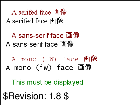
Purpose of test is to determine if the font family is being correctly selected. The top two lines of text test serif fonts; the top line in maroon tests the generic font family 'serif' and the second line in black tests a selection of commonly available named serif fonts. The next two lines of text test sans-serif fonts; the top line in maroon tests the generic font family 'sans-serif' and the second line in black tests a selection of commonly available named sans serif fonts. The following two lines of text test monospaced fonts; the top line in maroon tests the generic font family 'monospaced' and the second line in black tests a selection of commonly available named monospaced fonts. The lowercase 'i' and uppercase'W' should be the same width,for monospaced fonts.
The seventh line of text, in green, tests for three non-existent fonts (nonsense names). There is no fallback generic font specified. The text must be displayed anyway.
The first six lines contain two Japanese characters (画像) at the end of the line. Both of these characters must be displayed, although it is compliant to display them with the 'missing glyph' if no suitable font containing Japanese characters can be found. Most but not all fonts have a visible missing glyph character. If the selected font has a visible missing glyph character, it should appear wherever the corresponding glyph is not available.