<JakeAbma> scribe: Jake
<JakeAbma> Happy Birthday to WCAG 2.0!!!
<JakeAbma> awk: next week 18th, who wil attend?
<alastairc> Planning to attend / chair
<JF> WILL attend
<laura> I can attend.
<JakeAbma> will attend
<Makoto> will attend
<Detlev> attending most likely
<stevelee> Will attend
<JakeAbma> awk: 25th?
<JakeAbma> awk: meet next week, next will be Januari 8th (skip 2)
<JF> +1 to the plan
<AllanJ> http://w3c.github.io/low-vision-a11y-tf/user-needs-coverage.html
<JakeAbma> Jim: looked at user needs document, LVTF
<JakeAbma> Jim: created a table with needs, looked at WCAG 1, 2 and Silver
<JakeAbma> Jim: not really something for 2, well set for Silver
<JakeAbma> Jim: not for 2.2
<JakeAbma> awk: are all Silver issues UA things?
<JakeAbma> Jim: yeh, seems to be more UA things
<JakeAbma> Jim: more closely also some reflow and text adjustments
<JakeAbma> Jim: on the author part
<JakeAbma> Jim: other things like CSS injection etc. will be on browsers
<JakeAbma> JF: justification may be AA, is there a reason why we coulld't have that Jim?
<JakeAbma> JF: what is your criteria on this?
<JakeAbma> JF: justification, margins and border may become 2 / 3 SC here
<jon_avila> FYI WCAG 2.0 SC 1.4.8 AAA covers justification. Getting other parts of this moved up as well would be helpful.
<JakeAbma> JF: we may get something through, what will be the blockers?
<Detlev> If soft hyphenation is working, I can imagine cases where justified text might be justifiable to conform to style expectations (two-column rendendering of scientifc papers).
<JakeAbma> Jim: for text spacing we ended up in the mid range, to allow for
<JakeAbma> Jim: authors should not 'block'adjustments, not make widgets for changes, that might be something for UAs
<JakeAbma> Jim: Point of Regard has to do with zoom
<JakeAbma> JF: Related Information also is something for the LVTF, I see something happening if we discuss this 2 / 3 times...
<JakeAbma> JF: we cherry picked because of people and time we had, we may have openings right now
<JakeAbma> MG: also see room here for 2.2 to look for SC from within COGA
<JakeAbma> AWK: high level goal here is a list of thing to look at with the group
<JakeAbma> AWK: what we need to do is to take a look and make it comprehensive as possible
<alastairc> Jim/ MichaelG - worth looking at "locus of attention", the old HCI term for 'point of regard', might find some good academic resources from that term.
<JakeAbma> AWK: if we can make them more explicit, that would be the next step and share it on the list
<JakeAbma> JF: if you have more research, please provide so we can get up and running
<JakeAbma> JF: to Jim
<laura> We have lots of research in the Wiki.
<JakeAbma> AWK: update processed from Jared?
<JakeAbma> AC: yes, Jared helped with some focus issues, been through them
<JakeAbma> AC: some concept refined for changing shapes
<JakeAbma> AC: other aspects were changes of outlines inside and / or outside UICs
<JakeAbma> AC: created update for these
<alastairc> The alternative approach: https://github.com/w3c/wcag/pull/557/files
<alastairc> Preview: http://htmlpreview.github.io/?https://github.com/w3c/wcag/blob/26d63f851bb3b9023fc554d16acb125f4435e4c1/understanding/21/non-text-contrast.html
<alastairc> Use of Color and Focus Visible
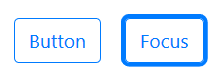
<JakeAbma> AC: some examples added, the text is: ""A common method of adding a focus indicator is to add an outline around or inside the component. That outline must change the contrast ratio by at least 3:1 for the color it is replacing. In practice, it will also mean the outline will contrast with either the component or the component's background."
<jon_avila> from a usability perspective size might be hard to detect --in particular when there is no comparison to other non-focused buttons
<JakeAbma> DmD: look a bit confusing, we want it to be clear
<JakeAbma> DmD: contrast with button? OR Background?
<JakeAbma> DmD: can we mature it to a bit more clear scenario?
<jon_avila> We need to be able to compare two buttons -- one that is focused and one that is not.
<JakeAbma> JF: default focus style is sufficient, while I think it not, that contradicts normative text
<JakeAbma> AC: this change doesn't impact that
<alastairc> Intersting little test page for this: https://alastairc.ac/tests/wcag21-examples/ntc-focus-styles.html
<JakeAbma> MG: non-text contrast, nothing in SC says differences in state must have specific contrast requirements
<JakeAbma> MG: changes in shape and mixing with color may be hard to handle from within this SC
<JF> +1 to Jon
<JakeAbma> Jon: we should not forget about adjacent state of UIC
<Zakim> alastairc, you wanted to say that we can't require states, needs to be narrower
<JakeAbma> AC: what is a required state? there are more that 16 link states for example
<JakeAbma> AC: separate / define functional states?
<JF> state dynamic property expressing characteristics of a user interface component that may change in response to user action or automated processes States do not affect the nature of the component, but represent data associated with the component or user interaction possibilities. Examples include focus, hover, select, press, check, visited/unvisited, and expand/collapse.
<JakeAbma> MG: to what degree are links non-text contrast Alastair?
<jon_avila> yes
<jon_avila> A link is a user interface component
<JakeAbma> JF: 2 types of states: user interaction or they are not
<JakeAbma> JF: so like interacting with a button (to active) or a visited (inert) link
<JakeAbma> AWK: what state are we regarding as ïn scope"for this SC?
<Detlev> agree with Alastair that it shoud just be focus/unfocused state and functional states like checked etc.
<alastairc> From the doc: "This Success Criterion does not require that all states are differentiated within the component. With the exception of keyboard focus indicators, links and buttons are not required to differentiate states such as hover. Information within controls that convey the value or state of an input, such as checkboxes, sliders, and radio buttons must meet the contrast requirement for those states. For example, the tick in a checkbox must meet the
<alastairc> contrast requirement."
<alastairc> gap: has to be visible in every state, not that every state differentiates.
<JakeAbma> AWK: we have some different views in the WG for what the states are exactly
<Zakim> JF, you wanted to remind about pie-charts
<JakeAbma> AWK: not sure where to go now
<JakeAbma> JF: we have contrast to siblings AND backgrounds, so they both are present at one time, that also counts for other examples
<gowerm> trackbot, make minutes
<trackbot> Sorry, gowerm, I don't understand 'trackbot, make minutes'. Please refer to <http://www.w3.org/2005/06/tracker/irc> for help.
<AWK> Alastair: Part of the challenge is that the chart is static and the controls are not. And we wind up running out of colors to use in meeting this SC.
<AWK> Jon: agree with Alastair. There needs to be enough of a change in size or color or something to satisfy the SC
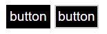
<alastairc> Examples of what I mean by change of size: https://raw.githubusercontent.com/w3c/wcag/26d63f851bb3b9023fc554d16acb125f4435e4c1/understanding/21/img/first-button-example.png
<AWK> ... there are lots of ways to do this without contrast
<AWK> ... and we should encourage that
<JakeAbma> Jon: changing shapes without contrast is harder to see as comp[onents may change in size because of text lenght for instance
<jon_avila> scribe: jon_avila
<JF> comparing inert versus active?
<Detlev> Jon: Different ways of meeting requirements flipping darkening bg (which is often poblematic)
<Zakim> JF, you wanted to say we are relying on visual information to convey "something" - else why do it?
JF: Alistair said chart was
static and component is static. Both are in scope. If you are
using affordance to indicate information then what the SC is
saying there has to be sufficient contrast to low vision users
have a reasonable chance to see that information.
... different between on focus and on hover is more mechanical
than functional. At that point the user has turned the
attention to the control. So it's the active state rather than
inert.
<david-macdonald> someone have a link to Jared's comments?
Alistair: problem is it's not feasible. And do we require links to have hover state.
JF: states are ambiguous because we provide examples but not definitive list.
Alastair: All are in scope.
Doesn't mean state has to be different.
... Draw that line to focus visible. Here are different ways
with contrast so you can meet.
JF: as long as all ways meet contrast then all techniques are valid. Doesn't matter how you meet as long as the change of state is sufficient in contrast.
Alastair: To itself or surroundings?
JF: To both.
... comparison to siblings in Jon Avila page tab example.
... still need boundaries where it's important for
information.
MG: Loop back to concept on whether states need to differentiate. 3:1 against adjacent colors. Not comparing states.
<JF> +1 to AWK. The first part is the requirement, the bulleted part is the 'scoping' of the SC
MG: don't see differentiation
between states in the language of 1.4.11
... each state has to have 3:1 to adjacent colors.
Awk: Focus is still requirement under 2.4.7
<JF> +1 to Jon
<Zakim> gowerm, you wanted to say create a sufficient technique
MG: I do think there is a happy
ending for 2.4.7 as we make a sufficient technique for 1.4.11
and 2.4.7.
... that was satisfy everyone but we aren't creating a failure
technique.
... sufficient technique to ensure 3:1 between focused and
non-focused states under 2.4.7. Non perfect but workable.
<Zakim> alastairc, you wanted to ask which bits of the new doc aren't agreed?
mg: don't have to just use contrast -- you can use shape or add another line. Contrast is just one way.
Alastair: trying to work out which bits are agreed or not. Previously linked to hover state and we had a proposed response but could not find if it was agreed.
<Detlev> put it to straw poll? Just to move *a bit * forward?
Alastair: Can we call out checkboxes and other functional things.
<gowerm> yes, it appears that the language around hover is gone from the Understanding doc. It was there at some point
awk: don't recall and discussion around graphical part - discussion primarily on user interface components
detlev: If there is an implicit requirement such as button pressed, is there a requirement for them to be differentiated. May fall under some other affordance criteria
awk: Alastair - do you feel like there is anything in the update that isn't supporting the view that it's not requiring 3:1 between states?
Alastair: adjacent color for state indicator like checkbox are included.
detlev: could mean applying this to a button show that you have pressed a higher contrast option. A button which does nothing passes. If a button indicates then the SC would apply? If you do nothing you get away with it.
<alastairc> Near the top: "With the exception of keyboard focus indicators, links and buttons are not required to differentiate states such as hover. Information within controls that convey the value or state of an input, such as checkboxes, sliders, and radio buttons must meet the contrast requirement for those states."
awk: leave this one open for a
week. Survey for the next week and discussion clarifications
and changes. The working group needs that foundational
clairty
... does that make sense to people
makes sense.
David: may need to reword for 2.2 around focus clarity
<gowerm> Or add in a new SC specific about differentiation between certain states
awk: certain we want to make it measurable. If the conclusion is that we failed in 2.1 then that should be a requirement.
<Detlev> Just noting that an affordances SC seems to be a real gap (if there are different fucntional states, they can be visuall differentiated)
RESOLUTION: Leave open and send email to list for thoughts on feedback
awk: 3 ready, 2 with changes. awk
has changes in pull request.
... overlapping in contrast is 4th telephone example. Makoto is
questioning whether example is recognizable
Makoto: if it had not seen the image before I may not be able to recognize that it is a phone. Not 100% confident. but I can live with it.
awk: Still part of test
procedure. There is some level of judgement that has to happen
to know if it's still recognizable.
... Do you agree it's a good conceptual topic?
Makoto: yes
awk: It's really about the
example.
... what do others think about the example?
detlev: suggest it's easier to
talk about salient feature of icon such as shape. the entire
shape meets the requirement for contrast.
... ancillary can have lower contrast..
... easier to not go into chisel away and is there is a subject
element. That would be more clear.
awk: something we have discussed
with this SC for a long time. A number of example have come up
and why we adopted this view that is being clarified.
... would be simpler to say shape -- but then it was
entire?
detlev: what's salient and what is not -- that is the test - decoration would be non-salient.
awk: that may still require human judgement.
<AWK> Jon: my concern with the phone example is that it makes the phone look like it is on a base and therefore less identifiable
<AWK> ... this one is a judgement call (this icon in the 4th example).
<alastairc> The (approved?) fail example from the understanding doc: https://www.w3.org/WAI/WCAG21/Understanding/img/contrast-gradient.png
<gowerm> +1 to a failure example
awk: like your fail example Alastair -- put a failure example.
alastair: did discuss at design. The concept that has little areas that don't follow but the image as a whole does have contrast to distinguish.
mg: easiest thing might be to
make gradient thinner. We want to allow designers to create
things that usable but yet are adoptable.
... not a lover of gradient -- want to allow for a tiny segment
that might not pass but where whole image is sufficient.
<kirkwood> Its a difficult example with the generational evolution of phone. Could a simple image of a car work better?
mg: suggest changing gradient a bit to demonstrate more clearly what we are after.
awk: does that work for other
people?
... had my comments which are in pull request. In
applicability: when creating icons that need to be discernable.
Most techniques start with all techniques that support
graphical icons.
... In the description around the objection. The technique is
to ensure that graphcis icons provide enough contrast.
... change to "not all graphics are in the scope -- but if the
icons are required to understand the content then..."
... made some spelling changes to "color".
<alastairc> Happy with all the language changes.
awk: The big thing -- in the
procedure where it says the test assume a contrast tool with a
color picker. Not sure why that is necessary.
... propose change to remove part about "color picker".
Fine with me.
Alastair: fine with me
awk: gradient example is
outstanding and Alastair will adjust and make it lessened to
make it more identifiable as a phone.
... any other thoughts on concerns about this one?
... any objection to accept as amended pending image
change?
RESOLUTION: Accepted as amended pending image change
awk: thanks everyone. Confident we will resolve 1.4.11 -- not quite done yet.
<laura> Happy 10th Birthday WCAG 2.0. December 11, 2008 the W3C issued the Rec. Press release:
<laura> http://www.w3.org/2008/12/wcag20-pressrelease.html
awk: we are meeting next week. We are not meet following two after that.
david: Happy birthday to WCAG 2.0
<JF> bye all
<laura> bye
trackbot, end meeting
This is scribe.perl Revision: 1.154  of Date: 2018/09/25 16:35:56
Check for newer version at http://dev.w3.org/cvsweb/~checkout~/2002/scribe/

Guessing input format: Irssi_ISO8601_Log_Text_Format (score 1.00)

Succeeded: s/pat/part/
Succeeded: s/RESOLUTION: Accepted as amended/RESOLUTION: Accepted as amended pending image change/
Default Present: AWK, JakeAbma, stevelee, Detlev, kirkwood, MichaelC, JF, Makoto, alastairc, Laura, AllanJ, Kathy, Chuck, Katie_Haritos-Shea, gowerm
Present: AWK JakeAbma stevelee Detlev kirkwood MichaelC JF Makoto alastairc Laura AllanJ Kathy Chuck Katie_Haritos-Shea gowerm
Found Scribe: Jake
Found Scribe: jon_avila
Inferring ScribeNick: jon_avila
Scribes: Jake, jon_avila

WARNING: No meeting chair found!
You should specify the meeting chair like this:
<dbooth> Chair: dbooth

Found Date: 11 Dec 2018
People with action items:

WARNING: Input appears to use implicit continuation lines.
You may need the "-implicitContinuations" option.


WARNING: IRC log location not specified!  (You can ignore this
warning if you do not want the generated minutes to contain
a link to the original IRC log.)
[End of scribe.perl diagnostic output]