What I've Learned from my 'Students'
Reflections on 3 Years of Teaching Mobile Web Best Practices
openMIC #13
22 March 2012
The Course
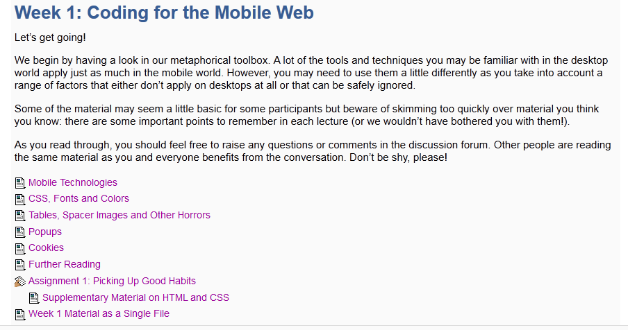
The Course
The Course
The Course
The Course
The Course
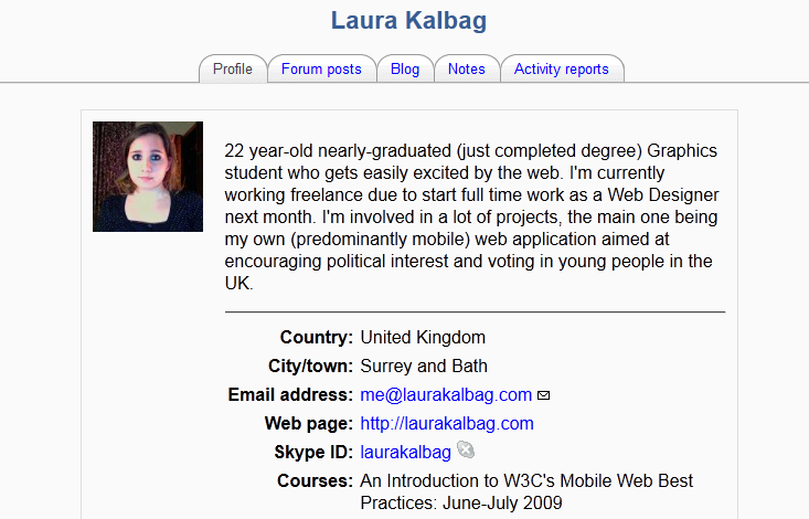
'Students'?

'Students'?
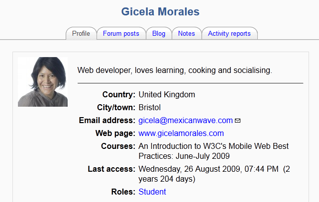
'Students'?

'Students'?
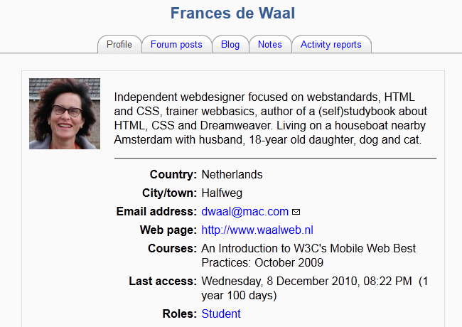
'Students'?
Bandwidth is Limited
- Might be on wi-fi, but assume they're on flaky GPRS
- Deliver minimal number of bytes, set cache headers etc.
- CSS display:none is lazy
Implication
Use server side techniques to adapt the content for mobile.
The Client Knows its Viewport
- You might not (know its viewport size)
- You can reset the system so that concepts like pixels and percentage widths are related to the screen size, not the actual number of dots on the screen
- Pixel perfect designs across multiple browsers on multiple devices is time consuming — and probably unnecessary
Implication
Use client side techniques to adapt the style for mobile
Smartphones Zoom, What's the Problem?
- Allow you to see desktop designs on handheld devices
- It's a clever hack to get around legacy desktop-only designs — and the 'legacy' is still growing
- Zooming in and out proves that you're using a really smart device to access a badly engineered site
Implication
You never have to zoom in or out of a mobile-friendly site
Battery and Processing Power is Limited
Images
Should be adapted server side and not on the client using CSS.
There's no easy way to do this … yet
Responsive Images
<picture alt="Alt tag should accurately describe the image represented by all sources, though cropping and zooming may differ.">
 <source src="mobile.jpg" /> <!-- Matches by default. -->
 <source src="high-res.jpg" media="min-width: 800px" /> <!-- Overrides the previous source over 800px before any assets are fetched, resulting in a single request. -->
 <img src="mobile.jpg" /> <!-- Fallback content, in the event the <picture> tag is completely unsupported by the user’s browser. -->
</picture>
You can join the Responsive Images Community Group.
Until then…
You need a mobile/desktop detector script, such as the one we use on the course developed by Francecs de Waal and Alex Pot of smartscripts.nl.
Use the GD Library, probably installed on your server already.
Create a function that uses GD to reduce the size of any image to within a preset limit if the user is on mobile.
Write <img… /> and <figure… /> elements dynamically into your HTML with something like:
<?php
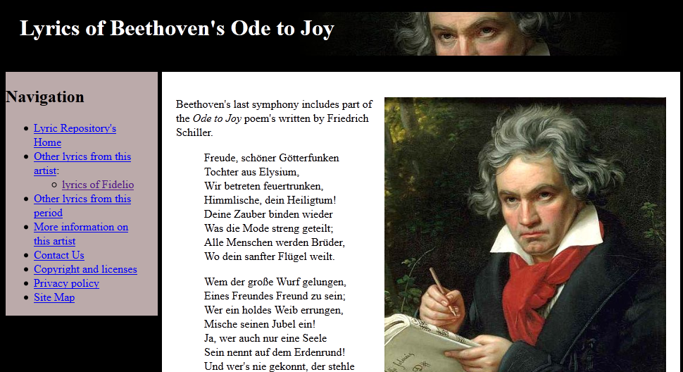
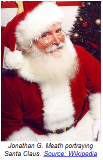
writeFigure('/diary/2011/atheistchristmas/Santa_Claus.jpg',
'Jonathan G. Meath portraying Santa Claus.
<a href="http://en.wikipedia.org/wiki/File:Jonathan_G_Meath_portrays_Santa_Claus.jpg"
>Source: Wikipedia</a>', 1, 'right');
?>
The Result
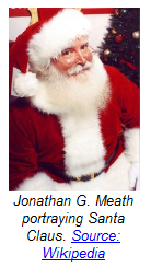
<figure style="width:202px" class="right">
  <img src="/inc/showImage.php?src=/diary/2011/atheistchristmas/Santa_Claus.jpg&float=1&w=200&h=280"
  width="200" height="280" alt="" />
  <figcaption>Jonathan G. Meath portraying Santa Claus.
    <a href="http://en.wikipedia.org/wiki/File:Jonathan_G_Meath_portrays_Santa_Claus.jpg">Source: Wikipedia</a>
  </figcaption>
</figure>
<figure style="width:122px" class="right">
  <img src="/inc/showImage.php?src=/diary/2011/atheistchristmas/Santa_Claus.jpg&float=1&w=120&h=168"
   width="120" height="168" alt="" />…
Details and all code at http://philarcher.org/diary/2011/phpimageadaptation/.
Efficient CSS Backgrounds
You are likely to have seen things like this:
background: url(data:image/gif;base64,R0lGODlhEAAQAMQAAORHHOVSKudfOulrSOp3WOyDZu6…
This is good because it saves an HTTP round trip.
This is bad because it takes more bytes to do this than the image it replaces.
So there's little if any gain.
A Diversion into SVG
<svg xmlns="http://www.w3.org/2000/svg">
<linearGradient id="r" gradientTransform="rotate(90,.5,.5)" >
  <stop offset="0" stop-color="#235EA4"/>
  <stop offset="1" stop-color="white"/>
</linearGradient>
<rect x="0" y="0" width="100%" height="100%" fill="url(#r)" />
</svg>
A Diversion into SVG
<svg xmlns="http://www.w3.org/2000/svg">
<linearGradient id="r" gradientTransform="rotate(90,.5,.5)" >
  <stop offset="0" stop-color="red" />
  <stop offset=".5" stop-color="orange" />
  <stop offset="1" stop-color="green"/>
</linearGradient>
<rect x="0" y="0" width="100%" height="100%" fill="url(#r)" />
<line x1="95%" y1="100%" stroke="red" stroke-width="5" x2="100%" y2="0" />
<line x1="94%" y1="100%" stroke="green" stroke-width="5" x2="99%" y2="0" />
<line x1="93%" y1="100%" stroke="black" stroke-width="5" x2="98%" y2="0" />
<circle cx="80%" cy="40%" r="60" fill="none" stroke="#579" stroke-width="30" stroke-dasharray="3,5,8,13" />
</svg>
style="background: red url(headgrad.svg) no-repeat 0 0;"
URL Encoding (cf. base64 encoding)
data:image/svg+xml,%3Csvg%20xmlns%3D%22http%3A%2F%2Fwww.w3.org%2F2000%2Fsvg%22%3E%0D%0A%3ClinearGradient%20id%3D%22r%22%20gradientTransform%3D%22rotate(90%2C.5%2C.5)%22%20%3E%0D%0A%20%20%3Cstop%20offset%3D%220%22%20stop-color%3D%22red%22%20%2F%3E%0D%0A%20%20%3Cstop%20offset%3D%22.5%22%20stop-color%3D%22orange%22%20%2F%3E%0D%0A%20%20%3Cstop%20offset%3D%221%22%20stop-color%3D%22green%22%2F%3E%0D%0A%3C%2FlinearGradient%3E%0D%0A%3Crect%20x%3D%220%22%20y%3D%220%22%20width%3D%22100%25%22%20height%3D%22100%25%22%20fill%3D%22url(%23r)%22%20%2F%3E%0D%0A%3Cline%20x1%3D%2295%25%22%20y1%3D%22100%25%22%20stroke%3D%22red%22%20stroke-width%3D%225%22%20x2%3D%22100%25%22%20y2%3D%220%22%20%2F%3E%0D%0A%3Cline%20x1%3D%2294%25%22%20y1%3D%22100%25%22%20stroke%3D%22green%22%20stroke-width%3D%225%22%20x2%3D%2299%25%22%20y2%3D%220%22%20%2F%3E%0D%0A%3Cline%20x1%3D%2293%25%22%20y1%3D%22100%25%22%20stroke%3D%22black%22%20stroke-width%3D%225%22%20x2%3D%2298%25%22%20y2%3D%220%22%20%2F%3E%0D%0A%3Ccircle%20cx%3D%2280%25%22%20cy%3D%2240%25%22%20r%3D%2260%22%20fill%3D%22none%22%20stroke%3D%22%23579%22%20stroke-width%3D%2230%22%20stroke-dasharray%3D%223%2C5%2C8%2C13%22%20%2F%3E%0D%0A%3C%2Fsvg%3E

Created an SVG image and then created a base64 and URL-encoded data URI version of each (source).
Intuitively, we can hope that the URL encoded version will be smaller after compression despite a bigger original size.
We can have this intuition because the compression of full text is usually more efficient than the compression of non textual data.
The intuition is validated, we reduce the size by 37% using URL encoding instead of base64 for SVG images !
Compression
So… for more complex backgrounds:
- consider SVG as progressive enhancement;
- use URL encoding, (using a tool such as Hixie's data URI Kitchen);
- (use mod_deflate to) compress the stylesheet.
Conclusions
- W3C online training courses provide intense period of interaction with fellow professionals who share a huge amount of expertise and enthusiasm;
- doing the course (whether as student or teacher) provides time to try things out you would never normally make time for;
- the discussion forum is the most important feature.
Signing Off
Next Intro to Mobile Web BP with Frances de Waal and me (Mobile Web 1) begins 30 April.
The How to Write Great Mobile Web Applications (Mobile Web 2) course with Robin Berjon & Marcos Caceres will run again later this year.
To the 700+ 'students' who have taken the course to date:
Thank you — I've learned a lot from you.