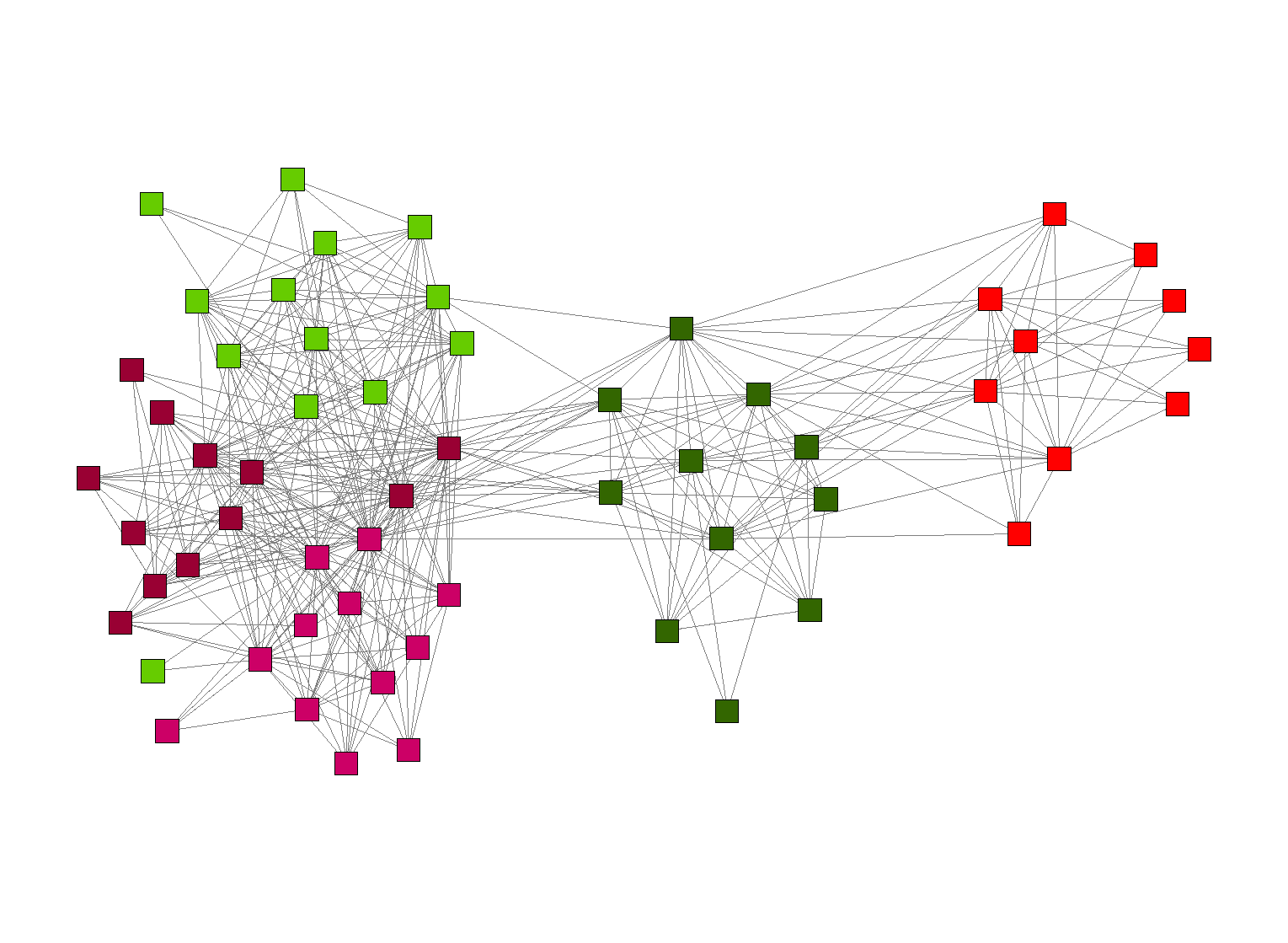
Figure 1: Parliamentary voting patterns
Open data sets often contain table-like information about some entities (e.g., donors to political parties) and their activities in relation to other entities (e.g., political parties themselves). These data sets are a valuable resource from which the information about relations between various entities can emerge.
In order to get the most out of this information we need a simple and powerful way for explaining the data and relations therein. In this paper we use graph analysis and visualization techniques in order to provide viewers with a visual explanation of the data.
Our use case is the analysis of parliamentary voting data performed during the Open Data Hackaton in Riga, December 2011.
Open data sets may contain insights that are not immediately apparent to the viewer when looking at the original data. In many cases the open data contain large amounts of table-like data that can swamp us by their numbers and may not seem very valuable in their original form.
One example of such data are the voting records of the Saeima, the parliament of the Republic of Latvia. Every voting activity is recorded, added to the protocol and the information about every vote of Members of Parliament (MPs) is published on the web. It is a valuable record of political activity but to a visitor of the website these are just tabular data that quickly loose their "news value" and may not be of particular interest.
A way to make sense of this data is by aggregating the raw information and identifying and visualizing common patterns.
The open data movement in Latvia is still in early stages of development. To date there is a very little, if any, amount of open data available in open, easily machine-readable formats. While the topic of getting the data is outside the scope of this workshop it should be noted that in our case the first challenge was to get the data to work on.
The information is available as dynamically generated HTML tables (such as this table). Thus the work described in this paper is a combination of efforts by two teams: data was collected by Raimonds Simanovskis and Jānis Baiža by screenscraping the original HTML data. This information was converted to a data table with information about every vote (including data about the MP, the vote casted, the decision the voting was about, etc.) and made publicly available via the BuzzData site.
The voting data form a bipartite graph linking individual MPs to their votes on a particular parliamentary decision. In this particular case we were interested in discovering the networks of MPs and their political parties.
In order to prepare the data for the next step we ran a number of Python scripts that took the voting data as input and produced the following data:
The most interesting of this is the information about "the co-voting behavior". For each pair of MPs we list how many times they have cast the same type of vote (yes, no, abstained) on the same parliamentary decision. The higher this number the more often the two MPs vote in the same way.
Data visualization was performed using the InFlow social network analysis tool. The tool takes input in the form of lists of nodes and edges, and allows the user to compute various social network metrics (e.g., centrality) and to create visualizations of the network. A visualization of the "co-voting network" was created by visualizing the data. In order to make the visualization more clear we decreased the number of nodes by removing the nodes for which the co-voting numbers were below a cut-off mark.
Figure 1: Parliamentary voting patterns
The resulting network is shown in Figure 1. Nodes in the network are colored by the branding of party of each MP. Clear clusters of MPs are emerging, usually clustered by their political party.
The interpretation of resulting networks is outside the scope of this paper. This is where the results of data analysis become an input for specialists who are familiar with the domain and can provide additional insights into the patterns that emerge from the data. An initial interpretation of the network in Figure 1 is provided by Valdis Krebs in the article "Innovation happens at the Intersections".
In this paper we emphasize the value of network visualization and analysis to understanding the patterns hidden in data. Public open data (such as parliamentary voting records) may be overwhelming and thus "uninteresting" to the general public in their raw form but can be made sense of by finding relations between the entities and by visualizing these relations.
This work has been partially supported by the European Regional Development Fund under project 2010/0206/2DP/2.1.1.2.0/10/APIA/VIAA/011.