What It Does
- Encourages web designers to think about the mobile audience;
- Encourages the adoption of good habits for design and usablity;
- Discourages use of technolgies that may be fine on a desktop but not on mobile;
- Encourages designers to remember that mobile device capabilities are limited and that you cannot assume that everyone has a smartphone.
Challenges
- Screen Size
- Input
- Bandwidth, Latency & Cost
- User Goals
- Advertising
- Device Limitations
Some Definite No-Nos: Popups
Some Definite No-Nos: Popups & Spawned Windows
No excuses. Don't do it.
(Because it's really hard to handle multiple screens on a mobile, even if your deivce supports them.)
- Popups.
- And
target="_blank"
Some Definite No-Nos: Graphics For Spacing
- Popups.
- And
target="_blank"
- Graphics for spacing
Some Definite No-Nos: Graphics For Spacing
No excuses. Don't do it.
(Because every image is another network request, which is more latency and, often, more cost).
Use CSS, that's what it's for.
- Popups.
- And
target="_blank"
- Graphics for spacing
Some Definite No-Nos: Frames
- Popups.
- And
target="_blank"
- Graphics for spacing
- Frames
Some Definite No-Nos: Frames
The many reasons for not using frames include:
- The [back] button does not work intuitively in many cases.
- If you reload a page the result may be different from what you had expected.
- There are security problems caused by the fact that it is not visible to the user when different frames come from different sources.
- Popups.
- And
target="_blank"
- Graphics for spacing
- Frames
Some Definite No-Nos: Frames
In the specific mobile context, many mobile devices do not support frames, therefore, frames should not be used in Mobile Web sites.
- Popups.
- And
target="_blank"
- Graphics for spacing
- Frames
Some Definite No-Nos: Image Maps
- Popups.
- And
target="_blank"
- Graphics for spacing
- Frames
- Image Maps
Some Definite No-Nos: Image Maps
- Pointing to links on a page is hard enough on a mobile as it is!
- The Recommendation is not to use image maps unless you know you are targeting a device that supports them effectively - which is unlikely.
- XHTML Basic 1.0 and 1.1 do not include the appropriate markup to declare image maps, and therefore all handsets supporting only this markup are unable to handle image maps.
- Popups.
- And
target="_blank"
- Graphics for spacing
- Frames
- Image Maps
Some Definite No-Nos: Image Maps
- Popups.
- And
target="_blank"
- Graphics for spacing
- Frames
- Image Maps
Some Definite No-Nos: Tables for Layout
- Popups.
- And
target="_blank"
- Graphics for spacing
- Frames
- Image Maps
- Tables for layout
Some Definite No-Nos: Tables for Layout
Using tables for layout, as opposed to using tables to present tabular data, is bad practice on desktop as well as mobile (mainly for accessibility reasons).
On mobile, tables often force horizontal scrolling (which is naff) or may be transformed (server side or client side). This may work but do you want to hand control to a content transformation engine?
- Popups.
- And
target="_blank"
- Graphics for spacing
- Frames
- Image Maps
- Tables for layout
Some Definite No-Nos: Nested Tables
- Popups.
- And
target="_blank"
- Graphics for spacing
- Frames
- Image Maps
- Tables for layout
- Nested Tables
Some Definite No-Nos: Nested Tables
Nested tables merely compound the problem. And you may not realise you're doing it. If you use a big table to control the
page layout and then plonk another table in the middle then that's a nested table!
- Popups.
- And
target="_blank"
- Graphics for spacing
- Frames
- Image Maps
- Tables for layout
- Nested Tables
W3C Mobile Web Best Practice in Practice
Many features that are familiar in the desktop world can and should be used on mobile... but let's flip the 'fail gracefully' mantra on its head and talk about progressive enhancement.
W3C Mobile Web Best Practice in Practice
Many features that are familiar in the desktop world can and should be used on mobile... but let's flip the 'fail gracefully' mantra on its head and talk about progressive enhancement.
- Of course you can use CSS to define fonts that make your design look better but don't rely on fonts to convey information as in 'vegetarian options are shown like this'.
- Of course you can use colour on mobile, but again, saying really important information is shown in red just doesn't work in the limited contrast/bright sunshine/dingy pub world of mobile.
W3C Mobile Web Best Practice in Practice
Many features that are familiar in the desktop world can and should be used on mobile... but let's flip the 'fail gracefully' mantra on its head and talk about progressive enhancement.
- Of course you can present tabular data in tables BUT if you can present the same information in a list, that's often going to be better.
<dl> lists are especially useful for this.
- Of course cookies are useful - goodness knows it's hard enough to enter passwords on mobile - but if you rely on them as the only way to generate dynamic pages you're likely to lose a proportion of your audience.
W3C Mobile Web Best Practice in Practice
Many features that are familiar in the desktop world can and should be used on mobile... but let's flip the 'fail gracefully' mantra on its head and talk about progressive enhancement.
- Of course you can embed video, Flash and anything else in your pages but provide an alternative representation as well. Even the iPhone doesn't (currently) support Flash.
- Of course you can use JavaScript but...
Progressive Enhancement - Example
This page:
- Uses a
dl list not a table
- Uses, but does not rely on, colour
- And is an example of how Not to do it!
The page is written almost entirely by JavaScript (try http://www.w3.org/2009/05/mwi_course_dl_badjs.htm with and without JavaScript enabled).
Progressive Enhancement - Example
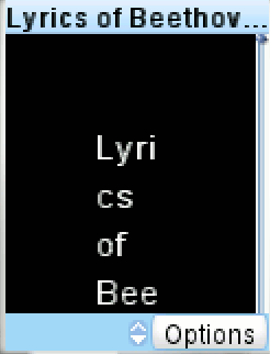
Without JavaScript support the same page looks like this:
Progressive Enhancement - Example
The two frames below show exactly the same code as each other but we've disabled the JavaScript in the page on the right. The page is available separately (and through http://tinyurl.com/n8l7bm).
Progressive enhancements added
The same file with JavaScript disabled
Desktop & Mobile in One?
Yes... and maybe more than you think.
Mobile Web Best Practices - Example
Without BP http://tinyurl.com/2ypphd
- desktop (good) -

- phone (bad!) -
BP inside http://tinyurl.com/yq7z9m
- desktop (still good!) -
- phone (good) -

Key Points
- Work in a single column;
- Provide basic navigation on one line at the top of the screen;
- Other navigation goes at the bottom of the page;
- Don't obscure the content with an image;
- Get your markup right and you can use different stylesheets for different media.
The Mobile Stylesheet - really?
Yes, but...
The Mobile Stylesheet - really?
The marketing departments of the device manufacturers don't want to talk about the mobile Web, they are keen to offer the 'full Web' and so top end devices ignore @media="handheld" completely.
Thankfully, support for media queries offers a way out.
 The problem is explained in detail in an article by W3C's Dominique Hazaël-Massieux called Return of the Mobile Stylesheet.
Dom proposed a solution based on different browser's habits and this works but a more efficient method, based on Dom's work, was proposed by Dean Hamack of Bushido Designs.
The Bushido Method
<!-- Mobile device detection by Bushido Designs: BushidoDesigns.net -->
<link rel="stylesheet" type="text/css" href="mobile.css"  />
<style type="text/css" media="screen and (min-width: 481px)">
<!--
@import url("screen.css");
-->
</style>
<!--[if IE]><link rel="stylesheet" type="text/css" href="screen.css"  media="screen" /><![endif]-->
<link href="mobile.css" rel="stylesheet" type="text/css" media="handheld, only screen and (max-device-width: 480px)" />
Basically it uses quirks of different browsers to kludge around inconsistent implementation - and covers the majority, but not all, cases.
Read Dom's original article at http://www.alistapart.com/articles/return-of-the-mobile-stylesheet
Then read the Bushido article at http://www.bushidodesigns.net/blog/?p=72 (Note, this has moved recently and there's no 301 from the old URI).
Going further
To go further means device-aware content generation.
W3C's Device Description Repository Simple API is there to help!
dot Mobi's Device Atlas is the best-known DDR and there are tutorials on the mobiforge site.
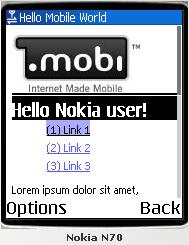
<?php
try{
    $vendor = Mobi_Mtld_DA_Api::getProperty($tree, $ua, 'vendor');
} catch (Mobi_Mtld_Da_Exception_InvalidPropertyException $e) {
    $vendor = "Unknown";
}
?>
<h1>Hello <?php echo $vendor; ?> user!</h1>
Thematic Consistency
- Desktop and mobile versions of the same site should be about the same thing
Thematic Consistency
- Desktop and mobile versions of the same site should be about the same thing.
- That does not mean they should be identical or that the mobile version must have as much content as the desktop.
- news.bbc.co.uk is a prime example.
One Web
However many versions you create, make sure there is one URI to link to.
Never ask your users, or other content creators - or search engines - to choose whether to
link a particular version of your page.
One Web
However many versions you create, make sure there is one URI to link to.
Never ask your users, or other content creators - or search engines - to choose whether to
link a particular version of your page.
Please
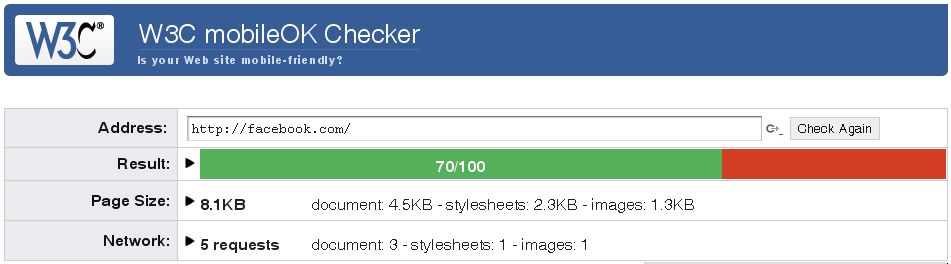
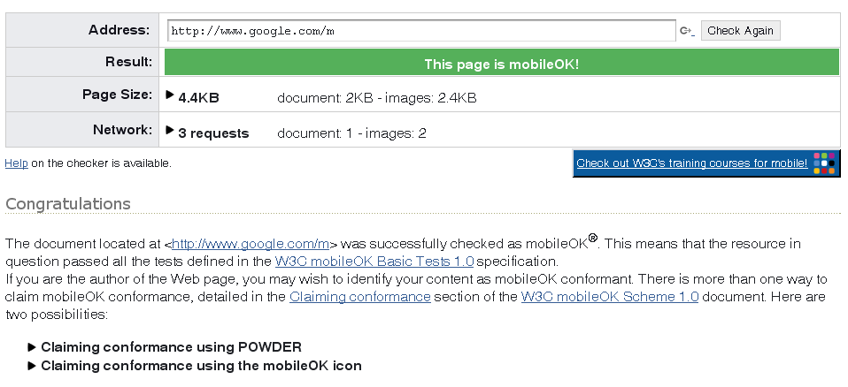
mobileOK
mobileOK is about the machine-testable best practices.
mobileOK

mobileOK/POWDER
1  <?xml version="1.0"?>
2  <powder xmlns="http://www.w3.org/2007/05/powder#">

3    <attribution>
4      <issuedby src="http://www.example.com/company.rdf#me" />
5      <issued>2008-06-25T00:00:00</issued>
6      <supportedby src="http://validator.w3.org/mobile/" />
7    </attribution>

8    <dr>
9      <iriset>
10       <includehosts>example.com</includehosts>
11     </iriset>

12     <descriptorset>
13       <typeof src="http://www.w3.org/2008/06/mobileOK#conformant" />
14       <displaytext>The example.com Web site conforms to mobileOK</displaytext>
15       <displayicon src="http://www.w3.org/2005/11/MWI-Icons/mobileOK.png" />
16     </descriptorset>
17   </dr>

18 </powder>
mobileOK -> POWDER -> Linked Data
<?xml version="1.0"?>
<rdf:RDF
  xmlns:rdf="http://www.w3.org/1999/02/22-rdf-syntax-ns#"
  xmlns:rdfs="http://www.w3.org/2000/01/rdf-schema#"
  xmlns:wdrs="http://www.w3.org/2007/05/powder-s#">

  <rdf:Description rdf:about="http://example.com/anypage.html">
    <rdf:type rdf:resource="http://www.w3.org/2008/06/mobileOK#Conformant" />
    <wdrs:logo rdf:resource="http://www.w3.org/2005/11/MWI-Icons/mobileOK.png" />
    <wdrs:text>The example.com webiste conforms to mobileOK</wdrs:text>
    <wdrs:describedby rdf:resource="http://www.w3.org/TR/powder-dr/dr-example_5_3.xml" />
  </rdf:Description>

  <rdf:Description rdf:about="http://www.w3.org/TR/powder-dr/dr-example_5_3.xml">
    <wdrs:issuedby rdf:resource="http://www.example.com/company.rdf#me" />
    <wdrs:issued>2008-06-25T00:00:00</wdrs:issued>
    <wdrs:supportedby rdf:resource="http://validator.w3.org/mobile/" />
  </rdf:Description>

</rdf:RDF>
Summary
- Design for mobile people, not mobile technology.
- Remember device and network limitations but add progressive enhancement.
- Simple adaptation is possible using CSS (especially with Media Queries), going
further entails device detection.
- Thematic Consistency and One Web are important for users, Web architecture and SEO.
- mobileOK provides a machine-testable guide to mobile development.
- POWDER designed to make things like mobileOK part of the linked data cloud.