Outline
- Challenges
- Layout
- Navigation
- Images
- Large and small screens together
Reminder: Challenges
- Screen size
- Input
- Network
- User goals
- Device Limitations
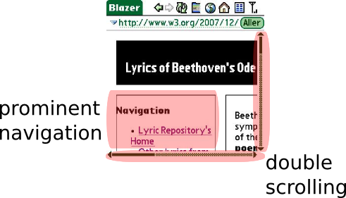
…on a phone
- scrolling / zooming
- navigation hides actual content
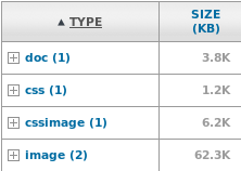
- heavy download
Mobile-friendly layout
Avoid:
- viewport changes: scrolling/zooming
- table-based layout:
<table>
- fixed layout:
style='width:400px'
- multi-columns layout:
style='position:absolute'
- wide images and tables
instead
- use liquid or elastic layout
- in a linear (single column) organization
Mobile-friendly layout
In practice:
- use relative measures in CSS ("%", "em") rather than absolute (e.g. px)
- avoid CSS properties
position, display, float
- keep images small
- keep tables narrow or turn them in lists
Mobile-friendly layout
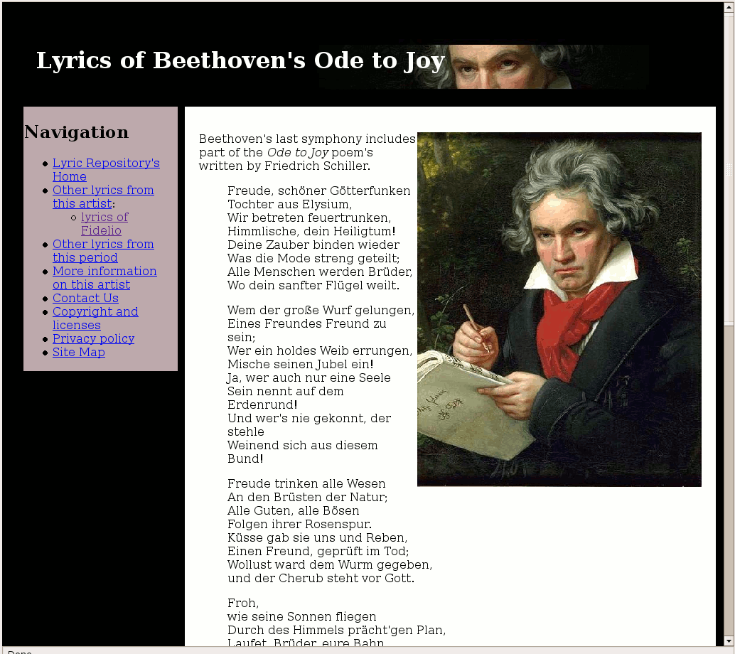
Applying to Beethoven's page
- CSS style sheet:
#container {
   width:100px;
}
#sidebar {
   width: 200px;
   float: left;
}
#content {
   margin-left: 242px;
}
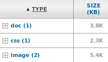
- Smaller images
- Table into list
→ resulting page (tinyurl.com/cjqk3h)
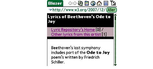
Mobile-optimized navigation
Long navigation bar at the top:
- hides actual content
- makes hard to distinguish pages
- can be difficult to skip
instead
- keep top navigation to a minimum
- push additional navigation lower down
- consider using
accesskeys [but…]
Dealing with images
Take care with
- images dimensions
- images weight
- background images impact on readibility
- reflow due to loading of images
- browser-based rescaling of images
- alternative content for images
- supported images format
Dealing with images
In practice:
- resize images to fit mobile screens
- optimize images weight, keep their number low
- provide a useful
alt attribute
- specify the
width and height in the markup
- use well-supported formats: GIF, JPEG, (PNG)
Dealing with images
Applying to Beethoven's page
#header {
   background-image:url("beethoven-background.jpg");
}
<img src="beethoven-Aipeic6G.jpg"
 alt="Portrait of Beethoven in 1820, by Joseph Karl Stieler"
 width="120" height="150" />
<img src='music.gif' alt='' width='22' height='22' />
→ resulting page (tinyurl.com/yzbqfv2)
Large and small screens together
Content adaptation on the server or on the client
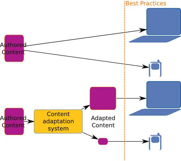
Large and small screens together
On the client: CSS Media Types
<link rel="stylesheet" media="handheld" href="mobile.css" />
<link rel="stylesheet" media="screen" href="computer.css" />
Applicable also as:
<style type='text/css' media="handheld">
and inside a style sheet with:
@media handheld { /* mobile-specific rules */ }
Large and small screens together
On the client: CSS Media Types
In summary
- liquid linear layout
- small and optimized top navigation bar
- reasonably sized images with alternative descriptions and well-defined dimensions
- using CSS to keep both small and large screens happy