slide
33
Copyright © 2005
W3C (MIT, ERCIM, Keio)


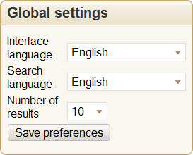
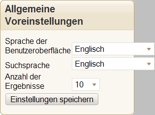
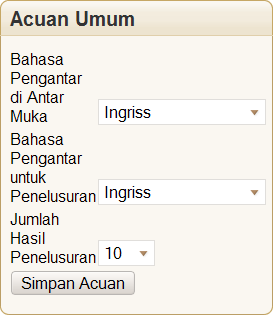
Form field label positioning
Linguistic issues