 What Graphics Designers
should know about the Mobile Web
What Graphics Designers
should know about the Mobile Web What Graphics Designers
should know about the Mobile Web
Max Froumentin
Philipp Hoschka
World Wide Web Consortium (W3C)
http://www.w3.org/
{maxf,ph}@w3.org
Overview
The newest generation of mobile phones with color screens and more powerful CPUs enable the design of highly graphics-oriented Web sites. However, graphics designers working on mobile web sites are faced with a number of new issues. First, they often need to produce content that is can easily be used on both mobile and desktop platforms in order to keep development cost in check, i.e. the graphics should be device-independent. W3C is working on general-purpose solutions for device independence that are also relevant for graphics. Another issue is user-interface design: On a mobile device, keyboards are often small, and consequently not a very suitable input device. In future, web designers will be able to use of W3C’s multimodal interaction technologies, where speech and handwriting recognition will replace the use of a keyboard as primary user input device.
Map Example
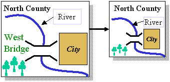
Fig 1: Two versions of a Map: Desktop (left) and Mobile (right)i>
Fig 1 shows some of the adaptations that may be required when doing the graphic design for a map to be used both on the desktop and on the mobile web. The mobile version is not only rescaled, but it is also using a different layout, and is missing some objects ("West Bridge" text).
Device Independent Authoring
The goal of W3C’s Device Independence Activity is to lower the cost of creating content for multiple devices by authoring the content so that it can be automatically adapted to different devices. In this adaptation, explicit control by the author is often necessary or even desired for creative reasons, especially for more graphics-oriented sites.
W3C has developed a number of techniques that authors can use to control the adaptation of their XML-based content to the constraints of mobile phones: CC/PP is a format for describing device characteristics such as the screen-size. CSS media queries allows to select style sheets depending on device characteristics. SMIL conditional content enables to select different parts of the content depending on device characteristics.
Adaptation can occur at the server, in an intermediate and at the client. Each of these approaches has advantages and disadvantages, which have been studied by the W3C.
Example: SMIL Conditional Content
The following SMIL fragment displays different images for different screen sizes:
<switch>
  <img src="bigImage"
       systemScreenSize="768x1024" />
  <img src="smallImage"
       systemScreenSize="160x160" />
</switch>
the SMIL content control features into the upcoming SVG 1.2 specification. This may allow to realize the adaptation shown in Fig 1, as well as the use of of discrete LOD techniques in SVG.
Multimodal Interaction
One of the most realistic usage scenarios for the mobile web is to use your mobile phone to find your way in an unknown city. However, this is difficult if you have to type in your current position and your destination using a mobile phone keyboard. In future mobile phones supporting multimodal interaction, this would be much easier: First, the phone displays a map of the city. Then, you can pick up your stylus, say "I want to go from here", tap with the stylus on point A on the map, then tap on point B and say "to here". The system will process the multimodal speech and stylus input, and tell you how to get from A to B.
W3C is currently developing the standards that will enable multimodal web interaction. Not all work is finished yet, but it is already possible to show some exciting, graphics-based demonstrations that reveal the vision of how to use multimodality for Web interaction. Moreover, some technology building blocks are already taking shape in the areas of speech recognition and backend technology.
Speech Recognition
W3C work on speech recognition is well-advanced. Specifications like VoiceXML, SRGS (Speech Recognition Grammar Specification) and SSML (Speech Synthesis Markup Language) already play an important role in the area of telephone-based interactive voice services, and will very likely be reused in the mobile Web. Familiarity with these technologies will be important for graphics designers and web authors that want to add speech recognition to their web sites.
Backend Technologies
Some of the technologies developed by the W3C Multimodal Activity will be invisible to a web designer but are still important to understand. InkML is a format to represent the output of digital pens so that handwriting recognition is possible. Also invisible is the machinery used for multimodal recognition, where languages like EMMA (Extensible Multimodal Annotation Markup Language) serve to integrate user input and recognition results of the different modalities used in an application.
Acknowledgement: This work was supported by the EU FP6 project MWeb. The views are those of the authors, and do not represent the views of the funding agency.
See also: http://www.w3.org/2001/di/, http://www.w3.org/2002/mmi/, http://www.w3.org/Graphics/SVG/