Rhys Lewis
Director of Software Architecture
Volantis Systems Ltd.
1 Chancellor Court
Occam Road
Surrey Research Park
Guildford GU2 7YT
United Kingdom
+44 (1483) 739775
rhys@volantis.com
New devices that can connect to the web continue to appear regularly. These devices often have new capabilities and can exploit features of newer generations of networks. They are often enabled for mobile use.
As diversity increases, traditional assumptions about the design of web sites suitable for viewing on typical desktop personal computers, become less and less useful. Authors need to spend additional effort in preparing sites that can be used from devices that vary greatly in capability and in the markup languages that they support. Device capabilities vary enormously. For example, the difference between the small, monochrome screen of many mobile phones and the large full colour display of a typical desktop personal computer is striking. Some devices may have no display at all, supporting voice output, for example.
The variability in markup languages can be seen by examining some of the devices in common use in the United Kingdom today. Markup languages used include variants of HTML version 3, HTML version 4, various variants of XHTML, including XHTML Basic, various WML releases, SMIL and VoiceXML. Services based on i-Mode are expected to appear soon.
The cost of developing sites that can support access from devices with such wide ranging capabilities is a major issue for authors. Using only traditional approaches, the cost of supporting multiple devices can be many times the cost of creating the original site. Alternative techniques that mitigate the cost of such development are of interest to the W3C Device Independence Working Group (DIWG). Specific aspects of one such approach, embodied in the Volantis Mariner product family, are described in this paper.
The particular approach, embodied in Mariner, has been developed over nearly three years, during which time a large number of sites have been developed for dozens of customers in a variety of industries. As a result of these projects, Volantis has gathered extensive practical experience of the issues associated with development and operation of such sites and of the characteristics of the devices used to access them.
Mariner takes an approach to supporting multiple devices defined as Single Authoring by the DIWG. Authors use a device independent markup language to specify the device independent aspects of the pages they are creating. Additional, device dependent information, covering aspects such as the stylistic properties of the final page and the physical layout of material, are defined separately. Construction of the final presentation involves adaptation of the device independent material and addition of extra information based on the device dependent material. The result is a page encoded in the appropriate markup language for the target device, laid out and styled appropriately.
The adaptation step embodies device-specific expertise and makes extensive use of the delivery context.
The DIWG has defined the concept of Delivery Context. Delivery context is a set of attributes that characterises the capabilities of the access mechanism and the preferences of the user. The access mechanism here encompasses the device and the mechanism by which it is connected to the web. The delivery context includes information such as the size of a device display and its input capabilities as well as user preferences, such as whether colour or monochrome images are to be displayed.
While standards such as CC/PP and UAProf are helping to allow devices to communicate their properties to a web server, the reality for many current devices is that very little information is directly available. Consequently, to access the hundreds of attributes that describe a device's capabilities, Mariner makes use of a device repository. Information in the delivery context received from the device is first used to identify it. Then the repository is accessed to retrieve the appropriate set of attributes. This is merged with any additional information received directly from the device to form the delivery context used during adaptation.
The single authoring approach in Mariner divides a presentation into four main elements. There is a device-independent markup language for defining the device-independent aspects of the page. There are device-dependent definitions of the physical layout of the material and of the stylistic information to be applied. Finally there are device dependent definitions of the media resources to be used. This section concentrates on Mariner's device-independent markup. Other aspects are described in later sections.
The device independent markup language used by Mariner is derived from the 'strict' version of XHTML. Two implementations of this language are supported. One is pure XML and the other is a Java Server Pages custom tag library.
Wherever possible, XHTML elements are used unchanged and the full set of attributes is supported. However, XHTML was not designed with device independence in mind. As a result, there are some details of its specification which are incompatible with device-independent usage. In these cases, extensions to XHTML are required in order to implement a device independent markup language. The following sections describe two of the extensions. Following these sections, an example illustrates some of the basic principles.
The XHTML forms model has a number of aspects that couple it tightly to the implementation of its presentation. The more recent XForms standard has done much to remove this coupling. Volantis expects that the full XForms specification will provide much of the final user interaction model required by a device-independent markup language. In the interim, Mariner's form model, which owes much to early revisions of XForms, provides device independent presentation and input. The Mariner forms model contains abstractions of the common user input primitives, including single selections, multiple selections, text input and boolean choices. The displayed representation of these primitives on a given device is under the control of the stylistic information associated with the page being generated. For example, a single selection might be presented as a drop down list on one device and as a set of radio buttons on another.
The material defined in device-independent markup usually needs to be displayed with different physical layout on different devices. The definition of the layout must be separate from the device independent markup itself, since it is device dependent. However, the device-independent markup must contain enough information for the relationship between it and the layout to be established. Mariner's approach is to define a grouping mechanism that allows subsets of the markup to be targeted at a particular, named, area of the display. This primitive is known as a pane. In the markup it can be specified as an element. In the physical layout, panes are specified as representing particular areas of the display. In devices with voice modality, panes correspond to definitions of the sequence in which audible material is presented.
The ability to group markup at a level below that of the entire page, also enables subsets of the markup to be targeted at different generated pages. This enables a page that would otherwise be too large for a device such as a WAP phone, to be broken up and sent as smaller fragments containing appropriate additional navigation links. Abstract groupings of material allow fragmentation to be performed under the control of device-dependent information, in this case the physical layout.
This section examines a basic example that illustrates a number of features of Mariner's approach to device independence. The example is based on the test page used to verify that a Mariner installation has been successful. It consists of a single canvas, Mariner's name for an authoring unit.
      <canvas layoutName="welcome" theme="welcome" pageTitle="Welcome to Mariner">
      <pane name="logo" >
        <img src="welcome/vol_logo" alt="Volantis Systems Ltd" />
      </pane>
      <pane name="background" >
        <p class="background">Volantis takes its name from a circumpolar star,
        visible anytime, anywhere. That's what we do: enable access to your e-business
        applications anytime, anywhere, from any device.</p>
      </pane>
      <pane name="congratulations" >
        <h2>Congratulations</h2>
          <p>You have successfully installed and configured Mariner.</p>
      </pane>
      <pane name="competition">
        <h2>Win a Compaq iPAQ !</h2>
          <p>Submit a screenshot of your best Mariner-based site, and we'll ship
          you a Volantis polo shirt.</p>
          <p>If we use it on the Volantis web-site we'll send you a new Compaq iPAQ!</p>
          <p>E Mail: <a href="mailto:poloshirt@volantis.com">poloshirt@volantis.com</a></p>
          <p>Please include:</p>
          <ol title="Please include">
            <li>Your name, address, E Mail and Phone Number</li>
            <li>Shirt Size (S,M,L and XL)</li>
            <li>Application server</li>
            <li>Devices you support with Volantis</li>
            <li>Brief description of your site</li>
          </ol>
      </pane>
      <pane name="smallprint">
        <p class="supersmall">
        Submitted entries may be used in marketing or promotions for Volantis Systems.
        By offering images and text, you are consenting to such use of names,
        likenesses, and general locations, for advertising and promotional purposes without
        additional compensation.</p>
      </pane>
      <pane name="links">
        <p><a href="http://www.volantis.com">www.volantis.com</a></p>
        <p><a href="mailto:support@volantis.com">support@volantis.com</a></p>
        <p><a href="mailto:moreinfo:volantis.com">moreinfo@volantis.com</a></p>
      </pane>
      <pane name="copyright">
        <p class="supersmall">Copyright (c) 2002 Volantis Systems Ltd. All Rights Reserved.</p>
        <p class="supersmall">Mariner <sup class="supersmall">tm</sup> and
        Volantis <sup class="supersmall">tm</sup> are trademarks of Volantis Systems Ltd.</p>
      </pane>
      <pane name ="agility">
        <img src="welcome/agility-by-volantis" alt="Agility by Volantis" />
      </pane>
      </canvas>
Figure 1: The device independent markup for the example.
Figure 1 shows the device independent markup for the authoring unit. Figure 2 shows the resulting page on a PC using Internet Explorer. Figure 3 shows the result on a PocketPC and Figure 4 the result on a very basic WAP phone. These very different presentations are all generated from the single set of markup in Figure 1.
Apart from the canvas and pane elements, the markup in Figure 1 is standard XHTML. Roughly speaking, the canvas element takes the place of the html element in XHTML. It defines a particular authoring unit. Among other things, its attributes specify the associated device-dependent definitions. The layout and theme are specified via these attributes. In the example, each is a local URL referencing a particular definition. The definitions can be held in various forms, including XML.
The author has chosen to define the page in terms of a number of panes. Several of these have only a small amount of content. For example, the pane named logo contains a single image. In Figure 1, notice that that in the markup for this pane, the URL referenced in the src attribute of the img element does not contain a file type, as would be the case for a typical reference to an image file. The way in which such references are resolved is described in Media Resources.
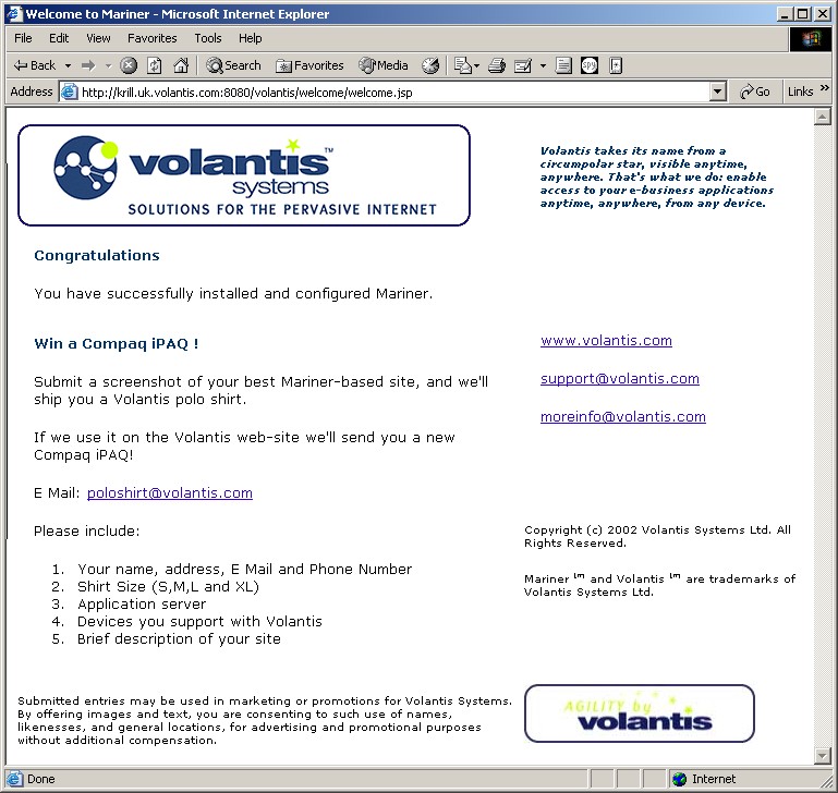
Figure 2: The appearance of the example from Figure 1 on a personal computer using Internet Explorer.
Figure 2 shows the entire canvas as rendered on a personal computer. The physical layout of this version is achieved from the arrangement of panes within the layout definition used for the PC. This is shown schematically on the left side of Figure 5. For example, the logo pane is positioned at the top left with the congratulations and competitions panes below it and the background pane to its right.
|
|
|
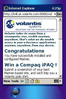
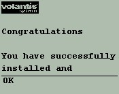
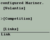
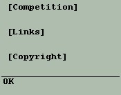
Figure 3: The appearance of the example from Figure 1 on a Personal Digital Assistant running PocketPC. The three images show the display scrolled to different positions.
Figure 3 shows the entire canvas rendered on a PocketPC personal digital assistant. Notice that the all the material from the canvas is rendered, but this time, the layout is completely different. The design is more appropriate for the smaller, portrait style display associated with the device. The layout is shown schematically on the right side of Figure 5. The logo pane is at the top with the background pane below it and followed by the congratulations and competition panes, for example. Notice also that the images associated with the page are different from those in the PC page. They are smaller versions more suitable for this particular device.
 |
 |
 |
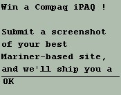 |
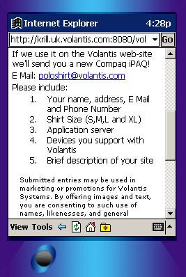
Figure 4: The appearance of the example from Figure 1 on a basic WAP phone. The first three images show the display scrolled to different positions. The fourth image shows the result of following the Competition link
Figure 4 shows the appearance of part of the canvas on a basic WAP phone. In this case, the display is so small that the authors have decided to associate certain fragments with separate pages. This association happens in the layout, so once again, the device-independent markup in Figure 1 is unaffected. In this case the initial page displayed, shown in the top three images in Figure 4, contains a small amount of the content and links to other pages for the rest. The fourth image shows the result of navigating the the Competition link, for example. The page displayed initially includes the logo and congratulations panes. Other panes are defined as being in separate fragments via the layout definition. The page displayed when the competition link is traversed contains the competition and smallprint panes.
The navigation is generated from the definition of the way in which the page is to be fragmented. This definition is contained within the layout, allowing the fragmentation to be entirely different on different devices. Authors can control various aspects of the way in which the navigation is presented.
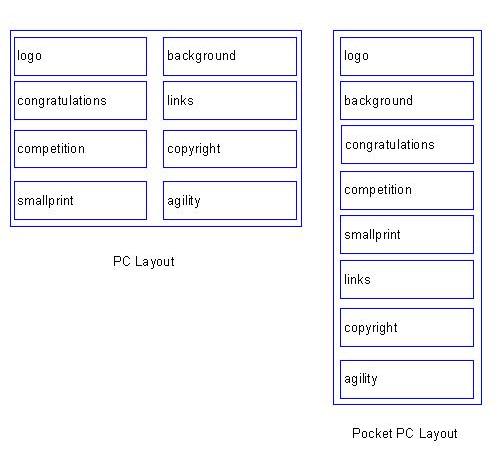
Figure 5: Schematic representations of the physical layouts used for the PC and Pocket PC versions of the presentation.
The example, though relatively simple, illustrates that single authoring approaches using device independent markup languages are capable of generating presentations that can vary considerably across devices. Not only can they support different layouts, styles and media resources, they can also support different mappings of a single authoring unit to the pages generated.
The example illustrates how additional navigation can be introduced to allow large amounts of data to be rendered on devices with limited display capability. This represents one particular type of mapping of an authoring unit onto the device. This is, however, not the only mapping that is required. The fragmentation described in the example represents a mechanism by which an author can explicitly provide the mapping. There are occasions, however, where the mapping needs to be automatic. Material whose size is not predetermined when the site is created, might need to be divided up further if it is too large for the device to accommodate. A common example is the body of a news article which may vary greatly in size. This variability is a particular problem for small mobile devices, such as WAP phones, which may have only a few kilobytes of page storage available. Strategies for automated division, based on intelligent division of the material, are possible and indeed are embodied in the Mariner implementation. Some sophistication is required to ensure that after the division, the markup remains valid and the resulting subsets of the content must be intelligible. This is, of course, an implementation issue. However, the need to specify that such processing should occur within specific elements of the presentation has been found to be a common requirement across many implementations.
In addition to mappings that split material for the device, there is a need for mappings that aggregate content. Abstractions that map to the HTML frameset concept can be devised and emulated to some extent on devices that do not support the function directly. Probably more important is the provision of a general inclusion mechanism so that content can be inccorporated from a number of sources. The ability to include additional arbitrary XML content with or without preprocessing via one or more XSLT-based transformations is a key aspect of aggregation. Mariner, for example, supports this kind of aggregation via inclusion mechanisms closely aligned to the emerging XInclude standard. Volantis believes that any device independent markup language must be compatible with the ability to use this type of content aggregation facility.
The first approach involves selection of a suitable resource from a set of possible resources. The section Affordability discusses how to control the cost of supporting multiple versions of a resource. The second approach involves creation of a suitable resource based on some standard resource, a process commonly known as transcoding. In either case, meta data about the device and the available resources is required. In Mariner, the reference to a media resource is usually a reference to this metadata. In Figure 1, for example, each img element references such metadata in its src attribute. The metadata allows the appropriate resource to be selected or created for the device in use. In either case, the delivery context provides the device-related information that allows an appropriate resource to be used.
Layout information is device dependent. Mariner's approach to this information is to allow device-specific layout definitions to be associated with particular devices. The name of the layout specified on a canvas implies a reference to a set of device-specific definitions. For a particular device, the most appropriate layout is chosen. Each layout defines a particular set of pane positions. The pane primitive allows coarse-grained control of layout, supporting physical positioning as well as fragmentation of content. Detailed, fine-grained control of the positioning of individual elements within this coarse layout is also possible using various stylistic attributes.
The section Affordability discusses how to control the cost of supporting multiple versions of a layout.
Stylistic information is device dependent. Mariner's approach to specification of stylistic information is to allow device-specific style sheets to be associated with particular devices. The name of the theme specified on a canvas implies a reference to a set of device-specific style sheets. For a particular device, the most appropriate sheet is chosen. Each sheet is a CSS2 (Cascading Style Sheet) definition of the stylistic attributes to be used.
The section Affordability discusses how to control the cost of supporting multiple versions of a style sheet.