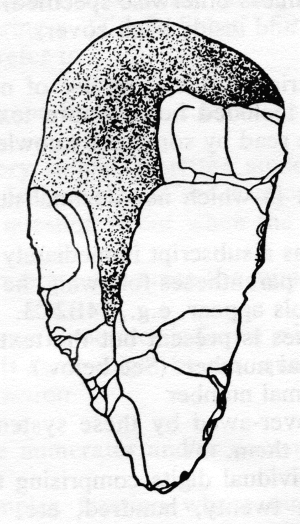
Fig. 2 A Flint Fist Hatchet of the Early Stone Age, Found in an Ancient Bed of the Nile.
The following excerpt is made with the permission of the National Braille Association, Inc. (NBA). The W3C appreciates the generosity of the National Braille Association to allow us to publish an excerpt from their manual, to provide instruction and examples to authors who are trying to describe complex images on their Web site. NBA retains all rights to this material.
Copies of the complete manual are available upon request. Write:
NBA Tape Recording ManualNBA Tape Recording Committee
Copyright © 1971, 1974, 1979, 1996, 2000 by the National Braille Association, Inc.
Converted to HTML for NBA by Wendy Chisholm. $Date: 2000/08/11 19:10:52 $
[Excerpted material starts here.]
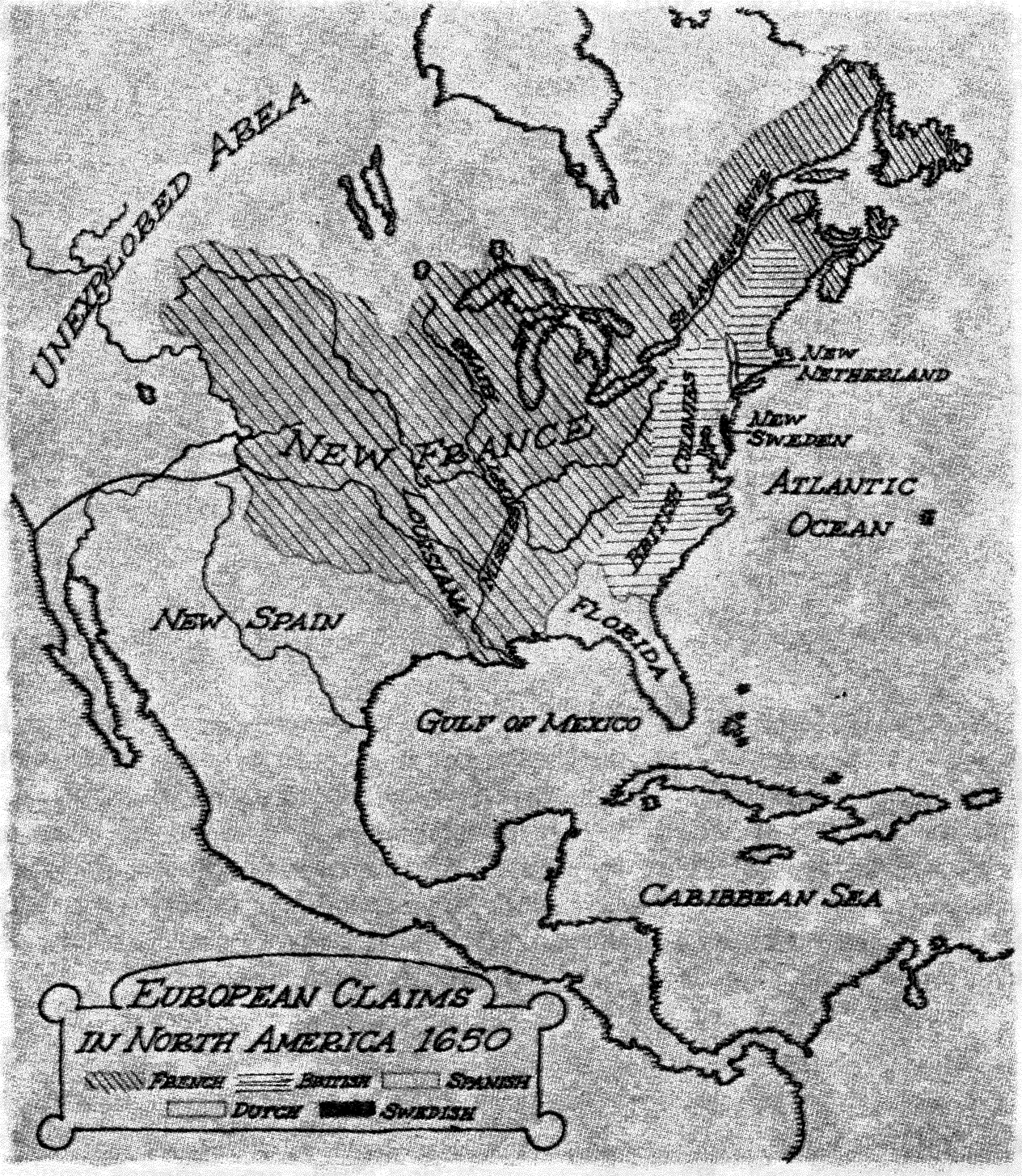
Figure 7 is a map entitled 'European Claims in North America in 1650.' Claims of the French, British, Spanish, Dutch and Swedish are shown. The largest claims are those of the Spanish, covering, in the eastern United States, all of what is now Florida plus the southern part of Georgia and southeastern Alabama. In the west New Spain reached from the Pacific Ocean to the Gulf of Mexico, covering southern California, all of Arizona, the southernmost part of Utah, the southwestern corner of Colorado, New Mexico except for its northeast corner, and Texas, excepting its panhandle. Spanish claims also extended southward to include Mexico, Central America, the Caribbean Islands and reached into South America.
New France stretched westward from Newfoundland, New Brunswick and Nova Scotia on the Atlantic Ocean and included most of the middle section of the United States, reaching south to the Gulf of Mexico. New France was bounded on the north by the southern part of the Canadian provinces of Quebec and Ontario, by Minnesota except for its northwestern corner, the southwestern two-thirds of North Dakota and by the southernmost parts of Alberta and Saskatchewan. The eastern border of New France included upper New York State, western Pennsylvania, West Virginia, the southwestern tip of Virginia, Tennessee, the northwestern tip of Georgia and northwestern Alabama. The western boundary extended from western Montana on the north through central Wyoming, central Colorado, included the northeastern corner of New Mexico, the Texas panhandle and Oklahoma. The southern border of New France covered Louisiana and Mississippi on the Gulf of Mexico.
By 1650 the Dutch had established colonies at present day Albany, New York and the tip of Manhattan Island.
Swedish colonies were scattered between Maryland and Connecticut.
The British colonies ranged southward along the Atlantic coast and
included what are now the states of Maine, Vermont, New Hampshire,
Massachusetts, Rhode Island, most of Connecticut, most of southern New
York State, the eastern half of Pennsylvania, New Jersey, Delaware, most
of Maryland, Virginia except for its southwestern corner, North
Carolina, South Carolina and northeastern Georgia.
The remainder of Canada and northwestern United States was unexplored. End Figure 7.
Again, ask, "Why is it here?" Here, too, accuracy and clarity are essential.
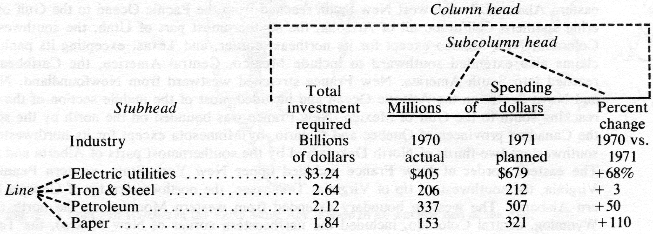
| Spending | ||||
|---|---|---|---|---|
| Who spends most on pollution cleanup |
Total investment required Billions of dollars |
Millions of dollars | Percent change 1970 vs. 1971 |
|
| Industry | 1970 actual |
1971 planned |
||
| Electric utilities | $3.24 | $405 | $679 | +68% |
| Iron & Steel | 2.64 | 206 | 212 | + 3 |
| Petroleum | 2.12 | 337 | 507 | +50 |
| Paper | 1.84 | 153 | 321 | +110 |
| Nonferrous metals | 1.62 | 100 | 152 | +52 |
| Gas utilities | 1.04 | 110 | 148 | +35 |
| Chemicals | 1.00 | 169 | 263 | +56 |
| Mining | .74 | 115 | 135 | + 17 |
| Machinery | .69 | 121 | 169 | +40 |
| Food & beverages | .40 | 84 | 151 | +80 |
| Commercial | .32 | 100 | 158 | +58 |
| Railroads | .32 | 28 | 28 | 0 |
| Rubber | .30 | 50 | 42 | -16 |
| Data: McGraw-Hill Economics Dept.; total required by pollution control standards as of Jan. 1, 1971; commercial category includes stores, insurance companies and banks. | ||||
The table is captioned, 'Who Spends the Most on Pollution Cleanup Source, McGraw-Hill Economics Department. Total required by pollution control standards as of January 1, 1971. Commercial category includes stores, insurance companies and banks. The table is divided into two columns. The left-hand column is captioned, 'Total investment required in billions of dollars'. The right-hand column is captioned 'Spending' and is divided into three subcolumns. The first subcolumn is titled 1970 actual in millions of dollars, the second is 1971 planned in millions of dollars, and the third is headed Percent change, 1970 versus 1971. The rows are industries. Reading the rows across, Row 1, electric utilities. Total investment required in billions of dollars, 3 point two four. Spending, 1970 actual, 405 million dollars; 1971 planned, 679 million dollars; percent change 1970 versus 1971, plus sixty-eight percent. Row 2, iron and steel. Total investment, 2 point six four billions. Spending, 1970, 206 millions; 1971, two hundred twelve millions. Percent change, plus three. Row three, petroleum. Investment, two point one two. Spending, three hundred thirty-seven, five hundred seven, plus fifty .
Name the type of graph, i.e., line, bar, pie; read the title, source and captions.
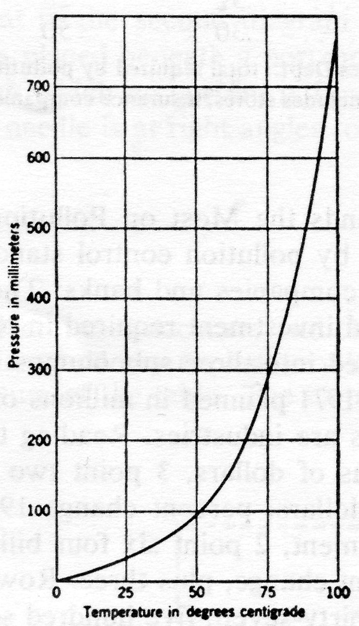
"Figure 5. 'The relationship between the vapor pressure of water and its temperature.' This is a line graph whose x axis is temperature in degrees centigrade, running from zero to one hundred degrees. The y axis is pressure in millimeters of mercury and runs from zero to 800 millimeters. The curve starts at the origin and rises so that when x is 25 degrees, y is approximately 40 millimeters. When x is 50, y is 100. When x is 75, y is just under 300. When x is 100, y is about 760. End of Figure 5. Text."
Ordinarily when two curves are placed on the same graph, the purpose is to draw a comparison between them. Therefore you would set up your table with two vertical values for each horizontal value:
| year | U.S. | Japan |
|---|---|---|
| '64 | 105 | 115 |
| '65 | 110 | 125 |
| '66 | 115 | 140 |
| '67 | 120 | 155- |
| '68 | 124 | 175 |
| '69 | 130 | 215 |
After giving caption, source, axes and units, you might introduce the reading of the graph itself with a statement about the general picture given by the graph and then proceed directly to the reading of the graph: "Between 1963 and 1969 hourly earnings rose much more rapidly in Japan than in the United States so that, taking 1963 as 100, in 1964 hourly earnings in the U.S. were around 105 and in Japan 115 ......
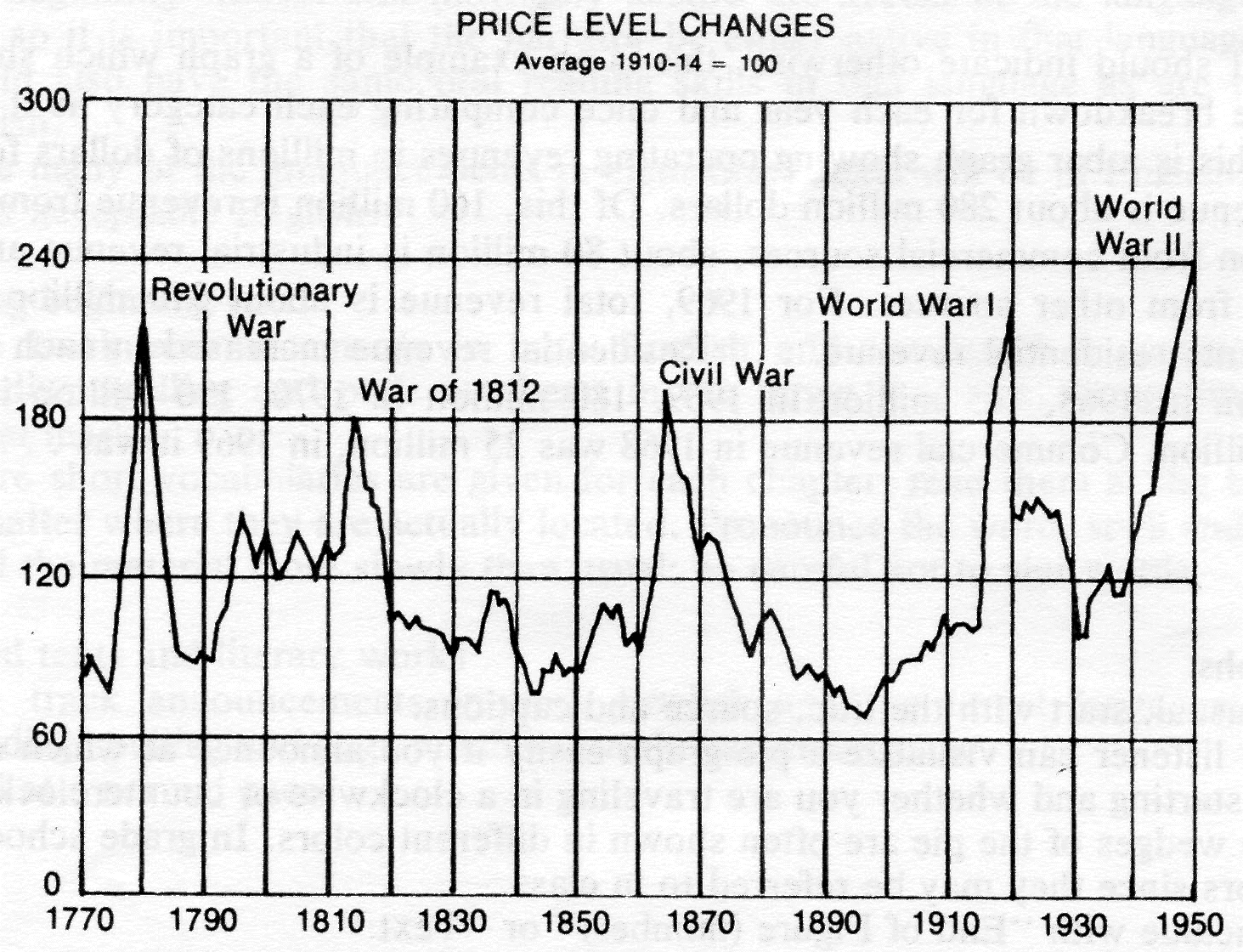
"Figure I is a line graph entitled 'Price Level Changes, Average for 1910 to 1914 equals 100'. Source: Leonard Ayres, Our National Debt After Great Wars, Committee on Public Debt Policy. The horizontal axis is years, starting at 1770 and ending at 1950. The vertical axis is Wholesale Price Index, running from zero to 300. This line graph shows that in peacetime, the Index generally fluctuates between 70 and 140. Sharp increases occur in the years of major wars; the index rose to about 220 during the Revolutionary War, 180 during the War of 1812, 190 during the Civil War, and 210 during World Wars I and 11. With the exception of World War 11, prices dropped back sharply following each war. Between 1945 and 1950, however, prices continued to climb to 240. End Figure 1. Text."
Read in a manner similar to reading a line graph. Bar graphs are used frequently for comparison; gear your reading accordingly.
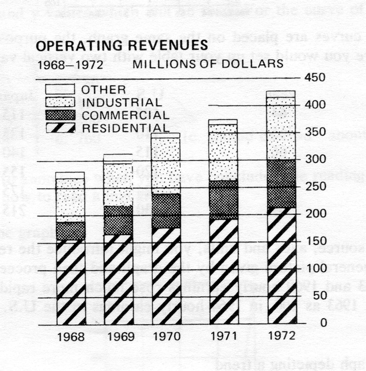
Unless the text should indicate otherwise, this is an example of a graph which should be read twice; once giving the breakdown for each year and once comparing each category as it varies from year to year. E.g.,
This is a bar graph showing operating revenues in millions of dollars for 1968 to 1972. For 1968, total revenue is about 280 million dollars. Of this, 160 million is revenue from residential sources, about 25 million from commercial sources, about 80 million is industrial revenue and the balance of 15 million comes from other sources. For 1969, total revenue is about 310 million, approximately 165 million represents residential revenue. . . . Residential revenue increased in each of the five years; it was 160 million in 1968, 165 million in 1969, 180 million in 1970, 190 million in 1971 and in 1972 reached 215 million. Commercial revenue in 1968 was 25 million, in 1969 it was . . . .
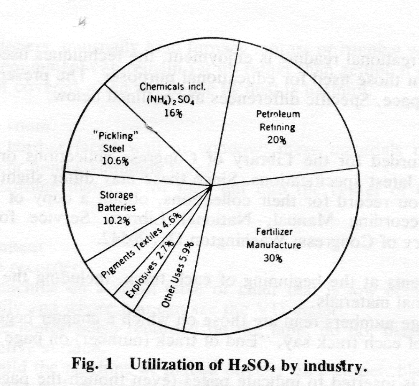
Figure one, 'Utilization of sulfuric acid by industry'. This is a pie graph showing the percentage of use by various industries. Starting at around six o'clock and reading counter-clockwise, the largest wedge of the pie is fertilizer manufacture with thirty per cent. In descending order, petroleum refining, twenty per cent; chemicals including ammonium sulfate, sixteen per cent; 'pickling' steel, ten point six per cent; storage batteries, ten point two per cent; pigments and textiles, four point six per cent; explosives, two point seven per cent; other uses, five point nine per cent. End of Figure one. Text.
Note that the figure itself may not be precise. This is unimportant to the point the author is making and need not be mentioned. Recording in languages other than English This section covers recording entire texts, ranging from grammar books for beginning students to advanced literary works.
[Excerpted material ends here.]
Copyright © 1971, 1974, 1979, 1996, 2000 by the National Braille Association, Inc. Excerpt by permission of National Braille Association, Inc. which retains all rights to this material.